Chapter 8. Animation: SVG and SMIL Animation
 | CONTENTS |  |
In this chapter:
- Basic Animations
- SVG As an Animation Grammar
- Basic Attributes of an Animation
- Applying SVG Animation to SVG Static Elements
- More Complex Animations
- SVG, SMIL Animation, and SMIL 2.0
- The <animate> Element
- The <set> Element
- The <animateMotion> Element
- The <animateColor> Element
- The <animateTransform> Element
- Rotation Using <animateTransform>
- Simple Sample Animations
Basic Animations
One of the most visually attractive aspects of SVG is its potential for animation. Most parts of an SVG image can be animated position onscreen, width, height, color, opacity, stop colors in a gradient, attributes of SVG filters. The visual effects are potentially legion. But before you get carried away or overwhelmed by the potential, look at how SVG animation is done.
SVG images can be animated by two methods: the use of declarative SVG elements (mostly using elements borrowed from SMIL Animation) or the use of ECMAScript (JavaScript) or another scripting language to manipulate the Document Object Model (DOM) of an SVG image. The two methods can be combined into one image.
This chapter focuses on declarative animation.
In practice, portraying in a book the visual appearances that SVG animation produces is difficult. Therefore, I strongly encourage you to experiment with the SVG code provided and view these animations on your own computer. A number of the animations presented in this chapter are accessible online on the Web site http://www.svgspider.com/default.svg.
SVG As an Animation Grammar
Animation is a time-based alteration in the characteristics of an image. During an SVG animation, the SVG rendering engine maintains two copies of the value to be animated. One is the original value (which is maintained in the DOM), and the other is the presentation value, the value that gives rise to the onscreen appearance during an animation.
Before I discuss and show you working SVG animations, I want to discuss the general way in which SVG animations are implemented and the various forms of syntax you can apply.
Basic Attributes of an Animation
To define an animation, you need to know what is to be animated, when the animation will begin, what is the starting value of the attribute to be animated, and what is the presentation value of that attribute at the end of the animation.
The attribute to be animated is specified by the value of the attributeName attribute. For example, if the fill attribute will be animated, you expect to see
attributeName="fill"
as an attribute on the animation element.
The timing of the beginning of an animation is determined by the value of the begin attribute. For example, if the animation will begin six seconds after the page loaded, you see this line in the code:
begin="6s"
SVG animations can be chained. If the animation will begin five seconds after the end of the First animation (identified by the id attribute of the former animation having the value of First), you see
begin="First.end+5s"
and, therefore, achieving the timing you want.
For many of the animations you use, you should define the duration, using the dur attribute. If the duration is not specified then, for most animations the SVG rendering engine will have insufficient information to implement the animation. To define the duration of an animation as being ten seconds, you use the dur attribute, like this:
dur="10s"
Several general methods exist for altering the values of an attribute. One uses both the from and to attributes so that for a color animation, you might see
from="red" to="blue"
Or, if you are altering the size of a rectangle in steps of ten pixels, you might use the from and by attributes, like this:
from="100px" by="10px"
which defines the change during the course of the animation. You can omit the from attribute if it is the same as the original value of the attribute defined in the attributeName and if it is contained in the Document Object Model (DOM). However, you should include the from attribute routinely because it acts as a reminder of the need to consider the beginning value of the attribute.
Finally, you can specify a variety of values to be displayed during the animation by using a values attribute. If you want to change the x attribute of an element successively from 5 to 10 to 30 to 5, you write something like this:
attributeName="x" values="5; 10; 30; 5"
I haven't yet discussed what happens at the end of the duration defined by the dur attribute. The default behavior is that the original value (the one maintained in the DOM) for the target attribute is again displayed. If you want instead to preserve the final version of the presentation attribute, you can do so like this:
fill="freeze"
which freezes the animation with the presentation value still on display.
WARNING
Be careful not to confuse the fill attribute on a simple SVG graphical shape, like the <rect> or <circle> elements, with the fill attribute of an animation element. The fill attribute of a graphical shape defines the paint to be applied within the outline of the shape. The fill attribute of an animation element defines whether the original value held in the DOM or the presentation value created during the animation is displayed after the animation is complete.
The SMIL Animation facilities do not limit you to a one- off animation. They provide syntax to define an indefinitely repeating animation or an animation that repeats a defined number of times. To produce an animation that repeats exactly three times, you use
repeatCount="3"
Or, to produce an indefinitely repeating animation, you use
repeatCount="indefinite"
You see later in this chapter many examples of precisely how to use these methods. My purpose now is simply to show you the range of syntax available to the SVG designer.
Applying SVG Animation to SVG Static Elements
Before you go on to look in detail at the animation elements in SVG, look at how an animation can be added to a simple SVG shape.
Typically, if you have a simple graphical shape with no content, you express it as an empty element:
<rect x="100" y="100" width="10px" height="100px" style="stroke:red; fill:rgb(0,0,0)"/>
However, when you want to add an animation to it, you need to nest the SVG animation element between the start tag and end tag of the element representing the graphical shape, like this:
<rect x="100" y="100" width="10px" height="100px" style="stroke:red; fill:rgb(0,0,0)"> <!-- The animation element goes in here. --> </rect>
If you want to have an animation that changes both the width and height attributes of a simple rectangle over a period of ten seconds, therefore, you would have an SVG image whose source code looks like this:
Listing 8.1 (AnimRect.svg)
<?xml version='1.0'?> <!DOCTYPE svg PUBLIC "-//W3C//DTD SVG 1.0//EN" "http://www.w3.org/TR/2001/PR-SVG-20010719/ DTD/svg10.dtd"> <svg width="300" height="250"> <rect x="100" y="100" width="10px" height="100px" style="stroke:red; fill:rgb(0,0,0)"> <animate attributeName="width" from="10px" to="100px" begin="0s" dur="10s" repeatCount="1" fill="freeze"/> <animate attributeName="height" from="100px" to="10px" begin="0s" dur="10s" repeatCount="1" fill="freeze"/> </rect> </svg>
By nesting the animation elements like this, you define the scope of the animation. Because, in this case, the <animate> element is nested immediately within the <rect> element, the attributes of the containing <rect> element are animated.
More Complex Animations
So far, the simple syntax you have looked at produces linear changes in an attribute smoothly over the duration of the animation. SVG, however, provides alternative methods to add other nonlinear or noninterpolated animations.
First, compare linear and discrete modes on a color animation. The top rectangle shown in Figure 08.01 changes slowly in color from white to yellow over 16 seconds. The lower rectangle stays white until the 16 seconds have passed and then changes step-wise from white to yellow. The discrete calcMode is needed particularly in situations where no interpolated values exist for example, when you are changing the visibility attribute from visible to hidden or vice versa. Interpolation values exist for the opacity attribute, but the visibility attribute is a separate thing, with the only possible values being hidden or visible.
Figure 08.01. The rectangles are animated using linear and discrete calculation modes, respectively, with resulting significant differences in animation behavior. Partway through the animation, the top rectangle is pale yellow and the bottom rectangle is still white (before the step-wise change to yellow).
Listing 8.2 (calcMode01.svg)
<?xml version="1.0" standalone="no"?> <!DOCTYPE svg PUBLIC "-//W3C//DTD SVG 1.0//EN" "http://www.w3.org/TR/2001/PR-SVG-20010719/ DTD/svg10.dtd"> <svg> <rect x="50" y="50" width="100" height="50" style="fill:#FFFFFF"> <animate attributeName="fill" calcMode="linear" from="#FFFFFF" to="#FFFF00" begin="2s" dur="16s"/> </rect> <rect x="50" y="150" width="100" height="50" style="fill:#FFFFFF"> <animate attributeName="fill" calcMode="discrete" from="#FFFFFF" to="#FFFF00" begin="2s" dur="16s"/> </rect> </svg>
Having looked at the difference between linear and discrete calculation modes, move on and look at paced calculation mode.
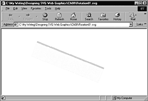
Figure 08.02 demonstrates the difference between linear calculation mode and paced calculation mode. The example shows two lines being animated by rotation using the <animateTransform> element. One animation uses linear calculation mode, and the other uses paced calculation mode.
Figure 08.02. A moment, early in the animation, when the blue line is animating faster than the red.
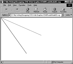
Listing 8.3 (calcMode02.svg)
<?xml version="1.0" standalone="no"?> <!DOCTYPE svg PUBLIC "-//W3C//DTD SVG 1.0//EN" "http://www.w3.org/TR/2001/PR-SVG-20010719/ DTD/svg10.dtd"> <svg> <line x1="0" y1="0" x2="300" y2="0" style="fill:red; stroke:red;"> <animateTransform attributeName="transform" calcMode="linear" type="rotate" values="0; 22; 45; 90; 0; 90; 22; 45; 0" dur="16s"/> </line> <line x1="0" y1="0" x2="300" y2="0" style="fill:blue; stroke:blue;"> <animateTransform attributeName="transform" calcMode="paced" type="rotate" values="0; 22; 45; 90; 0; 90; 22; 45; 0" dur="16s"/> </line> </svg>
Paced mode evens out the rotations over the 16 seconds of the rotation shown in Figure 08.02. However, linear mode divides all the changes into equal periods, so in the first period, it moves 22 degrees (and therefore lags behind the blue paced calcMode line). In the next period, the red linear calcMode line is again slower, traveling 23 degrees. In the third period, it speeds up a little, traveling through 45 degrees. In the fourth period, it speeds up more, traveling through 90 degrees, overtaking during the fifth time interval the steadier-paced line (forgive the pun) the paced calcMode blue line shown in the example.
If you take time to run the code, these differences are much easier to appreciate than if you attempt to understand what is happening by simply reading this text.
You can produce additional permutations by combining the use of the values attribute, the keyTimes attribute, and the linear calcMode. In the following code, pay particular attention to the keyTimes and values attributes. At 0 seconds (the first key time), the width of the rectangle is 10 pixels. At the second key time (12 seconds), the width has increased to only 20 pixels (the animation is slow). However, by the third key time (16 seconds), the width has increased to 110 pixels. If you run the animation, you should see 12 seconds of slow animation followed by a distinct increase in speed at 12 seconds. Figure 08.03 shows a moment in the middle of this animation.
Figure 08.03. An animation of the rectangle width controlled by the keyTimes attribute, partly completed.
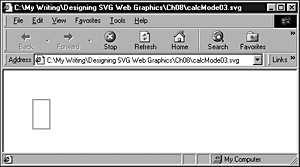
Listing 8.4 (calcMode03.svg)
<?xml version="1.0" standalone="no"?> <!DOCTYPE svg PUBLIC "-//W3C//DTD SVG 1.0//EN" "http://www.w3.org/TR/2001/PR-SVG-20010719/ DTD/svg10.dtd"> <svg> <rect x="50" y="50" width="10" height="50" s tyle="fill:none; stroke:red; stroke-width:1;"> <animate begin="0s" dur="16s" attributeName="width" fill="freeze" keyTimes="0s; 12s; 16s" values = "10; 20; 110"/> </rect> </svg>
In addition, the splines calculation mode (which I don't use in the examples in this book) is used in conjunction with the keyTimes and keyValues attributes. This mode is described fully in the SVG and SMIL Animation specifications (see Appendix A for the URLs).
In SVG, you can alter the appearance of an image over time by changing the values of one or more attributes of SVG elements over time. More specifically, each SVG animation element alters the presentation value of an attribute of an SVG element. The original value of the attribute is preserved, for possible future use, in the Document Object Model (DOM) of the SVG image or document. An SVG animation element is typically a child of the parent element, the value of whose attribute is being manipu-lated. For example, to change the color of a rectangle, you nest the <animateColor> element (described in more detail later) within the <rect> element, like this (and shown in Figure 08.04):
Figure 08.04. The fill of the rectangle is partway from white to red.
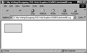
Listing 8.5 (ColorAnim00.svg)
<?xml version="1.0" standalone="no"?> <!DOCTYPE svg PUBLIC "-//W3C//DTD SVG 1.0//EN" "http://www.w3.org/TR/2001/PR-SVG-20010719/ DTD/svg10.dtd"> <svg> <rect x="20" y="20" width="100" height="50" style="fill:white; stroke:black;"> <animateColor begin="5s" attributeName="fill" from="white" to="red" dur="8s" fill="freeze"/> </rect> </svg>
Don't worry about the detail at the moment; just notice that the <animateColor> element is a child of the <rect> element whose fill color it changes. You can animate attributes on SVG elements other than the parent of an animation element if the animation element possesses a targetElement or href attribute. The href attribute belongs to the XML Linking Language (Xlink) namespace. It is not an HTML or XHTML href attribute. In this chapter, you focus on the default behavior where an animation element manipulates with time the presentation value of an attribute on its parent element.
SVG allows you to animate many attributes of SVG elements. You can change the color of a graphic, change its position, change its transparency, or make part of an image visible or hidden, for example, all by using the declarative animation syntax. You can produce particularly attractive or subtle effects when SVG filters are animated over time.
SVG provides five animation elements:
<animate> <set> <animateColor> <animateMotion> <animateTransform>
The first four elements are derived directly from SMIL Animation. The fifth animation element, <animateTransform>, is an SVG-specific animation element.
The <animate> element allows changes to be made to scalar SVG (XML) attributes or to CSS properties over time. The <set> element is an alternative to the <animate> element in some situations, conveniently allowing nonnumeric values to be set. The <animateColor> element allows color to be changed over time. The <animateMotion> element allows part of an SVG image to be moved along some path over time.
The <animateTransform> element allows the animation of one or more of the SVG transformation attributes; for example, scale. SVG provides, in addition to the <animateTransform> element, four other extensions to the animation functionality in SMIL Animation. A path attribute permits the animation of SVG path data. You can use an <mpath> element as a child of an <animateMotion> element to provide access to path data. A keyPoints attribute has been added to the <animateMotion> element, compared to the SMIL Animation original, to provide additional control of the speed of motion animations. A rotate attribute has been added to the <animateMotion> element and determines whether an object being animated along a path changes its orientation to correspond to the direction of the path at a particular point. (Think of how a car turns as a road curves.)
SVG, SMIL Animation, and SMIL 2.0
As I indicate in the preceding section, SVG derives four of its five declarative animation elements from SMIL Animation. SMIL, by the way, is the Synchronized Multimedia Integration Language. A W3C Recommendation for SMIL 1.0 was issued on June 15, 1998, and is at http://www.w3.org/TR/REC-smil. The SMIL Animation specification is, at the time this book was written, still in the W3C Proposed Recommendation stage. The latest version is at http://www.w3.org/TR/smil-animation. Also under development is the SMIL 2.0 specification, also a Proposed Recommendation. The latest version is at http://www.w3.org/TR/smil20.
SMIL Animation is the most important of these three specifications as far as understanding SVG animations in isolation is concerned. However, SMIL 1.0 and SMIL 2.0 allow the integration of multimedia components within which static or animated SVG graphics can play a useful part. A discussion of those exciting possibilities of the multimedia use of SVG is beyond the scope of this book.
SMIL Animation provides a way of expressing animations using XML- compliant elements that describe an animation along a timeline. In addition, SMIL Animation and, hence, SVG allows individual animations to be combined in visually attractive ways. Many animations described in this chapter are fairly simple because you must understand how each animation component works. After you understand fully how each one works, you should be in a good position to combine animation elements to good visual effect.
To produce an SVG animation, you declare a target attribute on an SVG element. For example, if you want to change the width of a rectangle, you use the width attribute as the target attribute, something like this:
Listing 8.6 (ChangeWidth.svg)
<?xml version="1.0" standalone="no"?> <!DOCTYPE svg PUBLIC "-//W3C//DTD SVG 1.0//EN" "http://www.w3.org/TR/2001/PR-SVG-20010719/ DTD/svg10.dtd"> <svg width="400" height="300"> <rect x="50" y="100" width="10" height="10" style="fill:red; stroke:black; stroke-width:3;"> <animate attributeName="width" from="10" to="100" begin="0s" dur="20s" /> </rect> </svg>
When the rectangle is first displayed, it has a width of ten user units. The attributeName attribute of the <animate> element indicates that the target attribute is the width attribute of the <rect> element. The animation begins at 0s, which means 0 seconds (immediately) after the image is displayed. The duration of the animation, expressed by the dur attribute, is 20 seconds. During that time, the value of the width attribute changes from 10 to 100. Visually, what was initially a small square increases progressively in width over a period of 20 seconds:
<animate attributeName="width" from="10" to="100" begin="0s" dur="20s" />
You have not specified that the rectangle retains its animated shape; therefore, it snaps back to the appearance of a small square after the animation is complete. If I had wanted the rectangle to retain the shape it had at the end of the animation, I would have added this line:
fill="freeze"
The original value of the target attribute is always available to be displayed again. During the animation, a copy of the original target attribute is created, and its changing values contribute to the display you see. However, the original value of the attribute remains unchanged in the SVG document's Document Object Model (DOM).
The <animate> Element
I look at the <animate> element as a general-purpose SVG animation element because it can do some of everything. For some animations, the more specialized animation elements (<animateColor>, <animateTransform>, <animateMotion>, and <set>) provide additional control or convenience.
Animating motion
One straightforward type of animation that is possible using the <animate> element is linear animation, which can be done horizontally, vertically, or (by combining two animations) diagonally.
Animate a circle horizontally first:
Listing 8.7 (LinCircleAnim01.svg)
<?xml version="1.0" standalone="no"?> <!DOCTYPE svg PUBLIC "-//W3C//DTD SVG 1.0//EN" "http://www.w3.org/TR/2001/PR-SVG-20010719/ DTD/svg10.dtd"> <svg width="500" height="300"> <circle cx="50" cy="50" r="10" style="fill:#990066"> <animate attributeName="cx" from="50" to="450" begin="2s" dur="10s" repeatCount="indefinite"/> </circle> </svg>
Similarly, you can animate the circle vertically by animating the cy attribute rather than the cx attribute:
Listing 8.8 (LinCircleAnim02.svg)
<?xml version="1.0" standalone="no"?> <!DOCTYPE svg PUBLIC "-//W3C//DTD SVG 1.0//EN" "http://www.w3.org/TR/2001/PR-SVG-20010719/ DTD/svg10.dtd"> <svg width="500" height="300"> <circle cx="50" cy="50" r="10" style="fill:#990066"> <animate attributeName="cy" from="50" to="250" begin="2s" dur="10s" repeatCount="indefinite"/> </circle> </svg>
Or, by animating simultaneously the cx and cy attributes, you can move the circle diagonally across the screen:
Listing 8.9 (LinCircleAnim03.svg)
<?xml version="1.0" standalone="no"?> <!DOCTYPE svg PUBLIC "-//W3C//DTD SVG 1.0//EN" "http://www.w3.org/TR/2001/PR-SVG-20010719/ DTD/svg10.dtd"> <svg width="500" height="300"> <circle cx="50" cy="50" r="10" style="fill:#990066"> <animate attributeName="cx" from="50" to="450" begin="2s" dur="10s" repeatCount="indefinite"/> <animate attributeName="cy" from="50" to="250" begin="2s" dur="10s" repeatCount="indefinite"/> </circle> </svg>
Animating size
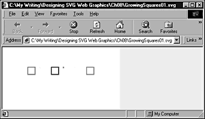
You can use the <animate> element to animate the size of an SVG element. The example in Listing 8.10 shows indefinitely repeating animations of a row of squares that change size in response to an <animate> element.
Listing 8.10 (GrowingSquares01.svg)
<?xml version="1.0" standalone="no"?> <!DOCTYPE svg PUBLIC "-//W3C//DTD SVG 1.0//EN" "http://www.w3.org/TR/2001/PR-SVG-20010719/ DTD/svg10.dtd"> <svg width="150" height="100"> <rect x="10" y="20" width="0" height="0" style="fill:none; stroke:red; stroke-width:1"> <animate begin="0s" attributeName="width" values="0; 10; 0; 10; 0;" dur="5s" repeatCount="indefinite"/> <animate begin="0s" attributeName="height" values="0; 10; 0; 10; 0;" dur="5s" repeatCount="indefinite"/> </rect> <rect x="25" y="20" width="0" height="0" style="fill:none; stroke:yellow; stroke-width:1"> <animate begin="1s" attributeName="width" values="0; 10; 0; 10; 0;" dur="5s" repeatCount="indefinite"/> <animate begin="1s" attributeName="height" values="0; 10; 0; 10; 0;" dur="5s" repeatCount="indefinite"/> </rect> <rect x="40" y="20" width="0" height="0" style="fill:none; stroke:blue; stroke-width:1"> <animate begin="2s" attributeName="width" values="0; 10; 0; 10; 0;" dur="5s" repeatCount="indefinite"/> <animate begin="2s" attributeName="height" values="0; 10; 0; 10; 0;" dur="5s" repeatCount="indefinite"/> </rect> <rect x="55" y="20" width="0" height="0" style="fill:none; stroke:#FF6600; stroke-width:1"> <animate begin="3s" attributeName="width" values="0; 10; 0; 10; 0;" dur="5s" repeatCount="indefinite"/> <animate begin="3s" attributeName="height" values="0; 10; 0; 10; 0;" dur="5s" repeatCount="indefinite"/> </rect> <rect x="70" y="20" width="0" height="0" style="fill:none; stroke:#00FF00; stroke-width:1"> <animate begin="4s" attributeName="width" values="0; 10; 0; 10; 0;" dur="5s" repeatCount="indefinite"/> <animate begin="4s" attributeName="height" values="0; 10; 0; 10; 0;" dur="5s" repeatCount="indefinite"/> </rect> <rect x="85" y="20" width="0" height="0" style="fill:none; stroke:#FF00FF; stroke-width:1"> <animate begin="5s" attributeName="width" values="0; 10; 0; 10; 0;" dur="5s" repeatCount="indefinite"/> <animate begin="5s" attributeName="height" values="0; 10; 0; 10; 0;" dur="5s" repeatCount="indefinite"/> </rect> </svg>
With animations like this, I can never make up my mind whether they are a nice background piece of motion or an irritating irrelevance. Overall, I like this one.
Figure 08.05 shows one part of the animation.
Figure 08.05. The animation of the size of the multiple squares at one point during the repeating animation.
The <set> Element
The <set> element provides a straightforward way of setting the value of an attribute or property to a particular value for a specified period. As with the other SMIL Animation and SVG animation elements, the <set> element sets the presentation attribute value, leaving the original value of the target attribute unchanged in the DOM.
You can use the <set> element to set the value of an attribute for which interpolated values make no sense; for example, the visibility attribute can have only the values hidden or visible. The additive or accumula-tive attributes are not permitted on a <set> element. Also, the repeatCount attribute does not cause the animation to be repeated, but simply extends the duration for which the animated presentation value is displayed.
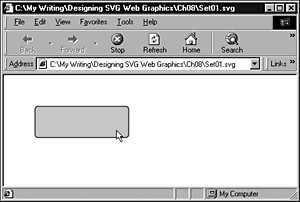
For example, you can use the <set> element to control simple rollover effects, like this:
Listing 8.11 (Set01.svg)
<?xml version="1.0" standalone="no"?> <!DOCTYPE svg PUBLIC "-//W3C//DTD SVG 1.0//EN" "http://www.w3.org/TR/2001/PR-SVG-20010719/ DTD/svg10.dtd"> <svg> <rect x="50" y="50" rx="5" ry="5" width="150" height="50" style="fill:#000099; stroke:#000099;"> <set begin="mouseover" end="mouseout" attributeName="fill" from="#000099" to="#CCCCFF"/> </rect> </svg>
When the mouse is moved over the rectangle, the fill changes to a sort of pale blue and remains like that until the mouse is moved away, ending the animation. This provides a more succinct syntax as an alternative to paired <animate> elements to achieve mouseover and mouseout effects. Figure 08.06 shows the rectangle before it is moused, and Figure 08.07 shows the appearance of the rectangle while it is being moused. Note that no pointing hand is there because the rectangle is not enclosed within an <a> element.
Figure 08.06. The rectangle not moused.
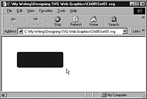
Figure 08.07. The rectangle showing the mouseover change in the fill.
Animating visibility
SVG allows you, using the <set> element, to make an element or group of elements visible or hidden.
Suppose that you want to keep some text hidden for two seconds and make it visible for six seconds. Because the text is to be hidden initially, you set the visibility attribute in the <text> element to a value of hidden. The animation is controlled by a <set> element, which animates the visibility attribute from hidden to visible. The begin attribute indicates that the animation begins two seconds after the image is loaded, and the dur attribute indicates that the text is visible for six seconds. After that period, the original value of the visibility property is restored (the text is again hidden).
Listing 8.12 (AnimVisibility.svg)
<?xml version="1.0" standalone="no"?> <!DOCTYPE svg PUBLIC "-//W3C//DTD SVG 1.0//EN" "http://www.w3.org/TR/2001/PR-SVG-20010719/ DTD/svg10.dtd"> <svg> <text id="TextElement" x="40" y="40" style="font-family:Verdana, sans-serif; font-size:30; visibility:hidden; fill:#990066;stroke:#990066" > And now you see me! <set attributeName="visibility" attributeType="CSS" to="visible" begin="2s" dur="6s"/> </text> </svg>
You can also make the text visible and keep it visible. To do that, you change the <set> element as follows:
<set attributeName="visibility" attributeType="CSS" to="visible" begin="2s" fill="freeze"/>
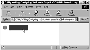
Listing 8.12 is a time-based visibility animation. You can also create event-based visibility animations, such as in Listing 8.13, where mousing the rectangle causes the circle to become visible.
Listing 8.13 (Rollover01.svg)
<?xml version='1.0'?> <!DOCTYPE svg PUBLIC "-//W3C//DTD SVG 1.0//EN" "http://www.w3.org/TR/2001/PR-SVG-20010719/ DTD/svg10.dtd"> <svg width="300" height="200"> <g style="display:none"> <animate attributeName="display" from="none" to="block" begin="Button.mouseover" dur="0.1s" fill="freeze" /> <animate attributeName="display" from="block" to="none" begin="Button.mouseout" dur="0.1s" fill="freeze" /> <circle cx="20" cy="25" r="10" style="fill:red;"/> </g> <rect id="Button" x="40" y="10" width="100" height="30" rx="5" ry="5" style="fill:red;"> <animateColor begin="mouseover" attributeName="fill" from="red" to="blue" dur="0.1s" fill="freeze" /> <animateColor begin="mouseout" attributeName="fill" from="blue" to="red" dur="0.1s" fill="freeze" /> </rect> </svg>
In Listing 8.13, I have created a group <g> element to control visibility. When visibility is controlled within a <g> element, it depends on animating the display property rather than the visibility property used in Listing 8.12.
<g style="display:none"> <animate attributeName="display" from="none" to="block" begin="Button.mouseover" dur="0.1s" fill="freeze" /> <animate attributeName="display" from="block" to="none" begin="Button.mouseout" dur="0.1s" fill="freeze" /> <circle cx="20" cy="25" r="10" style="fill:red;"/> </g>
The display attribute begins with a value of none. The first <animate> element changes the value of the display attribute from none to block, which makes the circle (which is part of the content of the <g> element) visible on mouseover. On mouseout, the second <animate> element causes the value of the display attribute to return to none, so the circle disappears from the screen.
A rollover of similar visual appearance could have been achieved by using the <circle> element without a containing <g> element and creating and animating a visibility attribute on the <circle> element from hidden to visible as shown in Figure 08.08.
Figure 08.08. The circle becomes visible when the rectangle is moused and disappears when the mouse is removed from the rectangle.
Animating URIs
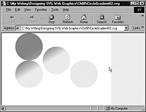
When an SVG fill is referenced, you make use of a URI that refers to the id attribute on the <linearGradient> or other element that defines the fill. That URI, like so many other SVG attributes, can be animated. Listing 8.14 contains a simple animation that puts this concept into practice and changes for a defined period the linear gradient used to fill one of the four circles (see Figure 08.09).
Figure 08.09. The URI referenced by the fill of the lower-right circle has been altered by the <set> element.
Listing 8.14 (CircleGradient02.svg)
<?xml version="1.0" standalone="no"?> <!DOCTYPE svg PUBLIC "-//W3C//DTD SVG 1.0//EN" "http://www.w3.org/TR/2001/PR-SVG-20010719/ DTD/svg10.dtd"> <svg width="400" height="300"> <defs> <linearGradient id="MyBlueGradient" gradientUnits="userSpaceOnUse" x1="90" y1="50" x2="150" y2="150" > <stop offset="10%" style="stop-color:#FF0066"/> <stop offset="75%" style="stop-color:#EEEEFF"/> </linearGradient> <linearGradient id="MyGreenGradient" gradientUnits="userSpaceOnUse" x1="60" y1="50" x2="120" y2="150" > <stop offset="10%" style="stop-color:#FF0066"/> <stop offset="75%" style="stop-color:#CCFFCC"/> </linearGradient> </defs> <ellipse cx="100" cy="50" rx="50" ry="50" style="fill:url(#MyBlueGradient)"> </ellipse> <ellipse cx="100" cy="150" rx="50" ry="50" style="fill:url(#MyBlueGradient)"> </ellipse> <ellipse cx="200" cy="100" rx="50" ry="50" style="fill:url(#MyBlueGradient)"> </ellipse> <ellipse cx="300" cy="150" rx="50" ry="50" style="fill:url(#MyBlueGradient)"> <set attributeName="fill" from="url(#MyBlueGradient)" to="url(#MyGreenGradient)" begin="3s" dur="5s" repeatCount="1"/> </ellipse> </svg>
As you can see in the following code, the from attribute of the <set> element refers to the <LinearGradient> element with an id attribute of MyBlueGradient and then alters to MyGreenGradient the gradient being referenced. At the end of the animation, because no fill attribute is on the <set> element, the gradient used returns to the one described by the fill property of the <ellipse> element:
<ellipse cx="300" cy="150" rx="50" ry="50" style="fill:url(#MyBlueGradient)"> <set attributeName="fill" from="url(#MyBlueGradient)" to="url(#MyGreenGradient)" begin="3s" dur="5s" repeatCount="1"/> </ellipse>
Chaining animations
So far, you have created animations that are either solitary or timed independently of each other. SMIL Animation and, hence, SVG also allows you to chain animations so that, if you have two animations, the second animation begins in a defined relationship to some aspect of the timing of the first animation. Look now at some examples of how animations can be chained.
In fact, all SVG animations are chained! Pause, and as you look at the following code, think for a moment what I mean:
Listing 8.15 (Chaining01.svg)
<?xml version="1.0" standalone="no"?> <!DOCTYPE svg PUBLIC "-//W3C//DTD SVG 1.0//EN" "http://www.w3.org/TR/2001/PR-SVG-20010719/ DTD/svg10.dtd"> <svg width="300" height="100"> <rect x="10" y="45" width="10" height="10" style="fill:pink;"> <animate begin="2s" dur="10s" attributeName="width" from="10" to="250"/> </rect> </svg>
The begin attribute has a value representing two seconds, but what does that two seconds refer to? It is timed relative to the end of document loading, so you have, even in that basic example, the chaining of events: The SVG document finishes loading, and the animation of the width attribute begins two seconds later. What you need to do is to understand the more general syntax to express the chaining of animations. Take a look at the following simple example, and you can see how this process works. I have added id attributes to the original <rect> element, the <animate> element, and the new <rect> so that you can be clear about exactly which part I am talking about.
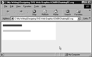
Listing 8.16 (Chaining02.svg)
<?xml version="1.0" standalone="no"?> <!DOCTYPE svg PUBLIC "-//W3C//DTD SVG 1.0//EN" "http://www.w3.org/TR/2001/PR-SVG-20010719/ DTD/svg10.dtd"> <svg width="300" height="100"> <rect id="MaroonRect" x="10" y="15" width="10" height="10" style="fill:#990066;"> <animate begin="PinkAnim.begin+2s" dur="10s" attributeName="width" from="10" to="250"/> </rect> <rect id="PinkRect" x="10" y="45" width="10" height="10" style="fill:pink;"> <animate id="PinkAnim" begin="2s" dur="10s" attributeName="width" from="10" to="250"/> </rect> </svg>
The animation proceeds as follows: Two seconds after document loading is complete, the pink rectangle is animated because of this code:
<animate id="PinkAnim" begin="2s" dur="10s" attributeName="width" from="10" to="250"/>
Notice that the animation has the id of PinkAnim. In the following line, another animation is linked to the beginning of that animation:
<animate begin="PinkAnim.begin+2s" dur="10s" attributeName="width" from="10" to="250"/>
by the syntax
begin="PinkAnim.begin+2s"
meaning that the animation starts relative to the element identified by the id attribute of value PinkAnim more specifically, two seconds after that animation begins. Figure 08.10 shows the animation part completed.
Figure 08.10. Because the animation of the top rectangle starts two seconds after the lower one begins, the top rectangle is smaller during much of the animation.
Similarly, you can add another animation that is started relative to the end of the PinkAnim animation, by using this code:
<rect id="YellowRect" x="10" y="75" width="10" height="10" style="fill:#FFFF00;"> <animate begin="PinkAnim.end+2s" dur="10s" attributeName="width" from="10" to="250"/> </rect>
If you run the following listing, you see that the pink rectangle is animated two seconds after document loading is complete. Two seconds later, the maroon rectangle is animated; two seconds after that, the animation of the pink rectangle is completed, and two seconds after that the animation of the yellow rectangle begins.
Listing 8.17 (Chaining03.svg)
<?xml version="1.0" standalone="no"?> <!DOCTYPE svg PUBLIC "-//W3C//DTD SVG 1.0//EN" "http://www.w3.org/TR/2001/PR-SVG-20010719/ DTD/svg10.dtd"> <svg width="300" height="100"> <rect id="MaroonRect" x="10" y="15" width="10" height="10" style="fill:#990066;"> <animate begin="PinkAnim.begin+2s" dur="10s" attributeName="width" from="10" to="250"/> </rect> <rect id="PinkRect" x="10" y="45" width="10" height="10" style="fill:pink;"> <animate id="PinkAnim" begin="2s" dur="10s" attributeName="width" from="10" to="250"/> </rect> <rect id="YellowRect" x="10" y="75" width="10" height="10" style="fill:#FFFF00;"> <animate begin="PinkAnim.end+2s" dur="10s" attributeName="width" from="10" to="250"/> </rect> </svg>
In case you are interested, the SVG jargon for PinkAnim.end is syncbase, and the 2s is the offset from it.
To modify the code so that the three animations are linked in sequence, you use as the syncbase for the second animation the end of the first one, and use as the syncbase for the third animation the end of the second. This process is implemented in the following code. I don't want you to get obsessed with the visual impact of changing the width of rectangles; rather, I want you to consider the power that is available if you chain animations in this way.
Listing 8.18 (Chaining04.svg)
<?xml version="1.0" standalone="no"?> <!DOCTYPE svg PUBLIC "-//W3C//DTD SVG 1.0//EN" "http://www.w3.org/TR/2001/PR-SVG-20010719/ DTD/svg10.dtd"> <svg width="300" height="100"> <rect id="MaroonRect" x="10" y="15" width="10" height="10" style="fill:#990066;"> <animate id="MaroonAnim" begin="PinkAnim.end" dur="5s" attributeName="width" from="10" to="250"/> </rect> <rect id="PinkRect" x="10" y="45" width="10" height="10" style="fill:pink;"> <animate id="PinkAnim" begin="2s" dur="5s" attributeName="width" from="10" to="250"/> </rect> <rect id="YellowRect" x="10" y="75" width="10" height="10" style="fill:#FFFF00;"> <animate id="YellowAnim" begin="MaroonAnim.end" dur="5s" attributeName="width" from="10" to="250"/> </rect> </svg>
Look at how you can develop this idea further. Notice that the yellow rectangle has an id attribute on its nested <animate> element. To link a fourth animation to the chain is a straightforward process: Just reference YellowAnim.end as the syncbase. If that fourth animation has an id attribute, you can easily add a fifth.
Can you also see how you can use this concept to create and exploit animation visual components?
As far as the "fourth" animation is concerned, the only thing it sees is the end of the YellowAnim animation. What comes before that is immaterial. The three linked animations are essentially an animated visual component, as far as the fourth animation is concerned. At its simplest level, you can link a further animation, which can be simple or complex, into the end of the YellowAnim animation. But nothing stops you from linking it instead to the MaroonAnim animation, or to the PinkAnim animation. So your simple animation could have three different animation paths as spinoffs from this simple start.
Determining multiple times to begin an animation
So far, you have looked at just using one value for the begin attribute of an <animate> element. However, SVG allows you to use a list of them. Make use of that facility by modifying the code for the pink rectangle, like this:
<rect id="PinkRect" x="10" y="45" width="10" height="10" style="fill:pink;"> <animate id="PinkAnim" begin="2s; YellowAnim.end" dur="5s" attributeName="width" from="10" to="250"/> </rect>
Notice that the begin attribute of the <animate> element has a value of 2s; YellowAnim.end. It contains a list of values. The first value indicates that the pink rectangle is animated two seconds after the document finishes loading. The second value indicates that the pink rectangle is animated when the yellow rectangle has finished its animation. You have therefore created a looping animation, by chaining the first animation to the end of the third.
NOTE
The ordering of the individual values within the values attribute is immaterial. You can insert additional values that should occur early after other values without causing any error, always assuming that you remember to separate individual values by semicolons inserted in the correct place.
To put these two ideas together, you can create a sequence of three animations. At the end of any of the individual animations, you can spin off other animations. In addition, you can loop back to the beginning of the first animation, creating a looping animation. Whenever the animations are as simple as those with the rectangles, this process isn't spectacular; if you apply your creativity, however, to create more sophisticated animation, perhaps involving color changes or animated gradients, for example, you can begin to glimpse the potential creative power available to you.
You can add another dimension to this process. What if the start of the animations are triggered by user events? What if by mousing part of an SVG image or clicking on a particular part, you can create a cascade of chained animations perhaps some of which loop too? Can you see the huge potential here? Don't worry if your brain is aching at the practical difficulties in visualizing, planning, and coding all that material just allow yourself to take a look at the potential power of it.
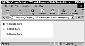
In the final example in this section I have cheated a bit. Interaction isn't covered until Chapter 11, "Creating Interactive SVG Graphics," so I don't explain the code for the interactive animations here (although you should be able to work it out if you have been following this discussion). I simply describe what it does. I have removed the starting point at two seconds after the document loads. To start the chain reaction (forgive the pun), you need to either mouse over the maroon or yellow squares or click on the pink one (as in Figure 08.11. Before you do anything, the screen looks something like this:
Figure 08.11. The appearance of Listing 8.19 before any of the small squares is activated by mousing or clicking.
Start by mousing or clicking a single square and following the chain of animations from one rectangle to another to convince yourself that, after they're started, they work as they previously did.
After you have done that, explore a little of how things have become more complex. If you mouse two squares with a little time between, you start two animations. In fact, you will have started four animations, including the two that hide the text <--Mouse here. The total animation you see depends on the relative times of when you mouse or click the relevant squares (see Figure 08.12).
Figure 08.12. The animation shortly after the maroon (top) rectangle has been moused.
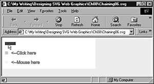
Listing 8.19 (Chaining06.svg)
<?xml version="1.0" standalone="no"?> <!DOCTYPE svg PUBLIC "-//W3C//DTD SVG 1.0//EN" "http://www.w3.org/TR/2001/PR-SVG-20010719/ DTD/svg10.dtd"> <svg width="300" height="100"> <rect id="MaroonRect" x="10" y="15" width="10" height="10" style="fill:#990066;"> <animate id="MaroonAnim" begin="PinkAnim.end; mouseover" dur="5s" attributeName="width" from="10" to="250"/> </rect> <text x="30" y="25" style="fill:red; stroke:red; font-size:14"> <animate begin="MaroonAnim.begin" dur="0.1s" attributeName="visibility" from="visible" to="hidden" fill="freeze"/> <animate begin="MaroonAnim.end" dur="0.1s" attributeName="visibility" from="hidden" to="visible" fill="freeze"/> <--Mouse here </text> <rect id="PinkRect" x="10" y="45" width="10" height="10" style="fill:pink;"> <animate id="PinkAnim" begin="YellowAnim.end; click" dur="5s" attributeName="width" from="10" to="250"/> </rect> <text x="30" y="55" style="fill:red; stroke:red; font-size:14"> <animate begin="PinkAnim.begin" dur="0.1s" attributeName="visibility" from="visible" to="hidden" fill="freeze"/> <animate begin="PinkAnim.end" dur="0.1s" attributeName="visibility" from="hidden" to="visible" fill="freeze"/> <--Click here </text> <rect id="YellowRect" x="10" y="75" width="10" height="10" style="fill:#FFFF00;"> <animate id="YellowAnim" begin="MaroonAnim.end; mouseover" dur="5s" attributeName="width" from="10" to="250"/> </rect> <text x="30" y="85" style="fill:red; stroke:red; font-size:14"> <animate begin="YellowAnim.begin" dur="0.1s" attributeName="visibility" from="visible" to="hidden" fill="freeze"/> <animate begin="YellowAnim.end" dur="0.1s" attributeName="visibility" from="hidden" to="visible" fill="freeze"/> <--Mouse here </text> </svg>
The more sensible or practical use is probably to allow, for example, multiple entry points into an animation. That could be a slide show, and, by mousing some visual cue for where you want to start, you can avoid repeating material you have already seen.
Or apply this in an SVG game? I leave creating that to you. You need to return from these flights of enjoyable creative fancy to consider some of the other SVG animation elements.
The <animateMotion> Element
The purpose of the <animateMotion> element is to create an animation along a path. The following code creates an animation where a circle traces the shape of a rectangle four times.
Listing 8.20 (AnimPath00.svg)
<?xml version="1.0" standalone="no"?> <!DOCTYPE svg PUBLIC "-//W3C//DTD SVG 1.0//EN" "http://www.w3.org/TR/2001/PR-SVG-20010719/ DTD/svg10.dtd"> <svg> <circle cx="0" cy="0" r="5" style="fill:red; stroke:red;"> <animateMotion path="M50,50 150,50 150,100 50,100 z" dur="5s" repeatCount="4" /> </circle> </svg>
Animation on a path
One of the most compelling types of animation is animation on a path. The path along which the animation can take place is any path that can be expressed in SVG, which leaves enormous scope for creativity.
Let's continue with a further example so that you can understand how to construct more visually exciting animations at a later stage. The animation whose source code is shown next is a small, red circle traveling along a semicircular path over a period of six seconds (see Figure 08.13).
Figure 08.13. Animation of a circle along a path.
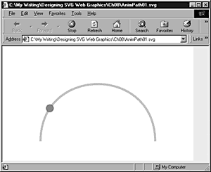
Listing 8.21 (AnimPath01.svg)
<?xml version="1.0" standalone="no"?> <!DOCTYPE svg PUBLIC "-//W3C//DTD SVG 1.0//EN" "http://www.w3.org/TR/2001/PR-SVG-20010719/ DTD/svg10.dtd"> <svg width="500" height="300"> <path d="M100,250 C 100,50 400,50 400,250" style="fill:none; stroke:#00FF00; stroke-width:5" /> <circle x="100" y="50" r="10" style="fill:red;"> <animateMotion dur="6s" repeatCount="indefinite" path="M100,250 C 100,50 400,50 400,250" /> </circle> </svg>
As you can see if you have loaded the code, the animation starts immediately after the SVG image is loaded. If I had wanted to delay the start of the animation, I could have added a begin attribute to the <animateMotion> element. Similarly, if you had wanted the animation to occur only once, you could have added to the <animateMotion> element a fill attribute with a value of freeze.
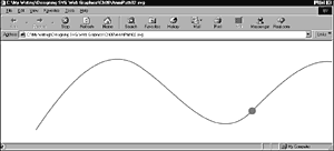
You can animate the circle, or any other SVG element or element grouping, along more complex paths. In the following example, the circle travels along a sinuous curve across the screen. The <path> element creates a visible red path that is drawn onscreen. The path attribute of the <animateMotion> element has the same values; therefore, the circle appears to travel along the curving red line (as shown in Figure 08.14).
Figure 08.14. A circle partway through an animation along a sinuous path.
Listing 8.22 (AnimPath02.svg)
<?xml version="1.0" standalone="no"?> <!DOCTYPE svg PUBLIC "-//W3C//DTD SVG 1.0//EN" "http://www.w3.org/TR/2001/PR-SVG-20010719/ DTD/svg10.dtd"> <svg width="1000" height="300"> <path d="M100,250 C200,100 300,0 400,80 C500,150 600,300 700,200 C800,100 900,0 1000,100" style="stroke:red;fill:none;stroke-width:2;"/> <circle x="100" y="250" r="10" style="fill:red;"> <animateMotion dur="10s" path="M100,250 C200,100 300,0 400,80 C500,150 600,300 700,200 C800,100 900,0 1000,100" repeatCount="indefinite"/> </circle> </svg>
If you run the code and look carefully at the animation, you see that the circle is nicely centered on the curve, as you can see in Figure 08.14. However, if you alter the code so that a rectangle follows the same path:
Listing 8.23 (AnimPath03.svg)
<?xml version="1.0" standalone="no"?> <!DOCTYPE svg PUBLIC "-//W3C//DTD SVG 1.0//EN" "http://www.w3.org/TR/2001/PR-SVG-20010719/ DTD/svg10.dtd"> <svg width="1000" height="300"> <path d="M100,250 C200,100 300,0 400,80 C500,150 600,300 700,200 C800,100 900,0 1000,100" style="stroke:red;fill:none;stroke-width:2;"/> <rect x="0" y="0" width="20" height="20" style="fill:red;"> <animateMotion dur="10s" path="M100,250 C200,100 300,0 400,80 C500,150 600,300 700,200 C800,100 900,0 1000,100" repeatCount="indefinite"/> </rect> </svg>
you find that it looks okay at some parts of the animation and that, at other points, the rectangle hangs off the curve rather untidily by its upper-left corner. The circle is placed symmetrically on the curve because the circle's center is the reference point for the cx and cy attributes. For the rectangle, on the other hand, the upper-left corner is referenced by the x and y attributes.
However, that problem is easily fixed. Simply change the x and y attributes to a negative number that is half the width and height, respectively:
<rect x="-10" y="-10" width="20" height="20" style="fill:red;"> <animateMotion dur="10s" path="M100,250 C200,100 300,0 400,80 C500,150 600,300 700,200 C800,100 900,0 1000,100" repeatCount="indefinite"/> </rect>
and the rectangle is then symmetrically displayed. The amended code is included in the listing as AnimPath04.svg.
When you want to create an animation along a path, however, you probably don't use something as symmetrical as a circle or rectangle. Also, you might want the SVG object being animated to "point" along the direction of a path. Suppose that you have plans to create a simulation of a fair-ground ride. The rectangle stays upright all the time, which doesn't look realistic with a vehicle to follow the track. You need to add a rotate attribute with the value of auto; then, you find that the rectangle follows the curve in a much more lifelike manner.
Listing 8.24 (AnimPath05.svg)
<?xml version="1.0" standalone="no"?> <!DOCTYPE svg PUBLIC "-//W3C//DTD SVG 1.0//EN" "http://www.w3.org/TR/2001/PR-SVG-20010719/ DTD/svg10.dtd"> <svg width="1000" height="300"> <path d="M100,250 C200,100 300,0 400,80 C500,150 600,300 700,200 C800,100 900,0 1000,100" style="stroke:red;fill:none;stroke-width:2;"/> <rect x="-20" y="-10" width="40" height="20" style="fill:red;"> <animateMotion dur="10s" path="M100,250 C200,100 300,0 400,80 C500,150 600,300 700,200 C800,100 900,0 1000,100" repeatCount="indefinite" rotate="auto"/> </rect> </svg>
You can use a similar technique when you are animating vehicles or a spacecraft or other creative mobile objects along a path.
Scrolling text using <animateMotion>
You can use the <animateMotion> element to create scrolling text. Look at an example I used in the SVGSpider.com Web site. If you look at Page03.svg on the site, you might recognize where this example was used.
The following code displays three separate text animations, each using <animateMotion> elements and each animated independently. Two of the pieces of text are animated from right to left, and the third is animated from left to right:
Listing 8.25 (MultiScrollingText.svg)
<?xml version='1.0'?> <!DOCTYPE svg PUBLIC "-//W3C//DTD SVG 1.0//EN" "http://www.w3.org/TR/2001/PR-SVG-20010719/ DTD/svg10.dtd"> <svg width="800" height="600" > <rect x="0" y="0" width="800" height="100" style="fill:#ccccff;"/> <svg x="250" width="300" height="100" zoomAndPan="disable"> <rect x="0" y="0" width="300" height="100" style="fill:white;"/> <text style="font-family:serif; stroke:red; fill:red; font-size:16;"> Aren't Scalable Vector Graphics wonderful? <animateMotion path="M 400 90 L -300 90" begin="0s" dur="12s" repeatCount="indefinite" /> </text> <text style="font-family:serif; stroke:green; fill:green; font-size:36; font-weight:bold;"> SVG <animateMotion begin="4s" path="M -300 70 L 400 70" dur="12s" repeatCount="indefinite"/> </text> <a xlink:href="http://www.svgenius.com/" target="new"> <text y="-5" style="font-family:sans-serif; stroke:orange; fill:orange; font-size:20;"> Experimental SVG at SVGenius.com <animateMotion begin="2s" path="M 400 30 L -300 30" dur="12s" repeatCount="indefinite"/> </text> </a> <rect height="300" width="50" x="0" y="0" style="opacity:0.3; fill:white; color:white;"/> <rect height="300" width="50" x="250" y="0" style="opacity:0.3; fill:white; color:white;"/> <rect x="0" y="0" width="300" height="100" style="stroke:#000066; stroke-width:2; fill:none;"/> </svg> <rect width="800" height="2" x="0" y="98" style="stroke:#003399;fill:#003399"/> </svg>
This code produces an animation onscreen, which is captured as shown in Figure 08.15.
Figure 08.15. Two of the three lines of scrolling text are visible onscreen.
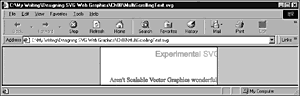
If you are wondering what the following lines in the code do, they add a slight masking effect to the early and late parts of the visual animation:
<rect height="300" width="50" x="0" y="0" style="opacity:0.3; fill:white; color:white;"/> <rect height="300" width="50" x="250" y="0" style="opacity:0.3; fill:white; color:white;"/>
You can use colors other than white and vary the opacity to achieve a desirable effect:
<rect height="300" width="50" x="0" y="0" style="opacity:0.4; fill:#9999FF; color:white;"/> <rect height="300" width="50" x="250" y="0" style="opacity:0.4; fill:#9999FF; color:white;"/>
Make sure to change the fill color of the background <rect> element to match. In these examples, I used a plain fill for these masking rectangles, but you could use a <linearGradient> element to create a graduated mask. Of course, you could use shapes other than a <rect> element.
The <animateColor> Element
The <animateColor> element allows you to change the color of an SVG element or element group over time.
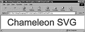
Now create a simple color animation of the color of some text. The following code animates the fill of the text Chameleon SVG from red to black (see Figure 08.16). The animation starts two seconds after the image loads, takes six seconds for the color transition, and is frozen with the new color properties (both the fill and the stroke are black when the animation finishes).
Figure 08.16. The color animation of the fill of the text is completed.
Listing 8.26 (ChamText01.svg)
<?xml version="1.0" standalone="no"?> <!DOCTYPE svg PUBLIC "-//W3C//DTD SVG 1.0//EN" "http://www.w3.org/TR/2001/PR-SVG-20010719/ DTD/svg10.dtd"> <svg> <text x="50" y="80" style="fill:red; stroke:black; font-family:Arial, sans-serif; font-size:72;"> Chameleon SVG <animateColor attributeName="fill" attributeType="CSS" from="rgb(255,0,0)" to="rgb(0,0,0)" begin="2s" dur="6s" fill="freeze" /> </text> </svg>
The <animateColor> attribute uses the from and to attributes, which you saw earlier in this chapter. The values of the fill attribute of the <text> element that is being animated can be expressed as rgb(255,0,0) or as #FF0000 or as a named color red. Notice too the addition of the attributeType attribute in the <animateColor> element, which specifies that the property to be animated is a CSS property.
The <animateTransform> Element
In this section, I introduce you to the <animateTransform> element. SVG transformations are some of the most complex parts of SVG; in the space available in this chapter, I introduce you to some of the more commonly used animations.
When I first started using animated transformations, I sometimes had difficulty holding all the detail in my head, which would allow me to adequately visualize what any tweaking I did to my code would do. With practice, that feeling of lack of control fairly quickly disappears. Don't be surprised if, for one or two of these transformations, you don't pick it up immediately.
Rotation Using <animateTransform>
Take a look at a simple rotation, using a grouping <g> element you used in an example in Chapter 3, "Creating Static Graphics Elements." The rotation turns the rectangle through 360 degrees in a 9-second period, using its upper-left corner as the pivot point. The code for the transformation is shown here:
<animateTransform begin="1s" dur="10s" type="rotate" from="0 150 150" to="360 150 150" attributeName="transform"/>
You should be familiar with the meaning of the begin and dur attributes. You must specify the attributeName property (in this case, transform) and the type attribute (in this case, rotate ). Notice that the from attribute contains three values, separated by spaces: 0 150 150. The first number is the starting position in degrees, meaning that it has its normal upright position. The second number is the x coordinate of the pivot point for the rotation, and the third number is the y coordinate of the pivot point.
The to attribute, similarly, contains three figures. The first is the number, in degrees, for the position of the rectangle at the end of the animation. Of course, 360 degrees looks the same as 0 degrees; during the period of the animation, however, the rectangle is rotated smoothly through 360 degrees (from 0 degrees to 360 degrees) over a period of nine seconds. As with the from attribute, the second and third numbers of the to attribute describe, respectively, the x and y coordinates of the pivot point (se Figure 08.17).
Figure 08.17. A rotate animation of a rectangle, early in the animation.
If you take time to run the code, you see that the rotation is smooth and doesn't change in speed throughout the animation, similar to the second hand on a watch. Here is the full code:
Listing 8.27 (Rotation01.svg)
<?xml version="1.0" standalone="no"?> <!DOCTYPE svg PUBLIC "-//W3C//DTD SVG 1.0//EN" "http://www.w3.org/TR/2001/PR-SVG-20010719/ DTD/svg10.dtd"> <svg xmlns:xlink="http://www.w3.org/1999/xlink"> <g> <animateTransform begin="1s" dur="10s" type="rotate" from="0 150 150" to="360 150 150" attributeName="transform"/> <rect x="150" y="150" width="300" height="68" style="fill:#DDDDFF; stroke:none"> </rect> <line x1="150" x2="450" y1="152" y2="152" xlink:href="#MyLine"/> <line x1="150" x2="450" y1="154" y2="154" xlink:href="#MyLine" style="fill:red;"/> <line x1="150" x2="450" y1="156" y2="156" xlink:href="#MyLine"/> </g> </svg>
Now you move on to create a slightly more complex rotation transformation. Although I walk you through the code and describe in detail what is happening, if you are going to be able to figure all this out, you need to run the code.
You use a similar rectangle, but animate it in a more complex way. The most important part of the code is the <animateTransform> element, so first look at it in isolation:
<animateTransform begin="0s" dur="12s" attributeName="transform" type="rotate" values="0 150 150; -180 150 150; 180 150 150; 360 150 150" additive="sum" accumulate="none" calcMode="linear" fill="remove" />
The begin and dur attributes should be familiar to you by now. The animation lasts 12 seconds. As shown in the preceding rotation, you have an attributeName attribute with a value of transform and a type attribute with a value of rotate. The values attribute at first sight looks complex, so let me break it down to make it easier to understand. The first three figures are the same as shown in the preceding example and describe the starting point of the animation a rectangle that is right side up. The second group of three numbers represents the position of the rectangle at the end of four seconds (one-third of the way through the animation). At four seconds, the rectangle is rotated, anticlockwise, by 180 degrees, which is what the -180 means. The rotation is around the x and y coordinates of 150 and 150, respectively.
The next four seconds are defined by 180 150 150, which means that the rectangle at the end of eight seconds is again upside down (as it was after four seconds), but has traveled from -180 degrees to +180 degrees in those four seconds. In other words, in those four seconds, the rectangle rotates 360 degrees clockwise. At four seconds, you see the rectangle switch from an anticlockwise rotation to a clockwise rotation. In addition, you might notice that from four to eight seconds, the rotation is twice as fast as before.
The final set of figures, 0 150 150, tells you that at 12 seconds the rectangle is back where it started upright. During the final 4 seconds, it rotates from 180 degrees to 0 degrees (clockwise), which is slower than the 360 degrees clockwise in the preceding 4 seconds. Just as the rectangle swings past the horizontal at 8 seconds, you should be able to see a distinct slow-ing in pace.
Maybe you are wondering how I could be sure that the contents in the values attribute refer to the positions at 0, 4, 8, and 12 seconds. I knew that because the calcMode attribute had a value of linear, which means that equal steps exist between the values in the values attribute.
If you add an extra set of three values to the values attribute, you see the positions at 0, 3, 6, 9, and 12 seconds.
Here is the full code:
Listing 8.28 (Rotation02.svg)
<?xml version="1.0" standalone="no"?> <!DOCTYPE svg PUBLIC "-//W3C//DTD SVG 1.0//EN" "http://www.w3.org/TR/2001/PR-SVG-20010719/ DTD/svg10.dtd"> <svg xmlns:xlink="http://www.w3.org/1999/xlink"> <defs> <line id="MyLine" x1="150" x2="450" y1="150" y2="150" style="fill:#000099; stroke:#000099; stroke-width:0.05;"/> </defs> <g> <animateTransform dur="12s" attributeName="transform" type="rotate" values="0 150 150; -180 150 150; 180 150 150; 360 150 150" additive="sum" accumulate="none" calcMode="linear" fill="remove" /> <rect x="150" y="150" width="300" height="68" style="fill:#DDDDFF; stroke:none"/> <line x1="150" x2="450" y1="152" y2="152" xlink:href="#MyLine"/> <line x1="150" x2="450" y1="154" y2="154" xlink:href="#MyLine" style="fill:red;"/> <line x1="150" x2="450" y1="156" y2="156" xlink:href="#MyLine"/> <use transform="translate(0,8)" xlink:href="#MyLine"/> <use transform="translate(0,12)" xlink:href="#MyLine" style="fill:red"/> </g> </svg>
If you want to create an endlessly repeating animation, you can modify the <animateTransform> element to look like this:
<animateTransform dur="12s" attributeName="transform" type="rotate" values="0 150 150; -180 150 150; 180 150 150; 360 150 150" additive="sum" accumulate="none" calcMode="linear" fill="remove" restart="always" repeatCount="indefinite" /> <rect x="150" y="150" width="300" height="68" style="fill:#DDDDFF; stroke:none"/>
Note the addition of the restart and repeatCount attributes to the <animateTransform> element.
Simple Sample Animations
In this section, I show you a few examples of the ways in which you can apply SVG animations.
Animating gradients
Take a look again at the linear gradient you saw early in Chapter 6, "Creating SVG Gradients," and look at how you can animate it:
Listing 8.29 (AnimBasicLinGradient01.svg)
<?xml version="1.0" standalone="no"?> <!DOCTYPE svg PUBLIC "-//W3C//DTD SVG 1.0//EN" "http://www.w3.org/TR/2001/PR-SVG-20010719/ DTD/svg10.dtd"> <svg width="500" height="300"> <defs> <linearGradient id="MyFirstGradient"> <stop offset="5%" style="stop-color:#FF6600"/> <stop offset="95%" style="stop-color:#FFFFCC"/> </linearGradient> </defs> <rect style="fill:none; stroke:red" x="1" y="1" width="498" height="298"/> <rect x="50" y="50" width="300" height="100" style="fill:url(#MyFirstGradient); stroke:none"/> </svg>
First, animate the pale yellow color that forms the right end of the gradient. To do that, you split the <stop> element into start and end tags and insert an <animate> element. You will choose to animate the color from pale yellow to deep blue, starting at three seconds, taking five seconds for the animation and allowing the animation to drop back to the original pale yellow color. You don't need to alter anything in the <rect> element because you are changing only the characteristics of the referenced fill:
<linearGradient id="MyFirstGradient"> <stop offset="5%" style="stop-color:#FF6600"/> <stop offset="95%" style="stop-color:#FFFFCC"> <animate attributeName="stop-color" begin="3s" dur="5s" from="#FFFFCC" to="#000066"/> </stop> </linearGradient>
If you want to animate both ends of the gradient, you similarly add another <animate> element nested within the other <stop> element of the <linearGradient> element. In the following code, you alter the color from a reddish color to pale blue over the same period as the right end of the gradient is being animated (as shown in Figure 08.18).
Figure 08.18. The animation of both stop colors of the linear gradient toward the end of the animation.
Listing 8.30 (AnimBasicLinGradient02.svg)
<?xml version="1.0" standalone="no"?> <!DOCTYPE svg PUBLIC "-//W3C//DTD SVG 1.0//EN" "http://www.w3.org/TR/2001/PR-SVG-20010719/ DTD/svg10.dtd"> <svg width="500" height="300"> <defs> <linearGradient id="MyFirstGradient"> <stop offset="5%" style="stop-color:#FF6600"> <animate attributeName="stop-color" begin="3s" dur="5s" from="#FF6600" to="#CCCCFF"/> </stop> <stop offset="95%" style="stop-color:#FFFFCC"> <animate attributeName="stop-color" begin="3s" dur="5s" from="#FFFFCC" to="#000066"/> </stop> </linearGradient> </defs> <rect style="fill:none; stroke:red" x="1" y="1" width="498" height="298"/> <rect x="50" y="50" width="300" height="100" style="fill:url(#MyFirstGradient); stroke:none"/> </svg>
To see the effect of the animation, you need to run the code. By adjusting the relative timing of the two animations, you can create some interesting wave effects.
Animating across a gradient
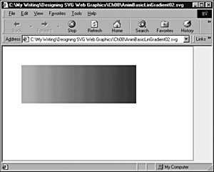
In the preceding section, I showed you how to animate the gradient within a static SVG shape. You can also produce interesting color effects on an SVG shape if you animate it within a linear gradient. Run the following code, and watch how the color of the rectangle changes from deep pink to pale blue (as in Figure 08.19).
Figure 08.19. A rectangle partway through its animation across a gradient.
Listing 8.31 (AnimatedGradientRect01.svg)
<?xml version="1.0" standalone="no"?> <!DOCTYPE svg PUBLIC "-//W3C//DTD SVG 1.0//EN" "http://www.w3.org/TR/2001/PR-SVG-20010719/ DTD/svg10.dtd"> <svg width="800" height="600"> <defs> <linearGradient id="MyBlueGradient" gradientUnits="userSpaceOnUse" x1="0" y1="50" x2="800" y2="50" > <stop offset="10%" style="stop-color:#FF0066"/> <stop offset="75%" style="stop-color:#EEEEFF"/> </linearGradient> </defs> <rect x="0" y="200" width="100" height="100" style="fill:url(#MyBlueGradient)"> <animate attributeName="x" begin="0s" dur="10s" from="0" to="700" repeatCount="indefinite"/> </rect> </svg>
Against a white background, animating across a gradient can be an interesting effect, depending how you configure the gradient. Suppose that you modify the second stop color so that it is the same as the background color; you can obtain an interesting, dissolving animation using code like the following:
Listing 8.32 (AnimatedGradientRect02.svg)
<?xml version="1.0" standalone="no"?> <!DOCTYPE svg PUBLIC "-//W3C//DTD SVG 1.0//EN" "http://www.w3.org/TR/2001/PR-SVG-20010719/ DTD/svg10.dtd"> <svg width="800" height="600"> <defs> <linearGradient id="MyBlueGradient" gradientUnits="userSpaceOnUse" x1="0" y1="50" x2="800" y2="50" > <stop offset="10%" style="stop-color:#FF0066"/> <stop offset="75%" style="stop-color:#EEEEFF"/> </linearGradient> </defs> <rect x="0" y="0" width="100%" height="100%" style="fill:#EEEEFF; stroke:#EEEEFF"/> <rect x="0" y="200" width="100" height="100" style="fill:url(#MyBlueGradient)"> <animate attributeName="x" begin="0s" dur="10s" from="0" to="700" repeatCount="indefinite"/> </rect> </svg>
The important difference from the preceding code is that a background color in a <rect> element fills the whole space so that as the square animates, it seems to disappear into a veil of mist. Of course, by adjusting the offset attribute values of the <stop> elements or the values of the stop-color attributes, you can obtain more striking or more subtle effects to suit your needs.
Animating text
If you recall, in Chapter 4, "Using Text in SVG," you created a static box of text that I indicated would be used to display a scrolling text window. Now go on to create the scrolling text window by adding an appropriate animation visual component:
Listing 8.33 (TextWindowAnimation.svg)
<?xml version="1.0" standalone="no"?> <!DOCTYPE svg PUBLIC "-//W3C//DTD SVG 1.0//EN" "http://www.w3.org/TR/2001/PR-SVG-20010719/ DTD/svg10.dtd"> <svg width="200" height="200"> <svg x="0" y="0" width="200" height="200"> <rect x="0" y="0" width="200" height="200" style="stroke:#990066; fill:none;"/> <text> <tspan x="5" y="25" style="font-size:14; font-family:Arial, sans-serif; stroke:#990066; fill:#990066"> <animate attributeName="y" begin="2s" dur="20s" from="225" to="-120" repeatCount="indefinite"/> Scalable Vector Graphics </tspan> <tspan x="5" dy="2em" style="font-size:10; font-family:Arial, sans-serif;"> The World Wide Web Consortium has </tspan> <tspan x="5" dy="1em" style="font-size:10; font-family:Arial, sans-serif;"> announced the availability of its </tspan> <tspan x="5" dy="1em" style="font-size:10; font-family:Arial, sans-serif;"> exciting new XML-based graphics </tspan> <tspan x="5" dy="1em" style="font-size:10; font-family:Arial, sans-serif;"> format, SVG, for the display </tspan> <tspan x="5" dy="1em" style="font-size:10; font-family:Arial, sans-serif;"> of 2D graphics, text and bitmap </tspan> <tspan x="5" dy="1em" style="font-size:10; font-family:Arial, sans-serif;"> graphics. </tspan> <tspan x="5" dy="2em" style="font-size:10; font-family:Arial, sans-serif;"> Further information is available </tspan> <tspan x="5" dy="1em" style="font-size:10; font-family:Arial, sans-serif;"> at the W3C web site, </tspan> <tspan x="5" dy="2em" style="font-size:10; font-family:Arial, sans-serif; fill:blue; stroke:blue"> http://www.w3.org/ </tspan> </text> </svg> </svg>
Notice that only one <animate> element is in the code, although it has many lines of text. When the first <tspan> element is animated under control of the <animate> element, the subsequent <tspan> elements are repositioned because their vertical position is defined by the dy attribute. When the first <tspan> moves up, the following <tspan> elements also move up to keep the vertical separation at the correct distance. Figure 08.20 illustrates this.
Figure 08.20. Scrolling text in the text window.
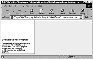
You have colored the text referring to http://www.w3.org blue, implying that you can link from the scrolling text. To add that functionality, simply nest the final <tspan> element within an <a> element with an appropriate value for the xlink:href attribute:
<a xlink:href="http://www.w3.org"> <tspan x="5" dy="2em" style="font-size:10; font-family:Arial, sans-serif; fill:blue; stroke:blue"> http://www.w3.org/ </tspan> </a>
Similarly, if you want to link the heading Scalable Vector Graphics directly to the SVG page at W3C and open that linked page in a new window, you can add this section earlier in the code:
<a xlink:href="http://www.w3.org/Graphics/ SVG/Overview.htm8" target="new"> <tspan x="5" y="25" style="font-size:14; font-family:Arial, sans-serif; stroke:#990066; fill:#990066"> <animate attributeName="y" begin="2s" dur="20s" from="225" to="-120" repeatCount="indefinite"/> Scalable Vector Graphics </tspan> </a>
Animating horizontal scrolling text
Scrolling text horizontally is also a fairly straightforward process, so you can produce ticker-tape-like effects.
The following code could form the top "frame" on a Web page, with the window on the ticker tape the size of a standard banner ad. A ticker tape like this one could be used for banner ads, news updates, and weather information, for example.
Listing 8.34 (TickerTape01.svg)
<?xml version="1.0" standalone="no"?> <!DOCTYPE svg PUBLIC "-//W3C//DTD SVG 1.0//EN" "http://www.w3.org/TR/2001/PR-SVG-20010719/ DTD/svg10.dtd"> <svg width="800" height="100"> <rect x="0" y="0" width="800" height="100" style="fill:#CCFFCC;"/> <svg x="166" y="20" width="468" height="60"> <rect x="0" y="0" width="100%" height="100%" style="fill:white; stroke:none;"/> <a xlink:href="mailto://Consulting@xmml.com"> <text x="700" y="40" style="stroke:green; fill:green; font-family:Courier, monospace; font-size:20; font-weight:normal;"> XMML.com now provides consulting services on XML, SVG, XSL-FO, XLink and XForms. Click here to email us. <animate attributeName="x" from="600" to="-1000" begin="0s" dur="20s" repeatCount="indefinite"/> </text> </a> <rect x="0" y="0" width="468" height="60" style="stroke:#009900; stroke-width:2; fill:none;"/> </svg> </svg>
When you are creating a ticker tape, you can easily overlook the need to scroll the text right out of its window. Notice that I have not taken the animation quite far enough to the left (see Figure 08.21). To provide a tidy end to the animation, you need to change the to attribute to have a value of -1250.
Figure 08.21. Scrolling text in a ticker tape animation.

If the example is used as a banner ad, you want users to be able to link to another Web site or to send an email message for information hence, the presence of the <a> element around the <text> element.
Altering text color
In Chapter 5, "Creating Navigation Bars," I showed you step-wise changes of color on mouseover and mouseout. However, SVG can also produce much more gradual color changes. For example, in Listing 8.35 you can examine a color change sequence that uses the values and keyTimes attributes on the <animateColor> element to animate color values of text over time:
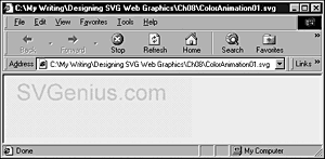
Listing 8.35 (ColorAnimation01.svg)
<?xml version="1.0" standalone="no"?> <!DOCTYPE svg PUBLIC "-//W3C//DTD SVG 1.0//EN" "http://www.w3.org/TR/2001/PR-SVG-20010719/ DTD/svg10.dtd"> <svg width="300" height="100"> <rect x="0" y="0" width="100%" height="100%" style="fill:#EEEEEE" /> <text x="20" y="40" style="fill:red; stroke:none; font-family:Arial, sans-serif; font-size:36;"> <animateColor attributeName="fill" begin="0s" values="red; white; blue; red" keyTimes="2s; 7s; 10s; 15s" dur="15s" repeatCount="indefinite"/> SVGenius.com </text> </svg>
Figure 08.22 shows the animated color moving from white to blue (see the values attribute in the code).
Figure 08.22. Part of a multistage color animation of text fill color.
Altering text opacity
Sometimes, you might want some text to fade gently into view or fade qui-etly into the sunset. By now, you probably have worked out how to create this effect, but let me give you a couple of examples.
The first example simply makes a simple piece of text visible over a period of ten seconds.
Listing 8.36 (AnimOpacityInText00.svg)
<?xml version="1.0" standalone="no"?> <!DOCTYPE svg PUBLIC "-//W3C//DTD SVG 1.0//EN" "http://www.w3.org/TR/2001/PR-SVG-20010719/ DTD/svg10.dtd"> <svg width="400" height="80"> <text x="20" y="50" style="font-family:Ventana, Arial, sans-serif; font-size:20; stroke:red; fill:red"> <animate begin="0s" dur="10s" attributeName="opacity" attributeType="CSS" from="0" to="1" fill="freeze"/> SVG is truly dynamic and subtle! </text> </svg>
You might want a faster animation, and you might want it to repeat. You could, as shown in the following example, alter the dur attribute to four seconds and add a repeatCount attribute with value of 5. If you want it to repeat indefinitely, you could change the value of the repeatCount attribute to indefinite.
Listing 8.37 (AnimOpacityinText01.svg)
<?xml version="1.0" standalone="no"?> <!DOCTYPE svg PUBLIC "-//W3C//DTD SVG 1.0//EN" "http://www.w3.org/TR/2001/PR-SVG-20010719/ DTD/svg10.dtd"> <svg width="400" height="80"> <text x="20" y="50" style="font-family:Ventana, Arial, sans-serif; font-size:20; stroke:red; fill:red"> <animate begin="0s" dur="4s" attributeName="opacity" attributeType="CSS" from="0" to="1" fill="freeze" repeatCount="5"/> SVG is truly dynamic and subtle! </text> </svg>
Another option is to create a chain of animations where an animation that makes text opaque when it finishes triggers a fade animation, which in turn triggers the first animation. In the following example, the duration of the animations gives a fairly subtle effect. By changing the duration of each animation to a shorter period, you can create a more dynamic (or intrusive) transition. The choice is yours. SVG gives you precise control so that you can change the animation to exactly the effect you want.
Listing 8.38 (AnimOpacityInText00.svg)
<?xml version="1.0" standalone="no"?> <!DOCTYPE svg PUBLIC "-//W3C//DTD SVG 1.0//EN" "http://www.w3.org/TR/2001/PR-SVG-20010719/ DTD/svg10.dtd"> <svg width="400" height="80"> <text x="20" y="50" style="font-family:Ventana, Arial, sans-serif; font-size:20; stroke:red; fill:red"> <animate id="MakeVisible" begin="0s; MakeTransparent.end" dur="4s" attributeName="opacity" attributeType="CSS" from="0" to="1" fill="freeze" /> <animate id="MakeTransparent" begin="MakeVisible.end" dur="8s" attributeName="opacity" attributeType="CSS" from="1" to="0" fill="freeze" /> SVG is truly dynamic and subtle! </text> </svg>
Animating opacity in a gradient
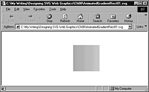
Now revisit one of the gradient examples and apply animations of the stop-opacity properties of the gradient. After the animation is applied, the code looks like this:
Listing 8.39 (AnimGradientOpacity01.svg)
<?xml version='1.0'?> <!DOCTYPE svg PUBLIC "-//W3C//DTD SVG 1.0//EN" "http://www.w3.org/TR/2001/PR-SVG-20010719/ DTD/svg10.dtd"> <svg width="800" height="600"> <defs> <linearGradient id="MyBlueGradient" gradientUnits="userSpaceOnUse" x1="0" y1="0" x2="0" y2="100" > <stop offset="10%" style="stop-color:#000066"> <animate begin="2s" attributeName="stop-opacity" from="1" to="0" dur="3s" fill="freeze"/> </stop> <stop offset="75%" style="stop-color:#AAAADD"> <animate begin="5s" attributeName="stop-opacity" from="1" to="0" dur="8s" fill="freeze"/> </stop> </linearGradient> </defs> <text x="50" y="70" style="font-family:Times, serif; font-size:72; fill:url(#MyBlueGradient);"> Hello SVG! </text> </svg>
As with many of the other animations in this chapter, the best way to appreciate what is going on is to run the code.
I have animated the stop-opacity property of both <stop> elements contained within the <linearGradient> element. Notice that I have set the duration of the first <animate> element to be three seconds, whereas the start time of the second animation is five seconds and its duration is eight seconds. These settings allow what is essentially a two-step fade of the text. During the first three seconds, the top part of the text fades notice-ably. It doesn't fade completely because color is still being contributed to the top part of the text by the color defined in the second <stop> element. However, from five seconds onward, the opacity of the remaining color in the text fades slowly over an 8-second period.
You might not choose to use such slow fades. My main aim in this example is to show you that you can independently control the fade of different parts of a gradient. Of course, this same technique can be applied to other SVG elements, not just to text, and can also be applied to gradients that have multiple stop elements, not just two. The potential for subtle, controlled fades in SVG animations is enormous.
Listing 8.40 demonstrates an animation of a filter that uses the <feTurbulence> filter primitive.
Listing 8.40 (AnimTurbulence01.svg)
<?xml version="1.0" standalone="no"?> <!DOCTYPE svg PUBLIC "-//W3C//DTD SVG 1.0//EN" "http://www.w3.org/TR/2001/PR-SVG-20010719/ DTD/svg10.dtd"> <svg width="400" height="500"> <defs> <filter id="Turbulence1" in="SourceImage" filterUnits="objectBoundingBox"> <feTurbulence in="SourceAlpha" type="turbulence" baseFrequency="0.01" numOctaves="1" seed="0" > <animate attributeName="baseFrequency" values="0.01; 0.008; 0.01; 0.012; 0.01" keyTimes="0s; 5s; 10s; 15s; 20s;" begin ="0s" dur="20s" repeatCount="indefinite"/> </feTurbulence> </filter> </defs> <rect x="0" y="0" width="400" height="500" style="filter:url(#Turbulence1)"/> </svg>
Figure 08.23 shows the visual appearance when baseFrequency has been animated to a value of approximately 0.008.
Figure 08.23. A turbulence filter primitive in the process of animation.
Listing 8.41 shows an animation of a complex of filter primitives that I adapted from an animation on the Adobe.com Web site. The visual appearance is approximately that of a floodlight scanning across some lettering over time.
Listing 8.41 (Spotlight.svg)
<?xml version="1.0" standalone="no"?> <!DOCTYPE svg PUBLIC "-//W3C//DTD SVG 1.0//EN" "http://www.w3.org/TR/2001/PR-SVG-20010719/ DTD/svg10.dtd"> <svg> <defs> <filter id="MySpot" x="-20%" y="-60%" width="150%" height="300%" > <feDiffuseLighting in="SourceGraphic" lighting-color="red" result="lamp" diffuseConstant=".8" surfaceScale="10" resultScale=".2"> <feSpotLight x="200" y="150" z="15" pointsAtX="0" pointsAtY="100" pointsAtZ="0" specularExponent="10"> <animate attributeName="pointsAtX" values="0;100;400;100;0" begin="0s" dur="8s" repeatCount="indefinite"/> </feSpotLight> <animateColor attributeName="lighting-color" values="yellow;white;red;white;yellow;" begin="0s" dur="8s" repeatCount="indefinite"/> </feDiffuseLighting> <feComposite in="lamp" result="lamp" operator="arithmetic" k2="1" k3="1"/> </filter> </defs> <text id="Spotlight" pointer-events="none" style="fill:white; stroke-width:4; stroke:white; font-size:80; filter:url(#MySpot);" x="10" y="85">XMML.com</text> </svg>
Figure 08.24 shows the "spotlight" partway through a scan of the lettering.
Figure 08.24. A complex animated SVG filter that looks like a spotlight playing across giant lettering.
I hope that in this chapter I have succeeded in conveying to you a little of the exciting potential of SVG animations. I consciously have largely avoided using at this stage any animations that are interactive in nature (those are described in Chapter 11).
If you have caught a glimpse of the enormous potential of SVG for producing subtle animations that go far beyond anything that is possible with bitmap graphics, please take time to experiment. The huge advantage of SVG is that you can examine how experts have produced animations that you find visually attractive or exciting. This is one of the reasons that I believe SVG will take off in a big way. I expect an explosion of interest and skills, just as there was with HTML, back in the early to mid-1990s. Of course, much more can be said about SVG animations, but that discussion needs to await another book dedicated to the topic.
| CONTENTS | |
EAN: 2147483647
Pages: 26
- Using SQL Data Definition Language (DDL) to Create Data Tables and Other Database Objects
- Using SQL Data Manipulation Language (DML) to Insert and Manipulate Data Within SQL Tables
- Working with Queries, Expressions, and Aggregate Functions
- Using Data Control Language (DCL) to Setup Database Security
- Working with Stored Procedures