Chapter 7. Using SVG Filters
 | CONTENTS |  |
In this chapter:
- Why Use Filters
- Using SVG Filters
- The Range of SVG Filters
- Examples Using SVG Filters
Why Use Filters
The filters provided in the SVG specification give to SVG many of the features you might have associated in the past exclusively with bitmap graphics programs.
All graphics are presented onscreen as bitmaps. The only question is when a graphic is converted to bitmaps. In graphics programs like Adobe Photoshop or Jasc Paint Shop Pro, the rendering to bitmap is carried out within the graphics program and, when you are creating GIFs and JPEGs, for example, the generated gradients are saved and exported as bitmap graphics. With SVG, the instructions are retained in an editable format until the SVG elements are rendered on the client machine by the SVG viewer.
Not surprisingly, companies such as Adobe and Jasc, which have expertise in understanding rendering, have been active in the SVG area. An SVG viewer has rendering functions broadly similar to those contained in what you traditionally think of as bitmap graphics programs but does the rendering "live" on the user's computer at the time you want an image to be displayed.
The detail of the syntax for using SVG filters can become a little overwhelming at times, and I cannot cover everything in the available space in this book. I introduce you to the general principles that apply widely to using SVG filters and show you some examples that apply to a few of the SVG filters. First, look at how an SVG filter is constructed. You create a simple drop shadow, an effect that is widely used in Web graphics.
NOTE
A full description of the SVG filters is in Chapter 15 of the SVG specification, at http://www.w3.org/TR/SVG/.
Using SVG Filters
An SVG filter is created from one or more filter primitives; for example, a Gaussian Blur. An SVG filter is made up of one or more filter primitives nested within a <filter> element. The skeleton for the source code of any SVG image that uses filters looks something like this:
Listing 7.1 (FilterSkeleton01.svg)
<?xml version="1.0" standalone="no"?> <!DOCTYPE svg PUBLIC "-//W3C//DTD SVG 1.0//EN" "http://www.w3.org/TR/2001/PR-SVG-20010719/ DTD/svg10.dtd"> <svg> <defs> <filter id="GetAHandle"> <!-- Filter primitives go here. --> </filter> </defs> <!-- SVG text or graphics shapes go here. --> </svg>
The definition of the filter is nested within a <defs> element. The filter itself is defined within a <filter> element that has, as a required attribute, an id attribute, which is how any graphical element within the SVG image gets a handle on the particular filter to be applied. For example, if you want a rectangle to use the preceding filter, it looks something like this:
<rect x="50" y="50" width="200" height="100" style="filter:url(#GetAHandle)"/>
The filter property is used together with the "bare names" version of XPointer the # character, in this case to point to the filter to be used. If you are not familiar with XPointer, just think of the # character as a way of identifying a named part of the same SVG document (in this case, a named <filter> element). Remember that SVG is an application of XML, so the id attribute of the filter element is case sensitive. If you use the wrong case on one letter, the filter effect is not likely to be applied.
You add, nested within a <filter> element, any filter primitives you want.
You possibly already know that a drop shadow is typically created using a Gaussian Blur, which is then offset from the original image. Now apply the Gaussian Blur, which is defined in a moment, to the text Hello SVG!:
Listing 7.2 (FilterSkeleton02.svg)
<?xml version="1.0" standalone="no"?> <!DOCTYPE svg PUBLIC "-//W3C//DTD SVG 1.0//EN" "http://www.w3.org/TR/2001/PR-SVG-20010719/ DTD/svg10.dtd"> <svg> <defs> <filter> <!-- Filter primitives go here. --> </filter> </defs> <text x="50" y="50" style="font-family:Arial, sans-serif; font-size:24;"> Hello SVG!</text> </svg>
Now add the definition of the blur, which produces the drop shadow:
<defs> <filter id="GetAHandle"> <feGaussianBlur in="SourceAlpha" stdDeviation="2"> </feGaussianBlur> </filter> </defs>
You add, nested within the <filter> element, the <feGaussianBlur> element. All SVG filter primitives are named in this way the element name starts with fe (lowercase) and then the name of the filter primitive. Notice that <feGaussianBlur> has an in attribute whose value is SourceAlpha, which means that the source to which the blur is applied is the alpha channel of the relevant image. The stdDeviation attribute controls how blurred the resulting image is. For the size of text you will use, a stdDeviation of 2 is about right. If you use a stdDeviation of 1, the shadow is too hard (in my opinion).
You have a few things left to do. You need to link the text to the filter you have just created. Because you don't want to display only the blurred shadow, you need a sharp copy of the text too (which I create as deep blue text).
The final code for the text HelloSVG! with a drop shadow looks like this:
Listing 7.3 (FilterSkeleton03.svg)
<?xml version="1.0" standalone="no"?> <!DOCTYPE svg PUBLIC "-//W3C//DTD SVG 1.0//EN" "http://www.w3.org/TR/2001/PR-SVG-20010719/ DTD/svg10.dtd"> <svg> <defs> <filter id="GetAHandle"> <feGaussianBlur in="SourceAlpha" stdDeviation="2"> </feGaussianBlur> </filter> </defs> <text x="53" y="53" style="font-family:Arial, sans-serif; font-size:24; filter:url(#GetAHandle)"> Hello SVG!</text> <text x="50" y="50" style="font-family:Arial, sans-serif; font-size:24; stroke:#000099; fill:#000099"> Hello SVG!</text> </svg>
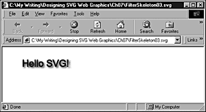
You can see the text HelloSVG! onscreen with a reasonably presentable drop shadow, as shown in Figure 07.01.
Figure 07.01. A simple drop shadow effect created using only the <feGaussianBlur> filter primitive plus an additional copy of the text.
So now you have seen how to create an SVG filter using a single filter primitive. To do that, you "cheated" in the sense that you created the blur from the content of a <text> element and then added another <text> element to display the text itself.
In most cases when you use SVG filters, you combine filter primitives using a technique similar to the one I am about to show you. First, add a result attribute to the <feGaussianBlur> element:
Listing 7.4 (CombinedShadow01.svg)
<?xml version="1.0" standalone="no"?> <!DOCTYPE svg PUBLIC "-//W3C//DTD SVG 1.0//EN" "http://www.w3.org/TR/2001/PR-SVG-20010719/ DTD/svg10.dtd"> <svg> <defs> <filter id="CombinedDropShadow"> <feGaussianBlur in="SourceGraphic" stdDeviation="2" result="ShadowOut"> </feGaussianBlur> </filter> </defs> <text x="50" y="50" style="font-family:Arial, sans-serif; font-size:24; filter:url(#CombinedDropShadow)"> Hello SVG!</text> </svg>
You can use the value of the result attribute as the input to further filters. In this example, as you build the parts, you use the value of the result attribute of the <feGaussianBlur> element as the input to a <feOffset> element and then use the output of that as the input to a <feMerge> element. Your aim is to create, eventually, a combination filter that displays both the original text and the drop shadow without having to use two <text> elements, as you did in the preceding example:
<filter id="CombinedDropShadow"> <feGaussianBlur in="SourceGraphic" stdDeviation="2" result="ShadowOut"/> <feOffset in="ShadowOut" dx="3" dy="3" result="ShadowOnly"/> </filter>
When you add the <feOffset> element, the Gaussian blur is taken as the input, and then it is offset to the right and down by three pixels. The dx and dy attributes signify a difference in the value of the x and y attributes, respectively, from those in the source image, so it is moved three pixels to the right and down. At this stage, however, you have only the drop shadow to work with, not the original text, so you need to combine the original image and the drop shadow you have just created. You do this using the <feMerge> element, like this:
<feMerge> <feMergeNode in="ShadowOnly"/> <feMergeNode in="SourceGraphic"/> </feMerge>
The <feMerge> element takes as input two things: the ShadowOnly output of the <feOffset> element and the source image (in this case, the content of the <text> element, which follows later in the document).
The source code for the finished text with a drop shadow looks like this:
Listing 7.5 (CombinedShadow03.svg)
<?xml version="1.0" standalone="no"?> <!DOCTYPE svg PUBLIC "-//W3C//DTD SVG 1.0//EN" "http://www.w3.org/TR/2001/PR-SVG-20010719/ DTD/svg10.dtd"> <svg> <defs> <filter id="CombinedDropShadow"> <feGaussianBlur in="SourceGraphic" stdDeviation="2" result="ShadowOut"/> <feOffset in="ShadowOut" dx="3" dy="3" result="ShadowOnly"/> <feMerge> <feMergeNode in="ShadowOnly"/> <feMergeNode in="SourceGraphic"/> </feMerge> </filter> </defs> <text x="50" y="50" style="font-family:Arial, sans-serif; font-size:24; stroke:#000099; fill:#000099; filter:url(#CombinedDropShadow);"> Hello SVG!</text> </svg>
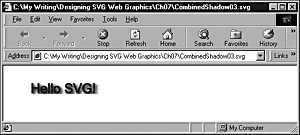
The text with a drop shadow looks onscreen like Figure 07.02.
Figure 07.02. The text with a drop shadow created using the <feGaussianBlur>, <feOffset>, and <feMerge> filter primitives.
If you try zooming in on this image (by right-clicking in the Adobe SVG Viewer), as shown in Figure 07.03, notice how the quality of the image is maintained. Both the text and the drop shadow remain clear and with none of the "jaggies" you would expect when magnifying a bitmap, such as a GIF image.
Figure 07.03. A zoomed view of the text and drop shadow produced by Listing 7.5. Notice that the shadow has a sharp, linear cutoff on both its top and bottom edges.
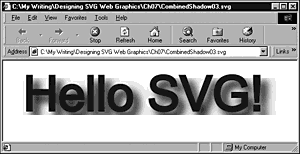
Notice that, using this technique, the drop shadow is a deep blue color, just like the text. In the preceding example, the drop shadow uses the alpha channel and is gray. If you want a gray shadow, simply change the value of the in attribute of the <feGaussianBlur> element from SourceGraphic to SourceAlpha.
In Figure 07.03, you can see a sharp edge, at both the bottom and top of the shadow, produced by the filter you created. The reason is that only a limited space is allowed, by default, for the creation of SVG filters. Because you have offset the shadow and blurred it, you need to have more space available to you if you want to achieve a full-size shadow with nice, fuzzy edges. To allow enough space for all the shadow, you need to insert and adjust the width , y, and height attributes on the <filter> element, as shown in Listing 7.6:
Listing 7.6 (CombinedShadow04.svg)
<?xml version="1.0" standalone="no"?> <!DOCTYPE svg PUBLIC "-//W3C//DTD SVG 1.0//EN" "http://www.w3.org/TR/2001/PR-SVG-20010719/ DTD/svg10.dtd"> <svg> <defs> <filter id="CombinedDropShadow" width="140%" y="-20%" height="200%"> <feGaussianBlur in="SourceGraphic" stdDeviation="2" result="ShadowOut"/> <feOffset in="ShadowOut" dx="3" dy="3" result="ShadowOnly"/> <feMerge> <feMergeNode in="SourceGraphic"/> <feMergeNode in="ShadowOnly"/> </feMerge> </filter> </defs> <text x="50" y="50" style="font-family:Arial, sans-serif; font-size:24; stroke:#000099; fill:#000099; filter:url(#CombinedDropShadow); line-height:28pt"> Hello SVG!</text> </svg>
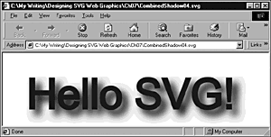
As you can see in Figure 07.04, the shadow is now displayed with a much softer edge, although there is still a hint of a linear edge at the top.
Figure 07.04. A zoomed view of the image produced by Listing 7.6, showing a nice, fuzzy edge to the drop shadow.
In addition to ensuring that you allow enough space for the drop shadow, you also need to be careful that you write the <feMerge> element in the way I just described rather than like this:
<feMerge> <feMergeNode in="SourceGraphic"/> <feMergeNode in="ShadowOnly"/> </feMerge>
If the drop shadow is placed later in the document than the reference to the source graphic, the drop shadow is painted, according to the SVG Painter's model, in front of the graphic. This effect can be fairly noticeable if the text is fairly light colored, as shown here:
Listing 7.7 (CombinedShadow05.svg)
<?xml version="1.0" standalone="no"?> <!DOCTYPE svg PUBLIC "-//W3C//DTD SVG 1.0//EN" "http://www.w3.org/TR/2001/PR-SVG-20010719/ DTD/svg10.dtd"> <svg> <defs> <filter id="CombinedDropShadow" width="140%" y="-20%" height="200%"> <feGaussianBlur in="SourceAlpha" stdDeviation="2" result="ShadowOut"/> <feOffset in="ShadowOut" dx="3" dy="3" result="ShadowOnly"/> <feMerge> <feMergeNode in="SourceGraphic"/> <feMergeNode in="ShadowOnly"/> <!-- THIS IS WRONG. THE SHADOW IS IN FRONT OF THE TEXT. --> </feMerge> </filter> </defs> <text x="50" y="50" style="font-family:Arial, sans-serif; font-size:24; stroke:#CC0099; fill:#CC0099; filter:url(#CombinedDropShadow);"> Hello SVG!</text> </svg>
Having looked at some basic techniques for using SVG filters, move on and look at the range of possibilities you can experiment with.
The Range of SVG Filters
With something as visually exciting and creative as the SVG filters, just listing them seems a shame, but I start this section by doing that. Strictly speaking, this list shows the filter primitives available in SVG:
feBlend feColorMatrix feComponentTransfer feComposite feConvolveMatrix feDiffuseLighting feDisplacementMap feFlood feGaussianBlur feImage feMerge feMorphology feOffset feSpecularLighting feTile feTurbulence
These filter primitives can be used singly or in combination. Used singly, they can sometimes produce useful effects, but when they are used in combination, some unusual and visually arresting effects are possible.
I encourage you to experiment with using the filter primitives singly, applying them to both text and graphical shapes. In doing that, you gain a feel for what each filter primitive does and you begin to achieve a feeling that you are in control of the filters rather than their being in control of you. I don't pretend that you will quickly master all the filters because literally many thousands of permutations exist. However, if you practice and spend time studying the visual effects of changing the various attributes of the filter primitives, you will gradually find that you can more often anticipate the visual effect you will create by making any particular adjustment to an attribute.
Examples Using SVG Filters
In this section, I can only hope to give you a flavor of what is possible with SVG filters. However, I think that I've provided enough to whet your appetite to spend time experimenting with them. Certainly, some impressive visual effects are possible.
Gaussian Blur
The <feGaussianBlur> filter primitive defines in Listing 7.8 a generic filter you can use. In the first <use> element, you adjust the opacity of the Gaussian blur to 0.4:
Listing 7.8 (SimpleShadow.svg)
<?xml version="1.0" standalone="no"?> <!DOCTYPE svg PUBLIC "-//W3C//DTD SVG 1.0//EN" "http://www.w3.org/TR/2001/PR-SVG-20010719/ DTD/svg10.dtd"> <svg width="500" height="300"> <defs> <filter id="MyGaussianFilter"> <feGaussianBlur stdDeviation="1.5"/> </filter> <g id="SomeText"> <text style="font-family:Arial, sans-serif; font-size:24;">SVG</text>> </g> </defs> <use x="30" y="40" xlink:href="#SomeText" style="opacity:0.4; filter:url(#MyGaussianFilter)"/> <use x="27" y="37" xlink:href="#SomeText" style="opacity:1.0; font-face:bold; stroke:red; fill:red;"/> <use x="30" y="80" xlink:href="#SomeText" style="opacity:1; filter:url(#MyGaussianFilter)"/> <use x="27" y="77" xlink:href="#SomeText" style="opacity:1.0; font-face:bold; stroke:red; fill:red;"/> </svg>
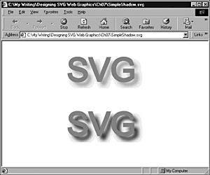
As you can see in Figure 07.05, the opacity of the top shadow is significantly less than the lower one.
Figure 07.05. Two Gaussian blurs used as drop shadows; the top has an opacity of 0.4 and the bottom an opacity of 1.
Turbulence Static
One of the seemingly simple filter primitives is the <feTurbulence> element. Yet, despite its seeming simplicity, it offers lots of possibilities for some attractive visual effects.
First look at a simple static image generated by using the <feTurbulence> filter primitive. The source code looks like this:
Listing 7.9 (Turbulence01.svg)
<?xml version="1.0" standalone="no"?> <!DOCTYPE svg PUBLIC "-//W3C//DTD SVG 1.0//EN" "http://www.w3.org/TR/2001/PR-SVG-20010719/ DTD/svg10.dtd"> <svg width="400" height="500"> <defs> <filter id="Turbulence1" in="SourceImage" filterUnits="objectBoundingBox"> <feTurbulence in="SourceAlpha" type="turbulence" baseFrequency="0.01" numOctaves="1" seed="0" > </feTurbulence> </filter> </defs> <rect x="0" y="0" width="400" height="500" style="filter:url(#Turbulence1)"/> </svg>
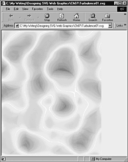
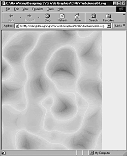
This simple code produces the attractive abstract pattern shown in Figure 07.06.
Figure 07.06. An abstract pattern produced using the <feTurbulence> filter primitive. For the code, see Listing 7.9.
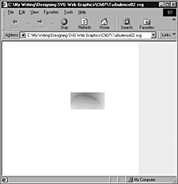
You can restrict the effect of a <filter> element to a defined rectangular area within an SVG element. For example, Listing 7.10 confines the <feTurbulence> filter primitive to a rectangle of the dimensions defined within the <filter> element:
Listing 7.10 (Turbulence02.svg)
<?xml version="1.0" standalone="no"?> <!DOCTYPE svg PUBLIC "-//W3C//DTD SVG 1.0//EN" "http://www.w3.org/TR/2001/PR-SVG-20010719/ DTD/svg10.dtd"> <svg width="400" height="500"> <defs> <filter id="Turbulence1" in="SourceImage" filterUnits="userSpaceOnUse" x="200" y="150" width="100" height="50"> <feTurbulence in="SourceAlpha" type="turbulence" baseFrequency="0.01" numOctaves="1" seed="0" > </feTurbulence> </filter> </defs> <rect x="0" y="0" width="400" height="500" style="filter:url(#Turbulence1)"/> </svg>
In Figure 07.07, you can see how the filter effect is restricted.
Figure 07.07. The <feTurbulence> filter is restricted to a rectangular area of the screen by means of the x, y, width, and height attributes on the containing <filter> element.
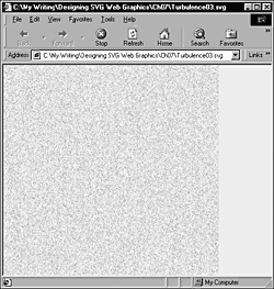
If you increase the base frequency on the <feTurbulence> filter primitive, you can get, rather than attractive waves, a tiny, speckled effect, as with the code shown in Listing 7.11. However, if you zoom in to the maximum allowed by the Adobe Viewer, you see that the pattern is essentially the same, only much smaller:
Listing 7.11 (Turbulence03.svg)
<?xml version="1.0" standalone="no"?> <!DOCTYPE svg PUBLIC "-//W3C//DTD SVG 1.0//EN" "http://www.w3.org/TR/2001/PR-SVG-20010719/ DTD/svg10.dtd"> <svg width="400" height="500"> <defs> <filter id="Turbulence1" in="SourceImage" filterUnits="userSpaceOnUse" > <feTurbulence in="sourceGraphic" type="turbulence" baseFrequency="0.5" numOctaves="1" seed="0" > </feTurbulence> </filter> </defs> <rect x="0" y="0" width="400" height="500" style="fill:red; filter:url(#Turbulence1)"/> </svg>
Figure 07.08 shows the speckling effect produced by the code shown in Listing 7.11.
Figure 07.08. A speckled effect produced by increasing the baseFrequency attribute on the <feTurbulence> filter.
The in attribute of the <feTurbulence> filter can take a number of inputs. For example, if, as shown in Listing 7.12, a semitransparent green rectangle serves as the background, you can add a greenish cast to the image you see in Figure 07.09.
Figure 07.09. A turbulence filter that uses a source image (a semi-opaque green rectangle).
Listing 7.12 (Turbulence04.svg)
<?xml version="1.0" standalone="no"?> <!DOCTYPE svg PUBLIC "-//W3C//DTD SVG 1.0//EN" "http://www.w3.org/TR/2001/PR-SVG-20010719/ DTD/svg10.dtd"> <svg width="400" height="500"> <defs> <filter id="Turbulence1" in="SourceImage" filterUnits="userSpaceOnUse" > <feTurbulence in="BackgroundImage" type="turbulence" baseFrequency="0.01" numOctaves="1" seed="0" > </feTurbulence> </filter> </defs> <rect x="0" y="0" width="400" height="500" style="fill:#99FF99; opacity:0.5;"/> <rect x="0" y="0" width="400" height="500" style="fill:red; filter:url(#Turbulence1)"/> </svg>
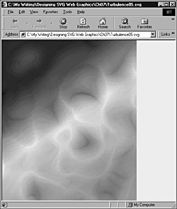
In the preceding example, I used a plain-colored background, but you can also use linear or radial gradients in all or part of the background image and use that as the input to the <feTurbulence> filter primitive, as in Listing 7.13 and shown in Figure 07.10.
Figure 07.10. A turbulence filter using a linear gradient as the input source image.
Listing 7.13 (Turbulence05.svg)
<?xml version="1.0" standalone="no"?> <!DOCTYPE svg PUBLIC "-//W3C//DTD SVG 1.0//EN" "http://www.w3.org/TR/2001/PR-SVG-20010719/ DTD/svg10.dtd"> <svg width="400" height="500"> <defs> <linearGradient id="MyBlueGradient" gradientUnits="userSpaceOnUse" x1="90" y1="50" x2="400" y2="500" > <stop offset="10%" style="stop-color:#000066"/> <stop offset="40%" style="stop-color:#FFFF00"/> <stop offset="75%" style="stop-color:#9999FF"/> </linearGradient> <filter id="Turbulence1" in="SourceImage" filterUnits="userSpaceOnUse" > <feTurbulence in="BackgroundImage" type="turbulence" baseFrequency="0.01" numOctaves="1" seed="0" > </feTurbulence> </filter> </defs> <rect x="0" y="0" width="400" height="500" style="fill:url(#MyBlueGradient); opacity:0.8;"/> <rect x="0" y="0" width="400" height="500" style="fill:red; filter:url(#Turbulence1)"/> </svg>
Many attractive visual effects are possible, so I encourage you to experiment.
Combined filters on text
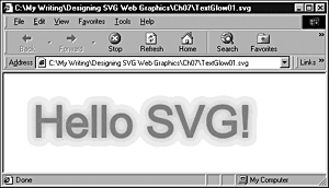
In this section, you take a look at how you can produce some combined filter effects on text. The following example makes use of several SVG filter primitives. It creates the text Hello SVG! with an orange glow or shadow behind it, which you can see in Figure 07.11.
Figure 07.11. A combination of filter primitives applied to text.
The following code produces that appearance. The code uses several SVG filter primitives: <feMorphology>, <feGaussianBlur>, <feFlood> and <feComposite>:
Listing 7.14 (TextGlow01.svg)
<?xml version="1.0" standalone="no"?> <!DOCTYPE svg PUBLIC "-//W3C//DTD SVG 1.0//EN" "http://www.w3.org/TR/2001/PR-SVG-20010719/ DTD/svg10.dtd"> <svg width="600" height="600"> <defs> <filter id="MyGlow" y="-40%" height="180%"> <feMorphology in="SourceAlpha" result="morphedAlpha" operator="dilate" radius="1"/> <feGaussianBlur in="morphedAlpha" result="blurredAlpha" stdDeviation="3"/> <feFlood result="flooded" style="flood-color:#FF9900; flood-opacity:0.75"/> <feComposite in="flooded" result="coloredShadow" operator="in" in2="blurredAlpha"/> <feComposite in="SourceGraphic" operator="over" in2="coloredShadow"/> </filter> </defs> <text x="100" y="50" style="fill:red; stroke:red; filter:url(#MyGlow); font-size:36;"> Hello SVG! </text> </svg>
The filter is created, as before, within a <filter> element, like this:
<filter id="MyGlow" y="-40%" height="180%">
The <feMorphology> element uses the alpha channel of the source image (the text Hello SVG!) as the input and uses the operator attribute, set to a value of dilate, to control the size of the image:
<feMorphology in="SourceAlpha" result="morphedAlpha" operator="dilate" radius="1"/>
Try experimenting with the value for the radius attribute to increase or decrease the size of the image. Using values such as 0.5, 2, or 3 gives you an impression of what the attribute does.
The result from the <feMorphology> primitive is used as the input to a <feGaussianBlur> primitive:
<feGaussianBlur in="morphedAlpha" result="blurredAlpha" stdDeviation="3"/>
The stdDeviation attribute can be used again to vary the size of the resulting blur. Values in the range from 1 to 4 allow you to see the range of effects, although you can always explore more extreme values:
<feFlood result="flooded" style="flood-color:#FF9900; flood-opacity:0.75"/> <feComposite in="flooded" result="coloredShadow" operator="in" in2="blurredAlpha"/>
Then you add an <feFlood> primitive. The flood-color property of the style attribute controls the color of the shadow you are creating. In the example, the flood-color property is set to #FF9900, an orange color. You can also vary the opacity by adjusting the value of the flood-opacity property; in this case, set at 0.75.
You then pull all those effect together using an <feCompositive> filter primitive.
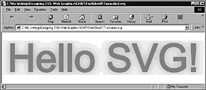
You must include the y and height attributes because the default values don't give enough space for the full effect of the filter to be correctly applied. If you use only
<filter id="MyGlow">
without specifying values for y and height attributes, you find that the filter effect is truncated, as you can see in Figure 07.12.
Figure 07.12. A zoomed view of a truncated glow effect on text.
Creating filtered text shapes
In most of the examples of filters used with text, you have been placing a variety of filter effects behind the text and leaving the text itself in pristine condition. But you can alter the appearance of the text itself as well as create shadows, for example. Figure 07.13 shows one example, building on the <feTurbulence> primitive you saw earlier in this chapter.
Figure 07.13. An unusual filter effect on text.
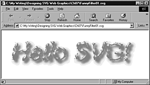
First, look at the code that produced that appearance, and then take a closer look at some aspects of the code:
Listing 7.15 (FunnyFilter01.svg)
<?xml version="1.0" standalone="no"?> <!DOCTYPE svg PUBLIC "-//W3C//DTD SVG 1.0//EN" "http://www.w3.org/TR/2001/PR-SVG-20010719/ DTD/svg10.dtd"> <svg> <defs> <filter id="MyOddFilter" y="-30%" height="180%"> <feTurbulence result="turb" baseFrequency="0.1" numOctaves="2" seed="0" stitchTiles="noStitch" type="turbulence"/> <feDisplacementMap in="SourceGraphic" result="displacedSource" scale="10" xChannelSelector="R" yChannelSelector="G" in2="turb"/> <feGaussianBlur in="displacedSource" result="blur" stdDeviation="2"/> <feOffset in="blur" result="offsetBlurredSource" dx="4" dy="4"/> <feSpecularLighting result="specularOut" in="blur" surfaceScale="5" specularConstant="1" specularExponent="10" lighting-color="#FFFFFF"> <fePointLight x="-5000" y="-10000" z="2000"/> </feSpecularLighting> <feComposite result="specularOut" in="specularOut" operator="in" in2="displacedSource"/> <feComposite result="litPaint" in="displacedSource" operator="arithmetic" k1="0" k2="1" k3="1" k4="0" in2="specularOut"/> <feComposite in="litPaint" operator="over" in2="offsetBlurredSource"/> </filter> </defs> <text x="50" y="50" style="fill:red; stroke:red; font-style:italic; filter:url(#MyOddFilter); font-size:48;"> Hello SVG! </text> </svg>
Having filters of this complexity can be a bit overwhelming. Trying to explain the effects of modifying each attribute is a lengthy process and is difficult to show in printed media, such as a book. So the best (and highly suggested) solution is for you to experiment. Let me focus on a couple of points in this example, however. If you modify the lighting-color attribute of the <feSpecularLighting> primitive, you can alter the color of the highlights on the text to which the filter has been applied. For example, if you change it to #00FF00, you can get interesting green highlights on the text.
You can also experiment with the position of the source for the <fePointLight> element. The following line
<fePointLight x="-5000" y="-10000" z="2000"/>
indicates that the source of the point light is 5,000 pixels to the left of the screen, 10,000 pixels above the top of the screen, and 2,000 pixels nearer to you than the screen is. I often prefer the appearance created by having the spotlight source a long way away from the text or other SVG object. However, for some purposes, you might find that you prefer the appearance (sometimes a little distorted) that closer light sources produce.
You can produce other interesting possibilities if you use two different colors for the fill and stroke properties of the <text> element. Note that applying text styling, such as italics, to the text is a straightforward process, as is applying this somewhat complex filter.
The field of SVG filters is enormous, and a discussion of this subject needs a book of its own. I hope that I have given you a flavor of what is possible with SVG filters and that you are encouraged to try experimenting with them on your own. Many interesting effects are waiting to be discovered.
| CONTENTS | |
EAN: 2147483647
Pages: 26