3.3 Display Widgets
3.3 Display Widgets
Among the most elementary widgets, display widgets do nothing other than show something to the user ” for example, text, pictures, and progress.
-
Label: A short piece of text that describes a nearby widget. Pango makes it easy to format labels. Labels aren't suitable for large amounts of text; see the text buffer and text view widgets in Section 3.12 for alternatives.
-
Image: Displays a picture on the screen. These types of widgets work in conjunction with GdkPixbuf, a GDK interface that permits you to load and display image files in nearly every common format.
-
Progress bar: Shows the user how far the application has progressed in a certain task. Progress bars can show the user exactly how far an application has gone. If the application doesn't quite know how long an operation will take, a progress bar can go into activity mode to show that something is happening (this looks a bit like the Cylon lights in Battlestar Galactica ).
The rest of this section is a small demonstration of these widgets. The first part of the program consists of the usual GTK+ declarations and event handlers:
/* -*-coding: utf-8;-*- */ /* display.c -- demonstrate display widgets */ #include <gtk/gtk.h> #include <math.h> const gdouble PROGRESS_STEP = 0.05; /* standard handlers */ gint delete_event(GtkWidget *widget, GdkEvent event, gpointer data) { return FALSE; } void end_program(GtkWidget *widget, gpointer data) { gtk_main_quit(); } The function that follows is a handler for a progress bar. It is a very concrete example of how an event on a widget object causes a signal emission, eventually leading the handler to manipulate another object.
There are two GtkProgressBar properties in this handler: fraction , a number between 0 and 1 indicating how much of the progress bar is filled, and text , a text string to render on top of the progress bar. Section 3.3.3 contains more information about progress bars.
/* bump the display counter on the given GtkProgressBar one PROGRESS_STEP further */ void advance(GtkButton *button, gpointer progress_ptr) { GtkProgressBar *progress_bar = GTK_PROGRESS_BAR(progress_ptr); gdouble current; gchar *embedded_text; g_object_get(progress_bar, "fraction", ¤t, NULL); current += PROGRESS_STEP; current = CLAMP(current, 0.0, 0.999); embedded_text = g_strdup_printf("%3.0f%% completed", current*100); g_object_set(progress_bar, "fraction", current, "text", embedded_text, NULL); g_free(embedded_text); } The main program comes next . Many normal declarations, gtk_init() , creation of the main window, and attachment of its destroy signal handlers, are here:
int main(int argc, char **argv) { GtkWindow *window; GtkVBox *vbox; GtkLabel *label, *label_markup; GtkImage *image; GtkHBox *progress_bar_box; GtkProgressBar *progress_bar; GtkButton *pulse_button, *advance_button; /* initialize GTK+, create a window, attach handlers */ gtk_init(&argc, &argv); window = g_object_new(GTK_TYPE_WINDOW, "title", "Display Widgets", "border-width", 12, NULL); /* attach standard window event handlers */ g_signal_connect(window, "delete_event", G_CALLBACK(delete_event), NULL); g_signal_connect(window, "destroy", G_CALLBACK(end_program), NULL); This little piece creates a subcontainer widget called a VBox. The items in a VBox stack vertically:
/* create a vertical box and pack it into window */ vbox = g_object_new(GTK_TYPE_VBOX, "spacing", 6, NULL); gtk_container_add(GTK_CONTAINER(window), GTK_WIDGET(vbox));
You're ready to see the first GtkLabel . This one carries a small, unadorned message. This text goes in the label property.
/* a new label. */ label = g_object_new(GTK_TYPE_LABEL, "label", "When lilacs last in the door-yard bloom'd.\n \ Fonts normally do not support all markup attributes:", NULL); gtk_box_pack_start_defaults(GTK_BOX(vbox), GTK_WIDGET(label));
Labels can be quite fancy, because Pango understands a type of markup language that you activate with the use-markup property. Notice that this (somewhat gaudy) example also sets the wrap property, telling Pango to wrap text lines if they get too long. These properties and others are in Section 3.3.1. (Yes, the program looks a little ugly.)
/* a label with extensive markup */ label_markup = g_object_new(GTK_TYPE_LABEL, "wrap", TRUE, "use-markup", TRUE, "label", "\ <span font_desc=\"Courier New Bold 16\">Courier - </span>\ <span font_desc=\"Charter Bold 16\">Charter - </span>\ <span font_family=\"Times\">Times - </span>\ <span face=\"Verdana\">Verdana - </span>\ <span size=\"xx-small\">Tiny - </span>\ <span size=\"x-small\">Extra Small - </span>\ <span size=\"small\">Small - </span>\ <span size=\"medium\">Medium - </span>\ <span size=\"large\">Large - </span>\ <span size=\"x-large\">Extra Large - </span>\ <span size=\"xx-large\">Huge - </span>\ <span size=\"36000\">Gigantic - </span>\ <span face=\"Times\">\ <span style=\"oblique\">Oblique - </span>\ <span style=\"italic\">Italic - </span>\ </span>\ <span weight=\"ultrabold\">Ultra Bold - </span>\ <span face=\"Times New Roman\" variant=\"smallcaps\">\ Caps and Small Caps - </span>\ <span stretch=\"condensed\">Condensed - </span>\ H<span rise=\"-5000\">2</span>O - \ <span background=\"black\" foreground=\"#FFFFFF\">Inverse</span> - \ <span underline=\"double\">Important - </span>\ <span strikethrough=\"true\">Strikethrough</span>\ \n\ The <tt>span</tt> tag appears to function \ well. However, it's <i>easier</i> to use \ <b>short forms</b><sup>*</sup>.\n\ \n\ <small><sup>*)</sup> short tags that work just\ the same as <tt>span</tt> with corresponding \ attributes</small>"); gtk_box_pack_start_defaults(GTK_BOX(vbox), GTK_WIDGET(label_markup));
The following statements create a GtkImage object to display a picture of an apple ( apple-green.png ). Section 3.3.2 goes into far more detail on images.
/* a GtkImage */ image = g_object_new(GTK_TYPE_IMAGE, "file", "apple-green.png", NULL); gtk_box_pack_start_defaults(GTK_BOX(vbox), GTK_WIDGET(image));
This code creates the progress bar mentioned earlier:
/* a progress bar with buttons to advance the progress or pulse activity */ progress_bar_box = g_object_new(GTK_TYPE_HBOX, "spacing", 6, NULL); gtk_box_pack_start_defaults(GTK_BOX(vbox), GTK_WIDGET(progress_bar_box));
These two buttons seem nearly identical at first, but notice that pulse_button gets a built-in signal handler, gtk_progress_bar_pulse() , described in Section 3.3.3.
advance_button = g_object_new(GTK_TYPE_BUTTON, "label", "_Advance", "use-underline", TRUE, NULL); pulse_button = g_object_new(GTK_TYPE_BUTTON, "label", "_Pulse", "use-underline", TRUE, NULL); gtk_box_pack_start_defaults(GTK_BOX(progress_bar_box), GTK_WIDGET(advance_button)); gtk_box_pack_start_defaults(GTK_BOX(progress_bar_box), GTK_WIDGET(pulse_button)); progress_bar = g_object_new(GTK_TYPE_PROGRESS_BAR, NULL); gtk_box_pack_start_defaults(GTK_BOX(progress_bar_box), GTK_WIDGET(progress_bar)); g_signal_connect(advance_button, "clicked", G_CALLBACK(advance), progress_bar); /* attach a builtin GTK+ handler to pulse the progress bar */ g_signal_connect_swapped(pulse_button, "clicked", G_CALLBACK(gtk_progress_bar_pulse), progress_bar);
We're finally ready to see the final window and start the main event loop.
/* show window and begin GTK+ main loop */ gtk_widget_show_all(GTK_WIDGET(window)); gtk_main(); return 0; }
Figure 3.5 shows the final application. It's much easier to understand this program when you run it, so if you haven't retrieved the source code yet, this might be a good time to think about it (see the introduction for more information).
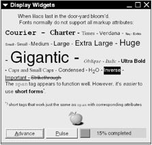
Figure 3.5: Display widgets.
3.3.1 Labels and Pango Markup
As you can see from the example in the previous section, it's not very hard to put a string into a label; just create a GtkLabel ( GTK_TYPE_LABEL ) object and set its label property.
A label with Pango formatting is only a little more complex. Set the label's use-markup property to TRUE so that you can use markup language directives.
Pango markup has few tags when compared to a cousin such as HTML. The most important tag pair is <span> ... </span> . You can put any text inside this pair and even nest other <span> tags. The <span> tag does nothing on its own; you must supply at least one of these attributes:
-
font_desc= string : Sets the text with the full font description string . An example of such a description is "Times Italic 12" . Other attributes have precedence over font_desc . You can look up font descriptions with any number of GTK+ font chooser programs, including the one in Section 3.6.8.
-
font_family= font : Selects a typeface family, such as Times or Sans .
-
face= font : Identical to font_family .
-
size= value : Controls the font size. There are three ways to do this:
-
A number representing the actual size in thousandths of a point. For example, a 10-point type size translates to 10000.
-
An absolute description : Pick one of xx-small , x-small , small , medium , large , x-large , and xx-large .
-
A relative description : Use smaller to get text smaller than the current text, and larger for the other way around.
-
-
style= string : Changes the style of the typeface; choose one of normal , oblique (leaning to the right), and italic . Most typeface families do not support both oblique and italic; one usually substitutes for the other.
-
weight= string : Indicates how thick the typeface appears; possible values are ultralight , light , normal , bold , ultrabold , and heavy . You can specify a number instead (to serve as reference, ultralight is 200, normal is 400, ultrabold is 800, and heavy is 900). Keep in mind that very few typefaces actually support all of these weights.
-
variant= string : Specifies normal , or smallcaps for caps and small caps. Few typefaces support small caps.
-
stretch= string : Specifies the width of each character. Possible values, from narrow to wide, are ultracondensed , extracondensed , condensed , semicondensed , normal , semiexpanded , expanded , extraexpanded , and ultraexpanded . Again, typefaces with all of these are rare.
-
background= color : Controls the text background color. This can be an RGB specification such as #AACC40 or an X11 color name such as midnightblue . For a complete list of color names on a Unix system, consult /usr/X11R6/lib/X11/rgb.txt (it's quite a poetic collection, including honeydew , rosy brown , and medium spring green ).
-
foreground= color : Controls the text color (the specification is as for background= color ).
-
underline= style : Draw lines underneath the text. The values are:
-
single for a single line.
-
double for two lines.
-
low to place a line underneath all descenders.
-
none for no underlining.
-
-
rise= number : Shifts the text vertically, in thousandths of an em ; number may be negative.
-
strikethrough= value : If value is true , Pango renders the text with a horizontal line drawn straight through each character.
-
lang= language : Selects the text's language. The value is a code as per RFC 3066/ISO 639: for example, en for English, es for Spanish, de for German, fy for Frisian, or i-klingon for Klingon.
There are some abbreviation tags that you can use for convenience. For example, <b> ... </b> is short for <span weight="bold"> ... </pan> .
| Abbreviation | Full Version |
|---|---|
| <b> | <span weight="bold"> |
| <big> | <span size="larger"> |
| <i> | <span style="italic"> |
| <s> | <span strikethrough="true"> |
| <sub> | <span "rise=-5000" size="smaller"> (subscript) |
| <sup> | <span "rise=5000" size="smaller"> (superscript) |
| <small> | <span weight="smaller"> |
| <u> | <span underline="single"> |
| <tt> | Use a monospaced (nonproportional) font |
| Note | Even though you have all of these formatting possibilities, try not to go too crazy. Use bold or italic fonts for emphasis and relative font sizes for superscripts or warnings (see the guidelines for dialog boxes in Section 3.10). Try to avoid absolute font sizes and don't arbitrarily mix and match typefaces. |
Other important GtkLabel properties include the following:
-
use-underline ( gboolean ): If TRUE , you can put an underscore in front of a letter in the label to denote a keystroke.
-
mnemonic-widget ( GtkWidget ): The widget to activate when the user presses the key mentioned in the preceding property.
-
justify ( GtkJustification ): Determines the text justification. Possible values are:
-
GTK_JUSTIFY_LEFT
-
GTK_JUSTIFY_RIGHT
-
GTK_JUSTIFY_CENTER
-
GTK_JUSTIFY_FILL (fills in space between words; works only with multiline text)
-
-
wrap ( gboolean ): If TRUE , Pango wraps long lines of text.
-
selectable ( gboolean ): If TRUE , the user may select text inside the label with the mouse.
-
cursor-position ( gint , read-only): The position of the selection described in the preceding property; the number of characters between the beginning of the text and the start of the selection.
-
selection-bound ( gint , read-only): The number of characters in the selection.
When you create labels for your application, try to be as consistent and unambiguous as possible. Here are some tips:
-
Left-justify your labels unless you have an important reason for doing otherwise .
-
Make labels for user elements expressive enough for a sight-impaired user to know what the element does. A screen reader shouldn't need to need to read everything in a window before the user can take action. Dialog boxes, in particular, are something to watch out for.
-
Place any labels for large icons and images underneath the picture, akin to a book's captions for illustrations.
-
Put a label accompanying a small icon directly to the right of the icon. The icon serves as a visual point of entry.
-
If a label describes a large area containing widgets, such as a list or group of buttons, place the label above the area.
-
As was the case for small icons, labels for small widgets such as check boxes and radio buttons go to the right of these elements.
-
When placing a label to the left of a widget because you want the user to read the whole as a sentence (such as a label next to a small text-entry box), end the label with a colon so that there is a clear connection between the label and widget.
-
Don't use the same label text (or very similar text) in the same window.
3.3.2 Images and GDK Pixbufs
To represent an image, create a GtkImage ( GTK_TYPE_IMAGE ) widget and set its file property to the filename of an image.
GDK works behind the scenes with the GdkPixbuf class ( GDK_TYPE_PIXBUF ), GDK's fundamental class for image data. GDK understands many different graphics file formats, including JPEG, GIF, PNG, ICO, PNM, RAS, TGA, TIFF, Windows BMP, XPM, and even SVG. The image loader is modular, so GDK adds new format support from time to time.
In addition to loading your own files, you can select an image from a library of stock images. The fundamental GtkImage properties for loading and storing images are as follows:
-
pixbuf ( GdkPixbuf ): The image data buffer.
-
pixbuf-animation ( GdkPixbufAnimation ): The image data, if the image is animated.
-
file ( gchararray , write-only): An image file for GDK to load into the image buffer.
-
stock ( gchararray ): The identifier for one of the GTK+ stock images, if you wish to display one.
-
icon-size ( gint ): The desired size of the stock image (above).
-
storage-type ( GtkImageType , read-only): The representation type of the image in memory. Possible values include
-
GTK_IMAGE_EMPTY : No image data present (yet).
-
GTK_IMAGE_PIXBUF : The image came from a file or GdkPixbuf .
-
GTK_IMAGE_STOCK : The image is part of a stock image library.
-
GTK_IMAGE_ANIMATION : The image contains GDK Pixbuf animation.
-
GdkPixbuf
If you need to alter the image for display, or if you just want more control, you can create your own GdkPixbuf objects.
| Note | GtkImage stores its own data. Therefore, if you change a GdkPixbuf structure that you already have on the screen, you must tell the GtkImage object about this change, or nothing will happen on the screen. You'll see this in the render_image() function for the example program further on in this section. |
Here are the most important functions that operate on the GdkPixbuf type:
-
GdkPixbuf *gdk_pixbuf_new_from_file(const gchar * filename , GError ** error )
Loads the image in filename into an image buffer and returns a pointer to the buffer. If some problem occurs in loading the image, this function returns NULL and sets error (the possible error classes are GDK_PIXBUF_ERROR and G_FILE_ERROR ).
Use g_object_unref() to free a pixbuf's memory.
-
int gdk_pixbuf_get_width(GdkPixbuf * pixbuf )
Returns the width of an image in pixels.
-
int gdk_pixbuf_get_height(GdkPixbuf * pixbuf )
Returns the height of an image in pixels.
-
GdkPixbuf *gdk_pixbuf_copy(const GdkPixbuf * pixbuf )
Returns a complete copy of pixbuf (not just a reference).
-
void gdk_pixbuf_copy_area(const GdkPixbuf * source , int src_x , int src_y , int width , int height , GdkPixbuf * dest , int dest_x , int dest_y )
Copies an area width by height pixels starting at the coordinates ( src_x , src_y ) in source to the coordinates ( dest_x , dest_y ) in dest . The origin (0,0) in a Pixbuf is at the upper left.
-
GdkPixbuf *gdk_pixbuf_scale_simple(const GdkPixbuf * pixbuf , int width , int height , GdkInterpType interpolation )
Returns a copy of pixbuf scaled to width by height pixels. You can choose the interpolation method from the following:
-
GDK_INTERP_NEAREST : Nearest neighbor approximation is the fastest algorithm, but it doesn't have very good results. It's unusable to scale down an image, but is acceptable for enlarging in certain circumstances.
-
GDK_INTERP_TILES : Tile interpolation is better than nearest neighbor; for example, PostScript uses this method. In particular, it delivers better results when you reduce an image's size.
-
GDK_INTERP_BILINEAR : If you're looking for good interpolation with moderate CPU time consumption, bilinear interpolation is usually a good choice.
-
GDK_INTERP_HYPER : Hyperbolic interpolation delivers excellent results, but consumes an enormous amount of processor time.
-
-
void gdk_pixbuf_scale(const GdkPixbuf * source , GdkPixbuf * dest , int dest_x , int dest_y , int width , int height , double offset_x , double y_offset , double scale_x , double y_scale , GdkInterpType interpolation )
This extremely verbose function gives you fine control over how to scale an image. Scales source by scale_x horizontally and scale_y vertically, shifts that result by offset_x (horizontally) and offset_y (vertically), and pastes this into dest at ( dest_x , dest_y ) ; interpolation method as described in the preceding function.
-
void gdk_pixbuf_composite(const GdkPixbuf * source , GdkPixbuf * dest , int dest_x , int dest_y , int width , int height , double x_offset , double y_offset , double scale_x , double scale_y , GdkInterpType interpolation , int alpha )
Works like the preceding function, but rather than replacing the target pixels, adds the newly scaled image as a transparent layer. This makes sense only if the source has transparent pixels or you specify a number smaller than 255 as the transparency value alpha (domain: 0 to 255).
-
gboolean gdk_pixbuf_get_has_alpha(const GdkPixbuf * pixbuf )
Returns TRUE if a Pixbuf contains an alpha channel (transparency information).
-
GdkPixbuf *gdk_pixbuf_add_alpha(const GdkPixbuf * pixbuf , gboolean substitute , guchar r , guchar g , guchar b )
Returns a copy of pixbuf with an alpha channel. If substitute is TRUE , this function makes all pixels that match the RGB color value given by r / g / b transparent. This function sets all other pixels to 255 ( opaque ) in the alpha channel.
-
void gdk_pixbuf_saturate_and_pixelate(const GdkPixbuf * source , GdkPixbuf * dest , gfloat saturation , gboolean pixelate )
Changes the saturation (color contrast) in source , pixelates the result (that is, if pixelate is TRUE ), and copies the result to dest . dest must exist ahead of time and have the same dimensions as source ; you might want to copy source or use the same Pixbuf as source and target . The saturation value is a floating-point number greater than or equal to 0. At 0, the image becomes grayscale; 1.0 has no effect on the image, and any larger number exaggerates the colors (for example, to provide the GTK+ insensitive icon effect).
-
void gdk_pixbuf_fill(const GdkPixbuf * pixbuf , guint32 color )
Fills pixbuf with color pixels. The color value is a four-byte representation of red, green, blue, and alpha ” for example, 0xcececeff for opaque gray, 0x00000000 for transparent black, and 0xffffff80 for half-transparent white.
A simple demonstration of GdkPixbuf that uses slider widgets for scaling and saturation operations follows. Figure 3.6 shows the end result.
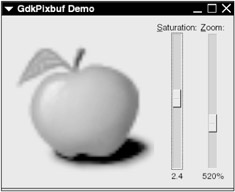
Figure 3.6: Demonstration of saturation and scaling.
The first part of this program consists of signal handlers that you have already seen.
/* -*-coding: utf-8;-*- */ /* pixbufdemo.c -- GdkPixbuf demo */ #include <gtk/gtk.h> /* standard handlers */ gint delete_event(GtkWidget *widget, GdkEvent event, gpointer data) { return FALSE; } void end_program(GtkWidget *widget, gpointer data) { gtk_main_quit(); } The following function converts a number into a string, represented as a percent. You will see it in conjunction with the image's zoom value.
/* rounds a number to the nearest whole percentage and returns this (followed by %) in a newly allocated string */ gchar* percent(GtkScale *scale, gdouble number, gpointer data) { gint percent; gchar *str; percent = (gint)(number * 100); str = g_strdup_printf("%d%%", percent); return str; } The render_image() handler that follows demonstrates the saturation and scaling functions described earlier in this section. Notice that image comes through as the handler's data pointer, and that render_image() retrieves several other parameters from image (you'll see where it all fits together later). The important points to notice are how render_image() retrieves the original image, how it manipulates the image, and how it must tell the image widget to display the newly manipulated image.
/* (re-)render the image when it changes */ void render_image(GtkWidget *adjuster, gpointer data) { GtkImage *image; GtkAdjustment *zoom, *saturation; GdkPixbuf *orig_pixbuf, *new_pixbuf; gint orig_width, orig_height; gint new_width, new_height; gdouble zoom_value, saturation_value; image = (GtkImage *) data; /* get the original pixbuf dimensions */ orig_pixbuf = (GdkPixbuf *)g_object_get_data(G_OBJECT(image), "orig-pixbuf"); orig_width = gdk_pixbuf_get_width(orig_pixbuf); orig_height = gdk_pixbuf_get_height(orig_pixbuf); /* get adjuster-induced changes */ zoom = (GtkAdjustment *)g_object_get_data(G_OBJECT(image), "zoom"); zoom_value = gtk_adjustment_get_value(zoom); saturation = (GtkAdjustment *)g_object_get_data(G_OBJECT(image), "saturation"); saturation_value = gtk_adjustment_get_value(saturation); /* compute new size */ new_width = (gint)(orig_width * zoom_value); new_height = (gint)(orig_height * zoom_value); /* prevent a height or width of 0 */ new_width = MAX(1, new_width); new_height = MAX(1, new_height); /* scale the original pixbuf to the new dimensions (feel free to try other interpolation algorithms) */ new_pixbuf = gdk_pixbuf_scale_simple(orig_pixbuf, new_width, new_height, GDK_INTERP_BILINEAR); /* modify the saturation on the newly scaled pixbuf note that args 1 and 2 are the same */ gdk_pixbuf_saturate_and_pixelate(new_pixbuf, new_pixbuf, saturation_value, FALSE); /* display the new pixbuf in the image widget */ g_object_set(image, "pixbuf", new_pixbuf, NULL); /* reference to new_pixbuf is no longer necessary, the system may dispose of it when convenient */ g_object_unref(new_pixbuf); } | Warning | After passing new_pixbuf to the image widget, render_image() releases the Pixbuf reference. This is important because render_image() creates a new object for new_pixbuf upon every invocation (regardless of the old value). Therefore, there would be a big memory leak if GTK+ still thought that there was an active reference to the old Pixbuf. If you aren't careful, even a small program like this could quickly grow to 50MB in active memory and beyond after the user plays around a little. |
The main program starts with the usual mundane declarations and initializations.
int main(int argc, char **argv) { GtkWindow *window; GtkHBox *hbox; GtkImage *image; GtkVBox *zoom_box, *saturation_box; GtkLabel *zoom_label, *saturation_label; GtkVScale *zoom_slider, *saturation_slider; GtkAdjustment *zoom, *saturation; GdkPixbuf *orig_pixbuf; /* initialize GTK+, create a window */ gtk_init(&argc, &argv); window = g_object_new(GTK_TYPE_WINDOW, "title", "GdkPixbuf Demo", "default-width", 300, "default-height", 300, "border-width", 12, NULL); /* attach standard event handlers */ g_signal_connect(window, "delete_event", G_CALLBACK(delete_event), NULL); g_signal_connect(window, "destroy", G_CALLBACK(end_program), NULL); The first order of business is to load the image from the disk. However, recall from earlier that render_image() needs the original pixmap. This program couples the original pixmap to image with the help of an object data extension named orig-pixmap .
/* create image widget and load a file */ image = g_object_new(GTK_TYPE_IMAGE, "file", "apple-green.png", NULL); /* store the original pixbuf in the image widget data */ g_object_get(image, "pixbuf", &orig_pixbuf, NULL); g_object_set_data(G_OBJECT(image), "orig-pixbuf", (gpointer)orig_pixbuf);
The next part looks somewhat confusing because slider widgets come later in the book, in Section 3.6.5. This code creates a slider for scaling the image in the image widget; the values represented by the slider range from 0.01 to 7.5, and they will show up on the slider as 1% to 750%.
/* define storage for zoom slider */ zoom = GTK_ADJUSTMENT(gtk_adjustment_new(1.0, /* default */ 0.01, /* minimum */ 7.5, /* maximum */ 0.01, /* step increment */ 0.1, /* page increment */ 0.0)); /* page size */ /* create zoom slider */ zoom_slider = g_object_new(GTK_TYPE_VSCALE, "draw_value", TRUE, "value-pos", GTK_POS_BOTTOM, "adjustment", zoom, NULL); /* create label for zoom slider */ zoom_label = g_object_new(GTK_TYPE_LABEL, "label", "_Zoom:", "use-underline", TRUE, "mnemonic-widget", zoom_slider, NULL); /* format the zoom slider's display as a percentage */ g_signal_connect(zoom_slider, "format-value", G_CALLBACK(percent), NULL); /* put all of the zoom elements in a vbox */ zoom_box = g_object_new(GTK_TYPE_VBOX, NULL); gtk_box_pack_start(GTK_BOX(zoom_box), GTK_WIDGET(zoom_label), FALSE, FALSE, 0); gtk_box_pack_start_defaults(GTK_BOX(zoom_box), GTK_WIDGET(zoom_slider));
This code creates the saturation adjustment slider, with values from 0 to 5.0:
/* now do all of the above for a saturation slider */ saturation = GTK_ADJUSTMENT(gtk_adjustment_new(1.0, 0.0, 5.0, 0.01, 0.1, 0.0)); saturation_slider = g_object_new(GTK_TYPE_VSCALE, "draw-value", TRUE, "value-pos", GTK_POS_BOTTOM, "adjustment", saturation, "update-policy", GTK_UPDATE_DELAYED, NULL); saturation_label = g_object_new(GTK_TYPE_LABEL, "label", "_Saturation:", "use-underline", TRUE, "mnemonic-widget", saturation_slider, NULL); saturation_box = g_object_new(GTK_TYPE_VBOX, NULL); gtk_box_pack_start(GTK_BOX(saturation_box), GTK_WIDGET(saturation_label), FALSE, FALSE, 0); gtk_box_pack_start_defaults(GTK_BOX(saturation_box), GTK_WIDGET(saturation_slider));
As was the case with the original pixmap, render_image() needs to access the values in zoom and saturation :
/* store the adjuster widgets in the image object */ g_object_set_data(G_OBJECT(image), "zoom", (gpointer)zoom); g_object_set_data(G_OBJECT(image), "saturation", (gpointer)saturation);
Now the program must connect the render_image() handler that manipulates and redisplays the image when a user changes a slider. Remember that this handler needs the GtkImage object as its data pointer so that it can access the original pixmap dimensions and other object data extensions above:
/* install adjuster signal handlers */ g_signal_connect(zoom, "value-changed", G_CALLBACK(render_image), (gpointer) image); g_signal_connect(saturation, "value-changed", G_CALLBACK(render_image), (gpointer) image);
Finally, the program can put all of the various containers together, show everything, and fall into the GTK+ main event loop:
/* create a new HBox, pack the image and vboxes above */ hbox = g_object_new(GTK_TYPE_HBOX, NULL); gtk_box_pack_start_defaults(GTK_BOX(hbox), GTK_WIDGET(image)); gtk_box_pack_end(GTK_BOX(hbox), GTK_WIDGET(zoom_box), FALSE, FALSE, 3); gtk_box_pack_end(GTK_BOX(hbox), GTK_WIDGET(saturation_box), FALSE, FALSE, 3); /* pack everything into the window, show everything, start GTK+ main loop */ gtk_container_add(GTK_CONTAINER(window), GTK_WIDGET(hbox)); gtk_widget_show_all(GTK_WIDGET(window)); gtk_main(); return 0; }
If you want to see some more operations with GdkPixbuf , take a look at Eye of GNOME, the GNOME image viewer. This application is easy to adapt for tests and demonstrations .
Stock Items and Images
GTK+ and GNOME include many prebuilt label strings for common tasks in GUI applications. A stock item is the label, its key combinations, and other data. Stock items are convenient ” for example, you create a standard, full-featured Cancel or OK button without much fuss; as a bonus, the button appears in the user's native language.
There's another reason for using these stock items: They come with stock icons. Every icon is available in several standard sizes (usually in pairs, for example, one size for menu items and something slightly larger for toolbar buttons).
Each stock item has an identifier that you access with a macro (there is a string behind each macro in the current implementation). For example, for the GTK+ Cancel stock item, use GTK_STOCK_CANCEL . You'll find a list of the the GTK+ and GNOME stock items in Appendix A.
As mentioned in Section 3.3.2, a GtkImage object has a stock property for specifying a stock image and an icon-size property for choosing one of these standard sizes:
-
GTK_ICON_SIZE_MENU for menu entries (16 x 16 pixels).
-
GTK_ICON_SIZE_SMALL_TOOLBAR for small tool items (18 x 18 pixels).
-
GTK_ICON_SIZE_LARGE_TOOLBAR for large tool items (24 x 24 pixels).
-
GTK_ICON_SIZE_BUTTON for buttons (20 x 20 pixels).
-
GTK_ICON_SIZE_DND icons that represent drag-and-drop objects (32 x 32 pixels).
-
GTK_ICON_SIZE_DIALOG icons in a dialog box (48 x 48 pixels).
3.3.3 Progress Bars
The example in Section 3.3.2 introduced the progress bar, a widget that informs the user how far along a program is when it is busy at work. The progress bar class name is GtkProgress , and its type identifier is GTK_TYPE_PROGRESS_BAR . Progress bar objects contain the following properties:
-
fraction ( gdouble ): The fraction of current progress; a floating-point number from 0 up to (but not including) 1.
-
pulse-step ( gdouble ): The fraction of the progress bar width that the indicator should move at every pulse; applies to activity mode (discussed later).
-
orientation ( GtkProgressBarOrientation ): The widget's orientation, including its direction of growth. Possible values are
-
GTK_PROGRESS_LEFT_TO_RIGHT : Horizontal bar, growing left to right.
-
GTK_PROGRESS_RIGHT_TO_LEFT : Horizontal bar, growing right to left.
-
GTK_PROGRESS_BOTTOM_TO_TOP : Vertical bar, growing bottom to top.
-
GTK_PROGRESS_TOP_TO_BOTTOM : Vertical bar, growing top to bottom.
-
-
text ( gchararray ): Text to overlay on top of the progress bar.
| Note | fraction should never be greater or equal to 1.0, unless you enjoy ugly warnings on the console. The earlier example solves this problem with the CLAMP() macro. |
In activity mode, the progress bar does not display text. After entering activity mode, you can advance the indicator with
GtkProgressBar * progress_bar ; gtk_progress_bar_pulse( progress_bar );
Activity mode works for situations where the program can't figure out how long its current task will take. For example, when traversing a directory tree, there is no terribly good way to tell how long the operation will take. Therefore, you could advance the indicator every time the program runs through 100 files.
Set fraction to leave activity mode.
The example also shows that you can switch between normal and activity mode without a problem ” behavior that you might know from certain web browsers. (Of course, many people find this behavior to be very annoying.)
EAN: 2147483647
Pages: 108