3.4 Container and Layout Widgets
3.4 Container and Layout Widgets
It would be practically impossible to organize normal widgets without container widgets. Each container has a specific way of ordering its widgets based on parameters and packing order.
The principal container types are as follows :
-
Horizontal and vertical boxes. These are the most important and fundamental containers. When you need to arrange several widgets in a row or column, you should use a box. The two classes here are GtkHBox for horizontal rows and GtkVBox for columns , both derived from the GtkBox parent class. This book will refer to the objects from these classes as HBoxes and VBoxes.
There are special subclasses called GtkHButtonBox and GtkVButtonBox for groups of buttons. They work like any other box, except that all widgets packed into one of these boxes tend to receive consistent appearance and layout characteristics. Button boxes are good for buttons , as the name implies, but they aren't terribly good for anything else.
-
Horizontal and vertical panes. A pane consists of two adjacent containers divided by a user -adjustable slider bar. A typical use of the horizontal paned container ( GtkHPaned ) is a window with a file manager in the primary pane and a list of items on the other side. A mail client could use a vertical paned container ( GtkVPaned ) to separate the message list and display. The abstract GtkPaned class is the parent of these two container classes.
-
Notebooks . These organizer widgets ( GtkNotebook ) hold several pages with tabs along one of the edges for the user to select and view a page. Programs often use notebooks for property settings.
Note Notebooks with too many pages are a plague of modern GUI development. Try to keep these things under control.
-
Tables. If you need to arrange several widgets in a grid, GtkTable is probably the best bet. Common uses of table containers include matrices of nearidentical elements, such as a tic-tac-toe game or the Nautilus file permissions dialog box; you can also make certain widgets in the table span cells over a row and column. With the proper packing options, you can create good layouts for several kinds of applications. Cell coordinates can change when you add or delete a widget from the table; if you're doing this sort of thing, you probably want to get some help from Glade (see Chapter 5).
-
Alignment. These simple containers ( GtkAlignment ) dictate the size and alignment of exactly one widget.
You already saw some examples of HBoxes and VBoxes in earlier examples. The following program demonstrates button boxes, panes, notebooks, and tables.
Notice that the widget declarations in the main program are grouped by container.
/* -*-coding: utf-8;-*- */ /* container.c -- container demo */ #include <gtk/gtk.h> /* standard handlers */ gint delete_event(GtkWidget *widget, GdkEvent event, gpointer data) { return FALSE; } void end_program(GtkWidget *widget, gpointer data) { gtk_main_quit(); } int main(int argc, char **argv) { GtkWindow *window; GtkHPaned *h_pane; GtkVPaned *v_pane; GtkVButtonBox *button_column; /* button box elements */ GtkButton *button[3]; GtkTable *table; /* table elements */ GtkButton *tictac[3][3]; gint i, j; GtkNotebook *notebook; /* notebook elements */ GtkLabel *page_1_content; GtkImage *page_2_apple; GtkButton *page_3_button; GtkLabel *page_1_title, *page_2_title, *page_3_title; /* initialize GTK+, create a window, attach handlers */ gtk_init(&argc, &argv); window = g_object_new(GTK_TYPE_WINDOW, "title", "Container Madness", "default_height", 200, "default_width", 300, "border-width", 12, NULL); /* attach standard event handlers */ g_signal_connect(window, "delete_event", G_CALLBACK(delete_event), NULL); g_signal_connect(window, "destroy", G_CALLBACK(end_program), NULL); The program initially divides the main window into two panes with a horizontal pane widget that the user can slide left and right.
/* Divide window horizontally with a pane */ h_pane = g_object_new(GTK_TYPE_HPANED, NULL); gtk_container_add(GTK_CONTAINER(window), GTK_WIDGET(h_pane));
So far, there's been nothing terribly new about this application. Now let's put another widget (a vertical paned container, to be specific) in the left pane created by the preceding code:
/* create a vertical paned container and put it in the left side of the horizontal pane above */ v_pane = g_object_new(GTK_TYPE_VPANED, NULL); gtk_paned_add1(GTK_PANED(h_pane), GTK_WIDGET(v_pane));
Notice that the packing function for paned containers here is gtk_paned_add1() , to put the widget into the left pane. If this were a vertical paned container, it would put the widget into the top pane. Refer to Section 3.4.3 for more information on paned containers.
The next three statements create three buttons; there is nothing unusual about them.
/* create three buttons */ button[0] = g_object_new(GTK_TYPE_BUTTON, "label", "Foo", NULL); button[1] = g_object_new(GTK_TYPE_BUTTON, "label", "Bar", NULL); button[2] = g_object_new(GTK_TYPE_BUTTON, "label", "Baz", NULL);
A vertical button box holds the buttons. Because a button box is a form of GtkBox , the packing functions are the same as for a regular box container (see Section 3.4.1).
/* put the buttons in a vertical button box */ button_column = g_object_new(GTK_TYPE_VBUTTON_BOX, NULL); for (i=0; i<3; i++) { gtk_box_pack_start_defaults(GTK_BOX(button_column), GTK_WIDGET(button[i])); } As the following comment indicates, this button box will go into the top pane of the vertically paned container (recall that this container is on the left side of the window).
/* put the vertical button box into the top pane of v_pane, from earlier */ gtk_paned_add1(GTK_PANED(v_pane), GTK_WIDGET(button_column));
The following code shows how to create a table container. Because the work of creating all of the widgets for the table can be mundane, a short loop will create a button for each cell in the table. See Section 3.4.2 for a description of a table container's properties and methods .
/* create a 3x3 table container */ table = g_object_new(GTK_TYPE_TABLE, "n-rows", 3, "n-columns", 3, "homogeneous", TRUE, NULL); /* fill the table with some buttons */ for (i=0; i<3; i++) { for (j=0; j<3; j++) { tictac[i][j] = g_object_new(GTK_TYPE_BUTTON, NULL); gtk_table_attach_defaults(table, GTK_WIDGET(tictac[i][j]), i, i+1, j, j+1); } } /* label the buttons in the table's diagonal */ g_object_set(tictac[0][0], "label", "Tic", NULL); g_object_set(tictac[1][1], "label", "Tac", NULL); g_object_set(tictac[2][2], "label", "Toe", NULL); /* put the table in the lower pane of v_pane, from above */ gtk_paned_add2(GTK_PANED(v_pane), GTK_WIDGET(table)); The last container widget in this program is a notebook that occupies the right pane in the main window. The first of three pages in the notebook contains a "Page 1!" label. The page needs a title to put on its tab; the first page's title is "This."
/* create a notebook */ notebook = g_object_new(GTK_TYPE_NOTEBOOK, NULL); /* put the notebook in the window's right pane */ gtk_paned_add2(GTK_PANED(h_pane), GTK_WIDGET(notebook)); /* create notebook's page 1, containing only a label */ page_1_content = g_object_new(GTK_TYPE_LABEL, "label", "Page 1!", NULL); /* create page 1's title ("This") */ page_1_title = g_object_new(GTK_TYPE_LABEL, "label", "This", NULL); /* add the page to the notebook */ gtk_notebook_append_page_menu(notebook, GTK_WIDGET(page_1_content), GTK_WIDGET(page_1_title), NULL); Section 3.4.4 describes notebook packing methods such as gtk_notebook_append_page_menu() , as well as the many properties that you can assign to notebooks.
The following fragment creates two more notebook pages: one with an image of an apple, and the other containing a single button. After all of the notebook pages are in place, we're also ready to display the window and start the main event loop. Figure 3.7 shows the final application.
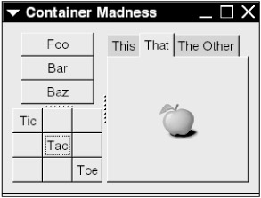
Figure 3.7: Container demonstration.
/* add another page containing an apple image */ page_2_apple = g_object_new(GTK_TYPE_IMAGE, "file", "apple-green.png", NULL); page_2_title = g_object_new(GTK_TYPE_LABEL, "label", "That", NULL); gtk_notebook_append_page_menu(notebook, GTK_WIDGET(page_2_apple), GTK_WIDGET(page_2_title), NULL); /* page 3 contains a button */ page_3_button = g_object_new(GTK_TYPE_BUTTON, "label", "Click me", NULL); page_3_title = g_object_new(GTK_TYPE_LABEL, "label", "The Other", NULL); gtk_notebook_append_page_menu(notebook, GTK_WIDGET(page_3_button), GTK_WIDGET(page_3_title), NULL); /* show the whole thing and start GTK+ main loop */ gtk_widget_show_all(GTK_WIDGET(window)); gtk_main(); return 0; }
All container classes have GtkContainer as a superclass (class identifier: TK_TYPE_CONTAINER ). You have seen
gtk_container_add( container , widget )
from this class; all of the examples so far use it to pack a widget into the ain window.
| Note | Use gtk_container_add() only with simple containers such as GtkWindow and GtkFrame . The more complex containers need more parameters and therefore have their own packing functions. |
To remove a widget from a container, use
gtk_container_remove(container, widget)
| Warning | Taking a widget out of its container usually leads to the widget's destruction, because the container held the only (previously floating) reference to the widget object. Obtain a new reference for the widget object if you want to save it. |
The gtk_container_add_with_properties() function is a convenience function that allows you to place a widget in a property like gtk_container_add() , but allows a NULL - terminated list of property and value pairs for the widget (the syntax for the list is the same as for g_object_set() ).
If you need to run the same function on many widgets at once, one particularly useful utility is
gtk_container_foreach( container , callback_function , data )
This runs the GtkCallback function callback_function on all of the widgets inside container . The callback takes a widget and data as its parameters; the type definition is as follows:
typedef void (*GtkCallback) (GtkWidget *widget, gpointer data);
All objects derived from the GtkContainer class have these two properties:
-
border-width ( gint ): The border width of the container, in pixels. If this value is zero, packed widgets extend to the very edge of the container.
-
child ( GtkWidget , write-only): Writing a widget to this property packs it into the container. Therefore,
g_object_set( container , "child", widget , NULL)
is identical to
gtk_container_add( container , widget )
3.4.1 Boxes
Whether a horizontal box ( GtkHBox , GTK_TYPE_HBOX ) or a vertical box ( GtkVBox , GTK_TYPE_VBOX ), all boxes has the same purpose: to arrange widgets in a line.
These two functions pack a widget into a box:
gtk_box_pack_start( box, widget, expand, fill, padding ) gtk_box_pack_end( box, widget, expand, fill, padding )
The parameters for both functions are
-
box ( GtkBox * ): The container widget.
-
widget ( GtkWidget * ): The widget to pack into box .
-
expand ( gboolean ): Indicates whether the widget should try to center itself over any remaining free space in the box. This does not have any effect on the widget's size (see fill , described next). The box divides its free space among the widgets packed with this parameter set to TRUE .
-
fill ( gboolean ): When TRUE , the widget actually grows to cover the free space, rather than float over it. This will not work unless you set expand to TRUE .
-
padding ( guint ): The pixel count of free space to keep on each side of the widget.
The gtk_box_pack_start() function packs a widget at the front of the box. All widgets previously packed into the box with this function still appear in front of any new widget. gtk_box_pack_end() is a similar function for packing at the end of acontainer.
| Note | In a VBox, the start of the container is the top. In an HBox, it's usually the left side, but don't always assume this. If a user's locale sets a language where the writing goes from right to left, the horizontal widgets are likely to be reversed . |
If you don't feel like typing all of the parameters for these two packing functions all of the time, use these two functions:
gtk_box_pack_start_defaults( box , widget ) gtk_box_pack_end_defaults( box , widget )
These are like their counterparts described earlier, but set fill and expand to TRUE , and padding to 0.
The GtkBox class has two properties:
-
spacing ( gint ): The distance between packed widgets (in pixels). Keep in mind that this is in addition to any padding that you add when packing the widgets.
-
homogeneous ( gboolean ): If TRUE , widgets inside the box become (and stay) the exact same size.
The button box classes ( GtkHButtonBox and GtkVButtonBox , class type identifiers GTK_TYPE_HBUTTON_BOX and GTK_TYPE_VBUTTON_BOX ) have the same methods and properties as normal boxes. There is one additional GtkButtonBox property that gives you finer control of how the box arranges the buttons: layout-style . Its value is one of the following:
-
GTK_BUTTONBOX_DEFAULT_STYLE : The default layout; like a regular box.
-
GTK_BUTTONBOX_SPREAD : The box spreads the buttons across its space at equal intervals. There is a half-interval at each end.
-
GTK_BUTTONBOX_EDGE : Like the preceding, but with no space at each end.
-
GTK_BUTTONBOX_START : The box groups the buttons at the beginning of its space.
-
GTK_BUTTONBOX_END : The box groups the buttons at the end of its space.
Container Child Properties
When you pack a widget into a GtkBox container, the widget obtains some child properties that control how it appears in the box. However, these are not regular GObject properties; you need to use special functions to retrieve and set the values.
The child property access functions rely on the GValue system (see Section 2.4.2):
void gtk_container_child_get_property (GtkContainer * container , GtkWidget * child , const gchar * property_name , GValue * value ); void gtk_container_child_set_property (GtkContainer * container , GtkWidget * child , const gchar * property_name , const GValue * value );
The preceding child property functions require that value be an allocated and initialized GValue . This example with the padding child property should give you the idea:
GValue *value; /* initialize value */ gv = g_new0(GValue, 1); g_value_init(gv, G_TYPE_INT); /* get current child property padding value */ gtk_container_child_get_property( container , widget , "padding", gv); /* set padding value to a ludicrous value */ g_value_set_int(gv, 100); gtk_container_child_set_property( container , widget , "padding", gv); g_free(value);
Here are the GtkBox child properties:
-
expand ( gboolean ): See the expand parameter described earlier.
-
fill ( gboolean ): See the fill parameter described earlier.
-
padding ( guint ): See the padding parameter described earlier.
-
pack-type ( GtkPackType ): The side where the widget was packed; possible values are GTK_PACK_START and GTK_PACK_END .
-
position ( gint ): The position of the widget in the box ( positions start at 0).
A child of a GtkButtonBox widget receives an additional secondary child property (type: gboolean ). When TRUE , the widget appears at the other side of the button box. Help buttons and the like often get this treatment.
3.4.2 Tables
An object of the GtkTable class is essentially a bounded two-dimensional box. The example in Section 3.4 showed that tables have n-rows and n-columns properties for the number of rows and columns in the table.
After you create a table, you can use it as a container. Naturally, it's not a good idea to arbitrarily pack widgets into the table. You can assign a widget to a specific table cell, and you can also tell it to span rows and columns. The function for inserting a widget into a table is
gtk_table_attach( table , widget , left_attach , right_attach , top_attach , bottom_attach , xoptions , yoptions , xpadding , ypadding )
The arguments are as follows:
-
table ( GtkTable * ): The target GtkTable widget.
-
widget ( GtkWidget * ): The widget to insert into table .
-
left_attach ( guint ): The column index for the widget's left side. A table's first column and row index is 0.
-
right_attach ( guint ): The column index for the widget's right side. If you don't want to span columns (that is, you want only one column), use left_attach+1 .
-
top_attach ( guint ): The row for the widget's top side.
-
bottom_attach ( guint ): The row for the widget's right side. If you don't want to span rows, use top_attach+1 .
-
xoptions ( GtkAttachOptions ): Bitwise ORed options for layout in the horizontal direction. Choose from the following:
-
GTK_EXPAND : Distribute widgets with this option evenly across the available space. This is similar to the expand parameter you saw for boxes in Section 3.4.1.
-
GTK_FILL : In conjunction with the preceding option, the widget should grow to occupy the available space. This is also similar to the fill GtkBox parameter.
-
GTK_SHRINK : If there isn't enough space for the widget, the table will attempt to shrink the widget.
-
-
yoptions ( GtkAttachOptions ): Like xoptions , but for layout in the vertical direction.
-
xpadding ( guint ): The number of pixels to reserve on the widget's left and right sides.
-
ypadding ( guint ): The number of pixels to reserve on the widget's top and bottom sides.
After you insert a widget into a table, the widget gets most of the parameters just described as child properties. The property names are left-attach , right-attach , top-attach , bottom-attach , x-options , y-options , x-padding , and y-padding .
GtkTable containers also have these properties:
-
column-spacing : The number of pixels between columns.
-
row-spacing : The number of pixels between rows.
-
homogeneous : If this gboolean property is TRUE , all columns should be of equal width, and all rows should have equal heights. In other words, all cells that don't span rows or columns should be the same size.
3.4.3 Paned Widgets
A paned widget is a container with two sides; each side holds a child widget. A user-adjustable slider bar divides the panes. On a GtkHPaned ( GTK_TYPE_HPANED ) widget, a vertical slider divides child widgets in the left and right panes, and a GtkVPaned ( GTK_TYPE_VPANED ) widget has a horizontal slider with child widgets above and below. If you have trouble associating the names with the correct orientation, forget about the sliders and think of them as boxes.
To place widgets into a paned container, use these functions:
gtk_paned_add1( paned , widget ) gtk_paned_add2( paned , widget )
gtk_paned_add1() places a widget into the left or top of the container, and gtk_paned_add2() packs widgets into the right or bottom. The only two arguments to these functions are the container and its new child widget, as you saw in Section 3.4's example program.
If you need some control over the size of the child widgets, use these two instead:
gtk_paned_pack1( paned , widget , resize , shrink ) gtk_paned_pack2( paned , widget , resize , shrink )
Here, resize and shrink are Boolean values. If resize is TRUE , the paned container may resize the widget. If you set shrink to TRUE , the user may shrink the widget as desired with the slider bar, but if it is FALSE , you cannot make the widget smaller than its requested minimum size.
The parent class of the two paned container types ( GtkPaned ) defines two properties:
-
position ( gint ): The position of the slider bar, represented as the number of pixels from the left or top edge of the container.
-
position-set ( gboolean ): Set this property to TRUE if you want to change the slider position with the position property.
3.4.4 Notebooks
A notebook container ( GtkNotebook , GTK_TYPE_NOTEBOOK ) consists of several pages with tabs. When you click a page's tab, the page comes to the foreground, and you can work with any widgets on the page. You can also assign a context menu to the tabs; when you right-click a tab, you get a menu of the tabs.
After you create a notebook, you can add pages with several functions. Among the most verbose of these is
gtk_notebook_append_page_menu( notebook , widget , tab_label , menu_label )
The parameters are
-
notebook ( GtkNotebook * ): The container widget.
-
widget ( GtkWidget * ): The widget to put in the main part of the new page.
-
tab_label ( GtkWidget * ): The label for new page's tab.
-
menu_label ( GtkWidget * ): A label for the notebook's context menu. If you set this to NULL and tab_label is a GtkLabel widget, GTK+ uses that latter label for the context menu. Keep in mind that context menus are off by default; set the container's enable-popup property to activate them (as described later in this chapter).
| Note | You can put just about any kind of widget in a page's tab, but the only one that really makes any sense is a label. |
If you don't care about the menu, use
gtk_notebook_append_page( notebook , widget , tab_label )
Here are some other ways to add pages:
-
gtk_notebook_prepend_page_menu() is like its appending counterpart described earlier, but inserts the page at the front of the notebook rather than the end.
-
gtk_notebook_prepend_page() works like the preceding function, but has no menu label parameter.
-
gtk_notebook_insert_page_menu() has a fifth argument: where to insert the new page. The front of the notebook is at index 0.
-
gtk_notebook_insert_page() works like the preceding function, but has no menu label parameter.
To remove a page from a notebook, use
gtk_notebook_remove_page( notebook , page_number )
Notebook properties include
-
tab-pos (enumeration): The tab location; one of
-
GTK_POS_LEFT
-
GTK_POS_RIGHT
-
GTK_POS_TOP
-
GTK_POS_BOTTOM
-
-
show-tabs ( gboolean ): If FALSE , the notebook has no tabs.
-
show-border ( gboolean ): Enables or disables the border.
-
scrollable ( gboolean ): If TRUE , the notebook creates a scrolling tab list when there are too many tabs to display.
-
tab-hborder ( guint ): Controls the border thickness on the left and right sides of a tab's label.
-
tab-vborder ( guint ): Controls the border thickness above and below a tab's label.
-
tab-border ( guint , write-only): Controls the border thickness around a tab's label.
-
page ( gint ): Controls the current page index.
-
enable-popup ( gboolean ): Enables or disables context menus that appear when you right-click a tab.
-
homogeneous ( gboolean ): If TRUE , all tabs have the same width.
A widget packed into a notebook takes on these child properties:
-
tab-label ( gchararray ): The text of the tab's label.
-
menu-label ( gchararray ): The text of the widget's context menu label.
-
position ( gint ): The widget's page position in the notebook.
-
tab-expand ( gboolean ): If TRUE , the tab centers itself over open space.
-
tab-fill ( gboolean ): In conjunction with tab-expand , if TRUE , the tab grows to fill the open space.
-
tab-pack (enumeration): Indicates where you packed the page into the notebook; possible values are GTK_PACK_START and GTK_PACK_END .
3.4.5 Alignment Containers
If you want finer control of the placement and proportions of a widget, place it in a GtkAlignment ( GTK_TYPE_ALIGNMENT ) container. The container's properties are all gfloat values:
-
xalign : The horizontal alignment of the child widget. The values 0.0, 0.5, and 1.0 specify left justification, centered, and right justification, respectively.
-
yalign : The vertical alignment of the child widget. The values 0.0, 0.5, and 1.0 specify top, center, and bottom, respectively.
-
xscale : The horizontal scale of the child widget if the container has more space than the child needs. The value 0.0 means that the child should not grow at all if space is available, and the value 1.0 means that the child should use all available space.
-
yscale : Like the preceding, but for the vertical scale.
| Note | You will frequently encounter properties with names like xalign and yalign in other widget classes; they control alignment in the same manner as a GtkWidget container. |
3.4.6 Sensible Widget Arrangement
At this point, you should have a pretty good idea of how you can use containers to lay out your widgets. When it comes to how you should arrange them, the GNOME guidelines have some tips on how to achieve consistency, clarity, and legibility:
-
Layouts should run top to bottom and right to left, starting at the top left corner, at least for applications in languages that write left to right.
-
Use 3 as border-width in tables and boxes. In addition, set the distance between the elements inside ( spacing ) to 3 pixels.
-
Specify other distances between widgets in multiples of 6:
-
6 pixels between an icon and its label.
-
12 pixels between other widgets and their labels.
-
12 pixels of free space around the contents of a dialog box.
-
18 pixels between vertically arranged widgets.
-
-
If you align, indent, and group with distance, the result is usually a lot easier to look at and understand than something using visible frames , divider lines, and other fencelike elements.
EAN: 2147483647
Pages: 108
- Chapter III Two Models of Online Patronage: Why Do Consumers Shop on the Internet?
- Chapter IX Extrinsic Plus Intrinsic Human Factors Influencing the Web Usage
- Chapter X Converting Browsers to Buyers: Key Considerations in Designing Business-to-Consumer Web Sites
- Chapter XI User Satisfaction with Web Portals: An Empirical Study
- Chapter XVI Turning Web Surfers into Loyal Customers: Cognitive Lock-In Through Interface Design and Web Site Usability