Configuring Your Portal
The Control Panel
The Control Panel is primarily a palette of shortcuts for frequently used tasks, most of which are accessible from other pages through the Admin menu. In DotNetNuke version 3.0 and later, the Control Panel, an ICONBAR, is divided into three main sections: Page Functions, Add New Module and Add Existing Module, and Common Tasks (see Figure 4-3).
![]()
Figure 4-3
In DotNetNuke version 2.1, the Classic Control Panel had far fewer functions and a much thinner profile (see Figure 4-4). That version of the Control Panel is still an option in version 4.0 at the discretion of the Host. It's discussed briefly before the enhanced version is covered in more detail.
![]()
Figure 4-4
The main differences between the Classic and ICONBAR versions of the Control Panel are the addition of extra Page Functions, extra Add Module options, and Common Tasks. These differences are pretty straightforward and become more obvious as you move along. The only other difference is the deprecation of the Content check box.
| Note | In version 2.1, ill behavior of a poorly written module could result in a rather nasty error message that would keep a module from being displayed. In that case, it was virtually impossible for a Portal Administrator to remove the offending module. The Content check box provided a way to instruct modules not to display their content, which preempted the nasty error message and gave the Portal Administrator access to the modules settings where it could be deleted from the page. This condition rarely exists in versions after 2.1, so the Content check box does not appear on the ICONBAR version of the Control Panel. However, in the event that a seriously flawed module causes such behavior, the Classic Control Panel can be reinstated to leverage this functionality. |
The only functions on the Control Panel that can't be accessed through other navigation are the Site Wizard, Help, and Preview.
The Site Wizard
A slick addition to version 3.0 and later versions is the Site Wizard, which is the quickest way to make the most common customizations for those new to managing their own DotNetNuke web site. It walks you through a short conversational process, step by step, with extensive help and the ability to cancel at any time without saving the changes. Standard navigational controls appear on each page of the wizard for Back, Next, Finish, Cancel (without saving changes), and Help.
Clicking the Wizard button in the Control Panel takes you to step 1.
Step 1: Choose a Template for Your Site
The optional first step (see Figure 4-5) gives you the choice of applying a template to your portal. The purpose of a template is to add predefined functionality and content (pages, modules, and so on) to your site. For example, a Host might provide a variety of commonly used templates to jumpstart your club web site, family web site, small business web site, and so on.
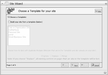
Figure 4-5
| Important | For advanced users and developers, templates provide a powerful mechanism for sharing predefined portal functionality. Templates can carry rich information including portal settings, security roles, pages, modules, permissions, and so on. Template creation is a function available to Host Administrators (see Chapter 5). |
Clicking the check box for Build Your Site From A Template (Below) enables the list of available templates (see Figure 4-6). Select a template from the list by clicking it. If you do not want to apply a template to your site, simply leave the check box empty.
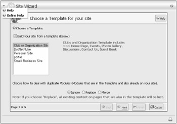
Figure 4-6
Radio buttons at the bottom of the page tell the wizard how to handle any conflicts that might be come up during the application of a template. A conflict is encountered when an existing component in your site matches a component that is also specified in the template (for example, when a module's title matches that of a module specified in the template). Table 4-1 summarizes the effects of each choice.
| Option | Description |
|---|---|
| Ignore | If a module of the same name and type as the one in the template already exists, the template definition is ignored. |
| Replace | If a module of the same name and type as the one in the template already exists, it is replaced by the definition in the template. |
| Merge | If a module of the same name and type as the one in the template already exists, the content is appended to the existing module content. |
| Note | Site templates are additive. This means that when you apply a template, it incorporates those elements specified in the template into your existing web site. A template does not remove existing pages, modules, or content except as part of resolving a conflict. This is a mechanism developed to help prevent important content from being overwritten in your portal. |
Select the option that best suits your needs. If you are beginning with a new (or empty) portal, the Replace option is most appropriate. Remember, you can click the Help button at any time for assistance.
Click Next to move on to step 2.
Step 2: Select a Skin for Your Site
Step 2 is where the fun begins. DotNetNuke has powerful skinning capabilities that enable administrators to choose how their site should look. Scroll though a list of the skins that are available and select the look you want applied to your site. If the author of the skin has provided an image for preview, it is displayed in a thumbnail format (see Figure 4-7). Click the thumbnail to view a larger image.
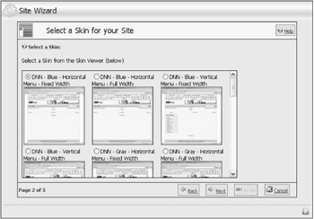
Figure 4-7
The skin you select is applied by default to any page that you add to your site. You'll be able to override that choice if you want, which is explored a bit later in this chapter. For now, just know that you'll be able to customize the look of other pages if you want to, even though you have chosen a default for all new pages here.
| Note | DotNetNuke comes preinstalled with several variations on its default skin. You can choose a version with vertical or horizontal menus, which display in fixed width or variable (browser) width and in any of five available colors (Blue, Gray, Green, Red, or Yellow). If your Host has enabled the option for your portal, you can upload additional skins that you can obtain from a variety of sources or that you can create yourself. |
When you have selected the default skin for your site, click Next.
| Note | Chapter 16 includes detailed information on how to create and package your own skins. |
Step 3: Choose a Default Container for Your Site
In step 3, you choose a default container (see Figure 4-8). That container is automatically applied to every new module that you add to your pages. Just like with your default skin, you'll be able to override that choice if you need to display the module in another container. A good rule of thumb is to choose a container that you will use for the majority of the modules on your site and then set the individual exceptions as explained in Chapter 3. This also helps with the workload if you later decide to change the look of your site with a new skin because you won't have as many containers to update for your new design.
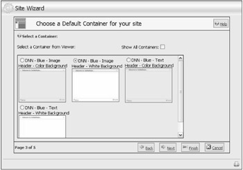
Figure 4-8
The container choices displayed in the wizard represent those that have been specifically packaged for the skin you chose in the previous step. Because a DNN - Blue skin was chosen for this example, the container choices are DNN - Blue also. However, clicking the Show All Containers check box at the top of the page displays all available containers for every skin that is available to you, so if you want to apply a yellow container as the default with the blue skin, you are free to do so.
| Note | DotNetNuke comes preinstalled with several variations on its default containers for each skin. You can choose a version with complementary background shading or white shading for the content area and image or text headers. Image headers provide a gradient fill image as the background for the module title, whereas text headers leave the background alone, matching the content area shading. |
After you select the default container for your site, click Next. (At this point the wizard has enough information to display your site if you want to stop, so you could click Finish. However, for the purpose of this chapter, go on to the next step of the wizard.)
| Note | You can find detailed information on how to create and package your own containers in Chapter 16. |
Step 4: Add Site Details
Every page in your site has a few simple attributes that help to identify it to web browsers and other services on the Internet, such as search engines. The Add Site Details page (see Figure 4-9) enables you to provide the necessary information.
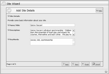
Figure 4-9
Table 4-2 lists each field and describes how its value affects your portal.
| Field | Description |
|---|---|
| Name/Title | Used in several places in the portal operation. Most notably, it's displayed in the title bar of the user's browser window. It is also used to refer to your portal in outgoing mail for user registration, password reminders, and so on. |
| Description | The default value to populate the HTML META tag for DESCRIPTION in each page of your site. This tag is important because it provides search engines such as Google, Yahoo, and MSN with an informative description of your site (or page). The value can be set for each page individually; however, if it is omitted, this default description is used. |
| KeyWords | Keywords are also used as a default value to populate the HTML META tag for KEYWORDS in each page of your site. This tag can be useful to help improve search engine placement. Keywords and/or phrases are separated by commas. The value can be set for each page individually; however, if it is omitted these default keywords will be used. |
When you have finished adding details for your site, click Next. (At this point, so you could click Finish. However, for the purpose of this chapter, go on to the next step of the wizard.)
Step 5: Choose a Logo
Step 5 is also optional. It invites you to select or upload an image for your logo (see Figure 4-10). For the default skins provided with DotNetNuke, the logo will appear in the upper left corner of the browser window. For this example, leave the logo unspecified.
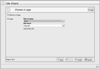
Figure 4-10
| Note | Custom skins may place your logo in another location or ignore it altogether (that's a skin designer's choice). You'll want to make sure your logo design matches any new skin that you choose. |
The File Location and File Name drop-down lists provide a simple way to locate the available files in your portal's root directory. Changing the File Location changes the list of files available (only web-friendly image files are listed). If your logo file is on your local computer and not your site, you can choose to upload it by clicking the Upload New File button. The page refreshes to reveal a standard upload control (see Figure 4-11). You still specify the File Location so the control will know in which subdirectory to store the image file. Click Save Uploaded File to get the file from your local computer to your portal, or click Select An Existing File to return to the previous selector.
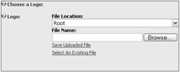
Figure 4-11
After you select the logo for your site, click Finish.
Now that you have completed the Site Wizard, take a look at your newly configured web site by navigating to any page (try clicking the Home menu item). Because you applied the Club or Organization Site template in step 1, the site now has some additional pages and example content instead of the empty web site that you began with. You can see the sample Gallery page in preview mode in Figure 4-12.
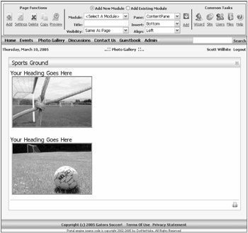
Figure 4-12
The Help Button
The Help button is a link that is configured by your Host (see Chapter 5). In the default installation, the link is configured to open the default help page at dotnetnuke.com. Your Host may opt to direct this link to another site that contains help that is more personalized or relevant to your specific hosting plan.
| Note | DotNetNuke has plenty of built-in help for its administrative functions. But the Help button gives Hosts some capability to create help completely customized for their (and your) purposes and put it right at your fingertips. For example, a Host-provided help site might have specific information related to customized templates available through the Site Wizard. |
The Preview Button
The Administrator's view of the site differs from a regular user's view because of the need to see skin panes, edit icons, module actions, and so on. But sometimes you just need to know how things are going to look to a non-administrative user — that's what the Preview button on the Control Panel is for.
When you click the Preview button, you will notice two things. First, your view of the portal (below the Control Panel) changes: the pane definitions and the edit options vanish. Second, the Preview button icon changes (a plus becomes visible under the magnifying glass) to indicate that you are in Preview mode.
It can be easy to forget that you are in Preview mode, so make sure you toggle this setting back off when you no longer need it.
EAN: 2147483647
Pages: 182