Chapter 9: Styles
|
| < Day Day Up > |
|
Overview
I’ve found that most people avoid using styles until they absolutely must. Then, when they finally learn how to use them, they are so upset about not having learned about them before.
If you are creating templates, I’d like you to consider the following before you begin:
Just a few things to keep you out of trouble when creating templates for your documents and manuals.
Use “safe” fonts as described on page 6-2 for all documents that may be sent electronically.
Don’t use character styles. Many people like to format some of their headings within the paragraph. Unfortunately, this requires not only a paragraph style, but also a character style. You will have to apply the style to the paragraph and then manually select the heading name to format it with a character style.
See Figure 9-1.
![]()
Figure 9-1: Troublesome Heading Format
Instead, use a layout like the one shown in Figure 9-2. While it may take more paper, it will save you lots of time, particularly if you create lots of documents using this layout.
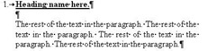
Figure 9-2: Better Alternative Heading Format
Unfortunately, many people are stuck with certain layouts, such as government and legal documents, but if you have anything to say about it, you can save tons of work this way.
Don’t use tables to set your headings to the left of the paragraph text, such as shown in Figure 9-3 unless you must.
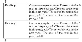
Figure 9-3: Troublesome Heading Format
Instead, set your headings to be aligned to the left margin and your paragraph text to be indented, as shown in Figure 9-4.
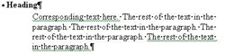
Figure 9-4: Better Alternative Heading Format
When creating styles for column layouts, where the column may be only a few inches wide, don’t justify your text. See Figure 9-5.
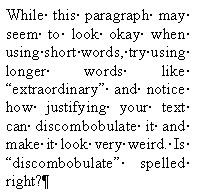
Figure 9-5: Troublesome Justification in Columns
Left justifying thin columns just seems to work a bit better, as shown in Figure 9-6.
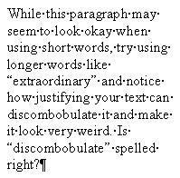
Figure 9-6: Better Justification in Columns
For the same reasons, inserting clipart with justified text wrapped around it can look pretty bad. I recently saw a book that had text wrapped around a graphic, and it looked something like Figure 9-7.
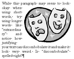
Figure 9-7: Troublesome Justification with Pictures
Notice how the word “extraordinary” gets separated. While you can turn on automatic hyphenation, it still breaks the word and does not look nice.
The best way is to just avoid thin columns or avoid placing your graphics along side of the text. Insert it between paragraphs instead.
When the boss tells you that they want the layout a certain way, argue for the methods that will save you time. Money talks, and the boss will want to know that it’ll save you lots of time to use your methods. Remember: 10 minutes each workday = one week per year.
|
| < Day Day Up > |
|
EAN: 2147483647
Pages: 130