Section 9.3. WHAT THIS MEANS FOR DESKTOP APPLICATIONS
9.3. WHAT THIS MEANS FOR DESKTOP APPLICATIONSThose of you who work on web sites might already be familiar with everything discussed so far. People expect web sitesand by extension, web applicationsto have strong graphic styling, and you will rarely find them looking completely plain and neutral. But what if you work on desktop applications? If you try to apply these principles just to the controls' look-and-feelhow the controls are drawnyou don't have many choices. Java applications get to choose from a few look-and-feel options, most of which are native looking or fairly neutral (like Swing's Metal look-and-feel). Linux applications have some nice choices, too, such as GNOME's application themes. But native Windows or Mac applications generally use the standard platform look-and-feel, unless you're willing to work hard to develop a custom one. Given the situation, you can be forgiven for just using the platform look-and-feel standards, and concentrating your graphic design attentions elsewhere. But some applications now look more "webbish" or "designery" than they used to, and they generally look better for it. Microsoft Money 2000 was one of the first mainstream applications to break the mold. Its designers chose to use background images in the top margins, gradient fills, anti-aliased headline fonts, and an unusual color scheme. Other applications have since done similar things. Winamp, as another example, has used creatively-designed skins for a long time; now most other media players have very distinctive looks, too. Even if you do use a neutral look-and-feel for your actual widgetry, there still are ways to be creative.
The biggest danger here is accessibility. Operating systems like Windows let users change desktop color/font themes, and that's not just for funvisually impaired users use desktop themes with high-contrast color schemes and giant fonts just so they can see what they're doing. Make sure your design works with those high-contrast themes. It's the right thing to do.[4]
Along the same lines, you might replace ordinary text labels with images containing unusual fonts, maybe with halos, or drop-shadow effects, or complex backgrounds. This is common in web pages. If you insist on using an image for text, you need to provide enough information with that image to let a screen-reader like JAWS read it aloud. (How exactly you do that depends entirely upon the UI technology you're using.) Another danger is fatiguing your users. If you design an application meant to be used at full size or for a long time, then tone down the saturated colors, huge text, high contrast, and eye-catching texturesmake the design quiet, not loud. More importantly, if your application is meant to be used in high-stress situations, like a control panel for heavy machinery, strip out anything superfluous that might distract users from the task. Here, cognitive concerns are far more important than aesthetics. That said, I hope this discussion gives you some ideas about how to make your desktop UI a little more interesting. Figure 9-11 gives you some examples of controls with custom look-and-feels that still are relatively usable. Figure 9-11. Some nonstandard (but usable) controls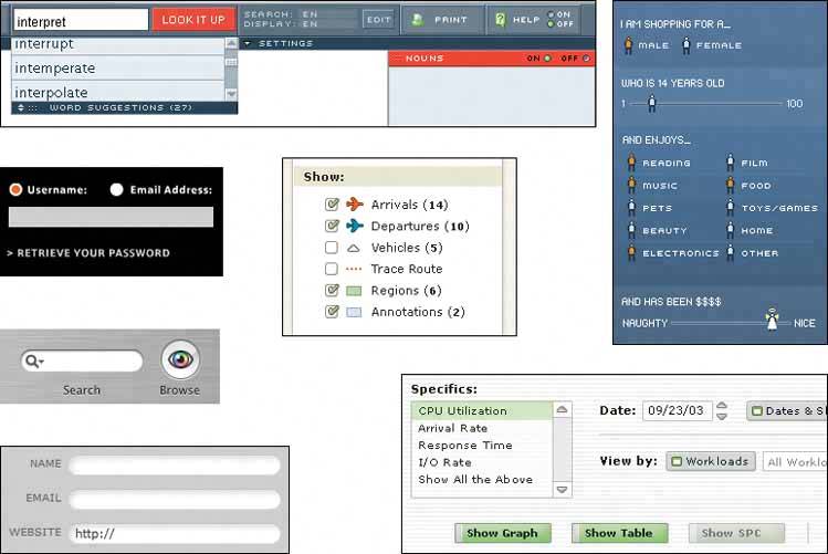 |
EAN: 2147483647
Pages: 75