9.4. THE PATTERNS All of these patterns except Skins draw on the concepts described in the introduction. They talk about specific ways to apply those concepts; Corner Treatments, for instance, captures one kind of repeated visual motif, and Borders that Echo Fonts captures another. Deep Background touches on texture choice, but so does Hairlines, and fonts are discussed in Contrasting Font Weights. Deep Background Few Hues, Many Values Corner Treatments Borders that Echo Fonts Hairlines Contrasting Font Weights
The Skins pattern is different. It deals more with meta-designit says nothing about how you design the skin or look-and-feel of your application, but it does address how you design your application to let others replace your look-and-feel with their own designs. 88. deep background Figure 9-12. Mac OS X desktop 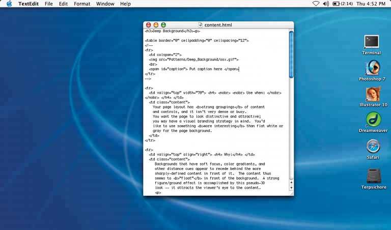
9.4.1.1. what Place an image or gradient into the page's background that visually recedes behind the foreground elements. 9.4.1.2. use when Your page layout has strong visual elements (such as text blocks, groups of controls, or windows), and it isn't very dense or busy. You want the page to look distinctive and attractive; you may have a visual branding strategy in mind. You'd like to use something more interesting than flat white or gray for the page background. 9.4.1.3. why Backgrounds that have soft focus, color gradients, and other distance cues appear to recede behind the more sharply defined content in front of it. The content thus seems to "float" in front of the background. This pseudo-3D look results in a strong figure/ground effectit attracts the viewer's eye to the content. Fancy explanations aside, it just looks good. 9.4.1.4. how Use a background that has one or more of these characteristics:
Soft focus -
Keep lines fuzzy and avoid too much small detailsharp lines interfere with readability of the content atop it, especially if that content is text or small icons. (You can kind of get away with sharp lines if they are low-contrast, but even then, text doesn't work well over them.)
Color gradients -
Bright, saturated colors are okay, but again, hard lines between them are not. Allow colors to blend into each other. In fact, if you don't have an image to use in the background, you can create a simple color gradient in your favorite drawing toolit still looks better than a solid color. (You don't need to store or download pure gradients as images, either. On the Web, you can create them by repeating one-pixel-wide strips, either horizontally or vertically. In systems where you can use code to generate large areas of color, gradients generally are easy to program.)
Depth cues -
Fuzzy detail and vertical color gradients are two features that tell our visual systems about distance. To understand why, imagine a photograph of a hilly landscapethe farther away something is, the softer and hazier the color is. Other depth cues include texture gradients (features that get smaller as they get farther away) and lines radiating from vanishing points.
No strong focal points -
The background shouldn't compete with the main content for the user's attention. Diffuse (weak) focal points can work, but make sure they contribute to a balanced composition on the whole page, rather than distract the viewer from seeing the parts of the page they should look at instead. See Figure 9-13. As you design an interface with a deep background, consider what happens when the user changes the size of the page. How will the background accommodate a larger (or smaller) size? Will it rescale to fit, or will the window just clip an unscaled image? Clipping is probably less unsettling to the user; it's how most web pages behave, and it feels more stable. Besides, you don't have to worry about changing aspect ratios, which is problematic with many images. Figure 9-13. Diffuse versus strong focal points 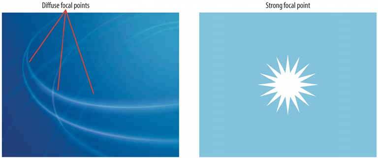
Figure 9-14. The Netscape 7 look-and-feel shows the use of gradient-based sculpturing behind UI controls. The gradient works well with other visual featuresbarely-visible drop shadows, contouring around the "Home" and "Radio" buttons, and even the shading in the etched group box around the Search field and buttonto create a finished "two-and-a-half-D" look. 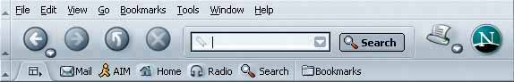
Figure 9-15. The Mercedes-Benz web site uses an image as a background. This image has some very strong focal pointsthe cars, of courseand they are the central feature of the page. But the outer parts of the image, which are much softer, are deep backgrounds for other content: the search box, the four small images at bottom, and the "4MATIC All-Wheel Drive" tagline.
The most interesting aspect of this figure is the darker band running down the lefthand side. The site needed a navigation bar with small text, but layering those links directly over the background image wouldn't have workedthe words may have been unreadable over small detail, and would have gotten lost in the composition. A translucent smoked-glass background highlights those white links by increasing contrast; it balances the page (which otherwise is right-weighted); it doesn't obscure the nice background image; and it adds a sense of layered depth. See http://www.mbusa.com/brand/index.jsp. 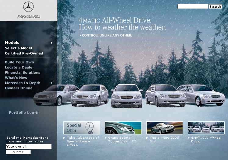
89. few hues, many values Figure 9-16. From http://thebanmappingproject.org 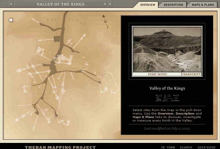
9.4.2.1. what Choose one, two, or at most three major color hues to use in the interface. Create a color palette by selecting assorted values (brightnesses) from within those few hues. 9.4.2.2. use when You decide on a color scheme for an application or site. You want to avoid a flashy, rainbow-colored, "angry fruit salad" look, but you still want the interface to have some character. 9.4.2.3. why Where colors are concerned, sometimes less is better. Too many color hues scattered throughout the interface, especially when they're bright and saturated, make a design noisy and cluttered. The colors compete for the user's attention. But when you use many subtle variations on a single color, you can create a design that has depth and dimension. Consider the gray and brown colors used in the example above, reproduced in the color strip below (Figure 9-17). Notice how the darker and grayer shades appear to recede, and the lighter and brighter tints appear to move forward. This contributes to the pseudo-3D effectssuch as beveling, drop shadows, and gradientsthat form the contours of the UI. Figure 9-17. The two hues used in the Theban Mapping Project UI 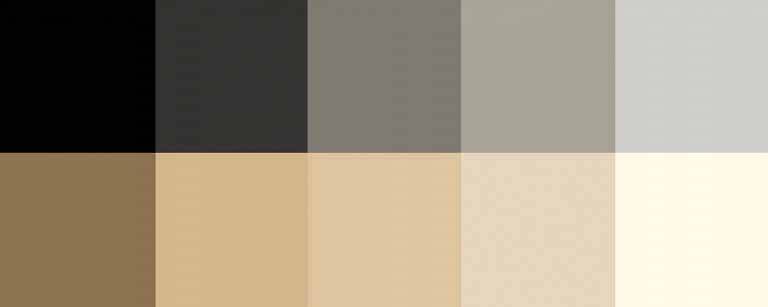
9.4.2.4. how As mentioned earlier, pick one, two, or even three main hues. You get black and white for free, but gray counts. In fact, gray works very well in multiple values and brightnesses; it's a versatile color, especially if you add a little color to make it more blue (cool), or more beige (warm). Within those hues, vary the color value to get a range of bright and dark shades. You also can vary the saturation at the same time; this can produce more subtle color combinations than you would get by varying just the value. Use as many of these colors as you want to compile a color palette for the application. You can, of course, use other colors in the interface besides these hues. Just use them sparingly. Icons, ads, and other features that take up relatively small spaces don't have to fit this restricted color scheme. You might want to choose only one or two accent colors, too, like using red or cyan to mark points of interest. In fact, using a single hue for the "background" of the UI actually emphasizes these minor colors because they don't get lost in a sea of color hues. 9.4.2.5. examples Figure 9-18. This graph uses two hues, blue and pink, to show its data. Blue represents boys' names, and pink represents girls' names. Within those colors, the color value represents the popularity of those names in 2003. A third color, dark gray, shows the frame around the datathe grid lines, the numbers, and the titleand a dark blue highlights the selected name ("Dale").
This color combination is very effective, both cognitively and aesthetically. The hues and values mean something with respect to the data, and the coding is very easy to followyou hardly even need the legend once you've looked at it once. Aesthetically, the whole thing has a layered richness that isn't garish, as rainbow hues would have been. And in American culture, people understand light blues and pinks as "baby" colors, so the emotional and cultural connection is there too. See http://babynamewizard.com. 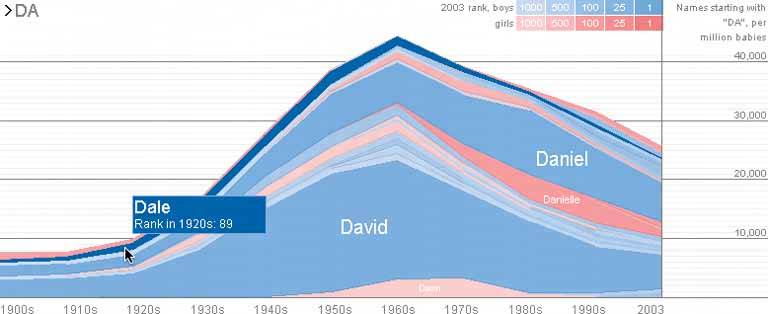
Figure 9-19. Even a single hue can produce designs with subtlety and interest. Here are two monochromatic examples from the CSS Zen Garden. (The green one technically has several green hues in it, some more yellowish than others, but the viewer's impression is of a single color.) 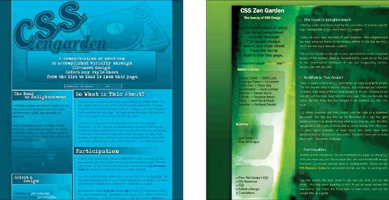
90. corner treatments Figure 9-20. Rounded corners on http://starbucks.com 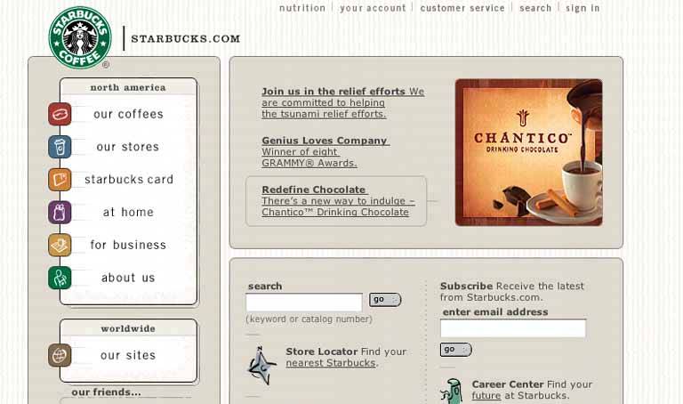
9.4.3.1. what Instead of using ordinary right angles, use diagonals, curves, or cutouts for some of the interface's box corners. Make these corner treatments consistent across the interface. 9.4.3.2. use when The interface uses rectangular elements, such as boxes, buttons, and tabs. 9.4.3.3. why The repetition of visual motifs helps unify a design. When you devise a single "corner" motif and use it consistently in many places, it gives a distinctive look to the whole design. It's certainly less boring than ordinary right-angled corners. 9.4.3.4. how Many web sites use curved corners. Others use diagonal lines, and a few use cutouts. What you choose depends on the overall look of your sitedo you have a logo, an image, or a font that has eye-catching visual elements to it? Use one of those visual elements. Are you going for something soothing (as curves often are), edgy, or energetic? Try out several different ideas. Not all of the rectangular elements in the interface need to use corner treatmentsdon't use too much of a good thing. But group boxes or panels usually do, and tabs commonly are done this way too. If you use corner treatments on one group box, do them all, for consistency. Furthermore, not every corner on a given box needs to use a corner treatment. Sometimes two opposing corners get it, such as the upper right and lower left. Sometimes it's just one corner, usually the upper left or upper right. Everywhere the element is repeated, make sure it resembles the others. In other words, curved corners should use the same type of curve (though not necessarily the same radius). Angles should be the same angledon't mix a 45-degree angle motif with a 20-degree angle, for instance. 9.4.3.5. examples The Starbucks web site, shown at the top of this pattern, takes advantage of its circular logo by echoing that curve in rectangle corners all over the pagein panel borders, icons, and even the "go" buttons. The overall effect is restful and unified. Figure 9-21. This personal web site uses rounded leaf-like corners as a major design element. Not every corner is rounded, and not every curve has the same radius, but it's still a repeated motif. The design still works. See http://hicksdesign.co.uk. 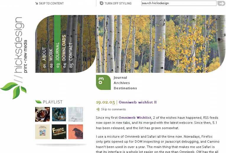
Figure 9-22. This K2 site has an entirely different look. This one uses lime-green borders with angled bottom corners. Notice that most angles are on the lower-right corners, but to the far left, one is on the lower left corner. Also note that the angles are the same as those on K2's logo in the bottom right. 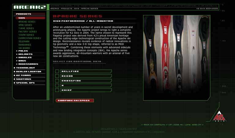
Figure 9-23. Angles can be calm-looking, too. Here are two examples of angled corners used on tabsone on a web page, and one on a desktop application. For tabs, angles make a lot of sensethey allow the tabs to overlap a bit visually without obscuring the entire right or left side of a tab. 
Figure 9-24. Angled tabs from Photoshop 
91. borders that echo fonts Figure 9-25. From http://www.moma.org/exhibitions/2002/brucke/ 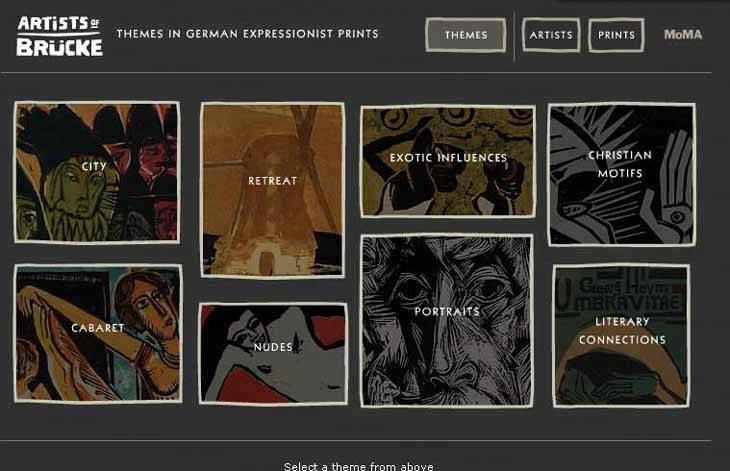
9.4.4.1. what When drawing borders and other lines, use the same color, thickness, and curves used by one of the design's major fonts. 9.4.4.2. use when Your design contains a font carefully chosen for its visual effect, such as the font used in headlines, a title, or a logotype. 9.4.4.3. why The repetition of visual motifs helps unify a design. Fonts and borders work at similar scales in a designonly a few pixels wideand when they reinforce each other visually, their effect is magnified. When they clash (especially if you use many different kinds of borders), their contributions are weakened. 9.4.4.4. how First, pick a font from your design. Title and headline fonts often work well, as do fonts used in logotypes, but sometimes body text works too. Observe its formal properties: color, primary line thickness, texture, curve radius, angles, and spacing. Now try to draw borders and lines that use some of those same properties. The color should be the same as the font's, though you can cheat on thickness and make it a bit thinner than the font's strokes. If the font has pronounced circular curves, as many modern sans-serif fonts do, try using that same curve radius on the border corners. If it's a particularly interesting font, ask yourself what makes it interesting. See if you can pull those visual elements from the font into the rest of the design. You don't need to do this with all the borders in your interface, of course; just a few will do, especially if the lines are thick. Be careful not to make borders too thick or coarse. Thick borders make a strong statement, and after a point, they overwhelm whatever's inside them. Images usually can handle a thicker border than lightweight body text, for instance. You can use single-pixel lines effectively in combination with heavier borders. 9.4.4.5. examples The example at the top of this pattern, Figure 9-25, uses borders that echo the logotype ("Artists of Brücke"). The logotype has a hand-drawn, roughedged look to it. The rest of the UI's text is smooth and tiny; if the thick hand-drawn look hadn't been picked up elsewhere in the design, it wouldn't be such a strong design element. But since the borders work with it in concert, the whole page hangs together visually. It's a nice contrast to the thin smooth fonts and lines. Figure 9-26. You can see this pattern at work in many web sites where modern sans-serif fonts are echoed in thick, solid-color borders. The "Earnings" headline picks up elements of HP's logo fontwhite and four to five pixels thickand the five-pixel white borders pick them up again. Here's something that's hard to see without a magnifier: the vertical lines in the "Earnings" font actually are only three pixels thick, but the font still looks similar to the five-pixel borders. Perception is more important than precision. See http://hp.com. 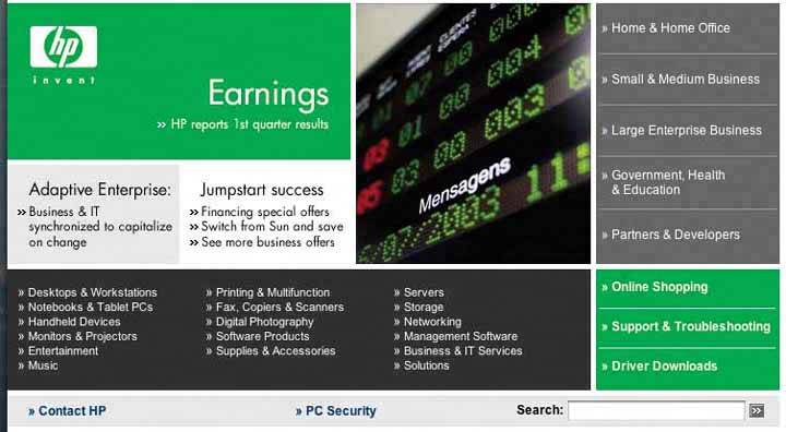
Figure 9-27. This works similarly, though again, the font doesn't exactly match the thickness of the borders. But that's okay. See http://www.planetkaizen.com. 
Figure 9-28. Dakine's web site mixes it up a bit. It uses many varied design elements, but the jagged white lines do in fact echo the logo font. Altogether, they lend a feeling of motion, tension, and edginess to the page, which was undoubtedly what its designers were afterDakine sells sports equipment to a young demographic. See http://dakine.com. 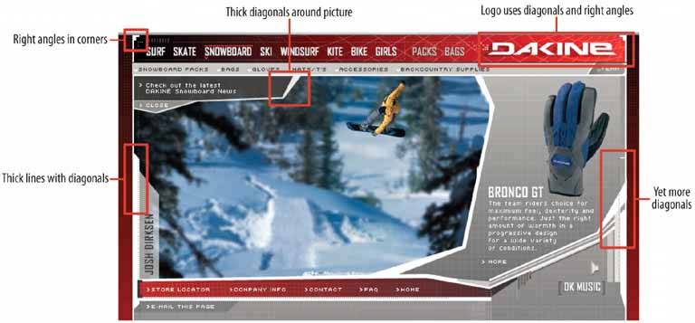
92. hairlines Figure 9-29. From http://www.nih.gov 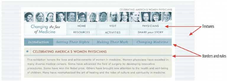
9.4.5.1. what Use one-pixel-wide lines in borders, horizontal rules, and textures. 9.4.5.2. use when You want a refined and sophisticated look to your interface. 9.4.5.3. why When your design is made up of larger elements, such as blocks of body text, areas of different color, and images, hairlines add a level of scale to the design that may not be present otherwise. The design will look more refined. 9.4.5.4. how Here are some of the many ways you can use hairlines in an interface: To demarcate Titled Sections, by underlining the titles To separate different content areas, either with horizontal or vertical rules, or with closed borders As guidelines to lead the eye through a composition Between areas of different background colors, to clarify the boundary between them In textures, such as a grid or a block of horizontal lines In icons, images, and drawn graphics As borders around controls, such as buttons
Hairlines look particularly good when placed near very thin sans-serif fonts. Remember that a gray line looks thinner than a black line, even if both are a single pixel wide. The same is true for other lighter colors, like the teal used in the NIH example at the top of the pattern. The less contrast between the line and its background, the thinner and lighter it appears. Another way you can lighten a hairlineand add another texture while you're at itis to make it a dotted line instead of a solid line. As of this writing, finely-drawn dotted lines are becoming common on the Web, even as underlines for links. A trick to increase the tension and edginess in a design is to push a hairline flush up against the bottom of a line of text. Design 8 of the CSS Zen Garden designs does exactly that with its title and headlines (see Figure 9-8, back in the introduction to this chapter). 9.4.5.5. examples Figure 9-30. Both Microsoft and Apple have used subtle hairline textures in their UI designs. Here are two examplesone from an OS X standard dialog, and the other from Microsoft Money. Both designs place small text against the textured background, which is a little risky. But the colors in these textures are so close that the difference is only barely detectable, so the texture doesn't interfere with readability. 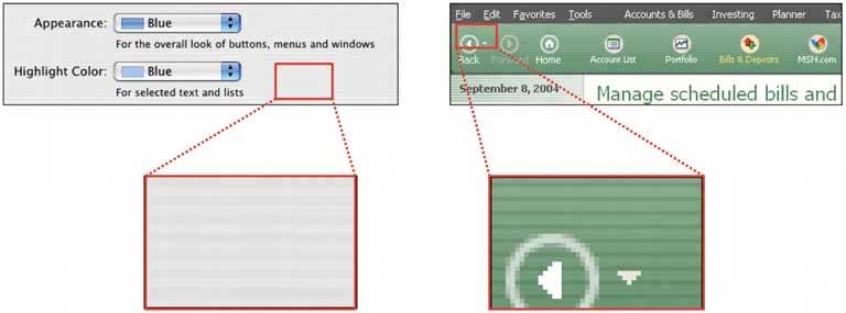
Figure 9-31. IDEO's special identity-card web feature uses hairlines as a major design element, as does the NIH site at the top of the pattern. Notice that hairlines demarcate the title, the major navigation links ("Digital Identity"), the minor links (the square icons), and the decorative bricks. The design uses a horizontal hairline texture again behind the major links. These hairlines harmonize nicely with the small sans-serif font. See http://www.ideo.com/identity/. 
Figure 9-32. This design uses hairlines to frame the content and to create a strong focal point on the title ("Color, Mood & Meaning"). This time many of the lines are curved rather than straight, but the same principles apply. See http://poynterextra.org/cp/index.html. 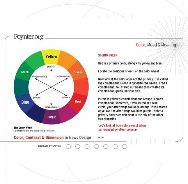
93. contrasting font weights Figure 9-33. From http://eg2006.com 
9.4.6.1. what Use two contrasting fontsone thin and lightweight, and the other heavier and darkerto separate different levels of information and add visual interest. 9.4.6.2. use when Text makes up important elements on the page, and you want the page's organization to be very clear at first glance. You want the page to look dramatic. 9.4.6.3. why When two fonts differ in weight, they form a strong and vibrant visual contrast. Aesthetically, contrast contributes to a dramatic and eye-catching look. High typographic contrast, which includes size, texture, and colorbut especially weightguarantees that your page will not look dull. You can use this contrast to structure the text on the page. For instance, heavier-looking letters can form titles and headlines, thus helping build a visual hierarchy. The bold text in the above figure pulls the eye towards it. Thus, contrasting font weights contribute to the cognitive perception of the page as much as the aesthetics. 9.4.6.4. how This pattern has many possible applications. This book already mentioned the use of bold text for headlines, but applications might include: Separating labels from data in a two-column listing Separating navigational links from information Indicating selection, such as selected links or list items Emphasizing words in a phrase Separating one word from another in a logotype
If you're using fonts that are larger than body text, such as the logotypes on the following page, make sure that the contrast is strong enough to be noticed. When the font family offers several weights, as does Helvetica Neue, pick fonts that are at least a couple of steps apart. If the contrast is weak, it looks accidental, not intentional. (The same goes for other font attributes. If you make two text elements different sizes, make them really different; if you want to mix font families, make sure they don't look too much alike!) 9.4.6.5. examples Figure 9-34. Adaptive Path's home page has not one, not two, but three uses of contrasting font weights. The first is in the logotypethe heavier font weight and darker color emphasize the shorter word "path". The graphic figure underneath it adds additional emphasis. (Also note the use of Deep Background and Hairlines in this screenshot.)
The second usage is in the tagline, where the important words "value" and "experience" are heavily weighted. The design still uses spaces here to separate words, so the value of contrasting font weights is in the emphasis of some words over others.
The third usage is in the navigation bar, where the current page ("home," in this screenshot) gets a heavier font weight than the others. You should consider all the links to be one family of objects, but the current page ought to stand out, so the font is the same for all links except for the weight. 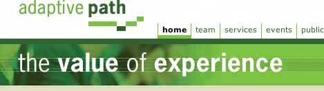
Figure 9-35. When you work with data written in body text, you can use bold letters to separate labels from data. In this little window, users will be more interested in the data than the labels, so that's what gets the eye-catching bold text. See http://lukew.com/portfolio/. 
Figure 9-36. Several more arbitrary examples of emphasis and separation: the Getty Images logo, a tagline from http://microsoft.com, and the CHI 2003 logo. 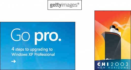
94. skins Figure 9-37. Three Winamp skins 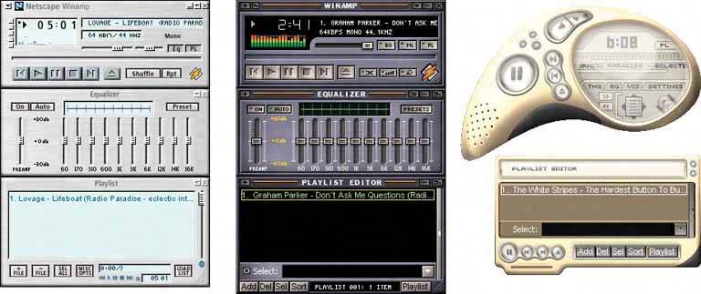
9.4.7.1. what Open up the look-and-feel architecture of your application so users can design their own graphics and styles. 9.4.7.2. use when Your user base includes a large population of people who know your interface well. For those people, the interface has relatively low cognitive requirementsit's not used in high-stress situations, for instanceso it's not necessary to make all widgets look standard. Furthermore, these users like to tinker. They value style, and they are inclined to set software preferences to suit their tastes. 9.4.7.3. why When people rearrange and customize their personal space, physical or virtual, they derive a sense of ownership of that space. This is a basic human need (though not all people act on it; many people are perfectly content with software's "factory settings"). Changing simple color and font preferences is one common way to customize someone's software environment, but skins go far beyond color schemes and fonts. There's evidence all over the Internet that users really like skins. Actually, we're talking about two groups of users here: those who download and use skins, and those who not only use them but also design them. Those who design them see skinning as an opportunity to be creative, and to get their work out into the public eye. Many are graphic artists. These people may get to know your UI design very, very well. In any case, there are numerous applications out theremost of them open-source, but Windows XP is one toothat are skinnable, and the sheer number of user-designed skins is enormous. The number of person-hours spent on these skins is testimony to the power of the creative impulse. For the skin designers, skinnable applications fulfill another basic human need: creativity. 9.4.7.4. how Exactly how to design and implement a skinnable application depends entirely on the UI technologies you use, so it's very hard to generalize anything here. First, remember that any native Windows XP application already is subject to skinning by a product called WindowBlinds (see http://www.stardock.com/products/windowblinds). It literally changes the way native controls are drawn. Second, here's how application-specific skinning might work. Some skinnable applications let skinners define simple bitmap fragments, or "slices," that are fitted into the application frame at specific pixel locations. So a skinner might create images for corner tiles, horizontal slices (which are repeated along a horizontal line as many times as is necessary), vertical slices, and buttons in their various states: for example, checked, pressed, or rollover. ICQ skins work like this; see Figure 9-38. Your original page layout will remain stable in these cases. Figure 9-38. Static bitmap skin implementation, courtesy of the tutorial at http://www.geocities.com/bakerstr33t/ 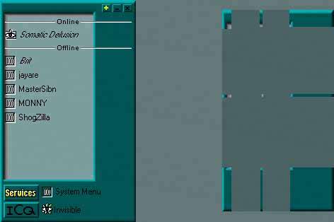
However, some applications, including Winamp 3, allow skins to rearrange the location of controls, reshape the application frame, and even add new functionality. Some scripting is involved, and these skins are correspondingly harder to produce. And your UI gets rearranged! Your choices of functionality and navigation are preserved, but not much else is. One objection often raised to skins is that they make interfaces harder to use. That's true about many badly designed skins. Ask yourself, though: How much does that matter? Does each application have to be cognitively perfect? (Default look-and-feels aren't perfect, though they're certainly more usability-tested than skins are.) For an application that someone already knows well and doesn't place high cognitive demands on, there's a point at which its basic usability is "good enough" and personal aesthetic preferences take over. When skins are available, people make that choice for themselves, whether or not they've educated themselves about usability. To an extent, you canand should, as part of a designer's responsibilitydecide at which level to permit skinning. You may only allow icons to be changed. You may permit bitmap-level skinning that preserves layout, like ICQ. Or you may allow full customizability, like Winamp 3; it's up to you to decide if that kind of freedom is likely to make the interface criminally hard to use. I'm going to speculate that excellent application designfor example, well-chosen functionality, easily understood organizational models, appropriate navigation, good page layout, and standard widgetrycan make an interface more resilient to bad skins. Design it as well as you can, and then put it out there for people to customize at a level you decide is appropriate. See what happens! Figure 9-39. Many high-end cell phones can have skins installed, along with ring tones and other customizations. This figure shows a few skins for the Nokia 6600. Note that all the text and buttons stay in the same places; only details like wallpaper, icons, and particular widget graphics are skinnable. See http://mangothemes.com. 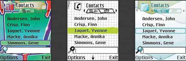
Figure 9-40. Start Menu details from four WinXP skins, found at http://browse.deviantart.com/skins/windows/windowblindsxp/.
WindowBlinds makes the entire Windows XP desktop skinnable, along with native applications, as mentioned earlier. These screenshots show some elaborate skins for Windows XP. Notice how they use many of the techniques and patterns discussed in this chapter: the use of only one or two main hues with many values, deep backgrounds and pseudo-3D detailing, dynamic curves and angles, and interesting corner treatments. 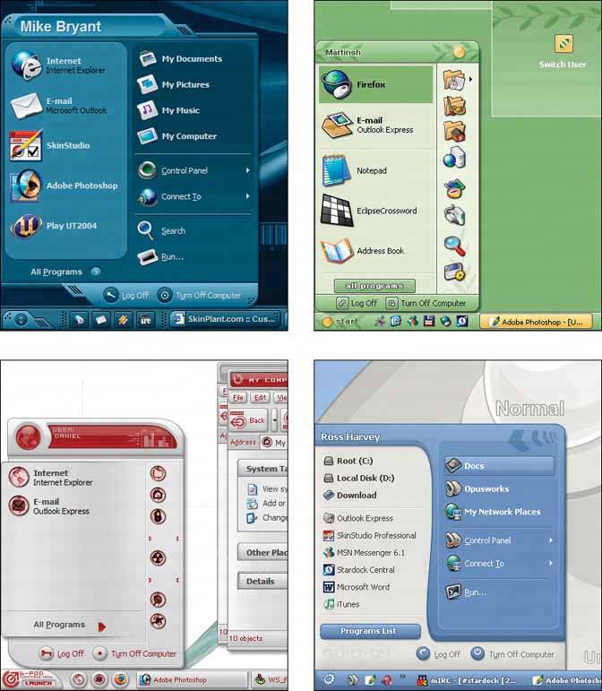
|