Section 7.3. THE PATTERNS
7.3. THE PATTERNSAs you might have guessed if you read through the control tables in the preceding section, most of these patterns describe controlsspecifically, how you can combine controls with other controls and text in ways that make them easier to use. Some patterns define structural relationships between elements, like Dropdown Chooser and Fill-in-the-Blanks. Others, such as Good Defaults and Autocompletion, discuss the values of controls and how those values change. A large number of these patterns deal primarily with text fields. That shouldn't be surprising. Text fields are as common as dirt, but they don't make it easy for users to figure out what should go in them. They're easiest to use when presented in a context that makes their usage clear. These six patterns give you many ways to create that context:
The next three patterns deal with controls other than text fields. Dropdown Chooser describes a way to create a custom control; Illustrated Choices encourages visuals in lists and other controls; and List Builder describes a commonly reinvented combination of controls that lets users construct a list of items.
You should design the remaining patterns into the whole form. They apply equally well to text fields, dropdowns, radio buttons, lists, and other stateful controls, but you should use them consistently within a form (or within a dialog box, or even an entire application).
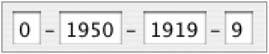
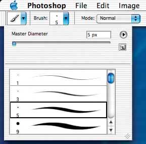
68. forgiving formatFigure 7-1. From http://wunderground.com 7.3.1.1. WhatPermit users to enter text in a variety of formats and syntaxes, and make the application interpret it intelligently. 7.3.1.2. use whenYour UI asks for data that users might type with an unpredictable mix of whitespace, hyphens, abbreviations, or capitalizations. More generally, the UI can accept input of various kinds from the userdifferent meanings, formats, or syntax. But you want to keep the interface visually simple. 7.3.1.3. whyThe user just wants to get something done, not think about "correct" formats and complex UIs. Computers are good at figuring out how to handle input of different types (up to a point, anyway). It's a perfect match: let the user type whatever he needs, and if it's reasonable, make the software do the right thing with it. This can help simplify the UI tremendously, in terms of how many brain cells a user has to use to figure it out. It may even remove the requirement for an Input Hint or Input Prompt, though they're often seen together, as in the example above. You might consider Structured Format as an alternative, but that pattern works best when the input format is entirely predictable (and usually numeric, like telephone numbers). 7.3.1.4. howThe catch (you knew there would be one): it turns a UI design problem into a programming problem. You have to think about what kinds of text a user is likely to type in. Maybe you ask for a date or time, and only the format variesthat's an easy case. Or maybe you ask for search terms, and the variation is what the software does with the data. That's harder. Can the software disambiguate one case from another? How? Each application uses this pattern differently. Just make sure that the software's response to various input formats matches what users expect it to do. Test, test, and test again with real users. 7.3.1.5. exampleFigure 7-2 comes from Outlook's tool for setting up a meeting. Look at the "Start time:" and "End time:" fields at the bottom of the screenshotyou don't need to give it a fully defined date, like what appears in the text fields. If today is April 24, and you want to set up a meeting for April 29, you can type any of the following terms:
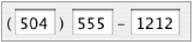
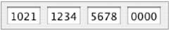
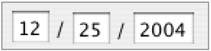
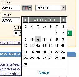
And so onthere are probably other accepted formats, too. The specified date then is "echoed back" to the user in the appropriate format for the user's language and location, as shown in Figure 7-2. Figure 7-2. Microsoft Outlook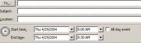 69. structured formatFigure 7-3. Photoshop's installation screen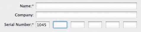 7.3.2.1. whatInstead of using one text field, use a set of text fields that reflect the structure of the requested data. 7.3.2.2. use whenYour interface requests a specific kind of text input from the user, formatted in a certain way. That format is familiar and well-defined, and you don't expect any users to need to deviate from the format you expect. Examples include credit card information, local telephone numbers, and license strings or numbers, as shown in Figure 7-3. It's generally a bad idea to use this pattern for any data whose format may vary from user to user. Consider especially what might happen if your interface is used in other countries. Names, addresses, postal codes, telephone numbersall have different standard formats in different places. Consider using Forgiving Format in those cases. 7.3.2.3. whyThe structure of the text fields gives the user a clue about what kind of input is being requested. For example, she can mentally map the six text fields in Figure 7-3 to the six-chunk number written on her Photoshop CD case, and conclude that that's the license number she now needs to type in. Expectations are clear. She probably also realizes that she doesn't need to type in any spaces or hyphens to separate the six chunks. Interestingly, this pattern usually gets implemented as a set of small text fields instead of one big one. That alone can reduce data entry errors. It's easier for someone to double-check several short strings (two to five characters or so) than one long one, especially when numbers are involved. Likewise, it's easier to transcribe or memorize a long number when it's broken up into chunks. That's how the human brain works. Contrast this pattern to Forgiving Format, which takes the opposite tack: it allows you to type in data in any format, without providing structural evidence of what's being asked for. (You can use other clues instead, like Input Hints.) Structured Format is better for very predictable formats, Forgiving Format for open-ended input. 7.3.2.4. howDesign a set of text fields that reflect the format being asked for. Keep the text fields short, as clues to the length of the input. Once the user has typed all the digits or characters in the first text field, confirm it for her by automatically moving the input focus to the next field. She can still go back and re-edit the first one, of course, but now she knows how many digits are required there. You can also use Input Prompts to give the user yet more clues about what's expected. In fact, structured format fields for dates often do use Input Prompts, such as "dd/mm/yyyy". 7.3.2.5. examplesAt its simplest, Structured Format literally can take the shape of the data, complete with spaces, hyphens, and parentheses, as illustrated in the following table:
Figure 7-4. For date input, LiveJournal uses Structured Format in combination with a dropdown to choose a month. It defaults to the current day and time. See http://livejournal.com. 70. fill-in-the-blanksFigure 7-5. From http://amazon.com 7.3.3.1. whatArrange one or more fields in the form of a prose sentence or phrase, with the fields as "blanks" to be filled in by the user. 7.3.3.2. use whenYou need to ask the user for input, usually one-line text, a number, or a choice from a dropdown list. You tried to write it out as a set of label/control pairs, but the labels' typical declarative style (such as "Name:" and "Address:") isn't clear enough for users to understand what's going on. You can, however, verbally describe the action to be taken once everything's filled out, in an active-voice sentence or phrase. 7.3.3.3. whyFill-in-the-Blanks helps make the interface self-explanatory. After all, we all know how to finish a sentence. (A verb phrase or noun phrase will do the trick, too.) Seeing the input, or "blanks," in the context of a verbal description helps the user understand what's going on and what's asked of him. 7.3.3.4. howWrite the sentence or phrase using all your word-crafting skills. Use controls in place of words. If you're going to embed the controls in the middle of the phrase, instead of at the end, this pattern works best with text fields, dropdown lists, and combo boxesin other words, controls with the same form factor (width and height) as words in the sentence. Also, make sure the baseline of the sentence text lines up with the text baselines in the controls, or it'll look sloppy. Size the controls so that they are just long enough to contain the user's choices, and maintain proper word spacing between them and the surrounding words. This is particularly useful for defining conditions, as one might do when searching for items or filtering them out of a display. The Excel and Photoshop examples below illustrate the point. Robert Reimann and Alan Cooper describe this pattern as an ideal way to handle queries; their term for it is "natural language output."[1]
There's a big "gotcha" in this pattern, however: it becomes very hard to properly localize the interface (convert it to a different language), since comprehension now depends upon word order in a natural language. For some international products or web sites, that's a non-starter. You may have to rearrange the UI to make it work in a different language; at the very least, work with a competent translator to make sure the UI can be localized. 7.3.3.5. examplesFigure 7-6. The Mac OS X System Preferences has several places that use a simple Fill-in-the-Blanks approach. Here's one.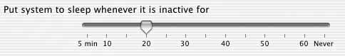 Figure 7-7. This Excel cell-formatting dialog box lets you choose the phrases in this "sentence" from dropdown boxes. As the phrases change, the subsequent text fieldsshowing 0 and 10 in this examplemight be replaced by other controls, such as a single text field for "greater than."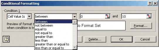 Figure 7-8. Photoshop's image search dialog box uses a very similar approach to the Excel dialog, but this one uses multiple conditions.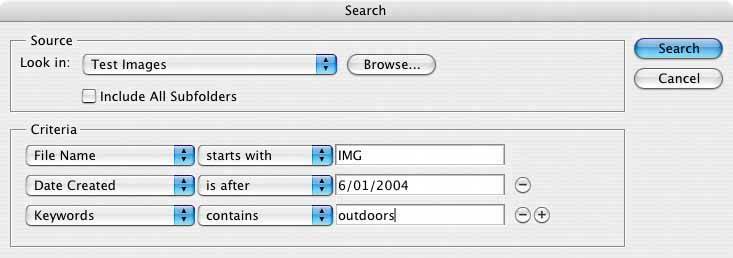 71. input hintsFigure 7-9. Mac OS X System Preferences 7.3.4.1. whatBeside an empty text field, place a sentence or example that explains what is required. 7.3.4.2. use whenThe interface presents a text field, but the kind of input it requires isn't obvious to all users. You don't want to put more than a few words into the text field's label. 7.3.4.3. whyA text field that explains what goes into it frees users from having to guess. If you visually separate the hint from the main label, users who know what to do can more or less ignore the hint, and stay focused on the label and control. 7.3.4.4. howWrite a short example or explanatory sentence, and put it below or beside the text field. Two examples conjoined by "or" works fine too. Keep the text small and inconspicuous, though readable; consider using a font two points smaller than the label font. (A one-point difference will look more like a mistake than an intended font-size change.) Also, keep the hint short. Beyond a sentence of two, many users' eyes will glaze over, and they'll ignore the text altogether. This pattern is often used in conjunction with Forgiving Format, as illustrated by the Word example below, or Structured Format. Alternative patterns are Input Prompt (in which a short hint goes into the control itself), and Good Defaults (which puts an actual valid value into the control). Input Hints permit longer, more permanent help texts than Input Prompts, but because no default value is present in the text field, the user is forced to consider the question and give an answer. 7.3.4.5. exampleFigure 7-10. The printing dialog boxes used by several Microsoft Office applications supply an Input Hint below a Forgiving Format text fieldit takes page numbers, page ranges, or both. The hint is very useful to anyone who's never had to use the "Pages" option, but users who already understand it don't need to focus on the written text; they can just go straight for the input field.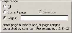 72. input promptFigure 7-11. From http://orbitz.com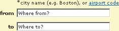 7.3.5.1. whatPrefill a text field or dropdown with a prompt that tells the user what to do or type. 7.3.5.2. use whenThe UI presents a text field, dropdown, or combo box for required input. Normally you would use a good default value, but you can't in this caseperhaps there is no reasonable default, as in the Orbitz form above. The user needs only a short reminder of what is required. 7.3.5.3. whyIt helps make the UI self-explanatory. Like Input Hints, an Input Prompt is a sneaky way of supplying help information for controls whose purpose or format may not be immediately clear. With an Input Hint, someone quickly scanning the UI can easily ignore the hint (or miss it entirely). Sometimes this is your desired outcome. But an Input Prompt sits right where the user will type, so it can't be ignored. The advantage here is that the user doesn't have to guess whether she has to deal with this control or notthe control itself tells her she does. (Remember that users don't fill out forms for funthey'll do as little as needed to finish up and get out of there.) A question or an imperative "Fill me in!" is likely to be noticed. An interesting side effect of this pattern is that users may not even bother to read the label that prefixes the text field. Look again at Figure 7-11. The labels "from" and "to" are completely superfluous, in terms of the form's meaning. Because the user's eye will be drawn first to the white text fields, those prompts probably will be read before the labels anyway! That said, don't remove the labelsthat prompt is gone forever once the user types over it, and on subsequent readings of this form, she may not remember what the control asks for. 7.3.5.4. howChoose an appropriate prompt string, perhaps beginning with one of these words:
End it with a noun describing what the input is, such as "Choose a state," "Type your message here," or "Enter the patient's name." Put this phrase into the control where the value would normally be. (The prompt itself shouldn't be a selectable value in a dropdown; if the user selects it, it's not clear what the software should do with it.) Since the point of the exercise was to tell the users what they were required to do before proceeding, don't let the operation proceed until they've done it! As long as the prompt is still sitting untouched in the control, disable the button (or other device) that lets the user finish this part of the operation. That way, you won't have to throw an error message at the user. 7.3.5.5. exampleFigure 7-12. Input Prompt has historically been unusual in desktop applications, but it's as good an idea in this context as it is on the Web. Note its use on a WYSIWYG editor's canvas hereit doesn't indicate a "required field" as such, but the application clearly communicates its intent to the user, who doesn't have to puzzle out what he should do next. 73. autocompletionFigure 7-13. Firefox's autocompletion for typed URLs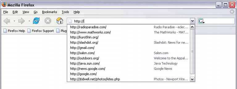 7.3.6.1. whatAs the user types into a text field, anticipate the possible answers and automatically complete the entry when appropriate. 7.3.6.2. use whenThe user types something predictable, such as a URL, the user's own name or address, today's date, or a filename. You can make a reasonable guess as to what they're attempting to typeperhaps there's a saved history of things this user has previously typed, for instance, or perhaps the user is picking from a set of preexisting values, like a list of filenames in a directory. When the typed entries are long and hard to type (or remember), like URLs or email addresses, Autocompletion is particularly valuable. Autocompletion is also common in text editors and command-line UIs. As users type commands or phrases, the application or shell might offer suggestions for completion. Code editors and OS shells are well-suited for this, because the language used is small and predictable (as opposed to a human language, like English); it's therefore easier to predict what the user tries to type. 7.3.6.3. whySave the user the trouble of typing the whole string, and do it for him. You thus save countless seconds of work, and contribute to the good health of thousands of wrists. An additional benefit can be error prevention: the longer or stranger the string that must be typed, the greater the odds of the user making a typographical error. Autocompleted entries can avoid that problem. 7.3.6.4. howWith each additional character that the user types, the software quietly forms a list of the possible completions to that partially entered string. If the user enters one of a limited number of possible valid values, use that set of valid values. If the possible values are wide open, then one of these might supply completions:
From here, you can approach the interaction design of Autocompletion in two ways. One is to show the user a list of possible completions on demand, such as by hitting the Tab key, and let him choose one explicitly by picking from that list. Many code editors do this (see Figure 7-17). It's probably better used when the user would recognize what he wants when he sees it, but may not remember how to type it without help. "Knowledge in the world is better than knowledge in the head." The other way is to wait until there's only one reasonable completion, and then put it in front of the user, unprompted. Word does this with a tooltip; many forms do it by filling in the remainder of the entry, but with selection turned on, so another keystroke would wipe out the autocompleted part. Either way, the user gets a choice about whether to retain the autocompletion or notand the default is to not keep it. You can use both approaches together, as in Figure 7-17. Make sure that Autocompletion doesn't irritate users. If you guess wrong, the user won't like ithe then has to go erase the autocompletion, and retype what he meant in the first place, avoiding having autocomplete pick the wrong completion yet again. These interaction details can help prevent irritation:
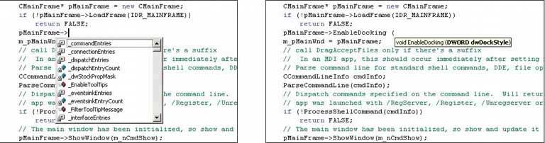
Here's one possible way to implement Autocompletion cheaply. You can turn a text field into a combo box (which is a combination of a typable text field and a dropdown). Each time the user enters a unique value into the text field, make a new drop-down item for it. Now, if your GUI toolkit allows type-ahead in combo boxes (as many do), the drop-down items are automatically used to complete whatever the user types. See Figure 7-13 above for a typical example; most web browsers now keep the most recently visited sites in a combo box where the user types URLs. 7.3.6.5. examplesFigure 7-14. Many email clients, of course, use autocompletion to help users fill in To: and CC: fields. They generally draw on an address book, contacts list, or a list of addresses you've exchanged email with. This example from Mac Mail shows a single completion suggested upon typing the letter 'c'; the completed text is automatically highlighted, so a single keystroke can get rid of it. You can thus type straight "through" the completion if it's wrong.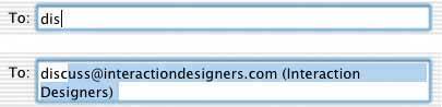 Figure 7-15. Word has a built-in dictionary of words and phrases that it uses to suggest completions. In this picture, typing the word "Your" at the beginning of a line has caused Word to suggest "Yours truly," which is appropriate only for signatures of letters. Had Word been smarter, it might have noticed that the text in question was in the middle of a 10,000-word book chapter that bore no resemblance whatsoever to a letter. But again, you can type straight through the autocompletion, ignoring it.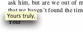 Figure 7-16. In contrast to Mail and Word, Google Suggest makes autocompletion its defining feature. As you type, it shows you the most popular searches that match what you've typed thus far. Rather than being a mere typing aid, it actually turns into a way to navigate a small corner of the public mental landscape.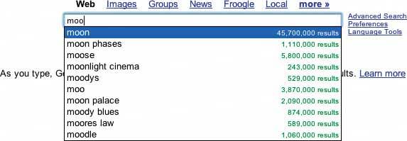 Figure 7-17. Finally, code editors such as Visual Studio invest in very complex autocompletion mechanisms. Visual Studio's IntelliSense" completes the built-in keywords of a programming language, of course, but it also draws on the functions, classes, and variable names defined by the user. It even can show the arguments to functions that you invoke (in the righthand screenshot). Furthermore, both "select from a list" and "take the one completion that matches" approaches are supported, and you can call up autocompletion on demand by typing Control-Space. |

EAN: 2147483647
Pages: 75
- Structures, Processes and Relational Mechanisms for IT Governance
- Integration Strategies and Tactics for Information Technology Governance
- Measuring and Managing E-Business Initiatives Through the Balanced Scorecard
- A View on Knowledge Management: Utilizing a Balanced Scorecard Methodology for Analyzing Knowledge Metrics
- Governance in IT Outsourcing Partnerships