7.2. CONTROL CHOICE The following charts describe controls and patterns for the kinds of information you might ask from the user, such as numbers and choices from lists. It's not a complete set by any means. In fact, you can probably come up with plenty of others. But the types shown here are common, and the listed controls are among your best choices for clarity and usability. Consider these factors when choosing among the possible controls for a given information type:
Available space -
Some controls take up lots of screen real estate; others are smaller, but may be harder to use than larger ones. Short forms on web pages might be able to spend that screen space on radio buttons or illustrated lists, whereas complex applications may need to pack as much content as possible into small spaces. Toolbars and table-style Property Sheets are especially constraining, since they generally allow for only one text line of height, and often not much width either.
User sophistication with respect to general computer usage -
Text fields would be familiar to almost all users of anything you'd design, but not everyone would be comfortable using a double-thumbed slider. For that matter, many occasional computer users don't know how to handle a multiple-selection list-box, either.
User sophistication with respect to domain knowledge -
A text field might be fine if your users know that, say, only the numbers 110 and 2030 are valid. Beginners will stumble, but if they're a very small part of your user base (and if the context is readily learned), maybe that's okaya tiny text field might be better than using a big set of interlinked controls.
Expectations from other applications -
Bold/Italic/Underline controls are well-known as iconic buttons; it would must be weird to see them as radio buttons instead.
Available technology -
As of this writing, HTML provides only a very small subset of the controls in common usage on the desktop: text fields, radio and checkboxes, scrolled lists, and drop-downs you cannot type into. Commercial and open-source GUI toolkits provide richer sets of controls. Their offerings vary, but many of them are extensible via programming, allowing you to create custom controls for specific situations. The following sections summarize the various control options for four common input scenarios: lists of items, text, numbers, and dates or times. Each choice is illustrated with a typical example, taken from the Windows 2000 look-and-feel. (Keep in mind that these examples are not necessarily the best possible rendering of these controls! You do have some freedom when you decide how to draw them, especially on the Web. See Chapter 9's introduction for further discussion.) 7.2.1. LISTS OF ITEMS A wide variety of familiar controls allow users to select items or options from lists. Your choice of control depends on the number of items or options to be selected (one or many), and the number of potentially selectable items (two, a handful, or many). Controls for selecting one of two options (a binary choice): Checkbox Pros: simple; low space consumption. Cons: can only express one choice, so its inverse remains implied and unstated. This can lead to confusion about what it means when it's off.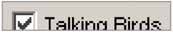
Two radio buttons Two-choice dropdown list "Press-and-stick" toggle button Pros: same as for checkbox; when iconic, very low space consumption. Cons: same as for checkbox; also, not as standard as a checkbox for text choices.
Menu of two radio-button menu items Pros: very low space consumption on the main UI, since it's found on menu bars or pop-up menus. Cons: popup menus might be hard to discover; requires a lot of dexterity.
Controls for selecting one of N items, where N is small: N radio buttons N-item dropdown list Pros: low space consumption. Cons: only one choice is visible at a time, except when the menu is open; requires some dexterity.
N-item set of mutually exclusive iconic toggle buttons Pros: low space consumption; all choices are visible. Cons: icons might be cryptic, requiring tooltips for understanding; user might not know they're mutually exclusive.
Menu of N radio-button menu items Pros: very low space consumption on main UI, since it's found on menu bars or popup menus; all choices are visible. Cons: popup menus might be hard to discover; requires a lot of dexterity.
Single-selection list or table Spinner Controls for selecting one of N items, where N is large: N-item dropdown list, scrolled if necessary Pros: low space consumption. Cons: only one choice is visible at a time, except when menu is open; requires a lot of dexterity to scroll through items on the drop-down menu.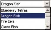
Single-selection list or table Single-selection tree or Cascaded List, with items arranged into categories Custom browser, such as for files, colors, or fonts Pros: suited for browsing available choices. Cons: may be unfamiliar to some users; difficult to design; usually a separate window, so it's less immediate than controls placed directly on the page.
Controls for selecting many of N items, in any order: Array of N checkboxes Array of N toggle buttons Pros: low space consumption; all choices are visible. Cons: icons might be cryptic, requiring tooltips for understanding; might look mutually exclusive.
Menu of N check-box menu items Pros: very low space consumption on main UI, since it's found on menu bars or popup menus; all choices are visible. Cons: popup menus might be hard to discover; requires a lot of dexterity.
Multiple-selection list or table List with checkbox items Multiple-selection tree or Cascaded List, with items arranged into categories Custom browser, such as for files, colors, or fonts Pros: suited for browsing available choices. Cons: may be unfamiliar to some users; difficult to design; usually a separate window, so it's less immediate than controls placed directly on the page.
List Builder pattern Pros: selected set is easy to view; selection can be an ordered list if desired; easily handles a large source list. Cons: very high space consumption due to two lists; does not easily handle a large set of selected objects.
Controls for constructing an unordered list of user-entered items: List or table with "Add" or "New" button List or table with New Item Row pattern (Chapter 6) List or table that can receive drag-and-dropped items Pros: visually elegant and space-saving; drag-and-drop is efficient and intuitive. Cons: "add" action is not visible, so users may not know the list is a drop target.
Controls for constructing an ordered list of items: Unordered list with "Up" and "Down" affordances Unordered list that offers internal drag-and-drop for reordering items Pros: visually elegant and space-saving; drag-and-drop is efficient and intuitive. Cons: rearrangement actions are not visible, so user may not know they're available.
7.2.2. TEXT Collecting text input from a user is one of the most basic form tasks. The controls typically are chosen according to the number of lines to be entered, whether or not the lines are predetermined choices, and whether or not the text will include formatting. Control for entering one line of text: Single-line text field  Controls for entering either one line of text, or a one-of-N choice: Combo box Text field with "More" button (you can also use it with a combo box instead of a text field) Pros: permits the launch of a specialized chooser dialog boxe.g., a file finder. Cons: not as familiar as a combo box to some users; not as immediate.
Control for entering multiple lines of unformatted text: Multiline text area 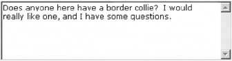 Controls for entering multiple lines of formatted text: Text area with inline tags Rich-text editor Pros: immediacy, since the edited text serves as a preview. Cons: use of toolbar is required, so it cannot always be keyboard-only.
7.2.3. NUMBERS Because they often must follow more complex formatting rules, entering numbers on a form is slightly more complex than entering basic text. The choice of input options depends on the type of number you enter and its allowable range. Controls for entering numbers of any type or format: Text field using Forgiving Format Pros: visually elegant; permits wide variety of formats or data types. Cons: expected format is not evident from the control's form, so it may cause temporary confusion; requires careful back-end validation 
Text field using Structured Format Pros: desired format evident from control's form. Cons: possibly higher space consumption; more visual complexity; does not permit any deviation from the specified format, even if user needs to do so.
Spin box (best for integers or discrete steps) Pros: user can arrive at a value via mouse clicks, without touching the keyboard; can also type directly if desired. Cons: not familiar to all users; you may need to hold down the button long enough to reach the desired value; requires dexterity to use tiny buttons.
Controls for entering numbers from a bounded range: Slider Pros: obvious metaphor; position of value in range is shown visually; the user cannot enter a number outside the range. Cons: high space consumption; unobvious keyboard access; tick labels can make it very crowded.
Spinner Pros: values are constrained to be in range when buttons are used; low space consumption; supports both keyboard-only and mouse-only access. Cons: not familiar to all users; requires dexterity to use tiny buttons; needs validation; cannot visually see value within range.
Text field with after-the-fact error checking (can have Input Hints, Input Prompt, etc.) Pros: familiar to everyone; low space consumption; keyboard access. Cons: requires validation; no constraints on what can be entered, so you have to communicate the range the range by some other means.
Slider with text field (can take the form of a Dropdown Chooser with a slider on the dropdown) Controls for entering a subrange from a larger range: Double slider (can be used with text fields, as above) Two sliders (also can be used with text fields) Two spinners (can be linked via Fill-in-the-Blank) Pros: values are constrained to be in range when buttons are used; low space consumption; supports both keyboard-only and mouse-only access. Cons: not familiar to all users; requires dexterity to use tiny buttons; needs validation; cannot visually see value within range.
Two text fields with error checking (can use Input Hints, Input Prompt, Fill-in-the-Blank) Pros: familiar to everyone; much lower space consumption than sliders. Cons: requires validation; no constraints on what can be entered, so you need to communicate the range by some other means.
7.2.4. DATES OR TIMES Because of the potential formats and internationalization issues, dates and times can be tricky to accept from users. Input options for dates or times include: Forgiving Format text field Pros: visually simple; permits wide variety of formats or data types; keyboard access. Cons: expected format not evident from control's form, so it may cause brief confusion; requires careful back-end validation.
Structured Format text field Pros: desired format evident from control's form. Cons: possibly higher space consumption; more visual clutter; does not permit deviation from specified format, even if user wants to do so.
Calendar or clock control Dropdown Chooser with calendar or clock control | 


