Section 4.1. THE BASICS OF PAGE LAYOUT
4.1. THE BASICS OF PAGE LAYOUTThis section discusses five major elements of page layout: visual hierarchy, visual flow, grouping and alignment, how to put these three elements together, and how to use dynamic displays. 4.1.1. VISUAL HIERARCHY: WHAT'S IMPORTANT?The concept of visual hierarchy plays a part in all forms of graphic design. Put simply, the most important content should stand out the most, and the least important should stand out the least. Titles ought to look like titles, and secondary content ought to look like secondary contentin other words, a reader should be able to deduce the informational structure of the page from its layout. Examples explain this concept best. Figure 4-1 shows text that wasn't formatted with any visual hierarchy at all. Figure 4-1. No visual hierarchy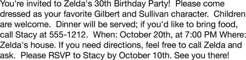 Passable, but not great. What's the most important information in that paragraph? You can guess that the first sentence is the most important, but otherwise, it's hard to tell, since the whole block of text is visually monotonous. Once you've read it and realize it's an invitation, you can tell from contextbut you had to read it first. Now let's improve on this example. Whitespace is one of the best tools you have for organizing a visual hierarchy. It's a cheap and graceful way of pulling apart monotonous blocks of information. Figure 4-2. With whitespace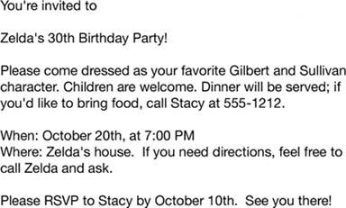 In Figure 4-2, you can at least see distinct groups of information. And the headline at the top"Zelda's 30th Birthday Party"stands out a bit more because it has whitespace around it. So does the not-quite-as-important RSVP message at the bottom. But the text that your eye falls on first is probably "You're invited to". It's sitting up there by itself, at the upper left corner, where every speaker of left-to-right languages looks first. That alone gives it unwarranted importance. You also have typography and positioning at your disposal, which Figure 4-3 applies to the same problem. Figure 4-3. With typography and alignment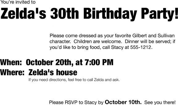 Big, bold fonts do the trick for importance, of course. Our eyes are drawn to dense, contrasted shapes with heavy "visual weight." The invitation's most important line is in a giant font; the second most important line is in a large font, but not as large; the body text is normal sized. Similarly, the tiny lightweight font used for the directions comment indicates "you may want to read this, but it's not that big a deal if you miss it." Spatial positioning does something a little more complex here. It's being redundant with the whitespace by separating some blocks of text from others. It's also enhancing the apparent importance of the "When" and "Where" textwhich are importantby making them stand on the almost-empty left margin, aligned with the headline. The shapes of some page elements give you clues, too. The comment about directions is indented underneath the "Where" text in the example. You can guess that the directions comment relates to, but is not as important as, the text above it. The same logic applies to tree views, auxiliary text under links, input hints under text fields, and so forth. With these and other familiar structures, like tables, their visual shapes "telegraph" meaning immediately, before the user even starts to read what's in them. In this chapter, the Center Stage pattern deals directly with visual hierarchy by encouraging you to establish a single large area of the UI to do the main task. Using the Titled Sections pattern helps define the visual hierarchy, too. And if you develop a Visual Framework (another pattern, which encodes how to do visual hierarchy within the whole UI), make sure it accommodates the different levels of hierarchy you need, such as titles, headlines, sub-heads, lists, navigation bars, and action buttons. These mechanisms can help you lay out a visual hierarchy:
You'll find that many UIs and printed graphics use several of these mechanisms at once. Web pages frequently use both color and fonts to differentiate headlines from body text; many UIs use both group boxes and whitespace to form visual groups. That's okay. Having all these "variables" to choose from gives you a lot of design freedom, especially since they each have a dual role: to show how the UI is organized, and to communicate branding, emotion, and other non-rational attributes. (I'll return to this fascinating topic in Chapter 9.) Meanwhile, let's look more deeply at visual organization. 4.1.2. VISUAL FLOW: WHAT SHOULD I LOOK AT NEXT?Visual flow deals with the tracks that readers' eyes tend to follow as they scan the page. It's intimately related to visual hierarchy, of coursea well-designed visual hierarchy sets up focal points on the page wherever you need to draw attention to the most important elements, and visual flow leads the eyes from those points into the less-important information. As a designer, you should be able to control visual flow on a page so people follow it in approximately the right sequence. Several forces can work against each other when you try to set up a visual flow. One is our tendency to read top-to-bottom and left-to-right. When faced with a monotonous page of text, that's what you'll do naturally; but any visual focal points on the page can distract you from the usual progression, for better or worse. "Focal points" are the spots your eyes can't resist going to. You tend to follow them from strongest to weakest, and the better pages have only a fewhaving too many focal points dilutes the importance of each one. You can set them up in many different ways, such as by using whitespace, high contrast, big chunky fonts, spots of "interesting" color, converging lines, hard edges, faces, and motion. (Yes, this list resembles the one above for visual hierarchy. Titles, logos, and critical sections of text or images use these properties to become focal points.) The next time you pick up a magazine, look at some well-designed ads and notice what your eyes gravitate toward. The best commercial graphic artists are masters at setting up focal points to manipulate what you see first. However, if you've ever brought up an ad-filled web page and pointedly ignored the brightly-colored moving ads (so you could read the monotonous blocks of text that you went there to read), then you know that we're not merely slaves to our hardwired visual systems! We can choose to ignore what we think we don't need to look at, and zero in on what we think is the important part of the page. Thus meaning and context also play a big part in visual flow. If you build a UI in which sequence makes a differencelike a Wizard, or a dialog box in which early choices affect later choicesthen think about visual flow. (Even if your UI does not depend upon sequence, you should think about it anyway, since a good visual flow is easier on your users' eyes.) It's not hard to set up a layout that flows well, but be on your guard against layout choices that work against it. Place your controls and buttons along a straightforward visual path. At the end of that path, put the link or button that finishes the task ("Submit," "Return to main page," or "OK") and brings the user somewhere else. Figure 4-4 shows a dialog box with a nice visual flow. Notice how your eyes start at the top, move straight down the column of text fields (perhaps slowing down at the horizontal lines), and "land" at the four icons. After pausing there to take them in, perhaps, your eyes may hop down to either the Help or the OK and Cancel buttons. Figure 4-4. Macromedia Contribute's "Insert Table" dialog box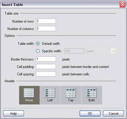 Now, at some point you'll probably take the time to read the labels, but they're so visually lightweight that they likely didn't catch your eye first. The text fields probably did, because they're focal pointswhite (contrasting against gray), strongly aligned, and semantically important. In summary:
4.1.3. GROUPING AND ALIGNMENT: WHAT GOES WITH WHAT?You knew this already, but I'll say it anyway because it's so important: by grouping things together visually, you state that they are related. Conversely, if you put two things far away from each other, such as the last field of a form and the form's "Submit" button, then you state that they're not related to each other. If visual flow doesn't step in and lead the user's eyes to the button by some other means, the user may not see it. Like focal points, grouping and alignment are necessary to forming a clear visual hierarchy. They also help with visual flow, by guiding the viewer's eyes from group to group. The human visual system craves order. We're wired to see larger forms made from smaller ones, like words from letters or tables from grids of cells. You can take advantage of this need for order by "clustering" related things together, and by separating those clusters with enough whitespace to keep them unambiguously separate. (Whitespace again! It's really okay to use it, even in small spaces. It's better to display less information with more clarity than to crowd a page too much.) This is how you associate a text field with its label, an image with its caption, or a graph with the slider that controls it. Group boxes can help here, but don't expect them to carry the entire burden of visual grouping; give them "room to breathe" on a crowded page. If you squint your eyes so you can't see the group box's edges, is there enough whitespace that you can still make out the groups? If so, you're doing fine. Also, be careful about nesting group boxes two or more levels deep, since it gets really hard to make out what's what. Try a different approach to designing the visual hierarchy. Alignment is another, more subtle way to associate things with one another. For instance, if you have two sets of buttons far away from each other on a dialog box, but they do somewhat similar things, you can line up one group under the other and make them the same width to emphasize the similarity. Or if you have two forms on a page, separated by blocks of text, then line up the forms' left edges against one invisible line and the texts' left edges against another. The theory behind grouping and alignment was developed early in the 20th century by the Gestalt psychologists. They described several layout properties that seem to be hardwired into our visual systems. Among them are the following:
Figure 4-5 depicts each property and how you can combine them to create an effective overall design. Figure 4-5. Four of the Gestalt principles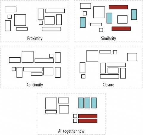 As important as they are individually, they're best used in combination with one another. Once again, redundancy is not always bad; the fifth grouping looks more like an actual page layout than a retro-styled mosaic. Continuity and closure, then, explain alignment. When you align things, you form a continuous line with their edges, and the users follow that line and (perhaps subconsciously) assume a relationship. If the aligned items are coherent enough to form a shapeor to form one out of the whitespace or "negative space" around itthen closure is also at work, adding to the effect. 4.1.4. PUTTING IT ALL TOGETHEROn the web page shown in Figure 4-6, the text is blurred so that you can't read it easily. But I bet you can understand a lot of the page structure. Figure 4-6. From http://www.alistapart.com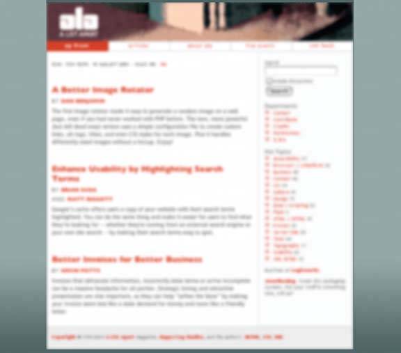 In your first glance, you just perceived many of the things we just talked about. Let's deconstruct that first glance. First, what path did your eyes follow? Probably one of those in Figure 4-7, or some variation thereof. Figure 4-7. Possible visual flows on alistapart.com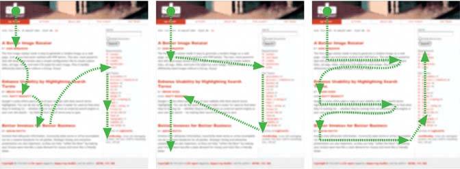 The logo is obviously a focal pointit sits where web page headers always sit, and it's a heavy font with high white-on-dark contrast. The headlines draw attention because of their color, size, and whitespace separation. The column on the right looks dense, orange, and visually interesting, so you may have looked at it too. Note that the third visual-flow variation doesn't start at the logo. Readers who visit a page with single-minded interest in the content may simply ignore the header and start at the upper left of the "white part" of the pagethere's no perceived benefit in looking at the page trappings. Now what about the Gestalt principles we just covered? The page presents three main groups, each of which has big red text, smaller red text, and blocks of body text. Similarity and proximity form these perceptual groups; whitespace sets them apart. The column on the right is set off by a very strong edgeactually, two of them; note the subcolumn along its left sideand its density and color give this strong coherence. The dark background of the header comprises another visual form, does the gray footer, with its single continuous line of text. Figure 4-8 shows the groupings on this page. Figure 4-8. Grouping on the ALA web page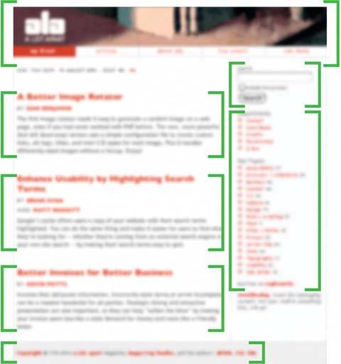 All this formatting contributes to the visual hierarchy. Context and higher-level mental processing kick in as you start to parse what you see and apply what you already know about web sites. You can easily distinguish the header, footer, main content, and auxiliary information. Within the main content, there are three points of interestprobably linked articleseach with its header, subheaders (bylines?), and body text. Within the auxiliary information, there's a mini-form (search?), two tables (probably containing links, since they're not black), and other text. The header contains five texts that are aligned and look similar, probably top-level navigation. You can safely ignore the footer, as you probably do on most web pages. 4.1.5. USING DYNAMIC DISPLAYSEverything I've discussed so far applies equally to UIs, web sites, posters, billboards, and magazine pages. They deal with static aspects of layout. Ah, but you have a dynamic computer display to work withand suddenly time becomes another dimension of design! Just as importantly, computers permit user interaction with the layout to an extent that most printed things can't. There are many, many ways you can take advantage of the dynamic nature of computer displays. You can concentrate on space usage, for exampleeven the biggest consumer-grade computer screens have less usable space than, say, a poster or a newspaper page. That's life. If you work with PDAs or cell phones, you've got an especially tiny space to work in. There are many techniques for using that space to present more content than you can show at one time.
Using scrollbars is one common way of presenting a small "viewport" onto a large thing, like text, an image, or a table. Scrollbars let the user move around at will, in one or two dimensions. (But refrain from using horizontal scrolling with text, please). Or, if you can carve up the content into coherent sections, you have several optionsCard Stacks, Closable Panels, and Movable Panels all put some layout control into the user's hands, unlike the more static Titled Sections. (You also can split up content over multiple virtual pages and let the user navigate between them; see Chapter 3, Navigation.) They invoke time by letting the user see various content at different times of their choosing. If you want to direct the user through a sequence of steps, Responsive Enabling and Responsive Disclosure are two well-known, dynamic ways of doing so. |
EAN: 2147483647
Pages: 75