Creating Charts
Charts are useful because they present a quick visual summary of data. Calc produces charts through a step-by-step wizard, so it becomes very easy indeed. Here are the steps:
-
Highlight the data you want to graph. Be careful to include only the data itself and not any surrounding cells, or even the cell that contains the title for the array of data.
-
Click the Insert Object button on the Main toolbar. This lets you insert a variety of objects, but if you click it just once, Calc automatically assumes you want to insert a graph.
-
The cursor turns into a target with a small graph next to it. Click and drag on the spreadsheet itself to define the area of the graph. This can be any size. Also, you can resize it later.
-
The wizard will start. The first step is to define the range of cells to be used for the chart. By highlighting the cells before you started, you've already done this, so you can click the Next button. However, first make sure that the First Row As Label option is highlighted.
-
The next step is to choose the type of chart you wish to use. For most simple data selections, a bar graph is usually best. However, you might also choose to select a horizontal bar graph. Then click Next.
-
The wizard presents a subselection of graph types. You can also select whether gridlines are used to separate the various areas of the graph. Make your selections and click Next.
-
The last step allows you to give the chart a title and also choose whether you want a legend (a key that explains what the axes refer to) to appear next to it.
-
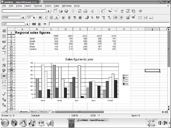
Click Create, and the chart will be created. Figure 25-4 shows an example.

Figure 25-4. Creating a chart is easy within Calc and adds a professional flourish to your spreadsheet.
Once you've created a chart, you can alter its size by clicking and dragging the handles. You can also change various graphical aspects by double-clicking them. However, keep in mind that the graph is actually a picture, so the properties you edit are limited to changing the color and size of various elements.
The chart is linked to your data. Whenever your data changes, so will your chart. This is done automatically and doesn't require any user input.
EAN: 2147483647
Pages: 293