| Although tables have dominated Web site design for years, Web designers increasingly recognize the power of creating layouts using pure CSS. Although CSS positioningexplained in Chapter 7lets you precisely place elements on the page, it turns out that these controls are not well suited for dynamic multicolumn layouts. Instead, it's the float property that gives us the ability to create the most flexible designs. For more details, see the sidebar "Layout with CSS vs. Tables." Layout with CSS vs. Tables Before tables, Web layout consisted of wide pages of text stretching from the left side of the window to the right. Designers had no way to break up this single column of content. Yet most designers came from a print background, and they were used to breaking text into two or more columns. Tables allowed designers to create a layout grid with multiple columns. Although tables were never meant to be the workhorse of Web layout, it was the only game in town until CSS. Layout with CSS offers two main advantages over table-based layout. The first, although minor, is that CSS layouts will usually load faster than table-based layouts. More importantly, CSS layouts are extremely modular, allowing you to quickly reshuffle and rearrange layouts without having to rip apart the HTML code (like you have to do with tables). Initially, Web designers tried to use absolute positioning to precisely place columns across the page. However, this did not deliver satisfactory results, because no content could be placed beneath the columns. So designers went back to the drawing board and found that the unassuming float property could be used to simply stack columns next to each other. However, this still has one drawback: the column heights are independent of each other. Unlike with tables, where the shortest column stretches down to the height of the tallest column, CSS columns end abruptly. |
In this example (Figure 21.3), we will be adding styles to the default.css file that is being linked to our structured HTML code shown in Code 21.2 I'm using the float property to place the #navigation and #content layers next to each other, creating a simple two-column layout. Figure 21.3. Columns have been set up for the navigation and content areas from Figure 21.1. 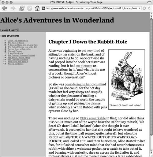
To set up a multicolumn layout using CSS: 1. | default.css
Create an external CSS file called default.css (Code 21.4). We'll add to this file in this and the next three sections of this chapter ("Styling Headers," "Styling Links and Navigation," and "Styling Copy and Content") to create the full code shown in Code 21.3.
Code 21.4. default.css:Add this code to create the columns defined in the HTML of Code 21.2. .page { display: block; width: 100%; padding: 0px; background-color: #ccc; } #header, #footer { clear: both; background-color: #999; } #navigation { float: left; width: 30%; max-width: 250px; min-width: 100px; font: bold 12px "Helvetica Neue Narrow", Arial, Helvetica, sans-serif; } #content { float: left; width: 65%; padding: 2%; max-width: 756px; min-width: 200px; border-left: 2px solid #999; background-color: #fff; } .dropBox { float: right; padding: 4px; margin: 4px; background-color: white; border: 2px solid #666; font-size: small; } .dropBox img { display: block; }
|
| 2. | .page {…}
Add the .page class to your CSS code Although this may not seem necessary, it prevents the columns from splitting apart if the browser window isn't wide enough. Most importantly, though, this class will control the width of the page.
In this example, I set the width to 100%, so it will stretch the available width of the browser window. However, you could set this to an absolute width (such as 756px).
| 3. | #header, #footer {…}
Add ID selector rule(s) for the header and the footer that run across the top and bottom of the columns, setting whatever styles you want to include, but make sure to include clear: both. This ensures that the header and footer do not wrap to the left or right of the columns and also forces the surrounding container using the .page class to stretch the height of our design.
| | | 4. | #navigation {…}
Set up an ID selector rule for your left column. The only mandatory property is float:left. The selector rule makes all three columns stack next to each other horizontally, rather than appearing underneath one another. In addition, you will want to set the width of the column.
In this example, I'm using width:30% so that the column will have a width relative to the surrounding .page class. The advantage of using relative values for the column width is that now I can set the page width in the .page rule and never have to adjust the column widths individually. However, I did set a minimum and maximum width so that the column never gets too narrow or too wide.
| 5. | #content {…}
Set up an ID selector rule for the right column, using float: left. Actually, a float value of left or right will work, but left keeps the right column and left column together to the left of the window.
In this example, I used width:65% and padding:2% to give the content a little breathing room.
| 6. | .dropBox {…}
Although not technically a column, you can also float elements to create a box that has surrounding content (including text and images) wrap around it. This is often used to add images or pull-quotes in text.
In this example, I created the .dropBox class to add a box that contains an image and a quote to go with it. In addition, I used a contextual selector to force a return after the image so that the caption will appear beneath it.
|
 Tips Tips
If you add the relative column widths together (30 percent + 65 percent +2 percent), you get 92 percent. Why not use the full 100 percent? I find that if you fill the entire width of your area (whether the width is set with relative or absolute values), your columns will break, stacking vertically rather than beside one another. Why? Browsers don't do math very well, especially when you mix absolute and relative units. My general rule of thumb is to leave 1 to 5 pixels or 1 to 10 percent for a fudge factor between floated elements. However, you will need to test your design on multiple browsers at multiple window sizes to find the exact fudge factor for your individual design. Although I used two columns here, you can add as many columns as you want for your design. Just add more <div> elements with the float property and adjust your column widths. To see an example of the three-column layout, see the Web site for this book (webbedenvironments.com/css_dhtml_ajax). Other "tableless" Web sites I have designed include Yuri's Night (yurisnight.net) and webbedENVIRONMENTS (webbedenvironments.com). If you design a great layout using CSS without tables, send me the URL (vqs-dynamic@webbedenvironments.com). I'd love to check it out.
|