ComboBox
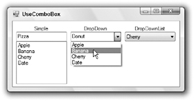
The ComboBox control contains a text box where the user can enter a value. It also provides a list box or drop-down list where the user can select a value. How the text box, list box, and drop-down list work depends on the control’s DropDownStyle property. Figure G-3 shows the three styles.

Figure G-3: The ComboBox provides three different styles: Simple, DropDown, and DropDownList.
When DropDownStyle is Simple, the ComboBox displays a text box and a list, as shown on the left in Figure G-3. The user can type a value in the text box, or select one from the list. The user can enter any text in the text box, even if it does not appear in the list.
When DropDownStyle is DropDown, the ComboBox displays a text box and a drop-down list, as shown in the middle in Figure G-3. The user can type a value in the text box. If the user clicks the drop-down arrow to the right of the text box, the control displays the list where the user can select an item. The user can enter any text in the text box, even if it does not appear in the list. In Figure G-3, the middle ComboBox control’s text box contains the value Dog, which does not appear in the list.
When DropDownStyle is DropDownList, the ComboBox displays a noneditable text box and a drop-down list. If the user clicks the control, the ComboBox displays a drop-down list exactly as it does when
DropDownStyle is DropDown. The difference is that the user must select an item from the list. If the user sets focus to the control and types a letter, the control selects the next item in the list that begins with that letter. If the user presses the same letter again, the control moves to the next choice beginning with that letter.
Setting DropDownStyle to DropDownList restricts the user’s choices the most and allows the least room for error. So, if you know all of the user’s choices, you should use the DropDownList style. If you must allow the user to enter new values, you should use one of the other styles. The DropDown style takes less room on the form and is more familiar to most users, so that is often the better choice.
The control’s DropDownWidth property determines how wide the drop-down list should be. It can sometimes be useful to make the drop-down area wider than the control. Then the control displays only the first part of the selected item, while the drop-down list can display extra detail. For example, you could make the items be state abbreviations, followed by some spaces, followed by state names as in “CA California.” The user would see the abbreviation CA in the ComboBox, but would see the whole item (including the state name) in the drop-down list.
The ComboBox control’s MaxDropDownItems property determines how many items the control displays in its drop-down list. For example, if you set this to 10 and the list contains more than 10 items, then the drop-down list displays a scroll bar to let the user find the additional items.
The MaxLength property lets you specify the maximum number of characters the user can type into the control’s text box. Note, however, that the control will display a longer value if the user selects it from the control’s list box or drop-down list. Set MaxLength to 0 to allow entries of any length.
If you set the control’s Sorted property to True, the ComboBox lists its choices in sorted order.
The ComboBox control’s Text property gets or sets the value displayed by the control’s text box. If the control’s DropDownStyle is DropDownList, this property does nothing at design time and the program can only set it to values that are in the control’s list of allowed values at runtime. Many programs use this property to see what value is selected in the control.
Like the CheckedListBox described earlier in this appendix, the items in a ComboBox can be any type of object and the control uses the objects’ ToString methods to figure out what text to display to the user. As is the case with the CheckedListBox, you can use the ComboBox control’s Items.Add method to add new objects to the control. See the “CheckedListBox” section earlier in this appendix for more information and an example that will also work with ComboBox controls.
If an item is selected, the ComboBox control’s SelectedItem property returns the item’s object. If no item is selected, this property returns Nothing.
If an item is selected, the ComboBox control’s SelectedIndex property returns the item’s index, numbered starting with zero. If no item is selected, this property returns -1.
Note that the SelectedItem and SelectedIndex properties return Nothing and -1, respectively, if the user types a new value into the text area, even if the user types a value that appears in the control’s item list. If you want the user to select an item rather than typing some text, you should set the control’s DropDownStyle property to DropDownList. Note that the control initially has no item selected when the program starts. If you want to ensure that something is always selected, select an item in the form’s Load event handler, as shown in the following code:
' Select the first customer. cboCustomer.SelectedIndex = 0 ' Select the last employee. cboEmployee.SelectedIndex = cboEmployee.Items.Count - 1 EAN: N/A
Pages: 417