Overview
Combining the PivotTable dynamic report and external data range (which is also known as query table) features in Excel, the PivotTable component provides interactive data analysis of both tabular and OLAP data sources. The output of the control is commonly referred to as a cross tabulation because it shows summary (aggregated) values for an intersection of categories. For example, you can display sales information grouped by product line within years down the rows, intersected with customer gender across the columns. When using a tabular data source, the PivotTable control can also show detail data rows for any aggregate value in addition to the summarized aggregates, or it can simply display all the tabular data in a flat list.
Whenever I talk about the PivotTable control, I usually jump right into a demonstration. Trying to explain what it does is infinitely harder than simply showing it in action. The technology behind the control is incredibly abstract, but its use is actually quite natural and intuitive. Many business analysts can use the control quite effectively but cannot describe what it does with any degree of accuracy. They know only that it can help them obtain answers to their questions. For that reason, I encourage you to open the file PivotTableIntro.htm from the Chap04 folder on the companion CD and experiment with it as I describe what this control can do. When opened, the sample page looks like Figure 4-1.
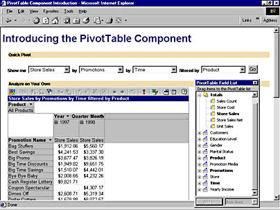
Figure 4-1. A sample PivotTable report.
The data source for this report is a sample cube that comes with Microsoft SQL Server OLAP Services. It contains sales information for a fictitious grocery chain named Foodmart. I have exported this cube to the Data\Sales.cub file on your companion CD so that you can use it without needing an OLAP server on your machine; however, this cube file is naturally slower than a server-based cube.
The sample page initially configures the PivotTable control to display a report of the sales amounts attributed to various promotions offered in 1997 and 1998. Using this report, you can answer questions such as, "What was the most successful promotion in 1997?" or, "Which promotions helped to sell the most product in the Drink product family?" To answer the first question, right-click any number in the 1997 column and choose the Sort Descending command, or select any number in the 1997 column and click the Sort Descending toolbar button. The report immediately re-sorts to show the promotions with the highest sales first, as shown in Figure 4-2.
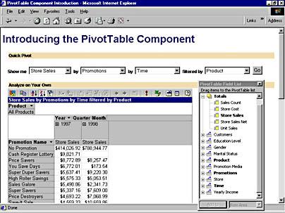
Figure 4-2. A sorted PivotTable report.
The No Promotion item is first in the list, meaning that more products are bought in response to no promotion than any particular promotion. The Cash Register Lottery promotion is next, but notice that it was not run in 1998. This discovery might lead a marketing manager to investigate why it was not continued, since it was the most successful promotion in 1997.
One of the most typical analysis techniques is to ask for more detail about an interesting piece of data. In OLAP terminology, this is often called drilling down. In fact, the PivotTable control lets you easily perform this technique. For example, suppose that a report displays the sales attributed to the Cash Register Lottery promotion in 1997 and you want to know whether that promotion was more effective during a particular season. In other words, you want to know how the sales attributed to that promotion break down into the four quarters of 1997. To show the detail, double-click the 1997 column label or click the plus sign (+) to the left of the label. The report expands to show the four quarters of 1997 and the sales amounts attributed to each, as Figure 4-3 illustrates.
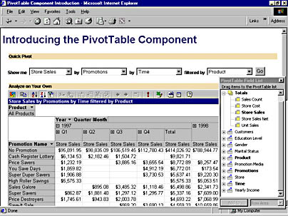
Figure 4-3. A drilled-down PivotTable report.
You can see that almost all the sales occurred in the first quarter, indicating that the promotion was popular when first introduced but waned over time, probably explaining why it was not run in 1998.
You can use the Quick Pivot interface on the page to quickly generate different cuts of the data, but to view more complex reports, drag items from the floating window called the PivotTable Field List (shown in Figure 4-4) to the report.
The field list displays all the totals and fields available in the data source. You can use this list to nest fields within each other, add more totals to the report, or put more fields in the filter area to restrict the data shown. For example, drag the Store field and drop it to the right of the list of promotion names to see how the promotion fared by country, state, and city. Next, drag the Sales Count total to the center of the report (where all the numbers are) to see the quantity sold in addition to the dollar amount. Finally, drag the Gender field to the right of the Product field at the top of the report. Once you have dropped it, click the small drop-down button at the right of the field label, choose "M" to show only the sales attributed to men, and click the OK button. The final report should look like Figure 4-5.
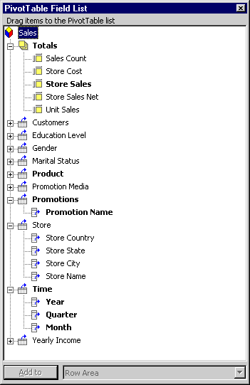
Figure 4-4. The PivotTable Field List.
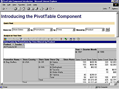
Figure 4-5. A complex PivotTable report.
The PivotTable component is obviously useful for sales analysis, but you can also use it to summarize any type of numeric data across many categories. When combined with the Chart component described in the previous chapter, it can be quite a powerful analysis tool. We will see a real-world example of this in Chapter 7.
EAN: 2147483647
Pages: 111