SPECIAL VARIATION
Control charts display five different conditions that signal the presence of special variation. This special variation is traditionally called an out-of-control condition. This may not be the case. We (quality professionals) have decided to call them out-of-control conditions to make the point that something out of the ordinary is happening in the process and needs to be investigated. Therefore, these so-called out-of-control conditions are really signals that some aspect of the operation has changed and is not part of the historical process. The signals are:
-
Points beyond control limits
-
Runs of seven (7) or more points
-
Trends of seven (7) or more points
-
Cycles of points
-
Unusual variation
POINTS BEYOND CONTROL LIMITS
Control limits are calculated as the boundaries of common variation. If each sample point is plotted within the control limits, the samples may have been collected from a single population. It is very unlikely that the sample data were collected from one population when one or more points plot beyond the control limits (see Figure 11.3). This is a signal that one or more of the manufacturing elements (machinery, materials, methods , measurement system, personnel, etc.) have changed.
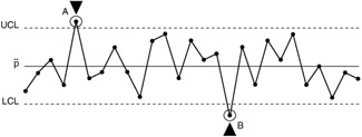
Figure 11.3: Points beyond control limits.
An out-of-control condition simply means that the manufacturing operation has changed from the historical process. A changed set of conditions may be due to either an improvement or a deterioration of the manufacturing conditions. Figure 11.3 provides two signals of special variation. The first signal (A) is a bad condition. The causes for this signal should be identified and eliminated from the system under consideration. The second signal (B) is an improved condition significantly better than that expected for the historical process. The cause for this level of defectives should be identified and made a part of the process routine. If the condition is made a part of the system, the control chart will show a run condition and will require recalculated process average and control limits. Table 11.1 shows some generic causes that affect the Xbar and R charts.
| Some Causes Affecting Xbar Chart (stable variability) | Some Causes Affecting R Chart |
|---|---|
| Over control Large systematic differences in material quality Large systematic differences in test method or equipment Control of two or more processes on same chart | Mixture of materials of distinctly different quality Different workers using a single chart Data from processes under different conditions plotted on same chart |
| Special note: | To identify the exact probability of a point outside the control limits, we use a special case of the binomial distribution, the Poisson distribution; if n is large and p is small ( n > 30 and p < .5), binomial probabilities are often approximated by means of the formula for the Poisson distribution: |
Here e = 2.71828... (natural logarithm). This distribution has many important applications in the interpretation of the control charts, beyond the direct connection with the binomial. If we replace the np with the parameter » (lambda) and we calculate the probability for getting x successes by means of the formula
now we can interpret the » as the expected, or average, number of successes. So, for example, if the average is three defects per day, the probability of having only one defect per day is
Is this good? It depends on the significance and the application. There are tables in which one can find the exact probability and computer software that will print the exact probability, given the data. The rule for interpretation is that if the calculated number is less than expected, there is no problem; move on. If the calculated number is greater than expected, there is a problem.
RUN OF SEVEN POINTS
Even when all of the sample points are plotted within the control limits, control charts can signal special causes of variation. A group of seven (7) or more points on one side of the process average is called a run (see Figure 11.4). This condition indicates that the process average is not the center line for the process. A run signals a sustained change in the process average.
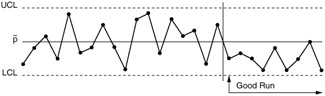
Figure 11.4: A "run" in a process.
The most significant characteristic of the run is that it does not cross the average line; it is always above or below the average. This is because changes in the process average may indicate performance that is better or worse than that experienced in the past. Runs should be identified on the control charts with highlights and notes. The causes of bad runs should be eliminated from the process, and causes of good runs should be made a part of the manufacturing routine. If a run continues for 25 or more subgroups, the process average line and control limits should be recalculated. Table 11.2 shows some generic causes that affect the Xbar and R charts.
| Some Causes Affecting Xbar Chart (stable variability) | Some Causes Affecting R Chart |
|---|---|
| Change in proportions of materials or subassemblies coming from different sources New worker or machine Modification of operation method or process Change in inspection device or method | Change in material Change in method Change in worker |
TREND OF SEVEN POINTS
A trend is a pattern of seven (7) or more plotted points that continuously increase or decrease. A trend is a gradual change or drift in the process setting (see Figure 11.5). Sometimes an increasing trend is called a run up, and a decreasing trend is called a run down. To be a trend, the points must cross the average line. Otherwise, it is a run.
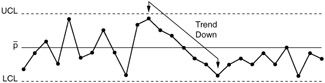
Figure 11.5: A trend in a process.
Table 11.3 shows some generic causes that affect the Xbar and R charts.
| Some Causes Affecting Xbar Chart (stable variability) | Some Causes Affecting R Chart |
|---|---|
| Gradual deterioration of equipment which can affect all items Worker fatigue Accumulation of waste products Deterioration of environmental conditions | Improvement or deterioration of worker skill Worker fatigue Change in proportions of subprocesses feeding a sequence operation Gradual change in homogeneity of incoming material quality |
CYCLE OF POINTS
A repeating pattern of plotted points is called a cycle (see Figure 11.6). Repeating patterns may be due to mechanical, physical, psychological, biological, or environmental changes. Cycles indicate opportunities for improvement. The factors that cause different parts of the pattern must be identified and evaluated. The desirable factors should be made a part of the regular process, and the undesirable factors should be eliminated.
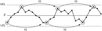
Figure 11.6: Process with "cycles."
Table 11.4 shows some generic causes that affect the Xbar and R charts.
| Some Causes Affecting Xbar Chart (stable variability) | Some Causes Affecting R Chart |
|---|---|
| Temperature or other recurring changes in physical environment Worker fatigue Differences in measuring or testing devices which are used in order Regular rotation of machines or workers Merging of subassemblies or other processes | Scheduled preventive maintenance Worker fatigue Worn tools |
UNUSUAL VARIATION
Control charts also provide signals when the observed data do not follow the expected distribution. Sometimes the causes for these signals are due to the sampling plan and not to variation in the manufacturing operation. Unusual variation is shown in Figures 11.7 and 11.8. The pattern is unusual in Figure 11.7 because more than two thirds of the plotted data points are within the center third of the control chart. Almost no data are being observed near the control limits. This situation is also called hugging. Figure 11.8 is an unusual pattern because more than one third of the data points are near the control limits. Very little data are being observed near the center line of the chart.
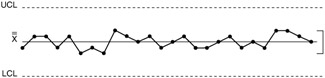
Figure 11.7: A process with a "hugging" situation.
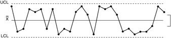
Figure 11.8: A process with extreme variation close to the control limits.
Table 11.5 shows some generic causes that affect the Xbar and R charts. Table 11.6 shows some generic causes that affect the Xbar and R charts.
| Some Causes Affecting Xbar Chart (stable variability) | Some Causes Affecting R chart |
|---|---|
| Incorrect calculation of control limits Incorrect sampling method | Collecting in each sample a number of measurements from widely differing universe |
| Some Causes Affecting Xbar Chart (stable variability) | Some Causes Affecting R Chart |
|---|---|
| Incorrect calculation of control limits Incorrect sampling method Mixing processes, workers, methods, etc., on regular bases | Collecting in each sample a number of measurements from widely differing universe |
Control charts may show unusual variation for two major reasons:
-
Fundamental changes in the process
-
Process stream effects
When fundamental changes are made to a process, an unusual pattern of variation may result. Installing a new set of bearings in a grinder, changing cutter material from silicone carbide to diamond, and converting relay switches to programmable controllers are examples of fundamental changes in a manufacturing process. In addition, changing material, changing suppliers, and the actual flow of the process will result in similar variation changes. The expected level of common variation for the new process is very different from that of the old process. The pattern of variation would look unusual if the control limits from the old process were applied to data collected from a new process.
Control charts should be constructed so that one control chart shows the variation from only one operation. When more than one source of variation is included in a control chart, multiple process streams influence the control chart. When measurements from several process streams are included in each subgroup , an averaging effect occurs (see Figure 11.7). The plotted points will tend to be very close to the process center line. The resulting control chart is very insensitive to changes in the process.
When different process streams are used for each subgroup, a pattern similar to that of Figure 11.8 results. The variation illustrated by the control chart is due to the changing source of information (different process streams) and not from difference in the manufacturing operation. The control chart tells little about variation from the specific process. In fact, a control chart including data from one of the process streams may be stable and in control.
EAN: 2147483647
Pages: 181