| Adding a drop shadow to text used to be a cumbersome process requiring several steps. However, Paint Shop Pro and many other imaging software companies have added drop shadows to their standard repertoire . To effectively use the Drop Shadow filter to create interesting effects with your text, follow these steps: -
Open a new 500x200pixel image with the resolution set to 72 pixels per inch. Set the background color to white and the image type to 16.7 million colors. -
Choose a background color (this will be the color that the Text tool will use for your text) and set the Foreground Style to none. Select the Text tool and then click your image to bring up the Text Entry dialog box. -
Leave most of the settings from the last two exercises, but choose a different font if you'd like. I chose Staccato BT and set the size to 96 points (see Figure 39.10). Figure 39.10. Text added to a new image and still surrounded by the selection marquee. 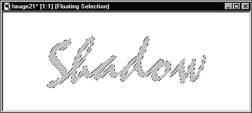  You can enter values for the text size that are different from the ones you see in the pull-down menu. To do so, simply click in the Size window and enter a new value. | The selection marquee surrounds the text. Don't deselect the text. (You might not have this font on your system but the results you get will be similar regardless of the font you choose.) -
Choose Effects, 3D Effects, Drop Shadow to open the Drop Shadow dialog box (see Figure 39.11). Figure 39.11. The Drop Shadow dialog box. 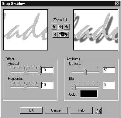 -
Click the Color button to open the Color dialog box and choose a color for your drop shadow. I'll stick with black. -
To arrive at the image in Figure 39.12, set the options in the Drop Shadow dialog box as follows : Color is Black, Opacity is 50, Blur is 5, Vertical Offset is 11, and Horizontal Offset is 8. Figure 39.12. Drop Shadow added to text.  You can use drop shadows to give the appearance of depth to your text. A closer, darker , sharper-edged shadow (as shown in Figure 39.13) gives the appearance of the text being just slightly above the screen (or printed page). Figure 39.13. Sharp-edged, dark drop shadow added to text.  To achieve the hard-edged, close shadow, I used the following values: Opacity: 80 Blur: 3 Vertical Offset: 7 Horizontal Offset: 5 The following values produced the drop shadow effect in Figure 39.14: Opacity: 60 Blur: 15 Vertical Offset: 15 Horizontal Offset: 11 Figure 39.14. Softer-edged, lighter drop shadow added to text.  Note how the text appears to hover higher in Figure 39.14 than it does in Figure 39.13. This effect is due to the softness and different offsets of the shadow in Figure 39.14. You should experiment with the various settings in the Drop Shadow dialog box to see how they affect the appearance of your text. |