| We promised you an extended look at the Metropolitan Museum of Art Web site. We now invite you to experience the extraordinary collection of the Metropolitan Museum of Art in New York City, familiarly known as the Met, as we explore the site using JAWS. Before we begin, however, we want to acknowledge the cooperation and great community spirit demonstrated by the Met staff, and especially librarian Eileen Sullivan. The Met necessarily safeguards the integrity of how its collection is publicly represented and reproduced. Our request to the Museum was outside the norm and yet, once Ms. Sullivan helped us to communicate to the Met about how we would use these images to improve Web use for people with disabilities, the Met staff members fully cooperated by granting us permission to print screen shots of their Web site to illustrate our experiences there. We are grateful to them for their interest in promoting access to these rich materials for all users, including those with disabilities. Let's get started with our exploration. In comparison to the vast sprawl of the Smithsonian or the enormous holdings of the Louvre, the Metropolitan Museum of Art seems almost petite, with a mere 2,000,000 objects. Yet here, too, we encounter unexpected accessibility barriers that reduce the site's effectiveness and lower the quality of the user experience. The design of the Met's home page as shown in Figure 7-5 is apparently simple: a rectangular image on the left displays an artifact from the Museum's collections, and accompanying text gives a brief description of the artifact. The page displays a bronze statue of a dancer from the Greek and Roman Art collection; the accompanying text is probably the same as that on the placard that identifies the physical statue in the Greek and Roman gallery. After approximately 30 seconds just about long enough for JAWS to read the masthead and the descriptive text that accompanies the image of the dancer the page updates itself, automatically and silently. The ALT text for the image on the original page (Figure 7-5) read simply and unhelpfully, "Image"; the new image (Figure 7-6) is identified as a link to a "Special Exhibition." The exhibition is unnamed, however, so the ALT text is of little value. Figure 7-5. Home page of the Metropolitan Museum of Art in New York City. View number 1. Accessed July 29, 2001, at http://www.metmuseum.org. Used with permission. 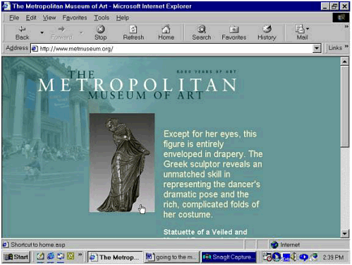 Figure 7-6. The Metropolitan Museum of Art's home page after a silent update, with a different image and descriptive text and a much expanded list of links. Accessed July 29, 2001, at http://www.metmuseum.org/home.asp. Used with permission. 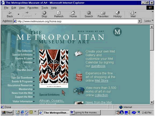 Automatic Refreshes and Redirects Are Accessibility Barriers It isn't simply that one image replaces another without notifying us of the impending change: we are actually taken to another page, though the change is so smooth and so subtle that we didn't notice it at first. There are other changes, too. In the space where the home page initially displayed the caption for the image of the dancer, there is now a two-column table whose left-hand column contains several small icons (representing a guest book, for example) and whose right-hand column invites us to do something (such as creating a personalized view of the collection and a personalized calendar of events by "signing" the guest book). This sort of auto-redirect is fairly common practice on today's Web but, like the pop-up window on the Smithsonian's HistoryWired site, it's a very problematic practice from the standpoint of accessibility. For visitors who use screen readers and talking browsers or have other difficulties with reading or focusing their attention, this unexpected change in screen display may pose an insurmountable obstacle. As Jim Allan of the Texas School for the Blind and Visually Impaired said to us recently, "It's like trying to watch TV when someone else has the remote." Allan was talking about pop-up windows, but his comment applies equally well to automatic refresh. For now, the answer is to follow WCAG 1.0 Checkpoint 7.4: "Until user agents provide the ability to stop the refresh, do not create periodically auto-refreshing pages." Visiting the Collection Like the designers of the Smithsonian's online collections, the Met's Web designers, Icon Nicholson, faced a formidable design challenge: they had to decide how best to represent an immense, diverse, and important collection in the online environment. Of note is the difference in the sheer amount of material represented on the two sites. The Smithsonian's HistoryWired site highlights 450 objects at any given time. By contrast, the Met's online highlights include some 3,500 objects chosen from a total of 2 million 50 items from each curatorial department in the Museum (Arms and Armor, Egyptian Art, Greek and Roman Art, Medieval, and so forth) plus the entire European painting collection. [6] [6] For more about the Met's curatorial departments, see http://www.metmuseum.org/collection/index.asp.
The bulk of the screen introducing the collection (Figure 7-7) is taken up with an explanation of the collection and its size and variety. The description of the Met collection's scope is followed by brief descriptions of the individual curatorial departments with links to their respective highlights sections. Perhaps inevitably, these links repeat most of the navigation links that appear on the left-hand side of the page. Figure 7-7. Screen shot of the Metropolitan Museum of Art's Collections page. Accessed July 22, 2001, at http://www.metmuseum.org/collections/index.asp. Used with permission. 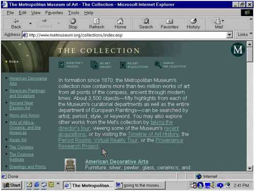 Navigation Links Can Be an Accessibility Barrier This is a trivial thing for sighted users, hardly worth noticing. But it can become a matter of considerable frustration for people using screen readers, talking browsers, or refreshable Braille displays. JAWS reported the Met's first page (Figure 7-5) as having only seven links. This is delightfully simple, but the pleasure is short-lived: there are 40 links on the page that replaces it (Figure 7-6), and 98 on the Collections page (Figure 7-7), many of them links down the left-hand margin. A layout scheme like this, in which 35 navigation links form the first cell of a <table> element used just for layout, forces screen readers to read the entire list of navigation links before getting to the "meat" of the page on every page, every time. With JAWS's speech rate set at approximately 220 words per minute, this takes roughly 35 seconds! By contrast, the explanatory text takes only about 26 seconds at the same rate. You do the math a lot of time is lost here. And of course the effect is multiplied many times over as users who are blind encounter the same phenomenon on site after site in the course of a day's work. For example, Jim Thatcher [2001a] reported that he listened to the CNN site with IBM's Home Page Reader "for over five minutes" before he came to what was supposed to be the lead story. Skip to Main Content Links The solution is to provide a method that lets users bypass repeated navigation links if they wish to do so. CNN addressed the problem that Thatcher reported, for example, by adding a Skip to Main Content link as the first link on every page. WCAG 1.0 recommends this practice, but the checkpoint (13.6) is buried deep under the heading of Guideline 13, which deals with a host of issues related to the mandate for clear, consistent navigation. It might seem odd that this item gets such low priority, but it reminds us how quickly things have changed on the Web. It's worth noting here that the idea of using navigation bars in the first place is also buried pretty deep within Guideline 13 and it too rates only a Priority 3 recommendation. Section 508, paragraph (o), published two years and many endlessly repeated navigation links later, uses stronger language: it requires that developers incorporate a method for skipping over such repeated links and other navigation bars. Even though the Met does not have to comply with the Section 508 standards, a Skip to Main Content or Skip Navigation link would indeed be a welcome addition here, as it is on the CNN site. Setting ALT to Null Like the navigation links, the descriptions of the curatorial departments and associated links are arranged in a two-column table. Column 1 represents the department with a thumbnail image, which is also a link to that department's page in the Collections site; Column 2 contains the explanatory text, as in the lower portion of Figure 7-7. With so much onscreen text to see and hear, the developers evidently and quite appropriately felt that ALT text for the thumbnails would be superfluous. They tried to force screen readers and talking browsers to skip over the thumbnail images by including empty alt attributes in the code that is, the alt attribute is present but no content is assigned to it, as in the code fragment reproduced below from the Collections page shown earlier. !<-- item picture --> <td width="55" align="right"> <a href="department.asp?dep=4">img src="/books/3/135/1/html/2/art/ co_img_4.gif" alt border="0"></a><br>img src="/books/3/135/1/html/2/art/spacer.gif" width="55" height="15" border="0"></td> This code creates a table cell whose contents are identified by a comment in the code as the "item picture." There are actually two <img> elements in the cell: the item picture and a transparent spacer image. The code for the item picture includes a kind of placeholder for ALT text, which is apparently intended to force screen readers and talking browsers to ignore the image and go directly to the item description in the next cell. The effort fails, however, because the syntax for the empty alt attribute is incorrect: it should read alt="", not simply alt or alt=" ", with an empty space between the quotation marks). The result: exactly the opposite of what the designers evidently intended. Instead of skipping the image, the screen reader falls back on the filename and reads it: "art/co_img_4.gif," it intones robotically. Exploring the Collection We now give the floor to John to relate some personal background that guides our choice for the next exploration. When I was a child I visited The Cloisters, a beautiful museum operated by the Met and devoted to medieval art. The Cloisters page provides a detailed description of the building itself and its relation to the Met's main building on Fifth Avenue. I'd like to explore some illuminated manuscripts, which have fascinated me since I saw my first one on a visit to Toronto with my parents in 1959 or '60. Let's look closely at a page that contains such an illuminated manuscript (Figure 7-8). There are a number of noteworthy features. First of all, there are several options for viewing the highlights for this segment of the Met's collection. Figure 7-8. Screen shot of a page from the Metropolitan Museum of Art's Web site for The Cloisters, a branch museum dedicated to medieval art. Accessed July 22, 2001, at http://www.metmuseum.org/collections/view1.asp?dep=7&item=54%2E1%2E2. Used with permission. 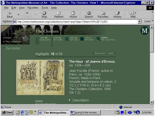 The default view, which we'll examine in some detail, shows one image at a time, as in Figure 7-8. Choosing to view 10 images at a time produces a page that uses what is by now the familiar two-column table with a reduced-size image in the left-hand column and the caption text (in a reduced font) on the right. There is also an option labeled "View 10 Text Only," which displays only the title and accession number (the accession number indicates the date when the object was added to the collection) for each object; the object's title is a link to the single-image or default view. And, finally, you can view all 50 highlights at once, as shown in Figure 7-9. Figure 7-9. The Metropolitan Museum of Art's View 50 screen shows all 50 highlights for The Cloisters collection. Each highlight is represented by a thumbnail image. Accessed August 6, 2001, at http://www.metmuseum.org/collections/view50.asp?dep=7. Used with permission. 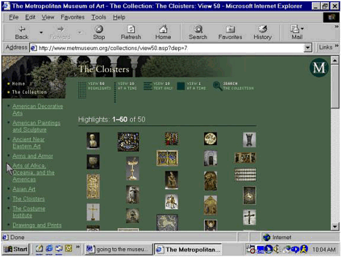
The screen shot in Figure 7-9 shows a set of thumbnail images, five to a row. You can run your eye over them to find the one you want, then click to go straight to the default view of the object you've selected. But you'd better be able to run your eye across the screen and pick out what you want to look at: there is no ALT text here. Or rather, the images do have alt attributes, but in each case the alt attribute has been set to empty using the syntax alt="" the correct syntax, as opposed to the incorrect example cited above. Through no fault of the Web designers, this results in different behavior, depending on which version of JAWS you're using and on which user settings you've chosen. Versions 3.7.047 and 3.7.087 seem to assume that the coding was a mistake, so instead of skipping over the images these two versions of JAWS report the (unintelligible) pathname for each image. JAWS 4.01 does the same thing. The much earlier JAWS 3.5, on the other hand, responds correctly to the empty alt strings; so does JAWS 4.02, the current version as of this writing. That is, JAWS versions 3.5 and 4.02 ignore the images all of them. The result? JAWS 3.5 and 4.02 read the navigation links on the left side of the screen, and that's it. Versions 3.7 and 4.1, on the other hand, report the navigation links as well as the filename for each image. It's hard to say which is worse both are pretty hideous as far as the quality of the user experience is concerned. There are really two issues here. One has to do with assistive technology; the other has to do with Web design. First there is the inexplicable decision by Freedom Scientific, the maker of the JAWS software, to back away from supporting correct HTML syntax for empty ALT text. As a Web designer, you are of course not responsible for this strange behavior on the company's part, which puts you in an uncomfortable bind from which there seems to be no good way out. But this brings us to the second issue: the original design decision. From a purely technical standpoint, the Icon Nicholson team members did the right thing when they used alt="" to create an empty alt attribute for each thumbnail image on the View 50 page (assistive technology vendors should support the accessibility standards!). But in our view, Icon Nicholson made a poor design decision when the team members decided against identifying each image so that people using screen readers, talking browsers, refreshable Braille displays, and text-only displays could easily understand what's on the page and make appropriate choices. In other words, the best solution here would be to provide meaningful ALT text for each image. This in turn raises some important issues about the design of the underlying database that stores the images and information about them: each record in the database should include a field for ALT text, so that the script that generates the highlights pages can make that ALT text available to users who need it. Consistent Design Let's go back to the default view one highlight image at a time as shown in Figure 7-8. The screen layout is similar to that of the first pages we encountered on the Met site. The image of a medieval illuminated manuscript appears on the left side of the screen, with the caption text beside it on the right. Above the image, a legend informs us that we are looking at number 16 of 50 highlights. This consistent use of layout resonates nicely with WCAG 1.0 Checkpoint 14.3: "Create a style of presentation that is consistent across pages." Usability experts recognize consistent page layout as a contributing factor in the successful completion of tasks by all Web site visitors, especially those who have cognitive disabilities or difficulty reading. Exploring the Image The illustration has been carefully formatted for the Web: the image size is just 23K, a size that will download easily even on a fairly slow modem connection. The image is also "zoomable" that is, selecting the image produces an enlargement (Figure 7-10). Figure 7-10. Screen shot of The Cloisters highlight page displayed in Figure 7-8, now showing an enlarged view of the illuminated manuscript, which fills most of the screen. Used with permission. 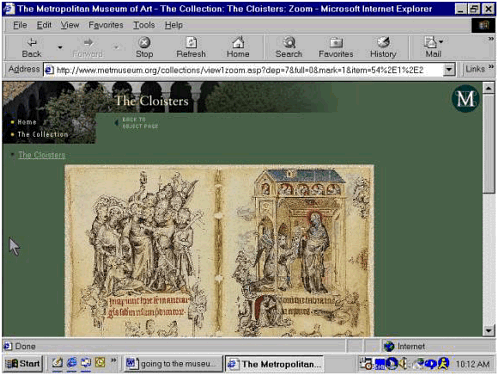 Once the image has been enlarged, you can then click on an area of the image to "zoom in" more closely on that area, as in Figure 7-11. Figure 7-11. A detail of the illuminated manuscript, viewed close up. This is produced by clicking on part of the enlarged image shown in Figure 7-10. Used with permission. 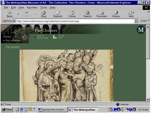 This feature is valuable for fully sighted visitors (for example, art history students who can't travel to New York). It could also be extremely beneficial for visitors with low vision who may be able to appreciate the image if they can zoom in on more detailed views. Equivalent Text Alternatives But there's trouble in this art-lover's virtual Paradise. The "zoom" feature would be even more valuable if the site provided an equivalent text alternative for each "view" of the image, as WCAG 1.0 and Section 508 require. Section 508, paragraph (l), puts it very clearly: "When pages utilize scripting languages to display content, or to create interface elements, the information provided by the script shall be identified with functional text that can be read by assistive technology." The problem is that you can zoom in on a portion of the image that interests you, but you can't "drill down" into the text description for additional detail. This may sound like an outlandish expectation, but it isn't. The same people who might benefit from zooming in on the image an elderly person with macular degeneration, for example, or an art history student with 20/20 vision who happens to live 1,800 miles from the Met might well be able to learn a great deal with the help of additional textual detail that corresponds to the visual display. The existing mechanism for zooming in to a more detailed view of the image, with the substitution of client-side image maps for the server-side maps used on the current site as discussed below, would also serve to present additional descriptive detail that would be accessible to people who cannot see the images at all. (See Chapter 9 for a discussion of Adam Alonso's useful guidelines for describing works of art and other complex images.) There are a few other details to take care of as well. The enlarged image in Figure 7-9 can be accessed via the keyboard the image in Figure 7-8 is a graphical link to the enlarged view of itself. But people using nonvisual displays would have to guess at that since the ALT text seems to be missing (JAWS reports "images slash cl015v dash 016r period r"). Then, when we move to the next level of detail, the ability to zoom in on details of the enlargement requires a mouse: what JAWS reports as "Click on image to zoom button" is apparently a server-side image map overlaid on an <input> element of type button. And here again is an unnecessary (and surely unintentional) barrier to access. Server-Side Image Maps Are Accessibility Barriers WCAG 1.0 Guideline 9 states the general principle that applies here: "Design for device-independence" that is, allow for a range of input devices, including keyboard, voice, headwand, and other assistive technologies. These assistive technologies generally map to the keyboard (so that interface elements that are keyboard accessible are usually accessible to other assistive technologies as well). Server-side image maps violate the principle of device-independent design because they require the use of a pointing device. This doesn't just affect people who are blind: it affects anyone who can't easily point and click, including people with cerebral palsy, Parkinson's disease, carpal tunnel syndrome, and a wide variety of other conditions such as stroke or hand tremors that are sometimes associated with old age. Both WCAG 1.0 and the Section 508 standards call for developers to avoid server-side image maps if at all possible and specify compensatory action when avoiding server-side maps isn't an option. WCAG 1.0 Checkpoint 9.1 asks Web authors to "Provide client-side image maps instead of server-side image maps except where the regions cannot be defined with an available geometric shape [Priority 1]," and Checkpoint 1.2 tells us what to do if we have to go server-side: "Provide redundant text links for each active region of a server-side image map." The Section 508 standards, paragraphs (e) and (f), are substantively identical to the WCAG 1.0 checkpoints. There's nothing on the Metropolitan Museum site to require server-side image maps. The zoomable images on the Met's highlights pages are divided into simple quadrants. Since one of the available geometric shapes for the <area> elements that form the selectable regions of client-side image maps is a rectangle (rect attribute), there is no need to use server-side maps. This means that eliminating the accessibility barrier created by the use of server-side image maps would be a trivial matter, technically speaking. It would only be necessary to replace the server-side image maps with client-side image maps. The selectable regions of these client-side image maps (<area> elements) would then be keyboard accessible, and associating ALT text with each <area> element would allow people using screen readers, talking browsers, refreshable Braille displays, and text-only browsers to identify the regions. Once they've made their choices, the server could display the detailed view with appropriate companion text. As with the ALT text for the thumbnail images on the View 50 page discussed above, this would require changes to the underlying database and the scripts that generate the zoomed images. There are even some tools that make it easy to automate the process of converting server-side image maps to client-side image maps. One such tool is A-Prompt, which we mentioned in Chapter 6. The Web Page as an Experience in Time: The Problem of Reading Order But other problems will be more difficult to resolve than the issue of image maps. The placement of some images on the page (the source code shows repeated use of a spacer image including multiple "transparent" spacer images) and the way <table> elements are used to control page layout throw the reading order out of whack. The most important of these disruptions occurs immediately after the screen reader has finished reading the caption text beside the highlight image. The extended description discussed above is what should logically come next, and this is the impression you get when listening to the page: after JAWS finishes the caption, it next says "Graphic arrow description," thereby identifying the small, right-facing triangle next to the word "Description." But the description is not what comes next. Here's a transcript of JAWS reading the illuminated manuscript highlight page from the point immediately following the caption text. Graphic arrow description Graphic arrow link alternate views Graphic arrow link provenance slash ownership history Link graphic the Met store Link graphic related store items Link graphic explore and learn more Link graphic online resources Link graphic view my Met gallery Link graphic related Link graphic support Link printing instructions
And now, finally, here comes the description we've been waiting for. JAWS says: Description The two hundred nine folios of. . . .
Visualizing the Problem The screen shots in Figures 7-12 and 7-13 illustrate the readingorder problem visually. They were created with an accessibility evaluation tool called The WAVE, designed by the late Len Kasday of Temple University. Figure 7-12 shows the part of the page from Figure 7-8 that contains an image from The Hours of Jeanne d'É vreux, plus the caption text that appears to the right of the image. Figure 7-12. Partial view of the page generated by The WAVE to evaluate the accessibility of the illuminated manuscript page shown in Figure 7-8. The WAVE was accessed August 5, 2001, at http://www.temple.edu/inst_disabilities/piat/wave/. Used with permission. 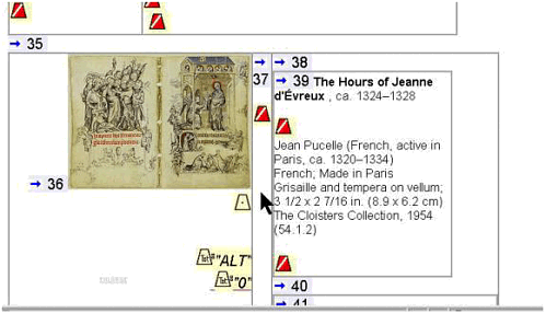 Figure 7-13. Second view of the Metropolitan Museum of Art's illuminated manuscript page as analyzed by The WAVE, showing the extended description of The Hours of Jeanne d'É vreux as the seventy-first element on the page. The WAVE was accessed August 5, 2001, at http://www.temple.edu/inst_disabilities/piat/wave/. Used with permission. 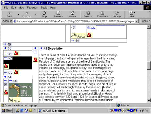 The numerals and directional arrows in Figure 7-12 show the order in which screen readers, talking browsers, refreshable Braille devices, and text-only displays will read the page elements. The cones with slash marks inside indicate graphics with missing ALT text. Most of these are spacer images inside the data cells of a nested table used for layout. A second screen shot of the same page (Figure 7-13) shows how far apart in reading order are the caption text about the manuscript page and the contextual description of the The Hours of Jeanne d'É vreux. The image of the manuscript page in Figure 7-8 is the thirty-fifth element on the page. The description, which had seemed about to follow immediately, is not element 36 it's actually the seventy-first element on the page! In Figure 7-13, the extended description of The Hours of Jeanne d'É vreux appears as the seventy-first element on the page the contents of a data cell inside a nested table. Beside it, on the left, is another table cell containing elements 51-53 all apparently spacer graphics that either lack ALT text or have empty alt attributes with incorrect syntax. Below that is another cell containing elements 55- 58, which include spacer images and graphical links to the Met Store and another view of the collection. Reading Order Matters! The point of all this is that reading order matters; it matters just as much as, and pretty much the same way as, the order of operations matters in a math problem. And for people whose experience of the Web depends mostly or entirely on listening to text read aloud by a robot, reading order may be just about everything. (Please see Chapter 9 for discussion of how graphic placement affects reading order.) |
