| By now, the purpose of fundamental controls such as the Label, TextBox, and Button should be clear to you, regardless of whether you are working with Web forms or Windows forms. However, if you are familiar with the Windows versions of these controls, you may notice some big differences. For example, when you draw an ASP.NET Label control on a Web form, the first thing you should notice is several properties are missing! For example, there is no way to force text alignment to the left or right, as with a Windows control. (If you want to do this, you can use a Table cell, as described in the upcoming section "Displaying Information in a Table.") Although lack of support for identical features may seem like a big limitation at first, it is outweighed by the fact your application can run in almost any browser. Remember that a browser's display capabilities are limited to standard HTML. An ASP.NET server control mimics as much of the functionality of the corresponding Windows control as it can, but must function within the constraints of the Web platform. As you will see, in some areas Web controls even provide additional capabilities. In this section, we'll look at some general features of the way Web controls work and describe a few controls that are essential to Web page navigation and organization. Allowing the Browser to Adjust Control Size As we mentioned in Chapter 18, "Web Applications and Services," when you arrange controls on a Web form you may do so in Grid Layout mode or Flow Layout mode. If you choose Flow Layout mode, the end user's browser has more freedom to adjust control position. Similarly, when setting the Height and Width properties of a Web control, the programmer can choose to exercise varying degrees of control (pun intended) over an object's size. For example, the following statements show three different ways to set the Width property of a Label control: Label1.Width = Unit.Pixel(300) Label2.Width = Unit.Percentage(75) Label3.Width = Unit.Empty The first statement sets the width of a Label control to 300 pixels. The second statement specifies the label should be 75% of the browser window size. The final line of code lets the browser determine the label width, based on the length of the label text and the size of the browser window. Figure 19.1 shows the effect of executing these three code statements on identical labels. Figure 19.1. Setting a relative width or no width allows a Web control to dynamically adjust to the size of the browser window; a width specified in pixels prohibits automatic resizing. 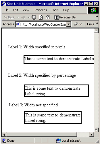 Note When entering a size number in the Properties window at design time, you can type px to indicate pixels or % to indicate a percent value.
As you can see from Figure 19.1, specifying an object's size in pixels provides the greatest degree of control but disables automatic resizing. Setting a Relative Font Size In a Web application, fonts can also be specified in relative or absolute units, using the FontUnit structure: Label1.Font.Size = FontUnit.Point(10) Label2.Font.Size = FontUnit.Larger Label3.Font.Size = FontUnit.XLarge In some browsers, such as Internet Explorer, the user can choose whichever text size is easiest to read for her. Using relative font sizes allows your Web page to adjust to these changes, while a font size specified in points remains fixed. Using a Style Sheet You may notice that many of the Web controls have a property called CSSClass. A .css file, which stands for Cascading Style Sheet, allows you to specify visual attributes such as color, size, and font names. You can link the same style sheet file to one or more Web pages to ensure that all your pages look visually consistent. Not only can you define the style of standard Web page elements like hyperlinks, but you can also define custom style classes that can be associated with Web controls via the CSSClass property. Navigating the Style Sheet By default, Web application projects automatically include a style sheet called Styles.css. To view the contents of the style sheet, right-click the Styles.css file in the Solution Explorer and select Open. Two new windows will open: the style sheet itself and the CSS Outline window, both of which are pictured in Figure 19.2. Figure 19.2. The CSS Outline Window provides a way to visually navigate a style sheet. 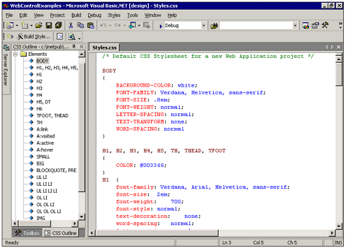 As you can see from Figure 19.2, the font names and sizes for various Web page elements are defined in the style sheet. To view the style attributes for body text, right-click the BODY element in the CSS Outline Window and select Style Builder. The Style Builder dialog box, shown in Figure 19.3, allows you to visually define the properties of a style. Figure 19.3. The Style Builder allows you to manipulate the contents of a Cascading Style Sheet in a graphical manner. 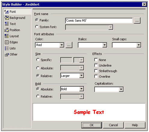 Creating a Custom CSS Class In addition to setting styles for the various predefined elements of a Web page, style sheets can also be used to define custom style classes. To demonstrate, we'll create our own style class called RedAlert to draw attention or indicate a problem. To create a new style class, perform the following steps: -
Right-click the Classes folder in the CSS Outline Window and select Add Style Rule. -
Click the Class Name Option and enter RedAlert. -
Click OK. The following skeleton style class is added to your style sheet: .RedAlert { } -
Right-click the RedAlert class in the CSS Outline Window and select Build Style to display the Style Builder. -
Set the Font color to Red and the Font size to X-Large. -
Click OK to close the Style Builder. Note that your font attributes have been added to the style sheet.
Congratulations, you have just created a new style class. Using Your CSS Class To use your new CSS class, you will need to link the style sheet to a Web form and then set the CSSClass property of a control to RedAlert. Even though the Styles.css file is included in your project, you still need to add the following line of HTML to tell the Web form about it: <LINK REL="stylesheet" Type="text/css" HREF="styles.css"> The previous line of code links the styles in a particular HTML document to the style sheet file. It is typically placed in the header section of an HTML document. To add this link in your own project, do the following: -
Open the designer for your Web form and click the HTML button to display the HTML view. -
Find the <HEAD> tag in the HTML file. Add the LINK statement from the previous line of code on a new line after the <HEAD> tag. -
Click the Design button to return to the design view. -
Add a Label control. -
Display the Properties window for the label and find the CSSClass property. Enter RedAlert for the CSSClass property value.
After performing these steps, the label control should be automatically updated to reflect the new style. Using the Panel Control to Organize Your Page One useful ASP.NET server control is Panel, which can contain other Web controls. Placing controls in a panel allows you to hide or show a group of controls at the same time, as well as have controls resize to fit panel rather than page boundaries. By adding borders to a panel, you can create visual boundaries, as shown in Figure 19.4. Figure 19.4. Panels can be used to group controls. 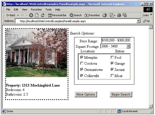 Using the Panel control at design time is a little tricky. To add controls to it, you have to drag them from the toolbox directly to the panel or copy and paste them from the Web form. The Panel is more suited to dynamically generating controls. Listing 19.1 shows how to generate an ImageButton control in a Panel at runtime. Listing 19.1 WEBCONTROLS.ZIP Adding Controls to a Panel 'Create a new button Dim MyButton As ImageButton MyButton = New ImageButton() MyButton.ImageUrl = "/Win2000.gif" AddHandler MyButton.Click, AddressOf MyClickHandler 'Add it to the panel Panel1.Controls.Add(MyButton) Panel1.HorizontalAlign = HorizontalAlign.Center Panel1.Visible = True The code in Listing 19.1 creates an instance of the ImageButton class and then sets the image location and Click event handler. Next, it is added to a panel using the Add method. Finally, the Panel's HorizontalAlign property is set to center the control, and the Visible property is set to True. The resulting form would not look any different than if you had simply drawn the button at design time. However, the flexibility of generating buttons and other controls at runtime may be useful when creating a Web form based on the results of a database query. Note When adding buttons to a panel dynamically, you need to execute the AddHandler statement in the Page_Load event. If you set up an event handler inside the Click event procedure of another button, for example, the event handler does not respond correctly. To work around this, you can have the first button set a variable that cause the dynamic button to be created in the next Page_Load event.
Mastering Page Navigation In a Windows application, you can show forms programmatically by creating an instance of the form class. In Web forms, you have to get the ASP.NET page processor to create the instance. One way to move from page to page in a Web application is to link the pages using hyperlinks. Another is to transfer the user to another page in response to a server-side event. Visual Studio .NET includes controls to accomplish both. Adding HyperLinks If you have ever used the Web, you are familiar with the concept of a hyperlink. Hyperlinks allow you to navigate to a different Web page. Creating a hyperlink manually using HTML is easy: <A HREF="http://www.vbinsider.com">Brian's Web Site</A> The previous line of code would cause the text Brian's Web Site to be displayed in the user's browser. Clicking the text would transfer the user to the http://www.vbinsider.com Web site. In the world of Web forms, you can use a HyperLink control to add hyperlinks to your Web pages. Although the HTML for a hyperlink is trivial, using the server-side control version allows you to access it seamlessly using server-side code. For example, you could set the Visible property to hide or show the hyperlink depending on whether the user has completed a data entry form. When you create a new instance of the HyperLink control, you typically set the following properties: Text The clickable text shown to the user. NavigateURL The address of the Web page to which you want the hyperlink to navigate. ImageURL Setting this property to the address of an image will override the Text property and display a clickable image instead. Target Allows you to open the new page in a specified frame or new browser window.
To aid in specifying URL addresses, you can display the Select URL dialog box when specifying the NavigateURL and ImageURL properties. The dialog box, shown in Figure 19.5, helps you locate a file by providing browse and preview capabilities. Figure 19.5. When linking Web forms in the same application, relative URLs allow you to move the application from server to server without changing the URL path. 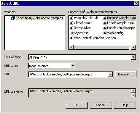 Raising Server-Side Events with Buttons Button controls provide a way for a user of your Web application to initiate an action on the server. This is the main thing that sets a button apart from a hyperlink the fact that a server-side event is raised. A hyperlink, on the other hand, causes the end user's browser to directly move to a new page without first talking to the server. There are three different types of button controls to choose from: Button The standard button control that appears as a gray box. LinkButton It looks like a HyperLink control but raises a server-side event. ImageButton Allows you to put a clickable image on your Web page. (Set the ImageURL property to specify the image.)
Figure 19.6 shows an example of the different types of Web buttons. Figure 19.6. The different types of Button controls in the Web forms model vary in appearance but are similar in functionality. 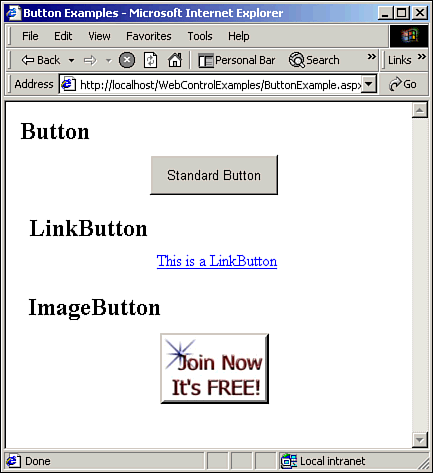 All the buttons work basically the same, in that the most important event is the Click event, which occurs when the user clicks the button with the mouse. However, the ImageButton also provides the x,y coordinate of the click, which can be useful in creating an image map. Listing 19.2 shows how to retrieve coordinates from an image map using the Click event. Listing 19.2 WEBCONTROLS.ZIP Creating an Image Map Private Sub ImageButton1_Click(ByVal sender As_ System.Object, ByVal e As_ System.Web.UI.ImageClickEventArgs) Handles ImageButton1.Click Dim sNewPage As String sNewPage = WhereDoIGo(e.X, e.Y) Response.Redirect(sNewPage) End Sub Private Function WhereDoIGo(ByVal X As Integer,_ ByVal Y As Integer) As String If X > 50 Then Return "http://www.microsoft.com" Else Return "http://www.yahoo.com" End If End Function The code in Listing 19.2 redirects the user's browser to a different Web page depending on where she clicked the image. | 
