The Components
Organizing Components into Containers
Before we discuss the components themselves in detail, we will discuss how to organize them into containers. From this standpoint, all components act alike. To not distract from the subject at hand, the next few programs will only use the three familiar component archetypes: the button, the textarea and the label which are implemented by JButton, JTextArea and JLabel respectively. The code should be self-explanatory, but feel free to consult the javadocs for additional information. At its basic level, creating a GUI is nothing more than putting components in containers. Let’s begin doing just that.
Absolute Positioning
The following code augments example 12.1 by adding a button, textarea and label to the JFrame. First we call contentPane.setLayout(null) in line 17 to instruct the content pane to put components where we explicitly say. The significance of that line will be more apparent when we discuss LayoutManagers. Then, for each component we add, we use the setBounds() method to set the exact size and location of each component (as in lines 20, 25 and 31). This is called absolute positioning. Since each component is added to the content pane of the JFrame, the parameters passed into the setBounds() method are interpreted in the coordinate system of the content pane – not the JFrame itself.
Use the following commands to compile and execute the example. From the directory containing the src folder:
javac –d classes -sourcepath src src/chap12/TestFrameWithContents.java java –cp classes chap12.TestFrameWithContents
Figure 12-13 shows the results of running example 12.2. Figure 12-14 shows component layout information that has been printed to the console.
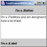
Figure 12-13: TestFrameWithContents GUI
Example 12.2: chap12.TestFrameWithContents.java
1 package chap12; 2 import java.awt.Container; 3 4 import javax.swing.JButton; 5 import javax.swing.JFrame; 6 import javax.swing.JLabel; 7 import javax.swing.JTextArea; 8 9 import utils.TreePrinterUtils; 10 11 public class TestFrameWithContents { 12 public static void main(String[] arg) { 13 JFrame frame = new JFrame("TestFrameWithContents"); 14 frame.setDefaultCloseOperation(JFrame.EXIT_ON_CLOSE); 15 frame.setBounds(200, 200, 200, 200); 16 Container contentPane = frame.getContentPane(); 17 contentPane.setLayout(null); 18 19 JButton button = new JButton("I'm a JButton"); 20 button.setBounds(0, 0, 200, 40); 21 contentPane.add(button); 22 23 JTextArea textArea = 24 new JTextArea("I'm a JTextArea and am designed to hold a lot of text."); 25 textArea.setBounds(0, 40, 200, 100); 26 textArea.setLineWrap(true); 27 textArea.setWrapStyleWord(true); 28 contentPane.add(textArea); 29 30 JLabel label = new JLabel("I'm a JLabel"); 31 label.setBounds(0, 140, 200, 40); 32 contentPane.add(label); 33 34 frame.setVisible(true); 35 TreePrinterUtils.printLayout(contentPane); 36 } 37 }
JPanel [0, 0, 192, 172] (null: 3 children) +--JButton [0, 0, 200, 40] +--JTextArea [0, 40, 200, 100] +--JLabel [0, 140, 200, 40]
Figure 12-14: TestFrameWithContents Console Output
Notice the console output resulting from TreePrinterUtils.printLayout(contentPane). TreePrinterUtils.printLayout is a handy tool for displaying the layout of a container in textual form. It will be utilized by all the remaining programs in this chapter to help clarify interface layouts. It progresses recursively through a component tree displaying the containment hierarchy and printing information about every component it encounters. For each component, it prints the component’s type followed by its bounds in square brackets. Then, if the component is a container and contains at least one child component, it prints the layout manager type and the number of child components inside parentheses. Layout managers will be discussed shortly.
By setting the bounds of each component explicitly, we have complete control of how we want our content pane to look. Great! With complete control, however, comes complete responsibility. Resize the window larger and smaller and notice the results. See Figures 12-15 and 12-16 to see the results of resizing the window larger and smaller.
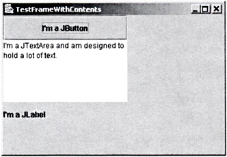
Figure 12-15: TestFrameWithContents Resized Larger

Figure 12-16: TestFrameWithContents Resized Smaller
Oops! Wouldn’t it be nicer if the components were automatically resized when we resized the window? Well, with a lot more coding we could write methods into our application that notice when the window is resized and then recalculate the bounds of the components so that they look good at the new window size. We could do this but we won’t. AWT provides us with a very handy mechanism for doing this and more. It is called the layout manager.
Layout Managers
java.awt.LayoutManager is an interface that declares methods for laying out components in a container. A layout manager earns its keep every time something happens in a container that might necessitate the repositioning of that container’s components. That includes resizing of the container, the addition or removal of children components and other events. While all components can make suggestions regarding what size to draw them (see the Component methods getPreferredSize(), getMinimumSize() and getMaximumSize()) the layout manager is the final authority for actually setting the bounds of all components by calling Component.setBounds(). By installing a predefined or custom layout manager into a container through Container.setLayout() we can avoid much of the headache of managing a container’s layout ourselves.
FlowLayout
FlowLayout arranges components similarly to the way a word-processor arranges text in a document. By default, it fills the container from left to right and top to bottom, “wrapping” to the next “line” components that would otherwise spill over the right edge of the container. By default, components in each line are centered and are separated from each other by a horizontal and vertical gap of 5 pixels. Alignment options and gap sizes may be passed into the constructor or set after the fact through FlowLayout.setHgap(int), FlowLayout.setVgap(int) and FlowLayout.setAlignment(int). Options for alignment include:
-
FlowLayout.CENTER (the default) - centers each row of components.
-
FlowLayout.LEFT - left-justifies each row of components.
-
FlowLayout.RIGHT - right-justifies each row of components.
-
FlowLayout.LEADING - justifies each row of components to its container’s leading edge.
-
FlowLayout.TRAILING - justifies each row of components to its container’s trailing edge.
FlowLayout always sizes components to their preferred size regardless how big or small the container actually is. Example 12.3 modifies example 12.2 by using FlowLayout as the layout manager for the content pane in line 18.
Use the following commands to compile and execute the example. From the directory containing the src folder:
javac –d classes -sourcepath src src/chap12/TestFrameWithFlowLayout.java java –cp classes chap12.TestFrameWithFlowLayout
Figure 12-17 shows the results of running example 12.3. Figure 12-18 shows component layout information that has been printed to the console.
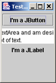
Figure 12-17: TestFrameWithFlowLayout GUI
Example 12.3: chap12.TestFrameWithFlowLayout.java
1 package chap12; 2 import java.awt.Container; 3 import java.awt.FlowLayout; 4 5 import javax.swing.JButton; 6 import javax.swing.JFrame; 7 import javax.swing.JLabel; 8 import javax.swing.JTextArea; 9 10 import utils.TreePrinterUtils; 11 12 public class TestFrameWithFlowLayout { 13 public static void main(String[] arg) { 14 JFrame frame = new JFrame("TestFrameWithFlowLayout"); 15 frame.setDefaultCloseOperation(JFrame.EXIT_ON_CLOSE); 16 frame.setBounds(200, 200, 200, 200); 17 Container contentPane = frame.getContentPane(); 18 contentPane.setLayout(new FlowLayout()); 19 20 JButton button = new JButton("I'm a JButton"); 21 button.setBounds(0, 0, 200, 40); 22 contentPane.add(button); 23 24 JTextArea textArea = 25 new JTextArea("I'm a JTextArea and am designed to hold a lot of text."); 26 textArea.setBounds(0, 40, 200, 100); 27 textArea.setLineWrap(true); 28 textArea.setWrapStyleWord(true); 29 contentPane.add(textArea); 30 31 JLabel label = new JLabel("I'm a JLabel"); 32 label.setBounds(0, 140, 200, 40); 33 contentPane.add(label); 34 35 frame.setVisible(true); 36 TreePrinterUtils.printLayout(contentPane); 37 } 38 }
JPanel [0, 0, 192, 172] (FlowLayout: 3 children) +--JButton [42, 5, 108, 26] +--JTextArea [-4, 36, 200, 32] +--JLabel [62, 73, 68, 16]
Figure 12-18: TestFrameWithFlowLayout Console Output
Notice that the component bounds in the output of TreePrinterUtils.printLayout are different than the bounds to which we set them. Well, what did you expect? After all, it’s the layout manager’s job to set the bounds – not ours. A layout manager determines the size and location of each component based on its own logic. Although not required, it is certainly reasonable that a layout manager would ignore a component’s current bounds when calculating that component’s new bounds..
Figures 12-19 and 12-20 show the effects of resizing the window wider and taller. Notice the wasted space and especially the poor layout of the JTextArea in figure 12-20 whose left and right sides are lopped off by the window’s own edges. This is clearly not the best layout manager for this application but it is certainly an improvement over no layout manager at all.
![]()
Figure 12-19: TestFrameWithFlowLayout Resized Wider
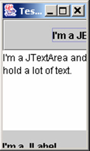
Figure 12-20: TestFrameWithFlowLayout Resized Taller
GridLayout
GridLayout divides a container’s area into a grid of equally sized cells. The number of cells in each row and column may be determined in the constructor or after construction via setRows(int) and setColumns(int). If either the rows or columns are set to zero, this is interpreted as “however many are necessary to fit all the children components”. For instance, if a GridLayout containing eight children has its rows set to zero and its columns set to two, then it will create four rows and two columns to contain the eight components. Figure 12-21 shows the grid coordinates and layout for a component using a GridLayout with four rows and two columns. .
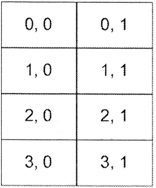
Figure 12-21: Coordinates for a Sample GridLayout with 4 Rows and 2 Columns
Like FlowLayout, GridLayout has configurable horizontal and vertical gap parameters. Unlike FlowLayout, GridLayout ignores components’ preferred sizes and guarantees that all components will fit in the container no matter how large or small. In example 12.4 we use GridLayout to see its effects on our tiny application. We also removed the superfluous calls to Component.setBounds().
Use the following commands to compile and execute the example. From the directory containing the src folder:
javac –d classes -sourcepath src src/chap12/TestFrameWithGridLayout.java java –cp classes chap12.TestFrameWithGridLayout
Figure 12-22 shows the results of running example 12.4. Figure 12-23 shows the GUI’s component location information printed to the console. Figures 12-24 and 12-25 show the effects of resizing the window wider and taller.
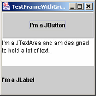
Figure 12-22: TestFrameWithGridLayout GUI
Example 12.4: chap12.TestFrameWithGridLayout.java
1 package chap12; 2 import java.awt.Container; 3 import java.awt.GridLayout; 4 import javax.swing.JButton; 5 import javax.swing.JFrame; 6 import javax.swing.JLabel; 7 import javax.swing.JTextArea; 8 import utils.TreePrinterUtils; 9 10 public class TestFrameWithGridLayout { 11 public static void main(String[] arg) { 12 JFrame frame = new JFrame("TestFrameWithGridLayout"); 13 frame.setDefaultCloseOperation(JFrame.EXIT_ON_CLOSE); 14 frame.setBounds(200, 200, 200, 200); 15 Container contentPane = frame.getContentPane(); 16 contentPane.setLayout(new GridLayout(3, 1)); 17 18 JButton button = new JButton("I'm a JButton"); 19 contentPane.add(button); 20 21 JTextArea textArea = 22 new JTextArea("I'm a JTextArea and am designed to hold a lot of text."); 23 textArea.setLineWrap(true); 24 textArea.setWrapStyleWord(true); 25 contentPane.add(textArea); 26 27 JLabel label = new JLabel("I'm a JLabel"); 28 contentPane.add(label); 29 30 frame.setVisible(true); 31 TreePrinterUtils.printLayout(contentPane); 32 } 33 }
JPanel [0, 0, 192, 172] (GridLayout: 3 children) +--JButton [0, 0, 192, 57] +--JTextArea [0, 57, 192, 57] +--JLabel [0, 114, 192, 57]
Figure 12-23: TestFrameWithGridLayout Console Output

Figure 12-24: TestFrameWithGridLayout Resized Wider
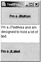
Figure 12-25: TestFrameWithGridLayout Resized Taller
Well, this is certainly better. No matter how the window is resized, components seem to be resized intelligently. But wait! Do we really need the button and label to occupy the same amount of space as the textarea? We could end up with unnecessarily large buttons and labels if the window were really large. Wouldn’t it be better if the textarea benefited from the extra space while the button and label just displayed at whatever size was best for them?
BorderLayout
FlowLayout and GridLayout layout components based partly on the order in which the components are added to the container. While these two layout managers can be quite useful, they are not as powerful as another set of layout managers that implement the LayoutManager2 interface. LayoutManager2 extends LayoutManager by adding methods that allow a component to be associated with a constraints object when it is added to a container. A constraints object amounts to a set of suggestions as to how a component should be sized and positioned in the container. LayoutManager2 implementations should do the best possible job arranging components even when faced with varying and perhaps mutually conflicting constraints.
BorderLayout is arguably the simplest implementation of LayoutManager2. It’s ideal for instances when only one particular component should expand or contract to fill space as the container is resized. It divides the container into 5 sections (BorderLayout.NORTH, SOUTH, EAST, WEST, and CENTER) and can manage up to 5 components. The CENTER component fills as much space as possible while the other components resize as necessary to display properly and fill in any gaps as is illustrated in figure 12-26.
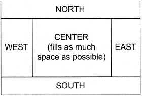
Figure 12-26: BorderLayout Positions
Applying BorderLayout to our tiny application, example 12.5 puts the button in the NORTH section, the label in the SOUTH and the textarea in the CENTER.
Example 12.5: chap12.TestFrameWithBorderLayout.java
1 package chap12; 2 import java.awt.BorderLayout; 3 import java.awt.Container; 4 5 import javax.swing.JButton; 6 import javax.swing.JFrame; 7 import javax.swing.JLabel; 8 import javax.swing.JTextArea; 9 10 import utils.TreePrinterUtils; 11 12 public class TestFrameWithBorderLayout { 13 public static void main(String[] arg) { 14 JFrame frame = new JFrame("TestFrameWithBorderLayout"); 15 frame.setDefaultCloseOperation(JFrame.EXIT_ON_CLOSE); 16 frame.setBounds(200, 200, 200, 200); 17 Container contentPane = frame.getContentPane(); 18 contentPane.setLayout(new BorderLayout()); 19 20 JButton button = new JButton("I'm a JButton"); 21 contentPane.add(button, BorderLayout.NORTH); 22 23 JTextArea textArea = 24 new JTextArea("I'm a JTextArea and am designed to hold a lot of text."); 25 textArea.setLineWrap(true); 26 textArea.setWrapStyleWord(true); 27 contentPane.add(textArea, BorderLayout.CENTER); 28 29 JLabel label = new JLabel("I'm a JLabel"); 30 contentPane.add(label, BorderLayout.SOUTH); 31 32 frame.setVisible(true); 33 TreePrinterUtils.printLayout(contentPane); 34 } 35 } Use the following commands to compile and execute the example. From the directory containing the src folder:
javac –d classes -sourcepath src src/chap12/TestFrameWithBorderLayout.java java –cp classes chap12.TestFrameWithBorderLayout
Figure 12-27 shows the results of running example 12.5. Figure 12-28 shows the GUI component’s location information printed to the console. Figures 12-29 and 12-30 show the effects of resizing the window.
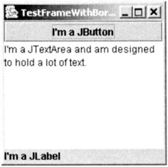
Figure 12-27: TestFrameWithBorderLayout GUI
JPanel [0, 0, 192, 172] (BorderLayout: 3 children) +--JButton [0, 0, 192, 26] +--JTextArea [0, 26, 192, 130] +--JLabel [0, 156, 192, 16]
Figure 12-28: TestFrameWithBorderLayout Console Output

Figure 12-29: TestFrameWithBorderLayout Resized Wider

Figure 12-30: TestFrameWithBorderLayout Resized Taller
This is probably the best layout manager for our little application because it resized the textarea the way we would expect, leaving the button and label alone except for stretching them horizontally as needed.
GridBagLayout
GridBagLayout is another implementation of LayoutManager2. It is quite powerful and quite complex. It can be thought of as GridLayout on steroids. Similarly to GridLayout, GridBagLayout arranges components in a grid. But that’s where the similarity stops. Whereas GridLayout forces all components to be the same size, GridBagLayout allows them to span multiple rows and columns, it allows rows and columns to have varying heights and widths, and it even provides individual sizing and positioning options within each component’s grid boundaries. Its only constructor takes no parameters because all other parameters are passed in through a GridBagConstraints object that is associated with a component when it is added. We will discuss the GridBagConstraints object in detail as we walk through and tweak the following program whose interface was inspired by the controls on my stereo tuner.
Use the following commands to compile and execute the example. From the directory containing the src folder:
javac –d classes -sourcepath src src/chap12/GridBagLayoutExample.java java –cp classes chap12.GridBagLayoutExample
Figure 12-31 shows the results of running example 12.6. Figure 12-32 shows the GUI components’ location information printed to the console.
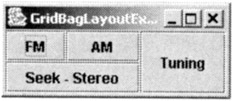
Figure 12-31: GridBagLayoutExample GUI
Example 12.6: chap12.GridBagLayoutExample.java
1 package chap12; 2 import java.awt.Container; 3 import java.awt.GridBagConstraints; 4 import java.awt.GridBagLayout; 5 6 import javax.swing.JButton; 7 import javax.swing.JFrame; 8 9 import utils.TreePrinterUtils; 10 11 public class GridBagLayoutExample { 12 public static void main(String[] arg) { 13 JFrame frame = new JFrame("GridBagLayoutExample"); 14 frame.setDefaultCloseOperation(JFrame.EXIT_ON_CLOSE); 15 16 Container contentPane = frame.getContentPane(); 17 contentPane.setLayout(new GridBagLayout()); 18 19 GridBagConstraints gbc = new GridBagConstraints(); 20 gbc.fill = gbc.BOTH; 21 gbc.gridwidth = 1; 22 gbc.gridx = 0; 23 gbc.gridy = 0; 24 contentPane.add(new JButton("FM"), gbc); 25 gbc.gridx = 1; 26 contentPane.add(new JButton("AM"), gbc); 27 28 gbc.gridx = 0; 29 gbc.gridy = 1; 30 gbc.gridwidth = 2; 31 contentPane.add(new JButton("Seek - Stereo"), gbc); 32 33 gbc.gridx = 2; 34 gbc.gridy = 0; 35 gbc.gridwidth = 1; 36 gbc.gridheight = 2; 37 contentPane.add(new JButton("Tuning"), gbc); 38 frame.pack(); 39 frame.setVisible(true); 40 41 TreePrinterUtils.printLayout(contentPane); 42 } 43 }
JPanel [0, 0, 183, 52] (GridBagLayout: 4 children) +--JButton [0, 0, 50, 26] +--JButton [50, 0, 61, 26] +--JButton [0, 26, 111, 26] +--JButton [111, 0, 72, 52]
Figure 12-32: GridBagLayoutExample Console Output
GridBagConstraints
A GridBagConstraints object is associated with each component added to a container with a GridBagLayout layout manager. We will discuss here the various fields of the GridBagConstraints object.
gridx, gridy
The gridx and gridy fields are integers that determine the column and row of the top left corner of the component. Row and column numbers start at zero. The special value GridBagConstraints.RELATIVE instructs the GridBagLayout to place the component next to the component added previously.
gridwidth, gridheight
The gridwidth and gridheight fields are integers that determine how many columns and rows the component should span. In example 12.6, the “FM” button is placed at gridx = 0, gridy = 0 and is given gridwidth = 1, gridheight = 1 so that it occupies a single grid cell at the top left corner of the window. The “AM” button has the same gridwidth and gridheight but is moved rightward to the next column by setting gridx = 1. The “Seek-Stereo” button is located at gridx = 0, gridy = 1 and is given gridwidth = 2 so that it will stretch horizontally across two columns. The “Tuning” button was placed at gridx = 2, gridy = 0 and given gridheight = 2 so that it would stretch vertically across two rows.
fill
The fill field is an integer that determines how a component should fill its space if the space allotted to it is larger than its preferred size. Options for fill include:
-
HORIZONTAL - stretches the component horizontally.
-
VERTICAL - stretches the component vertically.
-
BOTH - stretches the component horizontally and vertically.
-
NONE - means don’t stretch the component.
Figure 12-33 shows the results of setting fill to HORIZONTAL in the constraints for the “Tuning” button.
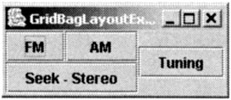
Figure 12-33: GridBagLayoutExample GUI Variation 1
ipadx, ipady
The ipadx and ipady fields are integers that determine the minimum padding to be added to the component’s width and height. (Pneumonic: ipad = internal padding) Note: the API states that the width and height of the component are increased by ipadx*2 and ipady*2. This however is not the behavior of Java 1.4 where the width and height are only increased by ipadx and ipady. Figure 12-34 shows the results of setting ipadx and ipady to 100 in the constraints for the “Tuning” button.
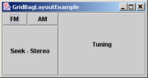
Figure 12-34: GridBagLayoutExample GUI Variation 2
insets
The insets field is an instance of java.awt.Insets and determines how much space there should be on all sides of the component. The insets object has four fields: left, right, top and bottom. Whereas ipadx and ipady increase the size of the component, insets increases the minimum display area for the component without affecting the size of the component itself. Figure 12-35 shows the results of setting insets to new Insets(50, 50, 50, 50) in the constraints for the Tuning button. Notice that the display area for the Tuning button is the same as in the previous GUI but the extra space was added to the outside of the button rather than inside the button.
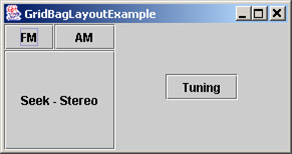
Figure 12-35: GridBagLayoutExample GUI Variation 3
weightx, weighty
The weightx and weighty fields are floating values ranging from 0.0 to 1.0. If, after all other calculations have been made, the GridBagLayout has calculated the combined area of all the components to be smaller than the con-tainer’s available area, GridBagLayout will distribute the extra space to each row and column according to their respective weightx and weighty values. Rows and columns with higher weights will be given more extra space than rows and columns with lower weights. A value of 0.0 tells it to not add any extra space. Figure 12-36 shows the results of setting weightx and weighty to 1 in the constraints for the Tuning button. You will have to drag the window to a larger size for the effects to be manifested.
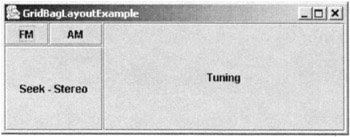
Figure 12-36: GridBagLayoutExample GUI Variation 4
anchor
The anchor field is an integer that determines where, within its space, a component is positioned, and has effect only when the component is smaller than the space allotted to it. This can only occur when fill is not BOTH. Options for anchor include (but are not limited to):
-
CENTER - the component will be centered
-
NORTH - the component will be placed at the top and centered horizontally
-
NORTHEAST - the component will be placed at the top right corner
-
EAST - the component will be placed at the left and centered vertically
-
SOUTHEAST - the component will be placed at the bottom right corner
-
SOUTH - the component will be placed at the bottom and centered horizontally
-
SOUTHWEST - the component will be placed at the bottom left corner
-
WEST - the component will be placed at the left and centered vertically
-
NORTHWEST - the component will be placed at the top left corner.
Figure 12-37 shows the results of setting weightx and weighty to 1, fill to NONE and anchor to SOUTHEAST in the constraints for the “Tuning” button. Again, you will have to drag the window to a larger size for the effects to be manifested.
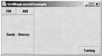
Figure 12-37: GridBagLayoutExample GUI Variation 5
Default GridBagConstraints Values
If a GridBagConstraints field is not explicitly set, it is given a default value as listed in table 12-8.
| Field | Default Value |
|---|---|
| int gridx | GridBagConstraints.RELATIVE |
| int gridy | GridBagConstraints.RELATIVE |
| int gridwidth | 1 |
| double weightx | 0.0 |
| double weighty | 0.0 |
| int anchor | GridBagConstraints.CENTER |
| int fill | GridBagConstraints.NONE |
| Insets insets | new Insets(0, 0, 0, 0) |
| int ipadx | 0 |
| int ipady | 0 |
Dialogue with a Skeptic
Skeptic: [looking over the code in example 12.6 and raising his/her eyebrows] Why did you use the same Grid-BagConstraints instance for all the buttons even though each button needs a different set of constraints? I mean, it seems that line 26 which sets the constraints for the “AM” button would also change the constraints object with which the “FM” button was previously associated in line 24. Don’t the “FM” and “AM” buttons both end up with the same constraint values?
Author: No they don’t, but you’ve made a good observation. The only reason that they don’t is that GridBagLay-out clones the GridBagConstraints parameter that is passed in with each component. It actually associates this clone with the component — not the one you pass in. Without this cloning behavior, all the buttons in example 12.6 would have shared the same GridBagConstraints object and the GridBagLayout might have attempted to place each button in exactly the same space as the others.
Skeptic: Relying on GridBagLayout to use clones seems kind of risky to me. Is this cloning behavior documented somewhere?
Author: You’re right. In the absence of some sort of guarantee, relying on a method to clone its parameters is risky. But it is documented. The API for GridBagLayout.addLayoutComponent(Component, Object) states: “Adds the specified component to the layout, using the specified constraints object. Note that constraints are mutable and are, therefore, cloned when cached.”
Skeptic: But, we didn’t call GridBagLayout.addLayoutComponent anywhere in our program!
Author: Yes, that’s true, but we did call Container.add(Component, Object). If you look at the javadocs for any of Container’s add methods, you’ll find this sentence: “This is a convenience method for addImpl(java.awt.Component, java.lang.Object, int).” Now, if you look at the javadocs for addImpl(Component, Object, int), you will see this sentence: “This method also notifies the layout manager to add the component to this container's layout using the specified constraints object via the addLayoutComponent method.”
Skeptic: Wow, I guess it pays to be adept at using the javadocs!
Combining LayoutManagers Using JPanels
Because containers are actually components, they can contain containers as well as components. This simple inheritance structure makes it possible to create arbitrarily complex GUIs by using containers to organize components into groups and subgroups. JPanel is the one Swing component that is specifically intended to be used as a container. It’s useful primarily for organizing a set of components into a single group governed by its own layout manager. Example 12.7 uses a JPanel with GridLayout as the center component in a content pane with BorderLayout. Figure 12-38 shows the results of running example 12.7 and figure 12-39 shows the console output.
Example 12.7: chap12.CombinedLayoutsExample.java
1 package chap12; 2 import java.awt.BorderLayout; 3 import java.awt.Container; 4 import java.awt.GridLayout; 5 6 import javax.swing.JButton; 7 import javax.swing.JFrame; 8 import javax.swing.JPanel; 9 10 import utils.TreePrinterUtils; 11 12 public class CombinedLayoutsExample extends JFrame { 13 14 public CombinedLayoutsExample() { 15 super("CombinedLayoutsExample"); 16 setDefaultCloseOperation(JFrame.EXIT_ON_CLOSE); 17 createGUI(); 18 } 19 20 public void createGUI() { 21 Container contentPane = getContentPane(); 22 contentPane.setLayout(new BorderLayout()); 23 contentPane.add(new JButton("WEST"), BorderLayout.WEST); 24 contentPane.add(new JButton("NORTH"), BorderLayout.NORTH); 25 JPanel gridPanel = new JPanel(new GridLayout(4, 3)); 26 for (int row = 0; row < 4; ++row) { 27 for (int col = 0; col < 3; ++col) { 28 gridPanel.add(new JButton("" + row + ", " + col)); 29 } 30 } 31 contentPane.add(gridPanel, BorderLayout.CENTER); 32 } 33 34 public static void main(String[] arg) { 35 JFrame frame = new CombinedLayoutsExample(); 36 frame.pack(); 37 frame.setVisible(true); 38 TreePrinterUtils.printLayout(frame.getContentPane()); 39 } 40 } 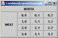
Figure 12-38: CombinedLayoutsExample GUI
JPanel [0, 0, 230, 130] (BorderLayout: 3 children) +--JButton [0, 26, 68, 104] +--JButton [0, 0, 230, 26] +--JPanel [68, 26, 162, 104] (GridLayout: 12 children) +--JButton [0, 0, 54, 26] +--JButton [54, 0, 54, 26] +--JButton [108, 0, 54, 26] +--JButton [0, 26, 54, 26] +--JButton [54, 26, 54, 26] +--JButton [108, 26, 54, 26] +--JButton [0, 52, 54, 26] +--JButton [54, 52, 54, 26] +--JButton [108, 52, 54, 26] +--JButton [0, 78, 54, 26] +--JButton [54, 78, 54, 26] +--JButton [108, 78, 54, 26]
Figure 12-39: CombinedLayoutExample Console Output
Use the following commands to compile and execute the example. From the directory containing the src folder:
javac –d classes -sourcepath src src/chap12/CombinedLayoutsExample.java java –cp classes chap12.CombinedLayoutsExample
Quick Review
Layout managers position components in containers and automatically reposition them as conditions change. All containers can be assigned a layout manager through the method setLayout(LayoutManager). There are two layout manager interfaces defined by the AWT: LayoutManager which positions components based on the order in which they are added to the container, and LayoutManager2 which positions them according to constraints objects. Flow-Layout and GridLayout are examples of the former type. FlowLayout arranges components in a container similarly to the way a text processor arranges text in a page. GridLayout divides the container into a grid of uniformly sized cells and places components one per cell. BorderLayout and GridBagLayout are constraints-based layout managers. Bor-derLayout takes up to five components. It allows the component placed in the center to fill all available space as the container resizes, while the other components are given only as much space as is necessary. GridBagLayout accepts a GridBagConstraints object on a per component basis, encapsulating many options for how each component should be placed in its container. There are several other layout managers including BoxLayout, CardLayout and SpringLayout, and it is even possible to write your own by implementing the LayoutManager or LayoutManager2 interface yourself.
EAN: 2147483647
Pages: 452