Chapter 10 -- Using Controls
Controls are the primary medium of user interaction. By typing and clicking, and by moving through controls on the forms in your application, users can manipulate their data and accomplish the tasks they want to do.
This chapter discusses:
- Understanding Controls and Data
- Choosing the Right Control for the Task
- Making Controls Easier to Use
- Extending Forms
For additional information, see Controls and Objects in the Language Reference.
Understanding Controls and Data
You can have two types of controls on your forms: controls that are bound to data and controls that are not. When users interact with bound controls, the values that they enter or choose are stored in the data source, which can be a table field, a cursor field, or a variable. You bind a control to data by setting its ControlSource property, or, in the case of grids, its RecordSource property.
If you don t set the ControlSource property of a control, the value that the user enters or chooses in the control is only stored as a property setting. The value is not written to disk or stored in memory beyond the lifetime of the control.
Effect of a ControlSource Property Setting on Controls
| Control | Effect |
| Check box | If the ControlSource is a field in a table, then NULL values, logical values true (.T.) or false (.F.), or numeric values 0, 1, or 2 in the ControlSource field cause the check box to be selected, cleared, or grayed as the record pointer moves through the table. |
| Column | If the ControlSource is a table field, the user is directly editing the field when editing values in the column. To bind an entire grid to data, set the RecordSource property of the grid. |
| List box or combo box | If the ControlSource is a variable, the value the user chooses in the list is stored in the variable. If the ControlSource is a field in a table, the value is stored in the field at the record pointer. If an item in the list matches the value of the field in the table, the item is selected in the list when the record pointer moves through the table. |
| Option button | If the ControlSource is a numeric field, 0 or 1 is written to the field, depending on whether or not the button is chosen. If the ControlSource is logical, .T. or .F. is written to the field, depending on whether the button is chosen. If the record pointer moves in the table, the value of the option button is updated to reflect the new value in the field. If the ControlSource of the option button s OptionGroup control (not the option button itself) is a character field, the caption of the option button is stored to the field if the option button is chosen. Note that the control source for an option button (as distinct from an OptionGroup control) cannot be a character field, or Visual FoxPro will report a data type mismatch when the form is run. |
| Spinner | The spinner reflects and writes numeric values to the underlying field or variable. |
| Text box or edit box | The value in the table field is displayed in the text box. Changes the user makes to this value are written back to the table. Moving the record pointer affects the Value property of the text box. |
Some of the tasks you want to accomplish with controls require having data bound to the control. Other tasks will not.
Choosing the Right Control for the Task
Visual FoxPro controls are flexible and versatile. Though there are multiple controls you could use to accomplish any particular task, you need to have a consistent approach to the controls you use so that users can tell what to expect when they see the interface you provide. For example, a label has a Click event in the same way that a command button does, but users familiar with graphical interfaces expect to click on command buttons to perform actions.
Most of the functionality you ll want to build into your forms will fall under one of the following categories:
- Providing users with a set of predetermined choices
- Accepting user input that can t be predetermined
- Accepting user input in a given range
- Allowing users to perform specific actions
- Performing specific actions at given intervals
- Displaying information
Providing a Set of Predetermined Choices
One of the most straightforward ways to ensure the validity of the data in a database is to give users a predetermined set of options. By controlling user choices, you can make sure that no invalid data is stored in the database. The following controls allow you to provide users with a set of predetermined choices:
- Option button groups
- List boxes and drop-down lists
- Check boxes
Using Option Button Groups

Option button groups are containers that contain option buttons. Typically, option buttons allow users to specify one of a number of operational options in a dialog box rather than data entry. For example, option buttons can be used to specify output to a file, a printer, or to print preview as described in Chapter 12, Adding Queries and Reports.
Setting the Number of Option Buttons in an Option Button Group
When you create an option button group on a form, two option buttons are included by default. You can determine how many option buttons are in a group by changing the ButtonCount property.
To set the number of option buttons in a group
- Set the ButtonCount property to the desired number of option buttons.
For example, to have a group of six option buttons, set the ButtonCount property of the option button group to 6.
The Value property of the group indicates which of the buttons has been chosen. For example, if a user chooses the fourth option button in a group of six option buttons, the value of the option button group is 4.
If the group s ControlSource property is a character field, or if the Value property is set to a character value before the form is run, the group s Value property is the caption of the selected option button.
Setting Option Button Properties
To manually adjust individual elements of an option button or command button group in the Form Designer, choose Edit from the group s shortcut menu.
You can set properties on individual buttons in the Properties window. You can also set these properties at run time by specifying the name of the option button and the desired property setting. For example, the following line of code, included in the method or event code of some object on the same form as the option button group, sets the caption of optCust in the option button group opgChoices:
THISFORM.opgChoices.optCust.Caption = "Sort by Customer" You can also set these properties at run time by using the Buttons property and specifying the index number of the option button in the group. For example, if optCust is the third button in the group, the following line of code also sets the caption of optCust:
THISFORM.opgChoices.Buttons(3).Caption = "Sort by Customer" To set properties on all buttons in a group
- Use the SetAll method of the group.
For example, the following line of code disables all the buttons in an option button group named
opgMyGroupon a form:THISFORM.opgMyGroup.SetAll("Enabled",.F., "OptionButton")
Enabling and Disabling Buttons in a Group
The previous example shows how to programmatically disable all option buttons in a group. When the buttons are disabled, they are displayed in the colors specified in the DisabledForeColor and DisabledBackColor properties of the option buttons. You could also set the Enabled property of the option button group to false (.F.) to disable the group; however, there would be no visual clue for the user.
Determining Which Option Button Is Currently Selected
You can use the Value property of the option button group to determine which option button in the group is selected. If the control source for the button is numeric, you have five option buttons in a group. If the third button is selected, the Value property of the option button group is 3; if no option buttons are selected, the Value property of the option button group is 0.
You can also determine the caption of the selected option button by using the Value and Buttons properties of the group. For example, the following line of code stores the Caption property of the selected option button to a variable cSelected.
oGroup = THISFORM.opg1 cSelected = oGroup.Buttons(oGroup.Value).Caption Filtering Lists with Option Buttons
If you have a small set of predetermined table filters, you could use option buttons to allow users to switch between the filters.
The following example assumes a form with a list box (lstCustomers) and an option button group that contains three option buttons.
Property Settings for the List Box
| Object | Property | Setting |
| lstCustomers | RowSourceType | 2 - Alias |
| lstCustomers | RowSource | Customer |
The filters are set in the Click event code of the option buttons.
Event Code for Filtering a List When a User Chooses an Option Button
| Object | Event | Code |
| optAll | Click | |
| optCanada | Click | |
| optUK | Click | |
When the user closes the form, don t forget to reset the filter by including SET FILTER TO in the Click event of the closing button or in the Destroy event.
Tip To refresh a list when the list source might have changed, use the Requery method.
Using Option Buttons to Store User Choices to a Table
While it is not as common, you can use option buttons to get information from a user to be stored in a table by saving the Caption property. If you have a standardized testing application, for example, you could use option buttons to allow a user to choose among multiple choice options A, B, C, or D. You could also use option buttons to indicate gender in an employee table.
To store the Caption property of an option button to a table
- Set the Value property of the option button group to an empty string.
- Set the ControlSource property of the option button group to a character field in a table.
For example, if the captions of the option buttons in a group are A , B , C , and D , and the ControlSource of the option button group is a character field, when a user chooses the button with the caption B , B is stored in the field.
To see an example of a multiple-choice test using option buttons
- Run Solution.app in the Visual Studio \Samples\Vfp98\Solution directory.
- In the treeview, click Controls, then click Options buttons.
- Click Present a user with multiple choices.
Using List Boxes and Drop-Down List Boxes

List boxes and drop-down list boxes (combo box controls with the Style property set to 2 - Dropdown List) provide a user with scrollable lists that contain a number of options or pieces of information. In a list box, multiple items can be visible at all times. In a drop-down list box, only one item is visible, but a user can click the down button to display a scrolling list of all the items in the drop-down list box.

Run Solution.app in the Visual Studio \Samples\Vfp98\Solution directory to see several examples that demonstrate using list boxes and drop-down list boxes, including the following:
- Add pictures to a list.
- Multiselect items in a list.
- Fill a list with values from different sources.
- Display multiple columns in a list.
- Sort list items.
- Move items between lists.
List box and a drop-down list box with the same RowSource property setting
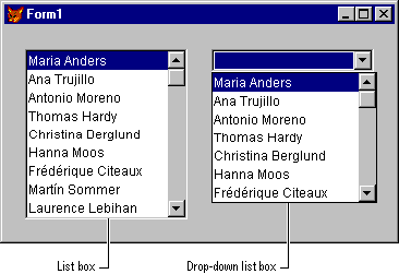
Tip If you have room on the form and if you want to emphasize the choices a user has, use a list. To conserve space and emphasize the currently selected item, use a drop-down list box.
Common List Properties and Methods
The following list box properties are commonly set at design time.
| Property | Description |
| ColumnCount | The number of columns in the list box. |
| ControlSource | Where the value that a user chooses from the list is stored. |
| MoverBars | Whether mover bars are displayed to the left of list items so that a user can easily rearrange the order of items in the list. |
| Multiselect | Whether the user can select more than one item in the list at a time. |
| RowSource | Where the values displayed in the list come from. |
| RowSourceType | Whether the RowSource is a value, a table, a SQL statement, a query, an array, a list of files, or a list of fields. |
Note The Value property of a list can be numeric or character. The default is numeric. Set the Value property to an empty string if the RowSource is a character value and if you want the Value property to reflect the character string of the selected item in the list. You can press the SPACEBAR and then the BACKSPACE key to enter an empty string for a property in the Properties window.
The following list box methods are commonly used.
| Method | Description |
| AddItem | Adds an item to a list with a RowSourceType of 0. |
| RemoveItem | Removes an item from a list with a RowSourceType of 0. |
| Requery | Updates the list if the values in the RowSource have changed. |
Filling a List Box or a Combo Box
You can fill a list box with items from a variety of sources by setting the RowSourceType and RowSource properties.
Choosing the Type of Data for a List or Combo Box
The RowSourceType property determines what kind of source populates the list box or combo box for example, an array or a table. Once you have set the RowSourceType, specify the source of the list items by setting the RowSource property.
| RowSourceType | Source of the List Items |
| 0 | None. Programmatically add items to the list. |
| 1 | Value |
| 2 | Alias |
| 3 | SQL Statement |
| 4 | Query (.qpr) |
| 5 | Array |
| 6 | Fields |
| 7 | Files |
| 8 | Structure |
| 9 | Popup. Included for backward compatibility. |
The following sections describe the various RowSourceType settings.
None If you set the RowSourceType property to 0, the default, the list is not automatically populated. You can add items to the list by using the AddItem method:
frmForm1.lstMyList.RowSourceType = 0 frmForm1.lstMyList.AddItem("First Item") frmForm1.lstMyList.AddItem("Second Item") frmForm1.lstMyList.AddItem("Third Item") The RemoveItem method allows you to remove items from the list. For example, the following line of code removes Second Item from the list:
frmForm1.lstMyList.RemoveItem(2) Value If you set the RowSourceType property to 1, you can specify multiple values in the RowSource property to be displayed in the list. If you set the RowSource property through the Properties window, include a comma-delimited list of items. If you set the RowSource programmatically, include the comma-delimited list in quotation marks:
Form1.lstMyList.RowSourceType = 1 Form1.lstMyList.RowSource = "one,two,three,four" Alias If you set the RowSourceType property to 2, you can include values from one or more fields in an open table.
If the ColumnCount property is 0 or 1, the list displays values in the first field of the table. If you set the ColumnCount property to 3, the list displays values in the first three fields of the table. To display fields in a different order than they are stored in the table, set the RowSourceType property to 3 - SQL Statement or 6 - Fields.
Note If the RowSourceType is 2 - Alias or 6 - Fields, when a user chooses a new value in the list, the table record pointer moves to the record with the value of that item.
SQL Statement If you set the RowSourceType property to 3 - SQL Statement, include a SELECT - SQL statement in the RowSource property. For example, the following statement selects all fields and all records from the Customer table into a cursor:
SELECT * FROM Customer INTO CURSOR mylist If you set the RowSource programmatically, remember to enclose the SELECT statement in quotation marks.
Note By default, Visual FoxPro SELECT statements without INTO clauses immediately display the resulting cursor in a Browse window. Since you rarely want this behavior in a RowSource SQL statement, include an INTO CURSOR clause in your SELECT statement.
Query If you set the RowSourceType property to 4, you can populate your list box with the results of a query you designed in the Query Designer. When RowSourceType is set to 4, set RowSource to the .qpr file. For example, the following line of code sets the RowSource property of a list to a query.
THISFORM.List1.RowSource = "region.qpr" If you don t specify a file extension, Visual FoxPro assumes an extension of .qpr.
Array If you set the RowSourceType property to 5, the list is populated with the items in an array. You can create an array property of the form or form set for the RowSource or use an array created elsewhere in your application.
For information about creating array properties, see Chapter 9, Creating Forms.
Troubleshooting The RowSource setting of a list is evaluated by Visual FoxPro as needed in your application, not just in the method in which you set the RowSource. You need to keep this scope in mind. If you create a local array in a method, that array will be scoped to the method and will not be available in all cases when Visual FoxPro needs to evaluate the property setting. If you set the RowSource of a list to an array property of the form or form set, you need to reference the property relative to the list, not relative to the method in which you set the property. For example, if you have a form array property named arrayprop, the following lines of code in the Init of the form produce different results:
THIS.lst1.RowSource = "THIS.arrayprop" && Error THIS.lst1.RowSource = "THISFORM.arrayprop" && No error. To populate a list with the elements in a multi-dimensional array
- Set the RowSourceType property to 5.
- Set the RowSource property to the multi-dimensional array.
- Set the ColumnCount property to the number of columns to display.
- Set the ColumnWidths property to the desired widths for each column.
Fields If you set the RowSourceType property to 6, you can specify a field or comma-delimited list of fields to populate the list, such as:
contact,company,country You can include the following types of information in the RowSource property of a list with a RowSourceType of 6 - Fields:
- field
- alias.field
- alias.field, field, field, ...
If you want to have fields from multiple tables in the list, set the RowSourceType property to 3 - SQL Statement.
Unlike a RowSourceType of 2 - Alias, a RowSourceType of 6 - Fields allows you to display fields independent of their actual positions in the table.
Files If you set the RowSourceType property to 7, the list is populated with files in the current directory. Additionally, options in the list allow you to choose a different drive and directory for file names to be displayed in the list.
List populated with files in a directory
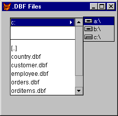
Set RowSource to the skeleton of the type of files you want to be displayed in the list. For example, to display Visual FoxPro tables in the list, set the RowSource property to *.dbf.
Structure If you set the RowSourceType property to 8, the list is populated with the fields in the table that you specify when you set the RowSource property. This RowSourceType setting is useful if you want to present the user with a list of fields to search for values in or a list of fields to order a table by.
Popup If you set the RowSourceType property to 9, you can fill the list from a previously defined popup. This option is included for backward compatibility.
Creating Multicolumn List Boxes
Although the default number of columns in a list box is one, a list box in Visual FoxPro can contain as many columns as you want. A multicolumn list box differs from a grid in that you select a row at a time in a multicolumn list box while you can select individual cells in a grid, and data in the list cannot be directly edited.
To display multiple columns in a list box
- Set the ColumnCount property to the number of desired columns.
- Set the ColumnWidths property. For example, if there are three columns in the list box, the following command would set the column widths to 10, 15, and 30, respectively:
THISFORM.listbox.ColumnWidths = "10, 15, 30" - Set the RowSourceType property to 6 - Fields
. - Set the RowSource property to the fields to be displayed in the columns. For example, the following command sets the sources of three columns in a 3-column list box to the contact, city, and country fields of the customer table:
form.listbox.RowSource = "contact,city,country"
Note For the columns to align correctly, you need to either set the ColumnWidths property or change the FontName property to a monospaced font.
When the RowSourceType of the list is set to 0 - None, you can use the AddListItem method to add items to a multicolumn list box. For example, the following code adds text to specific columns in a list box:
THISFORM.lst1.ColumnCount = 3 THISFORM.lst1.Columnwidths = "100,100,100" THISFORM.lst1.AddListItem("row1 col1", 1,1) THISFORM.lst1.AddListItem("row1 col2", 1,2) THISFORM.lst1.AddListItem("row1 col3", 1,3) THISFORM.lst1.AddListItem("row2 col2", 2,2) Allowing Users to Select Multiple Items in a List Box
The default behavior of a list allows one item at a time to be selected. You can, however, allow a user to select multiple items in a list.
To allow multiple selected items in a list
- Set the MultiSelect property of the list to true (.T.).
To process the selected items to copy them to an array or incorporate them elsewhere in your application loop through the list items and process those for which the Selected property is true (.T.). The following code could be included in the InteractiveChange event of a list box to display the selected items in a combo box, cboSelected, and the number of selected items in a text box, txtNoSelected:
nNumberSelected = 0 && a variable to track the number THISFORM.cboSelected.Clear && clear the combo box FOR nCnt = 1 TO THIS.ListCount IF THIS.Selected(nCnt) nNumberSelected = nNumberSelected + 1 THISFORM.cboSelected.Additem (THIS.List(nCnt)) ENDIF ENDFOR THISFORM.txtNoSelected.Value = nNumberSelected Allowing Users to Add Items to a List Box
In addition to allowing users to select items from a list box, you can allow users to interactively add items to a list.
To add items to a list interactively
- Use the AddItem method.
In the following example, when the user presses ENTER, the code in the KeyPress event of a text box adds the text in the text box to the list box and clears the text in the text box:
LPARAMETERS nKeyCode, nShiftAltCtrl IF nKeyCode = 13 && Enter Key THISFORM.lstAdd.AddItem(This.Value) THIS.Value = "" ENDIF Allowing Users to Enter Data into a Table from a List
If the ControlSource property is set to a field, whatever the user selects in the list is written to the table. This is an easy way to help ensure the integrity of the data in your table. While the user can still enter the wrong data, an illegal value cannot be entered.
For example, if you have a list of states or counties for a user to choose from, the user cannot enter an invalid state or county abbreviation.
Allowing Users to Go to a Record by Picking a Value in a List
Often, you want to let users select the record they want to view or edit. For example, you could provide users with a list of customer names. When the user selects a customer from the list, you select that customer s record in the table and display customer information in text boxes on the form. You can do this several ways, depending on the source of data in your form.
| RowSourceType | Selecting the appropriate record |
| 2 - Alias 6 - Fields | When the user chooses a value in the list, the record pointer is automatically set to the desired record. Issue THISFORM.Refresh in the InteractiveChange event of the list to show the new values in other controls on the form. |
| 0 - None 1 - Value 3 - SQL Statement 4 - QPR 5 - Array | In the InteractiveChange event, select the table that has the record with the desired values, then search for the desired value. For example, if the RowSource holds customer identification numbers from the customer table, use this code: |
Refreshing a One-To-Many Display Based on a List Value
When the user chooses to go to a record by picking a value in a list, you might have a one-to-many relationship that needs to reflect the changed record pointer in the parent table. You can implement this functionality with both local tables and local or remote views.
Local Tables
If the RowSourceType of the list is 2 - Alias or 6 - Fields and the RowSource is a local table with a relationship set in the form s data environment, issue THISFORM.Refresh in the InteractiveChange event when the user chooses a new value. The many side of the one-to-many relationship automatically displays only the records that match the expression of the parent table involved in the relation.
Views
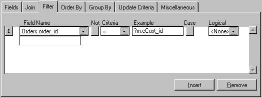
Refreshing a one-to-many display is a little different if the RowSource of the list box is a local or remote view. The following example describes creating a form with a list box and a grid. The list box displays the values from the cust_id field in the TESTDATA!Customer table. The grid displays the orders associated with the cust_id field selected in the list box.
First, in the View Designer create a parameterized view for the orders. When you create the view in the View Designer, set the selection criterion for the foreign key to a variable. In the following example, the variable is called m.cCust_id.
Parameterized view using a variable
Then, when you design the form, follow the steps in the following procedure. Note that the view requires a value for the parameter that isn t available when the form is loaded. By setting the NoDataOnLoad property of the view cursor object to true (.T.), you prevent the view from being run until the REQUERY( ) function is called, at which time the user would have selected a value for the variable used in the parameterized view.
To design a one-to-many list based on local or remote views
- Add the table and the parameterized view to the data environment.
- In the Properties window for the view cursor object in the Data Environment, set the NoDataOnLoad property to true (.T.).
- Set the RowSourceType property of the list box to 6 Fields, and set its RowSource property to the field referenced as the foreign key in the view s parameter.
In the example, you would set the RowSource property to
customer.cust_id. - Set the RecordSource property of the grid to the name of the view you created earlier.
- In the InteractiveChange event code of the list box, store the value of the list box to the variable, then requery the view, as in this example:
m.cCust_id = THIS.Value *assuming the name of the view is orders_view =REQUERY("orders_view")
For more information about local and remote views, see Chapter 8, Creating Views.
Displaying Child Records in a List
You can display records from a one-to-many relationship in a list so that the list displays the child records in the relationship as the record pointer moves through the parent table.
To display child records in a list
- Add a list to the form.
- Set the ColumnCount property of the list to the number of columns you want to display.
For example, if you want to display the
Order_id,Order_net, andShipped_onfields in the list, set the ColumnCount property to 3. - Set the ColumnWidths property to the appropriate widths for displaying your selected fields.
- Set the RowSourceType of the list to 3 SQL Statement.
- Set the RowSource to the SELECT statement. For example, the following statement selects three fields from the orders table for the current record in the customer table:
SELECT order_id, order_net, shipped_on from orders ; WHERE order.cust_id = customer.cust_id ; INTO CURSOR temp - In the Init event of the form and in the code that moves the record pointer through the table, requery the list:
THISFORM.lstChild.Requery
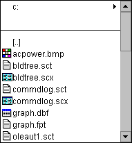
Adding Pictures to Items in a List
You can set the Picture property of the list to the .bmp file you want displayed next to the items in the list.
For example, you could have a list box populated with files. You might want to have a different bitmap next to the file if it is a table, a program, or some other file type.
List box with pictures
The following code is associated with the Click event of the list box:
FOR iItem = 5 TO THIS.ListCount && files start at the 5th item cExtension = UPPER(RIGHT(THIS.List(iItem),3)) DO CASE CASE cExtension = "DBF" THIS.Picture(iItem) = "tables.bmp" CASE cExtension = "BMP" THIS.Picture(iItem) = "other.bmp" CASE cExtension = "PRG" THIS.Picture(iItem) = "programs.bmp" CASE cExtension = "SCX" THIS.Picture(iItem) = "form.bmp" OTHERWISE THIS.Picture(iItem) = IIF("]" $ cExtension, ; "", "textfile.bmp") ENDCASE ENDFOR Using Check Boxes

You can use check boxes to allow a user to specify a Boolean state: True or False, On or Off, Open or Closed. However, there are times when it isn t accurate to evaluate something as True or False, such as unanswered questions on a True/False questionnaire.
To see examples of using check boxes
- Run Solution.app in the Visual Studio \Samples\Vfp98\Solution directory.
- In the treeview, click Controls, then click Check boxes.
There are four possible states for a check box, as determined by the Value property.
| Display | Value property |
 | 0 or .F. |
 | 1 or .T. |
 | 2 |
 | .NULL. |
The Value property of the check box reflects the data type of the last assignment. If you set the property to true (.T.) or false (.F.), the type is Logical until you set the property to a numeric value.
Tip A user can display a null value in a check box by pressing CTRL+0.
Storing or Displaying Logical Fields
If you set the ControlSource property of the check box to a logical field in a table, the check box is displayed as checked when the value in the current record is true (.T.), as not checked when the value in the current record is false (.F.), and as grayed when a null value (.NULL.) is in the current record.
Accepting Input That Can t Be Predetermined
It is not always possible to anticipate all the possible values that a user might need to enter into a control. The following controls allow you to accept user input that can t be predetermined:
- Text boxes
- Edit boxes
- Combo boxes
Using Text Boxes

The text box is the basic control that allows users to add or edit data stored in a non-memo field in a table.
To see examples of using text boxes
- Run Solution.app in the Visual Studio \Samples\Vfp98\Solution directory.
- In the treeview, click Controls, then click Text boxes.
To programmatically reference or change the text displayed in the text box
- Set or reference the Value property.
If you set a ControlSource for the text box, the value displayed in the text box is stored in the Value property of the text box and in the variable or field specified in the ControlSource property.
Validating the Data in a Text Box
To check or verify the value in the text box, include code in the method associated with the Valid event. If the value is invalid, return false (.F.) or 0. If the Valid returns false (.F.) an Invalid input message is displayed. If you want to display your own message, include the WAIT WINDOW command or the MESSAGEBOX( ) function in the Valid code and return 0.
For example, if you have a text box that allows a user to type an appointment date, you could check to make sure that the date is not already past by including the following code in the Valid event of the text box:
IF CTOD(THIS.Value) < DATE( ) = MESSAGEBOX("You need to enter a future date",1) RETURN 0 ENDIF Selecting Text When the Text Box Gets the Focus
To select all text when the user enters the text box with the keyboard, set the SelectOnEntry property to true (.T.).
Formatting the Text in a Text Box
You can use the InputMask property to determine the values that can be typed in the text box and the Format property to determine the way values are displayed in the text box.
Using the InputMask Property
The InputMask property determines the characteristics of each character typed into the text box. For example, you could set the InputMask property to 999,999.99 to limit user input to numeric values less than 1,000,000 with two decimal places. The comma and the period would be displayed in the text box before the user entered any values. If the user pressed a character key, the character would not be displayed in the text box.
If you have a logical field and want a user to be able to type Y or N but not T or F , set the InputMask property to Y .
Accepting User Passwords in a Text Box
Often in an application, you want to obtain secure information from a user, such as a password. You can use a text box to get this information without making the information visible on the screen.
To accept user input without displaying the actual value
- Set the PasswordChar property of the text box to * or some other generic character.
If you set the PasswordChar property to anything other than an empty string, the Value and Text properties of the text box contain the actual value that the user typed in the text box, but the text box displays a generic character for every key the user pressed.
Entering Dates in a Text Box
Text boxes have several properties that you can set to make it easy for your users to enter date values.
| Property | Description |
| Century | Whether the first two digits of the year are displayed or not. |
| DateFormat | Format the date in the text box to one of fifteen predetermined formats, such as American, German, Japanese. |
| StrictDateEntry | Setting StrictDateEntry to 0 - Loose allows a user to enter dates in more flexible formats than the default 99/99/99. |
Common Text Box Properties
The following text box properties are commonly set at design time.
| Property | Description |
| Alignment | Whether the contents of the text box are left justified, right justified, centered, or automatic. Automatic alignment depends on the data type. Numbers, for example, are right justified and characters are left justified. |
| ControlSource | The table field or variable whose value is displayed in the text box. |
| InputMask | Specifies the data entry rule each character entered must follow. For specific information about InputMask, see Help. |
| SelectOnEntry | Whether the contents of the text box are automatically selected when the text box receives the focus. |
| TabStop | Whether the user can tab to the control. If TabStop is set to .F., a user can still select the text box by clicking it. |
Using Edit Boxes

You can allow users to edit text fro_m long character fields or memo fields in edit boxes. Edit boxes allow automatic word-wrapping and the ability to move through the text using the arrow keys, page up and page down keys, and scrollbars.
To see examples of using edit boxes
- Run Solution.app in the Visual Studio \Samples\Vfp98\Solution directory.
- In the treeview, click Controls, then click Edit boxes.
Allowing Users to Edit a Memo Field in an Edit Box
All you have to do to allow a user to edit a memo field in an edit box is set the ControlSource property of the edit box to the memo field. For example, if you have a memo field named comments in a table named log, you can set the ControlSource property of an edit box to log.comments to enable a user to edit the memo field in the edit box.
Allowing Users to Edit a Text File in an Edit Box
You can also allow a user to edit a text file in an edit box. The following form demonstrates this.
Example form for editing a text file in an edit box
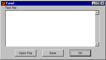
An OK button on the form closes the form with the following command in the Click event code:
RELEASE THISFORM The other two buttons in this example, cmdOpenFile and cmdSave, allow a user to open a text file and save the file after edits.
Code Associated with the Click Event of cmdOpenFile
| Code | Comments |
| Create a cursor with a character field to hold the name of the text file and a memo field to hold the contents of the text file. Add a blank record to the cursor. |
| Use the GETFILE( ) function to return the name of the file to open. Store the name in the FileName field of the cursor. |
| If the user chooses Cancel in the Get File dialog box, the FileName field will be empty and there will be no file to open. |
| Fill the memo field with the text in the file. |
| Set the ControlSource of the edit box on the form. |
| Enable the Save button. |
Once the file has been opened and edited, the Save button allows a user to write changes back out to the file.
Code Associated with the Click Event of cmdSave
| Code | Comments |
| Overwrites the old value in the file with the text in the memo field. |
Manipulating Selected Text in an Edit Box
Edit boxes and text boxes have three properties that allow you to work with selected text: SelLength, SelStart, and SelText.
You can select text programmatically using the SelStart and SelLength properties. For example, the following lines of code select the first word in an edit box.
Form1.edtText.SelStart = 0 Form1.edtText.SelLength = AT(" ", Form1.edtText.Text) - 1 Tip When you change the SelStart property, the edit box scrolls to display the new SelStart. If you change the SelStart in a loop, for example when searching for text, your code will execute faster if you include THISFORM.LockScreen = .T. before processing and THISFORM.LockScreen = .F. after processing.
You can access selected text in an edit box or text box with the SelText property. For example, the following line of code makes the selected text all uppercase:
Form1.edtText.SelText = UPPER(Form1.edtText.SelText) Common Edit Box Properties
The following edit box properties are commonly set at design time.
| Property | Description |
| AllowTabs | Whether the user can insert tabs in the edit box instead of moving to the next control. If you allow tabs, be sure to indicate that users can move to the next control by pressing CTRL+TAB. |
| HideSelection | Whether selected text in the edit box is visibly selected when the edit box doesn t have the focus. |
| ReadOnly | Whether the user can change the text in the edit box. |
| ScrollBars | Whether there are vertical scrollbars. |
Using Combo Boxes
The combo box control has the functionality of a list box and a text box. There are two styles for a combo box: Drop-down combo and Drop-down list. Specify which one you want by changing the Style property of the control. Drop-down lists are discussed in Using List Boxes and Drop-Down List Boxes earlier in this chapter.
Drop-Down Combo
A user can click the button on a drop-down combo box to see a list of choices or enter a new item directly in the box beside the button. The default Style property of a combo box is 0 Dropdown Combo.
Adding User Items to Drop-Down Combo Lists
To add the new user value to the drop-down combo box, you can use the following line of code in the method associated with the Valid event of the combo box:
THIS.AddItem(THIS.Text) Before adding an item, however, it would be a good idea to check to make sure that the value isn t already in the combo box drop-down:
lItemExists = .F. && assume the value isn t in the list. FOR i = 1 to THIS.ListCount IF THIS.List(i) = THIS.Text lItemExists = .T. EXIT ENDIF ENDFOR IF !lItemExists THIS.AddItem(THIS.Text) ENDIF Common Combo Box Properties
The following combo box properties are commonly set at design time.
| Property | Description |
| ControlSource | Specifies the table field where the value that the user chooses or enters is stored. |
| DisplayCount | Specifies the maximum number of items displayed in the list. |
| InputMask | For drop-down combo boxes, specifies the type of values that can be typed in. |
| IncrementalSearch | Specifies whether the control tries to match an item in the list as the user types each letter. |
| RowSource | Specifies the source of the items in the combo box. |
| RowSourceType | Specifies the type of the source for the combo box. The RowSourceType values for a combo box are the same as for a List. For an explanation of each, see Help or the discussion on list boxes earlier in this chapter. |
| Style | Specifies whether the combo box is a drop-down combo or a drop-down list. |
Accepting Numeric Input in a Given Range
Although you can set the InputMask property and include code in the Valid event to make sure that numeric values entered into text boxes fall within a given range, the easiest way to check the range of values is to use a spinner.
Using Spinners

You can use spinners to allow users to make choices by spinning through values or directly typing the values in the spinner box.
Setting the Range of Values that Users Can Choose
Set the KeyboardHighValue and the SpinnerHighValue properties to the highest number you want users to be able to enter in the spinner.
Set the KeyboardLowValue and the SpinnerLowValue properties to the lowest number you want users to be able to enter in the spinner.
Decrementing a Spinner When the User Clicks the Up Button
Sometimes, if your spinner reflects a value like priority, you want the user to be able to increase the priority from 2 to 1 by clicking the Up button. To cause the spinner number to decrement when the user clicks the Up button, set the Increment property to -1.
Spinning Through Non-Numeric Values
While the value of a spinner is numeric, you can use the Spinner control and a text box to allow users to spin through multiple types of data. For instance, if you want a user to be able to spin through a range of dates, you could size the spinner so that only the buttons are visible and position a text box beside the spinner buttons. Set the Value property of the text box to a date and in the UpClick and DownClick events of the spinner, increment or decrement the date.
Tip You can use the Windows API function GetSystemMetrics to set the width of your spinner so that only the buttons are visible and the buttons are the best width for the up and down arrow bitmap display.
- Set the spinner s BorderStyle property to 0.
- Include the following code in the Init of the spinner:
DECLARE INTEGER GetSystemMetrics IN Win32api INTEGER THIS.Width = GetSystemMetrics(2) && SM_CXVSCROLL Common Spinner Properties
The following spinner properties are commonly set at design time.
| Property | Description |
| Interval | How much to increment or decrement the value each time the user clicks the Up or Down buttons. |
| KeyboardHighValue | The highest value that can be entered into the spinner text box. |
| KeyboardLowValue | The lowest value that can be entered into the spinner text box. |
| SpinnerHighValue | The highest value that the spinner will display when the user clicks the Up button. |
| SpinnerLowValue | The lowest value that the spinner will display when the user clicks the Down button. |
Allowing Specific Actions
Frequently, you want to enable users to take specific actions that have nothing to do with manipulating values. For example, you can allow a user to close a form, open another form, move through a table, save or cancel edits, run a report or query, jump to an address of a destination on the Internet or an intranet, or any number of other actions.
Using Command Buttons and Command Button Groups

One of the most common places to put the code for specific actions is the Click event of a command button.
Making a Command Button the Default Choice
Set the Default property to true (.T.) to make the command button the default choice. The default choice has a thicker border than other command buttons. If a command button is the default choice, when the user presses ENTER, the Click event of the command button executes.
Note If the selected object on a form is an edit box or a grid, the code associated with the Click event of the default choice is not executed when the user presses ENTER. Pressing ENTER in an edit box adds a carriage return and line feed to the value in the edit box. Pressing ENTER in a grid selects an adjacent field. To execute the Click event of the default button, press CTRL+ENTER.
Common Command Button Properties
The following command button properties are commonly set at design time.
| Property | Description |
| Cancel | Specifies that the code associated with the Click event of the command button executes when a user presses ESC. |
| Caption | Text displayed on the button. |
| DisabledPicture | The .bmp file displayed when the button is disabled. |
| DownPicture | The .bmp file displayed when the button is pressed. |
| Enabled | Whether the button can be chosen. |
| Picture | The .bmp file displayed on the button. |
You can also include command buttons in a group so that you can manipulate them individually or as a group.
Managing Command Button Choices at the Group Level
If you want to work with a single method procedure for all the code for the Click events of command buttons in a group, you can attach the code to the Click event of the command button group. The Value property of the command button group indicates which of the buttons was clicked, as demonstrated in the following code example:
DO CASE CASE THIS.Value = 1 WAIT WINDOW "You clicked " + THIS.cmdCommand1.Caption NOWAIT * do some action CASE THIS.Value = 2 WAIT WINDOW "You clicked " + THIS.cmdCommand2.Caption NOWAIT * do some other action CASE THIS.Value = 3 WAIT WINDOW "You clicked " + THIS.cmdCommand3.Caption NOWAIT * do a third action ENDCASE Note If the user clicks in the command button group but not on a particular button, the Value property still reflects the last command button that was selected.
If you have written code for the Click event of a particular button in the group, that code is executed rather than the group Click event code when the user chooses that button.
Common Command Button Group Properties
The following command button group properties are commonly set at design time.
| Property | Description |
| ButtonCount | Number of command buttons in the group. |
| BackStyle | Whether the command button group has a transparent or opaque background. A transparent background appears to be the same color that the underlying object, usually the form or a page, is. |
Using the Hyperlink Object
You can use the Hyperlink object to jump to an address of a destination on the Internet or an intranet. The Hyperlink object can be used to start a hyperlink aware application, typically an Internet browser such as the Microsoft Internet Explorer, and open the page specified in the address. The Hyperlink NavigateTo( ) method allows you to specify the address of the destination that you jump to.
For example, to navigate to the Microsoft Internet site on the World Wide Web from a form, first add the Hyperlink control to the form. Add a command button to the form, and then add the following code to the Click event for the command button:
THISFORM.Hyperlink1.NavigateTo( www.microsoft.com ) When the form is run, you can click the command button to jump to the Microsoft Web site.
Performing Specific Actions at Given Intervals
The Timer control allows you to perform actions or check values at specific intervals.
Using the Timer Control

Timer controls respond to the passage of time independent of user interaction, so you can program them to take actions at regular intervals. A typical use is checking the system clock to see if it is time to do a particular task. Timers are also useful for other kinds of background processing.
To see examples of using timers
- Run Solution.app in the Visual Studio \Samples\Vfp98\Solution directory.
- In the treeview, click Controls, then click Timer.
Each timer has an Interval property, which specifies the number of milliseconds that pass between one timer event and the next. Unless disabled, a timer continues to receive an event (appropriately named the Timer event) at roughly equal intervals of time. The Interval property has a few limitations to consider when you re programming a timer:
- The interval can be between 0 and 2,147,483,647, inclusive, which means that the longest interval is about 596.5 hours (over 24 days).
- The interval is not guaranteed to elapse exactly on time. To ensure accuracy, the timer should check the system clock when it needs to, rather than try to keep track of accumulated time internally.
- The system generates 18 clock ticks per second, so even though the Interval property is measured in milliseconds, the true precision of an interval is no more than one-eighteenth of a second.
- If your application or another application is making heavy demands on the system such as long loops, intensive calculations, or disk, network, or port access your application may not get timer events as often as the Interval property specifies.
Placing a Timer Control on a Form
Placing a Timer control on a form is like drawing any other control: you choose the timer tool on the Controls toolbar and click and drag on the form.
A Timer control
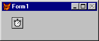
The timer appears on the form at design time so you can select it, view its properties, and write an event procedure for it. At run time, a timer is invisible and its position and size are irrelevant.
Initializing a Timer Control
A Timer control has two key properties.
| Property | Setting |
| Enabled | If you want the timer to start working as soon as the form loads, set to true (.T.). Otherwise, leave this property set to false (.F.). You may choose to have an outside event (such as a click of a command button) start operation of the timer. |
| Interval | Number of milliseconds between timer events. |
Note that the Enabled property for the timer is different than for other objects. With most objects, the Enabled property determines whether the object can respond to an event caused by the user. With the Timer control, setting Enabled to false (.F.) suspends timer operation.
Remember that the Timer event is periodic. The Interval property doesn t determine how long as much as it determines how often. The length of the interval should depend on how much precision you want. Because there is some built-in potential for error, make the interval one-half the desired amount of precision.
Note The more often a timer event is generated, the more processor time is consumed in responding to the event. This can slow down overall performance. Don t set a particularly small interval unless you need it.
Responding to the Timer Event
When a Timer control s interval elapses, Visual FoxPro generates the Timer event. Typically, you respond to this event by checking some general condition, such as the system clock.
A digital clock is a very simple but highly useful application involving a Timer control. Once you understand how the application works, you can enhance it to work as an alarm clock, stopwatch, or other timing device.
The digital clock application includes a timer and a label with a border. At design time, the application looks like this:
The digital clock application
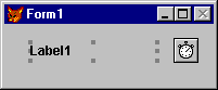
At run time, the timer is invisible.
| Control | Property | Setting |
| lblTime | Caption | |
| Timer1 | Interval | 500 (half a second) |
| Timer1 | Enabled | True |
The sole procedure in the application is the Timer event procedure:
IF THISFORM.lblTime.Caption != Time() THISFORM.lblTime.Caption = Time() ENDIF The Interval property for the timer is set to 500, following the rule of setting the Interval to half of the shortest period you want to distinguish (one second in this case). This may cause the timer code to update the label with the same time twice in one second. This could cause some visible flicker, so the code tests to see if the time is different from what is displayed in the label before it changes the caption.
Displaying Information
One of the principles of good design is to make relevant information visible. You can use the following controls to display information to your users:
- Images
- Labels
- Text Boxes
- Edit Boxes
- Shapes
Using Images

The Image control allows you to add pictures (.bmp files) to your form. An Image control has the full range of properties, events, and methods that other controls have, so an Image control can be changed dynamically at run time, Users can interact with images by clicking, double-clicking, and so on.
The following table lists some of the key properties of an Image control.
| Property | Description |
| Picture | The picture (.bmp file) to display. |
| BorderStyle | Whether there is a visible border for the image. |
| Stretch | If Stretch is set to 0 Clip, portions of the picture that extend beyond the dimensions of the Image control are not displayed. If Stretch is set to 1 - Isometric, the Image control preserves the original dimensions of the picture and displays as much of the picture as the dimensions of the Image control will allow. If Stretch is set to 2 - Stretch, the picture is adjusted to exactly match the height and width of the Image control. |
Using Labels

Labels differ from text boxes in that they:
- Cannot have a data source.
- Cannot be directly edited.
- Cannot be tabbed to.
You can programmatically change the Caption and Visible properties of labels to tailor the label display to the situation at hand.
Common Label Properties
The following label properties are commonly set at design time.
| Property | Description |
| Caption | The text displayed by the label. |
| AutoSize | Whether the size of the label is adjusted to the length of the Caption. |
| BackStyle | Whether the label is Opaque or Transparent. |
| WordWrap | Whether the text displayed on the label can wrap to additional lines. |
Using Text and Edit Boxes to Display Information
Set the ReadOnly property of text and edit boxes to display information that the user can view but not edit. If you only disable an edit box, the user won t be able to scroll through the text.
Using Shapes and Lines
Shapes and lines help you visually group elements of your form together. Research has shown that associating related items helps users to learn and understand an interface, which makes it easier for them to use your application.
The following Shape properties are commonly set at design time.

| Property | Description |
| Curvature | A value between 0 (90 degree angles) and 99 (circle or oval). |
| FillStyle | Whether the shape is transparent or has a specified background fill pattern. |
| SpecialEffect | Whether the shape is plain or 3D. This only has an effect when the Curvature property is set to 0. |
The following Line properties are commonly set at design time.

| Property | Description |
| BorderWidth | How many pixels wide the line is. |
| LineSlant | When the line is not horizontal or vertical, the direction of the slant. Valid values for this property are a slash ( / ) and a backslash ( \ ). |
Using Form Graphics to Display Information
You can graphically display information on a form by using the following form methods.
| Method | Description |
| Circle | Draws a circular figure or arc on a form. |
| Cls | Clears graphics and text from a form. |
| Line | Draws a line on a form. |
| Pset | Sets a point on a form to a specific color. |
| Prints a character string on a form. |
To see examples that demonstrate form graphics
- Run Solution.app in the Visual Studio \Samples\Vfp98\Solution directory.
- In the treeview, click Forms, then click Form graphics.
Enhancing Control Display
Command buttons, check boxes, and option buttons can display pictures in addition to captions. These controls all have properties that allow you to specify pictures to be displayed on the controls.
| Property | Description |
| DisabledPicture | Picture displayed on the button when the button is disabled. |
| DownPicture | Picture displayed on the button when the button is pressed. |
| Picture | Picture displayed on the button when the button is enabled and not pressed. |
If you don t specify a DisabledPicture value, Visual FoxPro displays the Picture grayed when the control is disabled. If you don t specify a DownPicture value, Visual FoxPro displays the Picture with the background colors changed so that the button appears pressed when the button is pressed.
If you don t want a caption displayed in addition to the picture, set the Caption property to an empty string by deleting the default caption in the Property Editing box of the Properties window.
Using Picture Masks
Often, a .bmp picture contains white space you don t want to appear on your controls. A white border around an irregularly shaped image could make your control look bad. To avoid this problem, Visual FoxPro creates a temporary default mask for your picture. White areas are given a transparent attribute so that the underlying color of the button or background shows through. To keep certain white areas of your .bmp white, create a mask for it that will override the default.
To create a mask for a .bmp
- Open the .bmp file in Paint or another bitmap utility.
- Blacken all areas of the picture that you want to be displayed exactly as they are in the .bmp file. Leave the areas you want to be transparent as white.
- Save the file in the same directory and with the same name as the .bmp file but with an .msk extension.
When Visual FoxPro loads a .bmp file specified by the Picture property for a command button, option button, or check box, it looks in the same directory for a matching .msk file. If an .msk file with the same name as the .bmp is in the directory, Visual FoxPro uses it as a mask for the picture. All white areas in the .msk picture are made transparent in the .bmp. All black areas in the .msk picture are displayed exactly as they are in the .bmp.
Note The .bmp picture and the .msk picture must have the same dimensions for the mask to be able to represent the area of the .bmp.
Manipulating Multiple Rows of Data
Visual FoxPro provides a very powerful tool the grid object for displaying and manipulating multiple rows of data.
Using Grids

The grid is a container object. Just as a form set can contain forms, a grid can contain columns. In addition, the columns contain headers and controls, each with their own sets of properties, events, and methods, giving you a great deal of control over the elements of the grid.
| Container | Can contain |
| Grid | Columns |
| Column | Headers, controls |
The Grid object allows you to present and manipulate rows and columns of data in a form or page. A particularly useful application of the Grid control is creating one-to-many forms, such as an invoice form.
To see examples of using grids
- Run Solution.app in the Visual Studio \Samples\Vfp98\Solution directory.
- In the treeview, click Controls, then click Grid.
A form with a populated grid
To add a Grid control to a form
- In the Form Controls toolbar, choose the Grid button and drag to size in the Form window.
If you do not specify a RecordSource value for the grid and there is a table open in the current work area, the grid will display all the fields in that table.
Setting the Number of Columns in a Grid
One of the first properties you might want to set for the Grid control is the number of columns.
To set the number of columns in a grid
- Select the ColumnCount property in the Property and Methods list.
- In the Property box, type the number of columns you want.
If the ColumnCount property is set to - 1 (the default), the grid will contain, at run time, as many columns as there are fields in the table associated with the grid.
Manually Adjusting Grid Display at Design Time
Once you have added columns to the grid, you can change the width of the columns and the height of the rows. You can manually set the height and width properties of the column and row objects in the Properties window or visually set these properties in grid design mode.
To switch to grid design mode
- Choose Edit from the grid s shortcut menu.
-or-
- In the Object box of the Properties window, select a column of the grid.
When you are in grid design mode, a thick border is displayed around the grid. To switch out of grid design mode, select the form or another control.
To adjust the width of the columns in a grid
- In grid design mode, position the mouse pointer between grid column headers so that the pointer changes to a bar with arrows pointing left and right.
- Select the column and drag until the column is the desired width
-or-
Set the column s Width property in the Properties window.
To adjust the height of the rows in a grid
- In grid design mode, position the mouse pointer between the first and second buttons on the left side of the Grid control so that the pointer changes to a bar with arrows pointing up and down.
- Select the row and drag until the row is the desired height.
-or-
Set the column s Height property in the Properties window.
Tip You can prevent a user from changing the height of the grid rows at run time by setting AllowRowSizing to false (.F.).
Setting the Source of the Data Displayed in the Grid
You can set the data source for the grid and for each column individually.
To set the data source for a grid
- Select the grid, then click the RecordSourceType property in the Properties window.
- Set the RecordSourceType property to 0 - Table, if you want Visual FoxPro to open the table for you, or 1 - Alias if you want the grid to be populated with the fields in a table that is already open.
- Click the RecordSource property in the Properties window.
- Type the name of the alias or table to serve as the data source for the grid.
If you want to specify particular fields to be displayed in particular columns, you can also set the data source for a column.
To set the data source for a column
- Select the column, then click the ControlSource property in the Properties window.
- Type the name of the alias or table and the field to serve as the source for the values displayed in the column. For example, you can type:
Orders.order_id
Adding Records to a Grid
You can allow users to add new records to a table displayed in a grid by setting the AllowAddNew property of the grid to true (.T.). When the AllowAddNew property is set to true, new records are added to the table when the last record is selected and the user presses the DOWN ARROW key.
If you want more control over when a user adds new records to a table, you can set the AllowAddNew property to false (.F.), the default, and use the APPEND BLANK or INSERT commands to add new records.
Setting Up a One-To-Many Form Using the Grid Control
One of the most common uses for a grid is to display the child records for a table while text boxes display the data for the parent records. When the user moves through the records in the parent table, the grid displays the appropriate child records.
If you have a data environment for your form that includes a one-to-many relationship between two tables, displaying the one-to-many relationship in the form is very easy.
To set up a one-to-many form with a data environment
- Drag desired fields from the parent table in the Data Environment Designer to your form.
- Drag the related table from the Data Environment Designer to the form.
In almost all cases, you ll want to create a data environment for your form or form set. However, it s not much more complicated to create a one-to-many form without using the Data Environment Designer.
To set up a one-to-many form without creating a data environment
- Add text boxes to your form to display the desired fields from the primary table.
- Set the ControlSource property of the text boxes to the primary table.
- Add a grid to the form.
- Set the RecordSource property of the grid to the name of the related table.
- Set the LinkMaster property of the grid to the name of the primary table.
- Set the ChildOrder property of the grid to the name of the index tag in the related table that corresponds to the relational expression of the primary table.
- Set the RelationalExpr property of the grid to the expression that joins the related table to the primary table. For example, if the ChildOrder tag is indexed on
"lastname + firstname", set RelationalExpr to the same expression.
Either way you set up the one-to-many form, you can add navigation controls to move through the parent table and refresh the form objects. For example, the following code could be included in the Click event of a command button:
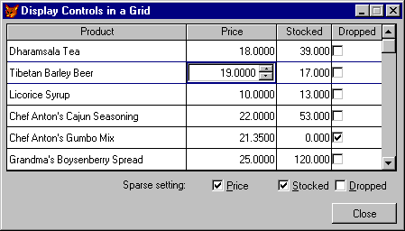
SELECT orders && if orders is the parent table SKIP IF EOF( ) GO BOTTOM ENDIF THISFORM.Refresh Displaying Controls in Grid Columns
In addition to displaying field data in a grid, you can have controls in the columns of a grid so that you can present a user with embedded text boxes, check boxes, drop-down list boxes, spinners, and other controls. For example, if you have a logical field in a table, when you run the form, a user can tell which record values are true (.T.) and which record values are false (.F.) by seeing whether the check box is set. Changing the value is as easy as setting or clearing the check box.
You can add controls to grid columns interactively in the Form Designer or write code to add the controls to the columns at run time.
To interactively add controls to a grid column
- Add a grid to a form.
- In the Properties window, set the ColumnCount property of the grid to the number of desired columns.
For example, type 2 for a two-column grid.
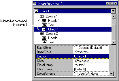
- In the Properties window, select the parent column for the control from the Object box.
For example, select Column1 to add a control to Column1. The border of the grid changes to indicate that you are editing a contained object when you select the column.
- Select the desired control on the Form Controls toolbar and click in the parent column.
The new control will not be displayed in the grid column in the Form Designer, but it will be visible at run time.
- In the Properties window, make sure the control is displayed indented under the parent column in the Object box.
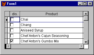
A check box added to a grid column
If the new control is a check box, set the Caption property of the check box to " " and the Sparse property of the column to false (.F.).
- Set the ControlSource property of the parent column to the desired table field.
For example, the ControlSource of the column in the following illustration is
products.discontinufrom Testdata.dbc in the Visual Studio \Samples\Vfp98\Data directory. - Set the CurrentControl property of the parent column to the new control.
When you run the form, the control is displayed in the grid column.
The check box is displayed in the column at run time.
Tip If you want to be able to center a check box in a grid column, create a container class, add a check box to the container class, and adjust the position of the check box in the container class. Add the container class to the grid column and set the ControlSource of the check box to the desired field.
To remove controls from grid columns in the Form Designer
- In the Object box of the Properties window, select the control.
- Activate the Form Designer.
If the Properties window is visible, the control name is displayed in the Object box.
- Press the DELETE key.
You can also add controls to a grid column using the AddObject method in code.
To programmatically add controls to a grid column
- In the Init event of the grid, use the AddObject method to add the control to the grid column and set the CurrentControl property of the column.
For example, the following lines of code in the Init event of a grid add two controls to a grid column and specify one of them as the current control:
THIS.grcColumn1.AddObject("spnQuantity", "SPINNER") THIS.grcColumn1.AddObject("cboQuantity", "COMBOBOX") THIS.grcColumn1.CurrentControl = "spnQuantity" * The following lines of code make sure the control is visible * and is diplayed in every row in the grid THIS.grcColumn1.spnQuantity.Visible = .T. THIS.grcColumn1.Sparse = .F. In this example, Column1 has three possible current control values:
-
spnQuantity -
cboQuantity -
Text1(the default control)
Note Properties set on the Grid level are not passed on to the columns or headers. In the same way, you must set properties of the headers and contained controls directly; they do not inherit their properties from settings at the Column level.
Tip For the best display of combo boxes in grid columns, set the following combo box properties:
BackStyle = 0 && Transparent Margin = 0 SpecialEffect = 1 && Plain BorderStyle = 0 && None Using Conditional Formatting in Grids
Special formatting in a grid can make it easier for a user to scan through the records in the grid and locate certain information. To provide conditional formatting, use the dynamic font and color properties of a column.
For example, you can add a grid to a form and set the ColumnCount property to 2. Set the ControlSource property of the first column to orders.to_name and the ControlSource property of the second column to orders.order_net. To display order totals less than 500.00 with a forecolor of black and order totals greater than or equal to 500.00 with a foreground color of red, include the following line in the grid s Init event code:
THIS.Column2.DynamicForeColor = ; "IIF(orders.order_net >= 500, RGB(255,0,0), RGB(0,0,0))" Common Grid Properties
The following grid properties are commonly set at design time.
| Property | Description |
| ChildOrder | The foreign key of the child table that is joined with the primary key of the parent table. |
| ColumnCount | Number of columns. If ColumnCount is set to - 1, the grid has as many columns as there are fields in the grid s RecordSource. |
| LinkMaster | The parent table for child records displayed in the grid. |
| RecordSource | The data to be displayed in the grid. |
| RecordSourceType | Where the data displayed in the grid comes from: a table, an alias, a query, or a table selected by the user in response to a prompt. |
Common Column Properties
The following column properties are commonly set at design time.
| Property | Description |
| ControlSource | The data to be displayed in the column. This is often a field in a table. |
| Sparse | If Sparse is set to true (.T.), controls in a grid are displayed as controls only when the cell in the column is selected. Other cells in the column display the underlying data value in a text box. Setting Sparse to true (.T.) allows faster repainting if a user is scrolling through a grid with a lot of displayed rows. |
| CurrentControl | Which control in the grid is active. The default is Text1, but if you add a control to the column, you can specify it as the CurrentControl. |
Note The ReadOnly property of a control inside the column is overridden by the ReadOnly property of the Column. If you set the ReadOnly property of the control in a column in the code associated with the AfterRowColChange event, the new setting will be valid while you are in that cell.
Making Controls Easier to Use
You want to make it as easy as possible for users to understand and use your controls. Access keys, tab order, ToolTip text, and selective disabling all contribute to a more usable design.
Setting Access Keys
An access key allows a user to choose a control from anywhere in the form by pressing ALT and the key.
To specify an access key for a control
- Precede the desired letter in the Caption property for the control with a backslash and a less than sign (\<).
For example, the following property setting for the Caption of a command button makes O the access key.
\<Open A user can choose the command button from anywhere in the form by pressing ALT+O.
To specify an access key for a text box or edit box
- Create a label with a backslash and less than sign (\<) in front of the desired letter, such as
C\<ustomer. - Make sure the label is the control in the tab order immediately preceding the text box or edit box you want to receive the focus.
Setting the Tab Order of Controls
The default tab order of controls on your form is the order in which you added the controls to the form.
Tip Set the tab order of controls so that the user can easily move through your controls in a logical order.
To change the tab order of controls
- In the Form Designer toolbar, choose Set Tab Order.
- Double-click the box next to the control you want to have the initial focus when the form opens.
- Click the box next to the other controls in the order you want them to be tabbed to.
- Click anywhere outside the tab order boxes to finish.
You can also set the tab order for the objects on your form by list, depending on the setting in the Form Design tab of the Options dialog box.
You can set the selection order for the option and command buttons within a control group. To move to a control group with the keyboard, a user tabs to the first button in the control group and then uses the arrow keys to select other buttons in the group.
To change the selection order of buttons within a control group
- In the Properties window, select the group in the Object list. A thick border indicates that the group is in edit mode.
- Select the Form Designer window.
- From the View menu, choose Tab Order.
- Set the selection order as you would the tab order for controls.
Setting ToolTip Text
Each control has a ToolTipText property that allows you to specify the text displayed when the user pauses the mouse pointer over the control. Tips are especially useful for buttons with icons instead of text.
To specify ToolTip text
- In the Properties window, select the ToolTipText property and type the desired text.
The form s ShowTips property determines whether ToolTip text is displayed.
Change the Mouse Pointer Display
You can change the mouse pointer display to provide visual clues to your users about different states your application might be in.
For example, in the tsBaseForm class of the Tasmanian Traders sample application, a WaitMode method changes the mouse pointer to the default wait state cursor. Before running any code that might take a while to process, the Tasmanian Traders application passes a value of true (.T.) to the WaitMode method to change the pointer and let the user know that processing is going on. After the processing is completed, a call to WaitMode with false (.F.) restores the default mouse pointer.
* WaitMode Method of tsBaseForm class LPARAMETERS tlWaitMode lnMousePointer = IIF(tlWaitMode, MOUSE_HOURGLASS, MOUSE_DEFAULT) thisform.MousePointer = lnMousePointer thisform.SetAll('MousePointer', lnMousePointer) If you want to change the mouse pointer to something other than one of the default pointers, set the MousePointer property to 99 - Custom and set the MouseIcon property to your own cursor (.cur) or icon (.ico) file.
Enabling and Disabling Controls
Set a control s Enabled property to false (.F.) if the functionality of the control is not available in a given situation.
Enabling and Disabling Buttons in a Group
You can enable or disable individual option buttons or command buttons in a group by setting the Enabled property of each button to either true (.T.) or false (.F.). You can also disable or enable all the buttons in a group by setting the Enabled property of the group, as in the following line of code:
frmForm1.cmgCommandGroup1.Enabled = .T. When you set the Enabled property of an option button group or a command button group to false (.F.), all the buttons in the group are disabled, but won t be displayed with the disabled ForeColor and BackColor. Setting the Enabled property of the group does not change the Enabled property of the individual buttons in the group. This allows you to disable a group of buttons with some of the buttons already disabled. When you enable the group, buttons that were originally disabled remain disabled.
If you want to disable all the buttons in a group so that they appear disabled, and if you don t want to preserve information about which buttons were originally disabled or enabled, you can use the SetAll method of the group, like this:
frmForm1.opgOptionGroup1.SetAll("Enabled", .F.) Allowing Users to Drag and Drop
When you design Visual FoxPro applications, you can drag text, files, and objects from the Component Gallery, Project Manager, the Database Designer, and the Data Environment Designer to desired locations on forms and reports. The drag-and-drop features in Visual FoxPro allow you to extend this ability to the user at run time.
This drag-and-drop capability extends to multiple-form operations. The user can drag text, files, and controls anywhere on the screen, including other forms.
Two types of drag and drop are now supported in Visual FoxPro: OLE drag-and-drop and control drag and drop. OLE drag-and-drop allows you to move data between other applications that support OLE drag-and-drop (such as Visual FoxPro, Visual Basic, the Windows Explorer, Microsoft Word and Excel, and so on). In a distributed Visual FoxPro application, you can move data between controls in the application, or between controls and other Window applications that support OLE drag-and-drop.
Control drag and drop allows you to drag and drop Visual FoxPro controls within your Visual FoxPro applications. Control drag and drop is also supported in earlier versions of Visual FoxPro. As the user drags a control, Visual FoxPro provides a gray outline that is the same size as the object and moves with the mouse pointer. You can override this default behavior by specifying a cursor file (.cur) for the DragIcon property of a control.
This section describes control drag and drop. For more information about OLE drag-and-drop, see OLE drag-and-drop in Chapter 31, Interoperability and the Internet.
To see examples of control drag and drop
- Run Solution.app in the Visual Studio \Samples\Vfp98\Solution directory.
- In the treeview, click Controls, then click General.
Dragging an Image control at run time
Note Run-time dragging of a control doesn t automatically change its location. You can do this, but you must program the relocation yourself, as described in the section Causing Control Movement, later in this chapter. Often, dragging is used only to indicate that some action should be performed; the control retains its original position after the user releases the mouse button.
Using the following drag-and-drop properties, events, and method, you can specify both the meaning of a drag operation and how dragging can be initiated (if at all) for any given control.
| To | Use this feature |
| Enable automatic or manual dragging of a control. | DragMode property |
| Specify what icon is displayed when the control is dragged. | DragIcon property |
| Recognize when a control is dropped onto the object. | DragDrop event |
| Recognize when a control is dragged over the object. | DragOver event |
| Start or stop manual dragging. | Drag method |
All visual controls can be dragged at run time and all controls share the properties listed in the preceding table. Forms recognize the DragDrop and DragOver events, but they don t have DragMode and DragIcon properties.
Enabling Automatic Drag Mode
To allow the user to drag a control whenever the user clicks the control, set its DragMode property to 1. This enables automatic dragging of the control. When you set dragging to Automatic, dragging is always on.
Note While an automatic drag operation is taking place, the control being dragged doesn t recognize other mouse events.
Responding When the User Drops the Object
When the user releases the mouse button after dragging a control, Visual FoxPro generates a DragDrop event. You can respond to this event in many ways. You can relocate the control at the new location (indicated by the last position of the gray outline). Remember that the control doesn t automatically move to the new location.
Two terms are important when discussing drag-and-drop operations source and target.
| Term | Meaning |
| Source | The control being dragged. |
| Target | The object onto which the user drops the control. This object, which can be a form or control, recognizes the DragDrop event. |
A control becomes the target if the mouse position is within its borders when the button is released. A form is the target if the pointer is in a blank portion of the form.
The DragDrop event receives three parameters: oSource, nXCoord, and nYCoord. The parameter oSource is a reference to the control that was dropped onto the target. The parameters nXCoord and nYCoord contain the horizontal and vertical coordinates, respectively, of the mouse pointer within the target.
Because oSource is an object, you use it just as you would a control you can refer to its properties or call one of its methods. For example, the following statements in the code associated with the DragDrop event checks to see whether the user has dropped a control on itself:
LPARAMETERS oSource, nXCoord, nYCoord IF oSource.Name != THIS.Name * Take some action. ELSE * Control was dropped on itself. * Take some other action. ENDIF All possible control types for oSource have a Visible property. Therefore, you can make a control invisible when it s dropped on a certain part of a form or on another control. The following line in the code associated with the DragDrop event of an Image control causes a dragged control to disappear when it s dropped on the image:
LPARAMETERS oSource, nXCoord, nYCoord oSource.Visible = .F. Indicating Valid Drop Zones
When you enable drag-and-drop, you can help your users by including visual clues about where a user can and cannot drop a control. The best way to do this is to change the DragIcon of the source in the code associated with the DragOver event.
The following code in the DragOver event of a control indicates to a user that the control is not a valid drop target. In this example, cOldIcon is a user-defined property of the form.
LPARAMETERS oSource, nXCoord, nYCoord, nState DO CASE CASE nState = 0 && Enter THISFORM.cOldIcon = oSource.DragIcon oSource.DragIcon = "NODROP01.CUR" CASE nState = 1 && Leave oSource.DragIcon = THISFORM.cOldIcon ENDCASE Controlling When Dragging Starts or Stops
Visual FoxPro has a setting of Manual for the DragMode property that gives you more control than the Automatic setting. The Manual setting allows you to specify when a control can and cannot be dragged. (When DragMode is set to Automatic, the control can always be dragged as long as the setting isn t changed.)
For instance, you may want to enable dragging in response to MouseDown and MouseUp events, or in response to a keyboard or menu command. The Manual setting also allows you to recognize a MouseDown event before dragging starts, so that you can record the mouse position.
To enable dragging from code, leave DragMode in its default setting (0 - Manual). Then use the Drag method whenever you want to begin or stop dragging an object:
container.control.Drag(nAction)
If nAction is 1, the Drag method initiates dragging of the control. If nAction is 2, the control is dropped, causing a DragDrop event. The value 0 for nAction cancels the drag. The effect is similar to giving the value 2, except that no DragDrop event occurs.
Note To enable a drag and drop operation from a list box, the best place to call the Drag method is in the code associated with the MouseMove event of the source list box, after determining that the mouse button is down. For an example, see Lmover.scx in the Visual Studio \Samples\Vfp98\Solution\Controls\Lists directory.
Causing Control Movement in a Drag-and-Drop Operation
You may want the source control to change position after the user releases the mouse button. To make a control move to the new mouse location, use the Move method. For example, the following code in the DragDrop event of a form moves the control that is dragged to the location of the drop:
LPARAMETERS oSource, nXCoord, nYCoord oSource.Move(nXCoord, nYCoord) This code may not produce precisely the effects you want, because the upper-left corner of the control is positioned at the mouse location. The following code positions the center of the control at the mouse location:
LPARAMETERS oSource, nXCoord, nYCoord oSource.Move ((nXCoord oSource.Width / 2), ; (nYCoord oSource.Height / 2)) The code works best when the DragIcon property is set to a value other than the default (the gray rectangle). When the gray rectangle is being used, the user normally wants the control to move precisely into the final position of the gray rectangle. To do this, record the initial mouse position within the source control. Then use this position as an offset when the control is moved. For an example, see Ddrop.scx in the Visual Studio \Samples\Vfp98\Solution\Forms directory.
To record the initial mouse position
- Specify manual dragging of the control.
- Declare two form-level variables, n
DragXand nDragY. - Turn on dragging when a MouseDown event occurs. Also, store the value of nXCoord and nYCoord in the form-level variables in this event.
- Turn dragging off when the MouseUp event occurs.
Extending Forms
Page frames allow you to extend the surface area of your forms, and ActiveX controls allow you to extend the functionality of your forms.
Using Page Frames

A page frame is a container object that contains pages. Pages in turn contain controls. Properties can be set at the page frame, page, or control level.
To see examples of using page frames
- Run Solution.app in the Visual Studio \Samples\Vfp98\Solution directory.
- In the treeview, click Controls, then click Page frame.
You can think of the page frame as a three-dimensional container that presents layered pages. Only controls on the top page (or on top of the page frame) can be visible and active.
Multiple pages in a page frame on a form
The page frame defines the location of the pages and the amount of the page that is visible. The upper-left corner of a page is anchored to the upper-left corner of the page frame. Controls can be placed on pages which are beyond the dimensions of the page frame. These controls are active, but are not visible unless you programmatically change the Height and Width properties of the page frame to make the controls visible.
Using Pages in an Application
With page frames and pages, you can create tabbed forms or dialog boxes with the same kind of interface capabilities that you see in the Project Manager.
In addition, page frames allow you to define a region of the form where you can easily swap controls in and out. For example, in Wizards, most of the form remains constant, but an area of the form changes with each step. Instead of creating five forms for the wizard steps, you could create one form with a page frame and five pages.
Solution.app, in the Visual Studio ...\Samples\Vfp98\Solution directory, contains two page frame examples that demonstrate using frames with and without tabs.
Adding Page Frames to a Form
You can include one or more page frames on any form.
To add a page frame to a form
- In the Form Controls toolbar, choose the Page Frame button and drag to size in the Form window.
- Set the PageCount property to indicate the number of pages to include in the frame.
Page frame with four pages
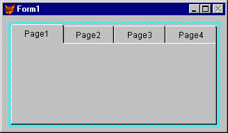
- From the frame s shortcut menu, choose Edit to activate the frame as a container. The page frame border widens to indicate that it is active.
- Add controls the same way you would add them to a form.
Note Like other container controls, you must select the page frame and choose Edit from the right mouse menu, or select the container in the Object drop-down list in the Properties window, so that the container is selected (has a wider border) before you add controls to the page you are designing. If you do not activate the page as a container before adding controls, the controls will be added to the form instead of the page, even though they may appear to be on the page.
To select a different page in the page frame
- Activate the page frame as a container by right-clicking it and choosing Edit.
- Select the tab of the page you want to use.
-or-
- Select the page in the Object box in the Properties window.
-or-
- Select the page in the Page box at the bottom of the Form Designer.
Adding Controls to a Page
When you add controls to a page, they are visible and active only when their page is active.
To add controls to a page
- In the Object box of the Properties window, select the page. A border appears around the page frame indicating that you can manipulate contained objects.
- In the Form Controls toolbar, choose the control button you want and drag to size in the page.
Managing Long Captions on Page Tabs
If the captions on your tabs are longer than can be displayed on the tab given the width of the page frame and the number of pages, you have two options:
- Set the TabStretch property to 1 - Single Row to show only the characters of the captions that will fit on the tabs. Single Row is the default.
- Set the TabStretch property to 0 - Multiple Rows to stack the tabs so that the entire caption on all the tabs is visible.
Changing Pages Programmatically
Whether a page frame is displayed with tabs or not, you can programmatically make a page active by using the ActivePage property. For example, the following code in the Click event procedure of a command button on a form changes the active page of a frame page on the form to the third page:
THISFORM.pgfOptions.ActivePage = 3 Common Page Frame Properties
The following page frame properties are commonly set at design time.
| Property | Description |
| Tabs | Whether tabs are visible for the pages. |
| TabStyle | Whether or not the tabs are all the same size and together the same width as the page frame. |
| PageCount | The number of pages in the page frame. |
OLE Container Control

You add an OLE object to a form by clicking this tool and dragging it to size in the Form window. This tool can represent a server object such as Microsoft Excel or Word, or it can represent an ActiveX control if your Windows SYSTEM directory contains ActiveX controls (files with an .ocx extension). For general information about ActiveX controls, see Chapter 16, Adding OLE.
OLE Bound Control

You can create a bound OLE object on a form by clicking this tool and dragging it to size in the Form window. After creating the object, you connect it to a General field in a table. Then, you use the object to display the contents of the field. For example, if you store Word documents in a General field, you can display the contents of these documents by using a bound OLE object on a form.
To create a bound OLE object
- Create or open a form.
- In the Form Controls toolbar, choose the OLE Bound Control button and drag it to size on the form.
- Bind the OLE object to a General field by setting the object s ControlSource property.
For an example of using the OLE Bound control, see Chapter 16, Adding OLE.
EAN: N/A
Pages: 58