Get Le Look
In Paris, fashion designers struggle with their haute couture to get "le look." I try to design user interfaces that have "le look" as well, but the particular look I'm after isn't trendy or attention-grabbing. Rather, I have the fairly modest goal of trying to create user interfaces that look normal. While it is difficult to precisely define what a "normal" user interface looks like, you can definitely tell when you are using one. As the fashion saying goes, if a person is poorly dressed you notice the clothes, but if a person is well dressed you notice the person. Similarly, if a user interface is poorly designed you notice the interface, but if a user interface is well done you notice the program. This is the style I'm after. Normal-looking Windows programs have a familiar appearance that is immediately comfortable. They look like they are part of Windows. Programs that are not normal draw attention to themselves and clearly stand out but often in an undesirable way.
And now an interesting question: isn't my goal of getting "le look" in conflict with the previously mentioned goal of obtaining a consistent corporate image? The answer is that it can be but it doesn't have to be. If you want your programs to have a distinct image, you can do so with very subtle distinctions. The appearance of the bitmaps and icons; the way documents are displayed; the layout of the dialog boxes; the appropriate selection of controls; the use of advanced user interface features such as tooltips, previews, and direct manipulation; and the avoidance of annoying user interface problems all combine to make more of an impression than more obvious techniques like using custom controls just for the sake of being different.
In the following sample user interface style guidelines, I have tried to include guidelines that characterize this look.
Sample User Interface Guidelines
The following is a list of sample user interface guidelines that you might want to consider using. The items marked with an asterisk are considered rules and should be followed in most circumstances. The remaining items are guidelines. My personal criteria for rules is that either the rule must be followed to satisfy the standards, or the rule is objective (as opposed to subjective) and there is rarely a good justification for not complying. However, for me, there is no such thing as an absolute rule in user interface design. If I have an excellent justification for breaking a rule, it's broken. I rarely do.
Some of the guidelines give what might seem to be arbitrary sizes and spacing. However, the sizes and spacing given agree with the standards and are known to work well with the English language. If you have a good reason for using other sizes and spacing, you should do so. Just make sure to use whatever sizes and spacing you choose consistently throughout the program.
Lastly, note that in Visual C++ shortcuts are called "accelerators" and access keys are called "mnemonics." Normally, shortcuts are obtained with the Ctrl key, and access keys use the Alt key and are indicated by an underlined letter. The terms used here are consistent with Designing for the User Experience and the Microsoft Manual of Style for Technical Publications, Second Edition.
General appearance
- Use consistency A consistent appearance will make the user interface easier to understand and use. The user interface elements should look as if they belong together.
- Use arrangement and flow In Western cultures, people read from left to right and from top to bottom, so place the more important information on top and to the left. The upper left corner receives the most attention.
- Use alignment In general, use left alignment to make user interface elements easier to scan. Use decimal alignment or right alignment for numeric text. Avoid right alignment and center alignment for non-numeric text. You don't have to center everything or make everything symmetrical. Prefer having white space on the right side and bottom instead.
- Use grouping Group related user interface elements to show relationships. Display related information together. Place controls near the objects acted upon. Use white space, group boxes, lines and labels, or other separators to group related user interface elements.
- Use emphasis Try to draw attention to the user interface elements that need to be seen first, using focus, location, grouping, hierarchy, enabling/disabling, size, color, or font attributes. Try to visually indicate what the user should do next.
- Use visual clues Try to use like sizing and spacing to indicate that user interface elements are similar and different sizing and spacing to indicate that user interface elements are different.
- Use white space Use white space to create "breathing room" that makes window layout easier to understand and more comfortable to view. The spacing should appear more or less balanced and even, with no awkward gaps. However, avoid having too much white space. If possible, try to make the window smaller instead.
- Watch for vanity Don't plaster company or product names and logos all over the place. While large company or product names and logos are perfectly acceptable in splash screens or about boxes, the available space in other windows should be used for something else. If there is nothing else, try to make the window smaller instead.
- Watch sizing Make user interface elements resolution independent. Use either system metrics (using the GetSystemMetrics API function) or text metrics (using the GetTextMetrics or GetTextExtentPoint32 API functions) to determine the size of user interface elements. Any object that displays text, such as dialog boxes or printed text documents, should use text metrics. Avoid using pixels for sizing.
- Consider using resource templates or predefined layout grids Resource templates or predefined layout grids will help you obtain consistency between different windows.
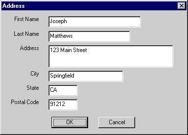
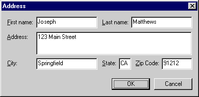
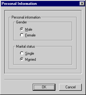
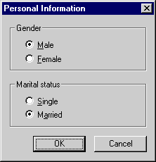
Note how the second dialog box below, unlike the first, has a compact, left-to-right, top-to-bottom flow; left-aligned labels that are easy to scan; and edit boxes aligned and sized to give them an organized, balanced look.
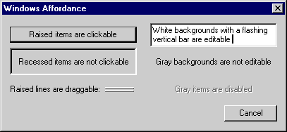
Windows visual affordance
Affordance relates to the ability of a user to determine how to use an object just by looking at its visual clues. Maintain the following visual affordances used in Windows:
- Raised items can be clicked.
- Items that become highlighted when the mouse cursor passes over them can be clicked.
- Recessed items cannot be clicked.
- Items with a white background and a flashing vertical bar can be edited.
- Items with a gray background cannot be edited.
- Gray items are disabled.
- Raised lines can be dragged.
Interaction
- Try to provide keyboard access to all features Ideally, all functions, except graphical functions like drawing, should be accessible with the keyboard alone.
- Try to provide mouse access to all features Ideally, all functions, except text entry, should be accessible with the mouse alone.
- * Make sure that activities that have significant consequences require explicit selection from the user The user needs to be fully aware that he is about to do something dangerous or destructive.
- * Give feedback for all time-consuming operations Make sure there is a wait cursor, progress meter, or some other visual feedback during lengthy operations. The user should be able to cancel lengthy operations. Label the button Cancel if canceling undoes the operation, otherwise label the button Stop.
- * Visually indicate modes Give the user visual feedback to indicate when he has entered a mode, typically by changing the cursor or the title bar text.
- * Make sure single-clicking and double-clicking are consistent Use single-clicking for selection for nonbuttons. Use double-clicking for selection plus performing the default action. In other words, double-clicking (in a list box, combo box, or any other control that takes a double click) should have the same effect as selecting an item in the control and pressing the Enter key.
- * Use the right mouse button only for context menus Make sure the right mouse button is used for context menus and not for any other purpose.
- * Do not use the middle mouse button If the user has a mouse with a middle mouse button, let the user assign the behavior using the Mouse utility in the Control Panel.
- Assign shortcut keys consistently Use function keys and Ctrl key combinations for shortcuts. Don't use Alt key combinations except by convention, since they are used for access keys. Never combine Alt and Ctrl keys, since such combinations make shortcuts cumbersome and less accessible.
- * Always make shortcut keys redundant Never make a shortcut key the only way to access a command. Give the user a more visible alternative.
- Avoid horizontal scroll bars Unlike vertical scrolling, horizontal scrolling is undesirable because it makes it difficult to read an item. As an alternative, try to use a vertical scroll bar, make the window wider, shorten the text, or wrap the text instead. Of course, use horizontal scroll bars if you really must.
Programs
- * Only main program windows have title bar icons, menu bars, toolbars, and status bars Secondary windows must not appear on the taskbar, since clicking on a primary window taskbar button also activates any secondary windows. Secondary windows should not have the complexity to warrant a menu bar, toolbar, or status bar. Title bar icons are used as a visual distinction between primary windows and secondary windows. Also, never use the default Windows icon (the flying window icon) as a window icon.
- Make the default configuration very simple Let users grow into a program at their own pace.
- Applications should use either a multiple-document interface (MDI) or a single-document interface (SDI) These program interfaces match the usage pattern of applications.
- Applications should be maximized by default The user is usually more productive when the full screen is dedicated to an application.
- Utilities should use either an SDI or a dialog box interface These program interfaces match the usage pattern of utilities. Using an MDI interface is not recommended for utilities because it requires too much effort to manage all the windows.
- Utilities should work in a small screen space Utilities are often used in conjunction with another program, so they need to run in a small screen space. Utilities should have a flexible window layout so that they can accommodate a wide variety of sizes. Utilities rarely run maximized.
- * SDI programs that use actual documents must support running multiple instances Running multiple instances will allow the user to work with several documents at a time.
- Use an Exit command to quit a program Use Exit to quit a program, Close to remove primary windows and modeless dialog boxes, and Cancel to remove modal dialog boxes. Use Close instead of Exit for primary windows when closing the primary window doesn't imply terminating the process. For example, closing a printer status window doesn't cancel the outstanding print jobs.
Terminology
- Use the same term to describe the same thing Using different terms for items that have only subtle differences will confuse the user.
Defaults
- Save and restore user selections A program should restore itself to the state it was in when last quit. MDI programs should restore the size and location of document windows. Dialog boxes should generally use the last input values for defaults.
- Provide appropriate defaults Help users get their work done by eliminating unnecessary effort through appropriate defaults. Give the default value that is most likely to be right, given how the setting is actually used. Often the best default is the last setting that the user input.
- * Consider safety when selecting default values Irreversible or destructive actions should never be the default. Never use a default value that would surprise the user.
Dialog boxes
- Dialog boxes should display correctly in all video modes When displayed in VGA mode (640 x 480), a dialog box should be no larger than 640 x 460 (saving 20 pixels for the taskbar). This will guarantee that the dialog box can be displayed in all video modes.
- * Make modal dialog boxes modal Make sure that all modal dialog boxes that have parent windows supply the correct parent window handle instead of a NULL handle. (Note that the correct parent handle is automatically supplied when using MFC.) If the parent window handle isn't supplied, the parent window is still active, so the dialog box really isn't modal.
- * Never use scrollable dialog boxes That is, never use dialog boxes that require the use of a scroll bar to be viewed completely. Such dialog boxes are difficult to use and completely unnecessary. Redesign the dialog box instead.
- * Never use menu bars in dialog boxes used as secondary windows Such dialog boxes require too much effort to use. Note that menu bars are acceptable in dialog boxes used as primary windows (such as the Find utility). Also note that context menus and menu buttons are acceptable in all dialog boxes:
- * Never use title bar icons in dialog boxes used as secondary windows Title bar icons are used as a visual distinction between primary windows and secondary windows.
- * Never display dialog boxes used as secondary windows on the taskbar Note that clicking on a primary window taskbar button also activates any secondary windows.
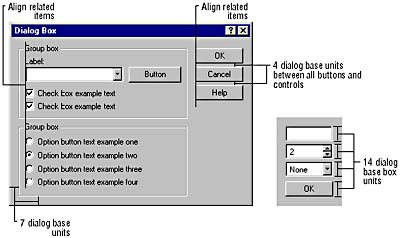
- Use the following layout and spacing within a dialog box:
- Between similar dialog boxes, use control locations to emphasize similarity If the same control with the same meaning appears in several similar dialog boxes, it should appear in the same location. On the other hand, avoid placing different controls that could be confused in the same location.
- Prefer dockable toolbars to modeless dialog boxes Dockable toolbars are functionally equivalent to modeless dialog boxes but allow for more flexible placement.
- Set input focus strategically Set the initial input focus on the control that is most likely to be used first.
- Don't put ellipses in dialog box title text For example, a dialog box that is displayed as the result of choosing the Print Options… command should have the title Print Options. An exception is to indicate that a command is in progress, such as with "Connecting To The Internet…"
- * Assign access keys to all controls that can handle access keys Access keys help users keep their hands on the keyboard and make a program more accessible. You can assign access keys to controls such as command buttons, radio buttons, and check boxes directly in their captions. You can assign access keys to controls such as edit boxes, list boxes, and combo boxes by supplying a static text label or group box with an access key that precedes the control in tab order. Don't assign an access key to a group box in other circumstances—this is confusing. An OK button doesn't have an access key, since it is selected with the Enter key when it is the default button. A Cancel button doesn't have an access key, since the Esc key is used to dismiss a modal dialog box. If possible, avoid assigning an access key to a lowercase g, j, p, q, or y, or to a character immediately preceding or following one of these characters. The underline doesn't look right against the character's descender. Of course, the access keys must be unique.
- Avoid using bold text Use bold text sparingly. Bold text was used in Windows 3.1 dialog boxes to draw disabled text on old video hardware (that is, dithered gray). Since modern video hardware can draw gray text without dithering, Windows now uses normal text in dialog boxes for a much cleaner look. Use bold text only for emphasis. Most dialog boxes should not use any bold text.
- Provide context-sensitive help For more complicated dialog boxes, supply context-sensitive help for the entire dialog box (accessed with a help button or the F1 key), control-specific help for individual controls (accessed with the What's This? button or the Shift+F1 key), or both.
Dialog box main command buttons
- * Separate main command buttons from the main body of a dialog box Main command buttons are command buttons such as OK, Cancel, Close, Help, Stop, Hide, and other related buttons. This separation makes the main command buttons easier to find and identify.
- Choose the dialog box orientation carefully In Western cultures, people read from left to right and from top to bottom, so main command buttons are easier to find if they are across the bottom or on the right. You should chose the orientation that makes the aspect ratio of the dialog box more similar to the aspect ratio of the screen, which is typically 3 units high to 4 units wide. This makes the dialog box appearance more comfortable and easier to position on the screen. Put the buttons across the bottom if they have different sizes. When in doubt, put the buttons across the bottom, since this orientation is more common and easier to read.
- Right-align main command buttons placed across the bottom Right-aligned main command buttons follow the left-to-right flow. You might want to make an exception by centering the main command button when there is only one.
- Avoid multiple rows or columns of main command buttons Multiple rows or columns of main command buttons will overwhelm the user. If you have many main command buttons, note that you can usually place more buttons in a single column on the right than in a single row across the bottom. Alternatively, consider using a command menu instead. If you must have many buttons, note that multiple rows are preferred to multiple columns.
- * For modal dialog boxes, always provide OK and Cancel buttons To use a dialog box, the user needs to be able to easily identify how to move forward (with the OK button) and backward (with the Cancel button). You can replace OK with a more specific command, but never replace Cancel in a modal dialog box, except with Stop to indicate that the effect of an operation in progress cannot be cancelled.
- * For modeless dialog boxes or dialog boxes used as primary windows, provide a Close button but do not provide OK and Cancel buttons Using OK and Cancel for a modeless dialog box or primary window makes the dialog box appear to be a modal dialog box. Furthermore, OK and Cancel are not meaningful when used in a modeless context. Use Close instead to eliminate any confusion.
- * Always put the OK button first, Cancel second, Help last OK or its equivalent should always be the first main command button. Cancel should be to the right of or below OK. Place the OK and Cancel buttons next to each other. The Help button should be the last button. If there is no OK button, place the Cancel button just before the Help button. This makes the main command buttons easier to find and identify.
- * Label the OK and Cancel buttons correctly The OK button should be labeled OK, not Ok or OK. The Cancel button should be labeled Cancel, not Cancel or CANCEL.
- * Make sure the Cancel button really cancels When cancelled, the program state should be exactly the same as it was before the modal dialog box was displayed. If not, the Cancel button should be replaced with a Stop button. The Cancel button in the body of a modal dialog box should have the same effect as the Close button on the title bar. Property sheets are an exception, since the Cancel button doesn't cancel or undo changes that have already been applied.
Property sheets and property pages
- Have property pages work independently Avoid having the behavior or operation of one property page depend upon another. Users are unlikely to discover such dependencies between property pages. There should be no restriction on the order in which property pages are used. The user should be able to view any property page at any time.
- Lay out property pages independently The contents of several property pages aren't always going to take exactly the same amount of space. The layouts of the property pages that take less space than the largest property page should not be formatted differently because there is extra space available.
Avoid centering.
- Prefer property sheets to dialog boxes with tab controls There is no significant usability advantage to using property sheets rather than tabbed dialog boxes except for additional consistency. Alternatively, use property sheets for dialog boxes that actually display an object's properties and tabbed dialog boxes for other uses.
- * Always use property sheets for properties, even if there is only a single page Always use a property sheet to make it clear that the user is viewing properties and not a regular dialog box. A property sheet has an Apply button to help the user experiment with settings.
- * Never use more than two rows of tabs A single row of tabs is preferred, but two rows are acceptable. Having more than two rows of tabs is too many. Use hierarchical property sets or multiple dialog boxes instead.
- * Always implement the Apply button for properties Again, providing an Apply button helps the user experiment with settings.
- * Always put the word Properties and the name of the object in the title of a property sheet that displays properties Again, note that not all property sheets are used to display properties.
- * Always place command buttons in the right location Command buttons that apply to all pages must be outside the tabbed page area. Command buttons that apply to individual pages must be inside the tabbed page area.
Wizards
- Use wizards for advanced, complex, or infrequent tasks Wizards are helpful for tasks that are sufficiently advanced or complex that the extra effort required to use them is worth the trouble. Wizards are most effective when used for tasks that are rarely performed. Using wizards for common tasks makes those tasks cumbersome.
Controls
- Prefer the standard controls Use the standard controls (the six original basic controls and the new Win32 common controls) whenever possible. Programs that use nonstandard controls don't look or behave like most other Windows programs. Use custom controls only when you have a good justification.
- Customize standard controls with caution Be careful when changing the standard appearance or behavior of the standard controls. It is often a mistake.
- * Disable invalid controls Disable controls that don't apply in the current program state.
- Eliminate unnecessary scroll bars If possible, make controls long enough or wide enough to eliminate the need for scroll bars.
Command buttons
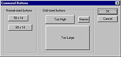
- Use a minimum width and a standard height Command buttons with text captions should have a minimum width of 50 dialog units (1095 twips in Visual Basic) and a standard height of 14 dialog units (375 twips in Visual Basic). Try to limit the number of different sizes for command buttons with text to no more than two. Owner-draw buttons or command buttons without a text caption (such as "…") may be any size. This guideline gives command buttons a consistent, simple appearance. Command buttons that have a height greater than 14 dialog units tend to look amateurish. While there is no maximum width for command buttons, a command button wider than 200 dialog units (4380 twips in Visual Basic) is questionable. See the following screen shot for examples of command buttons.
- Consider widening buttons for internationalization While a width of 50 dialog units is a good minimum width for English text, it might be too small for programs that are to be localized for other languages. For programs that need to be translated to other languages, a minimum command button width of 60 dialog units (1335 twips in Visual Basic) might be easier to work with.
- * Disable invalid command buttons instead of giving error messages Never have enabled commands that will result only in an error message.
- * Always use ellipses to indicate more information is required An ellipsis in a command indicates that more information other than a simple confirmation is required to carry out the command. An ellipsis does not mean that a dialog box follows.
- * Never assign a behavior to a double click Users do not expect command buttons to respond to double clicks, so they are unlikely to discover this behavior.
Check boxes
- * Use check boxes to turn options on and off, radio buttons to change modes Check boxes are effective in turning options on and off but confusing when used to change modes to a state other than on or off. For example, you can use a check box to indicate that a toolbar is displayed or not, but using a check box to toggle a printer between landscape mode and portrait mode would be very confusing. Use a group of radio buttons with landscape and portrait modes instead.
- Avoid groups of check boxes with more than eight (or so) items Consider using a check box list instead, since it takes up less space, but remember that a check box list will require more effort to use if scrolling is required. While check boxes are preferable if there is plenty of space or to be consistent with the use of other check boxes in the same window, more than eight or so check boxes is just too many.
- Consider putting related groups of check boxes in a group box Such grouping will make the relationship between the check boxes more apparent.
- Prefer vertical alignment A group of check boxes is easier to scan if aligned vertically, although horizontal and rectangular alignments are acceptable if they result in a better layout.
Radio buttons
- Avoid groups of radio buttons with more than eight (or so) items Consider using a list or combo box instead, since they take up less space. Remember, however, that these elements require more effort to use. While radio buttons are preferable if there is plenty of space or to be consistent with the use of other radio buttons in the same window, more than eight or so radio buttons is just too many.
- Avoid radio buttons for on/off or yes/no choices Use check boxes instead.
- * Always put radio buttons in a group box Since radio buttons form a set of mutually exclusive choices, a group box makes it clear what the choices are.
- Prefer vertical alignment A group of radio buttons is easier to scan if aligned vertically, although horizontal and rectangular alignments are acceptable if they result in a better layout.
Combo boxes
- * Always give combo boxes a label Labels are necessary to identify what the combo box is for.
- Make combo box drop-down lists at least five lines long Lists with fewer than five lines don't have a usable scroll bar thumb, making scrolling difficult. Note that if a combo box doesn't have enough items to fill the list, the list length is automatically shortened.
- Avoid combo box lists with fewer than four (or so) items Consider using radio buttons instead, since they are easier to use, although they do take up more space. Combo boxes with only a few items are preferable if space is at a premium or for consistency with other combo boxes in the same window.
Edit boxes
- * Always give edit boxes a label Labels are necessary to identify what the edit box is for. If the label is on the left, vertically align the label text with the edit box text.
- Avoid edit boxes for constrained input Use edit boxes for input where the user can enter any text or numbers for numeric edit boxes. For constrained input, use other controls, such as combo boxes, lists, sliders, and spin boxes. Use the date and time picker control for dates and times.
- Make edit boxes visible with spin boxes and browse buttons Spin boxes and browse buttons are simple, visible mechanisms that help the user give valid input in an edit box. Avoid forcing the user to type input. Use an edit box with a spin box only for numeric input, and be sure to use the AutoBuddy style for the spin box. For text, use a combo box instead.
- Set the width of edit boxes to suggest the size of the expected input The width of an edit box is a visual clue of the expected input. For example, if the user is entering an address, a State field that is about two characters wide clearly suggests entering a two-character state abbreviation. If the expected input has no particular size, choose a width that is consistent with other edit boxes or controls.
- * Always use numeric edit boxes for numeric input The user should never have to receive an error message for entering non-numeric text into a numeric field.
Sliders
- * Always give sliders a label Labels are necessary to identify what the slider is for. Typically, sliders also need labels to indicate the meaning of the high and low values as well as of the current selection—all without colons, of course.
Static text
- Left-justify static text labels Left-justification gives the labels an organized look and makes them easy to scan.
- Prefer to place static text labels on the left, not on top of their associated control This alignment makes the labels easier to find and the combined label and control easier to scan. Obvious exceptions are tall controls, such as lists, trees, and multiline edit boxes.
- * Always use colons at the end of static text labels used to identify a control Using a colon clearly indicates that the text is a control label. Labels used to give supplemental information about a control should not have a colon, such as labels used to interpret a slider control. Colons are also used as a clue by screen readers.
- * Always use read-only edit boxes for nonlabel text Read-only edit boxes allow the user to copy the text to the clipboard and scroll the text if it is longer than the control.
- * Never put static text on a raised border Static text on a raised border looks like a button, and users will try to click it. (The static text Modal frame extended style in Visual C++ will raise the border.)
List boxes
- * Always give list boxes a label Labels are necessary to identify what the list box is for.
- Make list boxes at least five lines long Lists with less than five lines don't have a usable scroll bar thumb, making scrolling difficult. Using a shorter list box is acceptable if the list box will not have a scroll bar.
- Consider using check box lists for multiple selection Check box lists make the ability to select multiple items more obvious. If a check box list isn't acceptable, use a multiple-selection list with static text indicating the number of items selected to clearly show that multiple selection is possible.
- Consider providing Select All and Deselect All commands for multiple-selection lists These commands make it easier for the user to make multiple selections, since it is common to want to select or deselect everything.
List views
- * Always give list views a label Labels are necessary to identify what the list view is for.
- Make list views at least five lines long Lists with fewer than five lines don't have a usable scroll bar thumb, making scrolling difficult. Using a shorter list box is acceptable if the list box will not have a scroll bar.
- * Use a clickable header only if the list is sortable Clickable headers should not be used for anything other than sorting. The first click should sort the list in normal order; the second click should sort the list in the reverse of normal order.
- * Always make a list view sortable if it can contain more than about 30 items Giving the user the ability to sort long lists makes it easier to find information.
Scroll bars
- * Use scroll bars only for scrolling Use sliders or spin boxes to set values.
- Make scroll bars long enough to have a usable scroll bar thumb Scroll bars without a usable scroll bar thumb make scrolling difficult.
Group boxes
- Use group boxes to group related controls While group boxes are traditionally used to group radio buttons, they can be used to group any type of control. Avoid group boxes with only a single control except to maintain consistency with other group boxes in the same dialog box.
- Consider using static lines and text labels instead of group boxes A problem with group boxes is that they can take up a lot of space if there are many of them. A good alternative if space is at a premium is to group controls using a combination of a static text label and a static line (actually a static etched frame with a height of one dialog box unit).
- * Don't use colons at the end of group box labels The box or line associated with a group makes the colon unnecessary and confusing.

Menus
- * Always use single words for menu titles A multiple-word menu title on the menu bar looks like multiple menu titles.
- * Never put gaps between the text on menu bars Nonuniform menu bar text looks awkward and serves no purpose.
- * Avoid multiple-line menu bars While any menu bar can take multiple lines if you make the parent window narrow enough, avoid having so many menu bar items that multiple lines are likely in ordinary usage.
- * Keep menus stable Disable, don't remove, invalid menu items. However, if a menu item is never valid during the instance of the program, remove it.
- Order menu items strategically Group related items. More important commands should appear at the top of the menu, less important commands at the bottom.
- * Disable invalid commands instead of giving error messages Menus should never have enabled commands that will only result in an error message.
- * Assign access keys Access keys help users keep their hands on the keyboard and make a program more accessible. If possible, avoid assigning an access key to a lowercase g, j, p, q, or y, or to a character immediately preceding or following one of these characters. The underline doesn't look right against the character's descender. Of course, the access keys must be unique within a menu.
- * Always use ellipses to indicate more information is required An ellipsis in a command indicates that more information other than a simple confirmation is required to carry out the command. An ellipsis does not mean that a dialog box follows.
- Use the standard menus Avoid not supplying File, Edit, and Help menus. Since these menus are standard, users expect them. For example, users expect to find commands like Print and Exit in the File menu, even though these commands have nothing to do with files. Similarly, users expect to find Cut, Copy, and Paste in the Edit menu, and at least the About command in the Help menu.
- Place the Find and Options commands consistently Always put the Find command in the Edit menu, and always put the Options command in the Tools menu if there is one or the View menu if not.
- * Use check marks to turn options on and off, radio groups to change modes Check marks are effective in turning options on and off, but confusing when used to change modes to a state other than on or off. For example, you can use a check mark to indicate that a toolbar is displayed or not, but using a check mark to toggle a printer between landscape mode and portrait mode would be very confusing. Use a radio group of landscape and portrait modes instead.
- * Never use multicolumn drop-down menus Multiple columns add unnecessary complexity to a menu.
- * Never use "Bang" menus Bang menus are items on the menu bar that look like drop-down menus but are actually commands that execute immediately upon selection, such as Exit! Obviously, users expect menu titles to act as menus and not commands.
- * Never right-justify menu titles This menu style is obsolete and only makes the menu hard to use. (You can right-justify menu titles using the Help property in Visual C++.)
Context menus
- Consider using context menus, but make them redundant Context menus shouldn't be the only way to access a command. Typically, commands in a context menu should also be available from the menu bar. Use context menus to make command access more efficient.
- Avoid including shortcut keys in context menus Rather, put the shortcut key assignments in the menu bar. Context menus are for quick access and are accessed with the mouse, not the keyboard.
Toolbars
- * Keep toolbars stable Disable, don't remove, invalid toolbar buttons. However, consider removing entire toolbars that do not apply when the user enters a mode.
- * Disable invalid commands instead of giving error messages Toolbars should never have enabled commands that will only result in an error message.
- Use large toolbar buttons for utilities A good utility toolbar is usually quite different from an application toolbar. It is far simpler and has much larger buttons. A utility toolbar should include only a few obvious commands with descriptive text and graphics.
- Use movable, customizable toolbars for applications, fixed toolbars for utilities Applications need flexible toolbars to support their typical usage pattern. Users typically do not use utilities long enough to need to customize their toolbars.
- Provide an option to show or hide the toolbar If there are multiple toolbars, provide options to show or hide them individually.
- * Always use tooltips Tooltips help the user understand what the toolbar buttons do.
Tooltips
- Make your toolbar tooltip text informative, yet brief Avoid stating the obvious. Consider using an ellipsis to indicate that more information is required to carry out the command. If the command has a shortcut key assigned, display the shortcut as well.
- Aim toolbar tooltip text at intermediate to advanced users Use tooltips to briefly identify or remind, not to teach.
- Use tooltips to display useful information Use tooltips in places other than toolbars. Tooltips are a great way to provide useful information to the user with very little effort. But use tooltips with restraint—they lose their value if there are too many of them. Don't use tooltips for controls like command buttons or static text.
- Don't automatically remove tooltips that contain a lot of text Tooltips automatically remove themselves after about 10 seconds by default. If the tooltip contains a lot of text, this will not be enough time for the user to read the text.
Text
- Avoid unnecessary abbreviations Try to either give the text more room or rewrite the text to take up less space. Abbreviations make text harder to understand.
- Avoid unnecessary uppercase text Never use words with all uppercase letters unless the word is an acronym. This makes it look as if you are shouting at the user.
- Avoid complex punctuation Prefer simple punctuation such as periods, commas, question marks, and dashes. Avoid semicolons, exclamation points, parentheses, brackets, and so on.
- * Use consistent capitalization Use book title capitalization for text in window titles, menus, command buttons, column headers, property page tabs, and toolbar tooltip text. Use sentence capitalization for text used in labels, radio buttons, check boxes, group boxes, and menu item help. (Book title capitalization is the capitalization of the first letter of every word except articles or prepositions not occurring at the beginning or end of the title. Sentence capitalization is the capitalization of the first letter of the initial word and any words that are normally capitalized—such as proper nouns.)
- Avoid distracting backgrounds Place text on solid, neutral-colored backgrounds. Make sure to create a good contrast between the text and the background.
- Avoid offensive language Avoid violent terms such as fatal, execute, kill, terminate, and abort.
Message boxes
- Carefully select the right message box type Use the Information message box with an OK button to provide the user with information about the results of a command. Use the Warning message box with Yes, No, and possibly a Cancel button to ask a question or alert the user to a condition or situation that requires the user's input before proceeding. Use the Critical message box to inform the user of a problem that requires correction before work can continue.
- * Do not use the Question message box type The question mark symbol (MB_ICONQUESTION) is no longer recommended for message boxes because it is now used consistently within Windows 98 to signify context-sensitive help.
- Avoid unnecessary message boxes Don't use error messages to report normal behavior. Instead, use them to report unusual or unexpected results. Don't use confirmations for actions that can be easily undone.
- Ask questions with yes or no answers When asking the user a question, use the Yes and No buttons instead of the OK and Cancel buttons. Using these buttons makes the question easier to understand. Unlike in dialog boxes, the OK and Cancel buttons are rarely used together in message boxes.
- Make sure the message box option buttons match the text For example, never give Yes and No as responses to nonquestions. Also, don't give multiple option buttons that have the same effect. For example, don't give both No and Cancel button options unless they have different results. The No button should perform the operation, whereas Cancel should cancel the operation.
- Carefully select the default button Make the safest or most frequent option the default button.
- Avoid unhelpful help Don't provide a Help button unless you can provide additional information that really is helpful. Don't supplement a meaningless message box with meaningless help.
- Consider using system-modal message boxes for critical errors Use system-modal message boxes to notify the user of serious, potentially damaging errors that require immediate attention. A system-modal message box is the same as an application modal message box except that the message box has the WS_EX_TOPMOST style. Unlike in 16-bit Windows, being system modal has no effect on the user's ability to interact with other programs.
Error messages
- Avoid error numbers Never give error numbers unless the user can actually do something useful with the number.
- Avoid blaming the user Avoid using the words you or your in the error message text. If necessary, use the passive voice when referring to user actions. It's better to say the equivalent of "mistakes were made" than the equivalent of "you screwed up."
- Avoid hostile language Avoid using the terms bad, caution, error, fatal, illegal, invalid, and warning in the error message text. Try to use more specific, descriptive terms instead. Try to explain what exactly is wrong.
- Use plain English in the error message text Be brief, clear, consistent, and specific. Never use words with all uppercase letters unless the word is an acronym. This makes it look like you are shouting at the user. Use full sentences and the simple present or past tense. Avoid abbreviating words.
- Avoid trying to be funny or clever in the error message text Users do not find error messages funny, and any attempt at humor will not be well received.
- Allow the user to suppress noncritical error messages For noncritical errors that occur often, give the user an option to suppress the error message in the future.
Fonts
- * Respect the user's font selections Windows allows the user to select fonts for title bars, menus, message boxes, and tooltips. Handle the WM_SETTINGCHANGE message so that font changes happen immediately and completely.
- Avoid distracting fonts Generally, typefaces other than Arial, Tahoma, and MS Sans Serif should be avoided. Verdana, Trebuchet MS, and Century Gothic are also good choices for a slightly different look. Any serif fonts in an interface should be considered distracting, although serif fonts are fine in a document. Don't use monospaced fonts except to indicate user input or mimic a typewriter.
- Avoid using bold or italic fonts Use bold fonts to attract attention and italic fonts for emphasis, but do so rarely.
- Avoid mixing typefaces Any window that does not contain a document should have at most two different typefaces.
Color
- * Use the system colors Respect the user's color selections. Avoid using fixed colors. Don't force the user to use your color selections. Avoid distracting text colors, generally anything other than black. Use the system colors COLOR_BTNTEXT or COLOR_WINDOWTEXT for text. There is absolutely nothing wrong with black text (COLOR_WINDOWTEXT) on a white background (COLOR_WINDOW). Handle the WM_SYSCOLORCHANGE message so that color changes happen immediately and completely.
- * Select the system colors based on their description, not their appearance Do not mix and match system colors that are part of a set. For example, don't mix COLOR_BTNTEXT with COLOR_WINDOW.
- Consider using the system halftone palette for graphics Using the halftone palette avoids a palette flash in 256-color mode.
- * Never use color as the sole means of conveying information Not depending upon the ability to distinguish colors makes a program more accessible to color-blind users and usable on a monochrome monitor.
3-D
- Avoid unnecessary 3-D effects Avoid 3-D static lines and rectangles, except when grouping controls. Prefer using white space to separate controls. Never surround 3-D rectangles with other 3-D rectangles. Avoid 3-D text.
- Use subdued 3-D effects Note how the more subtle 3-D effects used in Windows 98 are much more effective and pleasing to look at than the 3-D effects used in Windows 3.1. While most real-world objects have highlights, very few real-world objects have solid black borders. Windows 98 creates 3-D effects by using black borders only on the right and bottom for raised objects and on the top and left for sunken objects.
- * Use a consistent 3-D effect Make sure the light source for 3-D effects is the upper left corner of the screen.
Miscellaneous details
- * Never beep or blink Nothing is more annoying than a beeping, blinking program. A good exception is flashing a program's taskbar window button to notify the user of a pending message.
- Avoid unnecessary audio effects At the very least, make them optional. Ideally, they should be turned off by default and the user should have to explicitly request them.
- Improve the accessibility of documents with a zoom feature A program that displays documents can improve accessibility as well as overall usability by providing a document zoom feature.
- * Handle the WM_DISPLAYCHANGE message A program should be able to appear and function correctly after a display resolution change.
- CD-ROM_based programs should support AutoPlay AutoPlay should display a list of options, including setup, when the CD-ROM is inserted into the drive. AutoPlay should not run if the program is already installed.
- Support the user's locale Use the date and time picker control for date input, the GetDateFormat and GetTimeFormat API functions for date formatting, the GetCurrencyFormat and GetNumberFormat API functions for currency and number formatting, and the LCMapString API function for sorting. Consider using the RichEdit control for text input and output. Lastly, use the WM_INPUTLANGCHANGE message to handle changes to the input language.
EAN: 2147483647
Pages: 334