Silhouettes and Masking
| The traditional method of silhouetting an object to knock out its background involves using the dreaded Pen tool to create a path, earmarking that path as an official clipping path, and then saving the file as an EPS. However, since few people have any actual fondness for the Pen tool in Photoshop, they have instead become adept at avoiding the issue in several ways:
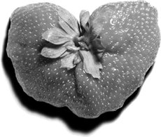
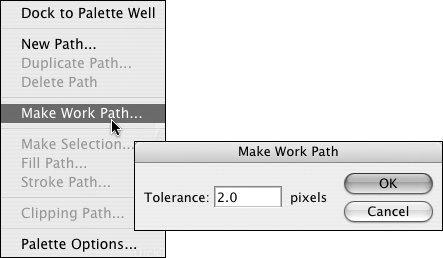
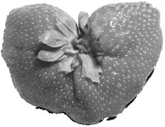
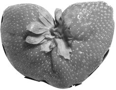
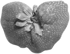
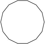
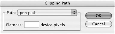
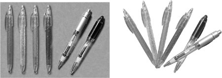
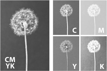
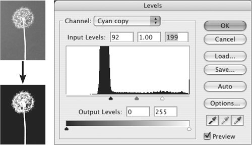
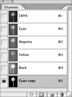
The first two options are adequate, but using the Magic Wand will result in a lousy path. The Magic Wand is not truly magic (sorry). It's acceptable for creating some selections to be used in Photoshop or as a starting point for a mask, but it's not the way to make a suitable path. Let's use the strawberry in Figure 9.6 as an example of what not to do. Figure 9.6. You could silhouette this strawberry with the Pen tool. (Or perhaps you could persuade someone else to do it.) Creating a Path: Right and WrongPhotoshop's attempts to convert an active selection ("marching ants") to a clipping path are valiant, but the results are usually less than stellar. Because a Magic Wand selection follows the rectangular edges of pixels, it's not a very good basis for a smooth clipping path. In some instances, noodling with the Make Work Path tolerance setting on the Paths palette (Window > Paths) can soften the granularity of the generated path (Figure 9.7), but you'll have to keep reloading the selection and experimenting with the tolerance settings, since this function doesn't offer any preview of the outcome. Figure 9.7. The Make Work Path tolerance setting smooths a path that's generated from an active selection. Figure 9.8 shows the unsavory result of taking the easy way out by converting a selection to a path with the tightest tolerance setting, 0.5 pixels. Figure 9.8. The result of converting a selection to a path by using a 0.5 pixel tolerance. The Wand doesn't seem so magic now, does it? Using a 10-pixel tolerance setting (Figure 9.9) cures the granular look of the path, but note that the smoothness results in a looser clipping path, which lops off some of the strawberry and shows some background. Figure 9.9. Selection converted to a path, using a 10-pixel tolerance. Smoother than Figure 9.8, but at the expense of fidelity. It's far better to bite the bullet and draw the path with the Pen tool (Figure 9.10). There's no need to obsessively follow every annoying little wiggle. Your goal is a reasonably faithful but smooth rendition of the object's edge, and it's perfectly legal to take a bit of artistic license to improve the edge of the silhouetted image. Figure 9.10. Clipping path drawn the way nature intendedwith the Pen tool. A dedicated tutorial on using the Pen tool is outside the scope of this book, but check the Appendix Appendix for some excellent references and tutorial resources. Path Flatness SettingsIn the olden days of anemic RIPs, users were encouraged to set a high flatness value for paths to ease the burden on the RIP. Think of the RIP as constructing curved lines as a series of tiny straight segments. The fewer of those segments the RIP had to chiselthe flatter it could render curvesthe faster the job would process. Figure 9.11 shows a circle imaged with a high flatness setting. It might be easy on the RIP, but it's not easy on the eye. Figure 9.11. A high flatness setting makes things easier for the RIP, but it results in a chiseled appearance for what should be curved lines. In reaction to seeing such clunky output, some people adopted the unfortunate habit of specifying very low flatness values in the Clipping Path dialog (Window > Paths > Clipping Path), such as 0.2 device pixels, in the hopes that this would encourage the RIP to carve more petite segments. Forcing the RIP to chew this finely had the unpleasant side effect of slowing job processing and in some cases, completely preventing the job from being processed by a RIP. When you choose Clipping Path from the Paths palette menu, you have the option to select the correct path and to enter a Flatness value. While RIPs are more robust now, it's actually best to leave the Flatness field blank (Figure 9.12), which allows the RIP to use its optimal flatness setting without additional calculations. So stop agonizing over what to put in the Flatness field. Just leave it empty, and the RIP will do what it knows is best. Figure 9.12. When specifying a clipping path, resist the urge to put a microscopic value in the Flatness field. Leaving it blank allows the imaging device to handle curves with its own optimal setting. Paths that Aren't Clipping PathsBesides being challenging to draw, clipping paths are bullies. When placed in a page-layout application, an image with an official clipping path can only display what's within the area of the clipping paththat's the whole point of a clipping path. But paths aren't official clipping paths until you designate them as such via the Paths palette menu. Consider an image that contains several elements that you'd like to use selectively in a page layout. If you're planning to use the clipping path approach to silhouetting those elements, you'd have to save multiple versions of the image, resulting in a separate image for each element you plan to use. But there's a more flexible approach available to you. Both InDesign and QuarkXPress 4.0 and above recognize any paths in EPS and TIFF files, and both applications provide the option of choosing which path you'd like to use to silhouette the image (Figure 9.13). The paths don't have to be official clipping pathsthey just have to be named paths. This trick also works with PSD files in InDesign, as well as QuarkXPress 6.5 and above. Figure 9.13. Choose a path in InDesign (left) or QuarkXPress (right, version 6.5). Taking this approach allows you to use the same image in multiple ways without saving multiple versions. In Figure 9.14, the same image provides seven usesa square-cut version and the six, individual silhouetted pens. The only limit is the number of named paths in the image. Note that an unsaved work path isn't recognized by InDesign or QuarkXPress. Unsaved, unnamed paths don't appear as options in either application. Figure 9.14. Six pens, six paths, one single image used in multiple ways. Alternative Silhouetting MethodsHere's some good news for those who loathe the Pen tool. Beginning with InDesign 2.0, InDesign has honored transparency in Photoshop images, and QuarkXPress 7.0 follows suit. In addition to providing liberation from the dreaded Pen tool, this means that you can perform the equivalent of photocomposition within a page layout (Figure 9.15), if you know how to create realistic masks. Figure 9.15. The dandelion (left) can be extracted from its background by using a density-based mask (center). Since InDesign honors transparency, the dandelion can then be composited with other elements in a page layout (right). If the subject was photographed on a fairly consistent background (by which we don't mean plaid), you can create a density-based mask similar to that of the dandelion by starting with one of the channels of the image. Open the Channels palette in Photoshop (Window > Channels) to inspect the channels. Click the name of each channel, one by one, until you find the channel with the most contrast between the subject and the background. It doesn't have to be perfect. It just has to provide a good start. In the case of the dandelion, the cyan channel is the most promising. The black channel is a close second choice, but the cyan has finer detail, so it's the winner (Figure 9.16). Figure 9.16. Shopping for a channel to provide a starting point for a mask. Either the cyan or black channel might work, but the cyan has more detail. Once you've decided on the channel that provides the best start for a mask, duplicate it. Select the channel in the Channels palette and, from the Channels palette menu, choose Duplicate Channel. You can name it something memorable in the dialog that follows, or just accept the default namein this case, Cyan copy. The next step is to manipulate the contrast in the Cyan copy channel so that it becomes solid black and white. Use Levels (Image > Adjustments > Levels) or Curves (Image > Adjustments > Curves) to exaggerate the contrast in the mask channel. The goal in our dandelion image is a white dandelion-shaped hole in a black background. Since each image is different, you'll have to experiment with the values in your images, but you can see the approach (and the results) in Figure 9.17. Figure 9.17. Using a Levels adjustment to increase the contrast of the mask channel. Your values will be dependent on your image. You'll probably have to use your paintbrush to edit the mask to your satisfaction. Paint with white to open up areas of the mask (which will reveal those parts of the image when you're finished). Paint with black to fill in the mask where you wish to hide areas of the image. The mask is stored in what's called an alpha channel (Figure 9.18). It doesn't function as a mask until you load it as an active selection. For the rest of the recipe, refer to Figure 9.2, and the instructions in the section, "Don't Erase That Pixel!" earlier in this chapter. Figure 9.18. When you create and save a mask, it's stored in an alpha channel. But it's just waiting there. It isn't an active mask until you load it as an active selection. Since the mask is derived from image contents, it's possible to create a much more natural silhouette without the hard-edged cutout appearance that usually results from using a clipping path. |
EAN: 2147483647
Pages: 132