Creating Windows Controls
| Windows Forms comes with an entire suite of prebuilt reusable controls. In addition to traditional controls like TextBox, Label, and Button, the Windows Forms control library includes more sophisticated controls, such as Drop-Down Calendar and DataGrid. In C#Builder, controls reside in the Tool Palette and may be dragged-and-dropped to a designer surface to build a GUI visually. To get started using controls, the discussion in the following section on Labels provides a walkthrough and some code to show what happens as each example is built. The source code for this book separates each of the controls into its own Windows Forms application, which would be the simplest technique for you to use if you're following along. Because the System.Windows.Forms namespace is incredibly huge, complete coverage is beyond the scope of this book. However, after you get the gist of how a few controls work and learn some of the finer points of working with the environment, it should be simple enough to consult the relevant documentation for more technical detail. Label ControlsA Label displays static text or images. Any type of user interaction beyond providing information should be performed by one of the other controls more suited to the type of interaction desired. Labels should be used to convey information and identify other controls. Using the properties of the Object Inspector, perform the following tasks:
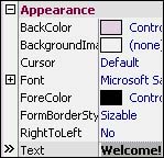
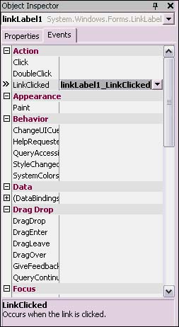
As indicated earlier, all Object Inspector modifications change the underlying code for the Windows Form. Listing 6.7 shows the excerpts from the InitializeComponent method that work with a Label. Listing 6.7 Programming a Label Control (Label.cs)// // label1 // this.label1.Dock = System.Windows.Forms.DockStyle.Fill; this.label1.Font = new System.Drawing.Font( "Microsoft Sans Serif", 26.25F, ((System.Drawing.FontStyle) ((System.Drawing.FontStyle.Bold | System.Drawing.FontStyle.Italic))), System.Drawing.GraphicsUnit.Point, ((System.Byte)(0))); this.label1.ForeColor = System.Drawing.SystemColors.ControlText; this.label1.Location = new System.Drawing.Point(0, 0); this.label1.Name = "label1"; this.label1.Size = new System.Drawing.Size(292, 266); this.label1.TabIndex = 0; this.label1.Text = "Welcome!"; this.label1.TextAlign = System.Drawing.ContentAlignment.MiddleCenter; As each of the preceding steps was being done, a line was being added to the code. Close examination of the statements shows which lines were added for property changes. Others were created as soon as the Label control was dropped onto the designer surface. Consult the documentation for System.Windows.Forms.Label for a description of settings for each property. LinkLabelThe LinkLabel is derived from the Label class. Its purpose is to provide an interface, similar to Web page hyperlinks, where a user can click and perform some action. To use this control, drag a LinkLabel control from the Tool Palette to the designer surface, change the Text property in the Object Inspector, and double-click on the LinkLabel control. The double-click caused a new method to be added to the code, as shown in Listing 6.8. Listing 6.8 Programming a LinkLabel Control (LinkLabel.cs) // // linkLabel1 // this.linkLabel1.Location = new System.Drawing.Point(72, 112); this.linkLabel1.Name = "linkLabel1"; this.linkLabel1.Size = new System.Drawing.Size(152, 23); this.linkLabel1.TabIndex = 0; this.linkLabel1.TabStop = true; this.linkLabel1.Text = "C# Unleashed On Sale Now!"; this.linkLabel1.LinkClicked += new System.Windows.Forms.LinkLabelLinkClickedEventHandler (this.linkLabel1_LinkClicked); // code removed for brevity private void linkLabel1_LinkClicked(object sender, System.Windows.Forms.LinkLabelLinkClickedEventArgs e) { MessageBox.Show("LinkLabel Clicked!"); } I added the MessageBox call to the linkLabel1_LinkClicked method in Listing 6.8; otherwise, the method would have been blank. Above this method is an excerpt from the InitializeComponent method for the LinkLabel control. Notice that a LinkLabelLinkClickedEventHandler is hooked up to the LinkClicked event. This is what ensures that the linkLabel1_LinkClicked method gets called whenever the LinkLabel is clicked by the user. See the discussion in Chapter 4 for more information on how delegates and events work. In addition to double-clicking the LinkLabel control in the designer, it is easy to explicitly set control events. In the Object Inspector there is an Events tab that displays all the available events for a control. The easiest way to create the event is by double-clicking on the blank text box to the right of the event name and letting C#Builder create the code and hook up the delegate holding the new event handler to the designated control event (see Figure 6.6). Figure 6.6. The Events tab of the Object Inspector.
Another way to hook up events is to go to the code editor and write the event handler method manually. Then go to the Events tab of the Object Inspector and type the name of the method into the window. This may be desirable when there are multiple controls, such as a Button, Toolbar Button, and Menu that need to implement the same behavior. Having a generically named method whose name can be cut and pasted into event properties will often be more convenient.
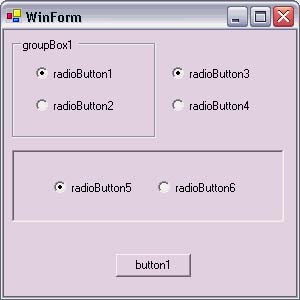
Yet another way to create an event handler is by finding the Event in the Object Inspector Events tab and typing the name of the method you want without a signature. When you press the Enter key, C#Builder will add a new method with the proper event handler signature to the code. ButtonA Button control is designed to be clicked and perform some action. Set its Text property to set the words displayed on the button, and set the Clicked event to define its behavior. The Clicked event is the default, so double-clicking on the button in the designer will produce the desired method. See the discussion in the preceding section about handling events in different ways. Implementing a Button control is so easy and straightforward that I'll leave this explanation as good enough and move on to other controls that require more explanation. TextBoxA TextBox control allows a user to enter and edit plain text. It comes in two configurations: single-line and multiline. Single-line TextBoxes are for data entry and obtaining information from a user. Multiline TextBoxes can be used for lengthy data entry or as a mini-editor. One of the first things I do when working with a TextBox is to go to the Text property in the Object Inspector and make it blank. If there is anything that should go in there, I explicitly set the Text property in code. Listing 6.9 shows how to read the information from a TextBox control. Listing 6.9 Getting TextBox Text (TextBox.cs) private void button1_Click(object sender, System.EventArgs e) { MessageBox.Show(textBox1.Text); } Listing 6.9 shows how to pull the text from a TextBox control by accessing its Text property. Setting the text is as simple as setting the Text property with a string. Multiline TextBoxes are the same component as a single-line TextBox with a property change. Drag a TextBox component onto the designer surface if you want to see the changes. All you need to do is to go to the Behavior section of the Object Inspector and change the default of false on the Multiline property to true. Before, the resize borders on the TextBox on the designer surface were grayed out, but after the change the resize borders were activated. Now you can resize the TextBox to fit a larger part of the screen. Because the example will be adding lines of text beyond what is displayed, the Scrollbars property in the Appearance section of the Object Inspector should be changed from its default, which is None, to Both, which turns on scrollbars when they are needed. There is a trick you can do with the multiline TextBox to make it scroll at the bottom. This would be useful for scrolling status of a program's progress. The method to use is ScrollToCaret, which takes advantage of the fact that the caret is located on the last line of text (see Listing 6.10). Listing 6.10 Using a Multiline TextBox (MultiLineTextBox.cs) private void button1_Click(object sender, System.EventArgs e) { string text = null; const int MaxLines = 25; for (int line=1; line <= MaxLines; line++) { text = string.Format("Line {0}\r\n", line); textBox1.AppendText(text); textBox1.ScrollToCaret(); Thread.Sleep(500); } } The AppendText method in Listing 6.10 adds text to the end of other text in the TextBox. This behavior differs from setting the Text property, which overwrites all the text. Notice also that I put a carriage return/line feed sequence, \r\n, in the input string. Just a newline character, \n, shows a blank format character, which happens when the TextBox can't display a character. The Thread.Sleep method delays the loop for half a second so that you can see the scroll action in real time. Without it the TextBox would be filled so quickly that it would diminish the visual experience of ScrollToCaret. I added using System.Threading; to the top of the file to use this class in an unqualified manner. CheckBoxCheckBoxes record the Boolean state of some data. Just drag them onto the designer surface, change their Text properties, and use them. Listing 6.11 shows how to use CheckBox controls. Listing 6.11 Using CheckBox Controls (CheckBox.cs) private void button1_Click(object sender, System.EventArgs e) { StringBuilder result = new StringBuilder("CheckBoxes Checked: \n\n"); if (checkBox1.Checked) { result.Append("CheckBox1\n"); } if (checkBox2.Checked) { result.Append("CheckBox2\n"); } if (checkBox3.Checked) { result.Append("CheckBox3"); } MessageBox.Show(result.ToString()); } Listing 6.11 gets the state of each CheckBox control by reading its Boolean Checked property. The results are collected in another .NET Framework type called the StringBuilder, which is more efficient than the string type for working with string data. A C# string is immutable, requiring a new string for every operation, but a StringBuilder changes string data without creating new objects. Remember to add a using declaration at the top of the listing for System.Text, which is the namespace for StringBuilder. RadioButtonRadioButton controls form a group of controls where a single item may be selected out of a group. They are sometimes called option buttons. All RadioButton controls on a form belong to the same group. For multiple groups, add RadioButton controls to GroupBox or Panel controls, as shown in Listing 6.12. The default setting on RadioButton controls is false, so remember to set the Checked property for the default selection in the Object Inspector after adding a new RadioButton control. Listing 6.12 Using RadioButton Controls (RadioButton.cs) private void button1_Click(object sender, System.EventArgs e) { StringBuilder result = new StringBuilder("RadioButtons Checked: \n\n"); if (radioButton1.Checked) { result.Append("RadioButton1\n"); } else { result.Append("RadioButton2\n"); } if (radioButton3.Checked) { result.Append("RadioButton3\n"); } else { result.Append("RadioButton4\n"); } if (radioButton5.Checked) { result.Append("RadioButton5\n"); } else { result.Append("RadioButton6\n"); } MessageBox.Show(result.ToString()); } Because there are only two RadioButton controls per group, the if statements in Listing 6.12 read the Checked property of one and if it isn't true, the other RadioButton control in the same group must be checked. For multiple RadioButton controls, the logic could get a bit more tedious. Another approach would be to set the Clicked event of each RadioButton control to a specific method, which has a switch statement that analyzes the sender object to see which control was selected. Be sure to look at the code in the InitializeComponent method, which shows RadioButton controls being added to both the GroupBox and the Panel. In Figure 6.7, RadioButtons 1 and 2 are in a GroupBox control, RadioButtons 3 and 4 are on the Form, and RadioButtons 5 and 6 are on a Panel. The BorderStyle property in the Appearance section of the Object Inspector for the Panel control is set to Fixed3D, causing the recessed appearance. The Checked property in the Appearance section of the Object Inspector is set to true for RadioButtons 1, 3, and 5. Figure 6.7. An application that uses RadioButton controls.
ComboBoxA ComboBox control serves a similar purpose as the RadioButton control in that it enables selection of a single option from a list. The main reason to use a ComboBox over a RadioButton group would be that the ComboBox can handle more options with less screen real estate. ComboBox controls are also convenient for adding items at runtime. Listing 6.13 shows how to create a ComboBox control. To set up this example, drag a ComboBox control and a Button control to the form. Select the form to show the border around the entire form and then double-click the form to create the WinForm_Load event, shown in Listing 6.13. Double-click the Button to produce the button1_Click method shown in Listing 6.13. Listing 6.13 Using a ComboBox Control (ComboBox.cs) private void WinForm_Load(object sender, System.EventArgs e) { comboBox1.Items.Add("Item 1"); comboBox1.Items.Add("Item 2"); comboBox1.Items.Add("Item 3"); comboBox1.Items.Add("Item 4"); comboBox1.Items.Add("Item 5"); comboBox1.SelectedItem = "Item 3"; } private void button1_Click(object sender, System.EventArgs e) { MessageBox.Show(comboBox1.SelectedItem.ToString()); } As shown in the WinForm_Load method in Listing 6.13, items are added to ComboBox by using the Add method of the ComboBox control Items property. The SelectedItem property sets the initial item to display. There is a zero-based SelectedIndex property that could have been set to 2 to achieve the same goal. ListBoxListBoxes are good for displaying a number of items. They are good for saving screen real estate, as opposed to CheckBox controls, which become harder to maintain as they grow in number. For this example, drag a ListBox and Button control to the surface, double-click on the form to create a Load event handler, and double-click the Button to create a Click event handler. Listing 6.14 shows how to work with a ListBox control. Listing 6.14 Using a ListBox Control (ListBox.cs) private void WinForm_Load(object sender, System.EventArgs e) { const int MaxItems = 25; for (int item=1; item <= MaxItems; item++) { listBox1.Items.Add("Item " + item); } } private void button1_Click(object sender, System.EventArgs e) { StringBuilder result = new StringBuilder("ListBox Items: \n\n"); foreach (string item in listBox1.SelectedItems) { result.Append(item + "\n"); } MessageBox.Show(result.ToString()); } ListBox controls have a SelectionMode property, located in the Behavior section of the Object Inspector, which can be set to control how many items may be selected at a time and how they may be selected. One means that only a single item may be selected at a time. MultiSimple means that each item clicked will be selected. When the SelectionMode is set to MultiExtended, items are selected by Shift+Click, for ranges, and Ctrl+Click, for toggling individual items. Listing 6.14 shows that, by using the Add method call in the WinForm_Load method, adding items to a ListBox is the same as adding to a ComboBox. Because I set the SelectionMode property to MultiExtended, getting the list of items is as easy as reading the SelectedItems property from the ListBox. CheckedListBoxA CheckedListBox control is similar to a ListBox control, except that it has a check box for each item. In addition to the SelectedItems and SelectedIndices properties of the ListBox, a CheckedListBox contains CheckedItems and CheckedIndices properties to obtain a string array or int array, respectively, or checked items. TreeViewA TreeView control displays a hierarchical list of items. This example shows a root node of the tree as Animal with subnodes for Mammals and Reptiles, with their own subnodes. To work this example, drag a TreeView control onto the form and resize it to fill the client area of the form. The Nodes property in the Object Inspector exposes an editor in which you can build nodes on the TreeView statically. However, typical use of the TreeView is for things such as directory/file listings. Listing 6.15 shows how to load a TreeView control dynamically and how to capture events when an item is selected. Listing 6.15 Using a TreeView Control (TreeView.cs) private void WinForm_Load(object sender, System.EventArgs e) { TreeNode rootNode = new TreeNode("Animals"); TreeNode mammalNode = new TreeNode("Mammals"); mammalNode.Nodes.AddRange ( new TreeNode[] { new TreeNode("Bear"), new TreeNode("Dog"), new TreeNode("Horse"), } ); TreeNode reptileNode = new TreeNode("Reptiles"); reptileNode.Nodes.AddRange ( new TreeNode[] { new TreeNode("Alligator"), new TreeNode("Lizard"), new TreeNode("Snake"), } ); rootNode.Nodes.AddRange ( new TreeNode[] { mammalNode, reptileNode } ); treeView1.Nodes.Add(rootNode); } private void treeView1_AfterSelect( object sender, System.Windows.Forms.TreeViewEventArgs e) { string root = "Animals"; string name = e.Node.Text; if (name.Trim() != root) { MessageBox.Show("You selected:\n\n" + name); } } Loading a TreeView dynamically requires adding a TreeNode object to the Nodes property of the TreeView control. In Listing 6.15, this is the last operation performed, but the order doesn't really matter, as long as you have a reference to the TreeNode you want to add to. The example uses a combination of Add and AddRange methods to add nodes to the TreeView. Each time a TreeView control item is selected, the AfterSelect event fires. Fortunately, this is the default event, so double-clicking the TreeView control in the designer sets up the method in the code. ListViewA ListView is a more powerful list control than the ListBox. It may display items in columns via a Detail configuration or can be used in the Small Icons and Large Icons configuration, similar to the way Windows Explorer displays files and directories. This example displays a Detail view, which is set in the View property in the Appearance section of the Object Inspector. Setting this property is important to making sure the ListView displays properly. To set up the example, just drag a ListView control to the form surface and set its View property to Detail. The ListView control has an Items property in the Behavior section of the Object Inspector that can be used to set items statically. Code for populating a ListView control dynamically is included in Listing 6.16. Listing 6.16 Using a ListView Control (ListView.cs) private void WinForm_Load(object sender, System.EventArgs e) { listView1.Columns.Add("Main Item", 100, HorizontalAlignment.Left); listView1.Columns.Add("SubItem 1", 75, HorizontalAlignment.Left); listView1.Columns.Add("SubItem 2", 75, HorizontalAlignment.Left); ListViewItem lvItem1 = new ListViewItem("First"); lvItem1.SubItems.Add("R1C2"); lvItem1.SubItems.Add("R1C3"); ListViewItem lvItem2 = new ListViewItem("Second"); lvItem2.SubItems.Add("R2C2"); lvItem2.SubItems.Add("R2C3"); listView1.Items.AddRange ( new ListViewItem[] { lvItem1, lvItem2, } ); } As shown in Listing 6.16, each ListViewItem represents a row in the ListView control. The first column in the row is defined when the ListViewItem is instantiated. Subsequent columns are added as SubItems of the ListViewItem. TabControlA TabControl control allows a lot of information to be organized in one space by grouping it on separate tab pages. Generally, the required tabs are already known at design time. To add tabs at design time, drag a TabControl to the form surface and open the TabPage Collection Editor from the TabPages property of the Misc section of the Object Inspector. After tab pages have been added, click once on the tab in the designer surface to edit its contents. Controls may be dragged to each tab page as needed. In the example for the TabControl, two tab pages will be created. The first tab page has two CheckBox controls and the second tab page has two RadioButton controls. Listing 6.17 shows how to get to these controls at runtime. Listing 6.17 Using the TabControl Control (TabControl.cs) private void button1_Click(object sender, System.EventArgs e) { StringBuilder result = new StringBuilder("TabControls Checked: \n\n"); if (checkBox1.Checked) { result.Append("CheckBox1\n"); } if (checkBox2.Checked) { result.Append("CheckBox2\n"); } if (radioButton1.Checked) { result.Append("RadioButton1\n"); } else { result.Append("RadioButton2\n"); } MessageBox.Show(result.ToString()); } In Listing 6.17, the reason that the button1_Click method has access to the RadioButton controls is that they are still part of the same class. When controls are dropped onto the designer surface, they become members of the Form class that contains them and will be initialized in the InitializeComponent method.
|
- Structures, Processes and Relational Mechanisms for IT Governance
- Technical Issues Related to IT Governance Tactics: Product Metrics, Measurements and Process Control
- Governance in IT Outsourcing Partnerships
- The Evolution of IT Governance at NB Power
- Governance Structures for IT in the Health Care Industry