Section 18.5. Improving Your Charts
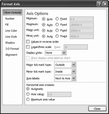

18.5. Improving Your Charts

So far, you've learned the key techniques you need to make sure your charts tell the right story. However, Excel lets you do plenty more, including adding trendlines, data tables, and error bars, and tweaking 3-D perspective and shapes . In the following sections, you'll learn even more about how to make the perfect chart.

18.5.1. Controlling a Chart's Scale

Many people don't think twice about the scale they use when they create a chartinstead, they let Excel set it automatically based on the values their chart has been built from. There's nothing wrong with this laissez-faire approach, but if you know how to take control of your chart's scale, you can make important data stand out and make it easier for people looking at your chart to spot relative differences in data and understand overall trends.

Usually, you'll be most interested in changing the scale of the value axis that runs on the left side of most charts. You can modify the scale of the value axis on most charts, including column charts, line charts, scatter charts, and area charts. (In a bar chart, the value axis actually runs horizontally along the bottom of the chart, although you can modify the scale in the same way as you do with these other chart types.) Pie and donut charts don't show a value scale at all.


Note: It's worth noting that quite a few unsavory individuals try to skew charts with crafty scale tricks. People often show two similar charts next to each other (for example, sales in 2006 and sales in 2008), and using a smaller scale in the second one to make it look like nothing's changed. Once you finish this section, you'll have a good idea how to spot these frauds. Some companies even have policies that enforce strict scale usage!

To change the scale, right-click the value axis, and then choose Format Axis. Or, if you find it hard to select the part of the chart you want, choose the value axis from the list in the ribbon's Chart Tools Format Current Selection section. Then, choose Chart Tools Format Current Selection Format Selection.

When the Format Axis dialog box appears, choose the Axis Options section (shown in Figure 18-21). You have the choice of letting Excel automatically set the scale based on your data, entering the values you think are appropriate.

Figure 18-21. The Format Axis dialog box lets you change the scale used on your chart. There's an "Auto" option next to each value. If selected (as in this example), Excel chooses the scale value (and the value it chooses appears in the text box on the right). In this example, the scale currently stretches from 0 to 180,000, with a major tick mark shown every 20,000 units. If you want to take control of the scale yourself, click Fixed instead of Auto (next to the value you want to change), and then edit the number in the corresponding text box.


Note: When you set a scale value to Auto, Excel calculates it based on the current chart size and your current data. If you add more data, change the data values, or resize the chart (in which case there's more room to show intermediate values on the axis), Excel may modify the scale. But when you use Fixed, your numbers are hard-wired into the chart, and Excel never changes them (although you may, later).

Several settings determine the scale of your chart. These settings include:

  • Minimum and Maximum . These values set the range of your scale. The axis starts at the minimum value (at the bottom of your chart), and ends at the maximum (at the top). Usually, Excel sets these values so that the minimum is 0 and the maximum is just a little bit above your largest data point. However, if your data points are very large and have only minor differences, you'll be able to help your chart's viewers make comparisons more easily if you compress the scale by having it start at a higher minimum value.

  • Major unit . The major unit setting determines how many units the scale is divided into. If you have a scale from 0 to 1,000 and a major unit of 100, gridlines and axis labels appear every 100 units. Altogether, that makes for 11 labels.

  • Minor unit . The minor unit setting determines how many tick marks are on the scale. (Tick marks are tiny lines added to the axis to help you judge the scale.) Usually the minor unit is less than the major unit. You may use a major unit of 100 and a minor unit of 10 in a chart that stretches from 0 to 1,000 (which generates 11 gridlines and 10 tick marks between each gridline). Five to 10 major units on each axis, and 5 to 10 minor units for every major unit, usually make for a readable chart.


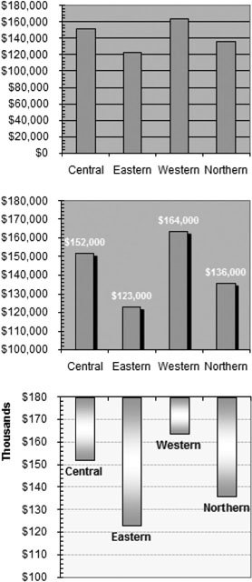
Note: When you first create a standard chart, minor tick marks are turned off, so the minor unit setting doesn't have any effect. To set whether Excel shows major and minor tick marks, choose an option from the "Major tick mark type" and "Minor tick mark type" lists. Anything other than None does the trick. (The various options just determine exactly what the tick marks look likefor example, whether they're on the inside of the grid, the outside, or if they cross completely.)

Along with the settings just listed, you may also want to tweak the "Horizontal axis crosses" setting at the bottom of the dialog box. This number controls where the category axis line crosses the value axis. Usually, this line's right at the bottom of the chart, at the minimum value. However, you have two other choices. You can choose "Maximum axis value" to place the category axis at the top of the chart. The scale remains the same (meaning the minimum value's still at the bottom of the chart and the maximum value's at the top).

More interestingly, you can choose "Axis value", and then type in the exact value where the category axis should appear. This choice lets you put the axis somewhere in the middle of your chart. For example, you may want to plot a chart of test scores and draw the axis at a point that would indicate the minimum passing mark. Note that in a column chart, when a column has a value that's less than the axis, it points "downward," as you can see in Figure 18-22 (bottom).

Using these basic ingredients , you have a good deal of control over your chart's appearance. Figure 18-22 compares a few different options that demonstrate how different scale choices can transform a chart, with the help of a little formatting.

Figure 18-22. These charts show the same data prepared three different ways.
Top: Here's a column chart the way Excel creates it, with the addition of minor tick marks in the value axis. This chart's problem is that the difference between the column values doesn't come across as very substantialbut, in fact, it is.
The middle and bottom examples solve this problem by setting the minimum value of the axis to $100,000, which shrinks the scale and emphasizes the differences between the columns ' values.
Middle: This chart also includes data labels that show each column's value.
Bottom: This chart's data labels have been removed from the X-axis, and category labels have been added to the whole data series so the region's name shows up just below the bar. This example is further enhanced with gradient fills, dotted gridlines, and a vertical scale set to use thousands.


The Format Axis dialog box also provides a few specialized options that aren't as commonly used but are still quite interesting. They include:

  • Values in reverse order . This option turns your chart upside down. It places the category axis at the top of the chart (instead of the bottom), and changes the value scale so that it increases as it stretches down the side of the chart.

  • Logarithmic scale . A logarithmic scale doesn't increase gradually. Instead, every major unit represents an increase by a power of 10. The values 0, 10, 20, 30, 40, 50 make up a typical scale. The values 0, 10, 100, 1000, 10000 make a logarithmic scale. Logarithmic scales lend themselves to scientific and mathematical applications to help you see certain types of relationships and patterns in your data.

  • Display units . You can use this option to shorten the text labels on your axis. This option's particularly useful if you have large dollar amounts. Imagine that your value axis stretches from $100,000 to $300,000. If you choose Thousands as your display unit, Excel adds the label Thousands along the value axis and changes the scale values to three digit numbers like $100 and $300. The bottom example in Figure 18-22 shows this space-saving trick at work.


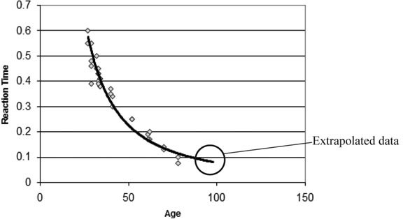
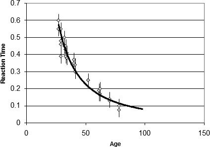
Note: If you're using a numeric or date-based category axis, you can format the scale of the category axis in the same way you format the scale of the value axis. You may want this option when you're creating an XY scatter chart or a line chart. If your category axis just displays labels, you can still format it, but you have fewer options. You can't change the scale, but you can reverse the order of categories, add tick marks, hide labels, and format the axis line's look.

18.5.2. Adding a Trendline

One of the main reasons that people create charts is to reveal patterns that are hidden in the data. A gift card company may look at a historical record of sales to make an educated guess about the upcoming holiday season . Or a researcher might look at a set of scientific data to find out if potatoes really can cure the common cold. In both these examples, what's most important is spotting the trends that lurk inside most data collections.

One of the easiest ways to spot a trend is to add a trendline to your chart. A trendline's similar to an ordinary line in a line chart that connects all the data points in a series. The difference is that a trendline assumes the data isn't distributed in a perfectly uniform pattern. Instead of exactly connecting every point in a series, a trendline shows a line that best represents all the data on the graph, which means that minor exceptions, experimental error, and ordinary variances don't distract Excel from finding the overall pattern. Figure 18-23 shows an example.

Figure 18-23. This example shows the comparison between age and reaction time that was introduced in the last chapter (Figure 17-21). The difference here is that the trendline has been extended beyond the actual data to predict results for people who are older than 80.


The other important point about trendlines is that they can predict values you don't have. The gift card company can use a trendline to get a good estimate of future sales, while a scientific experimenter can make educated guesses about data that wasn't recorded.

People most often use trendlines in XY scatter charts. Trendlines also makes sense in a column chart, and they can work in line, bar, and area charts in specialized circumstances.

To add a trendline, follow these steps:

  1. Select your chart .

    If you're using an XY scatter chart (the most common choice), make sure you're using a subtype that doesn't draw lines. Otherwise, the trendline and the chart line may cause confusion. To change the subtype of a chart, right-click the chart, and then choose Change Chart Type.

  2. If your chart has more than one series, choose the series you want to use to create the trendline .

    If your chart just has a single series, then you don't need to go to this troublejust select the entire chart.

  3. Choose the type of relationship that you expect to find in your data from the Chart Tools Layout Analysis Trendline list. To get even more types, choose Chart Tools Layout Analysis More Trendline Options .

    You can choose one of several types of trendlines:

    • A Linear trend varies regularly is the simplest possible relationship. If you're driving at a constant speed, the distance traveled increases linearly as the time increases.

    • A Power and Exponential trend starts off slowly and quickly ramps up. Logarithmic is the inverseit starts off rapidly and then levels out. These types of trends are more complex, but they are more common than linear trends in natural phenomena. Two example exponential relationships are the change in a population size with successive generations, and the distance traveled in a car if you continuously accelerate.

    • A Linear Forecast trend is similar to a Linear trend, but it extends a little bit further (the equivalent of two data points) to make a guess at where this relationship is going.

    • A Polynomial trend attempts to fit the data by creating an equation with a combination of different terms. This trend is the best choice if there are multiple factors involved and your data doesn't fit a smooth line or curve.

    If there's more than one series in your chart, Access asks you which one you want to use for the trendline. (You can repeat this process to add a trendline for each series.)

    After you've added the trendline, you can right-click it, and then choose Format Trendline to change the line color , thickness , and style.

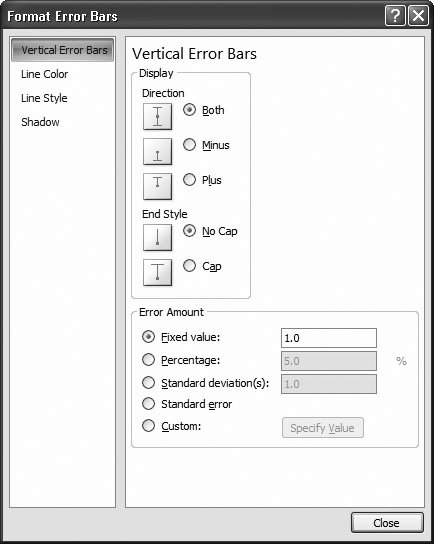
A standard trendline fits the data you have. However, you can also extend a trendline forward or backward to fill in values you don't know. This process of estimating data that you don't have (based on data that you do have) is extrapolation . A closely related concept is interpolation , which estimates unknown data values between known existing values. If a gift card company has information about sales from 2003 to 2006, you'd use extrapolation to predict sales in 2007. To make an educated guess at what sales were like in March 2004 (a month in which your firm lost its sales data), you'd use interpolation. All trendlines necessarily use interpolation since there's always, in effect, "missing" data points between the data points you're providing.

To extrapolate values in a trend, choose Chart Tools Layout Analysis Trendline More Trendline Options (if youre creating a trendline), or right-click the trendline, and then choose Format Trendline (if you want to extend the line after you've created it). Look for the Forecast box, and then specify the number of units that you want to add going forward or backward. Figure 18-23 shows an example.


Note: Don't always trust trendlines. It's quite possible that a relationship holds true only over a limited set of values. If you use a rising sales trendline as the basis for guessing future results, Excel's guesses don't, of course, take into account unexpected developments, like limited inventory or rising production costs. Similarly, if you extend the age versus reaction time comparison in Figure 18-23 too far, you'll wind up with ages and values that don't make sense (like a reaction time of 0 seconds, or a reaction time for a 300-year-old).

18.5.3. Adding Error Bars to Scientific Data

In a typical scientific experiment, you have two important sets of information: the actual results and an estimate that indicates how reliable these results are. This "reliability" number is the uncertainty . The uncertainty doesn't compensate for human error, faulty equipment, or invalid assumptions. Instead, it accounts for the limited accuracy of measurements. Think of the typical bathroom scale, which can give you your weight only to the nearest pound . That means there's an uncertainty of 0.5 pounds because any given measurement could be off by that amount. If a scientific experimenter weighs in at 150 pounds, he would record that measurement as 150 ±0.5 (150 pounds plus or minus 0.5 pounds ). Any other calculations based on weight need to take this potential inaccuracy into account.

Because every type of measurement has a different range of accuracy, there's always a certain degree of imprecision that you need to watch out for before you make a dramatic conclusion. In a scientific chart, you can indicate the uncertainty using error bars, as in Figure 18-25. If you plot 150 ±0.5 on a chart, you should end up with a point at 150 and an error bar that stretches from the point up to 150.5 and down to 149.5.

To add scientific error bars to a chart, follow these steps:
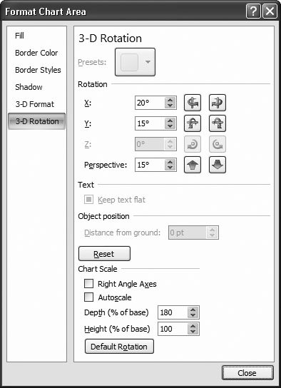
  1. Click to select the appropriate data series on the chart .

    If you have more than one data series, each series can have its own error bar settings.

  2. Make a selection from the Chart Tools Layout Analysis Error Bars list .

    You can use a standard choice to apply an automatic error bar setting (like one that assumes a 5 percent error). If you find a good fit, your job is finished. But usually you'll need to choose exactly what you want by picking Chart Tools Layout Analysis More Error Bars Options. Doing so shows the Format Error Bars dialog box (Figure 18-24).

    Figure 18-24. You can set error bars to use a fixed value (as in this example), a fixed percentage of the value, or you can specify a range of cells in the worksheet that contains the uncertainty value for each measurement.


  3. Choose how large your error bars should be .

    Two simple and useful choices are "Fixed value" (which lets you specify the same measurement of uncertainty for every value), and Percentage (which lets you specify a percentage uncertainty). You can also supply a different fixed uncertainty for each value. In this case, add a new column with this information in your worksheet, choose the Custom option, and then click Specify Value to specify the range of cells with the uncertainty information (you need one uncertainty value for each data point). Statistics fans can also use two more advanced options, like Standard deviation and Standard error. For definitions of these two weighty concepts, consult your favorite statistics textbook .

  4. Click Close to add error bars to your chart .

    Figure 18-25 shows a chart with error bars added.

Figure 18-25. This graph attempts to demonstrate a link between age and reaction time, with the error bars indicating that the reaction time couldn't be measured precisely. The error bars tell us that even though the trendline doesn't fit the data exactly, it lies within the range of measurement error. In this example, you can't distinguish all of the error bars because sometimes the points and error bars overlap (consider the two data points around age 40). On the other hand, it's easy to see the single data point at age 50 and the error bars above and below it.


18.5.4. Formatting 3-D Charts

As you learned in Chapter 17, many charts provide subtypes that are drawn in three dimensions. Some 3-D chart types are no different than their plainer 2-D relatives. In these charts, a 3-D effect simply gives the chart a more interesting appearance. But in true 3-D charts, it adds information by layering data from the front of the chart to the back, with each series appearing behind the other. (The column chart has seven subtypes . The first three are ordinary 2-D charts, the second three use a 3-D effect, and the last one's the only true 3-D chart. For more details about what subtype each chart supports, see the section "Chart Types" in Section 17.4.1.)

In true 3-D charts, you may need to take special care to make sure that data in the background doesn't become obstructed. A few tricks can help, such as reordering the series and simplifying the chart so it isn't cluttered with extraneous data. You may also want to rotate or tilt the chart so that you have a different vantage point on the data.

To rotate or tilt a chart, follow these steps:

  1. Right-click the chart, and then select 3-D Rotation .

    The Format Chart Area dialog box appears with the 3-D Rotation section selected, as shown in Figure 18-26.

  2. Use the arrow buttons to tilt the chart in various ways, changing the rotation and perspective .

    You can also edit the individual settings by hand:

    • The X value lets you turn the chart from side to side.

    • The Y value lets you tilt the chart up and down.

    • The Perspective value lets you make the chart seem closer or farther away.

    Figure 18-26. The 3-D Rotation section of the Format Chart Area dialog box lets you twist and turn your 3-D chart. As you make your changes, Excel updates the chart on your worksheet to give you a preview of what your settings will look like.


    You also have a few more specialized settings you can use to fine-tune your chart:

    • Turn on the "Right angle axes" checkbox if you're tired of turning your chart this way and that, trying to find a good vantage point. When this setting is switched on, the Perspective value has no effect. Instead, Excel "straightens" out the chart by squaring it up, face-forward.

    • Turn off the Autoscale checkbox if you want to set the height of the chart using the Height box. The Height box specifies a percentage that's compared against the length of the bottom of the chart (the X-axis). In other words, a Height of 100 percent means the chart will be just as high as the base is wide. A height of 200 percent means the chart will be twice as high as it is wide. Keep in mind that Excel compares the height against the width of the base, not the width of the entire chart. If you rotate the chart, the perspective makes it appear as though the base isn't as wide as it really is. In this situation, Excel still makes the chart just as tall as if you hadn't rotated it.

    • Use the Depth box to set how deep the chart is (from front to back). As with the Height box, you use a percentage that's compared to the base of the chart. That means a depth of 200 percent makes a chart twice as deep as the base is wide. Sometimes, a deeper chart creates a more dramatic 3-D effect.

    • Click the Default Rotation button to return your chart to the just-slightly tilted way it began life.

  3. Click Close when you're finished .

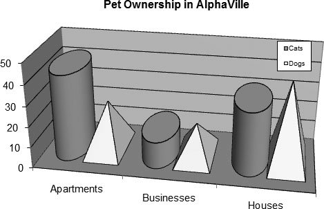
18.5.5. Changing the Shape of a 3-D Column

Excel provides several subtypes of column and bar charts that use a 3-D effect. Excel also provides the Cylinder, Cone, and Pyramid chart types, which are always three-dimensional (see the description of chart types, beginning in Section 17.4.1, for more information). It doesn't really make much difference whether you use columns, pyramids , or conesthe overall effect is pretty much the same. However, you create a much more dramatic effect by putting more than one shape in a single chart. If you want to compare two series, then you could represent one with columns and the other with cones, as shown in Figure 18-27.

Figure 18-27. To make a dramatic point, you can combine more than one shape in a chart. In this example, cylinders represent the cat population and pyramids represent the corresponding dog figures. Creating this chart is refreshingly easyyou just need to change the standard choice in the Shape tab of the Format Data Series dialog box.


To try this out, follow these steps:

  1. Create a column chart with two or more data series .

    Make sure you pick one of the chart subtypes that uses a 3-D effect.

  2. Right-click one of the data series, and then choose Format Data Series .

    The Format Data Series dialog box launches.

  3. Choose the Shape section. Click one of the pictures to change your columns into cylinders, cones, pyramids, or something else. Then click Close .

    Repeat steps 2 and 3 for any other data series that you want to change.


Excel 2007[c] The Missing Manual
ISBN: 596527594
EAN: N/A
Year: 2007
Pages: 173

flylib.com © 2008-2017.
If you may any questions please contact us: flylib@qtcs.net