Section 18.4. Formatting Chart Elements
18.4. Formatting Chart Elements Often, you don't select a chart element to delete or move it, but rather to format it with a different border, font, or color . In this case, simply right-click the element, and then choose the format option from the pop-up menu (or, select it, and then choose Chart Tools Format 18.4.1. Coloring the BackgroundNow you're ready to start creating spiffy-looking, customized charts . The background color is a good starting point. Initially, this color is a plain white, but it's easy enough to change if you want to add a personal touch. Just follow these steps:
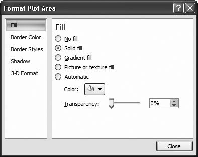
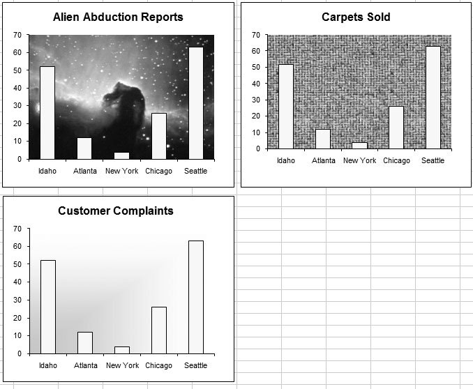
Note: Remember, if you don't have a color printer, you need to think about how colors convert when you print them in black and white. In some cases, the contrast may end up being unacceptably poor, leading to charts that are difficult to read. And even if you do have a color printer, remember you can always spare your ink using the "Print in black and white" option (Section 17.2.5.2). As a general rule, the less powerful your printer, the less you should use graphically rich details like tiles, background images, and gradients unless, of course, you're planning to view your worksheet only onscreen. The neat thing about this sequence of steps is that you can use exactly the same process to format any chart element. That means you now know enough to give a solid fill to a chart title, the gridlines, the columns in a column chart, and so on. And once you learn your way around the rest of the formatting options, you'll be able to really spiff up your chart. Tip: If you run rampant changing a chart element and you just want to return it to the way it used to be, select it, and then choose Chart Tools Format  Current Selection Reset to Match Style. Excel removes your custom formatting and leaves you with the standard formatting thats based on the chart style. Current Selection Reset to Match Style. Excel removes your custom formatting and leaves you with the standard formatting thats based on the chart style. 18.4.2. Fancy FillsColoring the background of a chart is nice, if a little quaint. In the 21st century, charting mavens are more likely to add richer details like textured backgrounds or gradient fills. Excel gives you these options and more. And although textured fills don't always make sense, they can often add pizzazz when used in the background of a simple chart. You can apply fancy fills to the chart background (the plot area) or individual chart items, like the columns in a column chart. Figure 18-14 demonstrates some of your fill choices.
To apply a fancy fill, start by selecting the chart element, and then choosing Chart Tools Format 18.4.2.1. Gradient fillsA gradient is a blend between two colors. You may use a black-and-white gradient that gradually fades from black in the top-left corner to white in the bottom-right corner. More complex gradients fade from one color to another to another, giving a 60s-era tie-dye effect. To set a gradient, in the formatting window's Fill section, choose the "Gradient fill" choice. You can use two basic strategies to choose your gradient: the colors and the shading pattern. For the utmost simplicity, you can use a prebuilt set of color and shading options. You choose this option by clicking the "Preset colors" button, and then clicking one of the thumbnail previews that appears in the drop-down list. Each one has a picturesque name like Late Sunset or Ocean. (As you make a choice here, Excel updates your chart to show the results you'll get if you apply the new fill.) The box below explains your custom gradient options.
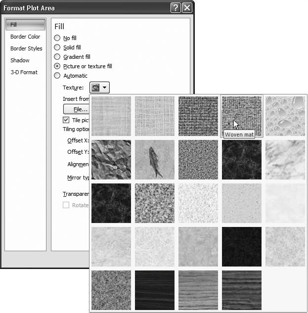
18.4.2.2. Texture fillsA texture is a detailed pattern that's tiled over the whole chart element. The difference between a texture and an ordinary pattern is that patterns are typically simple combinations of lines and shading, while a texture uses an image that may have greater, more photographic detail. To choose a texture for a fill, click "Picture or texture fill". You can then choose one of the ready-made textures from the drop-down texture list (Figure 18-15).
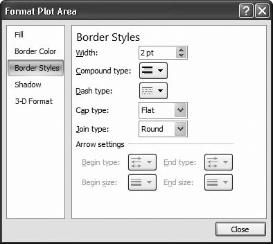
Further down the window, you see options that let you control exactly how Excel tiles your texture. You can size your texture to be larger or smaller by adjusting the scale percentages, and you can play with the offset settings to alter how the tiles of texture overlap. Finally, you can use the Mirror list to flip the texture around. But in truth, all these options are excessive frills, and you'll rarely need to touch any of them once you have a texture you like. If the ready-made list of textures doesn't have what you want, you can choose your own texture from a picture you have in a separate file, which is the next section's topic. Note: You'll notice that the Fill section has a slider bar that you can use to set the degree of transparency you want. You can make a fill partially transparent so that other elements show through. You can see a chart background through a partially transparent chart column. However, transparency is difficult to get right, and it often makes ordinary charts harder to read. But if your boss is out of the office and you need to fill the next hour , go ahead and experiment! 18.4.2.3. Picture fillsA picture is a graphical image that goes behind your chart and stretches itself to fit. Excel doesn't provide any ready-made pictures. Instead, you'll need to browse to a graphics file on your computer (a .bmp, .jpg, or .gif file). This option works well if you need a themed chartlike a beach scene behind a chart about holiday travel choices. If you just want to add a company logo somewhere on your chart, you're better off using the drawing tools described in the next chapter to place the logo exactly where you want it. To use a picture fill, choose the "Picture or texture fill" option, and then click the File button to browse for the picture you want to use. Once you've picked the right picture, you can adjust the other options in the Fill section. Start by making sure the "Tile picture as texture" checkbox isn't selectedif it is, Excel tiles your picture just like the textures you saw in the previous section. (On the other hand, if that's the effect you're looking for, click away.) Ordinarily, Excel stretches a picture over the surface of the chart. However, if you want your picture to fill just a part of the chart, you can adjust the different offset percentages (Top, Left, Right, and Bottom). Tip: If you just want to add an unstretched image or two somewhere on your chart, you shouldn't use a picture fill. Instead, add a picture object, as described in the next chapter. 18.4.3. Fancy Borders and LinesNow that you've tweaked the background fill to be slick and sophisticated (or wild and crazy), you're ready to modify other details. Along with the fill, the border is the next most commonly modified detail. You can add a border around any chart element, and your border can sport a variety of colors, line thicknesses, and line styles (like dashed, dotted , double, and so on). To set a line from a format window (like Format Plot Area), follow these steps:
Tip: Most of the time, you probably won't bother putting borders around chart elements. However, you can use the options in the Line Style section to configure the gridlines that appear behind your chart data. Just select the gridlines (you can use the Chart Tools Format Current Selection list if youre having trouble clicking in the right spot), and then choose Chart Tools Format Current Selection Format Selection. Youll see the familiar Border Color and Border Styles sections that let you change the line color, thickness, and dash style.
18.4.4. Formatting Data Series and Data PointsAdding labels is one way to distinguish important points on your chart. You can also use color, borders, and patterns. These techniques can't provide any additional information (like the value of the data point), but they're a great way to emphasize important information without cluttering up your chart. (Figure 18-18 shows a few examples.)
You could have several reasons for formatting a data series or data point:
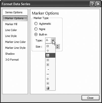
You already know the basic steps to format a data series because they're almost identical to the steps you use to format other parts of the chart. Start by selecting the area you want:
Note: Your use of color and fills is limited only by your imagination , but excessive formatting can be distracting, so it's best to add extra flourishes only when they help you make a point. You could use different colors in a bar chart to help highlight the meaning of the results on a company's annual sales chart. Redcolored bars could represent losses, while black bars could show profits. Then, use the familiar Chart Tools Format Here are some formatting ideas: Note: Use the Format Data Series or Format Data Point dialog box to implement any of these ideas.
Tip: If you format a data point and then format the series that contains that data point, the new formatting for the series takes over. Therefore, you need to reapply your data point formatting if you want a specific value to stand out from the crowd . To save time, you can use the helpful Redo feature to apply changes over and over again. First, format a data point the way you want it. Then, select a second data point, and press Ctrl+Y to reapply your formatting to the new data point. This technique can save you loads of time.
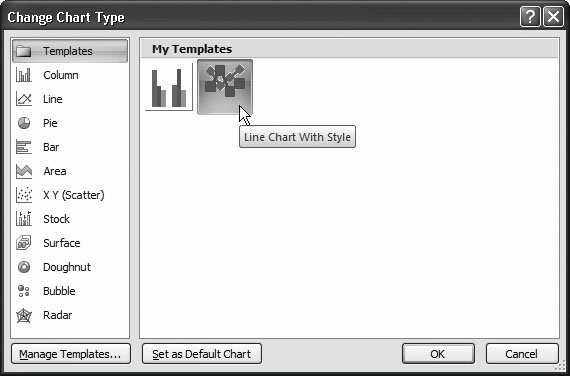
18.4.5. Reusing Your Favorite Charts with TemplatesYou can put a lot of work into creating the perfect chart. After you've slaved over your creation, it would be nice to have a way to reuse the formatting again in another workbook. Fortunately, Excel makes it possible through a template feature that lets you store your chart settings. Each chart template stores all the chart formatting settings you've made, but none of the data. Here's how it works. Once you've finished polishing up your chart, complete with all the formatting choices, choose Chart Tools Design By default, Excel offers to save the chart template in a Chart subfolder inside your personal template folder (Section 16.3). Don't change this folderthe Chart Template folder's the only place Excel looks for templates, so if you place it somewhere else, you can't reuse it. (Of course, nothing's stopping you from copying the chart template file, perhaps to get it into the Charts folder on someone else's computer so they can benefit from all your hard work.) To reuse your chart template, you need to pick it from the Create Chart or Change Chart Type dialog box. To create a new chart using your template, head to the ribbon's Insert
When you select your template and click OK, Excel creates a new chart with the same formatting but using the data that's selected on your worksheet. Obviously, these options may not all apply to a new chart you create based on your template. Maybe your template includes formatting information for four series, but your new chart has only three. In this case, Excel just ignores any formatting information it's not using. Note: The formatting in the chart template is just a starting point. If you want to reuse some of the formatting but not all of it, you're free to use any of the formatting techniques you learned about in this chapter to further refine your new chart. |