Section 6.3. Fonts
Using the CSS font properties, you can choose a font family, the font weight (its boldness setting), and font size (see Table 6-3). Be prepared, however, for a bit of Web-style uncertainty; this is one case where life isn't as easy as it seems.
The inescapable problem you face when using CSS font properties is that no two computers have the same set of fonts. A simple way to solve this would be to create Web browsers that could automatically download new fonts they don't havebut this would be a Web nightmare. First, it could swamp the average computer's hard drive with thousands of ( potentially low-quality) fonts. Second, it would infuriate the software companies who sell fonts. (Fonts aren't free, and so copying them wantonly from one computer to another isn't kosher.)
Table 6-3. Font Properties
| Property | Description | Common Values | Oldest Supported Browsers | Can Be Inherited |
|---|---|---|---|---|
| font-family | A list of font names . The browser scans through the list until it finds a font that's on the browser's PC. If no supported font is found, it uses the standard font it always uses. | A font name (like Verdana, Times, or Arial) or one of the generic family names: serif sans-serif monospace | IE 3, Netscape 4 | Yes |
| font-size | Sets the size of the font. | A specific size, or one of these values: xx-small x-small small medium large x-large xx-large smaller larger | IE 3, Netscape 4 | Yes |
| font-weight | Sets the weight of the font (how bold it appears). | normal bold bolder lighter | IE 4, Netscape 4 | Yes |
| font-style | Lets you apply italic formatting. | normal italic | IE 4, Netscape 4 | Yes |
| font-variant | Lets you apply small caps, which turns lowercase letters into smaller capitals (LIKE THIS). | normal small-caps | IE 4, Netscape 6 | Yes |
| text-decoration | Applies a few miscellaneous text changes, like underlining and strikeout. Technically speaking, these aren't part of the font (they're added in by the browser). | none underline overline line-through | IE 4, Netscape 4 | Yes |
| text-transform | Transforms text so that it's all capitals or all lowercase. | none uppercase lowercase | IE 4, Netscape 4 | Yes |
There may be practical solutions to these problems, but unfortunately , browser companies and the people who make Web standards have never agreed on any. As a result, any font settings you specify are just recommendations. If a browser doesn't have the font you request, it reverts to the standard font that the browser uses whenever it's on a site that doesn't have special font instructions.
Given that caveat, you're probably wondering why you should bother to configure font choices at all. Well, here's one bit of good news. Instead of requesting a font and blindly hoping that the browser has it, you can create a list of font preferences . That way, the browser will try to match your first choice and, if that fails, your second choice, and so on. At the end of this list, you should use one of the few standard fonts that almost all platforms are known to support in some variation. You'll see this technique at work in the next section.
| DESIGN TIME Graphical Text |
| The only guaranteed cure for font woes is graphical text . With graphical text, you don't type your content in an HTML file. Instead, you perfect it in a drawing program, and then save it as a picture. Finally, you display the picture of the text in your page using the <img> tag. Graphical text is clearly unsuitable for large amounts of text. First of all, it bloats the size of your Web page horribly. It's also much less flexible. For example, graphical text can't adjust itself to fit the width of the browser window or take into account your visitors ' browser preference settings. There's also no way for a Web surfer to search through your page hunting for specific words (or for a Web search engine to figure out what's on your Web site). However, graphical text is commonly used for menus , buttons, and headings, where these issues aren't nearly as important. You'll find this technique used on countless Web sites. For just one example, look at the children's site in this illustration. There's only a little real text herethe distinctive navigation buttons and headings are all graphics. Often, graphical text isn't as obvious. For example, you may have never noticed that the section headings on your favorite online newspaper are actually images. To figure out if a Web site is using graphical text or the real deal, try to select the text. If you can't, the text is really a picture. You'll learn how to use graphics (including graphical text) in Chapter 7. 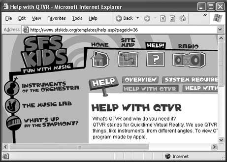 |
6.3.1. Specifying a Font
To select a font, you use the font-family attribute. Here's an example that changes the font for an entire page:
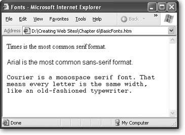
body { font-family: Arial; } Arial is a sans-serif font that's found on just about every modern computer, including those that run the Windows, Mac, Unix, and Linux operating systems. (See Figure 6-6 for more about the difference between serif and sans-serif.)
|
To be safe, when you specify a font, you should always use a font list that ends with a generic font family name. Every browser supports generic family names, which include serif, sans-serif, and monospace.
Here's the modified rule:
body { font-family: Arial, sans-serif; } Tip: If your font has a space in the name, make sure you enclose the whole font name in quotations.
At this point, you might be tempted to get a little creative with this rule by adding support for a less common sans-serif format. Here's an example:
body { font-family: Eras, Arial, sans-serif; } If Eras is relatively similar to Arial, this technique might not be a problem. But if it's significantly different, this is a bad idea.
The first problem is that by using on a non-standard font, you're creating a Web page whose appearance may vary dramatically depending on the fonts on the Web surfer's computer. Whenever pages vary, it becomes more difficult to really tweak them to perfection , because you don't know exactly how they'll be displayed. Different fonts take up different amounts of space, and if text grows or shrinks, the layout of other elements (like pictures) changes, too. Besides, is it really that pleasant to read KidzzFunScript or SnoopDawg font for long periods of time?
A more insidious problem occurs if another browser has a font with the same name that looks completely different. Even worse , browsers may access an online database of fonts to try and find a similar font that is installed on the Web surfer's computer. This approach can quickly get ugly. At worst, either of these problems can lead to illegible text.
Note: Most HTML editors won't warn you when you apply a non-standard font. So be on your guard. If your font isn't one of a small set of widely distributed Web fonts (more on which those are in a moment), you shouldn't try to use it.
6.3.2. Finding the Right Font
To make sure your Web page displays correctly, you should use a standard font that's widely available. But just what are these standard fonts? Unfortunately, Web gurus don't completely agree.
But if you want to be really conservative, you won't go wrong with any of these fonts:
-
Times
-
Arial and Helvetica
-
Courier
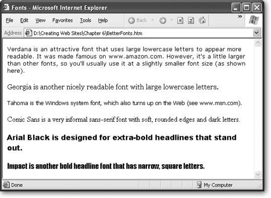
Of course, all of these fonts are insanely boring. If you want to take on more risk, you can use one of the following fonts, which are found on almost all Windows and Mac computers (but not necessarily on other operating systems like Unix):
-
Verdana
-
Georgia
-
Tahoma
-
Comic Sans
-
Arial Black
-
Impact
To compare these different fonts, see Figure 6-7.
Verdana, Georgia, and Tahoma can all help give your Web pages a more modern look. However, Verdana and Tahoma usually need to be ratcheted down one notch in size (a technique described in the next section).
For good resources that discuss different fonts, what platforms reliably support them, and the pros and cons of each font family (for example, some fonts look nice on screen but generate lousy printouts) see http://web.mit.edu/jmorzins/www/fonts.html and www.upsdell.com/BrowserNews/res_fontsamp.htm.
|
6.3.3. Font Sizes
Once you've sorted out the thorny issue of choosing your font, you may also want to change the size. It's important that you select a text size that's readable and looks good. Resist the urge to shrink or enlarge text to suit your personal preferences. Instead, aim to match the standard text size that you see on other popular Web sites.
Despite what you might expect, you don't have complete control over the font size in your Web pages. Most Web surfers use browsers that let them scale font sizes up or down, either to fit more text on screen or (more commonly) to make text easy to read on a high-resolution monitor. In Internet Explorer and FireFox, you'll find these options in the View  Text Size menu.
The browser's font size settings don't completely override the size you've set in your Web page. Instead, they just tweak it up or down. For example, if you choose to use a large font size (which corresponds to a setting of about 15 points in a word processor) and an Internet Explorer surfer selects View Text Size Larger, the text size grows about 20 percent in size (to 18 points).
The fact that your visitors have this kind of control is another reason you shouldn't use particularly small or large font sizes in your Web pages. When they're combined with the browser preferences, a size that's a little on the large size could become gargantuan, and text that's slightly small could turn unreadable. The best defense for these problems is to test out your Web page with different browsers and different font size preferences.
As you'll discover in the following sections, you have three choices for setting font sizes.
Tip: Getting the right font size is trickier than you might think, because different browsers will interpret your font sizes differently. If you want to explore Web typography in even more detail, check out the incredibly in-depth information that's available at http://usabletype.com/css. It's somewhat technical, but remarkably thorough.
6.3.3.1. Absolute sizes (keywords and percentages)
The simplest approach for specifying the size of your text is to use one of the size values listed in Table 6-3. For example, to create a really big heading and ridiculously small text, you could use these two rules:
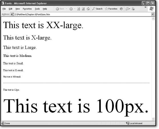
body { font-size: xx-small; } h1 { font-size: xx-large; } These size keywords are often called absolute sizes , because they apply an exact size. Exactly what size, you ask? Well, that's where it gets a bit complicated. These details actually aren't set in stonedifferent browsers are free to interpret them in different ways. The basic rule of thumb is that the font size medium corresponds to the standard text size that the browser uses. Every time you go up a size level, you add about 20 percent in size. (For math geeks , that means every time you go down a size you lose about 17 percent.)
A typical standard font size for most computers is 12 points (although text at this size typically appears smaller on Mac computers than on Windows computers). That means large text is approximately 15 points, x-large text is 18 points, and xx-large text is 27 points.
Figure 6-8 shows the basic sizes you can choose from.
There's one serious drawback to using the size keywordsthey really aren't absolute. As described above, when you set a font to medium you're supposed to get a browser's standard text size. Unfortunately, that's not how Internet Explorer sees it. Instead, IE displays its standard text size when it sees font that's set to small . That means if you want to get a little smaller (which is useful for some large fonts, like Verdana), you actually need to choose x-small . Unfortunately, other, more standards-aware browsers (like Firefox) don't have this idiosyncrasy. As a result, pages that look perfect on Internet Explorer are likely to look smaller on Firefox when you use size keywords.
The best solution to correct this problem is to use percentage sizes instead of size keywords. For example, if you want to make sure text is normal size, use this rule:
body { font-size: 100%; } And if you want to make text smaller, use something like this:
body { font-family: Verdana,Arial,sans-serif; font-size: 83%; } This sets text to be 83 percent of the standard size. It doesn't matter whether the standard size is considered small (Internet Explorer) or medium (most other browsers). This particular example creates nicely readable text with the Verdana font.
It's just as easy to upsize text:
h1 { font-size: 120%; }
|
But keep in mind that 100 percent always refers to the standard size of normal paragraph text (not the standard size of the element you're styling). So if you create a heading with 120 percent sized text, your heading is going to be only a little bigger than normal paragraph text, which is actually quite a bit smaller than the normal size of an <h1> heading.
Using percentage sizes is the safest, most reliable way to size text. Not only does it provide consistent results across all browsers, it also works in conjunction with the browser size preferences described earlier.
Tip: When you use absolute sizes, you create flexible pages. If the visitor ratchets up the text size using his browser's preferences, all your other fonts are resized proportionately.
6.3.3.2. Relative sizes
Another approach for setting fonts is to use one of two relative size valueslarger or smaller. This is a bit confusing, because as you just learned in the last section, absolute sizes are already relativethey're all based on the browser setting for standard text.
The difference is that relative sizes are influenced by the font of the element that contains them. The easiest way to understand how this works is to consider the following style sheet, which has two rules:
body { font-size: xx-small; } b { font-size: larger; } The first rule applies an absolute xx-small size to the whole page. The second rule (the relative one) inherits the xx-small size (see Section 6.1.4.2 for a recap about inheritance). However, it then steps the font size up one notch to x-small .
Now consider what happens if you edit the body style to use a larger font, like this:
body { font-size: x-small; } Now all bold text will be shown one level up from x-small , which is small .
The only limit of the two relative sizes is that they can step up or down only one level. You can get around this limitation by using font numbers . For example, a size of +2 is a relative size that increments a font two levels. Here's an example:
body { font-size: x-small; } b { font-size: +2; } Now the bold text is shown in medium text, because medium is two levels up from x-small .
Relative sizes are a little trickier to get used to than absolute sizes. You're most likely to use them if you have a style sheet that has a lot of different sizes. For example, you might use a relative size for bold text if you want to make sure bold text is always a little bit bigger than the text around it. If you were to use an absolute size instead, the bold text would appear large in relation to a small-sized paragraph, but it wouldn't stand out in a large-sized heading.
6.3.3.3. Exact sizes (pixels)
Most of the time, you should rely on absolute and relative sizing. However, if you really must have more control, you can customize your font size precisely by specifying a pixel size . Pixel sizes can range wildly, with 12px and 14px being about normal for body text. To specify a pixel size, use the number immediately followed by the letters px , as shown here:
body { font-size: 11px; } h1 { font-size: 24px; } Tip: Don't put a space between the number and the letters px. If you do, your rule may work in Internet Explorer but thoroughly confuse other browsers.
As always, you need to test, refine, and retest to get the right sizes. Some fonts look bigger than others, and require smaller sizes. Other fonts work well at larger sizes, but become less legible as you scale them down in size.
Web purists avoid using exact sizes because they are horribly inflexible on Internet Explorer. For example, if a near-sighted surfer has upped the text size settings in Internet Explorer, it won't have any effect on your page. (For some reason, other browsers don't suffer from this problemthey're able to resize pages even if you use pixel sizes.) As a result, when you use pixel sizes you could inadvertently lock out certain audiences or create pages that are difficult to read or navigate on certain types of browsers. It just goes to show that in the Web world there's a price to be paid for getting complete control over formatting.
EAN: N/A
Pages: 135
- Using SQL Data Definition Language (DDL) to Create Data Tables and Other Database Objects
- Performing Multiple-table Queries and Creating SQL Data Views
- Working with SQL JOIN Statements and Other Multiple-table Queries
- Understanding Transaction Isolation Levels and Concurrent Processing
- Working with Data BLOBs and Text