User Interface Style Evolution
|
|
It is not the strongest of the species that survives, nor the most intelligent, but the most responsive to change.
Charles Darwin[*]
In the good old days we started UI design work from scratch with each new mobile phone model. Product development took longer back then; there were fewer phone models, models had fewer features, and the product renewal cycle was slower than today. Those conditions allowed us to go out to study what the users wanted, and then come back to the labs to clean the whiteboards, do some designs, create prototypes, and prepare for a world tour to test the prototypes. After that it was iterate and reiterate until an appealing UI eventuated. The revolutionary Nokia 2110 UI was made in this way, as were the Nokia 3110 and 6110 phone user interfaces already mentioned.
Things have changed (to understate the matter) since the early and mid-1990s. In the year 2002, Nokia introduced more than 30 new handset models. The design time for a new product is now counted in months instead of years. In a fast-paced product development project, it is sometimes challenging to maintain a true human-centered approach. What makes it possible is an adherence to planned evolution instead of radical revolution.
In a sense we have invented the de facto cellular mobile telephone user interfaces. Nokia is a market leader with roughly two out of every five mobile phones sold in the world being made by Nokia. The two-softkey UI is being copied by many of our competitors, and our Navi-key phones have been the best-selling Nokia phones for a long time. In a situation like this, revolution really may not be the optimal user interface strategy, anyway.
The UI style portfolio is the collection of UI styles we have at our disposal at any given time. It is not static since new UI styles or style variants are always being developed. Old ones are gradually fading away or are terminated as they approach their usability knee (see Figure 1.5). Marketing strategies, technology, or any number of other reasons may also retire a style. Styles are dropped from the portfolio when they are no longer expressive, usable, or otherwise competitive in the changing marketplace. On the other hand, we obviously invest more design and development resources in UI styles that have longer-term potential.
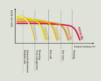
Figure 1.5: The usability knee.
Figure 1.6 illustrates the evolutionary development of Nokia's mainstream UI style portfolio (the 'big-screen communicators' are not shown in this illustration of the Nokia handset UI portfolio).
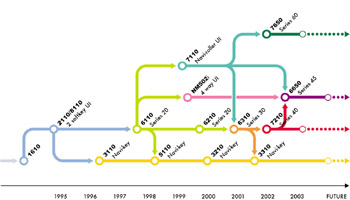
Figure 1.6: UI style evolution.
For many years, the Nokia 2110 phone with its large display and two dynamic softkeys has defined a baseline for mobile phone user interfaces. Roughly the same functionality was also available in Nokia 1610 phones, but the user interface was implemented with a smaller display and no softkeys. The Series 30 user interface is an evolutionary step forward from the Nokia 2110; with Series 30, menu structure navigation was designed in a more intuitive and consistent manner and the two keys for mode switching and backstepping (abc and clear) became redundant.
The old Nokia 1610 UI style has now been dropped from the UI style portfolio even though it supported the necessary features of its time quite well, and was still used in some analog phones long after the Nokia 2110 UI had been replaced by the Series 30 UI. Gradually we saw that the Nokia 1610 character display was becoming too small and rigid, and the control keys were ill-suited to increasingly complex features. Time passed it by when the fixed-key, two-row display could no longer adapt to the number of oncoming services.
A more recent and perhaps abrupt discontinuity in our evolutionary UI development occurred with Navi-roller. Based on Series 30 with the addition of a larger display and a roller, it was applied in the Nokia 7110, 7160, and 7190 phones. The multifunction Navi-roller (see earlier discussion on trademarking UI elements; see also Figure 1.7) was added to basic Series 30 interaction, so that instead of just scrolling up and down with the navigation device, a user could also select an item by clicking the roller. Navi-roller arrived with Nokia's first Wireless Application Protocol (WAP) Internet phones, and the roller device was intended to make Internet page navigation and selection easier. This UI design did not fulfill all of our stringent usability criteria.
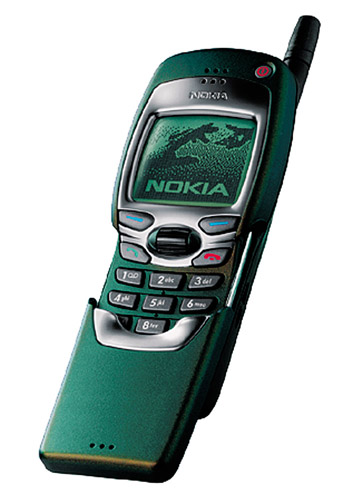
Figure 1.7: Navi-roller UI style.
Good UI designers have ample amounts of humility in their toolboxes, so we went out to the users and customer care centers, made a thorough analysis of what had gone wrong, and eventually applied what we learned when designing an improved UI style, Series 45, first introduced in the Nokia 6650. Some usability improvements devised as a direct result of the 'Navi-roller usability autopsy' project have also been incorporated into the Series 30 UI style displays and layouts.
The reason behind the lack of UI design consistency was that the roller device was added to the Series 30 UI style before we could claim a complete understanding of its implications. The product development team wanted to install the roller because it was seen as a good answer to the 'How do I point and click when browsing?' question. We believed that since the roller 'just replaces the up and down scroll keys,' integration with the Series 30 UI would be no problem, and that proved true in the browser application for which it was proposed. Elsewhere in the UI individual designers started to apply different solutions; in some applications the roller was used to make selections from the menu, and in others it was used to bring up a long list of available functions. This, we learned, was almost like having both the left and right mouse clicks of the Windows graphical user interface (GUI) mapped to the same key. Users struggled to learn the behavior of the roller click. The situation was further deteriorated by the fact that there was no room on the display for a label next to the roller device indicating what would happen if you pressed it. Our internal studies indicate that it takes some time for users to get accustomed to the softkeys with their dynamic behavior, and here we had brashly introduced a highly dynamic key with no instructions!
One happier example of style evolution was the NM502i phone for the Japanese market. It evolved modestly from the Series 30 UI by adding four-way navigation keys and a larger display.[*] Series 60 is the UI style for the Nokia 7650 imaging phone and its successors. Series 60 takes an evolutionary step (or two!) from previous UIs by introducing a larger display, PDA-style multitasking applications, and a more graphical look and feel in the UI. Within the scope of this chapter, where our concern is high-volume product categories and their incremental UI solutions, we can't profitably delve into detail on Series 60. The interested reader is encouraged to visit www.forum.nokia.com for more information on the Series 60 platform, which is a complete Symbian[†] smartphone reference design for manufacturers to license and integrate into their own smartphone devices.
[*]Symbian is a company created jointly by Psion, Nokia, Motorola, Matsushita, and Ericsson to develop and standardize mobile wireless device operating systems.
[*]ITU Recommendation E.161 (02/01), Arrangement of Digits, Letters and Symbols on Telephones and Other Devices that Can Be Used for Gaining Access to a Telephone Network; see http://www.itu.int/itudoc/itu-t/rec/e/e161.html.
[†]D. A. Norman, The Invisible Computer: Why Good Products Can Fail, the Personal Computer Is So Complex, and Information Appliances Are the Solution. Cambridge, MA: MIT Press, 1998.
|
|
EAN: 2147483647
Pages: 142