4.6. Alphabetical Property Reference
Given a listener at the center of a circular sound space (like in a surround-sound-equipped theater), azimuth sets the horizontal angle of the source of the sound (for example, in a text-to-speech browser). See also the elevation property.
CSS Syntax -
azimuth: angle | angleConstant || direction
Value Up to two values (other than inherit). One represents the angle, clockwise from straight ahead; the second is a 20-degree incremental movement to the left or right. An angle value is any value in the range of -360 to +360 (inclusive) plus the letters "deg", as in 90deg. The value 0deg is directly in front of the listener. To set the angle to the left of the listener, the value can be either -90deg or 270deg. Optionally, you can choose an angleConstant value from a large library of descriptions that correspond to fixed points around the circle. If you add the behind modifier, the values shift from in front of the listener to behind the listener. Value | Equals | Value | Equals |
|---|
center | 0deg | center behind | 180deg | center-right | 20deg | center-right behind | 160deg | right | 40deg | right behind | 140deg | far-right | 60deg | far-right behind | 120deg | right-side | 90deg | right-side behind | 90deg | left-side | 270deg | left-side behind | 270deg | far-left | 300deg | far-left behind | 240deg | left | 320deg | left behind | 220deg | center-left | 340deg | center-left behind | 200deg |
For the direction value, you can choose from two constants: leftwards | rightwards. These settings shift the sound 20 degrees in the named direction.
Initial Value center
Example -
h1 {azimuth: 45deg} p.aside {azimuth: center-right behind}
Applies To All elements.
This is a shortcut property that lets you set up to five separate (but related) background-style properties in one property statement. Values can be in any order, each one delimited by a space. Although the property is not officially available in Navigator 4, some combinations of values may work with it.
CSS Syntax -
background: background-attachment || background-color || background-image || background-position || background-repeat
Value Any combination of the five background-style property values, in any order. Any property not specified is assigned its initial value. See each property for details about the expected values.
Initial Value None.
Example -
body {background: url(watermark.jpg) repeat fixed}
Applies To All elements.
Object Model Reference -
[window.]document.getElementById("elementID").style.background
When an image is applied to the element background (with the background-image property), the background-attachment property sets whether the image scrolls with the document. The image can remain fixed within the viewable area of the element (the viewport), or it may scroll with the element as content scrolls. During scrolling, a fixed attachment looks like a stationary backdrop to rolling credits of a movie.
CSS Syntax -
background-attachment: fixed | scroll
Value The fixed value keeps the image stationary in the element viewport; the scroll value lets the image scroll with the document content.
Initial Value scroll
Example -
body {background-attachment: fixed}
Applies To All elements.
Object Model Reference -
[window.]document.getElementById("elementID").style.backgroundAttachment
Sets the background color for the element. Although it may appear as though a nested element's background-color property is inherited, in truth the initial value is transparent, which lets the next-outermost colored element show through whitespace of the current element.
CSS Syntax -
background-color: color | TRansparent
Value Any valid color specification (see description at beginning of the chapter) or transparent.
Initial Value transparent
Example -
.highlighter {background-color: yellow}
Applies To All elements.
Object Model Reference -
[window.]document.getElementById("elementID").style.backgroundColor
Sets the background image (if any) for the element. If you set a background-color for the element as well, the color appears if the image fails to load; otherwise, the image overlays the color. Transparent pixels of the image allow a background color to show through. See also the background-attachment property.
CSS Syntax -
background-image: uri | none
Value To specify a URL, use the url( ) wrapper for the property value. You can omit the property or specify none to prevent an image from loading into the element's background.
Initial Value none
Example -
h1 {background-image: url(watermark.jpg)}
Applies To All elements.
Object Model Reference -
[window.]document.getElementById("elementID").style.backgroundImage
Establishes the location of the left and top edges of the background image specified with the background-image property.
CSS Syntax -
background-position: [percentage | length] {1,2} | [top | center | bottom] || [left | center | right]
Value You can specify one or two percentages, which are the percentages of the block-level element's box width and height (respectively) at which the image (or repeated images) begins. If you supply only one percentage value, it applies to the horizontal measure, and the vertical measure is automatically set to 50%. Instead of percentages, you can specify length values (in the unit of measure that best suits the medium). You can also mix a percentage with a length. In lieu of the numerical values, you can create combinations of values with the two sets of constant values. Select one from each collection, as in top left, top right, or bottom center. Whenever you specify two values, they must be separated by a space.
Initial Value 0% 0%
Example -
div.marked {background-image: url(watermark.jpg); background-position: center top}
Applies To Block-level and replaced elements.
Object Model Reference -
[window.]document.getElementById("elementID").style.backgroundPosition
Establish the location of the left (x) or top (y) edges of the background image specified with the background-image property.
CSS Syntax -
background-position-x: [percentage | length] | [left | center | right ] background-position-y: [percentage | length] | [top | center | bottom]
Value You can specify the percentage of the block-level element's box width or height (respectively) at which the image (or repeated images) begins. Instead of percentages, you can specify length values (in the unit of measure that best suits the medium). In lieu of the numerical values, you may use one axis-specific constant value per property.
Initial Value 0%
Example -
div.marked {background-image: url(watermark.jpg); background-position-x: center}
Applies To Block-level and replaced elements.
Object Model Reference -
[window.]document.getElementById("elementID").style.backgroundPositionX [window.]document.getElementById("elementID").style.backgroundPositionY
Sets whether a background image (specified with the background-image property) should repeat and, if so, along which axis. You can use repeating background images to create horizontal and vertical bands.
CSS Syntax -
background-repeat: no-repeat | repeat | repeat-x | repeat-y
Value With a setting of no-repeat, one instance of the image appears in the location within the element established by the background-position property (default is the top-left corner). Normal repeats are performed along both axes, but you can have the image repeat down a single column (repeat-y) or across a single row (repeat-x).
Initial Value repeat
Example -
body {background-image: url(icon.gif); background-repeat: repeat-y}
Applies To All elements.
Object Model Reference -
[window.]document.getElementById("elementID").style.backgroundRepeat
Associates an external behavior definition to the element.
CSS Syntax -
behavior: uri[, uri[, ...]]
Value CSS-formatted URL value, with the actual URL pointing to an external .htc file, ID of an object element that loads a behavior ActiveX control into the page, or one of the built-in default behaviors (in the format url(#default#behaviorName)). Default behavior names are: - anchorClick
- anim
- clientCaps
- download
- homePage
- httpFolder
- mediaBar
- saveFavorite
- saveHistory
- saveSnapshot
- userData
For details on what these default behaviors do and under what security conditions you can use them, visit http://msdn.microsoft.com/workshop/author/behaviors/reference/reference.asp.
Initial Value None.
Example -
input.numOnly {behavior: url(numInput.htc)}
Applies To All elements.
Object Model Reference -
[window.]document.getElementById("elementID").style.behavior [window.]document.getElementById("elementID").behaviorUrns[i]
This is a shorthand property for setting the width, style, and/or color of all four borders around an element in one assignment statement. Whichever properties you don't explicitly set with this property assume their initial values. Numerous other properties allow you to set the width, style, and color of individual edges or groups of edges, if you don't want all four edges to be the same. Due to differences in the way browsers define their default behavior with regard to borders, every style sheet border rule should include the width and style settings. Failure to specify both properties may result in the border not being seen in one browser or the other.
CSS Syntax -
border: border-width || border-style || color | TRansparent
Value For the border-width and border-style property values, see the respective properties in this chapter. For details on the color value, see the section about colors at the beginning of this chapter.
Initial Value None.
Example -
p {border: 3px groove darkred}
Applies To All elements, but only block and replaced elements in IE 4 and 5 for Windows.
Object Model Reference -
[window.]document.getElementById("elementID").style.border
All four properties are shorthand properties for setting the width, style, and/or color of a single border edge of an element in one assignment statement. Whichever properties you don't explicitly set with this property assume their initial values.
CSS Syntax -
border-bottom: border-bottom-width || border-bottom-style || color | TRansparent border-left: border-left-width || border-left-style || color | transparent border-right: border-right-width || border-right-style || color | TRansparent border-top: border-top-width || border-top-style || color | transparent
Value For the width and style property values, see the border-bottom-width and border-bottom-style properties in this chapter. For details on the color value, see the section about colors at the beginning of this chapter.
Initial Value None.
Example -
p {border-bottom: 3px solid lightgreen} p {border-left: 6px solid lightgreen} p {border-right: 3px solid lightgreen} p {border-top: 6px solid lightgreen}
Applies To All elements, but only block and replaced elements in IE 4 and 5 for Windows.
Object Model Reference -
[window.]document.getElementById("elementID").style.borderBottom [window.]document.getElementById("elementID").style.borderLeft [window.]document.getElementById("elementID").style.borderRight [window.]document.getElementById("elementID").style.borderTop
Each property sets the color of a single border edge of an element. This power is easy to abuse by mixing colors that don't belong together. See also the border-color property for setting the color of multiple edges in one statement.
CSS Syntax -
border-bottom-color: color | transparent border-left-color: color | transparent border-right-color: color | TRansparent border-top-color: color | transparent
Value For details on the color value, see the section about colors at the beginning of this chapter. Also transparent.
Initial Value None.
Example -
p {border-bottom-color: gray} div {border-left-color: #33c088} p.special {border-right-color: rgb(150, 75, 0)} h3 {border-top-color: rgb(100%, 50%, 21%)}
Applies To All elements, but only block and replaced elements in IE 4 and 5 for Windows.
Object Model Reference -
[window.]document.getElementById("elementID").style.borderBottomColor [window.]document.getElementById("elementID").style.borderLeftColor [window.]document.getElementById("elementID").style.borderRightColor [window.]document.getElementById("elementID").style.borderTopColor
Each property sets the line style of a single border edge of an element. The edge-specific properties let you override a style that has been applied to all four edges with the border or border-style properties, but the edge-specific setting must come after the other one (in source code order) in the style sheet rule. See also the border-style property for setting the style of multiple edges in one statement.
CSS Syntax -
border-bottom-style: style border-left-style: style border-right-style: style border-top-style: style
Value Style values are constants that are associated with specific ways of rendering border lines. Not all browser versions recognize all of the values in the CSS recommendation. Style support is shown in the following table. Value | IE/Windows | NN | Others | CSS |
|---|
dashed | 5.5 | 6 | all | 1 | dotted | 5.5 | 6 | all | 1 | double | 4 | 4 | all | 1 | groove | 4 | 4 | all | 1 | hidden | n/a | 6 | all | 2 | inset | 4 | 4 | all | 1 | none | 4 | 4 | all | 1 | outset | 4 | 4 | all | 1 | ridge | 4 | 4 | all | 1 | solid | 4 | 4 | all | 1 |
The manner in which browsers interpret the definitions of the style values is not universal. Figure 4-1 shows a gallery of all styles as rendered by Internet Explorer, Firefox, Safari, and Opera 9. Don't expect the same look in all browsers. Figure 4-1. Border-style gallery 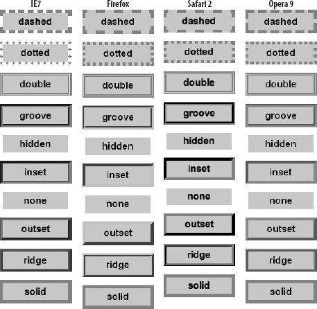
Initial Value none
Example -
p {border-style: solid; border-bottom-style: none} div {border-left-style: ridge}
Applies To All elements.
Object Model Reference -
[window.]document.getElementById("elementID").style.borderBottomStyle [window.]document.getElementById("elementID").style.borderLeftStyle [window.]document.getElementById("elementID").style.borderRightStyle [window.]document.getElementById("elementID").style.borderTopStyle
Each property sets the width of a single border edge of an element. See also the border-width property for setting the width of multiple edges in one statement.
CSS Syntax -
border-bottom-width: thin | medium | thick | length border-left-width: thin | medium | thick | length border-right-width: thin | medium | thick | length border-top-width: thin | medium | thick | length
Value Three constantsthin | medium | thickallow the browser to define how many pixels are used to show the border. For more precision, you can also assign a length value (see the discussion of length values at the beginning of this chapter).
Initial Value medium
Example -
h2 {border-bottom-width: 2px} div {border-left-width: thin} p.special {border-right-width: 0.5em}
Applies To All elements, but only block and replaced elements in IE 4 and 5 for Windows.
Object Model Reference -
[window.]document.getElementById("elementID").style.borderBottomWidth [window.]document.getElementById("elementID").style.borderLeftWidth [window.]document.getElementById("elementID").style.borderRightWidth [window.]document.getElementById("elementID").style.borderTopWidth
Sets whether borders of adjacent table elements (cells, row groups, column groups) are rendered separately or collapsed (merged) to ignore any padding or margins between adjacent borders. A table set to the separate border model may also have its border-spacing and empty-cells style properties set (if supported by the target browsers).
CSS Syntax -
border-collapse: collapse | separate
Value Constant values: collapse | separate.
Initial Value separate
Applies To The table element.
This is a shortcut property that lets you set multiple border edges to the same or different colors. Navigator 4 allows only a single value, which applies to all four edges. For other supporting browsers, you may supply one to four space-delimited color values. The number of values determines which sides receive the assigned colors.
CSS Syntax -
border-color: color {1,4}
Value For modern browsers, this property accepts one, two, three, or four color values, depending on how many and which borders you want to set with specific colors. Value quantities and positions are interpreted as shown in the following table. Number of values | Effect |
|---|
1 | All four borders set to value | 2 | Top and bottom borders set to the first value, right and left borders set to the second value | 3 | Top border set to first value, right and left borders set to second value, bottom border set to third value | 4 | Top, right, bottom, and left borders set, respectively |
Initial Value The element's color style property (which is inherited if not specifically assigned for the element).
Example -
h2 {border-color: red blue red} div {border-color: red rgb(0,0,255) red}
Applies To All elements, but only block and replaced elements in IE 4 and 5 for Windows.
Object Model Reference -
[window.]document.getElementById("elementID").style.borderColor
Determines the size of the space (if any) between all cell borders in a table. This property requires that the border-collapse property be set to separate (which is typically the default value). If you include only one length value, it applies to both the horizontal and vertical cell spacing; for two values, the first applies to the horizontal and the second to the vertical. See Figure 4-2 for a synopsis of a table's numerous dimension definitions. Figure 4-2. The geometry of a table element 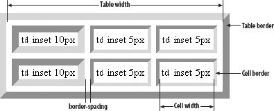
CSS Syntax -
border-spacing: length[length]
Value See the discussion of length values at the beginning of this chapter. If you want no spacing along one axis, set its value to zero.
Initial Value 0
Applies To The table element.
This is a shortcut property that lets you set multiple border edges to the same or different style. For mainstream browsers, you may supply one to four space-delimited border style values. The number of values determines which sides receive the assigned style.
CSS Syntax -
border-style: borderStyle {1,4}
Value Style values are constants that are associated with specific ways of rendering border lines. See border-bottom-style for a list of available values. The precise manner in which browsers interpret the definitions of the style values is far from universal. Figure 4-1 shows a gallery of all styles as rendered by Internet Explorer 7, Firefox, Safari, and Opera 9. Do not expect the exact same look in all browsers. This property accepts one, two, three, or four space-delimited borderStyle values, depending on how many and which borders you want to set with specific styles. Value quantities and positions are interpreted as shown in the following table. Number of values | Effect |
|---|
1 | All four borders set to value | 2 | Top and bottom borders set to the first value, right and left borders set to the second value | 3 | Top border set to first value, right and left borders set to second value, bottom border set to third value | 4 | Top, right, bottom, and left borders set, respectively |
Initial Value none
Example -
h1 {border-style: ridge; border-width: 3px} div {border-style: solid double; border-width: 4px}
Applies To All elements, but only block and replaced elements in IE 4 and 5 for Windows.
Object Model Reference -
[window.]document.getElementById("elementID").style.borderStyle
This is a shortcut property that lets you set multiple border edges to the same or different widths. You may supply one to four space-delimited width length values. The number of values determines which sides receive the assigned widths.
CSS Syntax -
border-width: thin | medium | thick | length {1,4}
Value Three constantsthin | medium | thickallow the browser to define how many pixels are used to show the border. For more precision, you can also assign a length value (see the discussion of length values at the beginning of this chapter). This property accepts one, two, three, or four space-delimited borderWidth values, depending on how many and which borders you want to set with specific styles. Value quantities and positions are interpreted as follows. Number of values | Effect |
|---|
1 | All four borders set to value | 2 | Top and bottom borders set to the first value, right and left borders set to the second value | 3 | Top border set to first value, right and left borders set to second value, bottom border set to third value | 4 | Top, right, bottom, and left borders set, respectively |
Initial Value medium
Example -
h1 {border-style: ridge; border-width: 3px 5px 3px} div {border-style: solid double; border-width: 4px}
Applies To All elements, but only block and replaced elements in IE 4 and 5 for Windows.
Object Model Reference -
[window.]document.getElementById("elementID").style.borderWidth
The CSS specification calls for this property to define the position of the bottom edge of a positioned element's margin edge relative to the bottom edge of the next outermost block content container; in the case of positioned elements using the root document as the positioning context, dimensions of the containing block are determined by the browser window of an unscrolled document. In other words, for a top-level positioned element, instead of using the bottom of the document as the comparative edge, these browsers use the bottom of the browser window space (the viewport in CSS terminology). As a result, the precise bottom position of the element varies with the user's browser window size. When the element is relative-positioned, the offset is based on the bottom edge of the inline location of where the element would normally appear in the content.
CSS Syntax -
bottom: length | percentage | auto
Value See the discussion about length values at the beginning of this chapter. Negative lengths may be allowed in some contexts, but be sure to test the results on all browsers. You may also specify a percentage value, which is calculated based on the height of the next outermost container. The setting of auto lets the browser determine the bottom offset of the element box on its naturally flowing offset within the containing box.
Initial Value auto
Applies To All positioned elements.
Object Model Reference -
[window.]document.getElementById("elementID").style.bottom
Positions the caption element above or below the tabular content of the enclosing table element. This property supplants some deprecated align property settings of the caption element.
CSS Syntax -
caption-side: top | bottom | left | right
Value One of the four constant values: top | bottom | left | right. The values left and right were removed from CSS2.1.
Initial Value top
Applies To caption elements.
Object Model Reference -
[window.]document.getElementById("elementID").style.captionSide
Defines whether a block-level element allows itself to be displayed in the same horizontal band as a nearby floating element, such as an image. Typically, another element in the vicinity has its float style property set to left or right. To prevent the current element from being in the same band as the floating block, set the clear property to the same side (left or right). If you aren't sure where the potential overlap might occur, set the clear property to both. An element with a clear property that is set to a value other than none is rendered at the beginning of the next available line below the floating element.
CSS Syntax -
clear: both | left | none | right
Value Any of the following constants: both | left | none | right.
Initial Value none
Example -
<img src="/books/2/570/1/html/2/logo.gif" height="40" width="60" style="float: right"> <h1 style="clear: right">Giantco Corporation</h1>
Applies To Block-level elements.
Object Model Reference -
[window.]document.getElementById("elementID").style.clear
Defines a clipping region of a positionable element. The clipping region is the area of the element layer in which content is visible. If you encounter problems clipping an element, wrap the content-holding element inside a block-level element whose clip property is set to the desired region.
CSS Syntax -
clip: rect(lengthTop lengthRight lengthBottom lengthLeft) | auto
Value Extending to CSS2.1, the only shape recognized for the clip property is rect. Other shapes may be admitted in the future. When specifying lengths for each side of the clipping rectangle, observe the clockwise order of values: top, right, bottom, left. See the discussion about length values at the beginning of this chapter. A value of auto sets the clipping region to the block that contains the content.
Initial Value auto
Example -
<span style="position: absolute; clip: rect(10px 110px 80px 10px)"> <img src="/books/2/570/1/html/2/desk1.gif" height="90" width="120"> </span>
Applies To Block-level, replaced, and positioned elements.
Object Model Reference -
[window.]document.getElementById("elementID").style.clip
Defines the foreground text color of the element. For some graphically oriented elements, such as form controls, the color property may also be applied to element edges, checkmarks, or other features. Such extracurricular behavior is browser-specific and may not be the same across browsers.
CSS Syntax -
color: color
Value See the discussion of color property values at the beginning of this chapter.
Initial Value black
Example -
th {color: darkred}
Applies To All elements.
Object Model Reference -
[window.]document.getElementById("elementID").style.color
Defines the actual content or source of content to be displayed before and/or after the current element. In CSS jargon, this kind of content is called generated content. This property may be set only with the :before and :after pseudo-elements associated with a real element. For example, as a result of the following style sheet rule: blockquote:after {content:"(Reprinted by permission.)"}
a permissions phrase is appended to the end of every blockquote element, although the content does not become a member of the document tree. HTML tags in the content text are not interpreted, but if the situation warrants it, an external document can be assigned to the content property.
CSS Syntax -
content: string | uri | counter | attr(attrName) | open-quote | close-quote | no-open-quote | no-close-quote | none | normal
Value The purpose of the "no" quote types is to let you specify the effect of a quote (as far as quote nesting goes) without displaying a quote symbol. Multiple space-delimited strings may follow the content: property name. Another value (counter) is not yet supported by all browsers (see counter-increment), but its potential is significant for documents that would benefit from client-side section number generation. A CSS counter offers a way for a style sheet to control numbering schemes for sequences of elements (such as sections, illustrations, and the like). The assumption is that the numbering is not part of the actual content, but is determined solely by the rendered context of the element within the document. Therefore, if you remove a numbered paragraph from a document in the edit phase, the paragraph numbering of the document adjusts itself automatically when the page is rendered. The basic operation of a counter entails assigning an identifier to it (thus allowing multiple counters to exist in the same document, such as one for sections, another for subsections). Other CSS properties (counter-increment and counter-reset) require values that point to an identified counter to control the numbering sequence. The following style sheet rule inserts a section label and number in front of every h1 element, and increments the counter number each time the style is applied to an h1 element while the document renders: h1:before {counter-increment: secNum; content: "Section " counter(secNum) ". "}
When counters are implemented in mainstream browsers, they will provide substantial power to highly structured, long documents.
Initial Value "" (empty string)
Example -
p.note:before {content: "==>"}
Applies To All elements plus a :before and/or :after pseudo-element.
These properties control the numbering sequence of a CSS counter used for generated content (see the content property). The counter-increment property sets the amount (and direction) of change each time the counter is accessed during rendering. The counter-reset property lets you set the counter to a specific number (default of zero).
CSS Syntax -
counter-increment: counterID [ posOrNegInteger ] | none counter-reset: counterID [ posOrNegInteger ] | none
Value A counterID is an identifier assigned to a content: counter(counterID) style property. The optional integer value is space-delimited after the counterID. You can combine multiple counter IDs in the same style property by stringing together space-delimited pairs of ID and integer values.
Initial Value none
Example -
h1 {counter-reset: subSection}
Applies To All elements.
For aural style sheets only, this property provides a shorthand for setting cue-before and cue-after property settings. A cue is a sound (also known as an auditory icon) that can be used to aurally delimit the reading of document content. Cue properties are URIs to sound resources.
CSS Syntax -
cue: cue-before || cue-after
Value If there are two values, the first is applied to the cue-before property and the second to the cue-after property. If there is only one value, the same auditory icon is applied to both cue-before and cue-after.
Initial Value none
Applies To All elements.
For aural style sheets only, a cue is a sound (also known as an auditory icon) that can be used to aurally delimit the reading of document content. The cue-before and cue-after properties are URIs to sound files that are to be played before and after the content is rendered via text-to-speech or another aural medium.
CSS Syntax -
cue-after: uri | none cue-before: uri | none
Value Any valid complete or relative URL (in CSS format) to a sound file in a MIME type supported by the browser. You may apply the same values to both properties for the same style selector if it makes aural sense for the listener.
Initial Value none
Example -
li {cue-before: url(ding.wav); cue-after: url(dong.wav)}
Applies To All elements.
Sets the shape of the cursor when the screen pointer is atop the element. The precise look of cursors depends on the operating system. Before deploying a modified cursor, be sure you understand the standard ways that the various types of cursors are used within the browser and operating system. Users expect a cursor design to mean the same thing across all applications. Figure 4-3 offers a gallery of cursors for each of the cursor constant settings provided by Internet Explorer for Windows. Figure 4-3. Internet Explorer cursor gallery 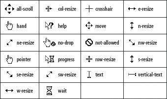
CSS Syntax -
cursor: cursorType || uri
Value A cursor type is one of the implemented cursor names. The following table shows which cursor types are supported by various browsers and the CSS standard (3* indicates a proposed value for CSS3). Cursor name | IE/Windows | IE/Mac | Mozilla | Safari | Opera | CSS |
|---|
alias | n/a | n/a | n/a | n/a | n/a | 3* | all-scroll | 6 | n/a | 1.8 | n/a | n/a | 3* | auto | 4 | 4 | all | all | 7 | 2 | cell | n/a | n/a | 1.8 | n/a | n/a | 3* | col-resize | 6 | n/a | 1.8 | n/a | n/a | 3* | context-menu | n/a | n/a | 1.8 | n/a | n/a | 3* | copy | n/a | n/a | 1.8 | n/a | n/a | 3* | count-down | n/a | n/a | n/a | n/a | n/a | n/a | count-up | n/a | n/a | n/a | n/a | n/a | n/a | count-up-down | n/a | n/a | n/a | n/a | n/a | n/a | crosshair | 4 | 4 | all | all | 7 | 2 | default | 4 | 4 | all | all | 7 | 2 | e-resize | 4 | 4 | all | all | 7 | 2 | grab | n/a | n/a | <1 | n/a | n/a | n/a | grabbing | n/a | n/a | <1 | n/a | n/a | n/a | hand | 4 | 4 | n/a | all | 7 | n/a | help | 4 | 4 | all | all | 7 | 2 | move | 4 | 4 | all | all | 7 | 2 | n-resize | 4 | 4 | all | all | 7 | 2 | ne-resize | 4 | 4 | all | all | 7 | 2 | nesw-resize | n/a | n/a | 1.8 | n/a | n/a | 3* | no-drop | 6 | n/a | 1.8 | n/a | n/a | 3* | none | n/a | n/a | n/a | n/a | n/a | 3* | not-allowed | n/a | n/a | n/a | n/a | n/a | 3* | nw-resize | 4 | 4 | all | all | 7 | 2 | nwse-resize | n/a | n/a | 1.8 | n/a | n/a | 3* | pointer | 4 | 4 | all | all | 7 | 2 | progress | 6 | n/a | <1 | n/a | 9 | 2.1 | row-resize | 6 | n/a | 1.8 | n/a | n/a | 3* | s-resize | 4 | 4 | all | all | 7 | 2 | se-resize | 4 | 4 | all | all | 7 | 2 | spinning | n/a | n/a | all | n/a | n/a | n/a | sw-resize | 4 | 4 | all | all | 7 | 2 | text | 4 | 4 | n/a | n/a | n/a | 2 | url(uri) | 6 | n/a | n/a | n/a | n/a | 2 | vertical-text | 6 | n/a | 1.8 | n/a | n/a | 3* | w-resize | 4 | 4 | all | all | 7 | 2 | wait | 4 | 4 | all | all | 7 | 2 |
Notice that IE 6 or later implements downloadable cursors. The IE setting for an external URL requires an address of a cursor file of extension .cur or .ani (which you create with a graphics utility that creates Windows cursors).
Initial Value auto
Example -
a.helpLink {cursor: help}
Applies To All elements.
Sets the direction of the flow of inline portions of content (such as text) and the order in which table cells are filled along a row. Analogous to the dir property of most elements, the direction style property lets you override the browser's default rendering direction for other languages or special content.
CSS Syntax -
direction: ltr | rtl
Value Either of two directional constants. The value ltr stands for left-to-right; rtl stands for right-to-left.
Initial Value ltr
Applies To All elements.
This is a multipurpose property that determines how a browser treats invisible boxes that surround every element and text node. For example, a block-level item exhibits specific characteristics that are quite distinct from an inline item (at least with respect to how the element renders in relation to surrounding content). The CSS specification provides numerous types of such boxes, because the space they occupy can be influenced differently by such things as borders or even outright rendering rules (e.g., the way a compact style controls definition list items). In practice, you may not see much, if any, difference between some display types because the browser's built-in style sheet doesn't specify anything different for the variations (e.g., a table element may render the same way if its display style property is set to block or table). At the same time, the display style lets you override the default rendering behavior of elements, such as making a block table render as an inline table. Additionally, display settings can be applied to arbitrary elements (e.g., divs and spans) to give them the rendering powers of the full-fledged elements in the value names. For example, a collection of hierarchical elements (such as the result of an XML query) can be displayed as a table by applying table-related display values to elements corresponding to groups, rows, and cells. Perhaps the most frequently used aspect of the display style property in DHTML is setting the scripts to toggle between showing and completely hiding the element and its space. When the property is set to none, the element is hidden from view, and all surrounding content cinches up to occupy whatever space the element would normally occupy. This is different from the visibility property, which reserves space for the element while hiding it from view. But to redisplay the item to its default display mode, you can assign one of the common display types (block and inline) or the more specific type associated with the element (such as list-item for an li element), if supported by your target browsers.
CSS Syntax -
display: displayType
Value The CSS specification identifies many display types, but browser support is more limited. The following table shows the supported types. Support for the list-item and all table-related values means that the values can be applied successfully to arbitrary containers. Display type | IE/Windows | IE/Mac | NN | Mozilla | Safari | Opera | CSS |
|---|
block | 5 | 4 | 4 | all | all | 7 | 2 | compact | n/a | n/a | n/a | n/a | n/a | n/a | <2.1 | inline | 5 | 4 | 4 | all | all | 7 | 2 | inline-block | 5.5 | n/a | n/a | n/a | n/a | n/a | <2.1 | inline-table | n/a | 5 | n/a | n/a | all | 7 | 2 | list-item | 5 | 5 | n/a | all | all | 7 | 2 | marker | n/a | n/a | n/a | n/a | n/a | n/a | <2.1 | none | 4 | 4 | 4 | all | all | 7 | 2 | run-in | n/a | 5 | n/a | n/a | n/a | 7 | 2 | table | n/a | 5 | n/a | all | all | 7 | 2 | table-caption | n/a | 5 | n/a | all | all | 7 | 2 | table-cell | n/a | 5 | n/a | all | all | 7 | 2 | table-column-group | n/a | 5 | n/a | n/a | n/a | n/a | 2 | table-footer-group | 5.5 | 5 | n/a | all | all | 7 | 2 | table-header-group | 5 | 5 | n/a | all | all | 7 | 2 | table-row | n/a | 5 | n/a | all | all | 7 | 2 | table-row-group | n/a | 5 | n/a | n/a | n/a | n/a | 2 |
Initial Value Element-dependent.
Example -
.hidden {display: none}
Applies To All elements (but some display types are applicable to specific elements).
Object Model Reference -
[window.]document.getElementById("elementID").style.display
Given a listener at the center of a three-dimensional sound space (like in a surround-sound-equipped theater), elevation sets the vertical angle of the source of the sound (for example, in a text-to-speech browser). See also the azimuth property.
CSS Syntax -
elevation: angle | angleConstant
Value Your choice of a specific angle (in degrees) or one of the five constant values. An angle value is any value in the range of -90 to +90 (inclusive) plus the letters "deg", as in 90deg. The value 0deg is at the same vertical level as the listener's ear. To set the angle above level, the value must be a positive value (45deg); below level requires a negative value (-45deg). Optionally, you can choose an angleConstant value from a library of descriptions that correspond to fixed points above and below level. Value | Equals |
|---|
above | 90deg (directly overhead) | below | -90deg (directly beneath) | higher | +10 degrees from current | level | 0deg (at listener's ear level) | lower | -10 degrees from current |
In combination with the azimuth property, you can place a sound at any point around a spherical surround-sound stage.
Initial Value level
Example -
h1 {elevation: -45deg} p.heavenly {elevation: above}
Applies To All elements.
Controls whether an empty td element shows its borders and background in a table. Surrounding cells don't change position when an empty cell is hidden. Instead, the cell is essentially transparent, allowing the table's background to show through in the space.
CSS Syntax -
empty-cells: show | hide
Value One of two constants: show | hide .
Initial Value show
Example -
td {border: salmon inset 3px; empty-cells: hide}
Applies To td elements.
Sets the visual, reveal, or blend filter used to display or change content of an element. A visual filter can be applied to an element to produce effects such as content flipping, glow, drop shadow, and many others. A reveal filter is applied to an element when its visibility or appearance changes. The value of the reveal filter determines what visual effect is to be applied to the transition from hidden to shown (or vice versa). This includes effects such as wipes, blinds, and barn doors. A blend filter sets the speed at which a transition between visibility states occurs.
CSS Syntax -
filter: filterType1(paramName1=value1, paramName2=value2,...) filterType2(paramName1=value1,...) ...
Value Each filter property may have more than one space-delimited filter type associated with it. Each filter type is followed by a pair of parentheses, which may convey parameters about the behavior of the filter for the current element. A parameter generally consists of a name/value pair, with assignment performed by the equals symbol. See the "Notes" section below for details on filterType values and parameters.
Initial Value None.
Example -
.fastStuff {filter: blur(add=true, direction=225)}
Applies To body, button, img, input, marquee, table, td, textarea, tfoot, th, thead, TR, and absolute-positioned div and span elements.
Object Model Reference -
[window.]document.getElementById("elementID").filters["filterName"]
Notes First-generation filters (which continue to be supported at least through IE 7) are divided into three broad categories: visual, reveal, and blend. Each category has its own parameter names. You can mix categories within a single filter property assignment and have quite a bit of fun experimenting with the combinations. Observe carefully the limitations about the elements to which you may assign filters. The visual filters and their parameters are as follows:
alpha( ) Controls transparency level. The opacity and finishopacity parameters can be set from transparent (0) to opaque (100). The style parameter sets the opacity gradient shape: uniform (0), linear (1), radial (2), or rectangular (3). startX and startY set the horizontal and vertical coordinates for opacity gradient start, whereas finishX and finishY set the horizontal and vertical coordinates for opacity gradient end.
blur( ) Gives the element the appearance of motion. The add parameter specifies whether to add the original image to the blurred image (1) or to omit it (0). direction sets the angle of the blurred image relative to the original image location: above (0); above-right (45); right (90); below-right (135); below (180); below-left (225); left (270); above-left (315). strength indicates the number of pixels for the blurred image to extend.
chroma( ) Sets a color transparent. The color parameter specifies the hexadecimal triplet value of the color to be made transparent.
dropShadow( ) Creates an offset shadow for apparent depth. The color parameter sets the hexadecimal triplet value of color for drop shadow. offx and offy specify the number of pixels between the element and the drop shadow along the x and y axes (positive values to the right/down; negative to the left/up). The positive parameter specifies whether only positive pixels generate drop shadows (1) or transparent pixels as well (0).
flipH( ) Creates a horizontally mirrored image of the element.
flipV( ) Creates a vertically mirrored image of the element.
glow( ) Adds radiance to outer edges. The color parameter sets the hexadecimal triplet value of the color for the radiance effect and strength sets the radiance intensity (1255).
gray( ) Removes colors but retains luminance.
invert( ) Reverses the hue, saturation, and brightness (HSV) levels.
light( ) Shines a light source on the element (numerous filter method calls are available to set specific types of light sources, locations, intensities, and colors).
mask( ) Creates a transparent mask. The color parameter sets the hexadecimal triplet value of the color applied to transparent regions.
shadow( ) Displays the element as a solid silhouette. The color parameter sets the hexadecimal triplet value of the color used for shadows and direction sets the angle of the shadow relative to the original image location: above (0); above-right (45); right (90); below-right (135); below (180); below-left (225); left (270); above-left (315).
wave( ) Renders the element with a sine wave distortion along the x-axis. The add parameter specifies whether to add the original image to waved image (1) or not (0). freq sets the number of waves to be applied to visual distortion, light sets the light strength (0100), phase sets the percentage offset for the sine wave (0100 corresponding to to 360 degrees), and strength sets the wave effect intensity (0255).
xRay( ) Renders only the edges. The blend and reveal transition filters and parameters are as follows:
blendTrans( ) Fades the element in or out. The duration parameter sets the floating-point value (seconds.milliseconds) of how long the transition effect should take.
revealTrans( ) Sets a transition effect between appearance states of an element. The duration parameter sets the floating-point value (seconds.milliseconds) of how long the transition effect should take. TRansition is a key integer that corresponds to one of the following transition types. Value | Transition type | Value | Transition type |
|---|
0 | Box in | 12 | Random dissolve | 1 | Box out | 13 | Split vertical in | 2 | Circle in | 14 | Split vertical out | 3 | Circle out | 15 | Split horizontal in | 4 | Wipe up | 16 | Split horizontal out | 5 | Wipe down | 17 | Strips left down | 6 | Wipe right | 18 | Strips left up | 7 | Wipe left | 19 | Strips right down | 8 | Vertical blinds | 20 | Strips right up | 9 | Horizontal blinds | 21 | Random bars horizontal | 10 | Checkerboard across | 22 | Random bars vertical | 11 | Checkerboard down | 23 | Random |
Both transition filters have a set of three methods: apply( ), play( ), and stop( ). Use apply( ) to freeze the element's display while you change the element's visibility or other visual property; then invoke the play( ) method on the filter to let the transition be seen by the user: document.getElementById("myImg").filters["revealTrans"].apply( ); document.getElementById("myImg").src = "newPix.jpg"; document.getElementById("myImg").filters["revealTrans"].play( );
A style sheet rule for the element may have been set to the following: img {filter: revealTrans(transition=2, duration=3)}
When the script statements execute, the change from one image to another occurs through a "circle in" reveal transition.
Sets the static or transition filter used to display or change content of an element with the help of the DXImageTransform ActiveX control, delivered with IE 5.5 or later for Windows. The purpose of the new filter mechanism is the same as the old style one, but the syntax for invoking the ActiveX control is new, as are many of the filter names.
CSS Syntax -
filter: progid:DXImageTransform.Microsoft.filterType1(paramName1=value1, paramName2=value2,...) progid:DXImageTransform.Microsoft.filterType2(paramName1=value1,...) ...
Value Each filter type must be preceded by the reference to the ActiveX control (progid:DXImageTransform.Microsoft.), and multiple filter types for a single filter style property are space delimited. Each filter type is followed by a pair of parentheses, which may convey parameters about the behavior of the filter for the current element. A parameter generally consists of a name/value pair, with assignment performed by the equals symbol. Filter types that control transitions also have methods that scripts invoke to freeze the display while some visible property of the element changes (also under script control) and then play the transition. (See the "Notes" section below for information about filterType values and parameters.
Initial Value None.
Example -
.fastStuff {filter: progid:DXImageTransform.Microsoft.MotionBlur(add=1, direction=225)}
Applies To All elements.
Object Model Reference -
[window.]document.getElementById("elementID").filters[ "DXImageTransform.Microsoft.filterName"]
Notes Documenting in detail ActiveX controls that work only on Windows versions of Internet Explorer exceeds the scope of this book. But by way of introduction to what the new filter scheme offers in IE 5.5 and later, the following table lists the static and trasition filters available in the DXImageTransform ActiveX control, along with descriptions of what they do. For specific details of properties that go into style sheet rules, as well as the scriptable properties and methods available to each filter, visit http://msdn.microsoft.com/workshop/author/filter/filters.asp. Filter name | Type | Description |
|---|
Alpha( ) | static | Controls transparency level (opacity) | Barn( ) | transition | A barn-door transition effect, with properties for speed, motion, and orientation | BasicImage( ) | static | Sets a variety of filter styles (mirror, opacity, grayscale, etc.) for all kinds of elements, but under script control can also rotate the element and alter its color mask | Blinds( ) | transition | A Venetian-blind transition effect, with properties for direction and thickness of the slats | Blur( ) | static | Controls the fuzziness of the element | Checkerboard( ) | transition | A checkboard transition effect with properties for direction, speed, and square sizes | Chroma( ) | static | Controls the transparency of a specific color | Compositor( ) | static | Combines color filter effects | DropShadow( ) | static | Creates an offset shadow for apparent depth, with properties for color, and depth of shadow | Emboss( ) | static | Controls an embossed texture effect | Engrave( ) | static | Controls an engraved texture effect | Fade( ) | transition | A blended transition between views, with properties for speed and the degree of overlap of both views | Glow( ) | static | Controls radiance of outer edges | Gradiant( ) | statics | Applies a colored gradient texture on the element's background | GradientWipe( ) | transition | A wipe transition using a gradient blend at the wipe line, with properties for speed, thickness of the gradient, and direction | ICMFilter( ) | static | Applies an external Image Color Management profile to the element | Inset( ) | transition | A wipe transition that works along horizontal and vertical axes, but diagonally from one corner to its opposite | Iris( ) | transition | A zoom-style transition with properties for speed, direction (in or out), and iris shape (e.g., circle, cross, diamond, plus, square, star) | Light( ) | static | Controlled exclusively through scripts, adds effect of light source directed at the element | MaskFilter( ) | static | Overlays a transparent mask for a color | Matrix( ) | static | Controls rotation, flipping, and scaling of element | MotionBlur( ) | static | Simulates motion via artificial blurring | Pixelate( ) | transition | Blends between views via an expansion/contraction and blurring/focusing of the content | RadialWipe( ) | transition | Blends between views via your choice of styles (clock, wedge, radial) | RandomBars( ) | transition | Blends between views via expanding/contracting bars, with properties for orientation and speed | RandomDissolve( ) | transition | Blends between views through random pixel changes | Shadow( ) | static | Displays element content as a silhouette | Slide( ) | transition | Blends between views through banded sliding of various types | Spiral( ) | transition | Blends between views through spiral reveals | Stretch( ) | transition | Blends between views through various stretch-style reveals | Strips( ) | transition | Blends between views with striped effect | Wave( ) | static | Adds sine-wave distortion to the element | Wheel( ) | transition | Blends between views via wheel spokes emanating from the element center | ZigZag( ) | transition | Blends between views via removal of rows of bricks |
Successful deployment of these filters, especially on complex content, requires extensive experimentation and testing to make sure that your combination doesn't crash the browser.
Determines on which side of the containing box the element aligns so that other content wraps around the element. When the property is set to none, the element appears in its source code sequence, and at most, one line of surrounding text content appears in the same horizontal band as the element. Due to the prior reservation of float as a keyword in JavaScript, the property name is not available as a style object property name in object models that use JavaScript. Internet Explorer adopted the styleFloat property name; the W3C DOM uses cssFloat.
CSS Syntax -
float: alignmentSide | none
Value An alignmentSide is one of the following constants: left | right.
Initial Value none
Example -
img.navButton {float: right}
Applies To All elements except positioned elements (or generated content).
Object Model Reference -
[window.]document.getElementById("elementID").style.styleFloat [window.]document.getElementById("elementID").style.cssFloat
This is a shorthand property that lets you set multiple font-related properties with one assignment statement. Some browsers are more forgiving than others about required and optional values, but this property should at least specify the font-size and font face (either by font-family or CSS2FontConstant values) in that order. The order of other space-delimited value types is not critical. In CSS2, some additional short-circuit constants apply named system fonts that have fixed values for each of the font-related properties.
CSS Syntax -
font: font-style || font-variant || font-weight || font-size[/line-height] || font-family | CSS2FontConstant
Value For syntax and examples of value types for font and line properties, see the respective property listing. The construction with the forward slash before the line-height value allows the use of a second length value within the potentially long sequence of values for this property: the line-height length value must always accompany the required font-size value, separated by a forward slash. The CSS2 font constants are as follows: caption | icon | menu | message-box | small-caption | status-bar. These constants refer to browser and operating system fonts used by the client. Their precise appearance is therefore different on different operating systems but consistent with the user's expectation for a particular type of font. In other words, these styles should be used when their function mirrors a system or browser function.
Initial Value None.
Example -
body {font: 12px serif} h2 {font: bolder small-caps 16px "Lucida Console", Arial, sans-serif} .iconCaption {font: 10px/1.1em caption}
Applies To All elements.
Object Model Reference -
[window.]document.getElementById("elementID").style.font
Sets a prioritized list of font families to be used to render the content. One or more font family names may be included in a comma-delimited list of property values. If a font family name consists of multiple words, the family name must be inside quotes. A font family may consist of multiple font definitions. For example, a Helvetica font family may also include a bold version and an italic versiongenuinely distinct fonts rather than the approximated versions of bold and italic. When you specify a font family by name, the browser looks into the client's system to see if there is a font available by that name. If not, the browser looks to the next font family name in the list. Therefore, it is wise to include font family names in a sequence that goes from the most esoteric to the most generic. The final font family name should be the generic family (serif, sans-serif, cursive, fantasy, or monospace) that most closely resembles the desired font. Many fonts that are widely installed on one operating system may not be as popular on another operating system. Browsers following the CSS2 specification should also be smart enough to recognize Unicode character codes and try to match them with named font families that cater to particular languages. Ideally, this will allow a browser to mix fonts from different languages and writing systems in the same element, provided each font-family is listed in the property value.
CSS Syntax -
font-family: fontFamilyName [, fontFamilyName [, ...]]
Value Any number of font family names, comma delimited. Multiword family names must be quoted. Recognized generic family names are: serif | sans-serif | cursive | fantasy | monospace.
Initial Value Browser default.
Example -
body {font-family: "Century Schoolbook", Times, serif}
Applies To All elements.
Object Model Reference -
[window.]document.getElementById("elementID").style.fontFamily
Notes Internet Explorer provides facilities for downloading font definition files for a browser that doesn't have a special font that the page designer wants for the page. The font definition files must be created by the author using browser-specific font conversion tools. An @font-face style sheet rule downloads the font definition file and associates that font description with an arbitrary font family name: @font-face {font-family: Neato; src: url(http://www.giantco.com/fonts/neato.eot}
See "At-Rules" earlier in this chapter for details on deploying this type of style rule. You then specify the font in regular font-family style properties. If the font has yet to download, the browser displays the page in another font until the downloadable font has arrived. At that point, the page is reflowed with the downloaded font.
Determines the font size of the element. The font size can be set in several ways. A collection of constants (xx-small, x-small, small, medium, large, x-large, xx-large) defines what are known as absolute sizes. In truth, these are absolute as far as a single browser in a single operating system goes because the reference point for these sizes varies with browser and operating system (analogous to the old HTML font sizes of 1 through 7). See Figure 4-4 for size comparisons viewed on the same video monitors. But they let the author have confidence that one element set to large is rendered larger than another set to medium. Figure 4-4. Font size constant values in Firefox 1.5 on the Windows and Mac platforms 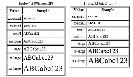 Another collection of constants (larger, smaller) are known as relative sizes. Because the font-size property is inherited from the parent element, these relative sizes are applied to the parent element to determine the font size of the current element. It is up to the browser to determine exactly how much larger or smaller the font size is, and a lot depends on how the parent element's font size is set. If it is set with one of the absolute sizes (large, for example), a child's font size of larger means that the font is rendered in the browser's x-large size. The increments are not as clear cut when the parent font size is set with a length or percentage. If you elect to use a length value for the font-size property, choose a unit that makes the most sense for fonts rendered on the output medium, such as pixels (px) for screen display and points (pt) or ems (em) for printed output. Em values are calculated relative to the size of the parent element's font size. Finally, you can set the font-size to a percentage, which is calculated based on the size of the parent element's font size. Some browsers hijack your best efforts at precisely sizing fonts, using their own (or user) settings to establish a "medium" size. That is why many designers prefer to rely on the relative-size constants for their font-size specification schemes. This choice means giving up a level of control over rendering from one browser and operating system to the next, but attempting too strict control on uniform rendering generally leads to utter frustration.
CSS Syntax -
font-size: absoluteSize | relativeSize | length | percentage
Value For an absolute size, one of the following constants: xx-small | x-small | small | medium | large | x-large | xx-large. For a relative size, one of the following constants: larger | smaller. For a length, see the discussion about length values at the beginning of this chapter. For a percentage, the percentage value and the % symbol.
Initial Value medium (for BODY element); the parent element's font-size value (for all others).
Example -
body {font-size: 14pt} p.teeny {font-size: x-small} em {font-size: larger} span.larger {font-size: 150%}
Applies To All elements.
Object Model Reference -
[window.]document.getElementById("elementID").style.fontSize
Allows an element to preserve the x-height (measured in exes) of a "first choice" font when substituting fonts. The z-factor is a ratio of the em- to x-heights of a font. Because different fonts set to the same font size can look larger or smaller than neighboring fonts on a page set to the same size, the z-factor can be used to calculate the ratio and apply it to other fonts. Even though the resulting font size may be larger or smaller than the "first choice" font setting, the perceived size is much more accurate. This also tends to equalize the horizontal metrics of fonts so that word-wrapped lines break at the same place with different font families.
CSS Syntax -
font-size-adjust: 0.47
Value A number representing the aspect value of the preferred font (perhaps obtainable from the font maker) or none.
Initial Value none
Applies To All elements.
Object Model Reference -
[window.]document.getElementById("elementID").style.fontSizeAdjust
Sets the rendered font to a letter-spacing relative of the specified font family.
CSS Syntax -
font-stretch: stretchType | normal
Value For an absolute size, one of the following constants: ultra-condensed | extra-condensed | condensed | semi-condensed | semi-expanded | extra-expanded | ultra-expanded. For a relative size, one of the following constants: narrower | wider.
Initial Value normal
Applies To All elements.
Object Model Reference -
[window.]document.getElementById("elementID").style.fontStretch
Determines whether the element is rendered in a normal (Roman), italic, or oblique font style. If the font-family includes font faces labeled Italic and/or Oblique, the setting of the font-style property summons those particular font faces from the browser's system. But if the specialized font faces are not available in the system, the normal font face is usually algorithmically slanted to look italic. Output sent to a printer with such font settings relies on the quality of arbitration between the client computer and printer to render an electronically generated italic font style. Although personal computer software typically includes other kinds of font rendering under the heading of "Style," see font-variant and font-weight for other kinds of font "styles."
CSS Syntax -
font-style: fontStyle
Value One of the following constants: normal | italic | oblique. Browsers tend to treat italic and oblique settings the same.
Initial Value normal
Example -
h2 em {font-style: italic}
Applies To All elements.
Object Model Reference -
[window.]document.getElementById("elementID").style.fontStyle
Determines whether the element should be rendered in all uppercase letters in such a way that lowercase letters of the source code are rendered in smaller uppercase letters. If a font family contains a small caps variant, the browser should use it automatically. More likely, however, the browser calculates a smaller size for the uppercase letters that take the place of source code lowercase letters. In practice, Internet Explorer for Windows prior to Version 6 renders the entire source code content as uppercase letters of the same size as the parent element's font, regardless of the case of the source code.
CSS Syntax -
font-variant: fontVariant
Value Any of the following constant values: normal | small-caps.
Initial Value normal
Example -
em {font-variant: small-caps}
Applies To All elements.
Object Model Reference -
[window.]document.getElementById("elementID").style.fontVariant
Sets the weight (boldness) of the element's font. CSS provides a weight rating scheme that is more granular than most browsers render on the screen, but the finely tuned weights may come into play when the content is sent to a printer. The scale is a numeric rating from 100 to 900 at 100-unit increments. Therefore, a font-weight of 100 is the least bold that can be displayed, whereas 900 is the boldest. A setting of normal (the default weight for any font) is equivalent to a font-weight value of 400; the standard bold setting is equivalent to 700. Other settings (bolder and lighter) let you specify a weight relative to the parent element's weight. The CSS2 specification offers guidelines about how the weight values should correspond to font family names and internal characteristics of some font definition formats. For example, the OpenType font definition format provides slots for nine font weights. In this case, the numeric font-weight property values map directly to the weight definitions in that font. If the font family contains a face with a name that contains the word Medium and one labeled Book, Regular, Roman, or Normal, the Medium face is equated with a weight value of 500 (whereas the other is at 400). All font face names including the word Bold are equated with a weight of 700. For font families that don't have all nine weights assigned, the browser should do its best to interpolate, but it is very likely that some weight values generate fonts of the same weight as other values.
CSS Syntax -
font-weight: fontWeight
Value Any of the following constant values: bold | bolder | lighter | normal | 100 | 200 | 300 | 400 | 500 | 600 | 700 | 800 | 900.
Initial Value normal
Example -
p em {font-weight: bolder}
Applies To All elements.
Object Model Reference -
[window.]document.getElementById("elementID").style.fontWeight
Sets the height of a block-level, replaced, and positioned element's content height (exclusive of borders, padding, and margins). IE for Windows counts top and bottom margins, padding, and borders when calculating the height of an element until you reach IE 6 in standards-compatibility mode (see the DOCTYPE element in Chapter 1). When observing the CSS standards, the height applies to only the content portion of an element, irrespective of borders, padding, or margins.
CSS Syntax -
height: length | percentage | auto
Value See the discussion about length values at the beginning of this chapter. The setting of auto lets the browser determine the height of the element box based on the amount of space required to display the content.
Initial Value auto
Example -
div#announce {height: 240} textarea {height: 90%}
Applies To Navigator 4, all absolute-positioned elements; Internet Explorer 4, applet, div, embed, fieldset, hr, iframe, img, input, marquee, object, span, table, and textarea elements; Internet Explorer 5, Mozilla, Safari, and Opera, all elements except nonreplaced inline elements, table column elements, and column group elements.
Object Model Reference -
[window.]document.getElementById("elementID").style.height
Controls the presence of the Input Method Editor in IE for Windows for browser and system versions that support languages such as Chinese, Japanese, and Korean.
CSS Syntax -
ime-mode: active | auto | disabled | inactive
Value One of four constants: active | auto | disabled | inactive.
Initial Value auto
Example -
input {ime-mode: active}
Applies To input and textarea elements.
Object Model Reference -
[window.]document.getElementById("elementID").style.imeMode
Increases the weight (importance) of a property setting with respect to cascading order. This keyword is a declaration rather than a property, but it can be attached to any property setting. The syntax requires an exclamation symbol between the property value and the important keyword. Extra whitespace around the exclamation symbol is acceptable. See Chapter 3.
CSS Syntax -
!important
Value No values assigned to this declaration.
Example -
p {font-size: 14pt !important}
Applies To All elements.
Object Model Reference -
[window.]document.getElementById("elementID").style.getPropertyPriority ("styleProperty")
These are Navigator 4-only properties that allow a positioned element's background color and image to extend through padding, all the way to the border. Values are the same as for the CSS background-color and background-image properties. See background-color, background-image, and padding.
Intended primarily for languages that display characters in vertical sentences, this property controls the progression of content, left-to-right, or right-to-left. Microsoft recommends using the writing-mode property instead.
CSS Syntax -
layout-flow: horizontal | vertical-ideographic
Value One of two constants: horizontal | vertical-ideographic.
Initial Value horizontal
Example -
body {layout-flow: vertical-ideographic}
Applies To All elements.
Object Model Reference -
[window.]document.getElementById("elementID").style.layoutFlow
This is a shorthand property that lets you set one or more layout grid properties (layoutGridChar, layoutGridLine, layoutGridMode, and layoutGridType) with one assignment statement. These properties are used primarily with Asian language content.
CSS Syntax -
layout-grid: layout-grid-mode | layout-grid-type | layout-grid-line | layout-grid-char
Value For syntax and examples of value types for font and line properties, see the respective property listing.
Initial Value both loose none none
Example -
body {layout-grid: both fixed 14px 14px}
Applies To All elements.
Object Model Reference -
[window.]document.getElementById("elementID").style.layoutGrid
Controls the size of the Asian language character grid for block-level elements.
CSS Syntax -
layout-grid-char: length | auto | none
Value Length value as an absolute unit measure, or a percentage. Or one of the following constants: auto | none.
Initial Value none
Example -
body {layout-grid-mode: both; layout-grid-char: 14px}
Applies To All elements.
Object Model Reference -
[window.]document.getElementById("elementID").style.layoutGridChar
Controls the line height of Asian language character grid for block-level elements.
CSS Syntax -
layout-grid-line: length | auto | none
Value Length value as an absolute unit measure, or a percentage. Or one of the following constants: auto | none.
Initial Value none
Example -
body {layout-grid-mode: both; layout-grid-line: 14px}
Applies To All elements.
Object Model Reference -
[window.]document.getElementById("elementID").style.layoutGridLine
Controls whether the Asian language character grid should be one- or two-dimensional.
CSS Syntax -
layout-grid-mode: gridMode
Value One of the following constants: both | char (for inline elements) | line (for block-level elements) | none.
Initial Value both
Example -
body {layout-grid-mode: both}
Applies To All elements.
Object Model Reference -
[window.]document.getElementById("elementID").style.layoutGridMode
Controls how the layout grid responds to characters of varying width.
CSS Syntax -
layout-grid-type: gridType
Value One of the following constants: fixed | loose | strict.
Initial Value fixed
Example -
div.kor {layout-grid-type: strict}
Applies To Block-level elements.
Object Model Reference -
[window.]document.getElementById("elementID").style.layoutGridType
For positionable elements, defines the offset position of the left margin edge of an element relative to the left edge of the next outermost block content container. When the element is relative-positioned, the offset is based on the left edge of the inline location of where the element would normally appear in the content.
CSS Syntax -
left: length | percentage | auto
Value See the discussion about length values at the beginning of this chapter. Negative lengths may be allowed in some contexts, but be sure to test the results on all browsers. You may also specify a percentage value, which is calculated based on the width of the next outermost container. The setting of auto lets the browser determine the left offset of the element box within the containing box by virtue of normal element flow.
Initial Value auto
Example -
h1 {position: relative; left: 2em} #logo {position: absolute; left: 80px; top: 30px}
Applies To Positioned elements.
Object Model Reference -
[window.]document.getElementById("elementID").style.left
Defines the spacing between characters within an element. Browsers normally define the character spacing based on font definitions and operating-system font rendering. To override the settings, assign a length value to the letter-spacing property. A negative value tightens the spacing, but test the effect on the selected font for readability on different operating systems.
CSS Syntax -
letter-spacing: length | normal
Value See the discussion at the beginning of this chapter about length values. The best results use units that are based on the rendered font size (em and ex). A setting of normal is how the browser sets the letters without any intervention.
Initial Value normal
Example -
.tight {letter-spacing: -0.03em} blockquote {letter-spacing: 1.1em}
Applies To All elements.
Object Model Reference -
[window.]document.getElementById("elementID").style.letterSpacing
Controls line-breaking rules for Japanese text.
CSS Syntax -
line-break: normal | strict
Value One of the following constants: normal | strict.
Initial Value normal
Example -
p {letter-break: strict}
Applies To Block-level elements.
Object Model Reference -
[window.]document.getElementById("elementID").style.lineBreak
Sets the height of the inline box (the box holding one physical line of content). Under normal circumstances, the line-height of the tallest font in a line of text or the tallest object governs the line height for that content line.
CSS Syntax -
line-height: normal | number | length | percentage
Value A value of normal lets the browser calculate line spacing for the entire element, thus producing a computed value that can be inherited by nested elements. A number value (greater than zero) acts as a multiplier for the font-size of the current element. Therefore, if a nested element inherits the line-height multiplier from its parent, that multiplier is applied to the current element's font-size setting (the multiplier, not the computed value of the parent, is inherited). A length value assigns an actual value to the inline box height. And a percentage value is a multiplier applied to the font size of the current element. In this case, the computer value can be inherited by nested elements.
Initial Value normal
Example -
p {line-height: normal} /* Browser default; actual value is inheritable */ p {line-height: 1.1} /* Number value; the number value is inheritable */ p {line-height: 1.1em} /* Length value; the actual value is inheritable */ p {line-height: 110%} /* Percentage value; percentage times font size */ /* is inheritable /*
Applies To All elements.
Object Model Reference -
[window.]document.getElementById("elementID").style.lineHeight
This is a shorthand property for setting up to three list-style properties in one assignment statement. Whichever properties you don't explicitly set with this property assume their initial values. These properties define display characteristics for the markers automatically rendered for list items inside ol and ul elements.
CSS Syntax -
list-style: list-style-type || list-style-position || list-style-image
Value See the individual property entries for list-style-type, list-style-position, and list-style-image for details on acceptable values for each. You may include one, two, or all three values in the list-style property setting in any order you wish.
Initial Value None.
Example -
ul {list-style: square outside none}
Applies To dd, dt, li, ol, and ul elements and any other element assigned the display: list-item style property.
Object Model Reference -
[window.]document.getElementById("elementID").style.listStyle
Provides the URL for an image that is to be used as the marker for a list item. Because this property can be inherited, a setting for an individual list item can override the same property setting in its parent.
CSS Syntax -
list-style-image: none | uri
Value For uri, supply any valid full or relative URL (in the CSS format) to an image file with a MIME type that is readable by the browser.
Initial Value none
Example -
ul {list-style-image: url(images/folder.gif)} li.file {list-style-image: url(images/doc.gif)}
Applies To dd, dt, li, ol, and ul elements and any other element assigned the display: list-item style property.
Object Model Reference -
[window.]document.getElementById("elementID").style.listStyleImage
Determines whether the marker is inside or outside (outdented) from the box containing the list item's content. When the list-style-position is set to inside and the content is text, the marker appears to be part of the text block. In this case, the alignment (indent) of the list item is the same as normal, but without the outdented marker. Figure 4-5 demonstrates the effects of both settings on wrapped list item text. Figure 4-5. Results of list-style-position settings 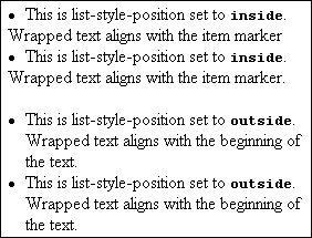
CSS Syntax -
list-style-position: inside | outside
Value Any of the constant values: inside | outside.
Initial Value outside
Example -
ul {list-style-position: inside}
Applies To dd, dt, li, ol, and ul elements and any other element assigned the display: list-item style property.
Object Model Reference -
[window.]document.getElementById("elementID").style.listStylePosition
Sets the kind of item marker to be displayed with each item. This property applies only if list-style-image is none (or not specified). The constant values available for this property are divided into two categories. One set is used with ul elements to present a filled disc, an empty circle, or a filled square; the other set is for ol elements, which have list items that can be marked in sequences of Arabic numerals, Roman numerals (uppercase or lowercase), or letters of the alphabet (uppercase or lowercase), and some other character sequences of other languages if the browser and operating system supports those languages.
CSS Syntax -
list-style-type: listStyleType
Value One constant value that is relevant to the type of list container. For ul: circle | disc | square. For ol: decimal | decimal-leading-zero | lower-roman | upper-roman | lower-greek | lower-alpha | lower-latin | upper-alpha | upper-latin | hebrew | armenian | georgian | cjk-ideographic | hiragana | katakana | hiragana-iroha | katakana-iroha. Commonly supported ol element sequences are treated as shown in the following table. Type | Example |
|---|
decimal | 1, 2, 3, ... | decimal-leading-zero | 01, 02, 03, ... | lower-alpha | a, b, c, ... | lower-greek | α, β, γ, ... | lower-roman | i, ii, iii, ... | upper-alpha | A, B, C, ... | upper-roman | I, II, III, ... |
Initial Value disc (for first level ul); decimal (for ol).
Example -
ul {list-style-type: circle} li {list-style-type: upper-roman}
Applies To dd, dt, li, ol, and ul elements and any other element assigned the display: list-item style property.
Object Model Reference -
[window.]document.getElementById("elementID").style.listStyleType
This is a shortcut property that can set the margin widths of up to four edges of an element with one statement. A margin is space that extends beyond the border of an element to provide extra empty space between adjacent or nested elements, especially those that have border properties set. You may supply one to four space-delimited margin values. The number of values determines which sides receive the assigned margins.
CSS Syntax -
margin: marginThickness | auto {1,4}
Value This property accepts one, two, three, or four values, depending on how many and which margins you want to set. Values for marginThickness can be lengths, percentages of the next outermost element size, or the auto constant. Value quantities and positions are interpreted as follows. Number of values | Effect |
|---|
1 | All four margin edges set to value | 2 | Top and bottom margins set to the first value, right and left margins set to the second value | 3 | Top margin set to first value, right and left margins set to second value, bottom margin set to third value | 4 | Top, right, bottom, and left margin set, respectively |
Initial Value 0
Example -
p.highlight {margin: 10px 20px}
Applies To All elements.
Object Model Reference -
[window.]document.getElementById("elementID").style.margin
All four properties set the width of a single margin edge of an element. A margin is space that extends beyond the element's border and is not calculated as part of the element's width or height.
CSS Syntax -
margin-bottom: marginThickness | auto margin-left: marginThickness | auto margin-right: marginThickness | auto margin-top: marginThickness | auto
Value Values for marginThickness can be lengths, percentages of the next outermost element size, or the auto constant.
Initial Value 0
Example -
blockquote {margin-left: 20; margin-top: 10} #narrowCol {margin-left: 30%; margin-right: 30%}
Applies To All elements.
Object Model Reference -
[window.]document.getElementById("elementID").style.marginBottom [window.]document.getElementById("elementID").style.marginLeft [window.]document.getElementById("elementID").style.marginRight [window.]document.getElementById("elementID").style.marginTop
Controls the space between list item markers (which occupy their own box in the CSS box model) and the box that contains the list item text. Requires that the list item elements be set to a display style marker.
CSS Syntax -
marker-offset: length | auto
Value A length value (see the discussion of length values at the beginning of this chapter), or the auto constant.
Initial Value auto
Example -
li:before {display: marker; marker-offset: 4em}
Applies To List elements set to marker display mode (generally with a :before or :after pseudo-class).
This is a page context property that sets whether the page should be rendered with crop or registration marks outside of the page content area. This property must be set within an @page rule. See "At-Rules," earlier in this chapter for details on deploying this type of style rule.
CSS Syntax -
marks: markType | none
Value Available markType values are the following constant values: crop | cross. A crop mark shows where pages should be trimmed; a cross mark is used for alignment and registration.
Initial Value none
Example -
@page {marks: crop}
Applies To Page context.
Object Model Reference -
[window.]document.getElementById("elementID").style.marks
These properties let you establish a maximum and/or minimum height for an element's box. You can bracket the permissible height of an element regardless of the height caused by the natural flow of the content. When you set the max-height property of an element that has content that may extend beyond that maximum, you should also set the overflow style property to hidden so that excess content is cropped. Failure to do so causes the overflowing content to bleed into the succeeding elements' content. Any box enhancements (borders, background color, etc.) shrink or expand to meet the requirements of the content or (if there isn't enough content to fill the box) minimum height. Internet Explorer 6 supports only the min-height property, and is limited to td, th, and tr elements inside a table with its table-layout style property is set to fixed. This conflicts with the CSS2 specification, which explicitly excludes table-related elements from being influenced by these properties. IE 7, however, implements both properties correctly when running in CSS compatibility mode (i.e., with a modern DOCTYPE declaration). IE 5 for Macintosh supports neither property.
CSS Syntax -
max-height: length | percentage | none min-height: length | percentage | none
Value See the discussion of length values at the beginning of the chapter. The value may also be a percentage that is calculated relative to the element's container. A value of none removes all constraints, allowing the content to flow naturally.
Initial Value none (max-width); none (min-width).
Applies To See text.
Object Model Reference -
[window.]document.getElementById("elementID").style.minHeight [window.]document.getElementById("elementID").style.maxHeight
These properties let you establish a minimum and/or maximum width for an element. You can bracket the permissible width of an element regardless of the width caused by the natural flow of the content within a parent container. IE 7 must run in CSS compatibility mode to use these properties
CSS Syntax -
max-width: length | percentage | none min-width: length | percentage | none
Value See the discussion of length values at the beginning of the chapter. The value may also be a percentage that is calculated relative to the element's container. A value of none removes all constraints, allowing the content to flow naturally.
Initial Value none (max-width); none (min-width).
Applies To All elements.
Object Model Reference -
[window.]document.getElementById("elementID").style.minWidth [window.]document.getElementById("elementID").style.maxWidth
This is a shortcut property that lets you set the radius of one or more border corners. The number of values determines which sides receive the assigned colors. Note that this value arrangement differs from the preliminary CSS3 border-radius property value setup.
CSS Syntax -
-moz-border-radius: radius {1,4}
Value A border corner radius can be defined by a length measure, signifying the length of the radius of the imaginary circle from which the rounded corner comes. The larger the value, the more rounded the corner becomes. For screen display, the pixel length unit is most appropriate. You may also use a percentage value in the range between 0% (no rounding) to 50% (maximum rounding). The rounded border does not crop content of the element. This property accepts one, two, three, or four radius values, depending on how many and which corners you want to make round. Value quantities and positions are interpreted as shown in the following table. Number of values | Effect |
|---|
1 | All four corners set to same value | 2 | Top left and bottom right corners set to the first value, top right and bottom left corners set to the second value | 3 | Top left corner set to first value, top right and bottom left corners set to second value, bottom right corner set to third value | 4 | Top left, top right, bottom right, and bottom left corners set, respectively |
Initial Value 0
Example -
div.hotbox {-moz-border-radius: 20px} div.circle {-moz-border-radius: 50%}
Applies To All elements.
Controls the radius of one border corner. Note that the value arrangement differs from the preliminary CSS3 corner-specific border-radius property value setup.
CSS Syntax -
-moz-border-radius-bottomleft: radius -moz-border-radius-bottomright: radius -moz-border-radius-topleft: radius -moz-border-radius-topright: radius
Value See -moz-border-radius.
Initial Value 0
Example -
div.bizarro {-moz-border-radius-topright:10%; -moz-border-radius-bottomright:10% }
Applies To All elements.
Controls the level of opacity of the element. The lower the value, the more transparent the element becomes. This is a proprietary Mozilla property that was joined by the CSS3 opacity property in Mozilla 1.7.2.
CSS Syntax -
-moz-opacity: alphaValue
Value The level of opacity is determined by a floating-point number between 0.0 and 1.0. A completely opaque rendering occurs at a value of 1.0. Percentage values supported in earliest Mozilla versions have been dropped.
Initial Value 1
Example -
div#watermark {-moz-opacity: 0.4}
Applies To All elements.
Object Model Reference -
[window.]document.getElementById("elementID").style.MozOpacity
Controls the level of opacity of the element. The lower the value, the more transparent the element becomes. Although the property is technically not inherited, the opacity of all child elements of a container are governed by the setting of the parent container.
CSS Syntax -
opacity: alphaValue
Value The level of opacity is determined by a floating-point number between 0.0 and 1.0. A completely opaque rendering occurs at a value of 1.0.
Initial Value 1
Example -
div#watermark {opacity: 0.35}
Applies To All elements.
Object Model Reference -
[window.]document.getElementById("elementID").style.opacity
Sets the minimum number of lines of the start of a paragraph that must be visible at the bottom of a page where a page break occurs. See the widows property for lines to be displayed at the top of a page after a page break.
CSS Syntax -
orphans: lineCount
Value An integer of the number of lines.
Initial Value 2
Applies To Block-level elements.
Object Model Reference -
[window.]document.getElementById("elementID").style.orphans
This is a shorthand property for setting the width, style, and/or color of all four edges of an outline around an element in one assignment statement. Properties that you don't explicitly set with this property assume their initial values. An outline differs from a border in two primary ways. First, an outline does not occupy space in the CSS box model. Rather, the outline simply hovers atop the element, drawn just beyond the border rectangle. Second, CSS does not restrict an outline to be rectangular, allowing an outline to follow the irregular outline of an unjustified paragraph, for example. IE 5 for the Macintosh draws only rectangular outlines. For earlier versions of Mozilla, a full set of CSS2 outline properties is available with the -moz- prefix (e.g., -moz-outline-color), as well as further proprietary extensions for outline radius corners similar to the -moz-border-radius property.
CSS Syntax -
outline: border-color || border-style || outline-width
Value See the respective properties in the following sections.
Initial Value None.
Example -
blockquote {outline: darkred ridge 5px}
Applies To All elements.
Object Model Reference -
[window.]document.getElementById("elementID").style.outline
Controls the color of an outline around an element.
CSS Syntax -
outline-color: color
Value A CSS color value. One value controls all sides of the outline. The CSS specification also calls for a constant called invert, which performs an algorithmic inversion of the background color, but this value is not supported in IE 5 Mac.
Initial Value In IE 5 for Macintosh, black. The CSS2 specification suggests invert as a default.
Example -
h2 {outline-color: salmon} div {outline-color: rgb(0,0,255)}
Applies To All elements.
Object Model Reference -
[window.]document.getElementById("elementID").style.outlineColor
Controls the distance beyond the element's border (equally in each direction) where the outline is drawn.
CSS Syntax -
outline-offset: length
Value A CSS length value. One value controls all sides of the outline.
Initial Value 0
Example -
h2 {outline-offset: 3px}
Applies To All elements.
Object Model Reference -
[window.]document.getElementById("elementID").style.outlineOffset
Controls the style of an outline around an element. These are the same edge designs as border styles.
CSS Syntax -
outline-style: borderStyle
Value Style values are constants that are associated with specific ways of rendering border lines. See border-style for a list and illustration. One value controls all sides of the outline.
Initial Value none
Example -
h2 {outline-style: solid} div {outline-style: groove}
Applies To All elements.
Object Model Reference -
[window.]document.getElementById("elementID").style.outlineStyle
Controls the thickness of an outline around an element. To prevent surrounding content from rendering under the outline, you should consider adding a margin around the element.
CSS Syntax -
outline-width: thin | medium | thick | length
Value Three constantsthin | medium | thickallow the browser to define exactly how many pixels are used to show the outline. For more precision, you can also assign a length value (see the discussion of length values at the beginning of this chapter). One value controls all sides of the outline.
Initial Value medium
Example -
h1 {outline-style: ridge; outline-width: 5px} div {outline-style: solid; outline-width: 2px}
Applies To All elements.
Object Model Reference -
[window.]document.getElementById("elementID").style.outlineWidth
Defines how the element treats content with rendered dimensions that exceed the specified height and/or width of the container. Except for some types of content that demand a fixed width (a pre element, for instance), the default behavior of an element is to respect the width property setting and handle the issue of overflow in the height of the element. Assigning the overflow property to the body element in an attempt to control the display of scroll bars is risky business for cross-browser compatibility. Test your overflow code thoroughly on IE for Windows (in quirks and standards-compatible modes). A setting of visible causes the containing block to expand to allow the full width (if fixed) and height of the content to be displayed. If borders, margins, and padding are set for the element, they are preserved around the expanded content block. If the element has height and width specified, as well as a background image or color, and if the content extends beyond the specified size, the results vary with browser family. IE for Windows in quirks mode expands the height of the background to accommodate the content, pushing succeeding content downward to accommodate the overflowing content. Recent browsers and IE 7 in standards-compatibility mode constrain the background rectangle to the specified size, but the content bleeds beyond the rectangle, and overlaps content that comes after the overflowing element. Because this is the default value for the overflow style property, it is best to specify some other overflow value (or clipping rectangle for a positioned element) whenever you restrict the size of an element. A setting of hidden forces the block to observe its height and width settings, potentially causing the content to be clipped by the size of the block. Borders and padding are preserved, but margins may be lost along the edges that clip the content. No scrollbars appear with this value. A setting of scroll usually generates a set of horizontal and vertical scrollbars inside the rectangle of the content block, whether they're needed or not. The bars become active only if the content actually requires scrolling in any direction. A setting of auto should generate scroll bars only if the content in the block requires it. In practice, browsers tend to add only a vertical scrollbar when the content is text that can adjust to the specified width of its container.
CSS Syntax -
overflow: overFlowType
Value Any of the following constants: auto | hidden | scroll | visible.
Initial Value visible
Example -
div.aside {position: absolute; top: 200px; left: 10px; height: 100px; width: 150px; overflow: scroll}
Applies To Block-level, replaced, and positioned elements.
Object Model Reference -
[window.]document.getElementById("elementID").style.overflow
Defines how the element treats content with rendered dimensions that exceed the specified width (x) or height (y) of the container. The operation of this property is the same as the regular overflow property, but each one operates along a single axis. This is particularly helpful if you want to have only a vertical or only a horizontal scrollbar appear with an element. See the overflow property discussion.
CSS Syntax -
overflow-x: overFlowType overflow-y: overFlowType
Value Any of the following constants: auto | hidden | scroll | visible.
Initial Value visible
Example -
body {overflow-x: hidden; overflow-y: scroll}
Applies To Block-level, replaced, and positioned elements.
Object Model Reference -
[window.]document.getElementById("elementID").style.overflowX [window.]document.getElementById("elementID").style.overflowY
This is a shortcut property that can set the padding widths of up to four edges of an element with one statement. Padding is space that extends around the content box of an element up to but not including any border that may be specified for the element. Padding picks up the background image or color of its element. As you add padding to an element, you increase the size of the visible rectangle of the element without affecting the content block size. You may supply one to four space-delimited padding values. The number of values determines which sides receive the assigned padding.
CSS Syntax -
padding: paddingThickness {1,4}
Value This property accepts one, two, three, or four values, depending on how many and which sides you want to assign padding to. Values for paddingThickness can be lengths or percentages of the next outermost element size. Value quantities and positions are interpreted as follows. Number of values | Effect |
|---|
1 | All four padding edges set to value | 2 | Top and bottom padding set to the first value, right and left padding set to the second value | 3 | Top padding set to first value, right and left padding set to second value, bottom padding set to third value | 4 | Top, right, bottom, and left padding set, respectively |
Initial Value 0; IE for Windows specifies a default value of 1 for td and th elements.
Example -
p.highlight {padding: 10px 20px}
Applies To All elements (IE 5 for Macintosh, IE 5.5 for Windows, and W3C browsers); body, caption, div, iframe, marquee, table, td, textarea, tr, and elements (IE 5 and earlier for Windows). CSS2.1 deletes support for tr, thead, tbody, tfoot, col, and colgroup elements.
Object Model Reference -
[window.]document.getElementById("elementID").style.padding
All four properties set the padding width of a single side of an element. Padding is space that extends around the content box of an element up to but not including any border that may be specified for the element. Padding picks up the background image or color of its element. As you add padding to an element, you increase the size of the visible rectangle of the element without affecting the content block size.
CSS Syntax -
padding-bottom: paddingThickness padding-left: paddingThickness padding-right: paddingThickness padding-top: paddingThickness
Value Values for paddingThickness can be lengths or percentages of the next outermost container size.
Initial Value 0; IE for Windows specifies a default value of 1 for td and th elements.
Example -
blockquote {padding-left: 20; padding-top: 10} #narrowCol {padding-left: 30%; padding-right: 30%}
Applies To All elements (IE 5 for Macintosh, IE 5.5 for Windows, and W3C browsers); body, caption, div, iframe, marquee, table, td, textarea, tr, and elements (IE 5 and earlier for Windows). CSS2.1 deletes support for tr, thead, tbody, tfoot, col, and colgroup elements.
Object Model Reference -
[window.]document.getElementById("elementID").style.paddingBottom [window.]document.getElementById("elementID").style.paddingLeft [window.]document.getElementById("elementID").style.paddingRight [window.]document.getElementById("elementID").style.paddingTop
Lets you connect a block-level element to an @page rule through an identifier assigned to the rule.
CSS Syntax -
page: pageRuleIdentifier | auto
Value The pageRuleIdentifier value is the name given to an @page rule in the same document.
Initial Value auto
Example -
table#results {page: printTable}
Applies To Block-level elements.
Object Model Reference -
[window.]document.getElementById("elementID").style.page
Defines how content should treat a page break around an element when the document is sent to a printer. Page breaks are not rendered in the visual browser as they may be in word processing programs; on screen, long content flows in one continuous scroll. Proper handling of pages for printers relies on the CSS2 concept of the page box, which is a rectangular region that ultimately reaches a printed page. Page break style properties help the browser control the precise content of each page box. Without any assistance (or with the auto setting), the browser divides pages for printing much as it has in the past by doing a best-fit for the content to fill up as much of each page as there is space for it. To force a page break above an element, associate a page-break-before: always style setting with the element. Similarly, to force a break after an element, use page-break-after: always. For example, if you want a special class of br elements to break after them, you could set up a class selector style rule as follows: <style type="text/css"> br.pageEnd {display: block; page-break-after: always} </style>
Then, whenever you want to force a page break in the document, include the following tag: <br >
Property settings for left and right assume that the browser is equipped to detect left-facing from right-facing pages for double-sided printing (as specified in CSS2). Because you are likely to set different margins for each side of the gutter, indicating how pages break to start a new section requires forcing sufficient page breaks to plant new sections on the desired page. For example, if you want each H1 element to begin on a right-facing page, you would set a page break style for it as follows: h1 {page-break-before: right}
This property forces the browser to at least one and at most two page breaks before the H1 element to make sure it starts on a right-facing page. When the browser generates a second page break for the left or right value, it means that the browser generates a blank page box for the second page break. Implementation of these properties is somewhat limited. Most modern browsers support always and auto, while Opera 9 correctly supports right and left.
CSS Syntax -
page-break-after: breakType page-break-before: breakType
Value Four constant values: always | auto | left | right (but treats left and right the same as always). CSS2 adds avoid, which urges the browser to avoid breaking the page in that element if at all possible.
Initial Value auto
Example -
div.titlePage {page-break-before: always; page-break-after: always}
Applies To Block-level elements.
Object Model Reference -
[window.]document.getElementById("elementID").style.pageBreakAfter [window.]document.getElementById("elementID").style.pageBreakBefore
Defines whether a printed page break is allowed within an element. Especially useful to define a container of multiple block elements that you want to keep printed on the same page.
CSS Syntax -
page-break-inside: breakType
Value One of two constant values: avoid | auto.
Initial Value auto
Example -
div.together {page-break-inside: avoid}
Applies To Block-level elements.
For aural style sheets, this is a shorthand property for setting both pause-after and pause-before properties in one statement. You may supply one or two values for this property.
CSS Syntax -
pause: time | percentage {1,2}
Value This property accepts one or two values, depending on the values you want to assign to the pause-before and pause-after settings. A single value of the pause property is applied to both pause-before and pause-after. When two values are supplied, the first is assigned to pause-before; the second is assigned to pause-after. Values for time are floating-point numbers followed by either the ms (milliseconds) or s (seconds) unit identifier. These settings are therefore absolute durations for pauses. Values for percentage are inversely proportional to the words-per-minute values of the speech-rate property setting. Because the speech-rate controls how long it takes for a single word (on average), a pause setting of 100% means that a pause has the same duration as a single word; a setting of 50% would be a pause of one-half the duration of speaking a single word.
Initial Value Depends on the browser.
Applies To All elements.
For aural style sheets, these set the duration of a pause after or before the current element. You can assign both properties to the same element to designate pauses before and after the element is spoken.
CSS Syntax -
pause-after: time | percentage pause-before: time | percentage
Value Values for time are floating-point numbers followed by either the ms (milliseconds) or s (seconds) unit identifier. These settings are therefore absolute durations for pauses. Values for percentage are inversely proportional to the words-per-minute values of the speech-rate property setting. Because the speech-rate controls how long it takes to speak a single word (on average), a pause setting of 100% means that a pause has the same duration as a single word; a setting of 50% would be a pause of one-half the duration of speaking a single word.
Initial Value Depends on the browser.
Applies To All elements.
For aural style sheets, this sets the average pitch frequency of the voice used for text-to-speech output.
CSS Syntax -
pitch: frequency | frequencyConstant
Value A frequency value is any positive floating-point number followed by either the Hz (Hertz) or kHz (kiloHertz) units, as in 500Hz or 5.5kHz. Alternatively, you can use any of the following constant values: x-low | low | medium | high | x-high. As of the CSS2 working draft available for this book, no specific frequency values had yet been assigned to these constants.
Initial Value medium
Applies To All elements.
For aural style sheets, this sets the range over which the average pitch frequency of a text-to-speech voice varies.
CSS Syntax -
pitch-range: number
Value Any positive number or zero. A value of 0 is a monotone voice; a value of 50 should offer a normal range; values above 50 might sound animated.
Initial Value 50
Applies To All elements.
For aural style sheets, this sets the sound-mixing properties of a background sound with a text-to-speech rendering of the element's content.
CSS Syntax -
play-during: uri [mix | repeat] | auto | none
Value The uri value is a link to the sound file to be used as background sound (if desired). Optionally, you can specify that the background sound of the parent element's play-during property is started and mixed with the current element's background sound. If the length of the background sound is shorter than it takes for the element's text to be spoken, the repeat constant tells the browser to repeat the sound until the spoken text has finished. A value of auto means that the parent element's sound continues to play without interruption. And a value of none means that no background sound (from the current or parent element) is heard for this element.
Initial Value auto
Applies To All elements.
Sets whether the element is positionable, and if so, what type of positionable element it is. The two primary types of positionable elements are set with values relative and absolute, with a third type, fixed, applicable to only some browsers. See Chapter 5 for details and examples.
CSS Syntax -
position: positionConstant
Value Browsers and the CSS standard recognize different sets of constant values for this property, as shown in this table. Value | IE/Windows | IE/Mac | NN | Others |
|---|
absolute | 4 | 4 | 4 | all | fixed | 7 | 5 | 6 | all | relative | 4 | 4 | 4 | all | static | 4 | 4 | 6 | all |
The static value is essentially an unpositioned element, one that flows in the normal rendering sequence of the body content. A fixed-position element is positioned relative to the window (viewport), and remains in its specified location even as the content scrolls underneath it.
Initial Value static
Applies To All elements.
Object Model Reference -
[window.]document.getElementById("elementID").style.position
Notes Navigator 4 treats elements that set the CSS position property in the following ways: an absolute-positioned element is turned into the same kind of element as that created as a layer element; a relative-positioned element is turned into the same kind of element as that created as an ilayer element. There are some subtle differences between the actual elements and the simulated version, resulting in more reliable behavior in Navigator 4 when the actual layer and ilayer elements were deployed.
Controls the characters to be generated for open and close quote symbols in text. The assumption is that the quote symbols are not part of the content, but are generated by the browser because of contextual clues (such as surrounding a quote with a q element). This property must be used with the content property, which, with the help of the :before and :after pseudo-classes, determines where the open-quote and end-quote symbols appear: q {quotes: "«" "»" "'" "'"} q:before {content: open-quote} q:after {content: close-quote}
CSS Syntax -
quotes: openString closeString [nestedOpenString nestedCloseString] | none
Value One or two pairs of quoted symbols. The optional second pair defines the symbols used for a nested quote symbol. Entity characters are not permitted.
Initial Value Depends on browser and system language.
Applies To All elements.
Object Model Reference -
[window.]document.getElementById("elementID").style.quotes
Notes Support in browsers isn't as good as indicated above. IE 5 for the Macintosh doesn't genuinely respond to the quotes property, but does substitute standard two-level quotes for the content property. Mozilla implements only the first level of quotes. Symbol characters outside the ASCII set may not align with the characters you put into the source code with your text editor. Verify the results before deploying this property.
For aural style sheets, this sets the brightness (stridency) of the voice used in text-to-speech rendering of the element.
CSS Syntax -
richness: number
Value A positive floating-point number to represent how strident the voice sounds. A value of 50 is normal. Lower values produce a softer, mellower voice; higher values produce a louder, more forceful voice.
Initial Value 50
Applies To All elements.
For positionable elements, this defines the position of the right margin edge of an element box relative to the right edge of the next outermost block content container. When the element is relative-positioned, the offset is based on the right edge of the inline location of where the element would normally appear in the content.
CSS Syntax -
right: length | percentage | auto
Value See the discussion about length values at the beginning of this chapter. Negative lengths may be allowed in some contexts, but be sure to test the results on all browsers. You may also specify a percentage value, which is calculated based on the width of the next outermost container. Note, however, that the results you get may seem like the inverse of what you expect: a value of 0% means that the right edge is flush against the right edge of the positioning context, whereas a value of 100% could push the element completely out of view to the left. The setting of auto lets the browser determine the right offset of the element box on its naturally flowing offset within the containing box.
Initial Value auto
Applies To Positioned elements.
Object Model Reference -
[window.]document.getElementById("elementID").style.right
Controls alignment of content in a ruby element.
CSS Syntax -
ruby-align: alignType | auto
Value One of the following constants: auto | center | distribute-letter | distribute-space | left | line-edge | right. For more details on ruby-related styles, visit http://www.w3.org/TR/css3-ruby.
Initial Value auto
Applies To IE limits this style to ruby elements only, but the preliminary CSS3 specification suggests it can apply to any element that contains ruby text (and is thus inheritable in that context).
Object Model Reference -
[window.]document.getElementById("elementID").style.rubyAlign
Controls text overhang characteristics of content in a ruby element.
CSS Syntax -
ruby-overhang: alignType | auto
Value One of the following constants: auto | none | whitespace. For more details on ruby-related styles, visit http://www.w3.org/TR/css3-ruby.
Initial Value auto
Applies To ruby elements (or any element that has its display property set to ruby-text).
Object Model Reference -
[window.]document.getElementById("elementID").style.rubyOverhang
Controls whether nested ruby (rt element) text renders on the same line or above its related ruby base (rb element) text.
CSS Syntax -
ruby-position: positionType
Value IE recognizes one of the following constants, above | inline, while the preliminary CSS3 specification prefers these constants: after | before | inline | right. For more details on ruby-related styles, visit http://www.w3.org/TR/css3-ruby.
Initial Value above (IE); before (CSS3).
Applies To ruby elements (or any element that has its display property set to ruby-text).
Object Model Reference -
[window.]document.getElementById("elementID").style.rubyPosition
Controls the colors for specific components of a scrollbar user interface element associated with scrollable elements. The following table describes which pieces of a scroll bar are controlled by each property. Property | Description |
|---|
scrollbar-3dlight-color | Top and left edges of the scroll slider and arrow button boxes | scrollbar-arrow-color | Arrows inside arrow button boxes | scrollbar-base-color | Overall hue of the scroll bar | scrollbar-darkshadow-color | Right and bottom edges of the scroll slider and arrow button boxes | scrollbar-face-color | Forward flat surfaces (e.g., front-facing panel of slider) and alternating pixels of the track | scrollbar-highlight-color | Normally white pixels that create 3D effects, plus alternating pixels of the track | scrollbar-shadow-color | Slighlty thicker edges controlled by scrollbar-darkshadow-color | scrollbar-track-color | Entire track, as solid version of specified color |
You can experiment with combinations of multiple scroll bar pieces and colors.
CSS Syntax -
scrollbar-3dlight-color: color scrollbar-arrow-color: color scrollbar-base-color: color scrollbar-darkshadow-color: color scrollbar-face-color: color scrollbar-highlight-color: color scrollbar-shadow-color: color scrollbar-track-color: color
Value CSS color values.
Initial Value Varies with user Display control panel settings.
Example -
textarea {scrollbar-face-color: lightyellow}
Applies To applet, bdo, body, custom, div, embed, object, and textarea elements.
Object Model Reference -
[window.]document.getElementById("elementID").style.scrollbar3dLightColor [window.]document.getElementById("elementID").style.scrollbarArrowColor [window.]document.getElementById("elementID").style.scrollbarBaseColor [window.]document.getElementById("elementID").style.scrollbarDarkShadowColor [window.]document.getElementById("elementID").style.scrollbarFaceColor [window.]document.getElementById("elementID").style.scrollbarHighlightColor [window.]document.getElementById("elementID").style.scrollbarShadowColor [window.]document.getElementById("elementID").style.scrollbarTrackColor
Sets the size and/or orientation of a page box. Intended primarily for printed page formatting, the settings may not affect how content is cropped or oriented on the video screen. This property is set within an @page declaration.
CSS Syntax -
size: [length {1,2}] auto | portrait | landscape
Value If you specify one or two length values, the page box becomes absolute regardless of the paper sheet size; without specific length values, the page box is sized relative to the selected paper sheet size. If you supply only one length value, it is applied to both the width and height of the page box; if there are two values, the first controls the page box width and the second controls the page box height. Bear in mind that printers frequently impose a minimum margin around the rendered page box. Even when the size property is set to auto, you can add more breathing space around the page box by adding a margin property to the @page declaration.
Initial Value auto
Example -
@page{size: landscape}
Applies To Page context.
For aural style sheets, this specifies whether a browser equipped for text-to-speech should speak the element's content, and if so, whether the speech should be as words or spelled out character-by-character.
CSS Syntax -
speak: speechType
Value Three possible constant values: none | normal | spell-out. A value of none means that speech is turned off. The browser does not delay over the duration of the speech and any specified pauses (see the volume: silent property value). A value of normal turns on speech and reads the text as words. A value of spell-out turns on speech and reads the content letter-by-letter (certainly applicable to abbr and acronym elements).
Initial Value normal
Applies To All elements.
For text-to-speech-capable browsers, this specifies whether the browser calls out the name of a table cell's header prior to the cell's value every time that value is read aloud or just one time for all adjacently read cells that share the same header (e.g., navigating downward through a table column).
CSS Syntax -
speak-header: headerFrequency
Value Two possible constant values: once | always.
Initial Value once
Applies To th elements.
For aural style sheets, this sets whether numbers are to be read as individual numerals ("one four two") or as full numbers (e.g., "One hundred forty-two"). The language used for the spoken numbers is set with the element's lang property.
CSS Syntax -
speak-numeral: numeralType
Value Two possible constant values: digits | continuous.
Initial Value continuous
Applies To All elements.
For aural style sheets, this sets whether punctuation symbols should be read aloud ("period") or interpreted as the language's natural pauses for the various symbols.
CSS Syntax -
speak-punctuation: punctuationType
Value Two possible constant values: code | none. A value of code means that a symbol name is spoken when the symbol is encountered in element text.
Initial Value none
Applies To All elements.
For aural style sheets, this sets the number of words per minute of the text-to-speech output.
CSS Syntax -
speech-rate: wordsPerSecond | speedConstant
Value A wordsPerSecond value is any positive floating-point number with no unit appended. Alternatively, you can use any of the following constant values. Value | Meaning |
|---|
x-slow | 80 words per minute | slow | 120 words per minute | medium | 180200 words per minute | fast | 300 words per minute | x-fast | 500 words per minute | slower | Current rate minus 40 words per minute | faster | Current rate plus 40 words per minute |
Initial Value medium
Applies To All elements.
For aural style sheets, this sets the amount of stress (inflection) in the spoken voice.
CSS Syntax -
stress: stressLevel
Value A stressLevel value is any positive floating-point number with no unit appended. A value of 50 is normal.
Initial Value 50
Applies To All elements.
Determines whether the browser uses computed heights and widths of the entire table's data to begin rendering the table or relies on the table element's size properties and uses the first row's cell widths to begin rendering table content. When the property is set to auto, the browser must load all of the table cells and their content before the first row of data can be rendered, causing a brief (but perhaps imperceptible) delay in drawing the table. Setting the value to fixed allows table rendering to begin sooner, which is helpful for large tables. If content in succeeding rows is wider than the fixed column size, the content is usually clipped unless you set the overflow style property to visible (but that will likely make a visual jumble in adjacent cells).
CSS Syntax -
table-layout: layoutType
Value Two possible constant values: auto | fixed.
Initial Value auto
Applies To table elements.
Determines the horizontal alignment of text within an element. This property is inherited, so it can be set for a container to impact all nested elements, such as a p element within a div element. Values of center, left, and right are supported across the board. The value of justify is not a CSS requirement, but it works in IE 5 or later and other mainstream browsers.
CSS Syntax -
text-align: alignment
Value One of the four constants: center | justify | left | right.
Initial Value Depends on browser language.
Example -
p.rightHand {text-align: right} blockquote {text-align: justify}
Applies To Block-level elements, but right-alignment also works in text-type input and textarea elements in IE 5 and later for Windows, Mozilla, Safari, and Opera.
Object Model Reference -
[window.]document.getElementById("elementID").style.textAlign
Controls the horizontal alignment of the last line of text within an element's box.
CSS Syntax -
text-align-last: alignment
Value One of the following constants: auto | center | justify | left | right. The value of auto picks up the inherited text-align property.
Initial Value auto
Example -
blockquote {text-align-last: center}
Applies To Block-level elements.
Object Model Reference -
[window.]document.getElementById("elementID").style.textAlignLast
Controls the spacing between ideographic (typically Asian languages) and nonideographic characters.
CSS Syntax -
text-autospace: spacingType
Value One of the following constants: ideograph-alpha | ideograph-numeric | ideograph-parenthesis | ideograph-space | none.
Initial Value none
Example -
div {text-autospace: ideograph-numeric}
Applies To All elements.
Object Model Reference -
[window.]document.getElementById("elementID").style.textAutospace
Specifies additions to the text content of the element in the form of underlines, strikethroughs, overlines, and (in Navigator and CSS) blinking. You may specify more than one decoration style by supplying values in a space-delimited list. Thankfully, mainstream browsers ignore the blink setting. Navigator 4 does not recognize the overline decoration. Text decoration has an unusual parent-child relationship. Values are not inherited, but the effect of a decoration carries over to nested items. Therefore, unless otherwise overridden, an underlined p element underlines a nested span element within, for example.
CSS Syntax -
text-decoration: decorationStyle | none
Value In addition to none, any of the following four constants: blink | line-through | overline | underline, but Mozilla ignores blink.
Initial Value none
Example -
div.highlight {text-decoration: underline}
Applies To All elements.
Object Model Reference -
[window.]document.getElementById("elementID").style.textDecoration [window.]document.getElementById("elementID").style.textDecorationBlink [window.]document.getElementById("elementID").style.textDecorationLineThrough [window.]document.getElementById("elementID").style.textDecorationNone [window.]document.getElementById("elementID").style.textDecorationOverLine [window.]document.getElementById("elementID").style.textDecorationUnderline
Sets the size of indenting of the first line of a block of inline text (such as a p element). Only the first line is affected by this setting. A negative value can be used to outdent the first line, but be sure the text does not run beyond the left edge of the browser window or frame.
CSS Syntax -
text-indent: length | percentage
Value See the discussion about length values at the beginning of this chapter. Negative lengths may be allowed in some contexts, but be sure to test the results on all browsers. You may also specify a percentage value, which is calculated based on the width of the next outermost container.
Initial Value 0
Example -
body {text-indent: 2em} p.firstGraphs {text-indent: 0}
Applies To Block-level elements.
Object Model Reference -
[window.]document.getElementById("elementID").style.textIndent
Controls detailed character distribution techniques for any block-level element that has its text-align CSS property set to justify. This property is designed primarily for Asian or other non-Latin languages.
CSS Syntax -
text-justify: justificationType
Value One of the constants shown in the following table. Value | Meaning |
|---|
auto | Lets browser choose best type | distribute | Similar to newspaper but optimized for Asian languages | distribute-all-lines | Justifies lines, including the last line, leading to potentially very wide word spacing | distribute-center-last | Justifies lines but centers the last line (not implemented) | inter-cluster | Justifies lines lacking word spacing | inter-ideograph | Justifies lines consisting of ideographs | inter-word | Justifies lines by distributing padded space between words (common for Latin languages) | kashida | Justifies Arabic script through elongated strokes (IE 5.5 or later required) | newspaper | Justifies lines by distributing padded space between words and between characters |
Initial Value 0
Example -
div#col1 {text-align: justify; text-justify: newspaper}
Applies To Block-level elements.
Object Model Reference -
[window.]document.getElementById("elementID").style.textJustify
For Arabic text in a block-level element with text alignment style set to justify, controls the ratio of kashida expansion to whitespace expansion.
CSS Syntax -
text-kashida-space: length | percentage
Value See the discussion about length values at the beginning of this chapter. You may also specify a percentage value, which is calculated based on the width of the next outermost container.
Initial Value 0%
Example -
div#col1 {text-align: justify; text-justify: newspaper; text-kashida-space: 5%}
Applies To Block-level elements.
Object Model Reference -
[window.]document.getElementById("elementID").style.textKashidaSpace
Controls whether text content that overflows a fixed box space should display an ellipsis ( . . . ) at the end of the line to indicate more text is available. The element should also have its overflow style property set to hidden. Opera 9 implements a proprietary version of this property: -o-text-overflow.
CSS Syntax -
text-overflow: overflowType
Value One of two constants: clip | ellipsis.
Initial Value clip
Example -
td {overflow: hidden; white-space: nowrap; text-overflow: ellipsis}
Applies To Block-level elements.
Object Model Reference -
[window.]document.getElementById("elementID").style.textOverflow
Sets shadow effects for the text of the current element. A text element can have more than one shadow, and each shadow can have its own color, vertical offset, horizontal offset, and blur radius. Each shadow exists in its own minilayer, stacked with the first shadow specification at the bottom of the heap. Values for each shadow are space-delimited, and multiple shadow value sets are comma-delimited.
CSS Syntax -
text-shadow: [color] horizLength vertLength blurRadiusLength, [[color] horizLength vertLength blurRadiusLength] | none
Value If you omit the color property value, the shadow uses the element's color property value (which may, itself, be inherited). The color property can be placed before or after whatever length values are set for a shadow. See the discussion of color values at the beginning of this chapter. Values for horizLength and vertLength are length values (see the beginning of this chapter), and their sign indicates the direction the shadow offset takes from the element text. For the horizLength value, a positive value places the shadow to the right of the element; a negative value to the left. For the vertLength value, a positive value places the shadow below the text; a negative value places it above. A blur radius is a length value (see the beginning of this chapter) that specifies the extent of the shadow from the edge of the text characters.
Initial Value none
Applies To All elements.
Controls the capitalization of the element's text. When a value other than none is assigned to this property, the cases of all letters in the source text are arranged by the style sheet, overriding the case of the source text characters.
CSS Syntax -
text-transform: caseType | none
Value A value of none allows the case of the source text to be rendered as-is. Other available constant values are capitalize | lowercase | uppercase. A value of capitalize sets the first character of every word to uppercase. The values lowercase and uppercase render all characters of the element text in their respective cases.
Initial Value none
Example -
h2 {text-transform: capitalize}
Applies To All elements.
Object Model Reference -
[window.]document.getElementById("elementID").style.textTransform
Controls whether an underline (i.e., an element with a text-decoration style set to underline) is rendered above or below the text. Applicable primarily to Asian languages rendered in vertical columns.
CSS Syntax -
text-underline-position: positionType | none
Value IE 5.5 recognizes two constant values: above | below. IE 6 adds the values auto and auto-pos (which appear to do the same thing). The default value also changed between versions, from below to auto. In IE 6, the auto value underlines vertical Japanese text "above" (to the right) of the characters.
Initial Value none
Example -
h2 {text-underline-position: above}
Applies To All elements.
Object Model Reference -
[window.]document.getElementById("elementID").style.textUnderlinePosition
For positioned elements, this defines the position of the top margin edge of an element relative to the top edge of the next outermost block content container.
CSS Syntax -
top: length | percentage | auto
Value See the discussion about length values at the beginning of this chapter. Negative lengths may be allowed in some contexts, but be sure to test the results on all browsers. You may also specify a percentage value, which is calculated based on the height of the next outermost container. The setting of auto lets the browser determine the top offset of the element box on its naturally flowing offset within the containing box.
Initial Value auto
Example -
h1 {position: relative; top:2em} #logo {position: absolute; left:80px; top:30px}
Applies To Positioned elements.
Object Model Reference -
[window.]document.getElementById("elementID").style.top
Controls the embedding of bidirectional text (such as a mixture of German and Arabic), in concert with the direction style property.
CSS Syntax -
unicode-bidi: embeddingType
Value One of the following constant values: bidi-override | embed | normal.
Initial Value normal
Example -
div.multiLingual {unicode-bidi: embed}
Applies To All elements.
Object Model Reference -
[window.]document.getElementById("elementID").style.unicodeBidi
There are two sets of values for this property, and they affect different characteristics of the inline element to which they are applied. The major point of reference is that an inline element has its own line box to hold its content. Two values, top and bottom, affect how the text is rendered within the line box. The settings bring the text flush with the top or bottom of the box, respectively. Application of this property is not limited to inline spans of text. Images and tables can use this style property. All other settings for vertical-align affect how the entire element box is vertically positioned relative to text content of the parent element. The default value, baseline, means that the line box is positioned such that the baselines of both the line box's text (or very bottom of an element such as an img) and the parent text are even. That's how an em element can be its own line box element but still look as though it flows on the same baseline as its containing p element. The rest of the property's constant values (and percentage or length) determine where the element's line box is set with respect to the parent line. A positive percentage or length value positions the element the stated distance above the baseline; a negative value positions the element below the baseline. Percentages are calculated with respect to the line height.
CSS Syntax -
vertical-align: vertAlignType | length | percentage
Value Two constant values apply to alignment of text within the element itself: bottom | top. Six constant values apply to alignment of the element's line box relative to the surrounding text line (of the parent element): baseline | middle | sub | super | text-bottom | text-top. A value of baseline keeps the baseline of the element and parent element line even. A value of middle aligns the vertical midpoint of the element with the baseline plus one-half the x-height of the parent element's font. Values of sub and super shift the element into position for subscript and superscript but do not by themselves create a true subscript or superscript in that no adjustment to the font size is made with this property. A value of text-bottom aligns the bottom of the element with the bottom of the font line of the parent element text; a value of text-top does the same with the tops of the element and parent.
Initial Value baseline
Example -
span.sup {vertical-align: super; font-size: smaller}
Applies To Inline elements only.
Object Model Reference -
[window.]document.getElementById("elementID").style.verticalAlign
Controls whether the element is rendered on the page. An element hidden via the visibility property preserves space in the document where the element normally appears. If you prefer surrounding content to cinch up the space left by a hidden element, see the display property. The CSS specification suggests that the value of collapse, when applied to table row-related elements, should cinch up the table, but no mainstream browser does that (Mozilla 1.8, Safari 2, and Opera 9 simply hide the row, leaving a blank row space). The visibility property is inherited when its value is set to inherit. This setting means that if the parent is hidden, the child is also hidden. But, by setting the child's visibility property to visible, you can still keep the parent hidden while showing the child independently.
CSS Syntax -
visibility: visibilityType
Value One of the constant values: collapse | hidden | inherit | visible. IE for Windows does not recognize the collapse value. Navigator 4 allows visibility control only of positioned elements.
Initial Value visible
Example -
#congrats {visibility: hidden}
Applies To All elements.
Object Model Reference -
[window.]document.getElementById("elementID").style.visibility
For aural style sheets, this sets the voice family names the aural browser should try to use for speaking the content. Multiple, comma-delimited values are accepted. This feature is analogous to the font-family setting for visual browsers.
CSS Syntax -
voice-family: voiceFamilyName [, voiceFamilyName [, ...]]
Value A voiceFamilyName may be the identifier for a voice type provided by the aural browser or a generic voice name (yet to be determined by the W3C). As with font-family settings, you should specify multiple voice types, starting with the more specific and ending with the most generic for the type of speech you want for the element's content.
Initial Value Depends on browser.
Applies To All elements.
For aural style sheets, this sets the dynamic range (softness/loudness) of the spoken element. Because normal speech has inflections that prevent an absolute volume to apply at all times, the volume property sets the median volume.
CSS Syntax -
volume: number | percentage | volumeConstant
Value A volume number value is any number. A value of zero should represent the minimum audible level for the equipment and ambient noise environment; a value of 100 should represent the maximum comfortable level under the same conditions. A percentage value is calculated relative to the parent element's volume property setting. Alternative settings include the following constants (and their representative values): silent (no sound) | x-soft (0) | soft (25) | medium (50) | loud (75) | x-loud (100).
Initial Value medium
Applies To All elements.
Sets how the browser should render whitespace (extra character spaces and carriage returns) that is part of the element's source code. Under normal circumstances, HTML ignores extra whitespace and thus collapses the rendered content around such space. For example, only single spaces are preserved between words, and br elements are required to force a line break within a paragraph. A whitespace property setting of pre treats whitespace as if you had surrounded the element in a pre element. Although browsers have a tradition of rendering pre elements in a monospace font, the look of an ordinary element set to white-space: pre preserves its font characteristics.
CSS Syntax -
white-space: whiteSpaceType
Value One of five constants: normal | nowrap | pre | pre-line | pre-wrap (the last two are extensions to the pre value, new to CSS2.1) A value of normal allows regular HTML treatment of whitespace to rule. A value of nowrap (not available in Navigator 4) tells the browser to ignore line breaks in the source text (in case the author breaks up lines for readability in the editor) and break them on the page only where there are explicit HTML line breaks (with a br element, for example). A value of pre has the browser honor all whitespace entered by the author in the source content, without adjusting any font settings of the element.
Initial Value normal
Example -
div.example {white-space: pre}
Applies To All elements.
Sets the minimum number of lines of a paragraph that must be visible at the top of a page after a page break occurs. See the orphans property for lines to be displayed at the bottom of a page before a page break.
CSS Syntax -
widows: lineCount
Value An integer of the number of lines.
Initial Value 2
Applies To Block-level elements.
Sets the width of a block-level, replaced, and positioned element's content width (exclusive of borders, padding, and margins). IE for Windows counts left and right margins, padding, and borders when calculating the width of an element until you reach IE 6 in standards compatibility mode (see the DOCTYPE element in Chapter 1). When observing the CSS standards, the width applies to only the content portion of an element, irrespective of borders, padding, or margins.
CSS Syntax -
width: length | percentage | auto
Value See the discussion about length values at the beginning of this chapter. The setting of auto lets the browser determine the width of the element box based on the amount of space required to display the content within the current window width.
Initial Value auto
Example -
div#announce {position: relative; left: 30; width: 240} textarea {width: 80%}
Applies To Navigator 4, all absolute-positioned elements; Internet Explorer 4, applet, div, embed, fieldset, hr, iframe, img, input, marquee, object, span, table, and textarea elements; Internet Explorer 5, Mozilla, Safari, and Opera, all elements except nonreplaced inline elements, table column elements, and column group elements.
Object Model Reference -
[window.]document.getElementById("elementID").style.width
Controls the word-break style for ideographic languages or content that mixes Latin and ideographic languages.
CSS Syntax -
word-break: breakType
Value One of the following constant values: break-all | keep-all | normal.
Initial Value normal
Example -
div {word-break: keep-all}
Applies To Block-level and table-related elements.
Object Model Reference -
[window.]document.getElementById("elementID").style.wordBreak
Sets the spacing between words when the text is not under external word-spacing constraints (e.g., an align property set to justify). IE 5 for Macintosh may exhibit overlap problems with the word-spacing of elements nested inside the one being controlled.
CSS Syntax -
word-spacing: length | normal
Value A value of normal lets the browser handle word spacing according to its rendering calculations. See the discussion about length values at the beginning of this chapter.
Initial Value normal
Applies To All elements.
Object Model Reference -
[window.]document.getElementById("elementID").style.wordSpacing
Specifies word-wrapping style for block-level, specifically-sized inline, or positioned elements. If a single word (i.e., without any whitespace) extends beyond the width of the element containing box, the normal behavior is to extend the content beyond the normal box width, without breaking. But with the value of break-word, you can force the long word to break at whatever character position occurs at the edge of the box.
CSS Syntax -
word-wrap: wrapStyle
Value One of the constant values: break-word | normal.
Initial Value normal
Applies To Block-level, sized inline, and positioned elements.
Object Model Reference -
[window.]document.getElementById("elementID").style.wordWrap
Intended primarily for languages that display characters in vertical sentences, this controls the progression of content, left-to-right, or right-to-left.
CSS Syntax -
writing-mode: direction
Value One of the constant values: lr-tb | tb-rl. Value of tb-rl can rotate text of some languages by 90 degrees.
Initial Value lr-tb
Applies To All elements.
Object Model Reference -
[window.]document.getElementById("elementID").style.writingMode
For a positioned element, this sets the stacking order relative to other elements within the same parent container. See Online Section V for details on relationships of element layering amid multiple containers.
CSS Syntax -
z-index: integer | auto
Value Any integer value. A value of auto is the same as a value of zero. When all elements in the same parent container have the same z-index value, the stacking order is determined by element source code order.
Initial Value auto
Example -
div#instrux {position: absolute; left: 50; top: 70; z-index: 2}
Applies To Positioned elements.
Object Model Reference -
[window.]document.getElementById("elementID").style.zIndex
Notes Rendering mechanisms in many browsers and versions generate form controls (buttons, text boxes, and especially select elements) in such a way that they always render in front of a positioned element, regardless of z-index property setting. This means that a positioned element may find a form control from the regular content flow sticking out in front of the positioned element, such as a drop-down menu. There is no workaround for this, other than to set the visibility of the form controls (or its form container) to hidden while the positioned element is visible. IE 7 fixes this problem.
Controls the magnification of rendered content. This is particularly useful for output that might be displayed on monitors with very high pixel density. See screen.logicalXDPI property in Chapter 2.
CSS Syntax -
zoom: scale | percentage | normal
Value Magnification can be denoted as a floating-point number, a scaling factor (1.0 is normal), or a percentage (100% is normal).
Initial Value normal
Example -
body {zoom: 200%}
Applies To All elements.
Object Model Reference -
[window.]document.getElementById("elementID").style.zoom
|