Printmaking Effects
|
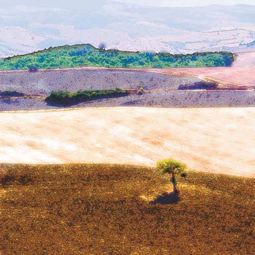
The interesting thing about printmaking effects is that they rely heavily on texture and color. There is also a strong graphic feeling to a print that supersedes the sense of photographic realism. This exploration looks at one way of achieving a graphic effect, although it is certainly not the only way. Image subject matter as well as color and texture variances will dictate modifications of the procedure. The key things to keep in mind are the aforementioned points of texture, color, and graphic composition. As you work, look for ways to articulate and emphasize texture in your images. In this case, I created an etched look that creates unique texture in the foreground as well as detailed markings in the other field areas. The process of converting photographic areas to textured markings is central to the process. By pushing the contrast and saturation, I moved the print out of the photographic space, which also emphasizes the marks and textures. Finally, be thoughtful about your photo choice to ensure that you've selected an image that lends itself to this type of conversion. Some images will lead you to emphasize one characteristic over another, pushing the compositional elements, for example, at the expense of color. Remember that these are just guidelines; explore these variables and don't feel constrained by the image or the process. Layered Landscape
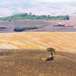
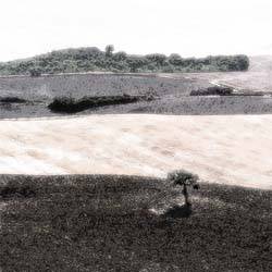
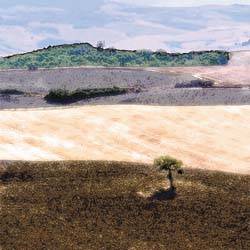
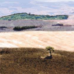
About the Original Image I liked this shot from southern Tuscany because of the layers that formed as the landscape receded in space. The foreground is one stripe, the middleground is a strong contrasting area, and so on, all the way back to the atmospheric horizon. In addition to the graphic division of the frame, I also liked the variety of textures in the image. The rough texture of the freshly plowed field in the foreground contrasts with the harvested field with tire tracks and markings, which is differentiated further by the granular texture in the middle section. Colors, textures, and graphic elements combine to create an interesting and diverse landscape image. Building the EffectWhen following a process such as this, I always create and modify duplicates of the background image, leaving the background layer clean and unchanged. Thus, I started by duplicating the Background layer by dragging it to the Add New Layer icon in the Layers palette. I double-clicked the duplicated layer name and renamed it Filter Layer. I selected Filter, Blur, Smart Blur to launch the Smart Blur dialog box. I like the Smart Blur filter for this process because it maintains and emphasizes the edges of objects while blurring smaller details. This is the first step in creating a graphic feel for the image. I set the Radius to 8.3 and the Threshold to 40.4, left all other settings at their defaults, and clicked OK to apply the effect. Filter Gallery CombinationsTo further the graphic feel, I launched the Filter Gallery and applied a combination of filters. Filter Gallery allows you to experiment with multiple filter combinations in a single dialog box, combining their application order and individual settings in countless combinations, all before committing a single modification. After selecting Filter, Filter Gallery, I opened the Artistic filter grouping in the center column and selected the Fresco filter. I set the Brush Size to 2, Brush Detail to 8, and Texture to 1. I then clicked the New Effect Layer icon at the bottom-right of the dialog box and selected the Poster Edges filter, which is also in the Artistic filter grouping. I set the Edge Thickness to 2, Edge Intensity to 1, and Posterization to 2. I repeated the process to add a third filter: I selected Diffuse Glow from the Distort filter grouping, set the Graininess to 6, Glow Amount to 1, and Clear Amount to 19. Remember that you can drag the filter tiles in the lower-right area of the dialog box to change their order, and turn them on and off using the visibility icons. I tried many combinations and this is the final configuration I settled on, clicking OK to apply the effect. The graphic texture of high-contrast, sharp-edged grain detail was working pretty well at this point, although the tonal density and color was a bit flat. To address this, I selected Image, Adjustments, Hue/Saturation. In the dialog box that appeared, I set the Hue slider to -10, Saturation to -40, and lightness to +4. I then selected Image, Adjustments, Curves and created a curve with two data points of Input: 29, Output: 28, and Input: 167, Output: 223 (see Figure
Blending Mode RevisionsNow that the tonal relationships were starting to work, I wanted to bring back a bit of color saturation. To do this, I duplicated the Background layer again and dragged the duplicated layer to the top of the layer stack, above the Filter layer. I set the blending mode in the Layers palette to Color, which directly applied the colors of the upper layer to the lower layer, without changing any tonal detail (see Figure
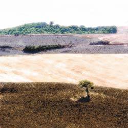
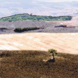
Working the BackgroundI really liked the lower part of the image, but wanted to bring back some detail in the upper portion, which was currently reduced to almost pure white. I duplicated the Background layer, dragged it to the top of the stack, named it Distance, and applied the Smart Blur filter to it, using the same settings I used in the previous application. After softening the image with the Smart Blur filter, I applied the same Filter Gallery settings to the Distance layer as I had to the original Filter Layer. (It's convenient in this context that the Filter Gallery retains the filter groupings and settings from the last time it was used; it was easy to choose Filter, Filter Gallery and click OK to quickly reapply the same settings to the new layer.) I then highlighted the Filter Layer in the Layers palette and selected the Magic Wand tool from the toolbox; I set the Tolerance setting to 22 in the Options bar. I clicked in the white sky area to cleanly select the white section only. I then activated the Distance layer again and clicked the Add Layer Mask icon to mask out everything in the Distance layer except for the selected area. The result shows additional detail at the top of the image (see Figure
To add a bit more texture to the Distance layer, I duplicated the Background layer yet again and named it Distance B. I applied the Filter Gallery settings again, this time without applying the Smart Blur filter. This choice added a bit more texture to the result. With the Distance B layer positioned above the Distance layer in the Layers palette, I Option-dragged (Alt-dragged in Windows) the mask thumbnail from the Distance layer to the Distance B layer to duplicate the mask. As a final modification, I set the Opacity of the Distance B layer to 50% (see Figure
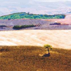
To add a bit of atmospheric perspective, I created a new layer by clicking the Create New Layer icon in the Layers palette. I selected a feathered 300-pixel brush with white as the foreground color and 17% Opacity selected in the Options bar. I lightly painted the top edge of the image to lighten the far distance slightly (see Figure
To complete the effect, I decided to pump up the color saturation a bit and lighten the image overall. I selected Hue/Saturation from the Adjustment Layer pull-down menu in the Layers palette to add an adjust ment layer to the top of the layer stack. I left Hue at 0, set the Saturation slider to +58, and set Lightness to +13. Even though it reduced the overall shadow density, the Lightness setting made the image feel more like a graphic and less like a photo (see Figure
|
EAN: 2147483647
Pages: 141