Hand Coloring
|
There was a time when all photographs were monochromatic, and the only way to add color was to paint them with a transparent dye, in a process called hand coloring. Photo retouchers would sit hunched over a black-and-white print with a small sable brush and painstakingly apply thin transparent coats of Marshall's Retouching Oils. Marshall's Oils are still available today, and people still hand color their images to replicate the nostalgic style and patina of this hand-crafted process. Photoshop replicates the hand-colored effect quite well, making it easier to erase your mistakes and start over without having to go back to the darkroom to make extra prints. When you select an image to hand color, you must first consider how the photo will look in black and white. Keep in mind that the color additions will fade and desaturate the colors slightly to simulate the look and feel of hand coloring. Does the print have high contrast and sharp detail? Are its color areas clear and well defined? If so, it's a good candidate for this process. If necessary, pump up the contrast or improve the tonal range with the Curves or Levels command. In general, the image should be a touch lighter than normal, with an extended tonal range in the highlights and midtones. The easiest way to achieve this is to use Curves, set the white and black points accordingly, and then place a single point on the curve with an input value of around 160 and drag the point straight up. This action opens up the tonality while having a minimal effect on the blacks and the shadows. Palio Procession
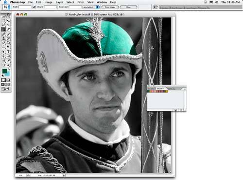
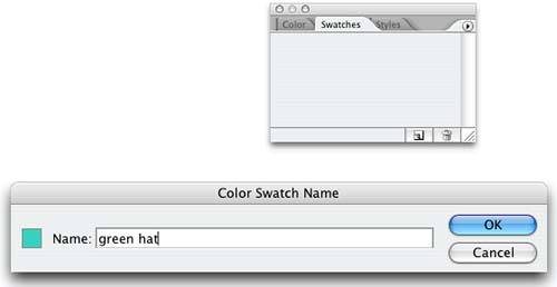
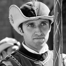
About the Original Image The photo I selected for this effect is a flag bearer from the Palio festival in Siena. His colorful costume provides ample opportunity to use the hand-colored effects to their fullest, while providing broad areas of flat color that should fill in pretty easily. In addition, I like to use a hand-colored effect with faces, especially close-ups like the one in this photo. Faces permit me to simulate the old-fashioned hand-colored look by using multicolored flesh tones; selecting a peach-colored tint for the base with a deeper red for the apples of the cheeks. As you'll see, I decided to leave the background in black and white to emphasize the hand-colored effect, although you can certainly fill it in if you're going for a subtler effect that's not quite as obvious. Building the EffectThe first step in the process is to build a color palette that will define the number of colors used while you're painting. Keep in mind that the tonality of the image will come from the black-and-white image we're about to create. The key thing in selecting colors is to select a limited number of hues that are representative of the image as a whole. These colors will be stored in the Swatches palette. By default, the Swatches palette is loaded with a bunch of distracting color presets that seldom relate to the image I'm working on. As a result, I usually start by deleting the presets so that I can build my palette from scratch. To delete the presets, go to the Presets Manager by choosing Edit, Preset Manager and then select Swatches from the Preset Type menu. Shift-click to select all the presets and press Delete to remove them. Click Done to close the Preset Manager. To sample the palette colors, select the Eyedropper tool from the toolbox and click within the image to set the selected color as the foreground color. Then open the Swatches palette by choosing Window, Swatches and move the mouse pointer into the palette. As you move the pointer over a blank space in the palette (which at this point is just about any portion of it), the pointer changes to a paint bucket. Click the mouse, and the foreground color you just sampled is loaded as a swatch. A Color Swatch Name dialog box appears as well, asking you to name the color, which you should absolutely do before clicking OK (see Figure
Reduce to Black and WhiteThere are numerous ways to convert an image to black and white, and any of them will work for this process. In this instance, I used a gradient map adjustment layer so that I could maintain the flexibility of future editing options as I worked through the coloring process. I began by clicking the Foreground color default button in the toolbox to set black as the foreground and white as the background colors. In the Layers palette, I selected Gradient Map from the Adjustment Layer drop-down menu. In the dialog box that appeared, I clicked the gradient strip to launch the Gradient Editor. Then I clicked one of the color stopsclicking either color stop activates the color midpoint diamond. You can drag the diamond left or right to lighten or darken the image (see Figure
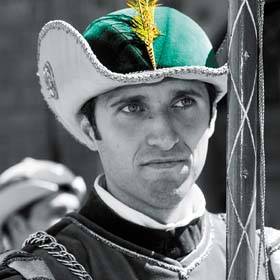
Add the First ColorThere are many ways to go about adding color, depending on your style and temperament. One approach is to devote a layer to each color; another approach is to devote a layer to a specific object or area. I prefer this second approach because it allows me to combine colors within a narrow range while still keeping areas separate. I added a new layer to the top of the layer stack by clicking the Add New Layer button in the Layers palette. When the layer appears in the palette, double-click it and type a layer name. Set the Layers palette blending mode to Color for this layer. If possible, use a graphics tablet for the painting, to ensure full control. Because the green area in the hat was so well defined, it was easy to select it with the Magic Wand tool. (Selecting the area I wanted to paint limited my brushstrokes to just the selected area.) To paint the image, I choose a brush, set the Opacity to 68% in the Options bar, clicked in the Swatches palette to select a color, and began painting. The color was applied, but the underlying tones of the photo still remained (see Figure
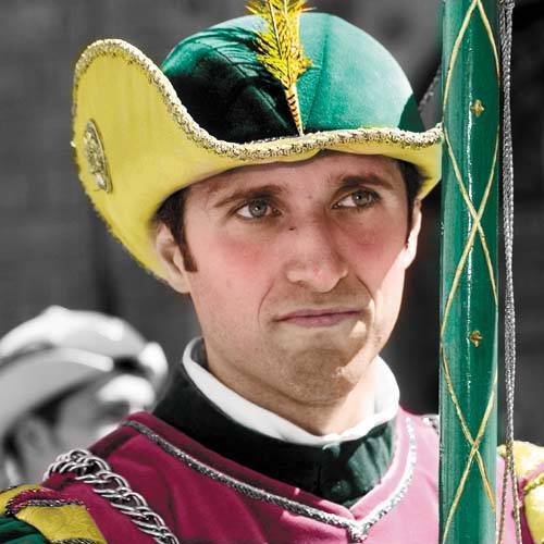
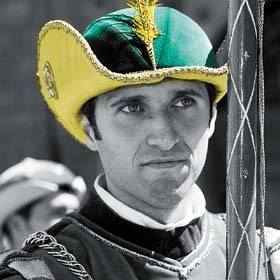
 Add Additional LayersI continued to add layers for the various areas I wanted to color, slightly modifying the technique along the way. In the second layer, I painted the feather as a brightly saturated orange, and used the Dodge tool with the range set to Highlights and Exposure at 22% to create additional color variation (see Figure
After painting a layer, you can select Image, Adjust, Hue/Saturation to open the Hue/Saturation dialog box. Drag the Hue slider to change the color on the layer. This approach is effective if you've missampled the color area, or you want to deviate from the original color you've applied. For the gold braid and the gold medallion on the hat, I painted the gold in at 100%, and then used an eraser with its Opacity setting of 46% to lighten the color and imply a gold finish (see Figure
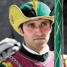
The face looks complicated but was really pretty simple. I started by painting the lighter color that I named Face Base on its own layer. I then used a 300-pixel, feathered brush set to 11% Opacity, and lightly painted the cheeks in the same layer, using the darker red color I named Cheeks. I used a smaller brush to add the lips and eye color. I did all this coloring on a single layer, but you could also create separate layers for each face part if you want to play it safe. To finish the effect and accent the hand-colored patina, I intentionally left the background in black and white. In addition to the stylized effect, the uncolored background also created an emphatic sense of space and depth, making the figure seem closer to the viewer (see Figure
|
EAN: 2147483647
Pages: 141