Setting Curves
| Once you've specified the colors you want in your multitone image and adjusted the tonal range of the grayscale image, it's time to start adjusting your multitone curves. If you followed our advice in "Tip: Use Stephen's Curves," you may have already loaded a curve set that's somewhat appropriate for your image. However, we'd like to emphasize that every image (and every spot-color ink) is different, so your curves probably need some kind of tweaking. Whether or not you go through the trouble is up to you, but here are some things to think about if you want to give it a go. Expanding Highlights and ShadowsThere are two ways in which you can expand your tonal range with multitones: focusing inks and using ink tones. Focusing inksYou can focus an ink plate on a particular area of the tonal scale by increasing the contrast in that area. Let's say you want to increase the detail in the shadows. From Chapter 6, Image Adjustment Fundamentals, you know that you need to increase the slope of the tonal curve in the shadow areas. However, that means you have to decrease the slope (and therefore the contrast) in the highlights, so you lose detail there. With one ink, that could be an unacceptable trade-off. But with two or more inks, you can use one to focus on the shadowsincreasing the contrast there and bringing out detailand use another to focus on the highlight detail (see Figure 10-10). When the page comes off press, you have greater detail in both areas. This is one methodology behind double-black duotones (where you print with black ink twice). Figure 10-10. Focusing inks on different tonal ranges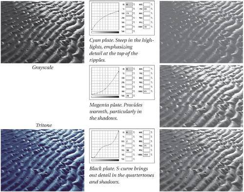 Tip: Save and Load Curves As we said earlier, it's a hassle not being able to see how each "channel" of the image changes as you adjust its curve. This is especially frustrating to new users who have a difficult time picturing what the curves are doing without the visual feedback. Whether you're a beginner or a seasoned pro, you may find this technique useful.
If the curve you've made isn't quite right, you can always adjust it in the duotone image; or if you want to get visual about it, go back and load the curve into the grayscale image's Curves dialog box again. Ink tonesThe second method of expanding your image's tonal range, ink tones, is almost always performed in conjunction with the first method, focusing inks. As we said earlier in the chapter, by printing with a gray ink along with black you immediately expand the tonal range, because a tint of gray is lighter than a tint of black; plus, gray printed over black is darker than black alone. Therefore, you can affect the tone of your image by picking appropriate second, third, and fourth colors. For instance, printing with two dark colors may make less sense than printing with a dark and a light color. If you're printing with three colors, you may want to use black plus a lighter gray (to extend the highlights) plus a darker color (to enrich the shadows).
Creating the CurvesTo ensure tonal consistency throughout the image, you need to think carefully about adjusting curves for each ink, depending on their relative tones. For example, let's say you're printing with black plus a PMS ink, Warm Gray 6 (which we can't show you, since we only have process inks to work with).
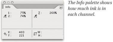
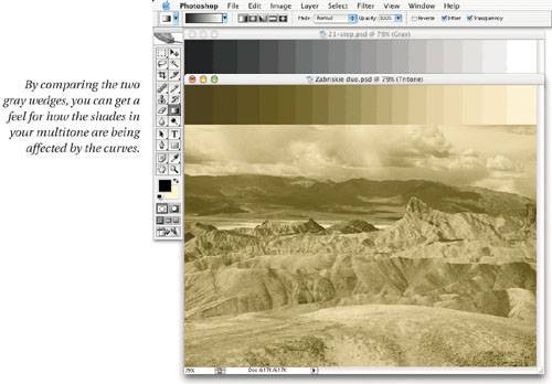
Note that this example is only thatan example. Change the ink, and you had better change the curve. Change one curve, and you had better change the other. Most of all, the curves you make and use must be dependent on the image you have, the data that makes up the image, and what you want to do with that data. Again, every image is different; so you should tailor the curves to bring out the detail where you want it most. (Fortunately, you can preview your duotone image as you adjust its colors and curves with the dialog box still open, making it easier to get it right the first time.) The Info PaletteWhen we work on multitone images, we like to set up the Info palette so that the First Color Readout is Actual Color. This way, we can always see how much ink is being laid down in an area (see Figure 10-11). Then we set the Second Color Readout to Grayscale, which tells us what the original underlying grayscale data is. Finally, we set the Mouse Coordinates in the Info palette to Pixels (so that we can easily refer back to the same pixel coordinate if we need to). Figure 10-11. The Info palette for duotones Tip: Make Gray Wedges Match One of the most complicated challenges of creating multitone curves is maintaining the overall tone of the image while attempting to expand its tonal range. One method we use while adjusting multitone curves is to work with a gray wedge.
Now, as you make adjustments to the duotone curves, you can watch for two important things. (Ordinarily we'd say, "Watch the Info palette." However, we haven't been able to extract information that's relevant to comparing images. Let us know if you know something we don't!)
Again, the goal of making a duotone is most often to maintain the overall tonality, so the two gray wedges should be approximately the same in tone (even if one is colorized and the other is not). However, sometimes your goal is to alter the toneperhaps to make the highlights lighter or darker. In those cases, the grayscale wedge is still useful as a benchmark. Unthinkable CurvesIn the preceding example, we created two curves that we would never ordinarily apply to an image, because they can result in severe posterization in some areas and lack of contrast in others. We can get away with these unthinkable curves, however, because the posterization and lack of detail are masked, in part, by the overprinting of the two inks. But these curves are still timid compared to some you might want to create. For instance, you may want to lay down a heavy solid swath of a light-gray ink under almost the entire image, in order to boost the feeling of depth, or to colorize the image slightly (see Figure 10-13). Figure 10-13. Boosting depth by adding gray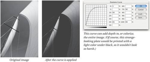 Or you may want to hit only a certain highlight area with an ink. In this case, it may be tempting to make the curve return to zero so that this ink won't fall into the shadows. Instead, we suggest you level off the curve so that the ink enriches the midtones and shadows as well (see Figure 10-14). That way, you get extra benefit from the ink, and avoid the hue shift caused when one ink is totally absent from part of the tonal range. Figure 10-14. Adding ink in the highlights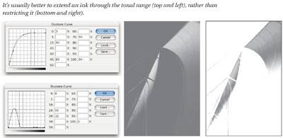 Compressing Tones for TargetingThere's no doubt that printing presses have difficulty printing extreme highlights or shadowsthe tiny halftone spots disappear to white, and the white areas in the shadows fill in, resulting in solid ink. This is the reason we're so adamant about compressing the tonal range of your images so that all the gray values and details appear in a range that can successfully print on press (see "White Points and Black Points and Grays, Oh My!" in Chapter 6, Image Adjustment Fundamentals). Nonetheless, one of the goals of multitone images is to expand the tonal range and recapture some of that highlight and shadow detail lost in the horrors of the printing process. If you compress the image data significantly before you start adjusting duotone curves, you've simply lost your chance to bring out those details. We suggest avoiding the targeting step during tonal correction, and instead using the duotone curves to compress the data (see Figure 10-15 and Figure 10-16). Figure 10-15. Examples of curves for compressing data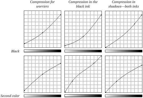 Figure 10-16. Creating curves for duotone and tritone images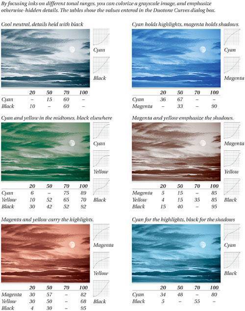 |
EAN: N/A
Pages: 220