Crystal Reports in the Real WorldAdvanced Charting
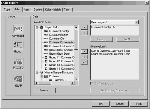
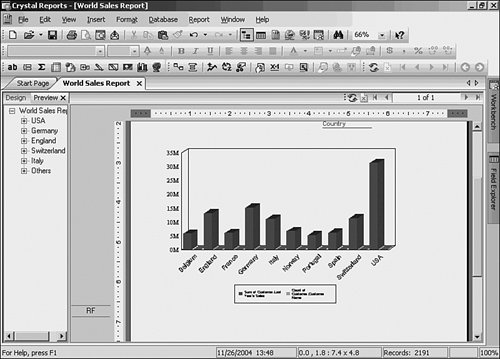
| Nothing enables users to visualize data better than a chart. With a glance, charts enable users to see relative distribution, peaks, and valleys of values. This section describes how to use charting in creative ways. The following creates a report that charts the sum of sales and distribution of customers by country:
|


EAN: 2147483647
Pages: 365