Adding OLAP Intelligence Objects to a Report
| After a page has been added to the report, individual analytic objects can be added, deleted, and manipulated on those pages to create meaningful report and application content. All the analytic components can be added by using either the Insert menu or any of the toolbar icons previously shown in Figure 19.9. After you select the component, the mouse pointer turns into a cross-hair pointer. You specify the size and placement of the selected object by locking in one corner of the object with a mouse click and then holding that click while dragging the mouse to the desired opposite diagonal corner. Each of the analytic components, including Worksheets, Charts, Dimension Explorers, Slice Navigators, Transition Buttons, and Text Boxes, is described in detail later in this chapter. While in Design mode, the currently selected object is indicated by a hatched border and object selection handles, as shown in Figure 19.12. Figure 19.12. A hatched border shows which object is currently selected.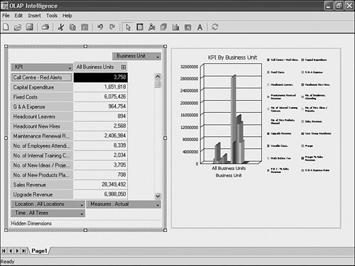 In Design mode, the currently selected object is the only active object and the only object that responds to mouse clicks. To change the active object, simply click a different object until it receives focus as indicated by the hatched border. Note The Lock option in the Tools menu prevents users from moving, adding, or deleting report objects. This is useful for finished reports because all the objects become simultaneously active, making the report much more intuitive to use. A locked report can optionally be protected with a password that subsequently must be typed in before the application can be unlocked. Moving, Resizing, and Formatting ObjectsAfter the report objects have been placed on a page, OLAP Intelligence allows a significant amount of freedom in defining their appearance, placement, and formatting. The appearance and formatting properties belonging to any object can be retrieved and edited by right-clicking on the hatched border of any active object. The formatting details of each object are described in the followed sections. Objects can be moved within a page using the mouse to drag the hatched border. As the mouse is moved over the border the cursor indicates when dragging is possible. Tip When dragging objects, the designer snaps the objects to a grid for easier alignment. Using the cursor keys in conjunction with the Ctrl key enables finer adjustments to be made. Objects can be resized by dragging the select handles on each corner and on each side of its hatched border. Worksheet Objects and Worksheet DimensionsThe most common object and the one that forms the core of most OLAP Intelligence reports is the worksheet. Similar in appearance to a Microsoft Excel worksheet, this analytic object provides two key benefits to OLAP Intelligence users:
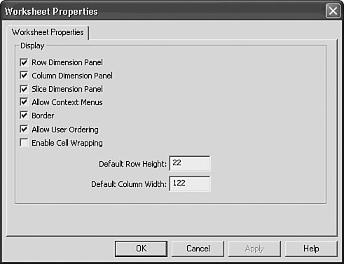
Figure 19.13 highlights the Worksheet object and the key dimension categories. All the row, column, and slice dimensions can be changed, swapped, or nested by simply dragging and dropping them into the different sections of the worksheet or by right-clicking on any of the dimension toolbars and accessing the various swapping and nesting options. Figure 19.13. Row, column, slice, and hidden dimensions in a worksheet provide a multidimensional paradigm for viewing OLAP data and reports.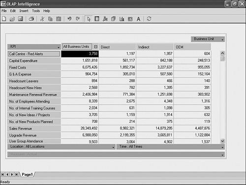 Note A chart on the same page as a worksheet always reflects the current column, row, and sliced dimension settings and dynamically changes as the worksheet does. Also note that although you can have two or more worksheets on the same page, they always provide the exact same viewpoint and changes in one are always immediately reflected in the others. As mentioned previously, a worksheet can display several row and column dimensions at once. This technique highlighted in Figure 19.14 is often referred to as the nesting of dimensions and enables multiple dimensions to be displayed in the row or column positions. Figure 19.14. A page showing two dimensions, Time and Measures, nested in the columns.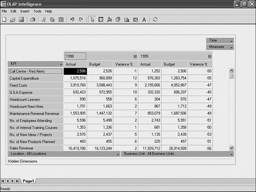 Sliced dimensions can be set to two different statesactive and hiddenby accessing their right-click context menu and the Dimension State menu option. When active, the sliced dimension is available for manipulation by the end user. When hidden, the report consumer sees neither the dimension nor its default value. The default value for a hidden dimension is set identically to that of an active dimensionthrough the use of the member selector. The member selector is introduced later in this chapter. Setting Worksheet PropertiesThe Properties dialog of the worksheet object shown in Figure 19.15 provides the Report Designer with the capability to selectively turn off some of the powerful functionality within the Worksheet for a specific report. The worksheet properties are displayed by right-clicking on the hatched border and choosing Properties from the menu. Figure 19.15. The Worksheet Properties dialog enables you to toggle end-user features of the worksheet. For a complete listing of the worksheet properties, see the Worksheet properties table later in this section. Table 19.1 provides an overview of each of the Worksheet properties and a use case scenario for enabling and disabling the specified property.
Choosing Members to DisplayWorksheet objects enable you to navigate through dimensions by expanding (drilling down) or collapsing (drilling up) through the dimension hierarchies. Any member name with a + displayed next to it can be expanded, whereas those member names with a displayed can be collapsed. You can enact both traditional drill-down and drill-up functions by clicking on the + or sign. Alternatively, these forms of traditional drill-down, in addition to variant forms called Focused Drill-down and Focused Drill-up, are available when you right-click any drillable dimension member. Figure 19.16 shows the Drill menu available through the right-click context menu, and Table 19.2 describes four quick examples of the different drilling functions. Figure 19.16. The Drill context menu provides access to the different types of end-user drilling.
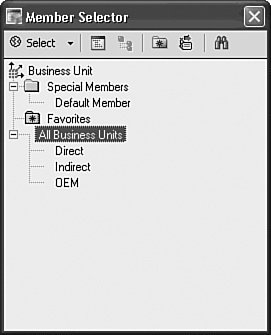
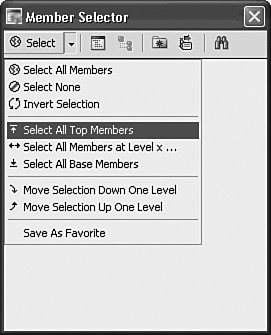
Tip Focused Drill-down is different from standard drill-down because it displays only the children of the member drilled on instead of the children and the already displayed members. To access Focused Drill-down, you can simply double-click any drillable dimension member. To drill back up, however, you need to use the right-click context menus. The member selector is another powerful and flexible means to choose members to display. A member selector can be invoked for any dimension through the downward pointing triangle displayed on the dimension heading, as shown in Figure 19.17. Check boxes are presented next to each member, and selection edits are reflected in real time on the page as members are selected or deselected. Figure 19.17. The member selector provides the end user with the capability to select members of the involved dimension. The member selector enables end users to find the data of greatest relevance to them expeditiously. Two of the most useful tools in the Member Selector dialog are the Select menu and the Search tool. Both of these tools (along with a few others) are accessible through icons on the Member Selector toolbar. The Select menu, shown in Figure 19.18, provides a number of shortcuts that facilitate quick and efficient member selection. This shortcut menu is also accessible from each member displayed within the member selector. Figure 19.18. The member selector's Select drop-down box provides shortcuts for adding displayed members. The Search Wizard, shown in Figure 19.19 and accessed through the binoculars icon, provides both standard and advanced filtering mechanisms to enable report users to productively search through a dimension with a large number of members. Because it is not uncommon in industry today to have dimensions (such as Product or Employee) that have thousands or tens of thousands (or many more) of members contained within them, this search mechanism enables you to find sought-after members efficiently. Figure 19.19 depicts a search for KPIs within a KPI dimension that contains the text Sales. After a search has been completed, you can add the entire search result list or a subset of it to the existing member selection or you can completely replace it. Figure 19.19. Search the KPI Dimension for members containing the word Sales.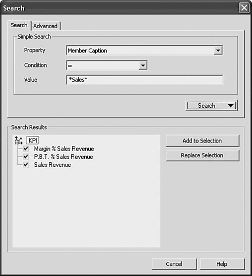 Tip When using the Member Selector Search dialog, you can use the * wildcard to find member names or captions quickly that contain a certain word. For example, typing *Sales* produces all KPIs that contain the word sales, and typing *Coffee* produces all products that contain the word coffee. If a dimension has multiple hierarchies defined in the underlying data source, the Select Hierarchy button on the Member Selector toolbar is enabled. This enables you to choose the active hierarchy to be displayed. Asymmetrical Member Selection and DisplayOLAP Intelligence supplies an out-of-the box method to provide asymmetrical dimension member views. An asymmetrical viewpoint is one where different members of a nested dimension can be displayed for each parent member. By default, when a dimension is nested as shown in Figure 19.20, the nested members are symmetrical in displaythat is, whatever members are selected for the nested dimension are displayed for all parent dimension members. Figure 19.21 shows a sample asymmetrical viewpoint that can be created through the right-click context menu Hide and Show commands on the member fields. Figure 19.20. Symmetrical reporting viewpointthe default display shows all nested members for each parent dimension member. Figure 19.21. Asymmetrical reporting viewpoint enables varied and specific selection of nested members for each parent dimension.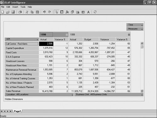 Table 19.3 reviews the commands associated with setting up and removing asymmetrical viewpoints.
Changing the Display Order of MembersBy default, members are displayed in a worksheet in the natural dimension orderthe order in which they are returned by the OLAP server. Because this might not always be preferred, the shortcut menu for any row or column dimension member contains the option Reorder Dimension Members. Selecting this option displays a dialog where the order of the dimension members can be changed through drag-and-drop operations or using the up and down arrow buttons within the dialog. Note The chosen order is lost if a drill-down or drill-up operation is performed on the dimension. This feature is best suited to flat dimensions, such as measures, where the display order tends to be more critical. Number FormattingYou can apply number formatting to individual rows and columns by choosing Format, Add from a dimension member's right-click context menu. This displays the Format dialog, shown in Figure 19.22. Figure 19.22. Change the display format of data for a selected member.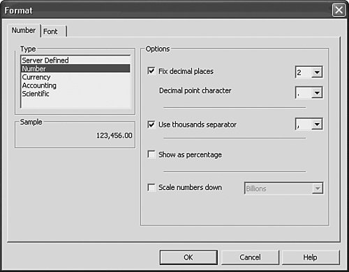 Once added, formats can be edited and removed through the right-click context menu. Changing the Displayed Caption for a MemberBy default, each member is displayed using the name defined for it on the OLAP server. In some cases a different name might be required. OLAP Intelligence enables you to change the caption by right-clicking on a member and choosing Change Caption from the menu. Automatic TotalsThe worksheet can generate a sum calculation for either the rows, columns, or both directions simultaneously, and automatically update it as the worksheet changes. This is useful when an arbitrary selection of members is made, such as a group of products. Figure 19.23 shows the sum of profit margin for the different store locations and for a number of time periods, with the calculation labeled Total on the worksheet. Figure 19.23. You can display automatic totals for the columns or rows of a worksheet.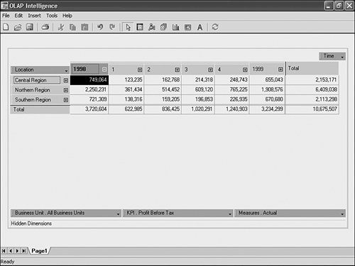 The shortcut menu (right-click menu) of any row or column dimension member in the worksheet controls the display of the automatic totals. The behavior of the total calculations changes when a filter is added to the column dimension. In Figure 19.24 a Top 3 filter has been added to sales, so the worksheet is now showing just the top three locations. The automatic totals now display the following:
Figure 19.24. Automatic totals with a filter applied display numerous pieces of valuable summary information.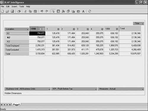 Using Calculated Members and Data AnalysisAdditional calculations and data analytics not provided in a report's underlying data source can be added to the data presented in the worksheet through the Calculations and Data Analysis menu options accessible through the right-click context menu on any member title. The Calculated Members dialog provides a number of the most common examples and includes shortcuts for contribution, variance, ratio, and growth calculations. Additional shortcuts are provided under the Data Analysis Expert tab on the same Calculated Members dialog and include Linear Regression, Trend Lines, and Moving Averages. To add a calculation or data analytic in OLAP Intelligence, right-click on a member or a dimension name, and then choose the Calculated Member menu item. This opens the Calculated Members dialog shown in Figure 19.25. Figure 19.25. The Calculated Members dialog enables creation of advanced members not found in the underlying OLAP data source.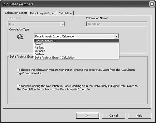 In addition to the Calculation Experts highlighted in Figure 19.25, OLAP Intelligence also enables you to create custom calculations that can leverage a rich set of Multi-Dimensional Expressions (MDX) on SQL Server Analysis Services cubes or Crystal OLAP Syntax on other data sources. The experts and the advanced calculation functionality are covered in more detail later in this chapter. Sorting and FilteringYou can sort and filter reports to isolate important information. These functions help you answer questions such as "What are my top five variances?" and "Which products have the highest sales growth?" Sorts can be applied to any row or column simply by right-clicking on its heading and using the Sort submenu items, shown in Figure 19.26. Figure 19.26. The worksheet Sort menu enables the end user to sort the report's data.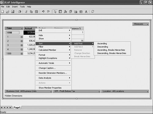 Adding an ascending sort to the Variance % column highlights the poorest performing time periods for a given KPI by moving them to the top of the worksheet (see Figure 19.27). Figure 19.27. You can sort the variances or any member in the worksheet.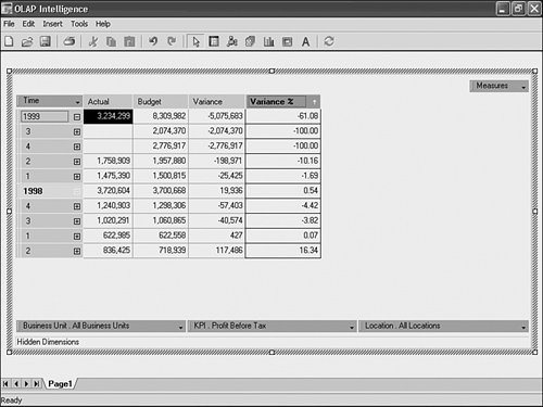 A sort is indicated by an arrow displayed next to a member name. The arrow points up to indicate an ascending sort and down to show a descending sort. Clicking on the arrow changes the direction of the sort. By default, a sort respects any dimension hierarchies; that is, the members are sorted within their hierarchical groupings. This behavior is changed through the Sort menu and the result of changing the sort to a "breaks hierarchies" sort is shown in Figure 19.28. The hierarchical relationship between All Time and its children has been broken, and it now appears as the second row. Figure 19.28. Use the Break Hierarchies option to change the order in which the sorted values are displayed. Note Sorts can be nested up to three deep. To add further sorts, use the Add Next option in the Sort menu. Nested sorts are indicated by a 1, 2, or 3 displayed next to the sort arrow. Filters can be applied to any row or column, and also can be applied to the whole worksheet. Filtering the whole worksheet enables null rows and columns to be removed. Access this by right-clicking in the blank area at the top-left corner of the worksheet above the row dimension title and selecting from the resulting menu list, as shown in Figure 19.29. This is a common requirement when using sparsely populated OLAP cubes. Figure 19.29. Applying a filter to the whole worksheet, removing null rows and columns.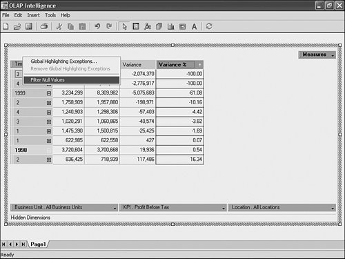 Filtering a specific row or column can be used to pick out the important information in a report. Figure 19.30 shows a filter being added to the Variance column, with the aim of isolating time periods with variances less than negative 5. Figure 19.30. Apply a filter to a column in the worksheet.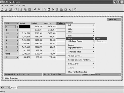 The Define Filter dialog enables the type of filter to be set or changed. In this example, the filter shows variances that are less than zero. These settings appear in Figure 19.31, and the results are shown in Figure 19.32. Figure 19.31. Apply a filter to show only those variances less than 0%.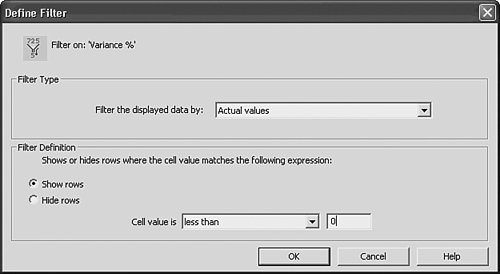 Figure 19.32. A filtered worksheet provides increasingly focused report data for end users.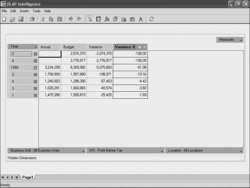 Note An x displayed in the Variance column heading indicates the presence of a filter. The filter can be edited by clicking on the x icon. In this example the filter was applied based on the displayed data values. Other types of filters are available from this dialog:
Exception HighlightingException highlighting, also known as conditional formatting or traffic lighting, is a technique using color to draw attention to values that are out of the ordinary. It might be used on the entire worksheet or only for selected rows or columns of the worksheet. Access exception highlighting for the whole worksheet by right-clicking in the white area at the top-left corner of the worksheet and selecting the Global Highlighting Exceptions option. Highlighting exceptions can also be applied to a single row or column simply by right-clicking on its heading and selecting the Highlight Exceptions option. Doing this displays the Highlight Exceptions dialog (see Figure 19.33). This enables the definition of the upper and lower limits for highlighting and the formatting to be applied. In this example, the involved KPI has been changed to No. of New Products Planned and the recently applied filter has been removed. Here, any values less than 0% are highlighted in red, whereas values more than 5% are highlighted in green. Those values between 0% and 5% are highlighted in yellow. The result appears in Figure 19.34. Figure 19.33. Apply exception highlighting to a column in the worksheet.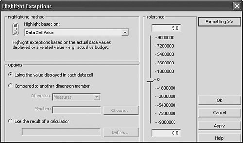 Figure 19.34. Here is an example of exception highlighting, showing adverse variances in red.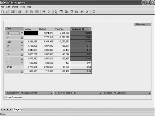 In this example, the exception highlighting is applied based on the displayed data values. This works well where the data value is a percentage but is problematic for absolute values, which change magnitude as the user drills down. To cater to these situations, other types of exception highlighting are available from the Highlight Exceptions dialog:
Using OLAP Intelligence ActionsActions are a powerful feature of OLAP Intelligence. They enable you to extend the functionality of your applications in a number of ways through the right-click context menu of the worksheet object. Actions provide impressive flexibility to OLAP Intelligence Reports and Applications through external application launching (such as Crystal Reports), redirection to external URLs or HTML code, sending of email, opening files, and so on. This advanced functionality is covered in detail later in this chapter. Adding Chart Objects to OLAP Intelligence ReportsSimilar to the Crystal Reports Report Design environment, OLAP Intelligence provides a visualization capability to facilitate meaningful data analysis on top of the numerically presented data. To the OLAP Intelligence Design Environment, a chart is simply another object that can be added to the report through either the Insert, Chart menu option or the Charting icon. When a chart is added to a report page, the product assumes a number of defaults around the chart's properties that can be edited through the right-click context and properties menus. Note Unlike the Crystal Reports Design Environment, there is no Charting Expert to step you through the initial chart set-up process. Instead, the chart automatically reflects the current viewpoint of the cube and OLAP Intelligence makes default chart option selections that can be edited using the powerful right-click chart editing optionsthe same ones available in Crystal Reports after a chart has been created with the Chart Expert. Because the Charting functionality for OLAP Intelligence is the same as the Chart Options functionality for Crystal Reports, covered in Chapter 8, "Visualizing Your Data with Charts and Maps," please reference that chapter for details on chart editing and manipulation. Tip As mentioned previously, the Chart on any given page reflects the underlying viewpoint (that is, alignment of dimensions) for that page. To change a viewpoint on a given page that only contains a chart, temporarily add a worksheet object and manipulate the dimensions there until the chart reflects the appropriate view, and then delete the previously inserted worksheet. Caution Because Charts reflect the current viewpoint of any given page and all of a viewpoint's currently displayed row and column dimension members, it is instructive to pay close attention to the data that is intended to be visualized in a chart. If, for example, a meaningful Visualization on Variance % over different KPIs was required but both the Actual and Budget numbers were still part of the viewpoint, the graphic would appear meaningless because the Magnitude of the Actuals and Budgets would change the scale of the graphic; it would be meaningless for projecting information on Variance %. Figures 19.36 and 19.37 show the differences in visualization. A good workaround here involves setting up a page with only the Variance % viewpoint and chart, and providing navigation buttons (covered later in this Chapter) to that page from the other report pages where Actual and Budget are displayed. Figure 19.35. A Variance % Chart where the Actuals and Budget members overwhelm the scale of the Variance % member.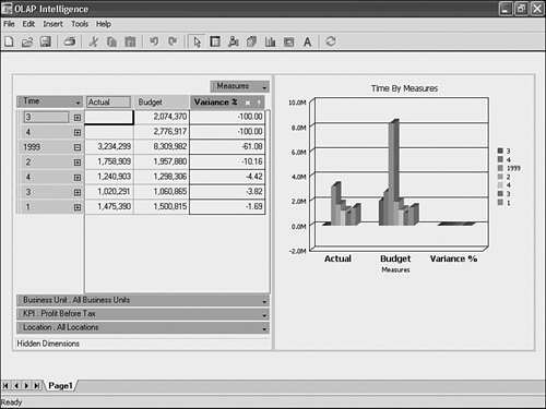 Figure 19.36. A Variance % Chart that does not show Actuals and Budget members.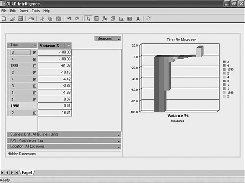 Figure 19.37. The Dimension Explorer and its components enable end-user manipulation of the report's data from outside the worksheet object.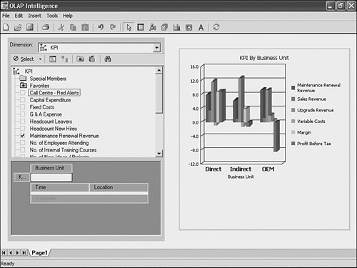 |
EAN: 2147483647
Pages: 365