The Evolution of WriteExpress s Website Design
The Evolution of WriteExpress's Website DesignYou should constantly change or improve your website design, layout, and structure. What seems to be effective today might not be as effective tomorrow. Continuously evaluate your site to see if you can make any improvements to increase your ROI or close more sales. Some say that you have a 45% chance of turning a visitor into a customer in a retail store and only 2% in an online store. It's too easy for a consumer online to visit your competitor with just a click of a button. You want to do everything you can to immediately grab customers' attention and make them want to further investigate your site. WriteExpress.com has gone through many variations of its website "look and feel" and layout. Let's take a look at three designs, including the current one. One of the earlier versions (see Figure 9.4) did not offer a professional look. Your visitors need to be convinced that you are a legitimate corporate business. A professional look and feel can offer the impression that you can compete with the big boys and that you mean business. This Web design also lacked a logo, easy-to-read sales copy, a sense of product identity, a unique selling position (USP), and creditability. You don't want to leave your customers asking, "What's in it for me?" or "Why should I purchase from you?" Figure 9.4. WriteExpress.com's first design concept.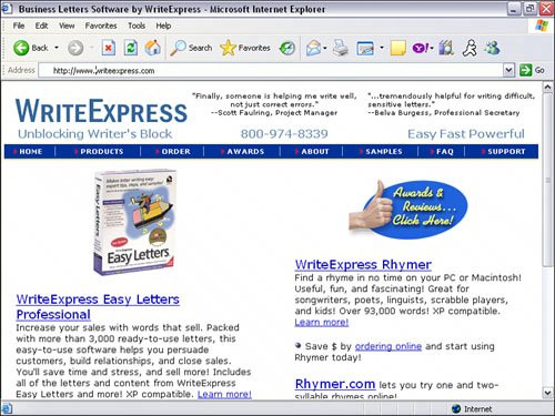 The second major redesign (see Figure 9.5) had a more professional look. Other changes included a custom logo, a product search capability, an easy-to-read product format with bullet points for scanning, a striking image, and a USP. Although this particular design change was leaps and bounds from the previous one, it did not convert as well as expected. Figure 9.5. The second iteration of the site has a more professional look and feel, but it still wasn't as effective as the one you see today.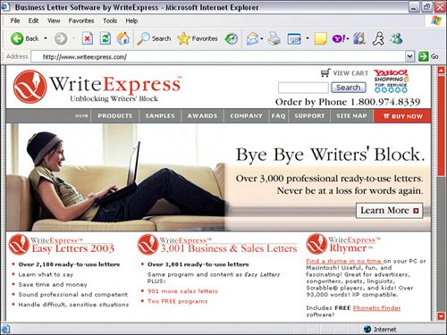 The third major redesign, which is in use today (see Figure 9.6), includes a change not only in "look and feel," but also in color. In the second design, the main colors of the site were gray, red, and black. After reviews and research, WriteExpress found that red was a negative color. Although it stood out, it didn't give consumers a sense of confidence or a feel-good experience. So, they decided to go with the safe blue tones. Immediately after launching the new site, they saw a major increase in sales. This is probably why most websites use blue tones in the site color schemes. Figure 9.6. After many iterations of site design, this current design has proven to be the most effective.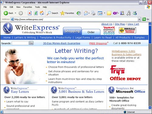 For WriteExpress, advanced features were not as important as site layout. WriteExpress treats the site as a billboard, not as a brochure. The purpose of a billboard is to get the customers' attention, inform them of a product or service, and to get them interested enough to seek more information. You don't have time to sit in your car and spend even 10 seconds reading, especially if you are going 80 miles per hour. It's the same concept with websites. Visitors are scanning your site. They're looking for benefits copy and attention grabbers (WII-FM). They want to make sure they are at the right site and that they can benefit from your website. They don't want to be soldthey want to be informed. The products are also laid out in a column format (see Figure 9.7) with a short description and product imageno more than six words per line. This makes reading and scanning easier. Unless space is an issue and the consumer is requesting detailed information, never have text span the entire website: It makes the text too overwhelming to read. Figure 9.7. WriteExpress laid out products into columns with short descriptions. Limiting six words per line also helps reading and scanning of information.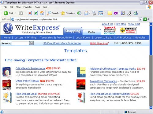
Testing Your Site Design EffectivenessSo how did WriteExpress.com know how and when it needed a site design change? Here are a few tips that helped them decide:
|
EAN: 2147483647
Pages: 208