An Ideal Library of Dashboard Display Media
So far we've considered only the first, most fundamental step in selecting the best medium of display. Once you've chosen between text, graphics, or some combination of the two, you must then determine how to organize the text and/or what kinds of graphics to use. These choices are vital. A poorly chosen graph, for example, could completely obscure otherwise clear data. In this section, we'll focus specifically on the best choice of graphical display to use when you determine that a visual rather than a textual display is appropriate.
Most display media that work well on dashboards are probably familiar to you already. Quantitative graphs and several other types of charts that are commonly used in business reporting (for example, process flow and organization charts) work well on dashboards, provided their design is kept clear and simple.
This discussion focuses on dashboard display media that are used to present actual data. Other display media, such as command buttons, are sometimes needed, but they fall outside our scope of interest. Two fundamental principles have guided the selection of each display medium in this proposed library:
- It must be the best means to display a particular type of information that is commonly found on dashboards.
- It must be able to serve its purpose even when sized to fit into a small space.
The library is divided into six categories:
- Graphs
- Images
- Icons
- Drawing objects
- Text
- Organizers
6.2.1. Graphs
Most dashboard display media fall into the graph category. Given the predominance of quantitative data on most dashboards, this isn't surprising. All but one of the items (treemaps) in this category display quantitative data in the form of a 2-D graph with X and Y axes. Most of these are familiar business graphs, but one or two will probably be new to you, because they were designed or adapted specifically for use in dashboards. Here's the list:
- Bullet graphs
- Bar graphs (horizontal and vertical)
- Stacked bar graphs (horizontal and vertical)
- Combination bar and line graphs
- Line graphs
- Sparklines
- Box plots
- Scatter plots
- Treemaps
6.2.1.1. Bullet graphs
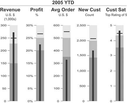
This is the one graph on the list that is almost certainly new to you. I assume this because a bullet graph is a simple invention of my own, created specifically for dashboards. It is my answer to the problems exhibited by most of the gauges and meters that have become synonymous with dashboards. Gauges and meters typically display a single key measure, sometimes compared to a related measure such as a target, and sometimes in the context of quantitative ranges with qualitative labels that declare the measure's state (such as good or bad). Figure 6-5 provides two examples of the gauges and meters that are commonly found on dashboards. Both display a key measure in comparison to a target, which is represented by zero on the gauge on the right and, I assume, by the top of the thermometer on the left.
Note: Can you make sense of the thermometer on the left in Figure 6-5? Do sales increase as they rise or as they fall on the thermometer? Given the fact that actual sales are 75.93% of target and the mercury in the thermometer extends about 75% of the way to the top of the thermometer, we must assume that sales rise as the mercury rises, but then, as red on a dashboard usually means bad, why is the red range at the top?
Figure 6-5. These are typical examples of meters and gauges with contextual data.
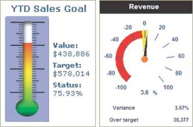
The question that you should ask when considering gauges and meters such as these is: "Do they provide the clearest, most meaningful presentation of the data in the least amount of space?" In my opinion, they do not. Radial gauges such as the example on the right in Figure 6-5 waste a great deal of space, due to their circular shape. This problem is magnified when you have many radial display mechanisms on a single dashboard, for they cannot be arranged together in a compact manner. The linear nature of the thermometer style of display potentially avoids this problem, but in displays such as this, space tends to be wasted on meaningless realism. If dashboard display media were designed by expert communicators, rather than by graphic artists who clearly haven't focused on the communication needs, they would look much different.
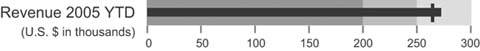
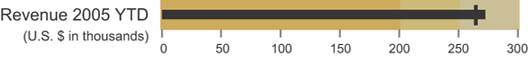
The bullet graph achieves the communication objective without the problems that usually plague gauges and meters. It is designed to display a key measure, along with a comparative measure and qualitative ranges to instantly declare if the measure is good, bad, or in some other state. Figure 6-6 provides a simple example.
Figure 6-6. A simple horizontally oriented bullet graph.
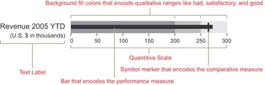
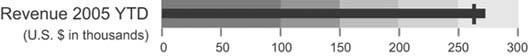
Now, I am well aware that it sounds a bit too high and mighty for me to call the bullet graph my invention. It's not much more than a bar graph with a single bar, or a thermometer without the reservoir at the end to hold the mercury while at rest. Simple as it is, why hasn't anyone else come up with this idea before? Any software vendor who wants to use it can be my guest, free of charge. I'll even supply the design specification. Figure 6-7 shows the same bullet graph, this time with each of its components identified.
Figure 6-7. A simple bullet graph with each of its components labeled.
The linear design of the bullet graph, which can be oriented either horizontally or vertically, allows several to be placed next to one another in a relatively small space. Figures 6-8 and 6-9 show how closely they can be packed togetherimagine how much room would be required to display the same data using circular gauges.
As you scan a collection of bullet graphs such as those in Figures 6-8 and 6-9, notice how easy it is to detect those measures that have met or exceeded the comparative measures represented by the short line that intersects each bar. When a measure exceeds this bar, a cross shape is formed. This form is easy to see because it is perceived preattentively. You can scan the bullet graphs on a dashboard and immediately know which measures are doing well and which are not simply by the presence or absence of these cross shapes.
Figure 6-8. A collection of horizontally oriented bullet graphs.
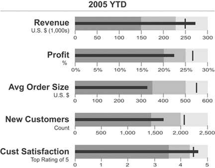
Figure 6-9. A collection of vertically oriented bullet graphs.
Notice also that the background fill colors that encode the qualitative categories (such as bad, satisfactory, and good) are variables of color intensity rather than of hue. This assures that viewers who are color-blind can still see the distinctions. Even though various shades of gray have been used in the examples so far, any hue will work. Figure 6-10 uses various intensities of beige.
Figure 6-10. This bullet graph uses various intensities of beige to encode qualitative states.
You can encode more than three qualitative states with background fill colors, but to avoid complexity that cannot be perceived efficiently and to maintain a clear distinction between the colors, you shouldn't exceed five. Figure 6-11 illustrates this practical limit.
Figure 6-11. This bullet graph uses five distinct color intensities to encode qualitative states.
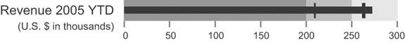
It is sometimes useful to compare a key measure to more than one other measure. For instance, you might want to compare revenue to the revenue target and to the revenue amount at this time last year. The bullet graph easily handles multiple comparisons by using a distinct marker for each. These distinctions can be displayed using variables of color intensity, line width (a.k.a. stroke weight), or even symbol shapes in a pinch. Figure 6-12 illustrates how two comparisons can be included using markers with different stoke weights.
Figure 6-12. This bullet graph includes two comparisons, which have been made visually distinct through the use of different stroke weights.
When I originally developed the design specification for the bullet graph, I called it by a different name: a performance bar. This original name possessed chutzpah and evoked a sense of good health, due to its similarity to those popular ultra-performance nutrition snacks like the PowerBar. I had to change the name, however, because I eventually realized that there were times when the key measure should be encoded using something other than a bar.
Whenever you use a bar to encode a quantitative value, as you've seen in each of the examples of bullet graphs so far, the quantitative scale should start at zero. The length of the bar represents the value, not just the location of its endpoint, so a scale that starts anywhere but zero will produce a bar with a length that doesn't correspond to its value. This makes accurate comparisons between bars very difficult.
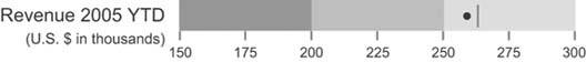
It is sometimes useful with bullet graphs, however, to avoid starting the quantitative scale at zero so that the scale can be narrowed to display more quantitative detail. For instance, suppose that all of the values that need to be included in the bullet graph fall between the range of $150,000 and $300,000, and you want to focus exclusively on this range of values to show more subtlety in the differences between the key measure and its comparisons (for example, a target). In this case, you should use some means other than a bar to accurately encode the key measure. For example, you can use a marker (a simple symbol shape) to encode the key measure and differently shaped markers for any comparative measures. Figure 6-13 illustrates this approach.
Figure 6-13. Because the quantitative scale of this bullet graph does not begin at zero, it uses a symbol marker rather than a bar to encode the key measure. In this case, the key measure is encoded as a circle and the target measure is encoded as a short line.
Using a bar to encode the key measure has the advantage of superior visual weight to highlight the key value, but a symbol marker allows you to narrow the quantitative scale to display greater subtlety in the values and their differences (using the symbol marker serves as a visual alert to the viewer that the scale does not start at zero). Both work well on a dashboard.
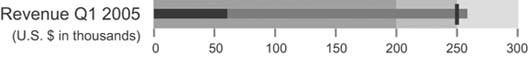
Let's look at one more way you can use bullet graphs. Whenever you compare a current measure to a future target, such as revenue as of January 15 compared to a Quarter 1 target, you can easily see how far you are from the target, but it's not always so easy to tell if you are on track to meet or surpass that future target, which could still be weeks or even months away. This is true whether you are using a bullet graph or any other graphical means to display this information. This shortcoming in the usefulness of the comparison can be ameliorated by adding a projection of where you'll be at the end of the period of time that is relevant to the target. The bullet graph in Figure 6-14 on the next page splits the revenue measure into two segments: the actual measure as of today and the projected measure of revenue based on current performance. This provides a rich display that tells you not only how far along you are on the path to the future target, but also how well you're doing today in relation to that target.
Figure 6-14. This bullet graph displays both the actual quarter-to-date revenue and a projection of expected quarter-end revenue based on current performance.
I can state with some confidence that bullet graphs work well, because I've tested them in controlled experiments to compare them to simple radial gauges. In my tests, bullet graphs outperformed radial gauges both in efficiency and accuracy of perception. The number of test subjects was far too small to satisfy scientific standards, so I'll refrain from claiming specific measures of superior performance. These tests were sufficient, however, to enable me to state without reservation that bullet graphs work every bit as well on dashboards as radial gauges and are able to convey the same information in much less space. I believe that makes them superior.
6.2.1.2. Bar graphs
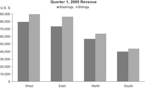
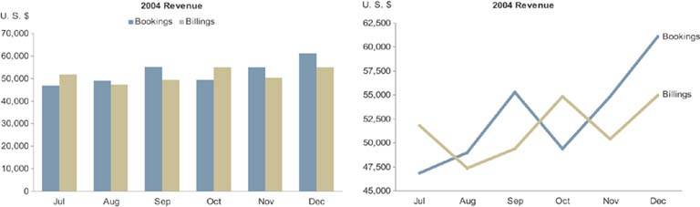
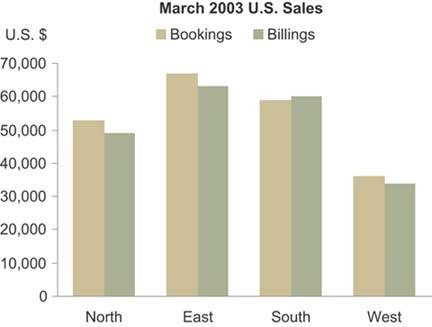
Unlike bullet graphs, bar graphs are designed to display multiple instances, rather than a single instance, of one or more key measures. In fact, every graph in this proposed library other than the bullet graph is designed to display more than one instance of one or more measures. Bar graphs are great for displaying measures that are associated with items in a category, such as regions or departments. The graph in Figure 6-15 is a typical example that could be found on a dashboard: it displays two key measuresbookings and billings revenuesubdivided into sales regions.
Figure 6-15. A typical bar graph.
I use the term "bar graph" in reference to all graphs that use bars to encode data, whether they are oriented vertically or horizontally.
Figure 6-16 shows another example of a typical bar graph, this time with the bars running horizontally.
Figure 6-16. A bar graph with horizontally oriented bars.
To fully understand when it is appropriate to encode data in a graph as bars rather than as lines (as in a line graph), you must understand a little about the three types of categorical scales that appear commonly in graphs:
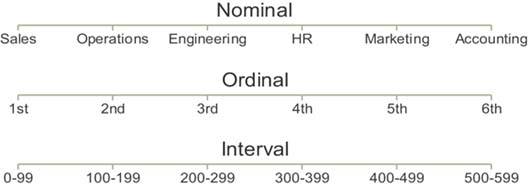
Nominal scales consist of discrete items that belong to a common category but really don't relate to one another in any particular way. They differ in name only (that is, nominally). The items in a nominal scale, in and of themselves, have no particular order and don't represent quantitative values in any way. Typical examples in dashboards include regions (for example, The Americas, Asia, and Europe) and departments (for example, Sales, Marketing, and Finance).
Ordinal scales consist of items that, unlike the items in a nominal scale, do have an intrinsic order, but in and of themselves still do not correspond to quantitative values. Typical examples involve rankings, such as "A, B, and C," "small, medium, and large," and "poor, below average, average, above average, and excellent."
Interval scales, like ordinal scales, also consist of items that have an intrinsic order, but in this case they represent quantitative values as well. An interval scale starts out as a quantitative scale that is then converted into a categorical scale by subdividing the range of values in the entire scale into a sequential series of smaller ranges of equal size and giving each range a label. Consider the quantitative range made up of values extending from 55 to 80.
This range could be converted into a categorical scale of the interval type consisting of the following sequence of smaller ranges:
- Greater than 55 and less than or equal to 60
- Greater than 60 and less than or equal to 65
- Greater than 65 and less than or equal to 70
- Greater than 70 and less than or equal to 75
- Greater than 75 and less than or equal to 80
Figure 6-17 shows an example of each type of scale.
Figure 6-17. The three types of categorical scales found in graphs.
Here's a quick (and somewhat sneaky) test to see how well you've grasped these concepts. Can you identify the type of categorical scale that appears in Figure 6-18?
Figure 6-18. This is a categorical scale that is commonly used in graphs. Can you determine which of the three types it is?

Months of the year obviously have an intrinsic order, which begs the question: "Do the items in a time series correspond to quantitative values?" In fact, they do. Units of time such as years, quarters, months, weeks, days, hours, and so on are measures of quantity, and the individual items in any given unit of measurefor example, yearsrepresent equal intervals. (Actually, months aren't exactly equal, and even years vary in size occasionally due to leap years, but they are close enough in size to constitute an interval scale for reporting purposes.)
Bar graphsnever line graphsare the best means to display measures subdivided into discrete instances along a nominal or ordinal scale. The visual weight of bars places emphasis on the individual values in the graph and makes it easy to compare individual values to one another by simply comparing the height of the bars. Lines, on the other hand, emphasize the overall shape of the values, and by connecting the individual values they give a sense of continuity from one value to the next throughout the entire series. This sense of connection between the values is appropriate only along an interval scale, which subdivides a continuous range of quantitative values into equal, sequential intervals; it's not appropriate along a nominal or ordinal scale, where the values are discrete and not intimately connected. Figure 6-19 shows some examples of inappropriate and appropriate usage of lines to encode data in graphs.
Figure 6-19. Examples of inappropriate (top two) and appropriate (bottom two) uses of lines to encode data in graphs.

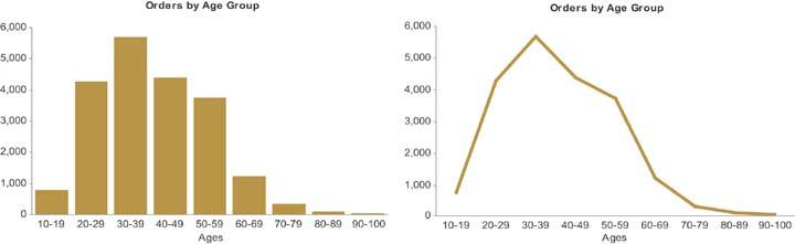
Line graphs are useful for encoding values along an interval scale, but there are occasions when it is preferable to use a bar graph to display such measures. For example, when you wish to emphasize the individual values rather than the overall trends or other patterns of the values, or when you wish to enable close comparisons of values that are located next to one another, a bar graph is a better choice. Figure 6-20 on the next page displays the same interval data in two ways: as a bar graph and as a line graph. Notice the differences in what the two images emphasize, despite the fact that the data are precisely the same. The bar graph emphasizes the individual values in each interval and makes it easy to compare those values to one another, while the line graph does a much better job of revealing the overall shape of the distribution.
Figure 6-20. These two graphsone a bar graph and one a line graphdisplay exactly the same data but highlight different aspects of it.
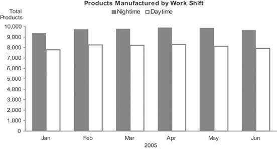
Because bar graphs emphasize individual values, they also enable easy comparisons between adjacent values. Figure 6-21 illustrates the ease with which you can compare measuresin this case the productivity of the daytime and the nighttime crews in any given monthusing this type of graph.
Figure 6-21. Bars are preferable to lines for encoding data along an interval scalein this case, a time series divided into monthswhen the graph is intended to support comparisons of individual measures.
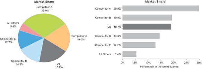
Even when you wish to display values that represent parts of a whole, you should use a bar graph rather than the ever-popular pie chart. This will present the data much more clearlyjust be sure to indicate somewhere in text (for example, in the graph's title) that the bars represent parts of a whole. Figure 6-22 provides an example of both a pie chart and a bar graph used to present the same part-to-whole data. Notice how much easier it is to make accurate visual judgments of the relative sizes of each part in the bar graph.
Figure 6-22. You can use a bar graph to more clearly display the same part-to-whole data that is commonly displayed with a pie chart.
6.2.1.3. Stacked bar graphs
A variation of the bar graph that is sometimes used to display business data is the stacked bar graph. This type of graph is useful for certain purposes, but it can easily be misused. I recommend against ever using a stacked bar graph to display a single series of part-to-whole data. A regular bar graph works much better. As you can see, it is much harder and more time-consuming to read the stacked bar graph in Figure 6-23 than the bar graph showing the same data in Figure 6-22.
Figure 6-23. A stacked bar graph is not the best way to display a single series of part-to-whole data.

Stacked bar graphs are the right choice only when you must display multiple instances of a whole and its parts, with emphasis primarily on the whole. Figure 6-24 provides an example with a separate instance of sales revenue per quarter, each subdivided by sales channel.
Figure 6-24. The only circumstance when a stacked bar graph is useful is when you must display multiple instances (for example, one for each quarter) of a whole (total sales) and its parts (in this case, per sales channel), with a greater emphasis on the whole than the parts.
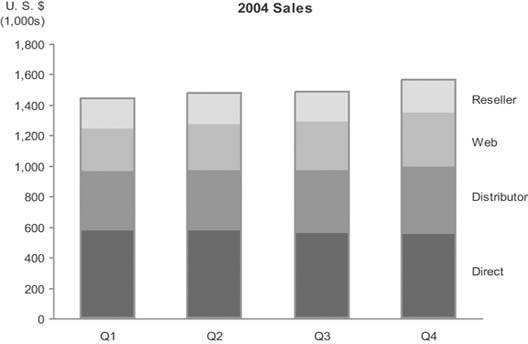
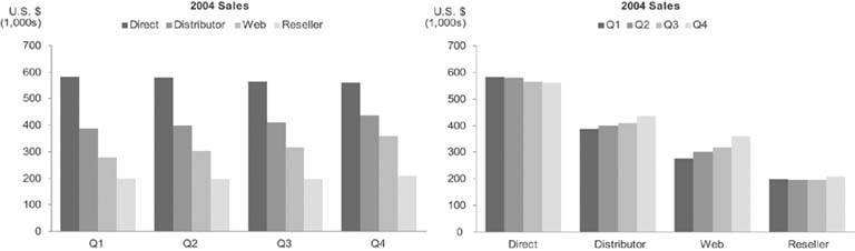
The changes in the distribution tend to be somewhat difficult to detect for all the segments except the one that appears at the bottom of each bar (in this case, "Direct" sales), which is why a stacked bar graph should not be used if these changes must be shown more precisely. Notice the detail regarding the changes in distribution of sales that can easily be seen in the bar graphs in Figure 6-25 (especially the one on the right). If you want to clearly display both the whole and its parts, you can use either two graphs next to one anotherone for the whole and one for its partsor a combination bar and line graph with two quantitative scalesone for the parts, encoded as individual bars, and one for the whole, encoded as a line.
Figure 6-25. These bar graphs reveal the shifts in the distribution of sales between the four channels much more clearly than the stacked bar graph in Figure 6-24.
6.2.1.4. Combination bar and line graphs
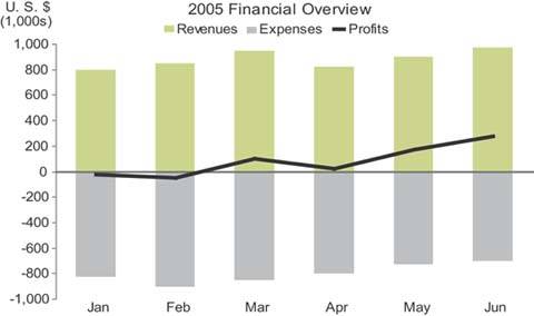
When you combine bars and lines together in a single graph, you shouldn't do so arbitrarily. This combination should be used only when some data can be displayed best using bars, with an emphasis on individual values and local comparisons, and some using a line, with an emphasis on the overall shape of the data. A common example involves displaying revenues and expenses (using bars to highlight the individual months) along with profits (using a line to highlight the trend), as seen in Figure 6-26.
Figure 6-26. This graph combines bars and a line to highlight monthly revenues and expenses on the one hand and the overall trend of profits on the other.
A less common use of combination bar and line graphs is one that I suggested in the bar graph section above as a way to clearly display multiple instances through time of both the individual parts of a whole and the whole itself. The example in Figure 6-27 solves this problem.
Figure 6-27. Example of a combination bar and line graph that displays quarterly instances of revenue by sales channel, encoded as bars, and total revenue, encoded as a line.
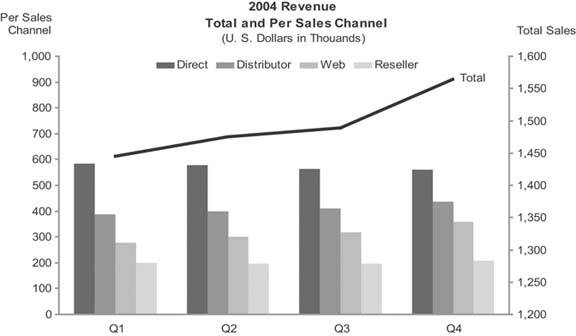
This is a combination bar and line graph with one quantitative scale for the bars and another for the line. It isn't necessary to use two quantitative scales, one on the left axis and one on the right, but doing so eliminates the wasted space that would otherwise appear in the gap between the total sales values and the much smaller values for the individual sales channels.
Note: The 80:20 rule of distribution is often used in reference to a company's revenue, usually stating that 80% of the revenue comes from 20% of the customers. Pareto's original observation that led to the formulation of this rule in 19th-century Italy was that 80% of the country's wealth was owned by 20% of the population.
Another useful combination of bars and a line breaks a rule that I declared earlier, when I said that you should use lines only to encode data along an interval scale. There is one exception to this rule, which involves a special kind of graph called a Pareto chart (named after its inventor, Vilfredo Paretothe same fellow who formulated the well-known 80:20 rule of distribution). Let's look at an example, and I'll explain why the Pareto chart deserves to be an exception to my general rule about the use of lines in graphs.
Pareto charts display individual values as bars and the cumulative total of those values as a line along a categorical scale. The categorical scale in a Pareto chart may be a time series, such as months of the year; this is an interval scale, so the use of a line in this case doesn't need an explanation. The example in Figure 6-28 does not have an interval scale, but a line still works well in this example.
Figure 6-28. This Pareto chart displays sales revenue by sales representatives, encoded as bars, as well as the cumulative revenue, encoded as a line.
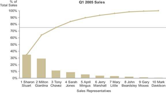
This graph has been designed to clearly show that the top 3 of 10 total sales representatives were responsible for 75% of total revenue for the quarter. The categorical scale, consisting of sales representatives, is an ordinal scale by virtue of the fact that the salespeople have been arranged in order by rank, based on their sales. Cumulative sales, as they increase from one salesperson to the next in ranked order, represent meaningful change. Each successive value is intimately connected to the one that precedes it, because it is the sum of itself and the previous value. This intimate connection merits the use of a line to encode changes in values from one to the next. The slope of the line provides useful information in this context: the steeper the line from one salesperson to the next, the greater that salesperson's revenue contribution was relative to the next-best salesperson's. By viewing the line as a whole, you can easily see how evenly distributed the contributions of the salespeople are, or how much they are skewed toward the top performers.
6.2.1.5. Line graphs
Line graphs do an exceptional job of revealing the shape of dataits movement up and down from one value to the nextespecially as it changes through time. Any time that you wish to emphasize patterns in the data, such as trends, fluctuations, cycles, rates of change, and how two data sets vary in relation to one another, line graphs provide the best means. Keep in mind that when you display time-series data on a dashboard, the shape of the data ("Is it going up or down?" "Is it volatile?" "Does it go through seasonal cycles?") is generally the picture that is needed, rather than the emphasis on individual values that bar graphs provide. In the context of dashboards, line graphs are often the best means to present a quick overview of a time series.
Figure 6-29 shows the same time-series data in two ways: on the left using a bar graph and on the right using a line graph. Notice how much more quickly and clearly the overall shape of the data comes through in the line graph. Unlike a bar graph, the quantitative scale of a line graph need not begin at zero, but it can be narrowed to a range of values beginning just below the lowest and just above the highest values in the data, thereby filling the data region of the graph and revealing greater detail. Always be sure to make the lines that encode the data more prominent than any other part of the graph so that the data stands out above all else.
Figure 6-29. Two graphs of the same time-series data: a bar graph on the left and a line graph on the right. Notice how the overall shape of the data is much easier to see in the line graph.
6.2.1.6. Sparklines
Sparklines are the brainchild of Edward R. Tufte, a true aficionado of data display. He has dedicated a full chapter to them in his book Beautiful Evidence (as yet unpublished but expected in 2006). My treatment of the subject is brief and far from definitive; my purpose here is to describe sparklines only to the extent necessary to demonstrate their valuable contribution to dashboards. Figure 6-30 provides an example of a simple sparkline.
Figure 6-30. A simple sparkline that displays the 12-month history of a checking account balance.

Tufte created the sparkline to provide a bare-bones and space-efficient time-series context for measures. Assuming that the sparkline in Figure 6-30 encodes a rolling 12-month history of an account balance, the ups and downs are instantly available to the viewer who wishes to consider the meaning of the current balance in light of its history.
Note: Edward R. Tufte, Beautiful Evidence (Cheshire, CT: Graphics Press, 2006).
Tufte describes sparklines as "data-intense, design-simple, word-size graphics." As such, they are ideal for dashboards and anything else that requires highly condensed forms of data display, such as medical diagnostic reports that include patient histories.
You might be wondering, "Where's the quantitative scale?" It's nowhere to be seen, and that's intentional. Sparklines are not meant to provide the quantitative precision of a normal line graph. Their whole purpose is to provide a quick sense of historical context to enrich the meaning of the measure. This is exactly what's required in a dashboard. Instead of details, you must display a quick view that can be assimilated at a glance. The details can come later, if needed, in the form of supplemental graphs and reports.
Although always small and simple, sparklines can include a bit more information than what I've illustrated so far. Figure 6-31 shows a sparkline that includes a light gray rectangle to represent the number of manufacturing defects that are acceptable, which reveals that in the last 30 days (the full range of the sparkline) the number of defects has exceeded the acceptable range on three occasions. The optional red dot marking the final value in the sparkline ties the end of the sparkline to the current value of five by making them both red.
Figure 6-31. This sparkline displays 30 days of manufacturing defect history compared to the acceptable range.

People commonly use simple up or down trend arrows to display the direction in which a measure is moving, but these are often ambiguous. In looking at the MTD Revenue measure in Figure 6-32, for example, it isn't obvious if the upward trend arrow indicates that revenue is trending upward overall for the year, the quarter, the month, or just since yesterday.
Figure 6-32. Simple trend arrows are often used on dashboards, but what they mean is sometimes unclear.

A sparkline, however, as shown in Figure 6-33, is not ambiguous, because it displays the entire period of history across which the trend applies.
Figure 6-33. This sparkline provides a clear picture of the historical trend leading up to the present measure.

As you can see, sparklines are ideal for dashboards. Every dashboard vendor ought to support them.
6.2.1.7. Box plots
The box plot is a fairly recent addition to the lexicon of graphs. It was invented in the 1970s by an extraordinary mathematician named John Wilder Tukey, who specialized in data display. This particular type of graph displays the distribution of value sets across the entire range, from the smallest to the largest, with many useful measures in between.
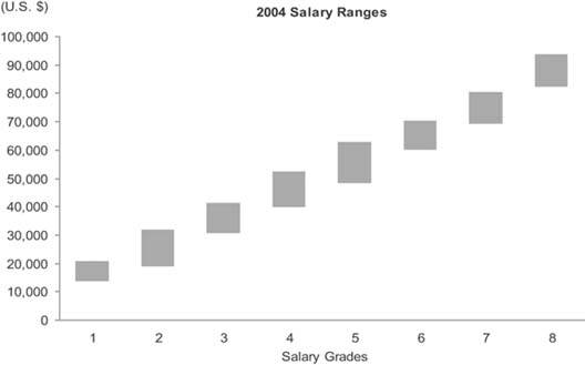
It is often inadequate to describe a set of values as a single summarized measure such as a sum or average. At times it is important to describe how those values are distributed across the entire range. For instance, to fully understand the nature of employee compensation in your company in each of the salary grades (that is, specified levels of compensation with prescribed ranges), you would certainly need to see more than the sum of salaries for each salary grade. Even a measure of average compensation, such as the mean or median, wouldn't tell you enough. Let's look at a few different ways that this data could be presented. Figure 6-34 presents the median salary in each gradethat is, the value that's in the middle of each range.
Figure 6-34. This graph displays employee salaries per salary grade as a single median value for each grade.
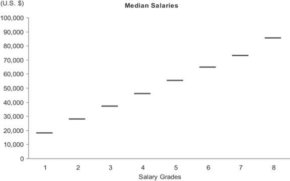
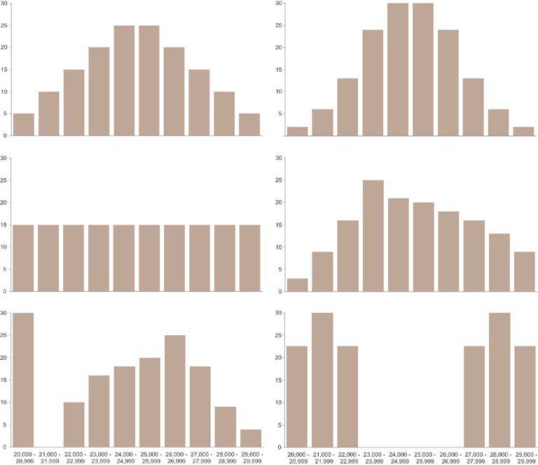
The adequacy of this display depends on your purpose. If your purpose requires a sense of how salaries are distributed across each range, this display won't tell enough of the story. The median expresses the exact center of the range, but not how the values are distributed around that center. Figure 6-35 shows six quite different examples of how the individual salaries in a single salary grade with a potential range of $20,000 to $30,000 and a median precisely in the middle at $25,000 might be distributed across that range. As you can see, the median alone tells a limited story, so it is often useful to display the data in a way that reveals more about how the values are distributed.
Figure 6-35. Six examples of how a set of salaries with the same median value might be differently distributed. The scale on the vertical axes represents the number of employees whose salaries fall into each of the ranges that run along the scale on the horizontal axes.
The graph in Figure 6-36 on the next page illustrates the simplest (and least informative) way to display how sets of values are distributed. It uses range bars to display two values for each salary grade: the lowest and the highest. Although it is useful to see the full range of each salary grade, this simple approach still tells us nothing about how individual values are distributed across those ranges. Do the values cluster near the bottom, center, or top, or are they evenly distributed?
Figure 6-36. This is the simplest but least informative way to display ranges of values. It uses range bars that encode the lowest and highest salaries in each salary grade.
With a combination of range bars and a measure of the median, as shown in Figure 6-37, a bit more insight begins to emerge.
Figure 6-37. This graph combines range bars with data points to mark the medians as well as the high and low salaries in each salary grade.

Knowing that by definition half of the values are larger than the median and half are smaller, we know that when the median is closer to the low end of a range of values, more values fall into the lower half than the upper half of the range. The closer the median is to the bottom of the range, the more skewed the values are in the opposite direction. The opposite is true when the median lies closer to the top of the range. The understanding of the distribution that is revealed by this relatively simple display certainly isn't complete, but it's definitely getting better and is probably sufficient for many purposes on a dashboard.
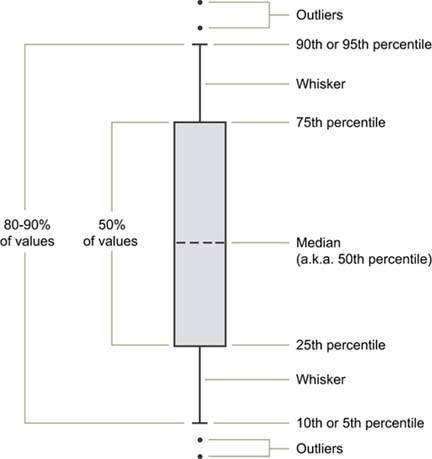
You can think of the combination of range bars with data points to mark the medians as a simplistic version of a box plot. A true box plot, as introduced by Tukey, provides more information. The box portion of a box plot is simply a rectangle (or bar) with or without a fill color. As with a range bar, the bottom of the box represents a value and the top represents a value, but these are usually not the lowest and highest values in the range. Figure 6-38 illustrates a full-grown version of a single box plot with "whiskers" (known as a box-and-whisker plot). This is just one of the many variations that are commonly used.
Figure 6-38. An individual box plot with whiskers. Outliers are individual data values that fall outside the range that is defined by the whiskers.
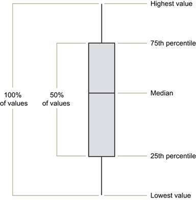
A graph with boxes like this conveys a rich picture of data distributionperhaps too rich for most dashboards and most of the folks who use them. A simpler version of the box plot, such as the one in Figure 6-39 on the next page, may be preferable for dashboard use.
Figure 6-39. A simplified version of a box plot such as this one is usually more appropriate for dashboards than the one shown in Figure 6-38.
6.2.1.8. Scatter plots
A scatter plot does only one thing, but it does it quite well: it displays whether or not, in what direction, and to what degree two paired sets of quantitative values are correlated. For instance, if you want to show that there is a relationship between the number of broadcast ads and sales revenues, a scatter plot such as the one in Figure 6-40 would work nicely.
Figure 6-40. This scatter plot displays the correlation between the number of broadcast ads and the amount of sales revenue for 24 months.
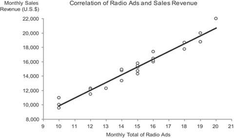
In this case, both the number of times ads were aired and the sales revenues for each month were collected as a paired set of values for 24 months. This graph tells us the following:
- There is a correlation between ads and sales revenue, indicated by the fact that a change in the number of ads almost always corresponded to a change in sales revenue.
- The correlation is positive (upward sloping from left to right), indicating that as the number of ads increased the sales revenue also usually increased.
- The correlation is fairly strong. This is indicated by the tight grouping of the data values around the trend line, showing that an increase or decrease in ads from one measure to another almost always corresponded to a similar amount of increase or decrease in sales revenue.
Given that each pair of measures was collected for a given month across 24 consecutive months, this data could have been displayed as a timeseries line graph, but the nature of the correlation would not have stood out as clearly.
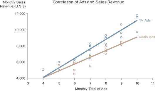
The scatter plot will still work nicely if you split the measures into multiple sets. For instance, you could split the ads into two typesradio and televisionas shown in Figure 6-41. A quick examination of this display tells us that the correlation of television ads to sales revenue is more positive (upward sloping) than that of radio ads, though the strength of each correlation (the proximity of the data values to the trend line) appears to be about the same.
Figure 6-41. This scatter plot displays the correlation between the number of radio and television ads and their respective amount of sales revenue for 24 months.
Scatter plots are sometimes rendered three-dimensionally, in order to display the correlation of three quantitative variables, rather than just two. Other methods are sometimes used as well to increase the number of correlated variables in a single scatter plot. I recommend against using any of these approaches on a dashboard, however, because even when they are designed as well as possible, they require too much study to understandtime that dashboard viewers don't have.
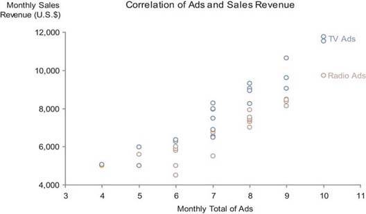
One other point I'd like to mention is that the use of a straight trend line (also known as a line of best fit) in a scatter plot makes the direction and strength of the correlation stand out more than just the individual data points by themselves. The graph in Figure 6-42 is precisely the same as the one in Figure 6-41, except that it lacks trend lines. It is easy to see that the direction and especially the strength of the correlations would require more time to discern without the trend lines. Lines of best fit come in several types, some of which are curved, and each works best for data sets that exhibit particular patterns. Knowledge of when to use them and how to interpret them, however, is not common except among statisticians, so it is best to avoid all but the simple straight line of best fit unless you and the dashboard's users have the necessary training to understand the other forms.
Figure 6-42. This scatter plot displays the correlation between the number of radio and television ads and their respective amount of sales revenue for 24 months, this time without the trend lines that appear in Figure 6-41.
6.2.1.9. Treemaps
Treemaps, developed in the 1990s by Ben Shneiderman of the University of Maryland, are graphs used to display large sets of hierarchically or categorically structured data in the most space-efficient way possible. Shneiderman is one of the most inspiring researchers and innovators working in information visualizationone who played a major role in defining the domain. Treemaps completely fill available screen space with a set of contiguous rectangles that have each been sized to encode a quantitative variable. Hierarchies and categories are represented as rectangles contained within larger rectangles. In addition to the quantitative variable that is associated with rectangle size, color can also be used to encode a second quantitative variable for providing a richer multivariate display.
The purpose of treemaps is not to make fine quantitative comparisons or to rank items, but rather to spot particular conditions of interest. The 2-D areas of rectangles and variations in color do not support easy, efficient, or accurate value comparisons, but when these visual attributes are combined in the treemap, they can make particular conditions jump out and thereby enable the process of discovery.
Due to their space-efficient design, treemaps can be used quite effectively on dashboards, but they should be reserved for those circumstances for which they were developed, and, when used, should be designed with care. The example in Figure 6-43 illustrates an appropriately applied and effectively designed treemap for a business dashboard.
Figure 6-43. This treemap, created using Treemap 4.3 software developed at the University of Maryland's Human-Computer Interaction Lab (HCIL), displays sales data (revenue and percentage of quota) by region.
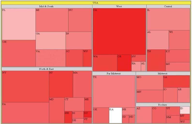
It displays sales by region, with revenue encoded as rectangle size and the percentage of sales quota achieved encoded as color (ranging from bright red as the lowest percentage and pure white as the highest). Notice how your eyes are mostly drawn to the large red rectangles, which represent states with large revenues that are performing poorlyin other words, states whose performance results in the greatest negative affect on revenue (for example, California). If you're interested in spotting those states whose good performance is having the greatest positive affect on revenue, you simply look for the largest light-colored rectangles (for example, Florida).
I chose to use a single hue rather than several to encode the percentage of sales quota, varying the values by intensity from completely unsaturated red (that is, white) to fully-saturated, bright red. It is common for this type of data to be encoded in a treemap using multiple hues, such as red for values that are below quota and green for those that are above quota. Typically, these colors would range from bright red at the low end through darker and darker shades, reaching black in the middle (for values close to the quota), and proceeding through dark shades of green all the way to bright green at the high end. If a clear distinction between values that are below quota and those above is necessary, then multiple hues would work, but I believe that often when such distinctions are displayed, they are unwarranted. If you are responsible for monitoring sales performance by state, do you really want to see a qualitative distinction between a state that is slightly below quota (dark red) and one that is slightly above quota (dark green)? Are these values really that different?
Treemaps are usually interactive, providing the means to select a particular item in the hierarchy and then drill down into the next level of items that belong to the higher-level item that you selected. This enables easy navigation through the hierarchy to investigate particular conditions of interest, potentially revealing what is going on at lower levels that is creating these conditions. This provides a simple path for more fully exploring and responding to those conditions that jump out on the dashboard as needing attention.
6.2.1.10. Final thoughts about graphs
You might be wondering why some of the other graphs that are familiar to you are missing from this proposed library. Each is missing for one of the following two reasons:
- It communicates less effectively than an alternative that I've included.
- It is too complex for the typical needs of a dashboard.
The pie chart probably tops the list of often-used graphs that were left out of this library of graphs because they communicate less effectively than other means. Pie charts were designed to display part-to-whole information, such as the individual products that make up an entire product line. As we've already discovered, however, part-to-whole information can be communicated more clearly using a bar graph. Another comparison of the two types of graph used to display the same set of part-to-whole data is shown in Figure 6-44.
Figure 6-44. This pie chart and bar graph both display the same part-to-whole data. The values are much easier to interpret and compare when a bar graph is used.
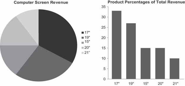
Viewers can process the information in the bar graph on the right much more quickly and easily than in the pie chart on the left. Why? Whereas a bar graph uses the preattentive visual attribute of line length (that is, the lengths or heights of the bars) to encode quantitative values, pie charts encode values as the two-dimensional areas of the slices and their angles as they extend from the center toward the circumference of the circle. Our visual perception does a poor job of accurately and efficiently comparing 2-D areas and angles. The only thing that a pie chart has going for it is that when you see one you automatically know that you are looking at measures that are parts of a whole. Because bar graphs can be used for other types of comparisons, when you use them to display part-to-whole data, you must label them in a manner that makes this clear. As long as this is done, bar graphs are far superior.
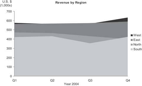
A pie chart falls into a larger class of graphs called area graphs. Area graphs use 2-D space to encode quantitative values, which is prone to inaccurate interpretation and often to occlusion (a problem that is caused when one object is hidden entirely or in part behind another). The area graph in Figure 6-45 on the next page illustrates the problem of occlusionrevenues for Quarters 2 and 3 in the West and Quarter 4 in the North are completely hidden.
Figure 6-45. Area graphs can suffer from the problem of occlusion.
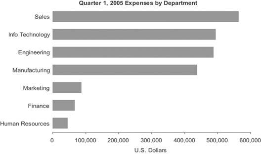
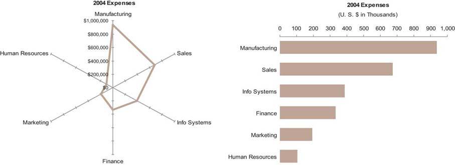
Another type of graph that's surfacing more and more often these days is the radar graph, a circular graph that encodes quantitative values using lines that radiate from the center of the circle to meet the boundary formed by its circumference. It is nothing but a line graph with the categorical scale arranged along a circular axis, as you can see on the left in Figure 6-46. For common business data a radar graph is not as effective as a bar graph (shown on the right in Figure 6-46), because it is more difficult to read values arranged in a circular fashion. The only time I've found a radar graph to be tolerable for displaying typical business data was when the categorical scale could naturally be envisioned as circularfor example, when the measures on the scale are the hours of a day, due to the familiar circular arrangement of time on a clock.
Figure 6-46. This radar graph (left) and bar graph (right) display the same expense data. In the radar graph, departments are arranged along the circumference and the quantitative scale for expenses resides along the radial axes that extend from the center. The bar graph is much easier and faster to read.
6.2.2. Icons
Icons are simple images that communicate a clear and simple meaning. Only a few are needed on a dashboard. The most useful icons are typically those that communicate the following three meanings:
- Alert
- Up/down
- On/off
6.2.2.1. Alert icons
It is often useful to draw attention to particular information on a dashboard. This is especially true when something is wrong and requires attention. An icon that works as an alert shouts at the viewer, "Hey, look here!" For an icon to play this role well, it needs to be exceptionally simple and noticeable. Ten variations of an alert icon, each with its own slightly different meaning, are far too complex for a dashboard. Try to limit alert levels to a maximum of two, and ideally to one. A single alert icon catches the eye much more effectively than multiple alerts with various meanings.
A common alert scheme on dashboards uses the traffic light metaphor, composed of three colors with different meanings. Green is typically used to indicate that all is wellbut what's the point? If everything's fine, you don't need to draw attention to the data. Alerts that are always there draw less attention than alerts that appear only when attention is required. This is because a simple icon that appears only in certain circumstances is perceived preattentively as an "added mark." This preattentive attribute is not tapped into when the traffic light alert system is used, because although the color used to encode the data may change, nothing is being added.
I've found that a simple shape, such as a circle or square, usually works best as an alert icon. If you must communicate multiple levels of alerts, rather than using distinct icons, stick with one shape and vary the color. Traffic signal colors of red, yellow, and green are conventional, but they don't work for the 10% of males and 1% of females who are color-blind. Figure 6-47 illustrates this point by showing the colors green, yellow, and red on the left and what a person with the predominant form of color-blindness would see on the right.
Figure 6-47. The icons on the right simulate what someone who is color-blind would see when looking at those on the left.

A solution that works for everyone involves distinct intensities of the same hue, such as light red (in place of yellow) and dark red, as shown in Figure 6-48.
Figure 6-48. The simple alert icons on the left use varying intensities of a single hue to encode different meanings. The two on the right simulate what a person who is color-blind would see. Varying intensities of any single hue are distinguishable by everyone.

6.2.2.2. Up/down icons
Up/down icons convey the simple message that a measure has gone up or down compared to some point in the past or is greater or lesser than something else, such as the target. Financial information is common on dashboards, and a quick way to indicate the up or down movement of stocks, profits, and so on is often useful. Fortunately, a conventional symbol is already in use to communicate these meanings: a triangle or arrow with the tip pointing either up or down. The color of the icons may vary as well (usually green for good and red for bad) so they stand out more clearly, but again, this is a problem for those who are color-blind. This problem can be avoided by using colors that vary greatly in intensity as well as hue, such as fully saturated red for the icon that indicates movement in the wrong direction and less eye-catching pale green for the other. Figure 6-49 illustrates a possible presentation of two versions of this simple icon.
Figure 6-49. Simple up and down icons.

6.2.2.3. On/off icons
On/off icons serve as flags to identify some items as different from others. For example, if you display a list of the top 10 current sales opportunities and you want to flag some as being closer to closing than others, a simple on/off icon would do this nicely. Other typical uses include marking featured items, such as products in a list, and pointing out where you currently are on a schedule that includes events that extend into the past and future. Any one of many simple icons could be used to serve this purpose, but checkmarks, asterisks, and Xs (Figure 6-50) are probably the most common and intuitively understood. Regardless of which icon you choose for this purpose, it is best to pick one and stick to it. Consistency might seem boring, but on dashboards it makes things clear.
Figure 6-50. Sample on/off icons.

6.2.3. Text
All dashboards, no matter how graphically oriented, include some information that is encoded as text. This is both necessary and desirable, for some information is better communicated textually rather than graphically. Text is used for the categorical labels that identify what items are on graphs, but it is often appropriate in other places as well. Any time it is appropriate to report a single measure alone, without comparing it to anything, text communicates the number more directly and efficiently than a graph (Figure 6-51). Note that in these instances some means to display the text on a dashboard, such as a simple text box, is necessary.
Note: See Chapter 7, Designing Dashboards for Usability, for a discussion of choosing fonts for use on a dashboard.
Figure 6-51. Text can be used on a dashboard to clearly convey a single measure on its own.

6.2.4. Images
The means to display images such as photos, illustrations, or diagrams is sometimes useful on a dashboard, but rarely, in my experience. A dashboard that is used by a trainer might include photographs of the people scheduled to attend the day's class, one used by a maintenance worker might highlight the areas of the building where light bulbs need to be replaced, or one used by a police department might use a map to show where crimes have occurred in the last 24 hours. However, images will be unnecessary for most typical business uses.
6.2.5. Drawing Objects
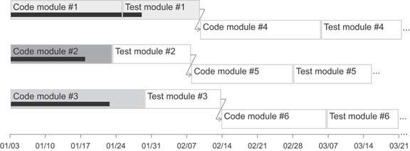
It is sometimes useful to arrange and connect pieces of information in relation to one another in ways that simple drawing objects handle with clarity and ease. For instance, when displaying information about a process, it can be helpful to arrange separate events in the process sequentially and to indicate the path along which the process flows, especially when branching along multiple paths is possible. Another example is when you need to show connections between entities, perhaps including a hierarchical relationship, such as in an organization chart. Entities can easily be displayed as rectangles and circles, and relationships can be displayed using lines and arrows. For instance, rectangles or circles could represent tasks in a project, with arrows connecting them to indicate their relationships and order.
Figures 6-52 and 6-53 provide examples of how some of these objects might be used. They can also be used to highlight and group information, which is a common need in dashboard design. Switching between rectangles and circles provides an easy way to distinguish different types of entities. Lines and arrows both show connections between entities, but arrows display the additional element of direction.
Figure 6-52. Simple drawing objects can be used to clarify relationships between the components of net revenue.

Figure 6-53. Simple drawing objects can be used to display relationships between tasks in a project plan.
6.2.6. Organizers
It is often the case that sets of information need to be arranged in a particular manner to communicate clearly. Three separate ways of organizing and arranging related information stand out as particularly useful when displaying business information on dashboards:
- Tables
- Spatial maps
- Small multiples
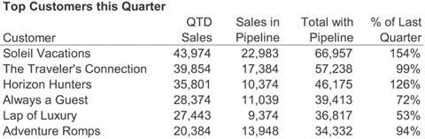
6.2.6.1. Tables
Tables arrange data into columns and rows. This is a familiar arrangement for text (Figure 6-54), but it can also be used to arrange any of the other display media that we've already examined. Arranging graphs, icons, and images into columns and rows is often useful.
Figure 6-54. A tabular arrangement of text.
6.2.6.2. Spatial maps
Spatial maps offer a more specialized and less often needed form of organization. They can be used to associate databoth categorical and quantitativewith physical space. When data is tied to physical space and its meaning can be enhanced by making that arrangement visible, spatial maps are useful.
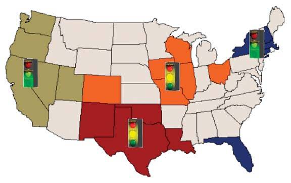
The most common arrangement of data related to physical space is a geographical arrangement in the form of a map. When the geographical location of the thing being measured must be seen to understand the data, placing the measures on a map supports this understanding. However, this doesn't mean that any time measures can be shown in relation to geography, they should be; only when the meaning of the data is tied to geography and that meaning cannot easily be understood without actually seeing the data arranged on a map should this approach be taken. For example, sales revenue can be understood in relation to a small number of sales regions without displaying the data on a map (see Figure 6-55), but displaying concentrations of absenteeism among employees in stores located throughout the United States on a map could reveal patterns related to location that might not be obvious otherwise.
Figure 6-55. Spatial maps can be useful when they add to our understanding of the data, but, as in this case, they are often used unnecessarily.
The second most useful type of spatial map on a dashboard is probably the floor plan of a building. If, for example, it is your job to monitor temperatures throughout a large building and respond whenever particular areas exceed established norms, seeing the temperatures arranged on a floor plan could bring relationships between adjacent areas to light that you might miss otherwise.
6.2.6.3. Small multiples
The last organizer arranges graphs in a manner that Edward Tufte calls "small multiples." This arrangement is tabular, consisting of a single row or column of related graphs, or multiple rows and columns of related graphs arranged in a matrix. I list small multiples separately from tables because organizers that display small multiples ought to have some intelligence built into them to handle aspects of this arrangement that would be time-consuming to arrange manually in a table.
In a display of small multiples, the same basic graph appears multiple times, each time differing along a single variable. Let's look at an example. If you need to display revenue data as a bar graph across four sales regions, with bookings and billings revenue shown separately, you could do so in a single graph, as shown in Figure 6-56.
Figure 6-56. This bar graph displays three variables.
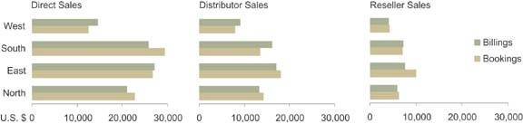
If, however, you must simultaneously display the revenue split between three sales channels (for example, sold directly, through distributors, and through resellers), a single graph won't work. To the rescue comes the small multiples display. As shown in Figure 6-57, by arranging three versions of the same graph next to one anotherone graph per sales channelyou can show the entire picture within eye span, making comparisons easy. To eliminate unnecessary redundancy, you could avoid repeating the region labels in each graph, as well as the legend and the overall title. This not only saves valuable space, which is always important on a dashboard, but it also reduces the amount of information that the viewer must read when examining the display.
Figure 6-57. This series of horizontally aligned small multiples displays revenue split between three sales channels.
An intelligent organizer for small multiples built into the software would allow you to reference the data, indicate which variable goes on which axis of the graph, which should be encoded as lines of separate colors, which should vary per graph, and finally whether you want the graphs to be arranged vertically, horizontally, or in a matrix; the organizer would then handle the rest for you. As of this writing, I have yet to see dashboard software that makes this easy to do. I reserve the hope, however, that this will soon change.
Clarifying the Vision
- Clarifying the Vision
- All That Glitters Is Not Gold
- Even Dashboards Have a History
- Dispelling the Confusion
- A Timely Opportunity
Variations in Dashboard Uses and Data
Thirteen Common Mistakes in Dashboard Design
- Thirteen Common Mistakes in Dashboard Design
- Exceeding the Boundaries of a Single Screen
- Supplying Inadequate Context for the Data
- Displaying Excessive Detail or Precision
- Choosing a Deficient Measure
- Choosing Inappropriate Display Media
- Introducing Meaningless Variety
- Using Poorly Designed Display Media
- Encoding Quantitative Data Inaccurately
- Arranging the Data Poorly
- Highlighting Important Data Ineffectively or Not at All
- Cluttering the Display with Useless Decoration
- Misusing or Overusing Color
- Designing an Unattractive Visual Display
Tapping into the Power of Visual Perception
- Tapping into the Power of Visual Perception
- Understanding the Limits of Short-Term Memory
- Visually Encoding Data for Rapid Perception
- Gestalt Principles of Visual Perception
- Applying the Principles of Visual Perception to Dashboard Design
Eloquence Through Simplicity
- Eloquence Through Simplicity
- Characteristics of a Well-Designed Dashboard
- Key Goals in the Visual Design Process
Effective Dashboard Display Media
- Effective Dashboard Display Media
- Select the Best Display Medium
- An Ideal Library of Dashboard Display Media
- Summary
Designing Dashboards for Usability
- Designing Dashboards for Usability
- Organize the Information to Support Its Meaning and Use
- Maintain Consistency for Quick and Accurate Interpretation
- Make the Viewing Experience Aesthetically Pleasing
- Design for Use as a Launch Pad
- Test Your Design for Usability
Putting It All Together
EAN: 2147483647
Pages: 80
