PivotCharts
Like PivotTables, PivotCharts are easier to work with if you first prepare a data source query. The same qryNorthwindEverything query that was used for PivotTables in the previous section is also useful for creating PivotCharts. A PivotChart has drop zones for category fields and series fields (similar to the row and column fields for PivotTables), and filter and data fields (similar to the filter and detail/total fields for PivotTables); however, some PivotChart types (such as the pie chart) only require a series field (no category field) and a data field.
I use the tag fpvc for PivotChart forms.
To create a PivotChart, create a new form and select AutoForm: PivotChart from the New Form dialog; select qryNorthwindEverything as its data source. The new, blank PivotChart is shown in Figure 5.14.
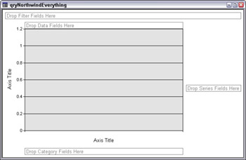
Figure 5.14
To start with a simple column graph (the default chart type), I dragged Country to the filter area, and filtered for USA, dragged CategoryName to the Categories drop area, OrderQuarter to the Series drop area, and Price to the data area. Note that Price appears on the chart as Sum of Price. If I dragged OrderDate to this area, it would appear as Count of OrderDate. Access places numeric fields as Sum, and other fields as Count, when they are placed in the Data area. The initial chart is shown in Figure 5.15.
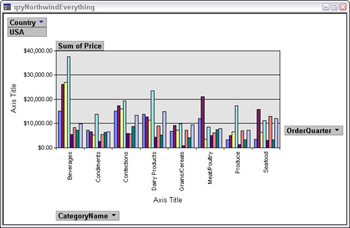
Figure 5.15
There are many more formatting options for PivotCharts than for PivotTables, and you can use them to prepare impressive charts, selecting an appropriate chart type for the data you are displaying. The column colors in the starter chart indicate the quarter for which the price is being summed, but without a legend the users won’t know which is which. Therefore, the first step is to add a legend to the chart, by clicking the Show Legend button on the PivotChart toolbar. To restrict the data to just 1995, I dropped down the OrderQuarter selector and checked only the 1995 quarters, as shown in Figure 5.16.
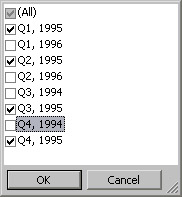
Figure 5.16
Next step is to replace the Axis Title placeholders with real titles for the X- and Y-axes; this is done by right-clicking the placeholder and opening the properties sheet from its context menu; here, the caption is edited on the Format page. I entered Food Categories as the X (bottom) axis title, and formatted it for 11 pt and bold. Similarly, I changed the Y- (left) axis title to Total Sales, 11 pt bold. The enhanced, but still rather plain chart is shown in Figure 5.17.
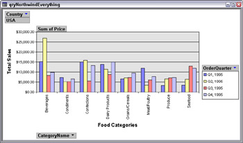
Figure 5.17
There are many choices for chart and graph types; to see them, click the Chart Type button on the PivotChart toolbar. Figure 5.18 shows the choices for column graphs; click the other chart types to see their selections.
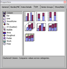
Figure 5.18
I selected the 3D, angled view, and in the same properties sheet I modified some of the visual effects of the graph on the 3D view page and the Fill page; the best way to learn about these selections is to experiment with them. I rotated the graph to display the columns better, and selected the Calm Water background for the chart. The modified chart is shown in Figure 5.19.
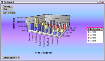
Figure 5.19
With the 3D graph, there are labels for the four quarters, so the legend could be removed, though I like to keep it, for clarity. You can swap rows and columns very easily with a PivotChart—just click the By Row/By Column toolbar button..
For some data, a line graph may be more suitable. Figure 5.20 shows a SmoothLine graph showing 1995 sales by month (using a count, not a sum) for all the UK salespersons.
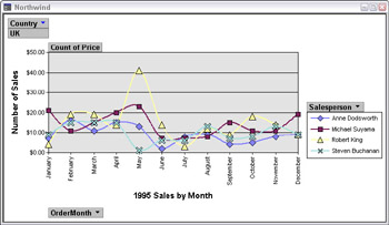
Figure 5.20
A pie chart is appropriate when you only want to look at data for a category, such as displaying sales by food categories. I created a PivotChart with Price for the data field and CategoryName for the Categories field, and added a title to the chart by opening its properties sheet and clicking the Add Title button on the General page. Then, I selected the placeholder Chart Workspace Title and edited the title in the Caption property of the Format page of its properties sheet. I also hid the field buttons and drop zones for a cleaner look by unchecking the Field Buttons/Drop Zones checkbox on the Show/Hide page of the chart’s properties sheet. Figure 5.21 shows the modified 3D pie chart.
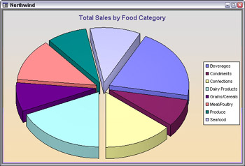
Figure 5.21
The PivotChart Toolbar
Like PivotTables, PivotCharts have their own toolbar, with several buttons you can use to modify PivotChart elements; some of them will be familiar to you from other toolbars. The PivotChart toolbar is shown in Figure 5.22, and its buttons are explained in the table following the figure.
![]()
Figure 5.22
| Important | Some toolbar buttons are only enabled if the appropriate PivotChart element is selected. For example, you can only collapse or expand levels if there are two or more fields in the Categories (or Series) area. |
| Toolbar Button | Function | Comments |
|---|---|---|
| | Switch to another view | Rarely, if ever needed for PivotCharts |
| | Save | Saves the form |
| | Search | Opens the Search pane |
| | | Prints the PivotChart |
| | Preview | Previews the PivotChart |
| | Undo | When it is enabled (rarely), undoes the last action |
| | Chart Type | Select the chart type |
| | Delete | Delete the selected element |
| | Show Legend | Makes the legend visible |
| | By Row/By Column | Swaps rows and columns |
| | Sort Ascending | Row or Column selected |
| | Sort Descending | Row or Column selected |
| | AutoFilter | Switches between the selected filter and showing all |
| | Show Top/Bottom Items | Category or Series selected |
| | AutoCalc | Data total selected |
| | Collapse | Hides lower level—select the higher of two category or series levels |
| | Expand | Displays lower level—select the higher of two category or series levels |
| | Drill into | Drills down into the data |
| | Drill out | Drills up out of the data |
| | Refresh | Useful when a PivotChart is based on a remote data source |
| | Multiple Plots | Lets you create a multi-chart—each value in the multi-chart field has its own chart |
| | Multiple Plots Unified Field | Uses the same scale for all multi-charts |
| | Field List | Displays the field list |
| | Properties | Lets you set many properties of various PivotChart elements; different properties can be set depending on which element is selected |
| | Database Window | Shows the database window |
| | New Object selector | Lets you create a new object |
| | Access Help | Opens Access Help |
Embedded PivotCharts
PivotCharts can also be embedded in standard forms, so that each record will have its own chart based on data in that record. To create an embedded PivotChart, first create the main form (I made a simple form based on the Northwind tblEmployees table), then create a PivotChart form as usual, and drag the PivotChart form to the main form where you want to embed it.
Next, to filter the PivotChart subform for just the current record, set the subform’s LinkChildFields and LinkMasterFields properties to the appropriate linking field (EmployeeID, in this case). Figure 5.23 shows the Employees with Chart form, with a line graph showing 1995 sales by food category for 1995.
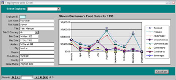
Figure 5.23
EAN: 2147483647
Pages: 124
- Step 1.1 Install OpenSSH to Replace the Remote Access Protocols with Encrypted Versions
- Step 2.1 Use the OpenSSH Tool Suite to Replace Clear-Text Programs
- Step 4.5 How to use OpenSSH Passphrase Agents
- Step 4.6 How to use PuTTY Passphrase Agents
- Step 6.2 Using Port Forwarding Within PuTTY to Read Your E-mail Securely