Building Navigation Bars
|
| < Day Day Up > |
|
A navigation bar differs from a set of rollover buttons because it keeps track of which button is clicked or selected. Navigation bar elements (buttons) can have more than two states. The common states are the up and the over states by you can add a third state of down and, sometimes, even a fourth state of over while down. Only the up state is required. Whether you opt to build the navigation bar in Fireworks or export the images and build the bar in Dreamweaver, the Set Nav Bar Image behavior powers the navigation bar's interactive elements.
| Caution | The Navigation Bar Object and the Set Nav Bar Image behavior contain several wicked bugs at the time this book was written. Macromedia may have released an updated version that addresses these bugs. Check at www.macromedia.com/support/dreamweaver. If there isn't an update or it doesn't fix the bugs, be sure to look for Caution notes about the bugs in the following paragraphs. |
Adding Fireworks navigation buttons to a Dreamweaver page
Fireworks MX This is not referring to the Fireworks Nav Bar behavior, which shows the down state of each button on their respective pages but a row of buttons to form a navigation area. To add a navigation bar to an existing Dreamweaver page, place your cursor into the page where you want to add the bar and use the Insert Fireworks HTML button found on the Common toolset of the Insert bar to add the Fireworks HTML page. Alternatively, you can choose Insert ® Interactive Images ® Fireworks HTML. To add the Nav Bar behavior in Dreamweaver see the section coming up in this chapter called, "Using the Set Nav Bar Image behavior."
| Cross-Reference | Chapter 20 shows how to build navigation buttons. You can find a tutorial for the Fireworks Nav Bar behavior at www.joycejevans.com/tutorials/ Fireworks/FWMX/Nav%20Bar/ nav_bar.htm . |
Building a navigation bar in Dreamweaver
Most professional developers prefer to export only the images for the button states from Fireworks and build their navigation bars in Dreamweaver. There are two options for adding a navigation bar, the Set Nav Bar behavior or the Navigation Bar object. The Navigation Bar object, located in the Common toolset of the Insert bar, provides a simple, one-screen interface for adding the different button states for each button in the navigation bar.
The Set Nav Bar Image dialog box (Figure 40-3) provides fields for naming your bar elements and Browse buttons to locate the various states for each button. You can also add alternate text and a URL link and set a target frame for navigation bar buttons used in a framed site. Use the Show Down Image Initially option to display the down state of the button for the current page. For example, if you have a set of four buttons plus a home button, you would set the home button to be down initially on the home page only. Click the Add (+) button to move to the next element of your bar and repeat the process of naming the button and adding the buttons states, URL, and alternate text. When you build the navigation bar in a section page, set that section's button to be down initially, too.
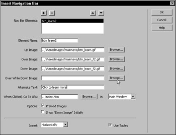
Figure 40-3: Name your button elements and select their buttons states. Add alternate text and locate the page for each button link. Click the Add (+) button to move to the next element of the navigation bar.
At the bottom of the dialog box, you can indicate whether your navigation bar is to be inserted horizontally or vertically and can also choose to add it within a table structure. When you click OK, the navigation bar is inserted into the page.
Using navigation bars in framed sites
Navigation bars are especially useful in framed sites because a single page can be used to indicate where the user is within the site. JavaScript maintains the button states, eliminating the need for multiple pages to display down buttons when in a site section. In a framed site, be sure to choose the target frame when setting the When Clicked, Go To URL link. The menu to the right of this field should display your named frames.
| Tip | If the frame you want to target doesn't appear in the menu to the right of the URL field, close the Insert Navigation Bar dialog box and name your frames. |
Using the Set Nav Bar Image behavior
When your pages already contain the buttons you want to use for a navigation bar, use the Set Nav Bar Image behavior to add navigation bar functionality. Instead of adding the buttons as elements in a single dialog box, select a button and use the Behaviors panel to add the Set Nav Bar Image behavior. Any names, alternate text, or targets already existing for the selected button populate the appropriate field in the Set Nav Bar Image dialog box.
| Caution | If your buttons already contain links, adding the Set Nav Bar Image behavior may actually create a nested anchor tag upon adding the behavior. This is invalid HTML and should be fixed. To workaround this bug, remove your page links before adding the behaviors to the buttons. |
To add navigation bar functionality using the Set Nav Bar Image behavior, follow these steps:
-
Select a button element.
-
Use the Behaviors panel to add the Set Nav Bar Image behavior.
-
In the Basic screen of the dialog box, use the Browse button to locate the various states for this button.
-
Add alternate text, a URL, and a target, as desired.
-
If working in the page that is the URL for this button, add a check in the box to set this button to Show Down Image Initially.
-
Click OK.
-
Repeat Steps 1–4 for each button. Perform Step 5 for a button only when building the navigation bar in the page that is the target of the button.
| Tip | To avoid having to rebuild the navigation bar in all your pages, try building the bar as a Library Item; then add the item to the site pages. You won't be able to set the initially down state for buttons until you detach the Library Item, of course. |
Navigation bars and templates
Using a navigation bar in a template (dwt) file is problematic; ideally, you want the region to remain locked until you have the pages for the site built from the template. But, if the region is locked, you cannot change the initial down state for the various buttons on their pages.
Although there may be complex, code-intensive methods to accomplish setting an initial down state for a navigation bar in a template, it is easier to fake the navigation bar appearance and not use the behavior at all.
Habitat Alert site Here's a work-around to mimic a navigation bar in the Habitat Alert site using editable attributes and building nested templates for each section:
-
In the Chapter 40 defined site, open basic page.dwt from the Templates folder.
-
Select the LEARN button (btn_learn) and choose Modify ® Templates ® Make Attribute Editable.
-
The SRC attribute should be selected but if not, choose it from the Attribute menu. Check the Make Attribute Editable box. Name this editable attribute learn button src.
-
From the Type menu, choose URL because an image src requires a path. The path given is correct, and you don't have to modify it. Click OK to close this dialog box and be prepared to see your button image become a placeholder image. This is as intended because the previous path is replaced by a parameter, written as @@(_document['learnt button src'])@@.
-
Repeat the process for the remaining three buttons, using the same naming convention with each button: act button src, support button src, and find button src.
-
Save the template and update the pages when prompted.
-
Open the instance pages and choose Modify ® Template Properties. Select the appropriate Editable Attribute for the page and change the path by appending _f2 just before the extension.
Unfortunately, there's no Browse button to make this easier, but because Fireworks outputs the over state as _f2, you know that this is all you need to make the proper path to the image used for the over and down states. In Chapter 44, you want the selected button graphic to remain selected as a DHTML menu appears below it.
The resulting pages use the second graphic when they load, letting the users know that they are in that section, while maintaining a locked set of navigation buttons in the template. Figure 40-4 shows the main page from the Learn section of the Habitat Alert site after setting up the Editable attribute.
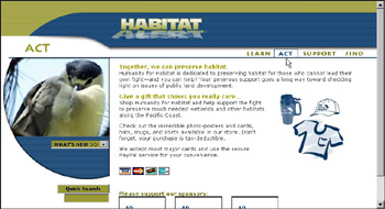
Figure 40-4: The Down state of the button reinforces the current location in the site.Cross-Reference The next step would be to build nested templates from the instance pages, as described in Chapter 37, so that all pages built for a specific section would have that section's navigation button in the down state.
|
| < Day Day Up > |
|
EAN: 2147483647
Pages: 491