CREATING STANDARD COMPONENTS FOR DEVICES
| No matter what you are creating for devices, at some point, you will need a "standard" component of some sort. Whether you need a radio button, checkbox, slider, or drop-down menu, creating and perfecting the infernal little thing will take up too much of your time. Any time you have to reinvent the wheel, it's a painful experience; thankfully, you don't have to do it now. On the web site for this book, (www.flashenabled.com) is a full set of components that are made just for devices. Download them now and then come back and learn all about how to use them!
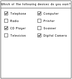
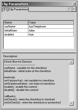
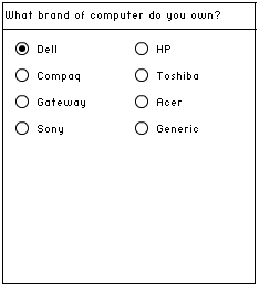
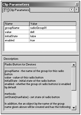
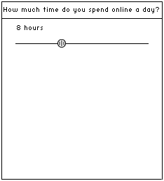
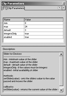
CheckboxesThe checkbox control provides a simple method for allowing users to select Boolean values (see Figure 3.1). It's easy for both users and developers. Figure 3.1. A simple checkbox control in action. All you need to do to use the checkbox control is place an instance of the DeviceCheckBox movie clip on the stage and then bring up the Clip Parameters panel. Here you see that the checkbox has three parameters: varName , initialState , and enabled . The first parameter, varName , is the name of the variable that this checkbox sets. This variable lives in the same timeline that houses the checkbox component. The second parameter, as it suggests, sets the initial state of the checkbox on or off. The final parameter, enabled , allows you to decide if the component should be immediately usable or if it will have to be enabled in some way before the user can modify it. After you have set these parameters, you're done! There's nothing else you have to do to use the checkbox. However, there are a few additional methods and callbacks that the component supports (see Figure 3.2). Figure 3.2. The Clip Parameters panel for the checkbox smart clip. First, there's the setVar method. This method supports a single parameter, a string. When you call this method, you are changing what variable is tied to the checkbox. Next, there's the setState method, which gets passed a single parameter, a Boolean value (true or false). This method allows you to change the state of the checkbox at any time without requiring the user to intervene. Finally, there are the enable and disable methods. These methods do exactly what you might think they do: They enable and disable the checkbox. Along with these methods, I mentioned that the checkbox also has a couple of callbacks. Callbacks are methods that you can overwrite to allow you to easily capture the point at which a particular event occurs. In the case of the checkbox, there's a callback for onChecked and another for onUnchecked . To see how these work, let's look at an example. Let's say that you already have a checkbox on your stage and it has an instance name of checkbox01. Let's also say that when this checkbox is checked, you want a movie clip named ball to appear; when it's unchecked, you want the movie clip to disappear. To do this, you would have the following code on your main timeline: checkbox01.onChecked = function(){ _parent.ball._visible = true; } checkbox01.onUnChecked = function(){ _parent.ball._visible = false; } What's happening here is that you are overriding the onChecked and onUnChecked methods of your checkbox movie clip. That is, the checkbox assumes those methods are in place and calls them automatically. By redefining them with your own code, you are making Flash run your custom code each time it calls those methods. Radio ButtonsRadio buttons allow users to choose a single option but still see all the options available to them (see Figure 3.3). Actually, calling it the radio button component is a bit of a misnomer. This is because the actual component is the radio button group because there's not a whole lot you can do with a single radio button! Figure 3.3. A group of radio buttons in action. However, if the component were to be the radio button group, then you would have to define the layout of the individual buttons within the Clip Parameters panel not exactly WYSIWYG. Because the component is actually just a piece of a component, there are a few strange things you will need to get used to when using the radio button. Each radio button instance that you drag to the stage (the DeviceRadioButton movie clip) has a number of properties that you need to set in the Clip Parameters panel (see Figure 3.4). These parameters are groupName , value , initialState , and enabled . Figure 3.4. The Clip Parameters panel for the radio button smart clip. The groupName parameter sets the name of the group to which this radio button belongs. It is actually the name of an object that will be created in the timeline to handle the group as a whole, but we'll get into that later. The value parameter is the value of that particular radio button. The actual type of this value will always be a string, so if you set this to be a number, be sure that the function that will be reading the values changes the type appropriately. The initialState parameter determines if the radio button will be on or off by default. Keep in mind that if you have multiple radio buttons, their initialState should be set to true. Only the last one will actually stay true because radio button groups can only have one radio button on at a time. Finally, the enabled parameter sets whether the group to which this radio button belongs is enabled by default. Notice that we are talking about the whole group and not an individual button; therefore, like the initialState parameter, it's only the last button in the group that can actually change this parameter. Radio buttons also support a single method: setState . You pass setState a single Boolean parameter, which represents the state to which you want to change the radio button. As you learned earlier, the radio button component creates a radio button group object for working with the group as a whole. However, again due to some shortcomings with the smart clip architecture, you need to create the group yourself if you want to be able to use it immediately. For example, if you had a group of radio buttons on the main timeline with their group all set to myGroup , you would probably want to have the following code in your main timeline: myGroup = new Object(); After that line, you can use some of the special functionality of the radio button group object. The radio button group object is where you can enable or disable the group, where the current value of the group lives, and where a special callback lives that lets you capture when a radio button is selected. Just like the checkbox component, the radio button group supports both enable and disable methods. The most interesting parts of the radio button group are its value property and its onRadio callback. The value property of a radio button group always contains the current value of the group. (Remember: The value of the group depends on the values you set for each radio button.) The onRadio callback is called any time a radio button in the group is selected. It is passed the value of the button that is selected. For example, if you just wanted to trace out the value of the myGroup radio button group, you would have the following code in your main timeline: myGroup = new Object(); myGroup.onRadio = function(value){ trace("Radio button group value:"+value); } If you ever want to disable the entire radio button group, you can simply use this: MyGroup.disable(); You might want to do this if the availability of a radio button group is dependent on some external variable. For example, if the user has the sound turned off in an application, he can't choose the default sound for the application. SlidersThe slider control provides a simple method for allowing users to choose from a range of values. It allows users to drag the slider around or simply click on the location where they want it to be (see Figure 3.5). Figure 3.5. A slider component in action. Like the other two previously discussed controls, the slider control is a smart clip and is named DeviceSlider (see Figure 3.6). After you have dragged an instance of it onto the stage, there are a number of parameters you can set for it in the Clip Parameters panel, such as min , max , default , integersOnly , and enabled . Figure 3.6. The Clip Parameters panel of the slider smart clip. The min parameter sets the minimum value that the slider can report. Note that this is inclusive; therefore, if you set this to 0, at its lowest point, the slider produces 0 as its value. The max parameter, as you might have guessed, sets the maximum value that the slider can report. Like the min parameter, the max parameter is inclusive in nature. The default parameter is the value that the slider will display when it is first shown. The slider will fire off a call to its onSlide callback when it sets this initial value. Finally, the enabled parameter works just like the enabled parameter in the other components and allows you to specify whether the slider is initially enabled. Besides these parameters, the slider supports three functions enable , disable , and setSlider as well as a callback, onSlide . The enable and disable functions work just like they do in the other components. They allow you to disable and enable the component any time you want. The setSlider method allows you to set the value of the slider at any time. Note that the value that you pass to setSlider must be within the min and max range you set for the component. Lastly, onSlide is called any time the slider is moved either by dragging it or by clicking on the slider's gutter. The onSlide method is passed the new value of the slider. In addition, the current value of the slider is always stored in the value property of the component. If you want to simply capture the current value of a slider component named mySlider and trace it, you would code the following: mySlider.onSlide = function(value){ trace("slider value:"+value); } |
EAN: N/A
Pages: 178