Chapter 18. Creating Liquid Layouts with CSS
| Direct from Topic 17, liquid or expando layouts are layouts that automatically resize themselves to fit the visitor's browser window. However, while the previous topic covered tables-based liquid layouts, this topic shows you how to build liquid layouts with Cascading Style Sheets (CSS).
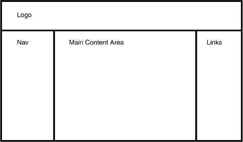
Start with a sketch of the layout, like the one in Figure 18.1. CSS layouts don't require nested tables, so you don't have to worry about those. Just break down the design into rectangular areas. Each of these becomes a div element in the HTML code. Figure 18.1. It isn't hard to create this layout with CSS. But how to make it liquid?
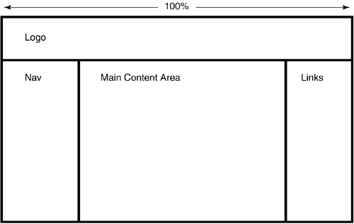
The next step is to decide which divs should be liquid. Let's say you want the Content div to expand and contract, but you want to keep the left and right sidebars at a fixed width, say 200 pixels for the Nav div and 150 pixels for the Links div. The Content div needs to be liquid, clearly, but what about the Logo div? If you were building this layout as a table, you wouldn't necessarily have to specify the width of the top cell as 100%, because the table itself would have a width of 100%, and the browser would resize the Logo cell to match the width of the table perfectly. You get no such shortcut in CSS. If you want the Logo div to stretch across the full width of the browser window, you have to put it in the CSS code explicitly. So add the Logo div to your still-short list of liquid elements, and mark up your sketch as in Figure 18.2. Figure 18.2. Since you're dealing with CSS, you have to define the Logo div as being liquid in this layout. If you were building a table, you wouldn't necessarily need to do this.
One of the less desirable features of CSS layout is that there isn't one single solution for creating the liquid effect. You have to use different methods depending on the position of the div in the layout:
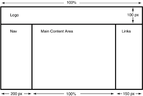
The Logo div stretches across the browser window from left to right, so this element falls into the first category. Its code looks like this: <div style="position: absolute; width: 100%; height: 100px; top: 0px; left: 0px;"> Logo </div> The divs for the nav bar and links section are regular fixed-width elements: <div style="position: absolute; width: 200px; top: 100px; left: 0px;"> Nav </div> <div style="position: absolute; width: 150px; top: 100px; right: 0px;"> Links </div> The Links style description says, among other things, right: 0px. This particular bit of code places the element against the right side of the screen. It's necessary to define the style this way, since you don't know how wide the content area will be, which is the whole point of liquid layouts in the first place. Now for the Content div: <div style="position: absolute; top: 100px; left: 200px; right: 150px;"> Content </div> Since this div appears between the left and right sidebars, it falls into the second category. You don't give it a width value, but you do position it 200 pixels from the left side of the browser window and 150 pixels from the right side. Why? To make sure it doesn't overlap the nav-bar and links areas. There you have it: a liquid layout in CSS. Figure 18.3 shows the finished layout sketch. Figure 18.3. The finished sketch for your liquid layout with CSS.
|
 the top of the layout. > <div style="position: absolute; width: 100%; height