Chapter 17. Creating Liquid Layouts with Tables
| Liquid or expando layouts are layouts that automatically resize themselves to fit the visitor's browser window. Compare liquid layouts with their fixed-width counterparts, which use absolute measurements like 600 pixels or 760 pixels, no matter what size browser window the visitor prefers.
The obvious benefit to liquid layouts is that they take advantage of all available screen real estate, which makes them look classier. Liquid layouts don't seem too compact when you view them in very wide browser windows, as fixed-width layouts sometimes do. Moreover, visitors with huge monitors and professional video cards can maximize their browsers and see more of your site before having to scroll, and visitors with special requirements are less likely to break your layout by setting their browser's font size to Largest. Controlling graphic design in liquid layouts is much more challenging. You don't have the benefit of knowing at exactly which pixel a certain element appears, since the width of the design space changes with the browser window.
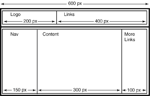
Liquid layouts begin life as fixed-width layouts. That is, when you build a liquid layout, you design the table that controls the layout to fit into a certain minimum-width browser window, say 600 pixels. Visitors who show up with browser windows smaller than the minimum width get the horribly unattractive horizontal scrollbars, even in a liquid layout. If you wanted nothing more than a fixed-width layout, you'd stop there. For a liquid layout, however, you're not quite done. To create the liquid effect, you very carefully set the width of certain table cells to the asterisk value (*), which is HTML shorthand for whatever. Using this generic width instead of a fixed pixel value forces the browser to calculate the width of the design in terms of the width of the browser window. Hence, liquefaction. So, which table cells get the width value of whatever? Here is where a plan and a sketch or two come in handy. Start with your initial, fixed-width design, like the one in Figure 17.1. Notice the simplicity of the layout, which is critical. This particular layout calls for two nested tables inside a two-cell container table. You could achieve the same effect with a single table that uses the colspan attribute, but you don't want to do that here. Never, under any circumstances, use rowspan or colspan attributes in liquid designs. If you do, as the table expands, your visitor's browser takes the liberty of inserting whitespace everywhere, especially where you don't want it. Listing 17.1. View Source for Figure 17.1.<table width="600" border="0" cellpadding="0" cellspacing="0"> <tr> <td> <!-- The first nested table begins here. --> <table width="600" border="0" cellpadding="0" cellspacing="0"> <tr> <td width="200">Logo</td> <td width="400">Links</td> </tr> </table> <!-- The first nested table ends here. --> </td> </tr> <tr> <td> <!-- The second nested table begins here. --> <table width="600" border="0" cellpadding="0" cellspacing="0"> <tr> <td width="150">Nav</td> <td width="350">Content</td> <td width="100">More links</td> </tr> </table> <!-- The second nested table ends here. --> </td> </tr> </table> Figure 17.1. Start with an initial, fixed-width designand keep it simple. Never use colspans or rowspans to achieve a complex design. Use nested tables instead.
This table has a width of 600 pixels, so it fits comfortably in a maximized browser window on a 640-width screen. However, it looks too compact in larger browser windows on wider screens. To make this table expand, you need to decide which table cells to switch from absolute, pixel-based width attributes to relative, percentage-based ones.
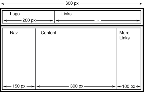
In the first nested table, the Links cell makes a good choice, so you set its width attribute to the asterisk value, as in Figure 17.2. (You also set the width of the table to 100%. If you don't, the table remains fixed at 600 pixels, even with the liquid cell.) With this code, the Logo cell grows no wider than 200 pixels, but the Links cell expands and contracts with the width of the browser window. If the logo cell expands instead, the browser keeps the Links cell at 400 pixels and puts the extra whitespace inside the Logo cell, which could throw your layout off-balance. Listing 17.2. View Source for Figure 17.2.<table width="100%" border="0" cellpadding="0" cellspacing="0"> <tr> <td width="200">Logo</td> <td width="*">Links</td> </tr> </table> Figure 17.2. In the first nested table, the Links cell is the better choice for variable width.
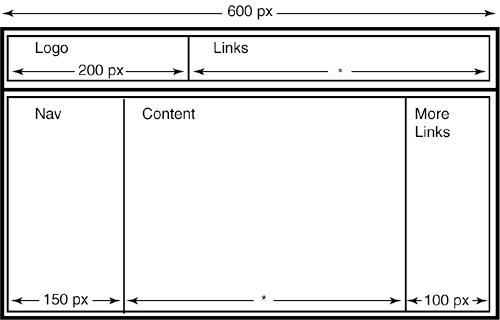
In the second nested table, the Content cell is the best choice for relative width (see Figure 17.3). This keeps the cells on either side at controlled widths while allowing the content of the page to fill the browser window naturally. So set the width of the Content cell to whatever, and set the width of the nested table to 100%. Figure 17.3. In the second nested table, choose the Content cell as the one for variable width.
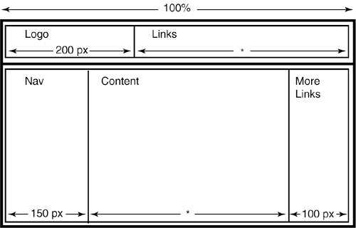
Now, just set the width of the container table to 100% to make it expand with the browser window, and you're done. Figure 17.4 shows the finished layout sketch. Listing 17.3. View Source for Figure 17.3.<table width="100%" border="0" cellpadding="0" cellspacing="0"> <tr> <td width="150">Nav</td> <td width="*">Content</td> <td width="100">More links</td> </tr> </table> Figure 17.4. Set the width of the container table to 100%, and your layout is liquefied.
Listing 17.4. View Source for Figure 17.4.<table width="100%" border="0" cellpadding="0" cellspacing="0"> <tr> <td> <!-- The first nested table begins here. --> <table width="100%" border="0" cellpadding="0" cellspacing="0"> <tr> <td width="200">Logo</td> <td width="*">Links</td> </tr> </table> <!-- The first nested table ends here. --> </td> </tr> <tr> <td> <!-- The second nested table begins here. --> <table width="100%" border="0" cellpadding="0" cellspacing="0"> <tr> <td width="150">Nav</td> <td width="*">Content</td> <td width="100">More links</td> </tr> </table> <!-- The second nested table ends here. --> </td> </tr> </table> |