Section 4.2. Organizing the Layout
4.2. Organizing the LayoutAssume that you come up with a list of five areas for your layout: navigation, content, header, footer, and sidebar. Get out a piece of scratch paper, and let the doodling commence. Here are the rules:
Keeping these suggestions in mind, you may come up with a layout for your site that looks something like Figure 4-1. It's equally possible that what you draw is closer in spirit to Figure 4-2. Figure 4-1. This is a classic side-nav layout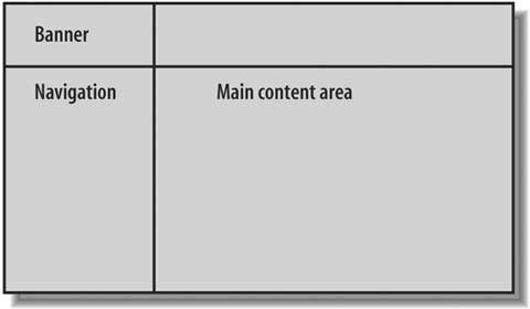 Figure 4-2. This is a classic top-nav layout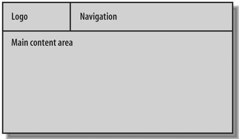
The sketch in Figure 4-1 is a side-navigation or side-nav layout, because the navigation area runs down the side of the page. By comparison, in Figure 4-2, the navigation area runs across the top of the page, so you have a top-nav layout. Side-nav and top-nav are the two most common layouts on the Web, and for good reason. Whether by instinct or repetition of experience, your visitors tend to look for the navigation along the side or at the top of the page. Whatever the cause, it makes good sense. The steering is always easy to find in a very convenient place on the screen. Better still, when your visitors want to focus on the content, their eyes can scan the middle of the page and ignore the navigation entirely. 4.2.1. Looking at Side-Nav LayoutsIn a side-nav layout, the navigation choices sit one below the other, usually at the top of the navigation area. This stack of five or six items doesn't usually add up to too much height, so side-nav layouts tend to offer a healthy amount of built-in whitespace. The extra visual buffer helps to distinguish the navigation area from the others in the layout, which makes your design more usable.
At the same time, you can see by comparing Figure 4-1 and Figure 4-2 that the content area in a side-nav layout isn't as wide as the content area in a top-nav layout, because the navigation area sits beside it and therefore accounts for a certain portion of the width of the page. A narrower content area means that less content fits inside it before the visitor has to scroll. Especially in the case of Figure 4-1, where the links area takes away additional width from the content, you have to be careful about what kind of content you plan to add to your pages. Text and typical images should fit without incident. Your visitors will probably get vertical scrollbars, but that's all right. Scrolling vertically, up and down the page, is fine. There's really no avoiding it. But if the contentan image, for exampleis wider than the available space, the visitor gets horizontal scrollbars in the browser window, which you should avoid at all costs. You may consider switching to a top-nav layout, or maybe you can do without the sidebar area in your current layout.
4.2.2. Looking at Top-Nav LayoutsWhen the navigation area runs across the top of the screen, it doesn't compete with the content area for page width, which means that your content is less likely to generate horizontal scrollbars in the browser windowsa definite advantage. The main drawback of top-nav layouts is that the navigation choices run horizontally, one beside the other instead of one below the other, which isn't particularly efficient. If you string together too many navigation choices, you can push up against the width of the page, and you risk getting horizontal scrollbars anyway. To reduce the likelihood of horizontal scrollbars, you have two remedies:
If neither of these options seems to work for your site, then you might reconsider a side-nav layout.
|
EAN: 2147483647
Pages: 154