Section 4.3. Designing the Navigation
4.3. Designing the NavigationYou set aside an area in your layout for the navigation. Now, what specifically are you going to put in that area? Graphical buttons? Text hyperlinks? Something else? This section gives you a brief tour of your options. 4.3.1. Tackling the Main NavigationStrictly speaking, the main navigation is what appears in your navigation area. The main navigation is the primary method for getting around your site. As such, it's important for you to get this navigation right. You won't go wrong if you pull the navigation choices directly from your outline. Grab your sheet from Chapter 3, and read off the top-level content categories. Maybe yours are Products, Services, Pressroom, About Us, and Contact Us. These are the items that should go into your main navigation. Now, what form should these items take? 4.3.2. Using text hyperlinksRegular old text works fine as your main navigation, as long as you clearly separate it from the text in the content area (see Figure 4-3). Figure 4-3. Text hyperlinks work fine in your main navigation One advantage to plain text is that it downloads almost instantly to the visitor's browser, so your web site loads quickly. Also, plain text is immediately accessible to people who rely upon screen readers or text-to-speech converters to browse your site, and it's worth noting that you can create any kind of text hyperlink in any imaginable visual style within Dreamweaver itselfyou don't need any outside authoring tools. The main disadvantage to text navigation is that it isn't terribly interesting to look at. Then again, maybe your site doesn't need the extra dazzle. Remember, the content should be the star of the show. Just make sure to separate your plain-text navigation from the running text of your page. You don't want the visitor confusing the two. 4.3.3. Using static imagesIn lieu of ordinary text hyperlinks, you can place images in your navigation area and make them clickable (see Figure 4-4). These are commonly called buttons, even if they don't necessarily look like buttons. Figure 4-4. Graphical buttons are an old standby for the main navigation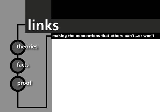 Unlike plain text, you can design graphical buttons to look like anything. You can give them an overtly button-like appearance, or you can remove any trace of the button metaphor. You can place icons next to them or inside them. You can label them with wacky or obscure fonts (see Chapter 6 for more information about typefaces on the Web). Your good taste and what your audience finds useful are the only limitations on your creativity.
At the same time, images come with some drawbacks. They don't download as quickly as plain text, so your web site may take a performance hit, although the delay usually isn't too noticeable in these days of high-speed and broadband Internet access. Further, web images aren't immediately accessible to screen readers and text-to-speech converters. Current technologies can't examine the content of an image and render in spoken language what it's an image of, so you have to attach a short text equivalenta literal descriptionto each button in your navigation. This procedure isn't hard, but it is something to take into account. However, the main drawback to graphical buttons for many first-timers is that you can't create the images in the Dreamweaver software. You need a dedicated graphics tool, preferably something high-end like Adobe Photoshop or Macromedia Fireworks, to design images for your site.
4.3.4. Using rollover imagesA rollover image appears to change when the visitor hovers over it with the mouse pointer (see Figure 4-5). What actually happens is that the Web browser pulls a magic trick called a swap. When the visitor hovers over the image, the browser replaces it with a second image file. The swap happens so quickly that it's like an animation effectthe eye perceives that the original image has transformed itself into something else. When the visitor moves the mouse pointer away, the browser swaps back the original image, and the rollover seems to revert to normal. Figure 4-5. A rollover image in action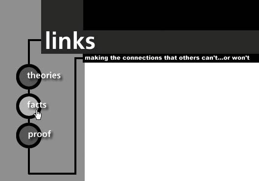 You can use rollover images instead of static, everyday web graphics in your navigation area, and in fact this makes good sense. Nothing says "Click me" like the intuitive prompting of a rollover effect. An image seemingly springing to life is hard to resist. While Dreamweaver adds the necessary JavaScript code to enable the swap, it's up to you to supply the images, and because each rollover requires two image files (or more, depending on the level of interactivity), the visitor has extra content to download. All the other limitations of standard images apply to rollovers as well.
4.3.5. Using flash buttonsA Flash button is a short, interactive Flash animation that works exactly like a rollover graphic: when the visitor hovers over the Flash button, the image changes. The dazzle factor on these things is high. The usability factor is, eh, so-so.
Unlike standard rollovers, you can create Flash buttons within Dreamweaver. You don't need any outside authoring tools, so that's a definite plus. The minuses, unfortunately, tend to rule out this option as a serious contender for your main navigation. It's not that Flash buttons aren't interactive enough. In fact, they tend to be more interactive than regular rollovers. The problem is that each Flash button resides in a separate instance of the Flash Player plug-in. As you may recall from Chapter 1, the Flash Player is standard equipment on the vast majority of computers, so compatibility isn't an issue here. However, the Flash Player takes time to load, and having five or six Flash Players on a page, each running its own movie file, can slow down performance considerably. Furthermore, Flash buttons by themselves aren't accessible to screen readers and text-to-speech converters, and, unlike images, there isn't a quick and easy way to provide text equivalents. The bottom line is this: if you use Flash buttons as your main navigation, know what you're getting into and proceed with caution.
For your reference, Table 4-1 summarizes the four choices for your main navigation.
4.3.6. Adding Secondary NavigationAll good web sites provide an alternate to the main navigation as a convenience to the visitor and as a kind of failsafe. Call this the secondary navigation. The secondary navigation reinforces the main navigation, but it doesn't appear in the navigation area. Instead, you place it somewhere else in the layout, usually at the very bottom of the content area.
After that long-winded speech about grouping, you might think it a heresy to add navigation-type content to the content area, but it really isn't as bad as that. As long as you clearly separate the main content from the secondary navigation (see Figure 4-6), you maintain the integrity of your groups. The secondary navigation should be text-baseddon't use images, rollovers, Flash buttons, or any other type of interactive goody. This speaks to the failsafe nature of the secondary nav. If your visitor has trouble accessing your main navigation for whatever reason, as long as the secondary navigation is in text form, it is as accessible as it can possibly be. Figure 4-6. Secondary navigation beneath the main content area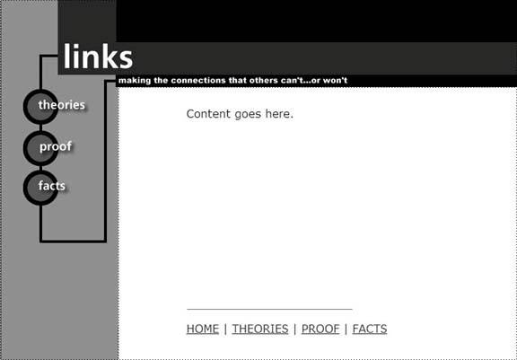
4.3.7. Dealing with Multiple Levels of StructureWhen you created your outline, you may have organized some of the content for your site into multiple levels. The top-level Products category, for instance, might lead to second-level categories like CDs and DVDs, and each of these might lead to further division according to genre or artist. If the top-level categories are the ones that go into the main navigation, how do you present the second-level and third-level categories? Where do you put them in your layout? One solution is to open up additional navigation areas in the general page layout. This way, you always know where the levels of navigation go, and the navigation choices are always at the ready for the visitor. Even better, the navigation for the various levels always appears in the same place on the page, which improves the consistency and therefore the usability of your design. Just because you set aside areas for second-level and third-level navigation doesn't mean that you have to fill them if you don't need them. In fact, you probably have very good reasons not to fill them. If your visitor is on a top-level-content pageProducts, for examplethen what do you put in the third-level navigation area? If the visitor happens to follow the CDs branch of from the Products page, then the third-level navigation choices might be Rock, Pop, Jazz, and Classical. But if the visitor follows the DVDs branch, then the third-level navigation becomes Horror, Science Fiction, Comedy, and Romance. A good rule of thumb for fine-tuning your navigational flow is this: "Link one level down and all levels up." That is to say, on the home page of your site, direct your visitors to the top-level content. The links in the main navigation area do just that, so you don't need to add anything to your second-level and third-level navigation areas in this casesimply leave them empty. On a top-level content page, you want to get your visitors to the second-level pages ("Link one level down…"), so make use of your second-level navigation area but keep the third-level area clear. The main navigation stays the same. The only other item that you need is a link back to the home page ("…and all levels up"). On a second-level content page, get your visitors to the third level of content with links in the third-level navigation area ("Link one level down…") while keeping the same choices in the second-level and main navigation areas, plus the link to the home page ("…and all levels up").
Another solution is to create pop-up menus (see Figure 4-7). A pop-up menu appears when the visitor hovers over a link in the main navigation area. The pop-up provides links to the second-level content pages in that particular main-nav category. When the visitor hovers over a link in the pop-up menu, another pop-up menu appears with links to the third-level content pages. Figure 4-7. Pop-up menus present multiple levels of structure at once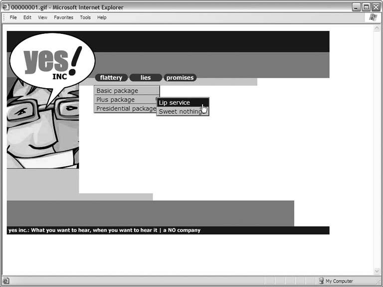 Pop-up menus are nice, because they don't clutter up your layout. You don't have to find room for second-level and third-level navigation areas. Instead, these areas pop up as the visitor needs them. The effect is very sophisticated, so it's not surprising that pop-up menus are a popular choice among web builders today. Creating pop-up menus in Dreamweaver is easy enough. You fill out a dialog box, and you're good to go. However, the underlying code that makes Dreamweaver's pop-up menus work is quite complex and it has been known to cause compatibility problems. For best results, your visitors must use Internet Explorer. All other browsers tend to choke, as do non-traditional browsing devices like cell phones, PDAs, and MSNTV. You also lose a degree of control over how the pop-up menus look. Different browsers interpret Dreamweaver's pop-up menus differently, so your menus might not appear exactly where you want them, or other odd formatting bugs may crop up.
Dreamweaver 8 Design and Construction (OReilly Digital Studio) ISBN: 0596101635
EAN: 2147483647 Year: N/A
Pages: 154 Authors: Marc Campbell
flylib.com © 2008-2017. If you may any questions please contact us: flylib@qtcs.net |
 Dreamweaver Help, and search for