Section 4.4. Taking Measurements
4.4. Taking MeasurementsThe width of the visitor's monitor screen is a key consideration, because it directly affects the width of your layout. Unfortunately, this measurement is completely out of your control. Your visitors decide what size monitors they buy, what screen settings they pick, and whether they prefer to browse the Web with a fully maximized browser window. If your layout is too wide for the visitor's screen, then your site generates horizontal scrollbars, which are never good. The best way to proceed is to make an educated guess. Table 4-2 lists common monitor settings and the corresponding widths for your layout. In each case, the layout width is less than the screen width to account for browser features like vertical scrollbars, which eat up some of the available screen real estate.
According to Table 4-2, if you want to be absolutely safe, you should design your layout to be 600 pixels wide. Nearly every device on the Web today can handle 640-pixel displays (with the notable exception of MSNTV, formerly WebTV, which holds firm at 544 pixels). However, most visitors have enough computing power to go beyond 640-pixel screens, and 600 pixels across doesn't leave you much room for design, so the 760-pixel layout has become the standard width. It accommodates the vast majority of people browsing the Web. Computers manufactured within the last four years tend to display at 1024 pixels (or higher), so as long as your audience isn't using antique hardware, 955-pixel layouts are generally fine. Don't push past 955 pixels, though. While many of your visitors wouldn't have a problem with higher screen widths courtesy of their brand new or high-end computers, those who have older or less prime equipment probably make up the greater part of your audience.
4.4.1. Looking at Fixed-Width LayoutsA fixed-width layout always keeps the same width, no matter the width of the browser window (see Figure 4-8). If you design your layout to a width of 760 pixels, then the width remains 760 pixels wide. Visitors with 640-pixel screens get horizontal scrollbars when they visit your site, while visitors with 1024-pixel screens or higher get fields of whitespace around your layout.
The advantage to building fixed-width layouts is that the measurements of your areas are always pixel-perfect. You can calculate exactly where a specific element appears, which makes it easier for you to achieve more ambitious designs. It's also easier to create fixed-width layouts in Dreamweaver, because it takes fewer steps, and you have less to edit and troubleshoot. The main disadvantage to fixed-width layouts is that they don't take full advantage of screen real estate for those visitors who happen to have wider displays. On the widest displays, your site can look cramped, which doesn't help in the usability department. As a workaround to this, many designers center their fixed-width layouts on the screen so that all the extra whitespace doesn't appear to one side. Instead, you get smaller fields of empty space on either side of the layout. Figure 4-8. A fixed-width layout always retains its width
4.4.2. Looking at Liquid LayoutsIn a liquid layout, the width of the layout changes to match the width of the browser window (see Figure 4-9). As the width of the browser window expands, the width of your site expands in step. This solves the problem of cramped layouts handily, because you never get whitespace around your design. A visitor could come along with a 1,600 pixel-wide screen, and your layout would dutifully fill up the space.
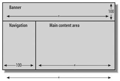
Liquid layouts begin as fixed-width layouts, in that you design your layout to fit within a certain size screen. Then, to enable the liquid effect, you specify that certain areas of your sitethe content area, for instanceshouldn't have a fixed size; they can expand as needed. The initial fixed width of your layout then becomes your minimum width. Go below this threshold, and you can anticipate horizontal scrollbars, because there might not be enough room in the browser window to accommodate all your content. But keep to the minimum width or exceed it, and the liquid effect works as advertised. You won't get horizontal scrollbars, and you won't leave fields of empty space. Liquid layouts in general are easier for the visitor to use, but they can be difficult for you to implement properly, especially when the layout is design-intensive. Straightforward designs work best in liquid form. Figure 4-9. A liquid layout expands to fill the width of the browser 4.4.3. Filling in the DetailsAfter you've decided upon a width for layout, you can begin to assign pixel measurements to the individual areas, as Figure 4-10 shows. When in doubt, eyeball it. Your measurements don't have to be precise, your sketch doesn't have to be to scale, and you can always modify your numbers later. The purpose here is to give yourself a starting point for when you construct your layout in Dreamweaver. A few things to keep in mind: Figure 4-10. Use pixel measurements to express widths and heights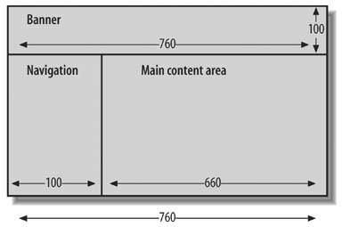
|
EAN: 2147483647
Pages: 154