Section 13.9. ToolTips
13.9. ToolTipsIn Chapter 2, we discussed tool tipsthe helpful text that appears when the mouse hovers over a GUI control. The tool tips displayed in Visual Studio serve as useful reminders of each toolbar icon's functionality. Many programs use tool tips to remind users of each control's purpose. For example, Microsoft Word has tool tips that help users determine the purpose of the application's icons. This section demonstrates how to use the ToolTip component to add tool tips to your applications. Figure 13.31 describes common properties and a common event of class ToolTip.
When you add a ToolTip component from the Toolbox, it appears in the component traythe gray region below the Form in Design mode. Once a ToolTip is added to a Form, a new property appears in the Properties window for the Form's other controls. This property appears in the Properties window as ToolTip on, followed by the name of the ToolTip component. For instance, if our Form's ToolTip were named helpfulToolTip, you would set a control's ToolTip on helpfulToolTip property value to specify the control's tool tip text. Figure 13.32 demonstrates the ToolTip component. For this example, we create a GUI containing two Labels so that we can demonstrate a different tool tip for each Label. To make the sample outputs clearer, we set the BorderStyle property of each Label to FixedSingle, which displays a solid border. Since there is no event-handling code in this example, the class in Figure 13.32 is empty. Figure 13.32. Demonstrating the ToolTip component.
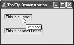
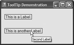
In this example, we named the ToolTip component labelsToolTip. Figure 13.33 shows the ToolTip in the component tray. We set the tool tip text for the first Label to "First Label" and the tool tip text for the second Label to "Second Label." Figure 13.34 demonstrates setting the tool tip text for the first Label. Figure 13.33. ToolTip component in the component tray.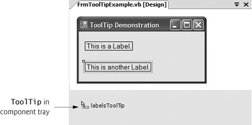 Figure 13.34. Setting a control's tool tip text.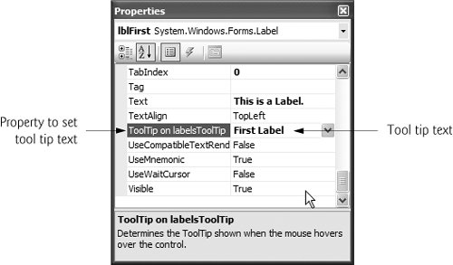 | |||||||||||||||
EAN: 2147483647
Pages: 435