Section 27.2. Design Principles
27.2. Design PrinciplesThis section describes the basic principles underlying the design of ZoneAlarm:
27.2.1. Know Your AudienceOur company held a weekly lunch meeting series in which we could hear an architect explain a bit of the technology within our firewall. The first meeting was packed with people anxious to learn, and about half of us were from marketing. As the words began to spill out of the architect's mouth, those of us in marketing quickly realized that the lecture Figure 27-1. Interacting with this ZoneAlarm Security Suite GUI is seldom necessary, as most user interaction occurs through the alerts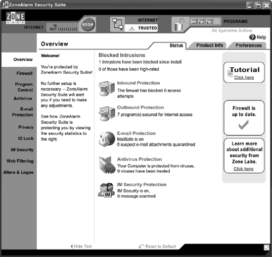 may as well have been in Latin. What the architect had to say may have been brilliant, but it failed for the very simple reason that it didn't reach the audience. Now imagine getting this wrong on your interface design, considering the thousands of hours it takes to design, build, test, and market a product. If you're not speaking your audience's language, all that work is wasted. But even a minor mismatch with your audience means that your product will be less successful than it could be, that it could lose its edge on the competition. and that the very customers you are trying to protect may make wrong decisions that will leave them exposed. That's why you must know your audience intimately. Skip this step, and you leave opportunity on the table. Even if your product doesn't fail outright, it won't be as good as it could have been. A mistake I made early in my career was thinking that knowing the audience was simply inherent in my job title. I, the product manager with the arts and humanities major and a background in writing, should naturally know better than the nerdy engineers what my audience wants. Of course, I was wrong. To know the audience, I needed to get out of the office and talk to them. Without this information, your guess is no better than anybody else's. If you're the key decision-maker for your product's design, this concept is powerful
and indispensable. Know your audience, and you'll not only be able to create much more successful design, but also earn the respect and credibility of your team so that you're empowered to make good decisions. But even if you're not personally talking to users, make sure that someone on your team is. This does not have to be a huge endeavor, by the way. If you dedicate even a four-hour, uninterrupted time slot each week to call people on the phone, send out surveys, talk to people at trade shows, visit people's homes, or even hang out at Best Buy and talk to people there, that's probably more than your competitors are doing. Of course, the more time you spend in this area, the better you will know your audience. 27.2.2. Think Like Your AudienceSo, you know your audience. That's a terrific start, and you're already well on your way to creating usable security. Now begins the difficult step of applying what you've learned about your audience and, in a way, becoming them. This means overcoming noiseanything that takes away your focus on the customer. For an interface designer, noise could be sticking entirely to classroom theory and ignoring the realities of the customer or the market. An architect or developer may try to create such an efficient, elegant architecture that the customer needs cannot be accommodated. Marketing may focus too much on revenue opportunities and forget that the best way to gain and keep customers is to focus on the needs and desires of the customers. If you are the lead decision-maker on a design, it's your job to filter all of this noise for the sake of the customer. You must truly step out of your noise-filled head and into the heads of your audience to make a design successful. One of the best ways to do this is to present your design to others throughout the design process. This forces your mind to shift perspectives and see the product through others' eyes. It's always amazing to me when, after working hundreds of hours on a design, we present it to others at a review meeting. Predictably, problems leap from the screen within a minute of the presentation as if we've put no thought at all into the design. This should be expected. There is a reason why every professional writer has an editor: once you produce something, you can no longer truly step out of your own head and see it for what it is. It's the same with software design: it takes someone else to help you find errors and tailor your product to the intended audience. Another great way to step out of your own head is to identify a representative person or two from your target audience and design for them. When I began considering our anti-virus software design, many of the guiding principles I used came from observing my roommate, Julie, one night after work. There she sat at her desk, anxious because she had heard about a virus outbreak and wondering if her computer was safe. It took her wading through multiple panels of her antivirus product before she got the information she wantedand discovered that her antivirus software had been out of date for months. What an advantage I had having witnessed her experience. Stepping into her head, I knew what questions to ask of our own design: can she glance at the antivirus area and know instantly and without a doubt that she's protected? Will she clearly know when her antivirus software is out of date or expired? Isn't it better for her if we put the most common controls and displays into a single panel, and we relegate all the advanced settings she'll probably never use to an Options dialog? The end result of considering this user and the other members of our target audience in these decisions was a very clear, easy-to-use interface that customers and reviewers have praised. 27.2.3. Eliminate ClutterWilliam Zinsser, author of On Writing Well,[1] calls clutter "the disease of American writing." "We are a society," he says, "strangling in unnecessary words, circular constructions, pompous frills and meaningless jargon." In writing, any words that do not help to get the main idea across only weaken it. As with so many writing principles, this is also true of software design. And while designing software is difficult in itself, designing a security productsomething that so few people understand to begin withpresents an even bigger challenge. Simply put, our job is to make the complex underpinnings of a security product into tasks and metaphors that our customers can understand. We are the intermediary. So it's critical that we strive for purity in our design so that every word, button, and pixel that's present in that design is used to explain an idea or a task and that any clutter is removed.
27.2.4. Eliminate ComplexityWhereas clutter occurs at the detail level of our designs, complexity can permeate our designs at a higher and more profound level, which can end up not only confusing a user, but also slowing time to market and introducing stability problems. If you can barely explain your design to somebody else, then the design is too complex. From an R&D perspective, if functionality takes unusually long to write, if the code is so tricky that it creates bugs, or if the functionality permutations would take QA too long to test, that is also a reason to simplify. A good example of this point comes from a startup wizard we were creating for a new product version (see the upcoming sidebar). The first step of the wizard had three possible branches. Moreover, each wizard permutation would turn product functionality on or off, but only if no conflicting software was found on the user's computer. This complexity bothered everyone on the team, but we proceeded heads-down toward our deadline anyway. Eventually we decided to try to do something to improve the wizard. It didn't take too long to come up with a fantastic solution: we realized that this segment of the wizard wasn't doing a bit of good for the customer, and it certainly wasn't making our job easy. When we moved the necessary functionality to a new location, it was simple and understandable. So, when a portion of your design seems overly complex or problematic, ask yourself: is it essential? Does it make things better or worse? Can it be done in another way, at a different time, or somewhere else? One of the keys to avoiding complexity is to give priority to the most common and likely use cases. So often, someone on the design team will ask, "What if the user wants to (insert extremely unlikely action)?" While it's important to ferret out those rare-use cases and ensure that they don't end in catastrophic failure, you've also got to be able to say you're not going to sacrifice the common use cases to design for a case that may never happen.
Figure 27-2. The four-step wizard was ungainly and difficult for less experienced users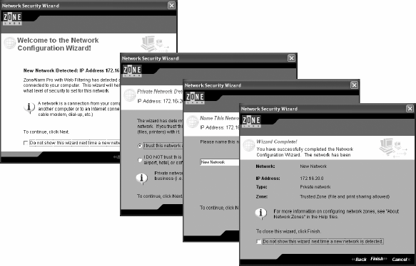 27.2.5. Create Just Enough FeedbackAmong the bad assumptions a security product designer can make is that people actually want to spend any time at all interacting with their security. This point is made throughout this book, but it is so important that I'd be remiss not to mention it here as well. Don't ask users to do anything unless it absolutely cannot be done safely without them. If you keep this in mind, you'll greatly reduce the likelihood that your users will make errors that defeat their security. Figure 27-3. The single-step wizard keeps the critical items and removes the clutter for a much easier and more effective user experience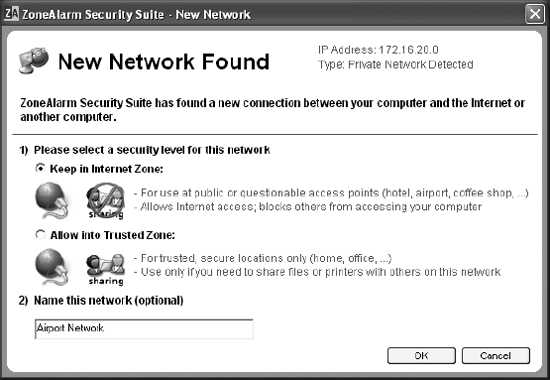 Keep in mind that users may not always agree with this principle. We have survey results where users of varying skill levels say they want to be involved in every decision made. But our usability studies consistently contradict this. So, what do users want? They want to be kept in the know about their security, to be reassured that they're being protected. But in general, they want this knowledge in unintrusive ways. So, while I talk about removing interface clutter, showing pop-ups and wizards only when absolutely necessary, and keeping the security product behind the scenes as much as possible, there are some elements of the product you should expose to the user. When we redesigned the ZoneAlarm product family, we built in some reassuring interaction points. On the main panel, two subtle lines at the top of the page report how many intrusions have been blocked since installation, and how many of those are high risk. These two little lines are cited in many of the fan-mail letters we receive, and are often mentioned by customers at trade shows. Our system tray icon is another subtle place for feedback that indicates whenever traffic moves from client to Internet. And if the product ever fails to load, the icon becomes an attention-grabbing X. There are times for more pronounced feedback as well. Our subscription expiration screen, for example, pops up and demands attention when the subscription is about to or already has expired. We wanted this alert to stick out because out-of-date software is one of the major factors in security attacks. Another example of pronounced feedback occurs when we find a virus. Although the virus is treated automatically, we still let users know what has happened so that they know we're actively protecting them. Our customers consistently tell us they like the reassurance we give them because they know that the software is working and that they are protected. When we provide this reassurance, we are also demonstrating the value of our products, generating loyalty, and building brand. Providing feedback is also very important as a security enhancement to alert users to a lapse in security. 27.2.6. Be a Customer Advocate When Usability and Competitive Pressure CollideWhile sound usability principles are probably understood by most designers in the security software industry, they are obviously not always followed. Competitive pressure and tight internal schedules are often the reason. Although ideally everyone on your team should be the user/customer advocate, you (or whoever is in the lead position) must be. Otherwise, things that have nothing to do with designing for the audience, such as engineering restrictions, timelines, budget, and politics, will edge out the needs of the audience. Phrases like "that's the way we've always done it," or "we cannot do that" can weigh too heavily at the expense of the goals at hand to the extent that you are left asking, "what's the point?" While this type of noise is very real and must be dealt with, you must make sure you don't penalize the user by letting such things get in your way. And while there are realities that may sometimes end up making the user second, you must keep your allegiances as much as possible to the user. Balancing customer needs with competitive pressure requires compromise on all sides, including yours. Sometimes implementing your proposed changes could affect the stability of the project or take developers away from other critical work. So you must think like a superhero. A mission may seem impossible, but you need to make it happen. Start by making sure that you know the exact goal of the intended design. Then decide if you can make headway on that goal by doing part of the work. Often, developers can help you eliminate the most risky, time-eating portions of the design that perhaps can be put off until the next release. It is very rarely an "all or nothing" decision that cannot be somewhat improved through other means. The wizard makeover discussed in the earlier sidebar was done after the VP of development told me that I couldn't do it. So I made a deal with him: if I could come up with changes within a week that would not affect client stability or push out the ship date, he would let the improvements be checked into the product code. As long as QA found no problems, we could leave the improvements in; otherwise, they would be pulled. I worked very closely with a seasoned developer who was supportive of my goals. I came up with a design that the developer had confidence in, quickly validated it with a UI designer and some 10-minute usability testing around the office, and by deadline time, the code was checked in. After holding my breath for a day to see if bugs would show up, we were in the clear and the VP was true to his word. In fact, he later congratulated me for pushing the changes because they offered such a vast improvement.
|
EAN: 2147483647
Pages: 295