Formatting Forms
Highlights
In this chapter, you will learn how to
- Establish a standard format for the InfoPath forms you create
- Apply color schemes to master tables and background colors to forms
- Embed a logo or other image in a form
- Add preformatted headings in table cells
- Add hyperlinks to graphics and text
- Format table cells and controls with borders and background colors
- Apply conditional formatting to text box controls
- Use the Format Painter to apply a selected special text format to labels and controls
For more information
- See the World Wide Web Consortium s (W3C) Cascading Style Sheets level 1 recommendation at www.w3.org/TR/REC-CSS1 .
- Go to msdn.microsoft.com, expand the Web Development node of the table of contents, and click the Cascading Style Sheets node to learn more about how Microsoft implements the CSS specification in Microsoft Internet Explorer.
- Preview the section Validating Numerical Values in Chapter 8 for additional expressions that you can use for conditional formatting.
Overview
To work through this chapter
- You need experience working with Microsoft InfoPath layout tables, which are described in Chapter 5, Laying Out Forms.
- You should be familiar with picture, date picker, drop-down list box, and check box control characteristics in data entry and design modes. Chapter 2, Filling Out Forms, and Chapter 6, Adding Basic Controls and Lists, cover these subjects.
- You should have the sample forms for this chapter from the CD that accompanies this book installed in your C:Microsoft PressIntroducing InfoPath 2003Chapter07 folder. The sample forms are required to complete the exercises in this chapter.
The preceding three chapters of Part II in this book, Designing InfoPath Forms, concentrate on the technicalities of creating, laying out, and adding sections and controls of various types to forms. This chapter takes a different tack; it deals primarily with form presentation issues, such as the use of graphics and colors to embellish your form designs, and using conditional formatting to alter the appearance of text box controls. Working through this chapters exercises wont turn you into a full-fledged graphic artist, but youll learn some techniques to give your forms a more professional appearance and, hopefully, make them easier on users eyes. Youll also learn how to minimize data entry errors using conditional formatting. Conditional formatting lets you change the appearance of, hide, or disable controls in response to field value changes.
The black and white screen captures in this book will make it difficult for you to see the effect of altering colors. Youll find that performing the exercises in this chapter will be much more illustrative .
Adopting an Organization Wide Format
The section Adhering to Design Standards in Chapter 5, Laying Out Forms describes the benefits of establishing a uniform approach for designing master layout tables and their embedded contents. Most example forms in Chapter 5 and successive chapters use a standard, two-row master table in which the form title appears in the first row and all other form components appear in the second row. This base design lets you add a standard background color to the master table for all forms you create.
The figures in this book and the examples in this chapter use the standard Microsoft Windows XP theme. If your organization has adopted a custom Windows XP color scheme or theme, youll undoubtedly want to adopt background, control, and, possibly, border colors for tables, controls, or both that complement the scheme. Bear in mind that youre not designing a Web page or advertising your organization wares or services with InfoPath forms. The best policy for adding color and graphic images to forms is conservatism regardless of your political persuasion.
Applying Color Schemes and Background Colors
InfoPath comes with 17 predefined color combinations, which you select in design mode from the Color Schemes task list, as shown in Figure 7-1. Each combination has six color squares, but most schemes have duplicate colors in positions 4 and 6 (numbered from left to right). You apply a color scheme to your form s master layout table by clicking the name of the scheme in the Color Schemes task pane. Layout tables, repeating tables, and sections are transparent by default, so they receive the color scheme s background color if you haven t previously applied shading to a table or section. (The 25 sample InfoPath forms use the Blue color scheme, but they don t embed sections and repeating tables in a master layout table.)
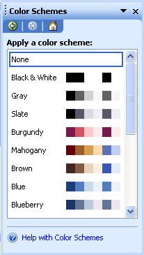
Figure 7-1: The Color Schemes task list lets you select one of 17 predefined sets of colors for form, table, and control backgrounds and text.
Here s how InfoPath applies the colors of the scheme you select to a form s master layout table:
- The title background receives the color of position 1, and the title text changes from black to the color in position 4.
- The title underline changes to the color of position 2.
- The background of row 2 in the master table becomes the color of position 4.
- Default repeating table borders, which are the same color as the default title underline, also receive position 4 s color. Table borders you add aren t affected, unless you accidentally made them the same color as the default repeating table borders (which isn t likely).
- The background of controls, such as text boxes, color pickers, and drop-down lists, remains white.
This chapter s exercises use the NWOrderCh6.xsn template in your C:Microsoft PressIntroducing InfoPath 2003Chapter07NWOrdersCh6 folder. This template is a copy of the NWOrdersFinal.xsn example form from Chapter 6.
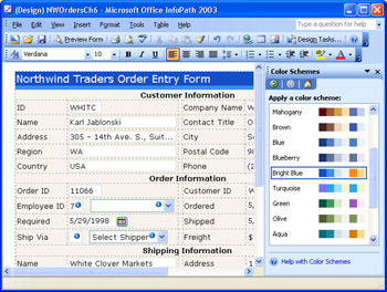
The Bright Blue color scheme is well suited to Windows XP s default theme. The position 1 color almost matches the title bar color in the InfoPath window, and the position 3 color is similar to the toolbar background. To add the Bright Blue color scheme to the NWOrdersCh6.xsn template, follow the steps on the next page.
Apply a color scheme
- Open NWOrdersCh6.xsn in design mode.
- Choose Format, Color Schemes to activate the Color Schemes task pane.
- In the task pane, click Bright Blue in the Apply A Color Scheme list. The appearance of the title and content rows in your master table changes, as shown here.
- Click Preview Form to check the changes. If necessary, scroll to the bottom of the form to verify that adding the color scheme changed the repeating tables default border to the position 2 color.
- Close the preview, and save the template as NWBrightBlue.xsn in a new My DocumentsInfoPathFormatting subfolder.
If you want to remove the color scheme and revert to the original design, click None in the Apply A Color Scheme list.
To establish a uniform brightness level within the form s window, which users might find easier on their eyes, you can surround the master table with a background color. You add a background color by choosing Format, Background Color to display the View Properties dialog box. The default Background Color selection is Automatic, which translates to no applied color (the window s background color). Opening the list displays a color picker control. After you apply a color scheme to a form, the scheme s six colors appear as selections in square buttons at the top of the color picker, as shown in Figure 7-2. (Before you apply a color scheme, these buttons aren t present.)
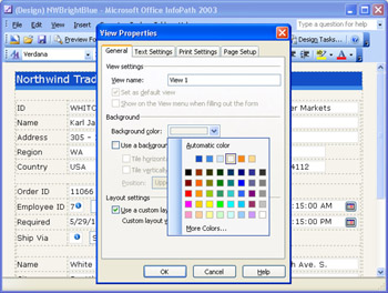
Figure 7-2: This template has the color of position 4 ( primaryLight ) applied as the view s background color.
To add a background color to the NWBrightBlue.xsn template, follow these steps.
Apply a background color
- With NWBrightBlue.xsn open in design mode, choose Format, Background Color or Format, View Properties to open the View Properties dialog box with the General tab active.
- Open the Background Color list, and choose one of the six scheme colors ”position 4 for this example.
- Click OK to add the background color to the outside of the master table.
- Open a maximized preview to check the form s appearance.
- Save your changes.
SP-1 To remove a background color, open the View Properties dialog box and choose Automatic in the Background Color list box. As an alternative to a background color, you can add a picture (a bitmap image) to serve as the form s background.
Embedding Logos and Static Graphics
The section Picture Controls in Chapter 6 explains how to add picture controls whose binary data is embedded in Picture ( base64Binary ) fields of the forms XML data document. You also can embed logos or other static graphics in templates. If youve worked with Microsoft Access forms, an InfoPath embedded picture corresponds to an Access image control with an embedded bitmap, such as that of the Switchboard form in the Northwind sample database. You can insert a picture from a file or from a clip art image. For clip art images, use the process described in the Chapter 2 section Inserting Pictures into Rich Text Boxes.
The examples in this section use the Northwind Traders logo captured as a Graphics Interchange Format (GIF) file from the Switchboard form and modified to change the background color from dark gray to the primaryLight background color. You dont need to change the background color of transparent GIF files. Adding an image to a form adds a FileName.ext copy of the original graphics file to the .xsn file, where FileName is eight random hexadecimal characters (0 to 8 and A to F), and ext is the source files extension. You might see a thumbs.db database file in the templates folder after you add a logo or other image. This file holds thumbnail images for graphics files in the folder; it isnt required, and you can safely erase it.
Adding the logo to a vacant or added table cell makes it easier to control the spacing between a logo or graphic and its surrounding text, as well as the alignment of the image. To add, resize, and pad a logo included with the sample files for this chapter, follow these steps.
Insert a logo from a file
- With the NWBrightBlue.xsn template open in design mode, position the cursor at the start of the Customer Information label.
- Choose Table, Insert, Rows Above to add another row to the master table. (The added row includes an underline.)
- Press Ctrl+L, or click the toolbars Align Left button to remove the inherited centered alignment.
- With the cursor in the added row, choose Table, Split Cells, specify 2 columns and leave the default 1 row in the Split Cells dialog box, and click OK to create two columns .
- Click in the left column of the added row, and choose Insert, Picture, From File to open the Open dialog box, which defaults to your My Pictures folder.
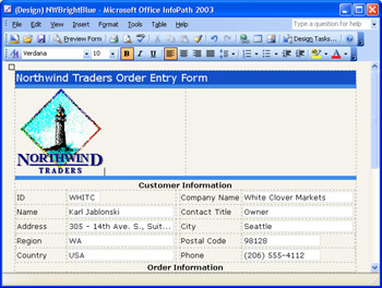
- Navigate to your C:Microsoft PressIntroducing InfoPath 2003Chapter07 NWBrightBlue folder, double-click the NWLogoBrightBlue.gif image, which has a background color that matches the primaryLight color in the Bright Blue color scheme, and drag the bottom of the row to the bottom of the picture, as shown here.
Resize and reposition the logo
- The logo is rather large, so click the image and press Alt+Enter or right click the image, and choose Format Picture to open the dialog box of the same name .
- Click the Size tab, type a smaller value, such as 85, in the Height text box, and click Apply to test the new size , as shown here.
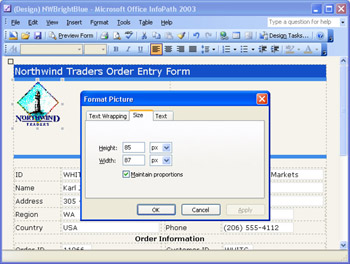
- Click the Text tab and type alternate text for the logo, such as Northwind Traders Logo, and click OK to close the dialog box. The alternate text appears when users select the Always Expand ALT Text For Images check box under the Accessibility heading of Internet Explorers Advanced tab of the Internet Options dialog box.
- Right-click the left cell outside the image region, choose Table Properties, and click the Cell tab.
- Add a top and bottom margin to the logo by specifying 5 pixels of padding to the top and bottom of the cell, leave the default 1 pixel left and right padding, and click OK to close the dialog box.
- Drag the bottom of the row up to the bottom of the image, and drag the cell divider to the right of the newly padded image.
- Save your changes.
Working with Headings and Text
A lot of empty space lies to the right of the logo you added in the preceding section, so a natural inclination is to fill the hole with a slogan , organization propaganda, or user instructions. Giving in to this temptation lets you try adding InfoPath s preformatted headings to a table cell .
The Pick Formatting To Apply list in the Font task pane has HTML heading styles 1 through 5, Normal (10-point Verdana is the default), and Clear Formatting choices. Applying a color scheme assigns the primaryVeryDark color to headings. The larger headings enable you to add outlandishly formatted text, as shown in Figure 7-3. ( Before has the orange accentDark color applied.)
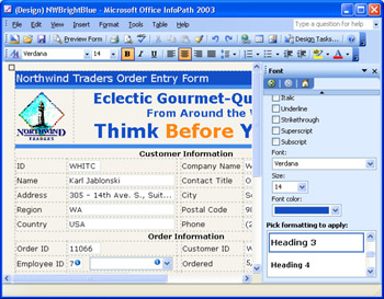
Figure 7-3: This is an example of overdoing the addition of headings and applying a garish font color to a form with the Bright Blue color scheme.
To add and format headings in the cell to the right of the logo that you added to the NWBrightBlue.xsn template, follow these steps:
Add, center, and format headings
- In the NWBrightBlue.xsn template, position the cursor in the cell to the right of the picture.
- Press Ctrl+D or choose Format, Font to open the Fonts task pane and select Heading 2 (18- point Verdana bold.)
- Type a few words, such as Eclectic Gourmet-Quality Foods.
- Press Enter to create a new line, select Heading 3 (14 point), and type From Around the World.
- Press Enter again, select Heading 1 (24 point), and type a user warning, such as Think Before You Type.
- Center the text that you just typed.
- Use the mouse to select a word, such as Before, to emphasize , open the Font Color list in the task pane, and select the position 5 color ( accentDark ), which applies the selected color s complement to the currently selected text.
- Click the emphasized word to deselect it and display the selected color, orange for this example.
- Save the changes, if you like them.
If you want to remove the formatting, select the text and click the Clear Formatting item in the Pick Formatting To Apply list.
You also can apply the color scheme to the labels on your form, although doing this might reduce their contrast if you haven t applied a bold attribute. The three bold form section headings are good candidates for the primaryVeryDark color.
Adding Hyperlinks to Forms and Images
Hyperlinks (HTML anchors) that you embed in forms aren t InfoPath controls because they don t bind to an XML Data document field. In this respect, hyperlinks are similar to embedded images. You can place a text-based (label) hyperlink at any location in the form or add a hyperlink to a graphic. To give both techniques a try with links to Microsoft sample Web pages for hyperlinks in the Northwind sample database s Suppliers table, follow these steps.
Add a hyperlink to a table cell
- With the NWBrightBlue.xsn template open in design mode, delete the third heading line you added in the preceding exercise, press Enter to add a new line, and click the Normal formatting item in the Font task pane.
- Click Ctrl+K or choose Insert, Hyperlink to open the Insert Hyperlink dialog box.
- For this example, type this URL in the Address text box: http://www.microsoft.com/accessdev/sampleapps/mayumi.htm.
- In the Text text box in the Display section, replace the automatically added URL with the text to appear in the cell, Mayumi s (on the World Wide Web), as shown here.
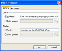
- Click OK to add the Hyperlink.
- If you want to change the font color of the hyperlink, select the text, open the Font task pane, and select a color from the Font Color list. Optionally, apply bold formatting to the link.
- Choose Preview Form, and click the hyperlink to test it.
Add a hyperlink to an embedded image
- Right click the image, the Northwind logo for this example, and choose Hyperlink to open the Insert Hyperlink dialog box. Adding a hyperlink to an image disables the Display option buttons and text boxes.
- In the Address text box, type the URL for the link, www.microsoft.com/accessdev/sampleapps/PlutzerE.htm, for this example.
- Click OK to add a hyperlink and a blue border to the image.
- Choose Preview Form, and click the image to test its hyperlink.
- Close the preview, and save your changes.
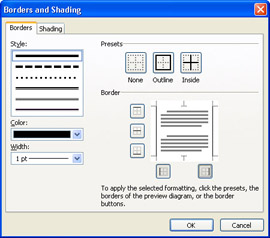
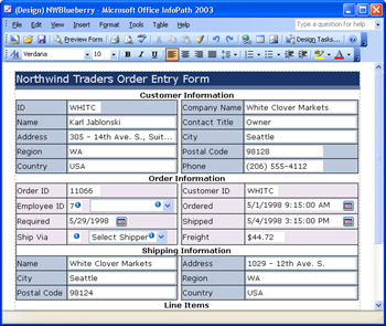
Figure 7-4 shows the result of adding the text and image hyperlinks to the form. You can t change the style or color of the border that the hyperlink adds to an image in InfoPath s user interface. You can remove the border by selecting the logo, choosing Tools, Borders and Shading, and clicking the None button on the Borders tab. Your C:Microsoft PressIntroducing InfoPath 2003Chapter07NWBrightBlue folder contains NWBrightBlueLogo.xsn, which includes all modifications you made in the preceding exercises.
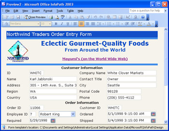
Figure 7-4: This preview of the NWBrightBlue.xsn template shows the added text and image hyperlinks.
Formatting Tables, Cells , and Controls
The Chapter 5 section Adding Table Borders briefly describes the process for adding outside and inside borders to layout tables and applying padding to cell contents. The sections that follow explain the formatting process in greater detail and describe how to add colors from a selected color scheme to individual tables and controls and their borders. Like the preceding examples, these exercises start with a copy of the NWOrdersCh6.xsn template but use a different color schemeBlueberry.
Formatting and Adding Borders to Tables
Its often useful to distinguish individual layout tables from one another, such as Customer Information from Order Information, or relate specific table elements to one another using background colors. For this example, you assign one background color to the Customer Information table and the Shipping Information rows of the Orders table, and another background color to all other Order Information elements, including the Line Items repeating table header. Adding outside and inside borders to tables is optional, but borders make the Customer, Order, and Shipping Information sections consistent with the default design of the Line Items repeating table. Adding a small left margin to the labels by cell padding improves the overall appearance of the form.
To change the background colors of the NWBlueberry.xsn template, apply table borders, and add left cell padding with InfoPaths multiselect feature for table cells, follow these steps.
Create a copy of the source template and change table background colors
- Navigate to your C:Microsoft PressIntroducing InfoPath 2003Chapter07 NWOrdersCh6 folder, open NWOrdersCh6.xsn in design mode, and save it as NWBlueberry.xsn in the My DocumentsInfoPathFormatting folder you created in the section Applying Color Schemes and Background Colors early in the chapter. Assign NWBlueberry (Test) as the form name in the Form Properties dialog box, and click OK.
- Choose Format, Color Schemes, and click Blueberry in the Color Schemes task pane to apply the color scheme to the form.
- Click in front of the Customer Information label to select the second row of the master form, choose Format, Borders and Shading to open the dialog box, click the Shading tab, select the No Color option, and click OK to remove the shading from the master table.
- Click in the Customer Information table ID cell or any other cell, choose Table, Select, Table to select all cells in the subtable.
- Choose Format, Borders And Shading, click the Shading tab in the dialog box, select the Color option, open the color picker, select the background color in position 3 ( primaryMedium ), and click OK to apply the background color to the first table.
- Repeat steps 4 and 5, but select the Order Information table, and apply the color in position 4 ( primaryLight ) to the table.
- Select the row containing the Shipping Information label. On the Shading tab in the Borders and Shading dialog box, select No Color to remove its background color.
- Use the mouse to select the three Shipping Information rows. On the Shading tab in the Borders and Shading dialog box, select the same color as you did for the Customer Information table in step 5 ( primaryMedium ) to visually relate the entries to the Customer Information table.
Add table and row borders
- Select all cells of the Customer Information table, and choose Format, Borders and Shading.
- On the Borders tab in the Borders and Shading dialog box, open the color picker, select the position 5 color ( accentDark ), click the Outline and Inside buttons , and then click OK to add a border to all selected cells.
- Select column C (the narrow separator column), and open the Borders tab in the Borders and Shading dialog box.
- Select the same color as you did in step 2, click the None button to clear all borders, and then click the two buttons at the bottom of the diagram to preserve the vertical borders, as shown here.
- Click the Shading tab, select the No color option, and click OK.
- Repeat steps 1 and 2 for the Order Information and Shipping Information table.
- Repeat steps 3, 4, and 5 for the Order Information section, but select the four cells in column C.
- Repeat step 6 for the three Shipping Information rows, and open the form in preview mode. The form appears as shown here.
- Close the preview, and save your changes.
Pad all label cells at once with column multiselection
- Click the ID cell of the Customer Information table.
- Press Ctrl, drag the mouse down column A of the Customer Information table to select the four cells, and drag the mouse down Column D.
- Repeat step 2 for columns A and D in the Order Information table, and your form in design mode with the six label columns selected appears as shown here.
- Choose Table, Table Properties to open the Table Properties dialog box, click the Cells tab, type 3 as the Left Padding value, and click OK to apply the 3-pixel padding to all selected cells.
- Adding the padding causes the Company Name label to occupy two lines, so remove Name, and change the Name label of the Shipping Information section to Company.
Adding Borders to Text Boxes
The default borders for text boxes often appear to vanish when you add table background colors. You can make the borders reappear by applying a darker color to them. The following steps also show you how to use InfoPaths multiselect feature for controls.
Add visible borders to all applicable controls at once
- Click the Order ID text box, press Ctrl, and then click each text box and date picker in the first three sections to select them. (You cant change the border style of controls that have built-in borders, such as drop-down list boxes, so dont select them.) Your form in design mode appears as shown here.
- Choose Format, Borders And Shading, open the color picker, select the position 1 color, which is dark enough to be visible, and click the Outline button.
- Click OK to apply borders to all controls in the first three form sections. Preview the form, which appears as shown here.
A drawback to adding darker borders to controls is that the blue border surrounding an empty control with the focus is difficult to discern from unselected controls, although the presence of the cursor in the selected text box mitigates the problem. You probably wont notice this potential issue with forms that have default values.
Applying Conditional Formatting
Conditional formatting is one of the most important features you can use in InfoPath to alert users of out-of-range, undesirable, or suspect values when they re entering data. Conditional formatting doesn t flag those values as errors; usually, it provides users a visual clue that the data is or might be incorrect. Chapter 8 describes declarative data validation rules that define erroneous entries. You apply conditional formatting primarily to text boxes; conditional formatting is disabled for date pickers, both list box types, check boxes, and option groups. Conditional formatting can apply any or all font attributes, change the font and background colors, or hide or disable the control.
These are some typical applications for conditional formatting alerts:
- Highlighting costs that are close to or exceed budget limits. As an example, if a cost item is within 90 percent of the budgeted amount, color the value orange and apply a bold attribute. If the cost is more than 100 percent of budget, color the value red and apply bold underline attributes, which is an undesirable or ”in some governmental agencies ”an out-of-range condition.
- Detecting differences in text values, such as a shipping address that differs from the billing address. In many cases, these addresses differ , but the data entry operator should be made aware of the suspect entry in case of a typographical error.
- Hiding controls in response to the setting of another control, such as hiding shipping address text boxes if a Same As Bill To check box is selected.
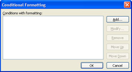
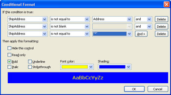
To apply conditional formatting to a control, choose Format, Conditional Formatting to open the Conditional Formatting dialog box, which initially displays an empty Conditions With Formatting list. Alternatively, open the control s Properties dialog box, click the Display tab, and click the Conditional Formatting button to open the dialog box. Click Add to open the Conditional Format dialog box, and specify the field name , a comparison expression, and a constant or field value in the three text boxes, as illustrated in Figure 7-5. The two open lists hide the Font Color (bright orange) and Background Color (dark blue) selections in the figure; although this figure shows both lists open, only one list can open at a time.
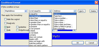
Figure 7-5: This image shows selections available in the comparison expression and compare-to values of the Conditional Format dialog box.
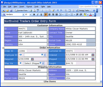
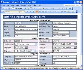
As an example of conditional formatting, the NWBlueberry.xsn template s default ShipAddress and PostalCode field values aren t the same as the Address and PostalCode field values. When you open a preview of the form, the expression shown in Figure 7-5 applies the conditional formatting to the text box bound to the ShipAddress field, as shown in Figure 7-6.
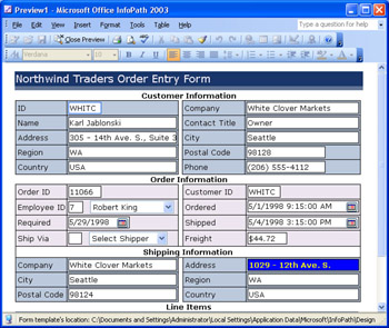
Figure 7-6: Grab the data entry operator s attention with orange and blue conditional formatting applied to the Shipping Information Address text box that s bound to the ShipAddress field.
Understanding Conditional Formatting Logic
The most common type of programming logic is positive; if the condition is satisfied, the expression evaluates as true . Multiple expressions can use and logic to draw a final conclusion ”if Expression1 is true and Expression2 is true, and so on, the final result evaluates as true . An alternative is or logic ” if Expression1 is true or Expression2 is true, the final result evaluates as true . InfoPath conditional expressions also provide a not version for most conditions, so you can specify a condition that evaluates as false .
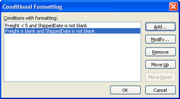
As an and logic example, you might not want to highlight empty Shipping Information text boxes when adding a new order for a customer. In this case, you add another condition with and logic ” ShipAddress is not blank ” as shown in Figure 7-7.
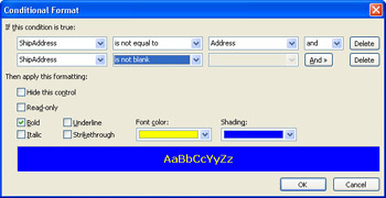
Figure 7-7: A second expression that uses the not operator demonstrates multiple conditional formatting criteria.
If you need another condition, such as testing whether an asterisk (*) in a shipping address field represents same as customer s corresponding billing address field, add another and condition ” ShipAddress is not * .
In the Conditional Formatting dialog box, you can add multiple sets of conditions, which is the equivalent of adding parentheses around multiple logical expressions to cause them to be evaluated as a group . Multiple condition sets are limited to the or operator ”if any condition group evaluates as true, conditional formatting is applied to the control. The following sections show you how to establish single and multiple condition sets.
Testing Text Values
The preceding section defined potential criteria for acceptable values of the text box bound to the ShipAddress field. In this exercise, you add those criteria and extend their application to text boxes bound to the ShipCity, ShipRegion, ShipPostalCode, and ShipCountry fields. Instead of an asterisk, the ShipAddress text box accepts Same as Bill To Address (*) as an acceptable entry, in preparation for exercises in later sections.
To set up conditional formatting for the NWBlueberry form s Shipping Information section, follow these steps.
Add the initial criterion
- With the NWBlueberry.xsn template open in design mode, select the Address text box of the Shipping Information section, and choose Format, Conditional Formatting to open the dialog of the same name, as shown here.
- Click Add to open the Conditional Format dialog box, with the ShipAddress field specified in the first drop-down list. (You can select any field in the selected group from this list, or click the Select A Field Or Group item to open a dialog box in which you select a field from another group.)
- Select the comparison operator Is Not Equal To in the second text box, and choose Select A Field or Group in the third list to open the Select a Field or Group dialog box.
- Expand the CustomerInfo node, and double-click Address to close the dialog box and substitute Address in the third list. (Refer to Figure 7-5.)
- Select the Bold check box, open the Font Color picker, choose light orange, open the Shading picker, and select medium blue. (The six color scheme color buttons don t appear in this version of the color picker.)
Add the second and third criteria and test the result
- Click the And button to expose a second criterion row, and select Is Not Blank in the comparison operator text box.
- Click And again, select Is Not Equal To in the second list and Type Text in the third list, and type * in the text box. InfoPath adds double-quotes around the text when you press Tab to leave the field, as shown here.
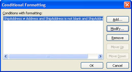
- Click OK to return to the Conditional Formatting dialog box, which displays part of the complete expression you added and has Modify and Remove buttons enabled, as shown here.
- Click OK to apply the conditional formatting expressions to the text box, and click Preview Form, which opens with the text box bound to the ShipAddress field highlighted. (Refer to Figure 7-6.)
- Test the first condition by copying and pasting the contents of the Address text box in the Customer Information section to the Address text box in the Order Information section and pressing Tab. The highlighting disappears because the two field values are equal.
- Test the second condition by deleting the text you pasted to leave a blank text box and pressing Tab. The text box contains a red asterisk, which denotes that an empty text box violates the form s XML schema, but the text isn t highlighted.
- Type * in the text box, and press Tab to verify the last criterion.
Add the remaining four * criterion fields
- Repeat steps 1 through 5 and 1 through 4 of the preceding two exercises, respectively, for the City and Country text boxes, comparing the values to the City and Country values of the CustomerInfo section.
- The ShipRegion and ShipPostalCode aren t required fields; the schema allows an empty value and won t flag an omission. For the text boxes bound to these two fields, don t add the second Is Not Blank criterion.
- Optionally, emulate a software quality assurance (QA) specialist and perform the tests in steps 5 through 7 of the preceding section.
Add the Same as Bill To Address (*) criterion
- Select the Shipping Information s Company text box, and repeat steps 1 through 4 of the Add the initial criterion exercise.
- Repeat steps 1 though 5 of the Add the second and third criteria and test the result exercise, but in step 2 type Same as Bill To Address (*) in the text box.
Conditional Formatting Based on a Non Blank Value
SP-1 Optional ShipVia and Freight field values are required if the order has been shipped, which is indicated by a non-blank value in the nillable ShippedDate field. You can apply conditional formatting to the ShipVia text box, the associated drop-down list box, or both. The example in this section formats the text box. Testing the Freight field value requires two expression groups that use the Or operator to disallow a blank value or a value less than $5.00. Northwind Traders minimum shipping and handling charge is assumed to be $5.00.
To add conditional formatting to the ShipVia and Freight fields, follow these steps.
Add criteria to the Ship Via text box
- Select the Ship Via text box, choose Format, Conditional Formatting, and click Add to open the Conditional Format dialog box.
- With ShipVia in the first list, select Is Blank from the comparison operator list, and click the And button.
- Select ShippedDate from the first list and Is Not Blank from the comparison operator list, choose the Bold text box, and assign the light orange font and medium blue background colors, as before.
- Click OK twice to add the criteria.
Add criteria groups to the Freight text box
- Select the Freight text box, and open the Conditional Format dialog box.
- With Freight in the first list, select Is Less Than from the comparison operator list, select Type a Number in the third list, type 5, and click the And button.
- Select ShippedDate from the first list and Is Not Blank from the comparison operator list, select the Bold check box, and assign the light orange font and medium blue background colors, as shown here.
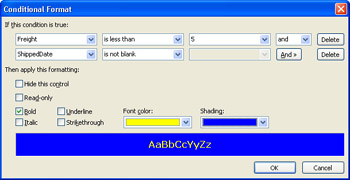
- Click OK to return to the Conditional Formatting dialog box, and click Add to open a second, empty Conditional Format dialog box.
- With Freight in the first list, select Is Blank from the comparison operator list, and click the And button.
- Select ShippedDate from the first list and Is Not Blank from the comparison operator list, select the Bold check box, and assign the font and background colors.
- Click OK to return to the Conditional Formatting dialog box, which displays both expressions in its Conditions With Formatting list, as shown here.
- Click OK to apply the conditional formatting expressions to the Freight text box.
- Save your changes, click Preview Form, and test the expressions with and without a Shipped date value. Your form in Preview mode with the default Shipped value, and missing Ship Via and invalid Freight values, appears as shown in Figure 7-8.
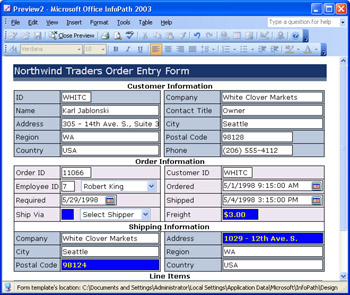
Figure 7-8: This preview of the NWBlueberry.xsn template shows conditional formatting applied to Ship Via, Freight, and Shipping Information fields.
Hiding Controls Conditionally
One of the most useful features of conditional formatting is its capability to hide controls that don t require values under a specified condition. For example, all but a few of Northwind Traders orders have the same billing and shipping addresses. In this case, it makes sense to default shipping addresses to billing addresses when an element or attribute value specifies the same address. One approach is to use the Insert Formula dialog box to add default Shipping Address values from the Customer table s address field values, as described in the section Adding Workflow-Dependent Rules in Chapter 10, Adding Views to a Template.
Alternatively, you can establish generic default values for a shipping address that s identical to the billing address. You prepared for this eventuality with the conditional formatting expressions in the preceding section ”Same as Bill To Address (*) for Company and * for all other Shipping Information fields are valid entries. Valid entries are required in hidden controls that the schema specifies as requiring at least one character ( minLength="1" ). The XML Schema specification calls minLength a constraining facet .
The next exercise adds a check box with a default true value bound to a Boolean attribute value specifies that the Shipping Information controls are hidden by default. The check box s value is metadata, so an attribute ”rather than an element ”is the appropriate field type.
Hiding controls also demonstrates the use of multiple conditional formatting expressions for a control. To add a bound check box to a new True/False (boolean) field and apply an additional conditional formatting expression group to control visibility of the Shipping Information controls, follow these steps.
Add a new True/False field and change default values
- Open the NWBlueberry form s Data Source task pane, select the OrderInfo group, add a new True/False (Boolean) attribute field named IsShipToSameAsBillTo, and set the default value to TRUE. The field (with the inevitable my: namespace prefix) appears at the bottom of the Data Source list.
- Drag the field to the right of the Shipping Information label, change the check box s label to Same as Bill To Address, and add a few spaces between Shipping Information and the check box.
- Right click the Company text box in the Shipping Address section, choose Text Box Properties, and replace the Default Value with Same as Bill To Address (*). Be sure to capitalize the default value correctly, because comparisons are case sensitive.
- Replace the Default Value of the remaining five Shipping Information text boxes with *.
- Save your changes, and click Yes when asked if you want to overwrite the form with the new version that has an altered data source.
Selectively hide Shipping Information controls
- Select the Company text box in the Shipping Information section, choose Format, Conditional Formatting, and click the Conditional Formatting text box s Add button to add another expression group.
- In the Conditional Format text box, select the IsShipToSameAsBillTo field.
- Select Is Equal To from the comparison operator list, and select TRUE in the third list.
- Select the Hide This Control check box. Your expression appears as shown here.
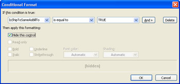
- Click OK to return to the Conditional Formatting dialog box with the added second criterion group (a single-statement expression) in its Conditions With Formatting list, and click OK to add the conditional formatting expressions.
- Repeat steps 1 though 5 for the remaining five text boxes.
- Save your changes, and preview the form to verify the controls are hidden when the check box is selected and visible when it s cleared.
- Create and test a new form from the template, as illustrated in Figure 7-9.
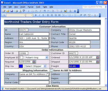
Figure 7-9: This test form created from the final version of the NWBlueberry.xsn template has two text boxes that contain inappropriate values.
The final version of the NWBlueberry.xsn form that incorporates the conditional formatting expressions added to this point is in your C:Microsoft PressIntroducing InfoPath 2003Chapter07NWOrdersFinal folder.
The conditional formatting exercises you worked through in the preceding few sections only scratch the surface of what you can accomplish with conditional formatting. The next chapter, which covers data validation, uses similar expressions for validating text data.
Using the Format Painter
SP-1 The Format Painter toolbar button lets you copy the formatting of a control or text and apply it to other controls or text on the form. InfoPath s Format Painter feature is similar to that of all Office 2002 or later applications, such as Access. You select the control or text with the format you want to copy, click or double-click the Format Painter button, and then click the text or control to apply the formatting. Double-clicking the Format Painter button locks the button in the enabled state to let you apply formatting to multiple text or control instances. You click the button again to disable the locked button. Unlike the Format Painter in Access, the InfoPath version doesn t apply the source control s conditional formatting rules to the target control.
To give the Format Painter a test, follow these steps.
Apply a label format to other labels and controls
- Open your NWBlueberry.xsn template in design mode, if it isn t open .
- Select both characters of the ID label in the Customer Information table, click the Bold button, click the Font Color button, and change the color from black to dark red.
- Double-click the Format Painter button to lock it in the enabled state.
- Click a few other labels in the Customer Information table to change their format.
- Click a couple of text boxes to apply the label format to their contents.
- Click one of the date picker controls to apply the formatting.
- Click the Format Painter button to return it to the disabled date.
- Close the template without saving the changes you made.
The Format Painter is especially handy if you decide to change the formatting of many text items, controls, or both in a form.
Summary
InfoPaths panoply of custom formatting features make it easy to design attractive forms. You can apply one of InfoPaths 17 color schemes to the title and second row of a master table, and then use any of the schemes lighter colors to apply a background color to the entire form, individual embedded layout tables, individual table cells , or controls. You also can use the selected schemes colors for table and control borders.
You can embed images from graphics files or clip art in pictures that InfoPath saves as part of the form template. You also can apply unbound hyperlinks to embedded images or descriptive text for the link. Views contain the data for embedded hyperlinks . InfoPath has a set of five predefined HTML headings that range in font size from 24 to 8 points.
You minimize the probability of data entry errors or omissions by taking advantage of InfoPaths declarative conditional formatting of text box controls. The Conditional Format dialog box makes it easy to generate simple or complex logical expressions that alter the appearance of or hide individual controls. If you cant create a single expression to implement the conditional formatting rules you need, the Conditional Formatting dialog box lets you add additional sets of rules, which are evaluated by a built-in Or operator.
Q A
|
1. |
Can I create my own custom color schemes? |
|
|
2. |
How do I embed a clip art picture in a form? |
|
|
3. |
Can I apply conditional formatting to values in repeating table rows? |
|
|
4. |
Can I use different conditional formatting colors to indicate the severity of a data entry problem? |
|

Answers
|
1. |
No. InfoPath color schemes are hard-coded. However, you can create your own set of custom colors by clicking the More Colors item in a color picker to open the Color dialog box, and typing decimal values (0 to 255) in the Red, Green, and Blue text boxes. InfoPath doesn t save custom colors between sessions; a session ends when you close InfoPath. |
|
2. |
Choose Insert, Picture, From Clip Art to open the Clip Art task pane, and follow the same procedure as you did when inserting a clip art picture in a rich text box. (See the Chapter 2 exercise, Inserting an Image from the Clip Art Task Pane. ) |
|
3. |
You bet. The next chapter shows you how with data validation and conditional formatting examples. |
|
4. |
Yes. Add multiple conditional formatting expression groups with different settings for the Font Color and Shading properties. |
On Your Own
Here are additional exercises to test your understanding of conditional formatting expressions:
- Apply an additional conditional formatting expression for the Freight text box that s true if the order hasn t been shipped and the Freight text box contains a value greater than 0.
- SP-1 Add a conditional formatting expression to the Required Date control that s true if the Required date isn t blank and is less than or equal to the Ordered date.
- SP-1 Add another conditional formatting expression to the Shipped Date control that s true if the Required and Shipped dates aren t blank and the Shipped date is equal to or greater than the Required date.
Part I - Introducing Microsoft Office InfoPath 2003 SP-1
Part II - Designing InfoPath Forms
- Creating Forms
- Laying Out Forms
- Adding Basic Controls and Lists
- Formatting Forms
- Validating Form Data
- Working with Advanced Form Elements
- Adding Views to a Template
- Setting Form Template and Digital Signing Options
- Publishing Form Templates
Part III - Working with Databases and Web Services
Part IV - Programming InfoPath Forms
EAN: 2147483647
Pages: 248
