Orchestration
When a novelist writes well, the craft of the writer becomes invisible, and the reader sees the story and characters with clarity undisturbed by the technique of the writer. Likewise, when a program interacts well with a user, the interaction mechanics precipitate out, leaving the user face-to-face with his objectives, unaware of the intervening software. The poor writer is a visible writer, and a poor interaction designer looms with a clumsily visible presence in his software.
| AXIOM | Well-orchestrated user interfaces are transparent. |
To a novelist, there is no such thing as a "good" sentence. There are no rules for the way sentences should be constructed to be transparent. It all depends on what the protagonist is doing, or the effect the author wants to create. The writer knows not to insert an obscure word in a particularly quiet and sensitive passage, lest it sound like a sour note in a string quartet. The same goes for software. The interaction designer must train his ears to hear sour notes in the orchestration of software interaction. It is vital that all the elements in an interface work coherently together towards a single goal. When a program's communication with the user is well orchestrated, it becomes almost invisible.
Webster defines orchestration as "harmonious organization," a reasonable phrase for what we should expect from interacting with software. Harmonious organization doesn't yield to fixed rules. You can't create guidelines like, "Five buttons on a dialog box are good" and "Seven buttons on a dialog box are too many." Yet it is easy to see that a dialog box with 35 buttons is probably to be avoided. The major difficulty with such analysis is that it treats the problem in vitro. It doesn't take into account the problem being solved; it doesn't take into account what the user is doing at the time or what he is trying to accomplish.
Adding finesse: Less is more
For many things, more is better. In the world of interface design, the contrary is true, and we should constantly strive to reduce the number of elements in the interface without reducing the power of the system. In order to do this, we must do more with less; this is where careful orchestration becomes important. We must coordinate and control all the power of the product without letting the interface become a gaggle of windows and dialogs, covered with a scattering of unrelated and rarely used controls.
It's easy to create interfaces that are complex but not very powerful. They typically allow the user to perform a single task without providing access to related tasks. For example, most desktop software allows the user to name and save a data file, but they never let him delete, rename, or make a copy of that file at the same time. The dialog leaves that task to the operating system. It may not be trivial to add these functions, but isn't it better that the programmer perform the non-trivial activities than that the user to be forced to? Today, if the user wants to do something simple, like edit a copy of a file, he must go through a non-trivial sequence of actions: going to the desktop, selecting the file, requesting a copy from the menu, changing its name, and then opening the new file. Why not streamline this interaction?
It's not as difficult as it looks. Orchestration doesn't mean bulldozing your way through problems; it means finessing them wherever possible. Instead of adding the File Copy and Rename functions to the File Open dialog box of every application, why not just discard the File Open dialog box from every application and replace it with the shell program itself? When the user wants to open a file, the program calls the shell, which conveniently has all those collateral file manipulation functions built-in, and the user can double-click on the desired document. True, the application's File Open dialog does show the user a filtered view of files (usually limited to those formats recognized by the application), but why not add that functionality to the shell—filter by type in addition to sort by type?
Following this logic, we can also dispense with the Save As … dialog, which is really the logical inverse of the File Open dialog. If every time we invoked the Save As … function from our application, it wrote our file out to a temporary directory under some reasonable temporary name and then transferred control to the shell, we'd have all the shell tools at our disposal to move things around or rename them.
Yes, there would be a chunk of code that programmers would have to create to make it all seamless, but look at the upside. Countless dialog boxes could be completely discarded, and the user interfaces of thousands of programs would become more visually and functionally consistent, all with a single design stroke. That is finesse!
Distinguishing possibility from probability
There are many cases where interaction, usually in the form of a dialog box, slips into a user interface unnecessarily. A frequent source for such clinkers is when a program is faced with a choice. That's because programmers tend to resolve choices from the standpoint of logic, and it carries over to their software design. To a logician, if a proposition is true 999,999 times out of a million and false one time, the proposition is false—that's the way Boolean logic works. However, to the rest of us, the proposition is overwhelmingly true. The proposition has a possibility of being false, but the probability of it being false is minuscule to the point of irrelevancy. One of the most potent methods for better orchestrating your user interfaces is segregating the possible from the probable.
Programmers tend to view possibilities as being the same as probabilities. For example, a user has the choice of ending the program and saving his work, or ending the program and throwing away the document he has been working on for the last six hours. Mathematically, either of these choices is equally possible. Conversely, the probability of the user discarding his work is, at least, a thousand to one against; yet the typical program always includes a dialog box asking the user if he wants to save his changes, like the one shown in Figure 9-3.
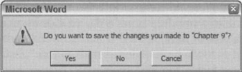
Figure 9-3: This is easily the most unnecessary dialog box in the world of GUI. Of course, we want to save our work! It is the normal course of events. Not saving it would be something out of the ordinary that should be handled by some dusty dialog box. This single dialog box does more to force users into knowing and understanding the useless and confusing facts about RAM and disk storage than anything else in their entire interaction with their computer. This dialog box should never be used.
The dialog box in Figure 9-3 is inappropriate and unnecessary. How often do you choose to abandon changes you make to a document? This dialog is tantamount to your spouse telling you not to spill soup on your shirt every time you eat. We'll discuss the implications of removing this dialog in Chapter 13.
Another example of confusing possibility and probability could be found in Microsoft Excel's (now obsolete) Version 4.0. When you selected one or more cells and press the Delete key to clear the field, a small dialog box popped up asking what you wanted to delete. This dialog box, shown in Figure 9-4, "conveniently" allowed the option of clearing the formats, formulas, or notes from the selected cells.
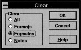
Figure 9-4: In Excel, Version 4.0, this dialog box popped up every time you pressed the delete key. This is quite reasonable if you are a computer, but if you are a human it means that you have to deal with the remote possibilities of deletion every time you try to do the high-probability clearing of the formula. Using Excel with this dialog was like listening to the symphony pause every time the conductor had to turn a page on the score. Thankfully, Microsoft fixed this in later versions.
This dialog drove users crazy with its unnecessary obtrusiveness. It is true that there are three types of deletion operations: format, formula, and notes. However, it is also true that, although people delete formulas with great frequency, they rarely delete formats or notes. Just because something is possible doesn't mean that it is probable. An advanced delete function, available from a drop-down or pop-up menu, solves the problem much more cleanly.
Programmers are judged by their ability to create software that handles the many possible, but improbable, conditions that crop up inside complex logical systems. This doesn't mean, however, that they should render that readiness to handle offbeat possibilities directly into the user interface. The obtrusive presence of edge-case possibilities is a dead giveaway for user interfaces designed by programmers. Dialogs, controls, and options that are used a hundred times a day sit side-by-side with dialogs, controls, and options that are used once a year or never.
| AXIOM | Design for the probable case; provide for the possible case. |
You might get hit by a bus, but you probably will drive safely to work this morning. You don't stay home out of fear of the killer bus, so don't let what might possibly happen alter the way you treat what almost certainly will happen in your interface.
Providing comparisons
The way that a program represents information is another way that it can obtrude noisily into a user's consciousness. One area frequently abused is the representation of quantitative, or numeric, information. If an application needs to show the amount of free space on disk, it can do what the Microsoft Windows 3.x File Manager program did: give you the exact number of free bytes, as shown in Figure 9-5.
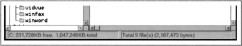
Figure 9-5: The Windows 3.x File Manager took great pains to report the exact number of bytes used by files on the disk. Does this precision help us understand whether we need to clear space on the disk? Certainly not. Furthermore, is a seven-digit number the best way to indicate the disk's status? Wouldn't a graphical representation that showed the space usage in a proportional manner (like a pie chart) be more meaningful? Luckily, Microsoft Windows now uses pie charts to indicate disk usage.
In the lower-left corner, the program tells us the number of free bytes and the total number of bytes on the disk. These numbers are hard to read and hard to interpret. With more than ten thousand million bytes of disk storage, it ceases to be important to us just how many hundreds are left, yet the display rigorously shows us down to the kilobyte. But even while the program is telling us the state of our disk with precision, it is failing to communicate. What we really need to know is whether or not the disk is getting full, or whether we can add a new 20 MB program and still have sufficient working room. These raw numbers, precise as they are, do little to help make sense of the facts.
Visual presentation expert Edward Tufte says that quantitative presentation should answer the question, "Compared to what?" Knowing that 231,728 KB are free on your hard disk is less useful than knowing that it is 22 percent of the disk's total capacity. Another Tufte dictum is, "Show the data," rather than simply telling about it textually or numerically. A pie chart showing the used and unused portions in different colors would make it much easier to comprehend the scale and proportion of hard disk use. It would show us what 231,728 KB really means. The numbers shouldn't go away, but they should be relegated to the status of labels on the display and not be the display itself. They should also be shown with more reasonable and consistent precision. The meaning of the information could be shown visually, and the numbers would merely add support.
In Windows XP, Microsoft's right hand giveth while its left hand taketh away. The File Manager (shown in Figure 9-5) is long dead, replaced by the Explorer dialog box shown in Figure 9-6. This replacement is the properties dialog associated with a hard disk. The Used Space is shown in blue and the Free Space is shown in magenta, making the pie chart an easy read. Now you can see at a glance the glad news that GranFromage is mostly empty.
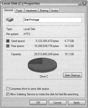
Figure 9-6: In Windows XP, Microsoft has replaced the electric chair with lethal injection. Instead of long, inscrutable numbers at the bottom of the File Manager, you can request a properties dialog box from the Explorer. The good news is that you can finally see how your disk is doing in a meaningful, graphic way with the pie chart. The bad news is that you have to stop what you're doing and open a dialog box to see fundamental information that should be readily available. In Windows 2000, this graph was automatically displayed on the left side of the Explorer window when a disk was selected; XP's solution represents a step backward.
Unfortunately, that pie chart isn't built into the Explorer's interface. Instead, you have to seek it out with a menu item. To see how full a disk is, you must bring up a modal dialog box that, although it gives you the information, takes you away from the place where you need to know it. The Explorer is where you can see, copy, move, and delete files; but it's not where you can easily see if things need to be deleted. That pie chart should have been built into the face of the Explorer. In Windows 2000, it is shown on the left-hand side when you select a disk in an Explorer window. In XP, however, Microsoft took a step backwards, and the graphic has once again been relegated to a dialog. It really should be visible at all times in the Explorer, along with the numerical data, unless the user chooses to hide it.
Using graphical input
Software frequently fails to present numerical information in a graphical way. Even rarer is the capability of software to enable graphical input. A lot of software lets users enter numbers; then, on command, it converts those numbers into a graph. Few products let the user enter a graph and, on command, convert that graph into a vector of numbers. By contrast, most modern word processors let you set tabs and indentations by dragging a marker on a ruler. The user can say, in effect, "Here is where I want the paragraph to start," and let the program calculate that it is precisely 1.347 inches in from the left margin instead of forcing the user to enter 1.347.
"Intelligent" drawing programs like Microsoft Visio are getting better at this. Each polygon that the user manipulates on screen is represented behind the scenes by a small spreadsheet, with a row for each point and a column each for the X and Y coordinates. Dragging a polygon's vertex on screen causes the values in the corresponding point in the spreadsheet, represented by the X and Y values, to change. The user can access the shape either graphically or through its spread-sheet representation.
This principle applies in a variety of situations. When items in a list need to be reordered, the user may want them ordered alphabetically, but he may also want them in order of personal preference; something no algorithm can offer. The user should be able to drag the items into the desired order directly, without an algorithm interfering with this fundamental operation.
Reflecting program status
When someone is asleep, he usually looks asleep. When someone is awake, he looks awake. When someone is busy, he looks busy: His eyes are focused on his work and his body language is closed and preoccupied. When someone is unoccupied, he looks unoccupied: His body is open and moving, his eyes are questing and willing to make contact. People not only expect this kind of subtle feedback from each other, they depend on it for maintaining social order.
Our programs should work the same way. When a program is asleep, it should look asleep. When a program is awake, it should look awake; and when it's busy, it should look busy. When the computer is engaged in some significant internal action like formatting a diskette, we should see some significant external action, such as the icon of the diskette slowly changing from grayed to active state. When the computer is sending a fax, we should see a small representation of the fax being scanned and sent (or at least a modeless progress bar). If the program is waiting for a response from a remote database, it should visually change to reflect its somnolent state. Program state is best communicated using forms of rich modeless feedback, briefly discussed earlier in this chapter. More detailed examples of rich modeless feedback may be found in Chapter 34.
Avoiding unnecessary reporting
For programmers, it is important to know exactly what is happening process-wise in a program. This goes along with being able to control all the details of the process. For users, it is disconcerting to know all the details of what is happening. Non-technical people may be alarmed to hear that the database has been modified, for example. It is better for the program to just do what has to be done, issue reassuring clues when all is well, and not burden the user with the trivia of how it was accomplished.
Many programs are quick to keep users apprised of the details of their progress even though the user has no idea what to make of this information. Programs pop up dialog boxes telling us that connections have been made, that records have been posted, that users have logged on, that transactions were recorded, that data have been transferred, and other useless factoids. To software engineers, these messages are equivalent to the humming of the machinery, the babbling of the brook, the white noise of the waves crashing on the beach: They tell us that all is well. They were, in fact, probably used while debugging the software. To the user, however, these reports can be like eerie lights beyond the horizon, like screams in the night, like unattended objects flying about the room.
As discussed before, the program should make clear that it is working hard, but the detailed feedback can be offered in a more subtle way. In particular, reporting information like this with a modal dialog box brings the interaction to a stop for no particular benefit.
It is important that we not stop the proceedings to report normalcy. When some event has transpired that was supposed to have transpired, never report this fact with a dialog box. Save dialogs for events that are outside of the normal course of events.
| DESIGN TIP | Don't use dialogs to report normalcy. |
By the same token, don't stop the proceedings and bother the user with problems that are not serious. If the program is having trouble getting through a busy signal, don't put up a dialog box to report it. Instead, build a status indicator into the program so the problem is clear to the interested user but is not obtrusive to the user who is busy elsewhere.
The key to orchestrating the user interaction is to take a goal-directed approach. You must ask yourself whether a particular interaction moves the user rapidly and directly to his goal. Contemporary programs are often reluctant to take any forward motion without the user directing it in advance. But users would rather see the program take some "good enough" first step and then adjust it to what is desired. This way, the program has moved the user closer to his goal.
Avoiding blank slates
It's easy to assume nothing about what your users want and rather ask a bunch of questions of the user up front to help determine what they want. How many programs have you seen that start with a big dialog asking a bunch of questions? But users—not power users, but normal people—are very uncomfortable with explaining to a program what they want. They would much rather see what the program thinks is right and then manipulate that to make it exactly right. In most cases, your program can make a fairly correct assumption based on past experience. For example, when you create a new document in Microsoft Word, the program creates a blank document with preset margins and other attributes rather than opening a dialog that asks you to specify every detail. PowerPoint does a less adequate job, asking you to choose the base style for a new presentation each time you create one. Both programs could do better by remembering frequently and recently used styles or templates, and making those the defaults for new documents.
Just because we use the word think in conjunction with a program doesn't mean that the software needs to be intelligent (in the human sense) and try to determine the right thing to do by reasoning. Instead, it should simply do something that has a statistically good chance of being correct, then provide the user with powerful tools for shaping that first attempt, instead of merely giving the user a blank slate and challenging him to have at it. This way the program isn't asking for permission to act, but rather asking for forgiveness after the fact.
| AXIOM | Ask forgiveness, not permission. |
For most people, a completely blank slate is a difficult starting point. It's so much easier to begin where someone has already left off. A user can easily fine-tune an approximation provided by the program into precisely what he desires with less risk of exposure and mental effort than he would have from drafting it from nothing. As we will discuss in Chapter 15, endowing your program with a good memory is the best way to accomplish this.
Command invocation versus configuration
Another problem crops up quite frequently, whenever functions with many parameters are invoked by users. The problem comes from the lack of differentiation between a function and the configuration of that function. If you ask a program to perform a function itself, the program should simply perform that function and not interrogate you about your precise configuration details. To express precise demands to the program, you would request the configuration dialog.
For example, when you ask many programs to print a document, they respond by launching a complex dialog box demanding that you specify how many copies to print, what the paper orientation is, what paper feeder to use, what margins to set, whether the output should be in monochrome or color, what scale to print it at, whether to use Postscript fonts or native fonts, whether to print the current page, the current selection, or the entire document, and whether to print to a file and if so, how to name that file. All those options are useful, but all we wanted was to print the document, and that is all we thought we asked for.
A much more reasonable design would be to have a command to print and another command for print setup. The print command would not issue any dialog, but would just go ahead and print, either using previous settings or standard, vanilla settings. The print setup function would offer up all those choices about paper and copies and fonts. It would also be very reasonable to be able to go directly from the configure dialog to printing.
The print control on the Word toolbar offers immediate printing without a dialog box. This is perfect for many users, but for those with multiple printers or printers on a network, it may offer too little information. The user may want to see which printer is selected before he either clicks the control or summons the dialog to change it first. This is a good candidate for some simple modeless output placed on a toolbar or status bar (it is currently provided in the ToolTip for the control, which is good, but the feedback could be better still). Word's print setup dialog is called Print…and is available from the File menu. Its name could be more clear, although the ellipsis does, according to GUI standards, give some inkling that it will launch a dialog.
There is a big difference between configuring and invoking a function. The former may include the latter, but the latter shouldn't include the former. In general, any user invokes a command ten times for every one time he configures it. It is better to make the user ask explicitly for configuration one time in ten than it is to make the user reject the configuration interface nine times in ten.
Microsoft's printing solution is a reasonable rule of thumb. Put immediate access to functions on buttons in the toolbar and put access to function-configuration dialog boxes on menu items. The configuration dialogs are better pedagogic tools, whereas the buttons provide immediate action.
Asking questions versus providing choices
Asking questions is quite different from providing choices. The difference between them is the same as that between browsing in a store and conducting a job interview. The individual asking the questions is understood to be in a position superior to the individual being asked. Those with authority ask questions; subordinates respond. Asking users questions makes them feel inferior.
| AXIOM | Asking questions isn't the same as providing choices. |
Dialog boxes (confirmation dialogs in particular) ask questions. Toolbars offer choices. The confirmation dialog stops the proceedings, demands an answer, and it won't leave until it gets what it wants. Toolbars, on the other hand, are always there, quietly and politely offering up their wares like a well-appointed store, offering you the luxury of selecting what you would like with just a flick of your finger.
Contrary to what many software developers think, questions and choices don't necessarily make the user feel empowered. More commonly, it makes the user feel badgered and harassed. Would you like soup or salad? Salad. Would you like cabbage or spinach? Spinach. Would you like French, Thousand Island, or Italian? French. Would you like lo-cal or regular? Stop! Just bring me the soup! Would you like chowder or chicken noodle?
Users don't like to be asked questions. It cues the user that the program is:
-
Ignorant
-
Forgetful
-
Weak
-
Lacking initiative
-
Unable to fend for itself
-
Fretful
-
Overly demanding
These are qualities that we typically dislike in people. Why should we desire them in software? The program is not asking us our opinion out of intellectual curiosity or desire to make conversation, the way a friend might over dinner. Rather, it is behaving ignorantly or presenting itself with false authority. The program isn't interested in our opinions; it requires information—often information it didn't really need to ask us in the first place (for more discussion on how to avoid questions, see Chapters 15 and 34).
Worse than single questions are questions that are asked repeatedly and unnecessarily. Do you want to save that file? Do you want to save that file now? Do you really want to save that file? Software that asks fewer questions appears smarter to the user, and more polite, because if users fail to know the answer to a question, they then feel stupid.
In The Media Equation (Cambridge University Press, 1996), Stanford sociologists Clifford Nass and Byron Reeves make a compelling case that humans treat and respond to computers and other interactive products as if they were people. We should thus pay real attention to the "personality" projected by our software. Is it quietly competent and helpful, or does it whine, nag, badger, and make excuses? We'll discuss more about how to make software more polite and considerate in Chapter 14.
Choices are important, but there is a difference between being free to make choices based on presented information and being interrogated by the program in modal fashion. Users would much rather direct their software the way they direct their automobiles down the street. An automobile offers the user sophisticated choices without once issuing a dialog box. Imagine the situation in Figure 9-7.
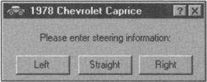
Figure 9-7: Imagine if you had to steer your car by clicking buttons on a dialog box! This will give you some idea of how normal people feel about the dialog boxes on your software. Humbling, isn't it?
Directly manipulating a steering wheel is not only a more appropriate idiom for communicating with your car, but it puts you in the superior position, directing your car where it should go. No user likes to be questioned like a suspect in a lineup, yet that is exactly what our software often demands of us.
Hiding ejector seat levers
In the cockpit of every jet fighter is a brightly painted lever that, when pulled, fires a small rocket engine underneath the pilot's seat, blowing the pilot, still in his seat, out of the aircraft to parachute safely to earth. Ejector seat levers can only be used once, and their consequences are significant and irreversible.
Just like a jet fighter needs an ejector seat lever, complex desktop applications need configuration facilities. The vagaries of business and the demands placed on the software force it to adapt to specific situations, and it had better be able to do so. Companies that pay millions of dollars for custom software or site licenses for thousands of copies of shrink-wrapped products will not take kindly to a program's inability to adapt to the way things are done in that particular company. The program must adapt, but such adaptation can be considered a one-time procedure, or something done only by the corporate IT staff on rare occasion. In other words, ejector seat levers may need to be used, but they won't be used very often.
| AXIOM | Hide the ejector seat levers. |
Programs must have ejector seat levers so that users can—occasionally—move persistent objects (see Chapter 11) in the interface, or dramatically (sometimes irreversibly) alter the function or behavior of the application. The one thing that must never happen is accidental deployment of the ejector seat (see Figure 9-8). The interface design must assure that the user can never inadvertently fire the ejector seat when all he wants to do is make some minor adjustment to the program.
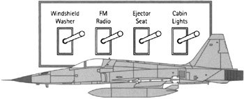
Figure 9-8: Ejector seat levers have catastrophic results. One minute, the pilot is safely ensconced in her jet, and the next she is tumbling end-over-end in the wild blue yonder while her jet goes on without her. The ejector seat is necessary for the pilot's safety, but a lot of design work has gone into ensuring that it never gets fired inadvertently. Allowing an unsuspecting user to configure a program by changing permanent objects is comparable to firing the ejection seat by accident. Hide those ejector seat levers!
Ejector seat levers come in two basic varieties: those that cause a significant visual dislocation (large changes in the layout of tools and work areas) in the program, and those that perform some irreversible action. Both of these functions should be hidden from inexperienced users. Of the two, the latter variety is by far the more dangerous. In the former, the user may be surprised and dismayed at what happens next, but she can at least back out of it with some work. In the latter case, she and her colleagues are likely to be stuck with the consequences.
By keeping in mind principles of flow and orchestration, your software can keep users engaged at maximum productivity for extended periods of time. Productive users are happy users, and customers with productive, happy users are the goal of any digital product manufacturer. In the next chapter, we further discuss ways to enhance user productivity by eliminating unnecessary barriers to use that arise as a result of implementation-model thinking.
|
|
EAN: N/A
Pages: 263