Chapter 9: Orchestration and Flow
To make software more productive, we must make its users more productive. To make users more productive, we must ensure that they remain in a harmonious frame of mind while using our applications. It is the user's mental state that ultimately dictates how effective he is at using our program. This chapter discusses how we can help ensure that our software reinforces user effectiveness and efficiency and how we can avoid disrupting the state of productive concentration that we wish our users to maintain.
Flow and Transparency
When people are able to concentrate wholeheartedly on an activity, they lose awareness of peripheral problems and distractions. The state is called flow, a concept first identified by Mihaly Csikszentmihalyi, professor of psychology at the University of Chicago, and author of Flow: The Psychology of Optimal Experience (HarperCollins, 1991).
In Peopleware: Productive Projects and Teams (Dorset House, 1987), Tom DeMarco and Timothy Lister, describe flow as a "condition of deep, nearly meditative involvement." Flow often induces a "gentle sense of euphoria" and can make you unaware of the passage of time. Most significantly, a person in a state of flow can be extremely productive, especially when engaged in process-oriented tasks such as "engineering, design, development, and writing." Today, these tasks are typically performed on computers while interacting with software. Therefore, it behooves us to create a software interaction that promotes and enhances flow, rather than one that includes potentially flow-breaking or flow-disturbing behavior. If the program consistently rattles the user out of flow, it becomes difficult for him to regain that productive state.
If the user could achieve his goals magically, without your program, he would. By the same token, if the user needed the program but could achieve his goals without going through its user interface, he would. Interacting with software is not an aesthetic experience (except perhaps in games, entertainment, and exploration-oriented interactive systems). For the most part, it is a pragmatic exercise that is best kept to a minimum.
| AXIOM | No matter how cool your interface is, less of it would be better. |
Directing your attention to the interaction itself puts the emphasis on the side effects of the tools rather than on the user's goals. A user interface is an artifact, not directly related to the goals of the user. Next time you find yourself crowing about what cool interaction you've designed, just remember that the ultimate user interface for most purposes is no interface at all.
To create flow, our interaction with software must become transparent. In other words, the interface must not call attention to itself as a visual artifact, but must instead, at every turn, be at the service of the user, providing what he needs at the right time and in the right place. There are several excellent ways to make our interfaces recede into invisibility. They are:
-
Follow mental models.
-
Direct, don't discuss.
-
Keep tools close at hand.
-
Provide modeless feedback.
We will now discuss each of these methods in detail.
Follow mental models
We introduced the concept of user mental models in Chapter 2. Different users will have different mental models of a process, but they will rarely visualize them in terms of the detailed innards of the computer process. Each user naturally forms a mental image about how the software performs its task. The mind looks for some pattern of cause and effect to gain insight into the machine's behavior.
For example, in a hospital information system, the physicians and nurses have a mental model of patient information that derives from the patient records that they are used to manipulating in the real world. It therefore makes most sense to find patient information by using names of patients as an index. Each physician has certain patients, so it makes additional sense to filter the patients in the clinical interface so that each physician can choose from a list of her own patients, organized alphabetically by name. On the other hand, in the business office of the hospital, the clerks there are worried about overdue bills. They don't initially think about these bills in terms of who or what the bill is for, but rather in terms of how late the bill is (and perhaps how big the bill is). Thus, for the business office interface, it makes sense to sort first by time overdue and perhaps by amount due, with patient names as a secondary organizational principle.
Direct, don't discuss
Many developers imagine the ideal interface to be a two-way conversation with the user. However, most users don't see it that way. Most users would rather interact with the software in the same way they interact with, say, their cars. They open the door and get in when they want to go somewhere. They step on the accelerator when they want the car to move forward and the brake when it is time to stop; they turn the wheel when they want the car to turn.
This ideal interaction is not a dialog—it's more like using a tool. When a carpenter hits nails, she doesn't discuss the nail with the hammer; she directs the hammer onto the nail. In a car, the driver—the user—gives the car direction when he wants to change the car's behavior. The driver expects direct feedback from the car and its environment in terms appropriate to the device: the view out the windshield, the readings on the various gauges on the dashboard, the sound of rushing air and tires on pavement, the feel of lateral g-forces and vibration from the road. The carpenter expects similar feedback: the feel of the nail sinking, the sound of the steel striking steel, and the heft of the hammer's weight.
The driver certainly doesn't expect the car to interrogate him with a dialog box, nor would the carpenter appreciate one (like the one in Figure 9-1) appearing on her hammer.
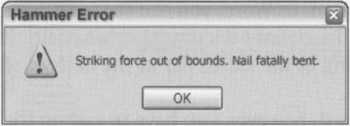
Figure 9-1: Just because programmers are accustomed to seeing messages like this, it doesn't mean that people from other walks of life are. Nobody wants his machine to scold him. If we guide our machines in a dunderheaded way, we expect to get a dunderheaded response. Sure, they can protect us from fatal errors, but scolding isn't the same thing as protecting.
One of the reasons software often aggravates users is that it doesn't act like a car or a hammer. Instead, it has the temerity to try to engage us in a dialog—to inform us of our shortcomings and to demand answers from us. From the user's point of view, the roles are reversed: It should be the user doing the demanding and the software doing the answering.
With direct manipulation, we can point to what we want. If we want to move an object from A to B, we click on it and drag it there. As a general rule, the better, more flow-inducing interfaces are those with plentiful and sophisticated direct manipulation idioms.
Keep tools close at hand
Most programs are too complex for one mode of direct manipulation to cover all their features. Consequently, most programs offer a set of different tools to the user. These tools are really different modes of behavior that the program enters. Offering tools is a compromise with complexity, but we can still do a lot to make tool manipulation easy and to prevent it from disturbing flow. Mainly, we must ensure that tool information is plentiful and easy to see and attempt to make transitions between tools quick and simple.
Tools should be close at hand, preferably on palettes or toolbars. This way, the user can see them easily and can select them with a single click. If the user must divert his attention from the application to search out a tool, his concentration will be broken. It's as if he had to get up from his desk and wander down the hall to find a pencil. He should never have to put tools away manually.
Modeless feedback
As we manipulate tools, it's usually desirable for the program to report on their status, and on the status of the data we are manipulating with the tool. This information needs to be clearly posted and easy to see without obscuring or stopping the action.
When the program has information or feedback for the user, it has several ways to present it. The most common method is to pop up a dialog box on the screen. This technique is modal: It puts the program into a mode that must be dealt with before it can return to its normal state, and before the user can continue with her task. A better way to inform the user is with modeless feedback.
Feedback is modeless whenever information for the user is built into the main interface and doesn't stop the normal flow of system activities and interaction. In Word, you can see what page you are on, what section you are in, how many pages are in the current document, what position the cursor is in, and what time it is modelessly just by looking at the status bar at the bottom of the screen.
If you want to know how many words are in your document, however, you have to call up the Word Count dialog from the Tools menu (see Figure 9-2). For people writing magazine articles, who need to be careful about word count, this information would be better delivered modelessly.
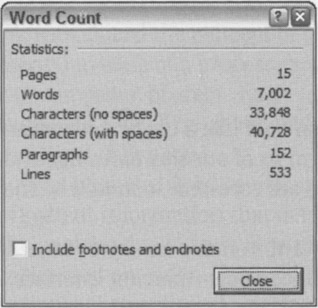
Figure 9-2: In Word, if you want to know the number of words in your document, you choose Word Count… from the Tools menu. This opens a dialog box. To get back to work, you must first click the Close button on the Word Count dialog. This behavior is the opposite of modeless feedback, and it hampers flow.
Jet fighters have a heads-up display, or HUD, that superimposes the readings of critical instrumentation onto the forward view of the cockpit's windscreen. The pilot doesn't even have to use peripheral vision, but can read vital gauges while keeping her eyes glued on the opposing fighter.
Our software should display information like a jet fighter's HUD. The program could use the edges of the display screen to show the user information about activity in the main work area of applications. Many drawing applications, such as Adobe Photoshop, already provide ruler guides, thumbnail maps, and other modeless feedback in the periphery of their windows. We will further discuss these types of rich modeless feedback in Chapter 34.
|
|
EAN: N/A
Pages: 263