Replacing Dialogs: Rich Modeless Feedback
Most computers now in use in the both the home and the office come with high-resolution displays and high-quality audio systems. Yet, very few programs (outside of games) even scratch the surface of using these facilities to provide useful information to the user about the status of the program, the users' tasks, and the system and its peripherals in general. It is as if an entire toolbox is available to express information to users, but programmers have stuck to using the same blunt instrument—the dialog—to communicate information. Needless to say, this means that subtle status information is simply never communicated to users at all, because even the most clueless designers know that you don't want dialogs to pop up constantly. But constant feedback is exactly what users need. It's simply the channel of communication that needs to be different.
In this section, we'll discuss rich modeless feedback, information that can be provided to the user in the main displays of your application, which don't stop the flow of the program or the user, and which can all but eliminate pesky dialogs.
Rich visual modeless feedback
Perhaps the most important type of modeless feedback is rich visual modeless feedback (RVMF). This type of feedback is rich in terms of giving in-depth information about the status or attributes of a process or object in the current application. It is visual in that it makes idiomatic use of pixels on the screen (often dynamically), and it is modeless in that this information is always readily displayed, requiring no special action or mode shift on the part of the user to view and make sense of the feedback.
For example, in Windows 2000 or XP, clicking on an object in a file manager window automatically causes details about that object to be displayed on the left-hand side of the file manager window. (In XP, Microsoft ruined this slightly by putting the information at the bottom of a variety of other commands and links. Also, by default, they made the Details area a drawer that you must open, although the program, at least, remembers its state.) Information includes title, type of document, its size, author, date of modification, and even a thumbnail or miniplayer if it is an image or media object. If the object is a disk, it shows a pie chart and legend depicting how much space is used on the disk. Very handy indeed! This interaction is perhaps slightly modal because it requires selection of the object, but the user needs to select objects anyway. This functionality handily eliminates the need for a properties dialog to display this information. Although most of this information is text, it still fits within the idiom. See Figure 34-6 for an example from a Cooper design project.
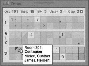
Figure 34-6: This pane from a Cooper design for a long-term healthcare information system is a good example of RVMF. The diagram is a representation of all the rooms in the facility. Color-coding indicates male, female, empty, or mixed-gender rooms; numbers indicate empty beds; tiny boxes between rooms indicate shared bathrooms. Black triangles indicate health issues, and a tiny "H" means a held bed. This RVMF is supplanted with ToolTips, which show room number, names of the occupants of the room, and highlight any important notices about the room or the residents. A numeric summary of rooms, beds, and employees is at the top. This display has a short learning curve. Once mastered, it allows nurses and facility managers to understand their facility's status at a glance.
Here's another example, this time from the Mac: When you download a file from the Internet, the downloading file appears on the desktop as an icon with a small dynamically updating progress bar, indicating visually what percentage has downloaded.
A final example of RVMF is from the computer gaming world: Sid Meier's Civilization. This game provides dozens of examples of RVMF in its main interface, which is a map of the historical world that you, as a leader of an evolving civilization, are trying to build and conquer. Civilization uses RVMF to indicate a half-dozen things about a city, all represented visually. If a city is more advanced, its architecture is more modern. If it is larger, the icon is larger and more embellished. If there is civil unrest, smoke rises from the city. Individual troop and civilian units also show status visually, by way of tiny meters showing unit health and strength. Even the landscape has RVMF: Dotted lines marking spheres of influence shift as units move and cities grow. Terrain changes as roads are laid, forests are cleared, and mountains are mined. Although dialogs exist in the game, much of the information needed to understand what is going on is communicated clearly with no words or dialogs whatsoever.
Imagine if all the objects that had pertinent status information on your desktop or in your application were able to display their status in this manner. Printer icons could show how near they were to completing your print job. Disks and removable media icons could show how full they were. When an object was selected for drag and drop, all the places that could receive it would visually highlight to announce their receptiveness.
Think about the objects in your application, what attributes they have—especially dynamically changing ones-and what kind of status information is critical for your users. Figure out how to create a representation of this. After a user notices and learns this representation, it tells him what is going on at a glance. (There should also be a way to get fully detailed information if the user requests it.) Put this information into your main displays in the form of RVMF and see how many dialogs you can eliminate from routine use!
One important point does need to be made about rich modeless visual feedback. It isn't for beginners. Even if you add ToolTips to textually describe the details of any visual cues you add (which you should), it requires users to discover it in the first place and then realize it's meaningful. RVMF is something that users will discover over time. When they do, they'll think it's amazing; but, in the meantime, they will need the support of menus and dialogs to find what they're looking for. This means that RVMF used to replace alerts and warnings of serious trouble must be extraordinarily clear to users. Make sure that this kind of status is visually emphasized over less critical, more informational RVMF.
Audible feedback
In data-entry environments, clerks sit for hours in front of computer screens entering data. These users may well be examining source documents and typing by touch instead of looking at the screen. If a clerk enters something erroneous, he needs to be informed of it via both auditory and visual feedback. The clerk can then use his sense of hearing to monitor the success of his inputs while he keeps his eyes on the document.
The kind of auditory feedback we're proposing is not the same as the beep that accompanies an error message box. In fact, it isn't beep at all. The auditory indicator we propose as feedback for a problem is silence. The problem with much current audible feedback is the still-prevalent idea that, rather than positive audible feedback, negative feedback is desirable.
NEGATIVE AUDIBLE FEEDBACK: ANNOUNCING USER FAILURE
People frequently counter the idea of audible feedback with arguments that users don't like it. Users are offended by the sounds that computers make, and they don't like to have their computer beeping at them. This is likely true based on how computer sounds are widely used today—people have been conditioned by these unfortunate facts:
-
Computers have always accompanied error messages with alarming noises.
-
Computer noises have always been loud, monotonous and unpleasant.
Emitting noise when something bad happens is called negative audible feedback. On most systems, error message boxes are normally accompanied by loud, shrill, tinny "beeps," and audible feedback has thus become strongly associated them. That beep is a public announcement of the user's failure. It explains to all within earshot that you have done something execrably stupid. It is such a hateful idiom that most software developers now have an unquestioned belief that audible feedback is bad and should never again be considered as a part of interface design. Nothing could be further from the truth. It is the negative aspect of the feedback that presents problems, not the audible aspect.
Negative audible feedback has several things working against it. Because the negative feedback is issued at a time when a problem is discovered, it naturally takes on the characteristics of an alarm. Alarms are designed to be purposefully loud, discordant, and disturbing. They are supposed to wake sound sleepers from their slumbers when their house is on fire and their lives are at stake. They are like insurance because we all hope that they will never be heard. Unfortunately, users are constantly doing things that programs can't handle, so these actions have become part of the normal course of interaction. Alarms have no place in this normal relationship, the same way we don't expect our car alarms to go off whenever we accidentally change lanes without using our turn indicators. Perhaps the most damning aspect of negative audible feedback is the implication that success must be greeted with silence. Humans like to know when they are doing well. They need to know when they are doing poorly, but that doesn't mean that they like to hear about it. Negative feedback systems are simply appreciated less than positive feedback systems.
Given the choice of no noise versus noise for negative feedback, people will choose the former. Given the choice of no noise versus unpleasant noises for positive feedback, people will choose based on their personal situation and taste. Given the choice of no noise versus soft and pleasant noises for positive feedback, however, people will choose the feedback. We have never given our users a chance by putting high-quality, positive audible feedback in our programs, so it's no wonder that people associate sound with bad interfaces.
POSITIVE AUDIBLE FEEDBACK
Almost every object and system outside the world of software offers sound to indicate success rather than failure. When we close the door, we know that it is latched when we hear the click, but silence tells us that it is not yet secure. When we converse with someone and they say, "Yes" or "Uhhuh," we know that they have, at least minimally, registered what was said. When they are silent, however, we have reason to believe that something is amiss. When we turn the key in the ignition and get silence, we know we've got a problem. When we flip the switch on the copier and it stays coldly silent instead of humming, we know that we've got trouble. Even most equipment that we consider silent makes some noise: Turning on the stovetop returns a hiss of gas and a gratifying "whoomp" as the pilot ignites the burner. Electric ranges are inherently less friendly and harder to use because they lack that sound—they require indicator lights to tell us of their status.
When success with our tools yields a sound, it is called positive audible feedback. Our software tools are mostly silent; all we hear is the quiet click of the keyboard. Hey! That's positive audible feedback. Every time you press a key, you hear a faint but positive sound. Keyboard manufacturers could make perfectly silent keyboards, but they don't because we depend on audible feedback to tell us how we are doing. The feedback doesn't have to be sophisticated—those clicks don't tell us much—but they must be consistent. If we ever detect silence, we know that we have failed to press the key. The true value of positive audible feedback is that its absence is an extremely effective problem indicator.
The effectiveness of positive audible feedback originates in human sensitivity. Nobody likes to be told that they have failed. Error message boxes are negative feedback, telling the user that he has done something wrong. Silence can ensure that the user knows this without actually being told of the failure. It is remarkably effective, because the software doesn't have to insult the user to accomplish its ends.
Our software should give us constant, small, audible cues just like our keyboards. Our programs would be much friendlier and easier to use if they issued barely audible but easily identifiable sounds when user actions are correct. The program could issue an upbeat tone every time the user enters valid input to a field. If the program doesn't understand the input, it would remain silent and the user would be immediately informed of the problem and be able to correct his input without embarrassment or ego-bruising. Whenever the user starts to drag an icon, the computer could issue a low-volume sound reminiscent of sliding as the object is dragged. When it is dragged over pliant areas, an additional percussive tap could indicate this collision. When the user finally releases the mouse button, he is rewarded with a soft, cheerful "plonk" from the speakers for a success or with silence if the drop was not meaningful.
As with visual feedback, computer games tend to excel at positive audio feedback. Mac OS 9 also does a good job with subtle positive audio feedback for activities like documents saves and drag and drop. Of course, the audible feedback must be at the right volume for the situation. Windows and the Mac offer a standard volume control, so one obstacle to beneficial audible feedback has been overcome.
Rich modeless feedback is one of the greatest tools at the disposal of interaction designers. Replacing annoying, useless dialogs with subtle and powerful modeless communication can make the difference between a program users will despise and one they will love. Think of all the ways you might improve your own applications with RVMF and other mechanisms of modeless feedback!
|
|
EAN: N/A
Pages: 263